
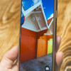
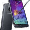
Review: Samsung Galaxy Note 4 for AT&T
Menus
The Note 4 runs the latest version of Android with Samsung's TouchWiz user interface on top. If you're keeping track, Samsung says it no longer refers to versions of TouchWiz. Instead of TouchWiz 5.0, it's just TouchWiz from now on. What we see on the Note 4 builds on the foundation set by the Galaxy S5 earlier this year, with some understandable adjustments for the larger screen.
By default, the lock screen includes a software shortcut to the camera, but you can add more if you want. The lock screen can show one or two clocks, the date and weather, select notifications, and of course a series of different locks. One of the locks can be your fingerprint, thanks to the fingerprint sensor built into the Home button. Like the Galaxy S5, the fingerprint sensor needs to be trained, and it can store several different fingers if you wish. I had no trouble training it. It performs a bit better than the reader on the GS5. It more correctly read and identified my fingerprints on the first try. It's just unreliable enough, however, that I resorted to using a standard PIN for locking purposes. I'd put it on even footing with the iPhone 6/6 Plus Touch ID sensor. It works best when you use two hands - one to hold the phone and the other to swipe your finger. Swiping one-handed requires more dexterity than my thumbs can muster.
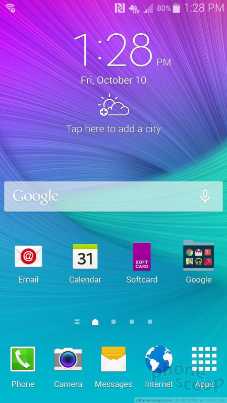
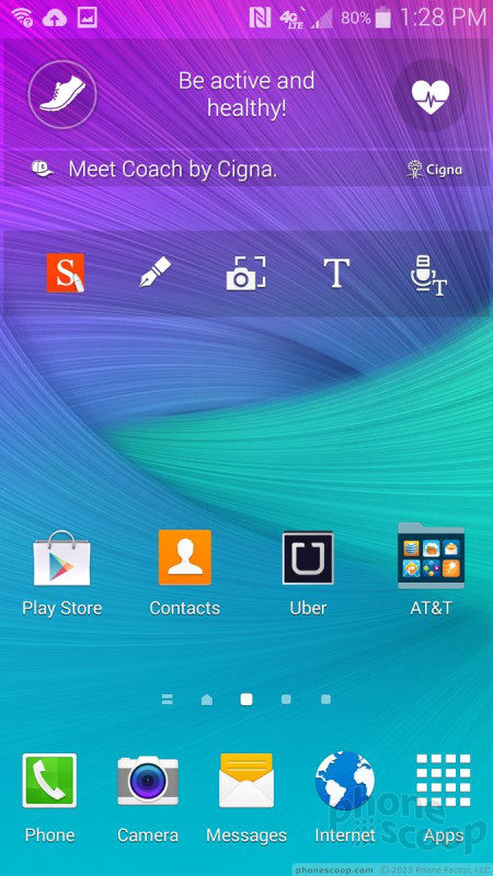
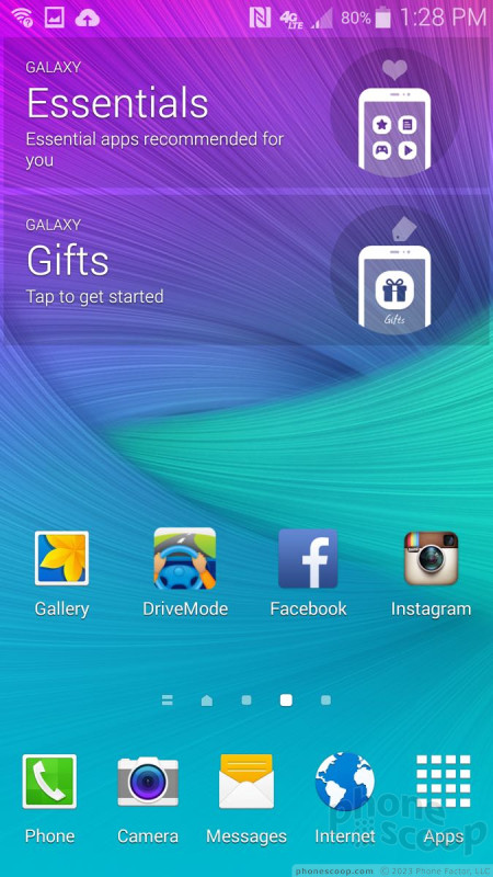
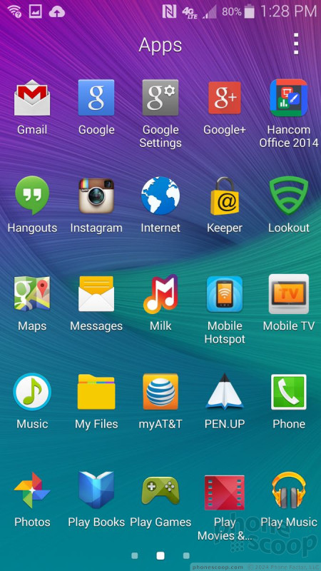
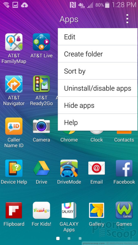

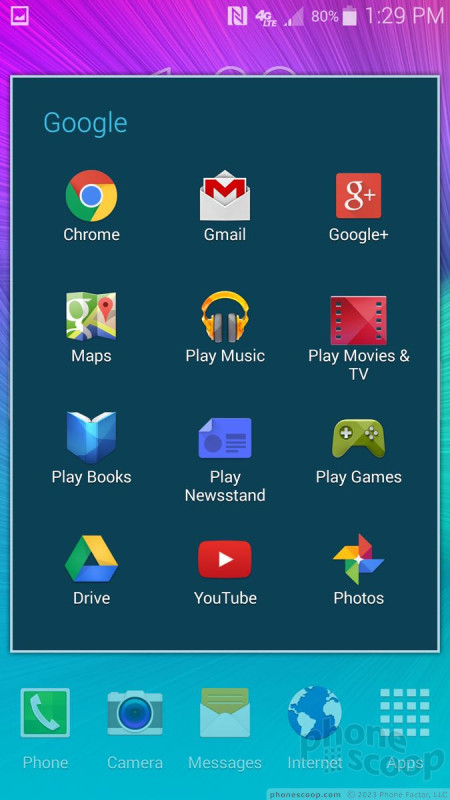
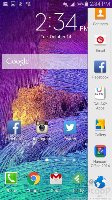
Anyone remotely familiar with Android will know exactly what to do with the home screen panels and app menu. There are multiple home screens live out of the box, with the leftmost reserved for Samsung's "Briefings" app (more on that in a sec). The panels are awash with shortcuts and widgets, but obviously these can all be removed so owners can personalize their device. The main app menu can be arranged in alpha order or by preference, but not in a list. You can hide apps easily, as well as use folders to reduce the amount of clutter.
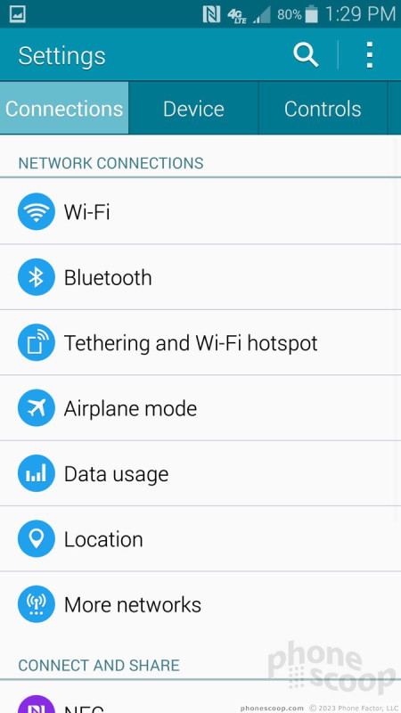
Samsung revised the settings panel - again! - after GS5 owners complained about the confusing grid-array of tools seen in the GS5's settings menu. The settings can be viewed in a single, long list or in tabs. The problem with the tabs is there are too many (at least five by my count) and they stretch beyond the edge of the screen. This means you have to swipe the tabs left and right to see the entire lot of them. That's annoying. Settings are lumped together in the usual set of categories, such as Network, Sound & Display, Personalization, Motions, System, etc.
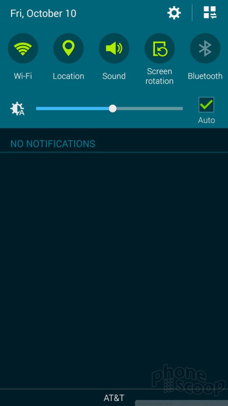
The notification tray is as useful as ever. The icons and toggles are easy to read and discern from one another. I dislike how much junk has become part of the notification tray, though. In addition to toggles for the radios and other controls, there's a brightness slider, another row of controls, and then the notifications. The extra controls take away valuable real estate from the notifications.


The Note 4 is another device to offer Samsung's Easy Mode, which is an optional, dramatically simplified user interface. It's meant for first-time smartphone owners and helps them get over the initial hump of using a touch screen device. It makes icons and text larger, removes home screen panels, and dumbs down the menus into simple lists. On the Note 4 its benefits are even more impressive, as icons and text are downright huge. It even has a "magnifier" tool to help enlarge anything in front of the camera.
The Note 4 also offers a one-handed mode, which shrinks the UI down by about 25% to one corner. The idea behind one-handed operation is to make elements such as the keyboard, dialpad, and other controls align with the side of the phone so you can reach everything with your thumb. With its 5.7-inch screen, my big hands can't stretch all the way to the upper corner unless I reposition the phone or use this mode. The one-handed mode can be turned on with a quick (very quick) back-and-forth swiping gesture. This gesture works better on the GS5. I found it unreliable on the Note 4.
The Note 4 is among the first devices to ship with the Qualcomm Snapdragon 805 processor, which is a top-of-the-line engine. There's no need to worry that the Note 4 doesn't perform. It has four cores clocked at 2.7GHz and I can tell you that this device absolutely screams. It never felt slow or bogged down. It's always quick on its feet. Apps open in a blink, animations and screen transitions are smooth, and apps download and install incredibly fast.
Multitasking
Multitasking is one of the Note series' defining features and Samsung made it even better on the Note 4.
For starters, the number of apps that are compatible with the multitasking function has roughly doubled. Further, the tool is simpler to use. On earlier Note devices, you had to enable multitasking in the settings menu. After you did this, a little tab floated along the side of the screen all the time so you could call up the multitasking apps. I hated that little tab. Now, a long press of the Back key opens up the tray for multitasking. I like this better.
As before, you grab any two apps from the tray and drag them to the screen. Resizing the windows is vastly easier thanks to a dead-simple tool. Further, more content can be dragged between the windows. For example, I was able to snag several screen shots from the gallery and dump them into the Scrapbook app.
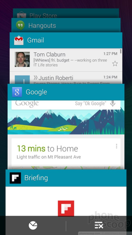
The Note 4 also makes a nice visual improvement to the app switcher. A long press of the Recents key calls up a vertical 3D carousel with apps floating on cards. You can cycle through the carousel to see all the recently-used apps, as well as close any apps that you may no longer want running in the background. It's much more appealing than the old app switcher.
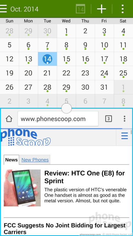
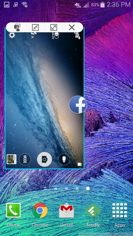
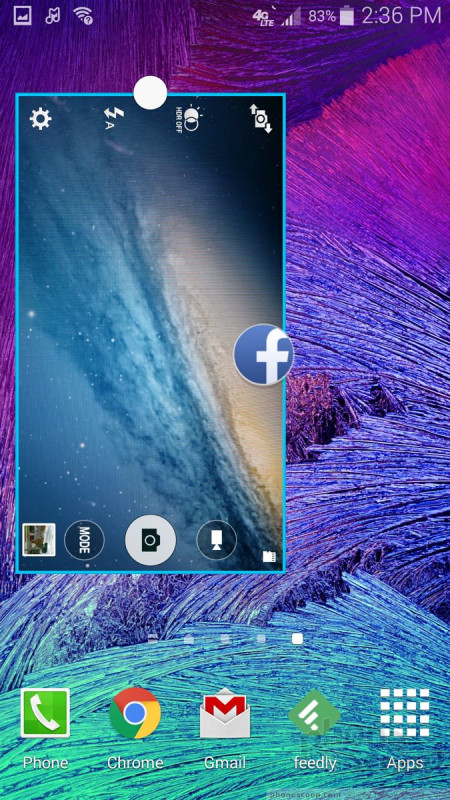
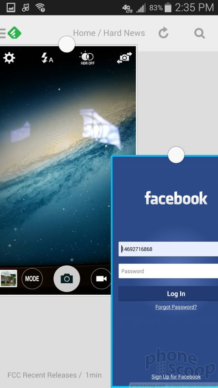
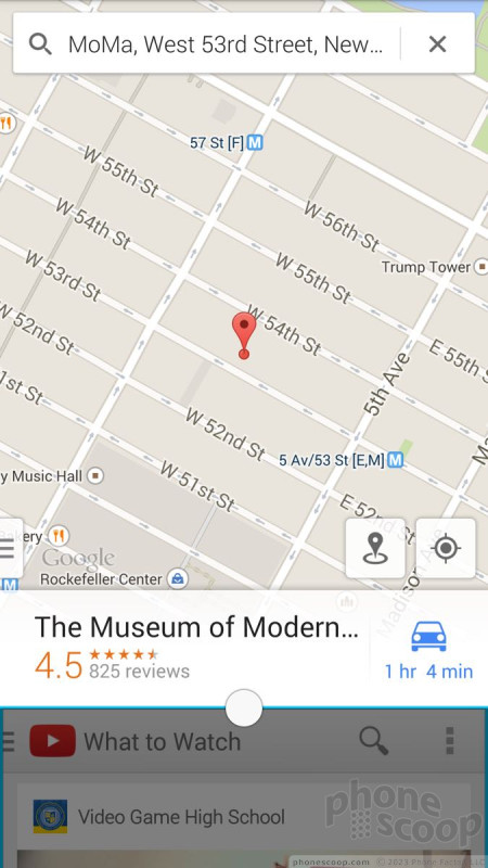
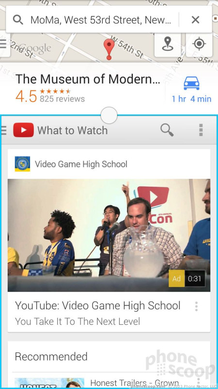
Last, Samsung reimagined what it called Pen Window on the Note 3. Basically, any app that can run in the multitasking environment can also run as a reduced-size app on top of other apps. For example, I was able to load a map in the background and then open the camera on top of it. I could interact with the Map to see where I was going, but kept the camera open in case I saw something cool. Samsung calls this the Pop-Up View shortcut. When first opened, each app runs in a 1080p HD window on the screen. However, you can resize the Pop-Up View to fit as much or as little of the screen as you want. The Pop-Up View works similar to QSlide apps on LG's devices.
There's no doubt the Note 4 is the king of multitasking on smartphones.

Calls and Contacts
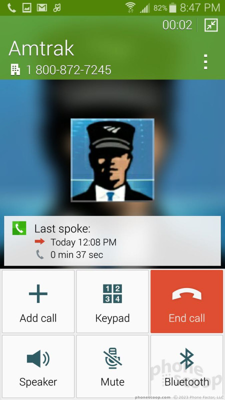
The phone app offers more customization than is available on most other handsets. When the dial pad is visible, tap the menu button and you'll see an options screen for the phone. Here is where you can set rejection behaviors, alerts, set up voicemail, and control the accessibility functions. You can turn on/off noise cancellation, too. It's quite a long list.
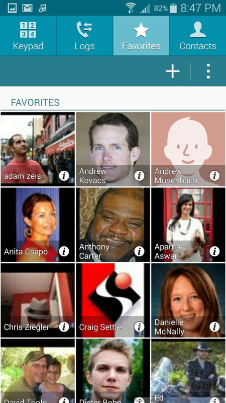
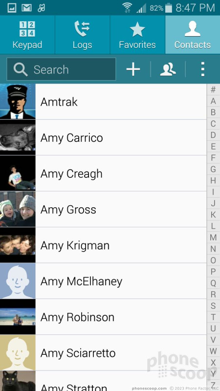
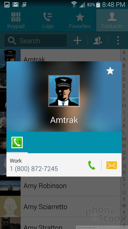
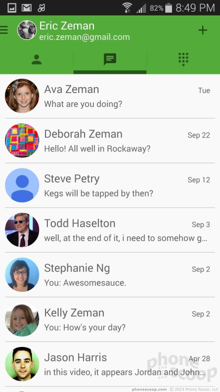
Other than the added settings, the contact app behaves more or less like the stock Android contact app. Favorites are accessible from a tab at the top of the phone app, as is the entire contact database. There are standard home screen shortcuts for direct access to a contact on the home screen panel, as well as a direct dial, and direct message, but there isn't a larger widget for your favorite contacts. Each individual contact card can hold tons of details about each person.

Messaging
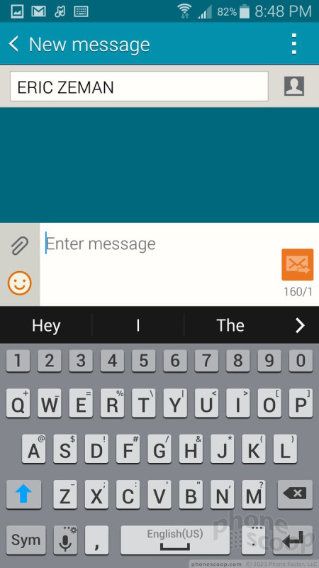
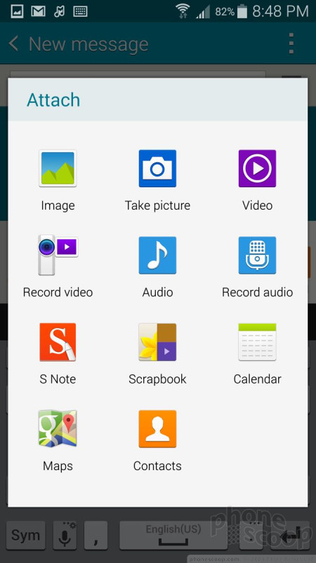
You won't be surprised by any of the messaging tools on the Note 4. The standard Android apps are all present and accounted for, which means Gmail, email, Hangouts, and messaging. You can select either the messaging or Hangouts apps to handle SMS duties. Samsung's ChatOn and AT&T's Messaging apps are both missing in action. So, too, are Facebook and Twitter. If you want anything other than the stock apps you'll have to download them from the Play Store yourself.
Perhaps AT&T has caught on that people will use the over-the-top messaging apps (WhatsApp, SnapChat, Skype) of their choice.

Briefings
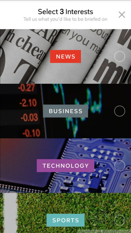
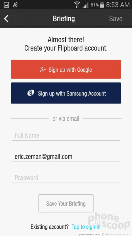
Briefings is a repackaged version of Flipboard. I'd call it Flipboard Lite. (Samsung's standalone My Magazine app, which debuted on the GS5 earlier this year, must have been a total flop. It's gone.) Briefings has some visual appeal, but lacks the extensive filtering options and news sources available to the full Flipboard app. For example, you can choose only three subjects of interest, which the app will then package together and show you. The full Flipboard app is installed, but you need to open it directly to get the full Flipboard experience. Weird.

 Hands on with Samsung's Galaxy Note 4
 Liveblog of Samsung Galaxy Note event
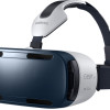 AT&T Selling Samsung's Virtual Reality Headset
 Samsung Releases Milk Video
 Samsung Note 4 Is More of A Big Thing
 Samsung Galaxy Note 4 (GSM)


