
Review: Samsung Glyde
If you've taken the LG Voyager for a spin, you won't find too much new with the menus on the Glyde. They take a page from the Voyager and put that Samsung spin on them.
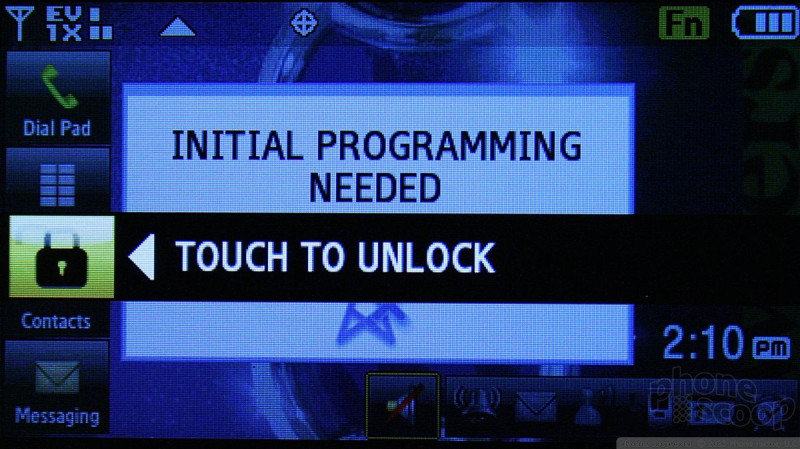
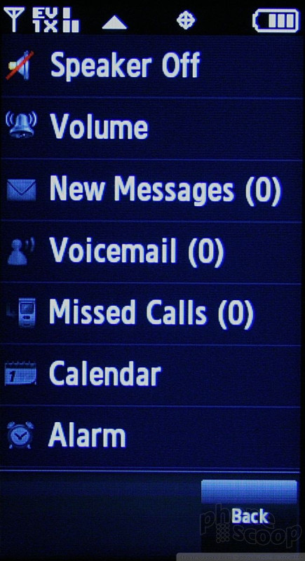
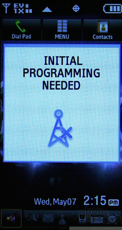
From the home screen, there are several options to get you top your desired content/applications. There is a little bar along the bottom of the screen with a bunch of icons in them. The icons are tiny. Touching anywhere along the bar brings up a shortcut menu. These are seven different items that Samsung believes you might want quick access to, such as your messages, calls, alarms, etc.
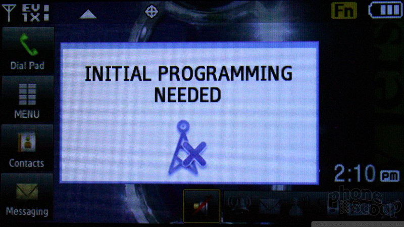
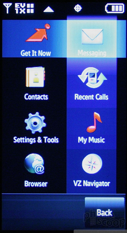
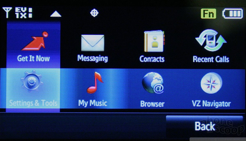
Touching the center of the phone's screen brings you to a shortcut menu with 12 items in it. This looks and acts like a standard phone menu. This menu can be customized to a degree, and is similar in function to the Croix UI from other Samsung phones. It even has the criss-cross light bars.
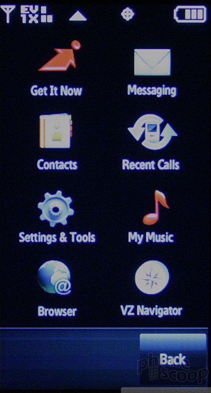
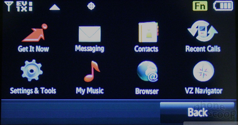
Running across the top of the home screen are three shortcuts to the dial-pad, main menu, and contacts. The main menu, such as it is, looks identical to the one on the Voyager, and has eight items in it. Some of the items are duplicated in the shortcut menu. For what reason, we can't say. This is where you go if you want to change the Glyde's settings.
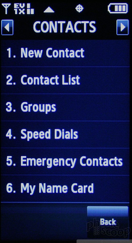
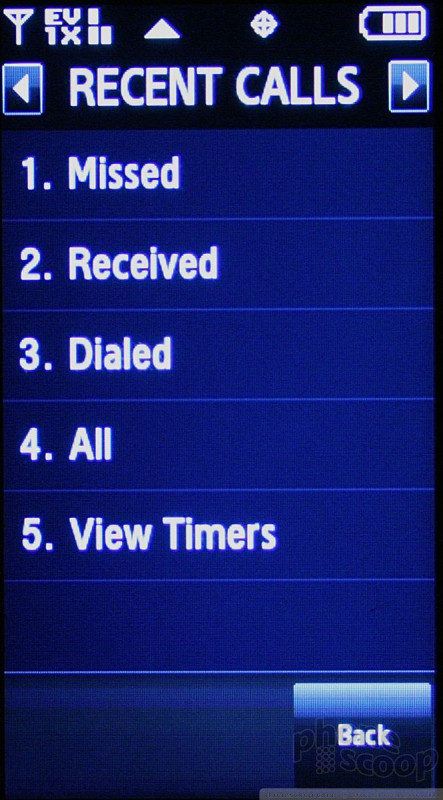
Once you open any of them, the familiar side-to-side tabbed scrolling reappears, letting you move from menu to menu without having to go back to the main screen.
They make sense, and are easy enough to figure out without too much trouble.


 Samsung's Glyde Slides Open at Verizon
 Samsung U940 Hurdles FCC
 iPhone 15 Series Goes All-In on USB-C and Dynamic Island
 Samsung S24 Series Adds More AI, Updates the Hardware
 Samsung's New Foldables Stick to the Formula
 Samsung Glyde U940


