Review: Samsung Galaxy Nexus for Verizon Wireless
The Galaxy Nexus is the first smartphone to ship with Android 4.0 Ice Cream Sandwich (ICS). Android 4.0 represents a major overhaul of the Android user interface. The design borrows heavily from Android 3.0 Honeycomb, but presents it in a way that makes more sense for a smartphone rather than a tablet. Well, most of the time, anyway.
The overall design and feel is appealing. It takes the changes apparent in Honeycomb and refines them in a way that makes it look far classier and calculated than before. It's less disjointed and feels like a complete thought, rather than a fragment. The lines are clean, the color palette is pleasing, and there's a more professional aspect to it. I find the use of black and white spaces really appealing.
The behavior of the home screens and menus has been revised significantly. Here's what's different with the major components.
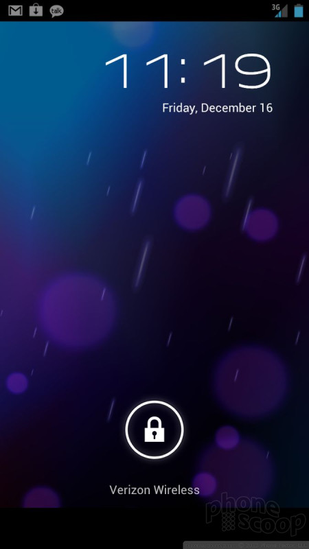
Home Screen: The lock screen offers only two options: You can swipe to unlock the device, or swipe to jump directly to the camera. There's still no camera shortcut if you put a gesture lock on your phone, though. The Galaxy Nexus has five home screens, which can hold apps, shortcuts, contacts, and widgets as normal. Changing the wallpaper works just as before, but to install widgets you need to go through the main menu (more on that in a minute). Transitioning between home screens felt snappy and quick. The dock at the bottom holds five items now, not four, and they are: phone, contacts, apps, messaging, browser These can all be customized, and can even include folders. You can also create folders on the home screens with a apps packaged inside. Out of the box, for example, Google has installed a folder called "Google" with some of its key apps bundled in there. Android now appears to encourage you use the home screen as your app menu. For example, when you download an app, it's added to your home screen automatically. Also, the way the full app menu now includes widgets implies that it's intended to be used primarily as a place to add apps to your home screen, rather than to launch apps directly. The addition of app folders on the home screen (but not in the app menu) also implies that Google expects you put all of your commonly-used apps on the home screen, rather than access them from the full app menu.
Basic Controls: Google has made a mess of the basic controls. As mentioned earlier, there are no physical buttons on the front of the Galaxy Nexus. Instead, three buttons — which come and go as necessary — appear at the very bottom of the screen: Back, Home, Multitask. These controls are lifted straight from Honeycomb. The first two are self-explanatory. The Multitask button, when pressed, reveals a graphical listing of all the recently used applications. Pick the app you want to jump to, and that's what it does. The search tool has been moved to the top of the display, and the all-important Menu button has been removed entirely. This is distressing. The Menu key was one of the most vital of the entire interface. It reappears in several different configurations (most often as a set of three vertical dots) inside apps. Sometimes this symbol is at the top of the screen; sometimes it's at the bottom. This inconsistency is disorienting and highly annoying. There's also a secondary menu tool that appears in the form of a really small triangle (in Gmail, for example). These two new tools for altering app settings are completely unintuitive.
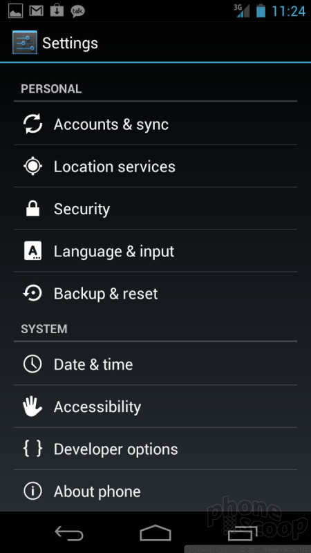
Settings: The settings is just another app shortcut on the home screen, although you can also now access it from anywhere via a button in the notification shade. Press it, and the full settings tools will open, wherein you can adjust network behaviors, ringtones, the display, applications, accounts, location services, and so on. The settings screens have been re-organized and spruced up a bit. It looks nicer and may be a tad easier to use. You can also control the basic radio settings via a home screen widget that lets you toggle Wi-Fi, Bluetooth, GPS, Sync services, and turn off automatic brightness.
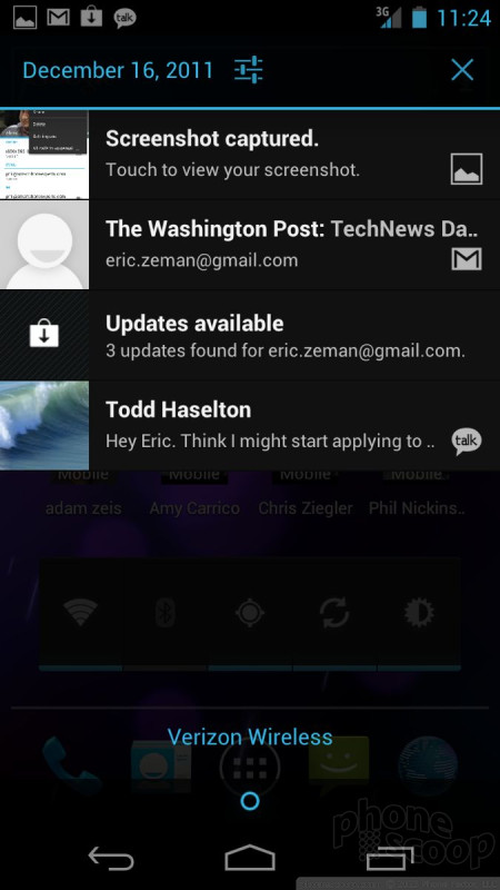
Notification Center: The drop-down notification shade has been modified slightly. It collects notification as before, but now you can dismiss individual notifications by swiping sideways. Again, this is a behavior carried over from Honeycomb. As mentioned, you can also access Settings from the notification shade now.

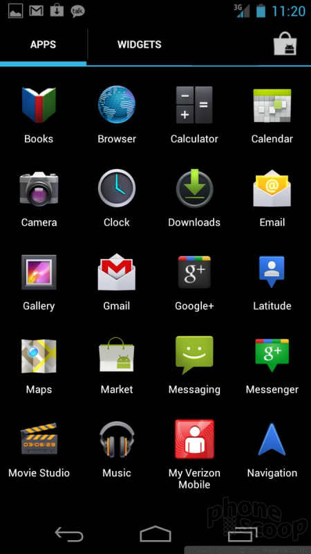
App Menu: The main app menu also gets its Honeycomb on. Out of the box, there are two screens populated with all the apps on board. The Galaxy Nexus has 34 apps in total. Only two are from Verizon, which are account management tools. The rest are all Google. Swipe the pages to the left and you'll eventually jump from a list of all the apps to a list of all the widgets that are available. This is the same widget tool as found in Honeycomb. The tool lets you see what the widget looks like and tells you how big it is (e.g., 1 x 3, 3 x 3, etc.). There are five pages of widgets available, many of which are associated with apps such as the Gmail client, or calendar, Twitter, and so on. I like this way for configuring widgets, because you get a sense of what each widget looks like and how big it will be before you dump in onto your home screen.


 Hands-On: Android 4.1 Jelly Bean
 Sprint Officially Reveals Galaxy Nexus
 Samsung Galaxy Nexus First Ice Cream Sandwich Phone
 Samsung Galaxy Nexus (LTE)


