
Review: Samsung Sunburst
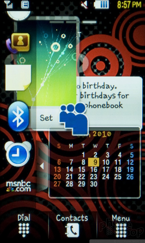
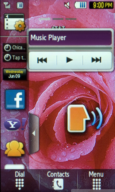
As I mentioned, the Samsung Sunburst uses Samsung's TouchWIZ interface design for the home screens. I am not a fan of TouchWIZ; it seems poorly designed for small screens like the three inch display on the Sunburst. TouchWIZ's main component is a drawer that pops out from the left side of the screen. The drawer contains small icons that represent widgets. You drag an icon out of the drawer, and it expands to offer some widget function. There's a music player widget, a Yahoo search widget, a shortcut to open the Facebook mobile Web site, and plenty more. The Sunburst offers 27 different widgets in all. Some of these are mostly useless, like the birthday widget, which it seems would only be useful a few times a year. Widgets don't take any action while they are stuck in the drawer, you have to drag them out to the home screen area to use their functions. This seems like a bad imitation of Android, where apps can be dragged in and out of the app drawer, but in Android you can also launch an app just by tapping it, no dragging required.
My problem with TouchWIZ isn't with its style. The interface never seems to function properly. Because of problems with the touchscreen, it's easy to scroll up and down the selection of widgets and accidentally drop one onto the home screen. Then, it's tough to put them away. You can't just drag them to a trash can, you have to open the drawer and put the widget back, like a child cleaning up his toys. For some reason, Samsung allows widgets to overlap and completely cover each other, so it's easy to make a mess on your screens and obscure the features you want. The Sunburst has a three paneled homescreen, but you can't drag widgets from one panel to another, you have to put them away, move to the next panel, then drag them out again. This is all very poor design. I like the idea of widgets on the homescreen. I think it adds a layer of utility and customization that most feature phones lack. But TouchWIZ executes this concept poorly.
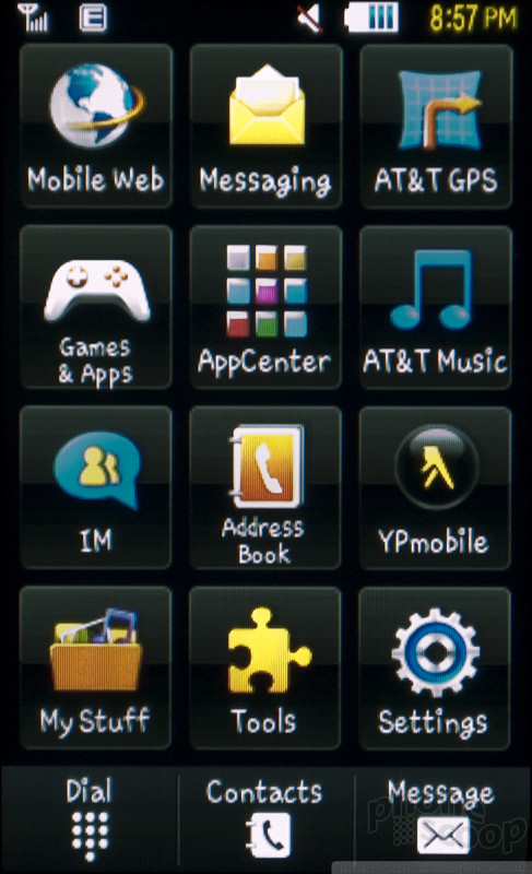
At the bottom of the home screen is a row of buttons to activate the dialpad, open the address book or view the phone's main menu. The menu, separate from TouchWIZ, is a basic icon grid. Most of the best features get their own top level icon, so its easy to jump into the messaging functions, the music player or the GPS navigation. I would replace IM on the main menu with AT&T's Social Net app. Otherwise, Social Net is hard to find, buried two levels deep under the "My Stuff" menu item. Come to think of it, I'd like to be able to completely customize this menu, but there are no options to change the design or specific offering.
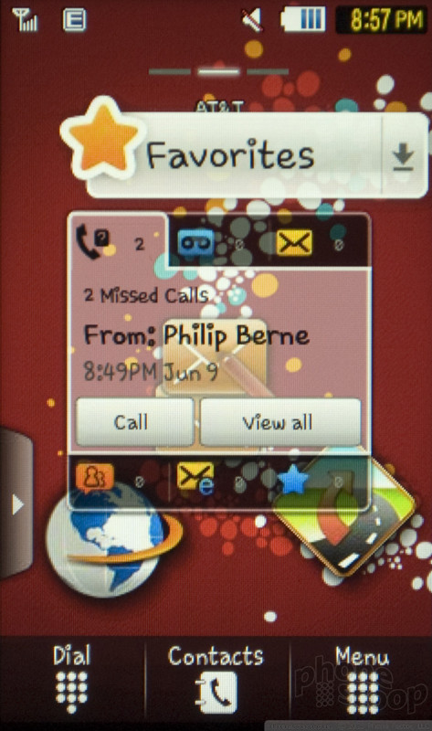
Samsung does a nice job with alerts on the lock screen. There's an alert bar, and it shows new calls, voice mail, text messages, IM chats and email. It even has a spot to show you if your designated Favorite people have tried to get in touch.

 iPhone 15 Series Goes All-In on USB-C and Dynamic Island
 Samsung S24 Series Adds More AI, Updates the Hardware
 Motorola Refreshes razr Lineup with Better Batteries & More
 Samsung's New Foldables Stick to the Formula
 Boost Updates its Celero Phones for 2024
 Samsung Sunburst A697


