
Review: Sanyo SCP-2700
Oddly, the SCP-2700 is yet another device to come from Sprint without its newer OneClick user interface. Instead, it borrows heavily from other lower-tier devices we've seen from Sprint.
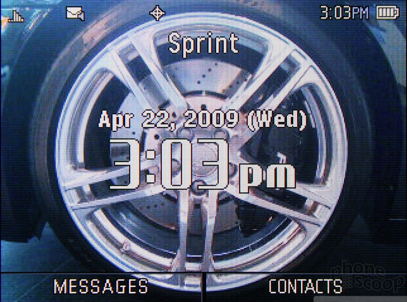
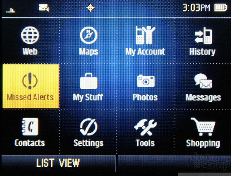
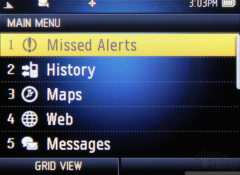
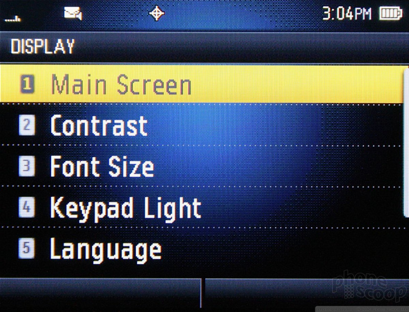
The home screen has links to your inbox and contacts via the soft keys. If you want to get at the main menu, press the center of the D-pad. The main menu is a 12-icon grid that can also be viewed in list form. Rather than make you jump through hoops to change the way the main menu looks, the left soft key does it automatically. For my money, the grid view is easier to use on a day-to-day basis.
The 12 icons don't offer any surprises and are composed of the requisite mixture of phone tools and Sprint service offerings. Similar to other Sprint phones, it uses the My Stuff folder to centralize all your media and apps and games. The "Shopping" icon doesn't take you to an on-board apps store. Instead, it fires up the browser and loads Sprint's content portal.
Once you move deeper into the menu system than the initial grid, the default view of the menus switches to a list.
 Apple and Google Launch Phone Diagnostic Tools
 JBL Brings Smart Charging Case to More Earbud Styles
 Google Makes Maps Smarter, Conversational
 Sanyo SCP-2700 Juno


