
Review: Google Nexus 6
The Nexus 6 runs a completely stock version of Android 5.0 Lollipop. It is entirely unencumbered by phone-maker user interface adjustments and tweaking. All Nexus devices run "pure Android", which is a large part of their appeal. They are also among the first Android devices to receive system updates from Google. (That means if you're rocking a Nexus 4 or Nexus 5, you can expect to get a taste of Lollipop very soon.) We've reviewed Android 5.0 Lollipop and Material Design in depth here. We suggest you check that out for the full skinny on Lollipop. What follows is a light re-cap of what's new and improved.


Menus
Google was smart enough to maintain the basic user interface elements we've come to know and rely on in Android. That means there's a lock screen, home screen panels, a settings menu, notifications, and quick settings, all of which are easily accessible. The most obvious change is the Material Design aesthetic and interface principles.
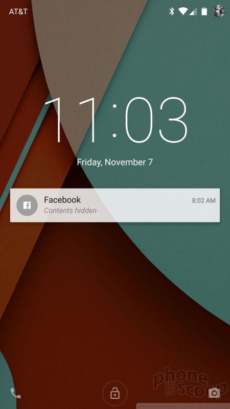
Lollipop's lock screen is a simplistic place, but offers lots of room for customization. You control whether or not there's an actual lock, what notifications are visible, and what your phone does at rest. There are shortcuts for opening the phone and camera, and Android supports a range of security options, such as passwords, PINs, and trusted devices (nearby Bluetooth accessories).
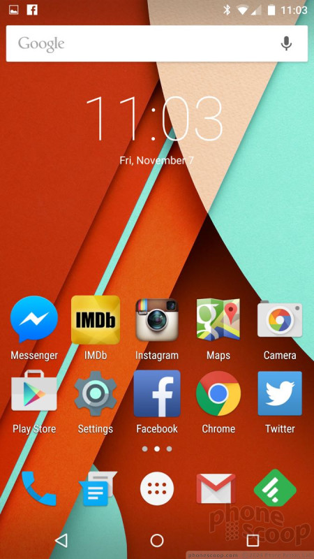
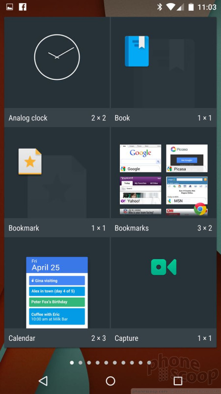
The Nexus 6 has three home screen panels when you first boot it, and one of them is Google Now thanks to the Google Now Launcher (you can turn this off if you want). As always, they slide left and right. You can drop pretty much anything you want on the home screens, such as apps, folders, contacts, and widgets. All of the screens maintain a dock at the bottom. The dock holds up to five shortcuts; one of them must be to the main app menu.
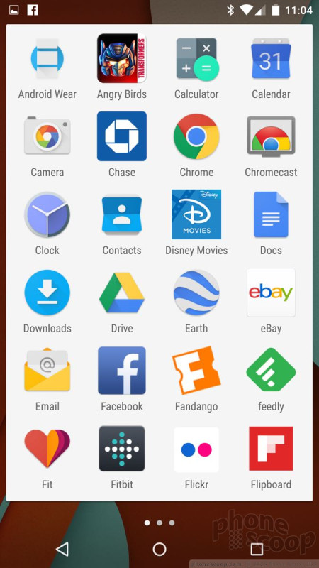
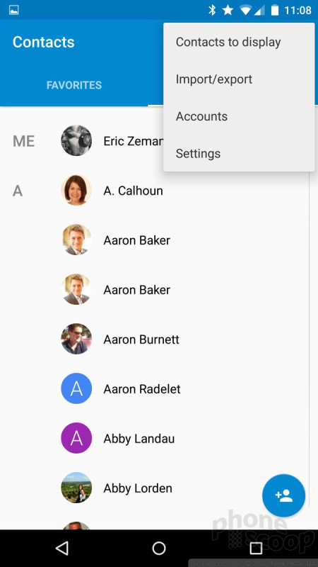
The Nexus 6 has a basic app menu: It's a simple, alphabetical grid. There's no dedicated shortcut to the Play Store, no list view, and no rearranging of the apps. You can group them into folders, but you can't even hide the apps that you're not interested in, at least not on our test device.


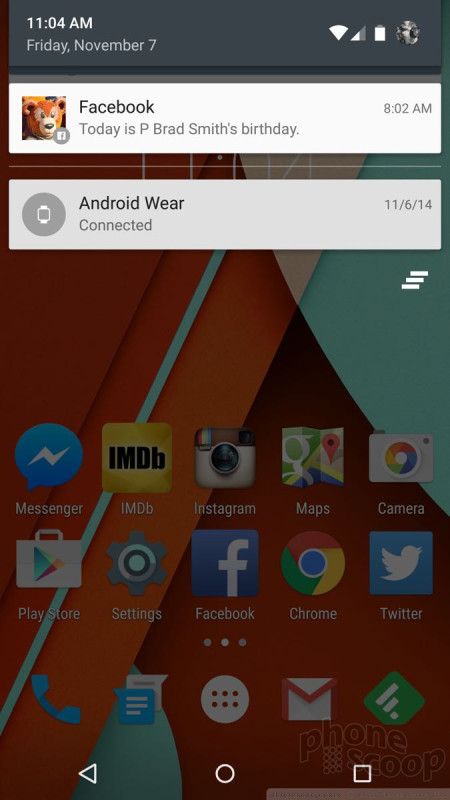
Lollipop supercharges notifications, which now closely resemble those of Apple's iOS platform. It helps that the N6 adopts a simple version of Moto Display. This means notifications surface on the screen when the phone is sleeping. They come and go as you touch the phone or move it. Multiple alerts can rest on the home screen at a time. If you want to act on a notification, double tap the alert to open the app. This applies to SMS messages, emails, missed calls, and so on. The alerts can contain the message contents and/or contact name, but these details can be hidden for privacy.
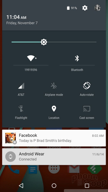
Lollipop carries over the Quick Settings from KitKat. It's accessible much like the notification tray. Simply swipe downward with two fingers to open Quick Settings. This provides access to basic controls such as cellular on/off, Bluetooth, and WiFi radios, as well as auto-rotate and the flashlight. In other words, they've made it more like the Control Center in iOS.
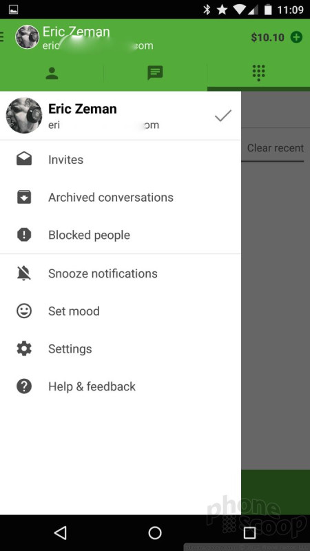
Lollipop also introduces a new Priority Mode for notifications. With Priority Mode, you can control which alerts bother you and which don't. There are three basic operating behaviors with Priority Mode: All, Priority, None. When you select All, every app is free to send notifications to the device. WIth Priority, only contacts you've assigned as priority contacts will be able to reach the device with notifications when they call or message. With None selected, no alerts of any kind will show up on the phone. It's similar to Do Not Disturb mode in iOS, but I don't think it's as user-friendly.
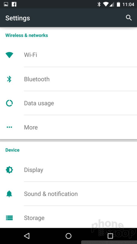
The settings tools look different, but act almost entirely as they did before. Rather than white text on a black background, the settings are green text on a white background. The tools are still organized into several groups, such as Wireless Networks, Device, Personal, and System.


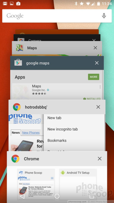
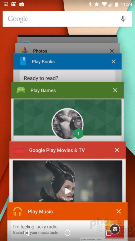
The Nexus 6 multitasks much like before, but the user interface is much nicer thanks to the 3D carousel layout. Otherwise, jumping between open apps is easy. It's a shame the Nexus 6 doesn't support running two apps side-by-side at the same time.
As far as performance goes, the Snapdragon 805 processor on the N6 ran Lollipop perfectly. The 805 is a quad-core beast that provides amazing performance across the board.
Calls and Contacts
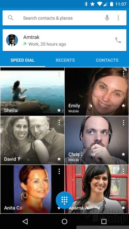
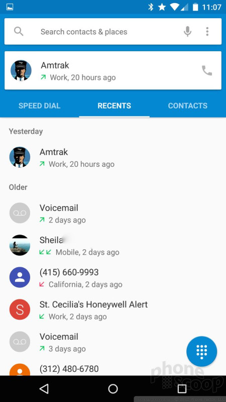
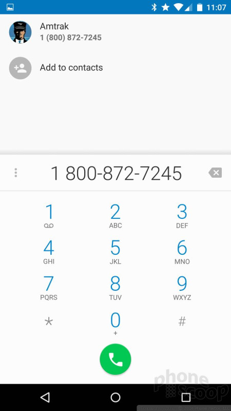
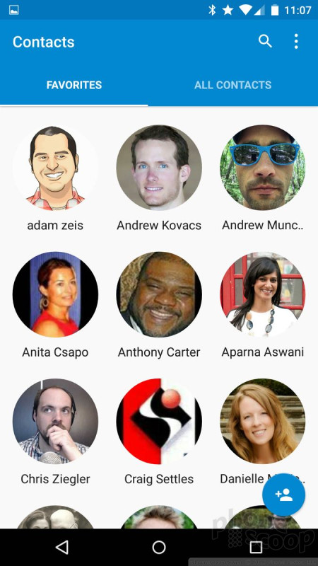
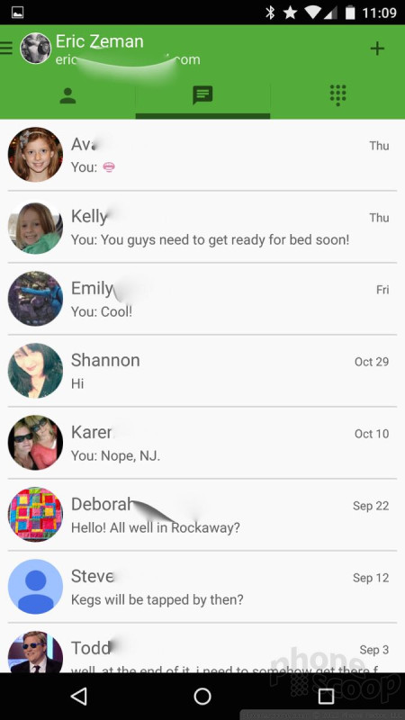
The phone app has three screens: speed dial (aka, favorites), recents, and contacts. The speed dial screen is visually appealing with photos of your favorite contacts. It holds at least 20 contacts in a 2x10 vertical grid. Buttons make it easy to send emails, texts, and make calls to each contact. The recents screen is where your call log is. I like how the app now separates call logs into separate days, making it easier to see the calls you've missed today, yesterday, and so on. If you press an individual call entry, a little pop-up box makes it a snap to call the person back, see the details of the call, add the number to your contacts, and so on.
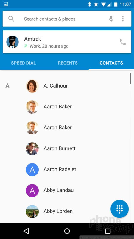
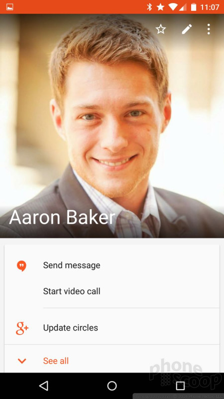
Then there's the contact screen. You'll see a long list of your contacts with circular photos next to each name. Press the contact name, and beautiful, colorful new contact cards pop up. I really like the way the new contact cards look. They are much more appealing than the spartan and bare contact cards of Android 4.x.

Two things persist across the speed dial, recents, and contacts screens: the search bar at the top and a small button on the bottom right corner. The search bar's use is rather obvious. The button in the bottom corner calls up actual phone dialer. I like that you can open the phone dialer from any of the screens within the phone app itself..
Messaging
The Nexus 6 and Android 5.0 have new Gmail and text messaging apps, but Hangouts and Google+ are largely carried over from early versions of Android.
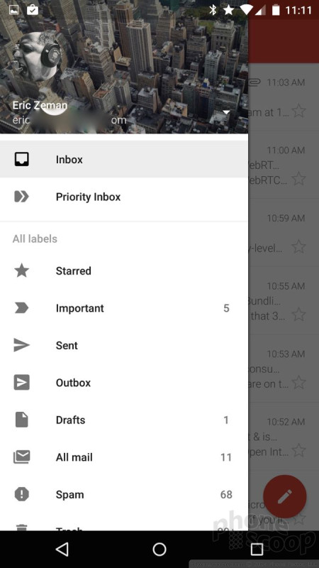
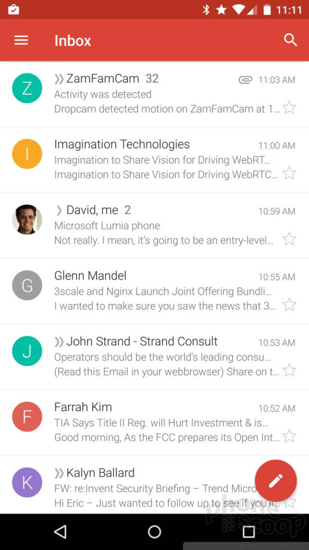
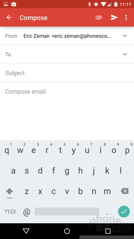
Like most other core apps, Gmail adopts Material Design in a big way and looks and feels very different from previous versions of Gmail. Think lots of color, circles, and smooth animations. Gmail now supports other email accounts and services. Before Android 5.0, Google offered two email apps: email and Gmail. Gmail was reserved for Google's own email service, while email was for everything else. The old email app is still there, but it redirects you to Gmail. The Gmail app can now handle everything. It supports Gmail and most POP3/IMAP4 email services, plus Microsoft Exchange. I was able to add my Yahoo and Outlook.com email accounts to Gmail with no problem. This resolves one of the more confusing aspects of Android for first-time users of the OS. Gmail makes it easy to view all your inboxes at once or separately. This could be life-changing for some people.

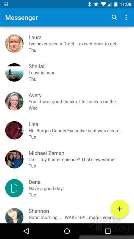
The stand-alone text messaging app makes great use of Material Design and is much more pleasant to use. I can't say the same for Hangouts. Why both of these apps exist is a question that needs answering. Google simply needs to combine them already, though it hasn't been able to do so successfully so far. Hangouts can handle SMS duties if you allow it, but it's not a smooth experience.

 Hands-On: Google Nexus 6
 Google Releases Final Developer Preview of Android 7 Nougat
 Google Reveals When Nexus Phones Will Cease Receiving Android Updates
 Yahoo Adds Search Tools to Aviate Android Launcher
 Google Publishes Android 5.0 Preview, Updates SDK
 Motorola Nexus 6


