Review: Android 5.0 Lollipop
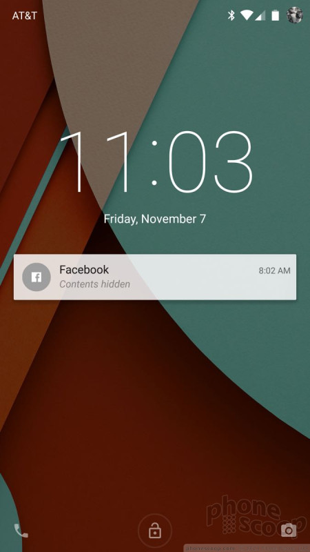
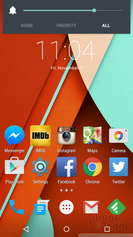
Lock Screen
Lollipop's lock screen is a simplistic place, but offers lots of room for customization. You control whether or not there's an actual lock, what notifications are visible, and what your phone does at rest.
When you first wake the device you'll see three icons floating at the bottom of the screen: phone, unlock, camera. You can swipe up anywhere on the screen to unlock it; swipe to the right anywhere on the screen to launch the phone; or swipe to the left anywhere on the screen to launch the camera. Lock screen widgets appear to have been nixed, but the Daydream tool is still available. Daydream lets you choose what the screen does when the device is plugged in and charging, such as show the clock, photos, Flipboard content, and so on.
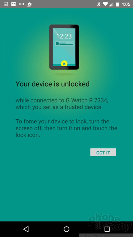
Lollipop offers a number of different locking tools. You can still choose a PIN code, a password, or a swipe pattern. You can use your face, though I found this hard to train. You may also use a "trusted device." A trusted device is a Bluetooth accessory, such as a smartwatch. I like to use a pattern to lock my Android phones. When I'm wearing my smartwatch, though, the phone will recognize the wearable and skip the lock screen. It assumes that because a trusted device is nearby, it is safe to unlock the phone because it's probably the owner. I like this option very much, and found it to work well. As soon as I disconnected the smartwatch from the phone, the phone required my swipe pattern before unlocking.
A redesigned Quick Settings panel is also available from lock screen. From there, you can easily adjust screen brightness or toggle on/off the radios.
I would say the Android and iOS lock screens are about on par. Android's one advantage is the ability to go straight to the phone thanks to a shortcut. Other than that. they offer similar sets of tools. Both Android and iOS are slightly ahead of Windows Phone in this regard, though Windows Phone 8.1 definitely made some progress on this front.

Home Screens
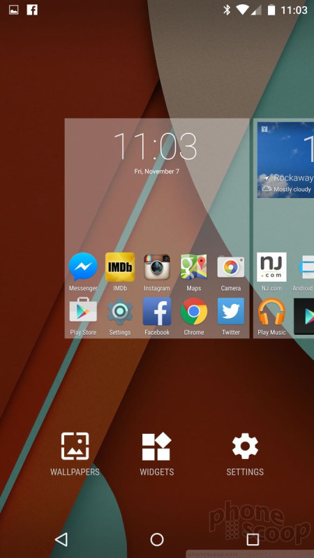
The home screen panels are one area where Android has remained mostly unchanged, and that's a good thing. One of Android's core strengths is the flexibility of the home screens.
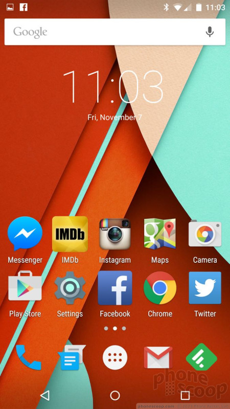
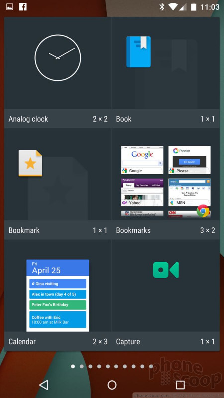
By default, the system creates three home screen panels. As always, they slide left and right. You can drop pretty much anything you want on the home screens, such as apps, folders, contacts, and widgets. Lollipop will create more screens as you add more content. Press-and-hold on any of the home screen panels to bring up the home screen editing tool. This allows you to switch wallpapers, add widgets, or jump to the full settings screen.
All of the screens maintain a dock at the bottom. The dock holds up to five shortcuts; one of them must be to the main app menu.
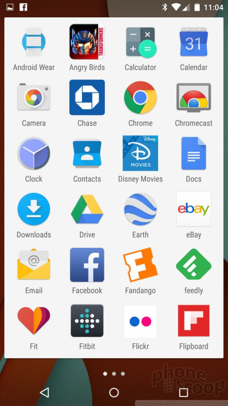
Speaking of the app menu, Lollipop offers the most basic rendition of the app menu I've seen from Google. It's a simple, alphabetical grid. There are no links to the Play Store, no list views, no rearranging the apps. You can group them into folders, but you can't even hide the apps that you're not interested in, at least not on our test device.
The app menu is one aspect of Lollipop where I dislike the design changes. In Android 4.x, the apps floated over your home screen wallpaper. Now, they all appear on a flat white screen. If you ask me, Lollipop loses a little bit of the dramatic flair the app menu had in Android 4.x. On the plus side, it's easier to see the apps, which now stand out from the background.
Android definitely offers the most flexible home screens of the three major smartphone platforms. I'd put Windows Phone 8.1 in second place, thanks to the resizeable Live Tiles, support for three columns, and transparent tiles. iOS has the least flexible home screens, thanks to its rigid design.
Notifications
Notifications have generally been solid on Android devices. In Lollipop, they are supercharged and now closely resemble those of Apple's iOS platform. I haven't yet decided if that's a good thing or a bad thing.
On the lock screen, the default behavior in Lollipop is for all notifications to pop up as an alert. Multiple alerts can rest on the home screen at a time. If you want to act on a notification, double tap the alert to open the app. This applies to SMS messages, emails, missed calls, and so on. The alerts can contain the message contents and/or contact name, but these details can be hidden for privacy. For example, the alert box can show you that you received an SMS from Sally Smith and she said, "Hey, where RU?" or the alert box can simply say "New SMS messages." You can choose to turn off the lock screen alerts.
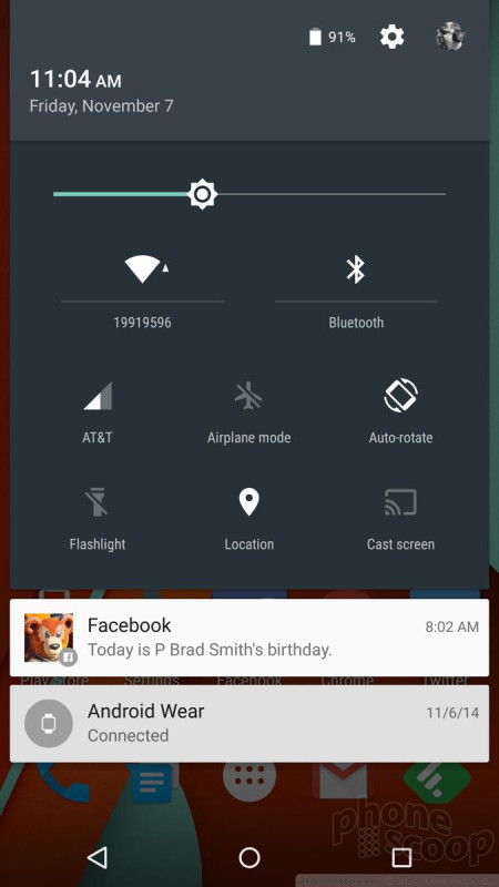
When using the device, notifications continue to pop down from the top of the screen like always. For example, when you receive a new email, you'll see the name of the sender and subject line flash across the top of the screen. If you swipe down from the top of the screen, all of your notifications are there lined up in the new alert boxes. They look rather pretty. You can dismiss individual notifications, open them or act on them, or dismiss all the notifications at once.
Lollipop carries over the Quick Settings from KitKat. It's accessible much like the notification tray. Swiping one finger down from the top opens notifications; swiping with two fingers opens the Quick Settings. The Quick Settings provides access to basic controls such as cellular on/off, Bluetooth, and WiFi radios, as well as auto-rotate and the flashlight. In other words, they've made it more like the Control Center in iOS.
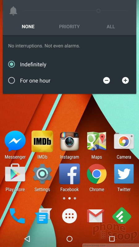
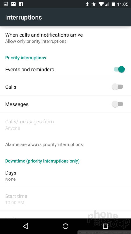
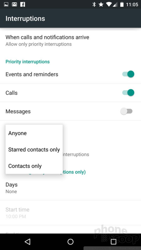
Lollipop also introduces a new Priority Mode for notifications. With Priority Mode, you can control which alerts bother you and which don't. There are three basic operating behaviors with Priority Mode: All, Priority, None. When you select All, every app is free to send notifications to the device, including sounds and vibrations. WIth Priority, only contacts you've assigned as priority contacts will be able to reach the device with notifications when they call or message. With None selected, no alerts of any kind will show up on the phone. It is similar to Do Not Disturb mode in iOS, but I don't think it's as user-friendly.
Priority Mode is accessed via the volume toggle. When you press the volume toggle, you'll see the three options – All, Priority, and None – appear under the volume bar on the screen. What's bothersome is that Lollipop makes the new “None” option the only way to completely silence the phone (including vibrate.) I sometimes like to silence all beeping and turn off the vibrate alert so my phone doesn't bug me at all. You used to be able to do that with the lowest “volume” setting. Now the lowest “volume” setting still vibrates; you have to touch the screen to turn off vibrate, making it a two-step process. Most vibrate motors make some small bit of noise; shouldn't the lowest volume setting be zero?
Android and iOS are on more even ground now when it comes to notifications. Managing them on iOS is more difficult and time consuming, but I think the payoff is greater. Windows Phone still needs to catch up a bit.

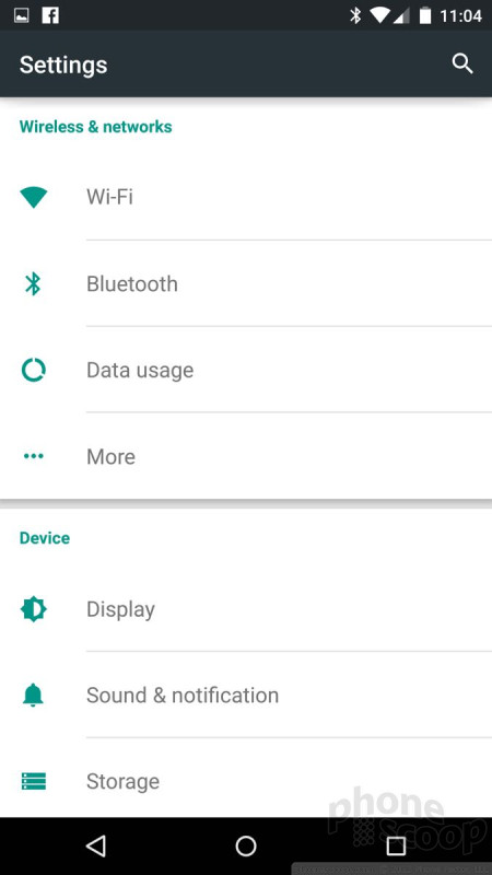
Settings
The settings tools look different, but act almost entirely as they did before. Rather than white text on a black background, the settings are green text on a white background. The tools are still organized into several groups, such as Wireless Networks, Device, Personal, and System.
For the most part, I find them easy to manage and use. It's simpler than ever to set up separate user profiles. This tool has long been a feature available to Android tablets, but now it's available to phones, too. That means two people can share the same phone and have entirely different experiences. I can't imagine most people will want others creating profiles on their phone, but it allows users to have a Guest Mode with restricted access to apps and services (great for kids.) This has long been available to Windows handsets and is not yet available for iOS owners.

Multitasking
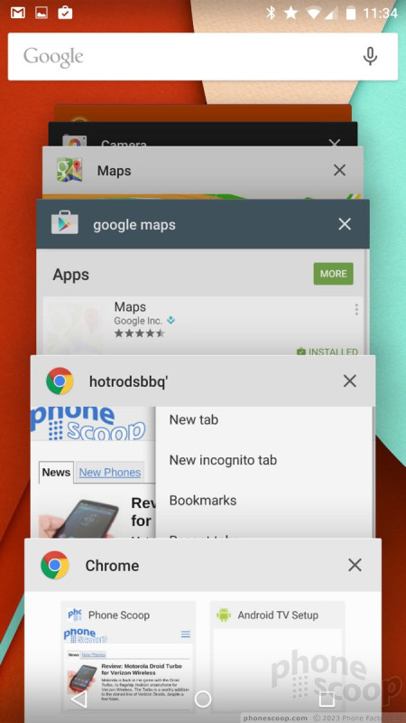
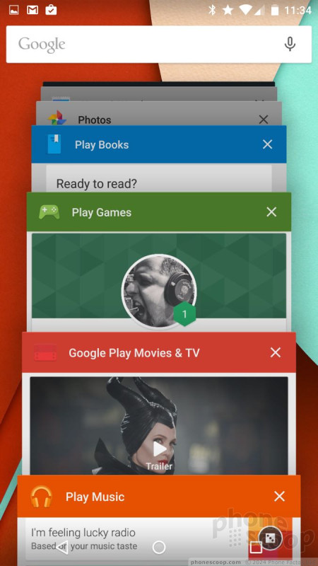
Multitasking – or fast app-switching – is much more visually appealing in Lollipop. In Android 4.x, a press of the multitasking button loaded a vertical list of recently-used apps with cards so you could get a look at what you were doing in each app. Only a few apps were visible on the screen at a time, so you had to scroll up and down to see the full list.
In Android 5.0, the list is now a 3D carousel that floats on the screen. Recently-used apps still appear on cards, but the cards are arranged in such a way that you can see more of them at a time. As you scroll through the apps, the cards cascade down off the screen in an animation that I really like. As before, you can dismiss (i.e., close) apps by swiping them sideways off the screen or by tapping a little X in the corner of each card.
Natively, Android 5.0 Lollipop doesn't support the split-screen multitasking that Samsung and LG have created. Devices such as the Note 4 and G3 let users run two apps on the screen at the same time. That's still not possible with Google's default version of the OS, though it's not possible in iOS or Windows Phone, either.
Performance
I tested Android 5.0 Lollipop on a Motorola Nexus 6 and an HTC Nexus 9. On the N6, it was a dream. The Snapdragon 805 processor on the N6 ran Lollipop perfectly. Lollipop did not run as well on the Nexus 9, which uses an Nvidia Tegra processor. It was much slower and more prone to crashing. We have yet to test Lollipop on older hardware, such as the Nexus 5 or Nexus 7.
 Samsung S24 Series Adds More AI, Updates the Hardware
 iPhone 16 Brings More Features to All Price Points, Including New Camera Control
 Apple Watch Series 9 Detects Finger Gestures, Brings Siri On-Device
 Google Launches New "Find My Device" Network
 Apple iOS 26 Brings a New Look and Long List of New Features