Review: Samsung Galaxy Note 3 for T-Mobile
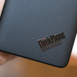
'Rich Corinthian Leather'

This phone seems inspired by the people who put Bentley grills on cheap Chryslers and throw in the kitchen sink with aftermarket mods and a Wal-Mart special LCD headunits and stick-on wood trim.
That 'corinthian leather' back is particularly offensive. What's a shame is there's a lot of -good- ideas about the Note. I love the memo and stylus. It's a shame they're tacked on to every single bad directive Samsung has to the point where despite Android becoming a rather attractive, coherent OS, not a single screenshot in this review shows matching icons. Yikes.
That 'corinthian leather' back is particularly offensive. What's a shame is there's a lot of -good- ideas about the Note. I love the memo and stylus. It's a shame they're tacked on to every single bad directive Samsung has to the point where despite Android becoming a rather attractive, coherent OS, not a single screenshot in this review shows matching icons. Yikes.
...

I've given up on icons. Only Nexus devices have a coherent look in that respect. I'd have to call out every phone, every phone maker for screwing it up.
...

Wow, I actually think the back cover and icons are pretty nice. When you say matching icons, are you referring to the color scheme, design, both, or something else?
Software wise, I haven't used TouchWiz since I had my Omnia 2, but from what I've seen regarding the Note 3, it seems to be intuitive and functional. What are the bad directives that I am missing?
Software wise, I haven't used TouchWiz since I had my Omnia 2, but from what I've seen regarding the Note 3, it seems to be intuitive and functional. What are the bad directives that I am missing?
...
There's 3 areas where I've noticed Samsung icons don't align-
-Sizing
-Color
-Dimensionality
Android has a -very- cohesive guide nowadays for things like app icon sizing, colors, etc at: http://developer.android.com/design .
Samsung, back in the days of the Galaxy SII, copied Apple pretty heavily, especially regarding icons. These icons were already pretty ugly, but as Samsung has 'evolved' them (most likely due to the desires of their legal team and not an actual designer) , they just became even more mismatched.
Icons are just the tip of the iceberg. You have things like a messaging app that's terrible (text is -always- too large), a gallery app that's terrible (can't hide albums), and quite possibly the worst calendar app...
(continues)
...

---" not a single screenshot in this review shows matching icons."---
I guess I can understand your gripe a little. However, the aesthetic looks of the icons never seem to have any bearing on my purchases or even bother me for that matter. Maybe we will see advances in this area. But, until then, I touch the icons, and things happen. That's what matters most to me.
I like this device presentation. It mostly caters to what much of the world is choosing as of current. I would be lying if I said I'm not attracted to it.
John B.
...

>>That 'corinthian leather' back is particularly offensive.
Then by all means go get you an artsy fartsy iPhone that still doesn't have HD screeen or half the features of the Note 3, and rant and rave to your heart's content about how awesome it is.
As for me, I really like the look of it. But I won't know for sure until I see and hold it in my hand. But even if I absolutely hate the look, I'm still getting it because of what it can do. This is the device I've been wanting for over a decade (well almost... no pico projector).
>>not a single screenshot in this review shows matching icons.
I've been using PC's for over 20 years and I can honestly say that I've never noticed (or cared) whether any of my icons ever matched. Hell, m...
(continues)
...

Ya, he's a troll with anything to do with Samsung, and especially the Note line. But somehow I can't help feeding him.
...
This forum is closed.