
Hands-On: Doro EasyPhone 740
Feb 28, 2012, 10:04 AM by Eric M. Zeman
Doro announced its first-ever smartphone at Mobile World Congress. Wait, a smartphone for seniors? How on earth does that work? We tell you in this hands-on report.
Doro specializes in making simple phones that senior citizens will find easy to use. To-date, it has made mostly bar and flip phones. That EasyPhone 740 is the company's first smartphone. Rather than offer a stock Android experience, however, Doro created its own, dreadfully easy user interface so seniors won't have a hard time using the EasyPhone 740.
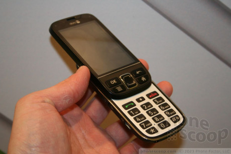
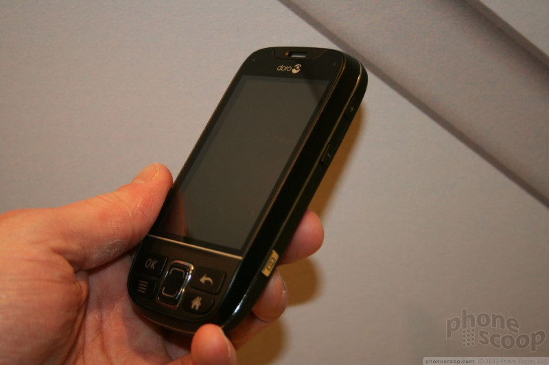
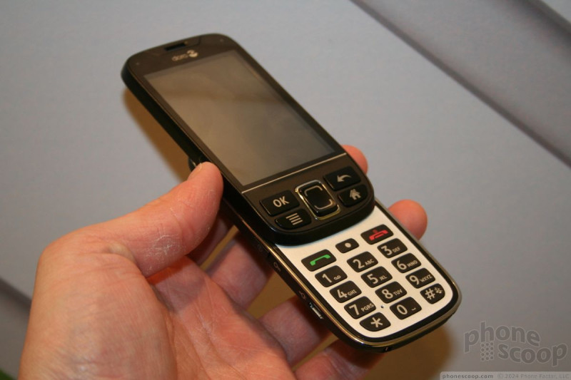
The EasyPhone is a slider. It's fairly thick, but not heavy at all. It has comfortable materials and edges so that it feels natural in the palm of your hand. It's somewhat cheap feeling, but that's part-and-parcel for Doro handsets, which aren't meant to be high-fashion show pieces for the rich and no-so-famous.
As far as looks go, it's a straight-forward phone. There are large buttons below the touch screen for accessing the menu system. Colors are a mix of black and silver.
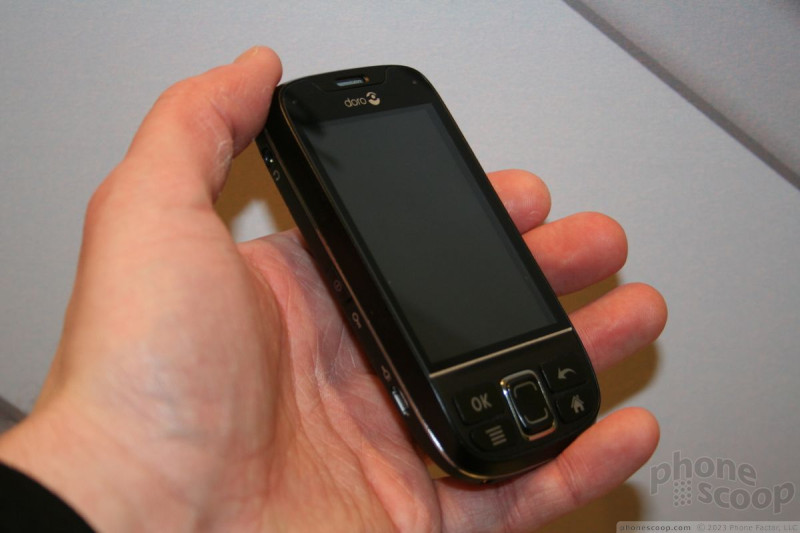
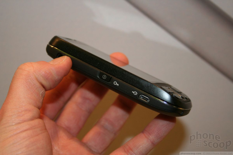
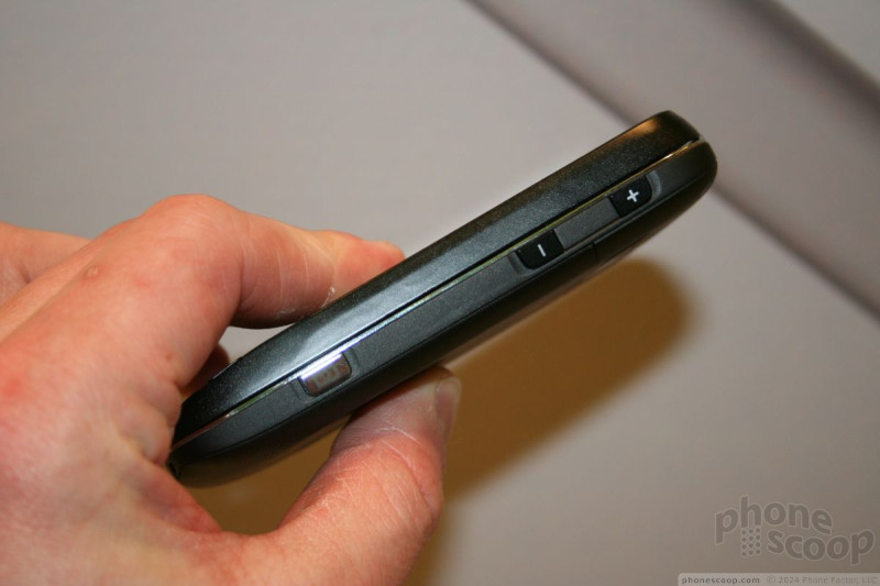

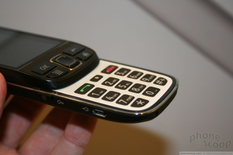
The sliding mechanism felt pretty good, but not great. I wasn't impressed with the solidity of the two halves, they were loosely connected. The buttons on the front all worked well, though having a rocker that only goes up-and-down (versus a four-way D-Pad) felt a bit weird to me.
The dial pad was a bit disappointing. The numer keys weren't as large as I think they should be for this type of device. Though the keys are covered in a rubbery material, they offer too little travel and feedback. Bigger, more reactive keys would be much better for a device to be used by seniors.
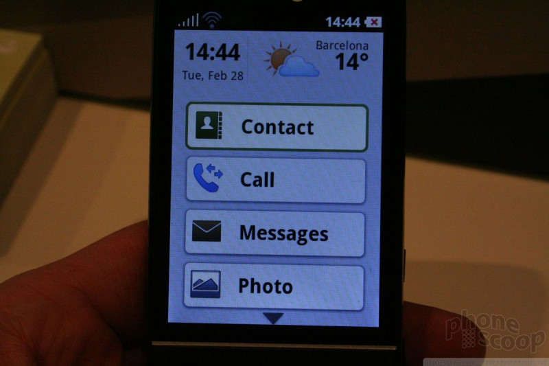
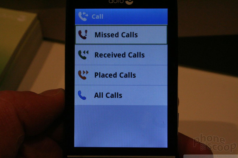
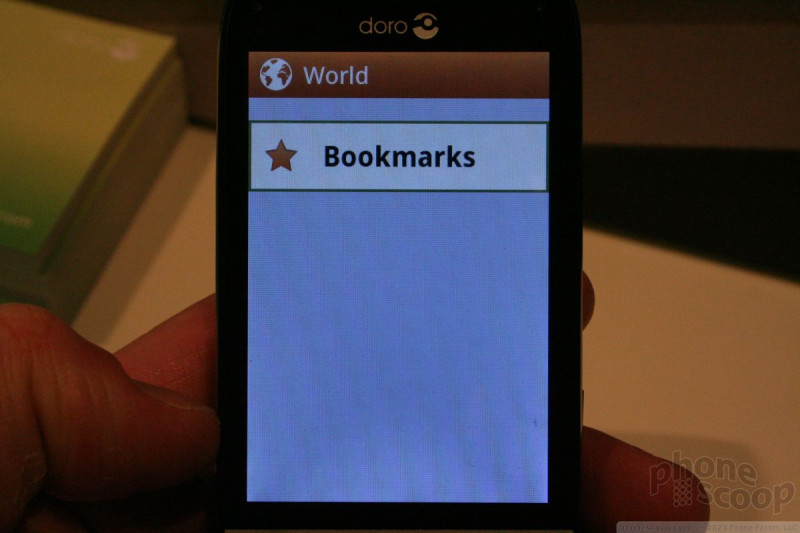
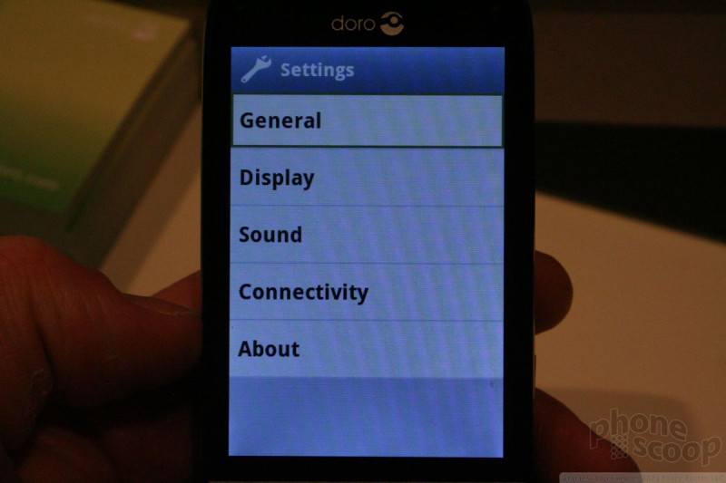
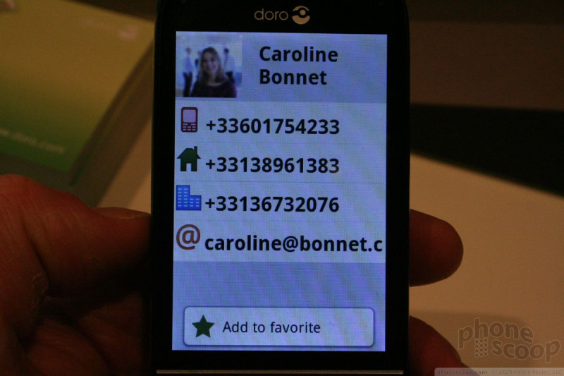
What really makes the EasyPhone 740 interesting, though, is the user interface. Doro's own UI is called the Doro Experience. It completely supplants the native Android code with a much shallower menu system for accessing the phone's features. Gone are the little icons and diminutive test. They are replaced by large, blocky letters and garishly huge software buttons on the screen that are just screaming to be pressed.
Really, it's not harder to use than any other feature phone. (Take a look at the video to get a better idea of how it works.) Doro said that it is going to use this UI across its product line, and is even open to licensing it to other OEMs should they be interested.
Eric has been covering the mobile telecommunications industry for 17 years at various print and online publications. He studied at Rutgers Newark and University of Kentucky, and has a degree in writing. He likes playing guitar, attending concerts, listening to music, and driving sports cars.
 Hands On with the 2025 Moto razr Lineup
 Apple Watch Series 9 Detects Finger Gestures, Brings Siri On-Device
 HMD Moving Beyond Nokia with its Own Brand
 FCC Revamps its Mobile Speed Test app
 T-Mobile Tests Wireless Emergency Alert Via Satellite

Comments

Great Idea -- need more phones with this


