Hands On with the Sony Xperia U
Feb 26, 2012, 7:35 PM by Rich Brome @rbrome.bsky.social

The Xperia U is the new little sister in the 2012 Xperia family. This cute little phone bears a very strong family resemblance in both hardware and software, while bringing the size and price down, and adding customization features to boot. Read on for our thoughts.
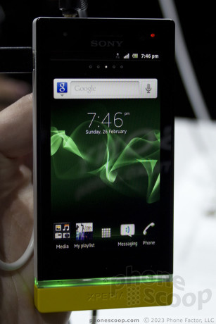
The Xperia U is smaller and cheaper than the P, but it keeps certain key features like the squared design with transparent bottom, and inside, the dual-core processor.
The body is also unibody like the P, but polycarbonate instead of metal. The polycarbonate shell of the U feels surprisingly good. In fact, I dare say it felt a smidge better than the metal on the P. It has a warm matte feel to it; the surface is really a pleasure to touch. The buttons fit and work well.
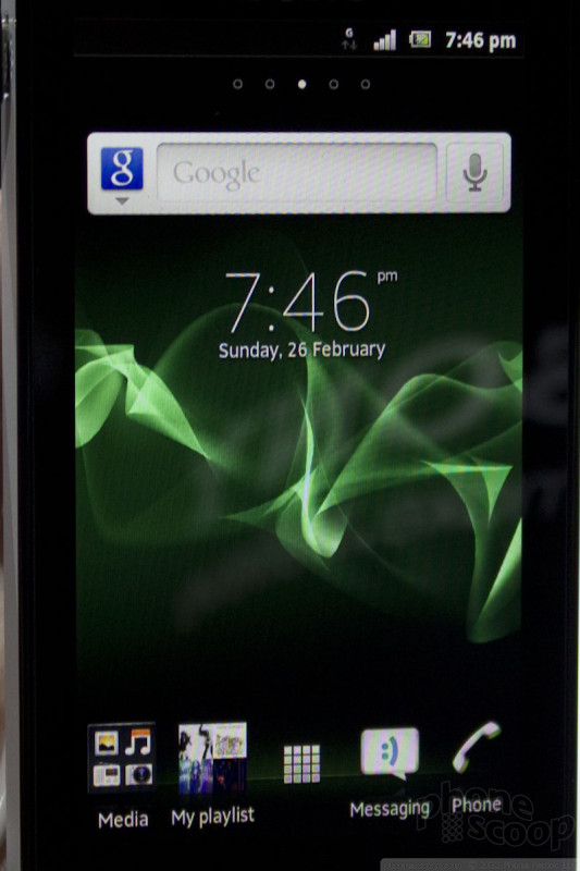
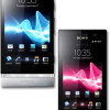
The U's focus is on personalization. To that end, it will come with either a white or black back, and at least two color options for the bottom included the box. The clear strip near the bottom also lights up in different colors, and can automatically match the color of your theme or wallpaper. You can therefore match the bottom of the phone with the light with the wallpaper, if you like. You can, of course, also use color to inform, setting it so that blue means a missed call while green means an unread text message.
Sony does a decent job adding features to the camera. So while the sensor is only 5-megapixel on this model, you get a set of controls that are both easy to use and powerful.
Like the Xperia P, the U is set to ship with Android 2.3, with an upgrade to 4.0 right on its heels. Some carriers may opt to wait for the 4.0 update. With that in mind, it's hard to say if what we saw is what you'll see on the final shipping unit. Nevertheless, Sony generally does good job of adding its little flourishes to the interface, and a few handy widgets, while keeping the main Android interface relatively unmolested. Naturally, all Sony phones provide ample access to Sony-label music and movies.
Comments
No messages


 Liveblog: Sony
 Sony Announces the Xperia P and Xperia U
 Sony Xperia U


