Review: Nokia 6682
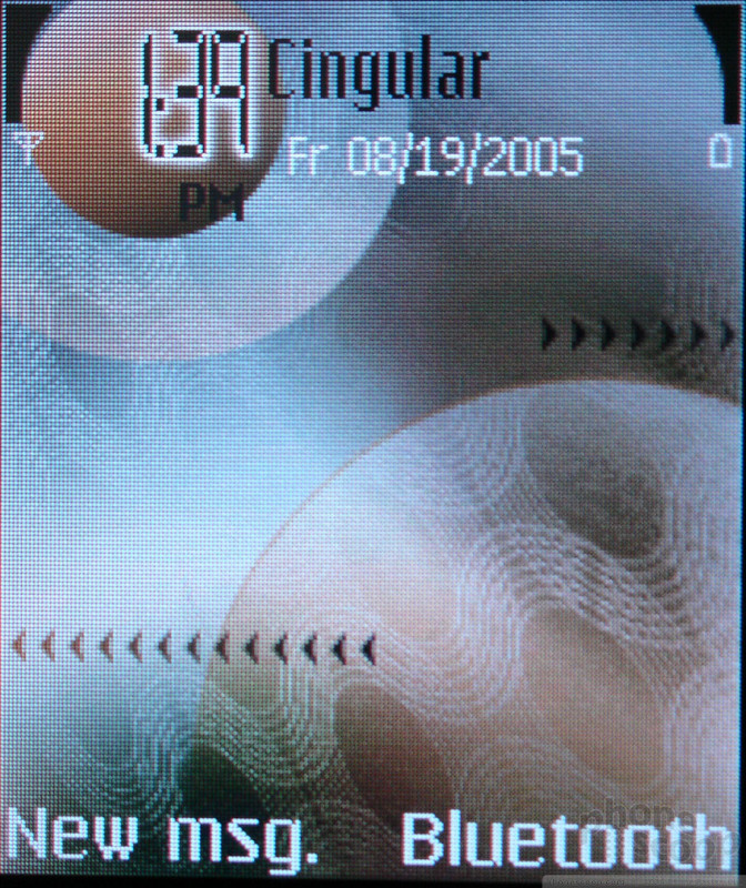
For those who have used a Series 60 smartphone before, the 6682 - which runs the latest (third) version of Series 60 - holds few surprises. However using this smartphone for the first time is not for the faint of heart. On the home screen the user is presented with a number of choices, none of which take him to the applications menu, although many take him to specific applications. The home screen is actually new to this version of Series 60 and features a configurable list of 5 applications, a display of upcoming events and tasks, as well as the two configurable soft buttons found in earlier versions. This new home screen removes much of the need to access the applications menu, so you may never really need to know how to do it.
The applications menu is reached from one of the vertical keys which looks more like a sync icon. The applications are clearly labeled in the menu with an icon and text and are in a scrolling grid. Pressing select on the D-pad opens an application. You can also select from a list of currently running applications by holding down on the applications button. This menu also allows you to close currently running applications as well.
Once in an application, the left softkey is dedicated to options while the right acts as a back or cancel button. You can leave the application and return to the home screen by pressing the end key at any time.
Navigating through the programs, through menus and through lists of files is very quick compared to most modern phones, especially smartphones. Sometimes when exiting back to the home screen, there is a noticeable delay in the redraw, but otherwise the interface is very speedy, even when launching applications. This is especially beneficial for the camera, which launches extremely fast.
The speed is even more impressive when you notice the graphic flourishes that Nokia has added to the latest version of their smartphone OS. Menus scroll up from the softkey labels, and messages and call status indicators gently fade away. It's fairly elegant and doesn't seem to consume the phone's resources.


 iPhone 15 Series Goes All-In on USB-C and Dynamic Island
 Nokia Refreshes Entry-Level Android Lineup for US
 OnePlus' New Mid-Range Phone Has a 108 Megapixel Camera
 T-Mobile Picks up Nokia's New Repairable, Affordable 5G Phone
 Nokia 6682 / 6681


