
Review: Pantech Crux
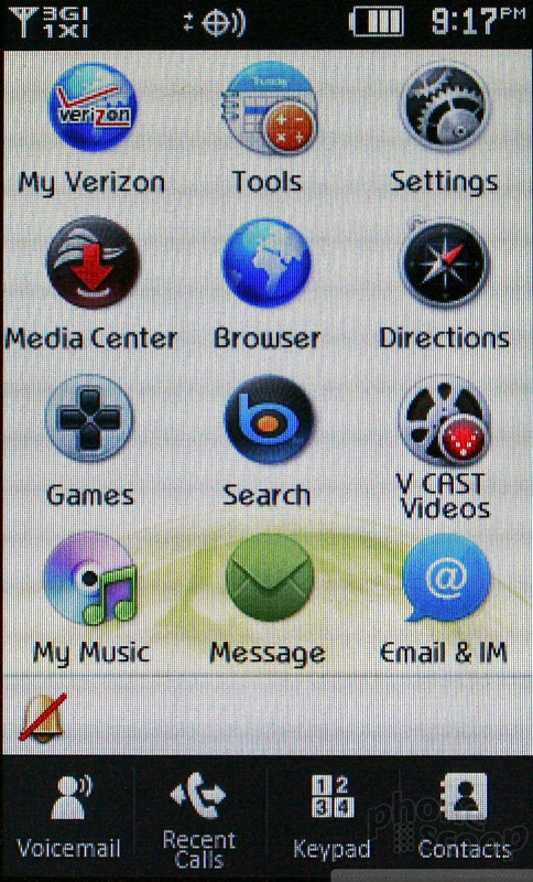
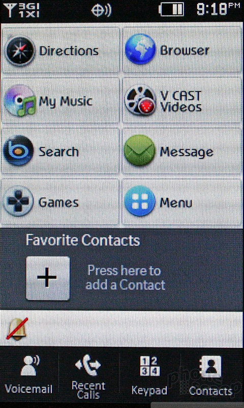
The Crux runs a proprietary user interface that blends elements we've seen on touch phones from LG and Samsung with Verizon's branded services. When unlocked, the basic home screen is a grid of 12 icons. The icons provide access to apps, controls and services such as Bing, V CAST, Messaging, Music, and so on. There are also four permanent icons in a dock at the bottom of the screen for dedicated access to voicemail, calls, dialpad and contacts.
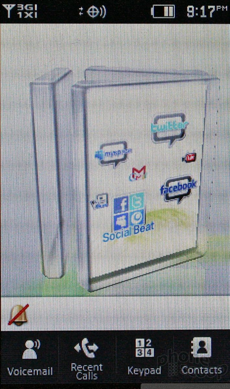
From this screen, a press of the Home key brings up a 3D animation that reveals two more home screens on the Crux. Spin the little pyramid on the screen to access one of the other two home screens. Any person accustomed to using modern smartphones will be miffed that they can't simply swipe sideways from the main home screen to access these secondary screens. The only way to get to them is via the Home button. Sure, the little 3D pyramid looks nice, but it comes at the cost of speed and usability.
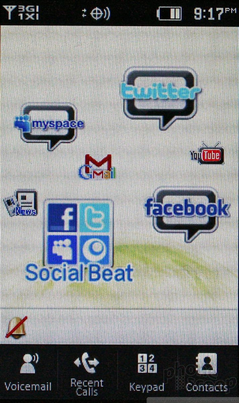
All the home screens can be reconfigured by the end user in a limited fashion. Out of the box, they are populated with social networking apps, widgets, and shortcuts on one screen, and media shortcuts on the other. End users have control over some of the widgets and shortcuts that appear on these pages. On the main screen, users can change it to a shortcut, view, as well as add, delete, and rearrange where menu items appear.
The Home button below the screen is an obvious riff on other devices in the market. It takes users from any app or service all the way back out to the main home screen. I'd much prefer the Crux had a Back button. There's frequently no way to go back one screen or up one level in some menus. This means your only option is to go back all the way out the home screen and start all over again. That gets old fast.
Within some apps, there is indeed a software Back button, but it is sprinkled throughout inconsistently. There is often a Cancel button thrown into the mix, which does the same thing as a Back button or the Home button would. A dedicated Back button would be much more useful.
My biggest gripe with the triad main menu isn't the design — it's easy enough to figure out and use — it's the lagginess. The one area the Crux lags the most is when transitioning between these three home screens and the apps/widgets on the two secondary screens. The lagginess results in navigation foul-ups, and can often lead you to press something you didn't intend or want.
One major positive is that Pantech took care to make sure all the software buttons are large and easy to use for fingers. There are no teensie, impossible-to-use screen tools. Everything you need to access is easily pressed by a thumb, large or small.
 iPhone 15 Series Goes All-In on USB-C and Dynamic Island
 Nothing Phone (2) Sports Upgraded Specs, More Useful Glyphs
 JBL Brings Smart Charging Case to More Earbud Styles
 iOS 18 Overhauls Home Screen, Messaging, Photos
 Google Upgrades its Watch and Buds
 Pantech Crux


