
Review: Kin Two
The Kin interface is designed to look more like an organic, ever-changing magazine layout than a classic icon-grid phone design. It would work well, too, if it weren't so hideous. In constructing the interface, Microsoft tried to avoid all "chrome." That is, the polished edges, shadows and 3D features that makes a digital interface look physical. Instead, what you get looks more like a DOS program from the early nineties.
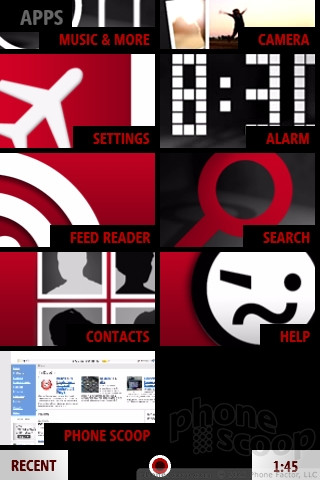
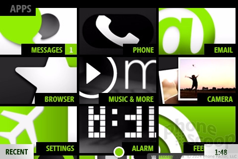
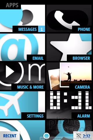
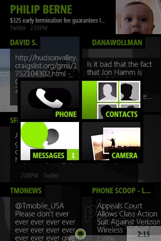
It's not all barren. The menu screen, to the left of the Kin Loop, has some stylish, large buttons to tap for messages, phone calls, email, the Web browser and the remainder of the short feature list on this phone. These buttons are red, white and black, unless you chose green (or blue, or pink). The deeper you dig, the more ugly things get. Every feature is ugly. It's all hard right angles; thick, chunky accent lines; muted, dark colors. If the Sidekick is rockabilly, the Kin Two is Soviet.
Instead of a home button, the Kin Two offers a Back button, a very silly idea that requires numerous clicks to jump from one app to another. This wouldn't be so bad if the Kin Two interface wasn't frustratingly slow. Every click gets a delay. Better if the Back button opened the main menu directly, as it does on better touchscreen phones. You can hold down the back button to jump directly to the Kin Loop, but I didn't figure this out until I had spent nearly two weeks with the phone. Instead of hiding this shortcut, it would have been nice to get a simple tutorial at the onset.
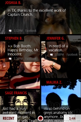
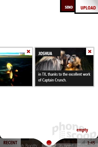
Instead of centering around a main application menu, the Kin puts the Kin Loop front and center. The Loop is basically a friend feed with status updates from Facebook, MySpace and Twitter all jumbled together. This is a horrible idea; the Loop looks a mess. Text crowds together and covers your friends' avatars. Sometimes, those avatars don't even show up. Perhaps the Kin Loop presents a good surface view of the current moment, but if you really want to keep up with your friends, you'll be digging into the longer RSS feeds frequently.
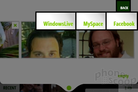
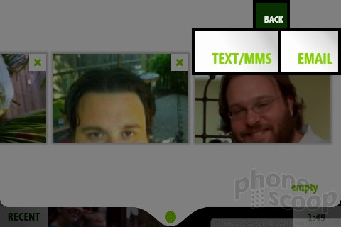
The second key feature for the Kin interface is the Spot. In theory, the Spot seems like it could be useful. It's a small dot at the bottom of the screen, and when you want to share something with other people, you drag things into the spot. Drag pictures, drag status updates, then drag contacts from your contact list, and the Spot puts it all together and sends things to the right place. Unfortunately, the Spot is a letdown. You can't forward email this way. You can't share music, even non-DRM tracks. You can't share appointments from the calendar, because there is no calendar on the Kin Two. Let that sink in for a moment. If I were taking dozens of pictures a day and lots of low resolution videos, I might find the Spot more useful, but I had to force myself to use it at all.
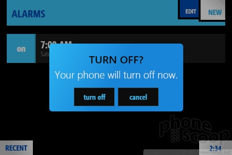
One last complaint: the screen lock is completely unreliable. Sometimes the screen lights up after a single press of the unlock / power button. Sometimes it took two presses. Often, I had to hold the unlock button down until the phone was ready to shut down, then clear the message asking if I wanted to turn off the phone, then swipe away the unlock screen. Of all the issues I found on this phone, the unlock problems were easily in my top three most annoying.
 Review: Microsoft Kin One and Two
 Google Pixel 8 Series Saves the Best for the Pro
 Motorola's new razr Foldable is Just $600
 JBL Brings Smart Charging Case to More Earbud Styles
 Google Launches New "Find My Device" Network
 Sharp Kin Two


