Microsoft Kin
First hands-on impressions of the Kin 2 from Microsoft!
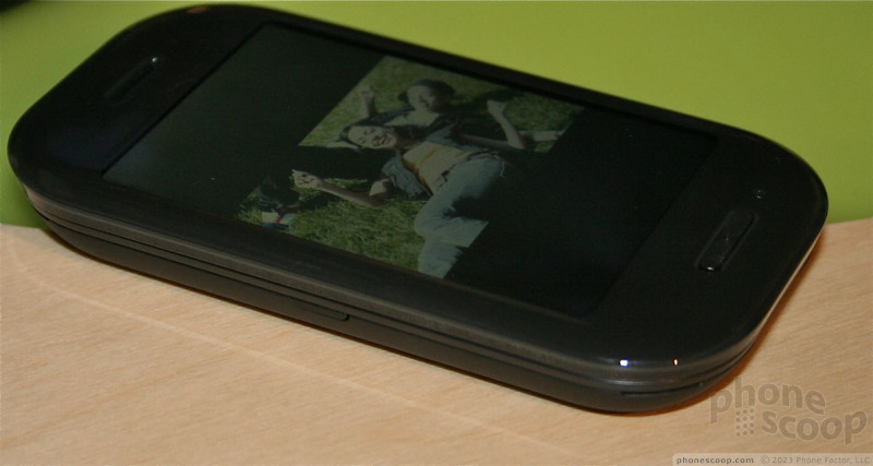
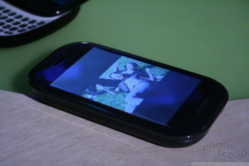
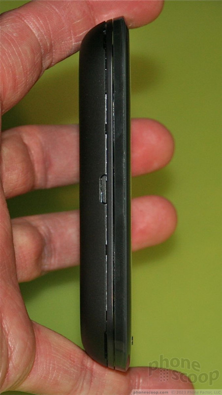
The Kin 2 is a much bigger, more well rounded device than the Kin1. It has a much larger screen than the Kin 1, and an equally larger keyboard. The slide mechanism works well, and the device pops open easily. The build quality of the slide feels strong.
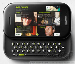

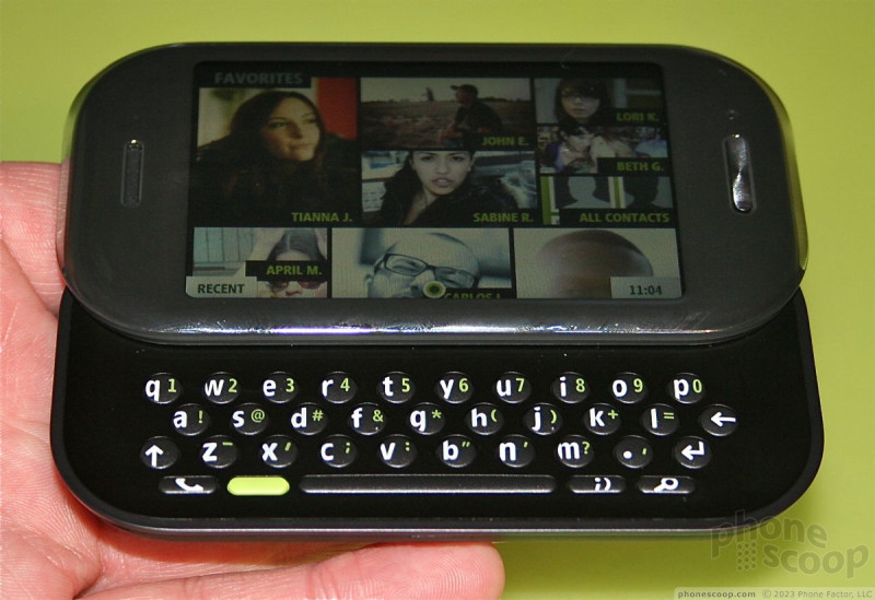
The keyboard feels EXACTLY like you'd expect from a Sharp-made device. It very much reminds me of the first Danger HipTop devices from years ago. The buttons are small, round, but have a comfortable shape to them. Typing with the keyboard is a breeze. I especially liked the travel and feedback of the buttons, which was excellent.
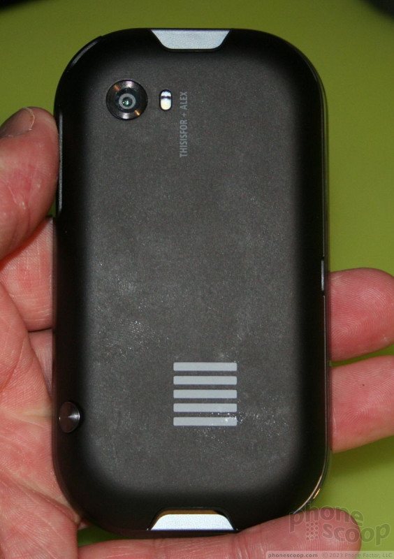
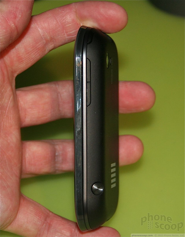
The buttons on the exterior of the device are OK, though we found the same less-than-awesome build quality as we found on the Kin 1. The volume rocker was on the side of the Kin 2, which meant it was easy to find and use. The camera button was also in a slightly better location, making it easy to find and use. The travel and feedback of the two-stage button felt good.
On the front of the device, there's only one button. Press it once to go back a screen, and press-and-hold to go all the way back to the main screen.
In all, the hardware feels pretty good. Definitely in the prototype range, and not as well-made as something such as the Motorola Droid.
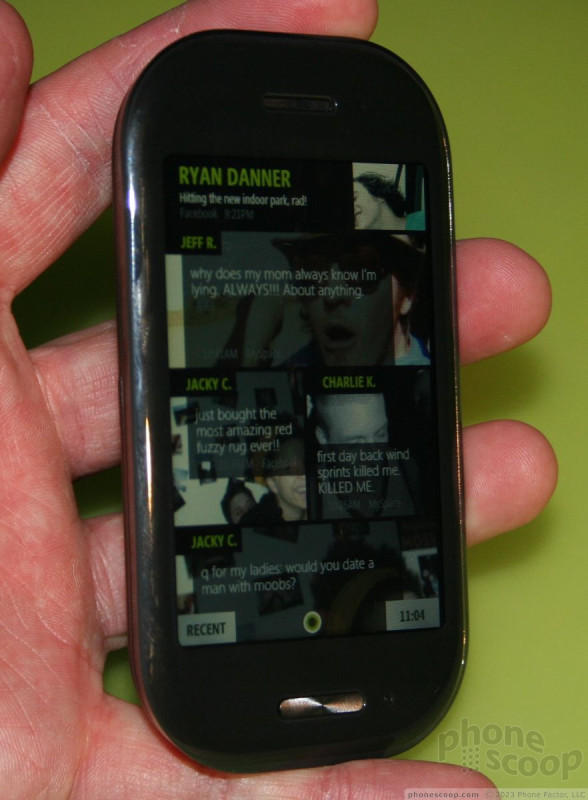
The operating system takes some time to get used to. The GUI is very jumbled, and has three main home screens.

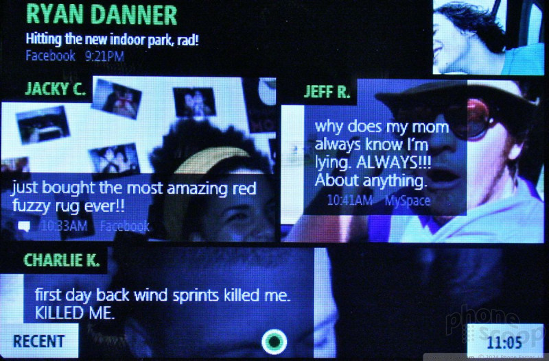
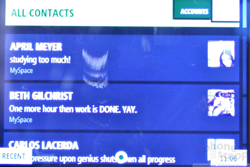

The main screen delivers the content that comes in from all a user's friends, RSS fees and social networking sites. Users can prioritize what content lands on this page, and it can come from all manner of different sources. If a user sees something he/she wants to share, they can drag it down to the Loop icon at the bottom of the screen. The Loop is a place where users store content that they intend to share.
Once you've dragged stuff into the Loop, press the Loop button to get at all the content. Users can then choose where and how to share that content, whether it be via Facebook, Twitter, MySpace, Email, MMS, SMS, etc. Everything in the Loop an be automatically shared with everything and everyone, or selectively.
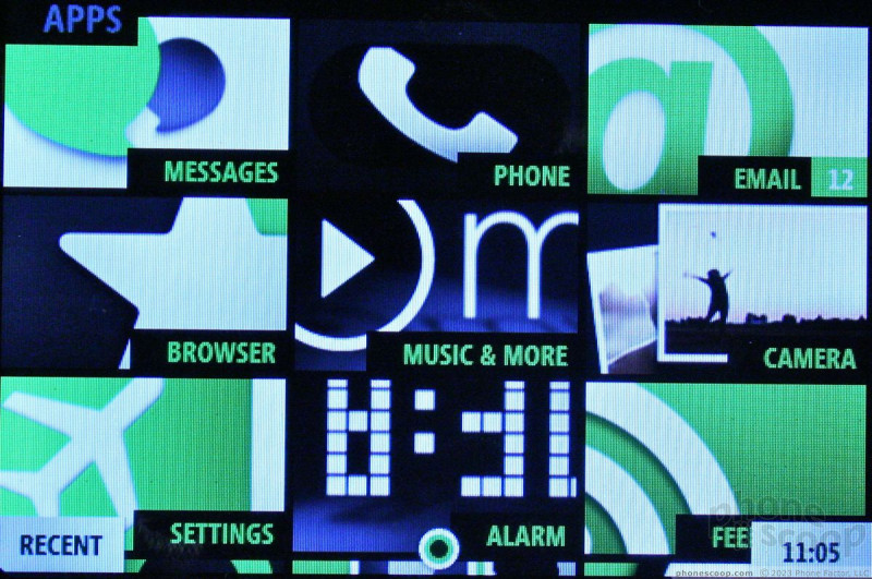
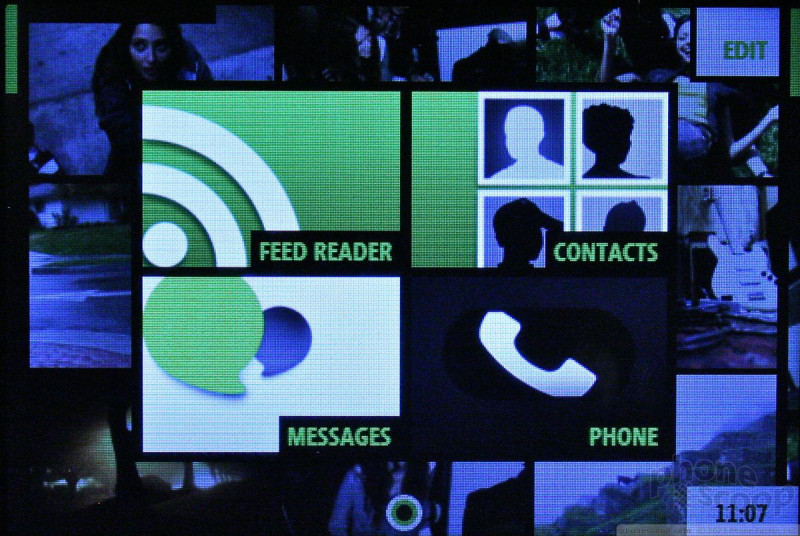
The main home screen has links to all the usual things you expect to find on a phone, such as the phone, settings, music, the camera, etc. The user interface reminds me very much of the recently announced Windows Phone 7 user interface. The fonts and the way Microsoft has broken things down into boxes really feels familiar.
As for the basic usefulness of the UI, it is very speedy. Microsoft said that the Kin1 and Kin2 have Tegra chips in them, and I saw no hesitation when using either device.
Because of the way content is aggregated onto the home page, it takes some getting used to, especially when it comes to navigating between the three main screens, but you get used to it over time.
 iPhone 15 Series Goes All-In on USB-C and Dynamic Island
 Samsung S24 Series Adds More AI, Updates the Hardware
 iPhone 16 Brings More Features to All Price Points, Including New Camera Control
 Motorola Refreshes razr Lineup with Better Batteries & More
 JBL Brings Smart Charging Case to More Earbud Styles