
Review: Nokia 7510
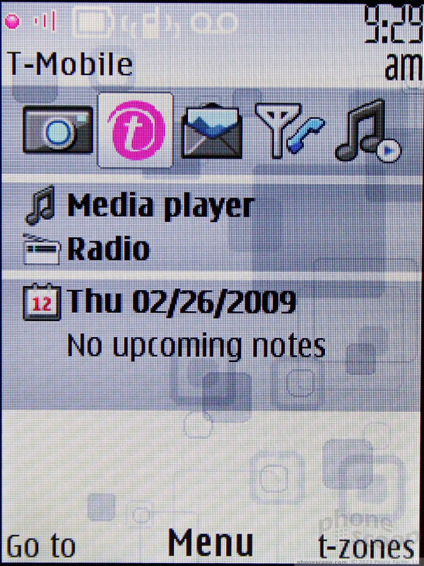
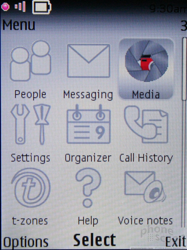
The 7510 is the first phone I've reviewed from T-Mobile with some new menu software on board. The standard home screen has the typical MyFaves design, but the main menu is quite different.
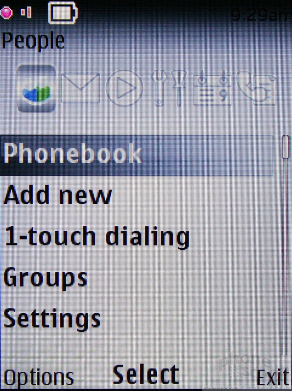
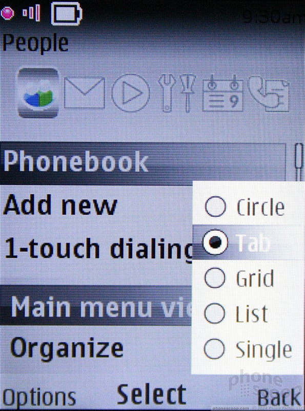
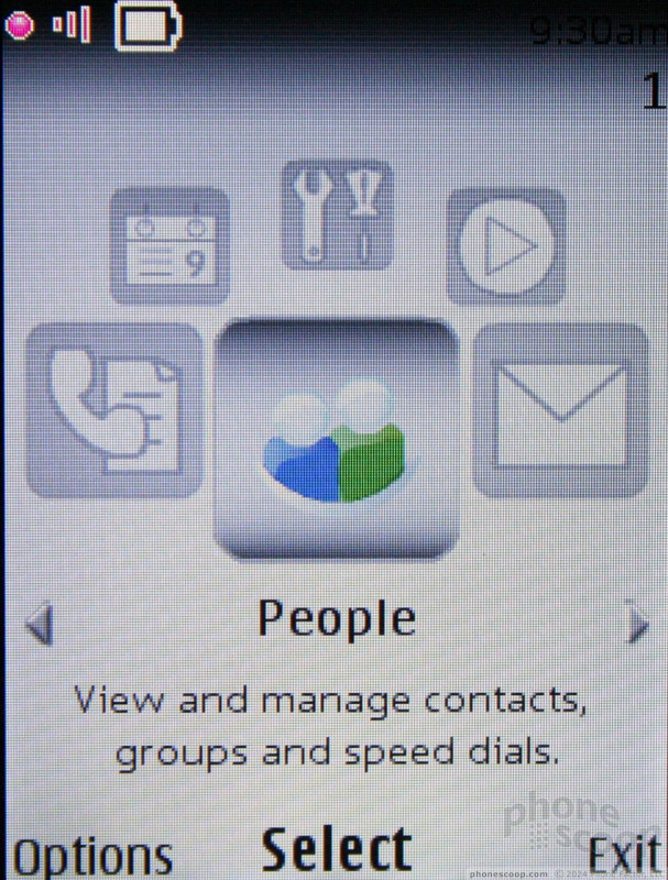
The first time you open it, the main menu itself resembles the MyFaves layout, with five main selections arranged on the screen in a 3D circle. Pressing the D-pad left or right cycles through the five choices. You can also configure it to a list, grid, single item per page or a tabbed system.
For my money, the tabbed configuration was the most useful. With the circle layout, for example, you only have five selections to choose from, and it isn't always clear what's in those five selections. With the tabbed system, you have five tabs running along the top of the page, each with five or more items underneath. In other words, you can see all the applications that are available in any given tab when you scroll over it. It is very similar to the traditional tabbed menu system that Verizon's used for years.
Using the grid breaks everything down into a nine-icon grid, which introduces several more choices compared to the circle layout.
Of course, you can ditch all of this and use the normal Series 40 menus, home screen layout with application shortcuts, and so on.
 CES 2009
 Motorola Refreshes razr Lineup with Better Batteries & More
 T-Mobile Picks up Nokia's New Repairable, Affordable 5G Phone
 Consumer Cellular Launches Flip Phone with eSIM
 Snapdragon 8 Gen 3 Can Run Generative AI Voice Assistant On-Device
 Nokia 7510


