Hands On with the moto g stylus 5G
Jun 9, 2021, 8:00 AM by Rich Brome @rbrome.bsky.social
updated Jun 12, 2021, 10:51 AM
Motorola's moto g series has long had an option for people who want an affordable phone with a large screen and large battery. Recently, that's been the g stylus, which gives you something extra to use with that big screen. Motorola already has a moto g stylus for 2021, but now there's a version with 5G, and it brings with it an even larger battery. So what is this interesting mid-range phone actually like in person? Here's our hands-on report, with a plethora of photos for you.
If it's been a while since you checked out new phones in person at your local store, (hmm... I wonder why!) you might not have realized that certain phones trends have continued unabated despite the pandemic. One of those trends is that toward ever-larger phones.
Hardware
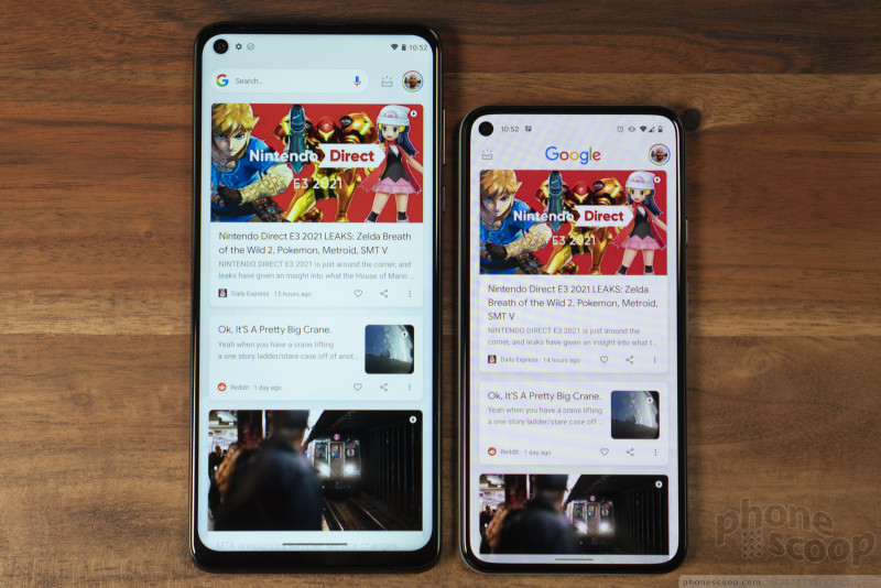
The moto g stylus 5G joins a growing crop of phones with displays that measure 6.8 inches on the diagonal. Sure, it helps that the bezels are thin. And most of the growth has been to make phones taller, while keeping the width in check, since width is more important for hand fit. Still... this is a mighty big phone, and that's before you slap a case on it.
What you get for the size (and heft; it's not light) is a massive display and massive 5,000 mAh battery. That's almost the largest battery you can get in a phone, so I expect battery life to be quite good. As for the display, it's full-HD, which is the resolution that even many top-end phones have these days, so it's plenty sharp. The display won't win awards. I mostly wish it were a smidge brighter. But it's a perfectly decent display for this class of phone.
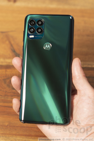
Turning to the back of the phone, you'll find a glossy "Cosmic Emerald" finish. It's a handsome color that looks classy and subtle in most general lighting. A special reflective layer provides a nice depth effect. Under brighter lights, the effect is more pronounced, with bands of bright and dark green catching the eye. At just the right angle, you might see a flash of rainbow colors on the camera hump. Under really bright light — like direct sunlight — you might see a prismatic rainbow effect on the main rear surface; but that's not common in most everyday lighting.
I'm a little surprised that they couldn't eliminate the camera hump with all that space to work with. With that said, the camera hump isn't huge.
The Motorola logo on the back doubles as the fingerprint reader. It's fairly high on the phone, but just low enough that I can reach it with my index finger while holding the phone normally.
Unfortunately, the same cannot be said for the side keys, which are simply way too high up. I can't reach any of them at all without shifting the phone down in my hand. At least the lock/power key has a ridged texture so it's easier to tell apart from the volume key. Weirdly, the card tray on the left has rounded shape that sticks out enough to feel like a really shallow button. I wouldn't be surprised if some owners assume it is some kind of broken button. I don't know why it isn't truly flush with the surface like on most phones.
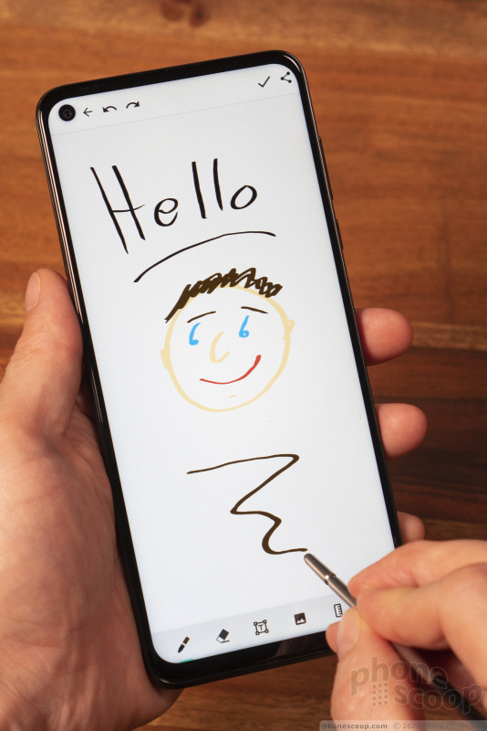
Motorola has made improvements to its stylus. It now pops out a bit further so it's easier to remove. More importantly, it's now perfectly round from tip to top, so there's no wrong way to insert it when you put it away. I like the design and tip material. But it didn't always draw quite where I expected it to when attempting very precise work; it could use a calibration option, perhaps.
Software
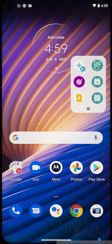
Removing the stylus can trigger certain actions. By default, when the phone is idle, removing the stylus launches you right into the Moto Note app (you can choose Google Keep instead). If you're already using the phone, removing the stylus brings up a little floating shortcut bar, containing shortcuts that can be customized.
Moto Notes is a basic note and sketching app. You can set your line color and width, customize the background, and mix in text and images. There are also customizable categories. But it doesn't compare to more advanced options offered by competitors. There's no handwriting recognition, to start with.
The Coloring Book app is cute. I like that you can create new coloring sheets from your own photos. The algorithm for this is very basic — just a type of contrast filter — but it gets the job done. It's a great way to pass the time by getting creative or honing your drawing skills, instead of playing a game.
The rest of the software is relatively clean-looking Android 11, as designed by Google. I appreciate that. You can customize quite a bit, either within Settings or from the consolidated Moto app. But by default, it's very Google-y.
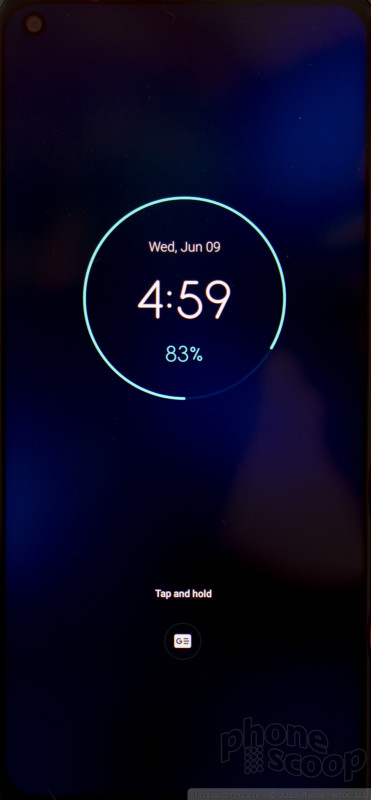
I do appreciated some of Motorola's well-known gesture shortcuts, such as the double twist to activate the camera, and chop-chop to activate the flashlight. The screen helpfully lights up with the time when you lift up the phone, and if you have a notification, you can press and hold the notification icon to take a peek at it. This phone even has Attentive Display, which can keep the screen on as long as you continue looking at the phone.
The camera app will feel familiar if you've used any recent Motorola phone. It does have some new tricks, like Spot Color for video, and Dual Capture, which uses the front and rear cameras in one video, displayed side-by-side.
I appreciate that the main camera lets you access all 48 megapixels of the main sensor as an option. (Not all recent Motorolas offer that.) I wish the wide camera were at least 12 megapixels, but 8 megapixels is better than the 5 offered on some competing phones. I also appreciate that manual mode lets you do long exposures up to 32 seconds.
I'm still skeptical that macro cameras are anything more than a marketing gimmick to say "our phone has more cameras!" Motorola justifies it by pointing out that #macrophotography continues to grow on Instagram. But a macro camera like this really needs some kind of tool in software to help you get the focus distance right. This doesn't have that, so I found it frustratingly difficult to get a good macro photo.
There's no shortage of other modes to help you have fun taking photos and videos, including Cinemagraph, Group Selfie, Timelapse, and Slow Motion.
If US carriers offer the moto g stylus 5G for the kind of price I expect, it should hold its own against the other "affordable 5G" phones on the market right now. There are two small things missing that all competing phones have: NFC (Google Pay), and the ability to capture video in 4K resolution. If those matter to you, this isn't your phone. But among affordable 5G phones, this will be the option with the largest screen, and the one with a stylus. The huge battery doesn't hurt.
Comments
No messages










 Motorola Adds 5G to the Moto G Stylus
 iPhone 15 Series Goes All-In on USB-C and Dynamic Island
 Samsung S24 Series Adds More AI, Updates the Hardware
 Motorola Gets Serious About Foldables with New RAZR Lineup
 Motorola moto g stylus 5G (2021)


