Review: Android 4.4 KitKat
Google may have made only minor alterations to the overall design of Android, but it made some interesting changes to the behavior of the user interface. Here are the specifics.
Lock Screen
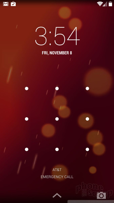
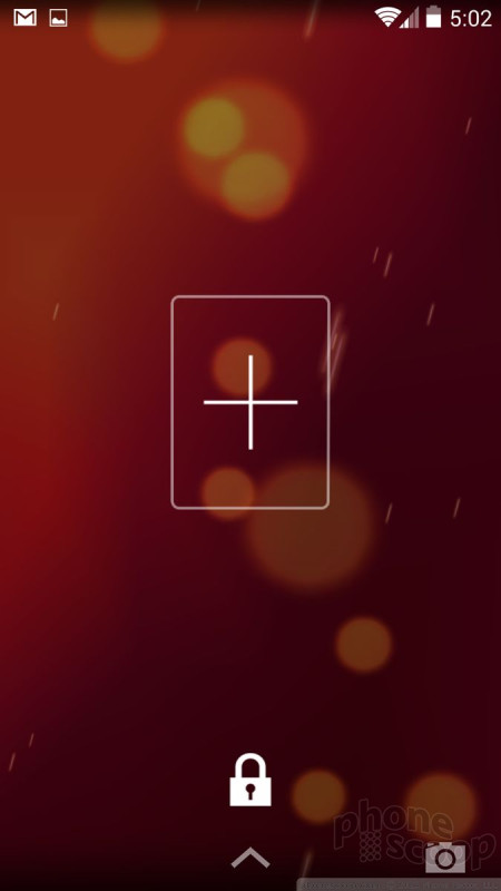
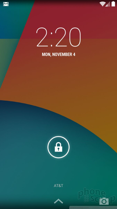
The lock screen can be fairly simple or somewhat complicated, depending on your preference. Out of the box, "Slide" is the default lock screen behavior. It consists of a lock icon floating close to the bottom of the screen. Press it and drag it anywhere to unlock the device. You can also choose to have no lock screen at all, or use an actual lock.
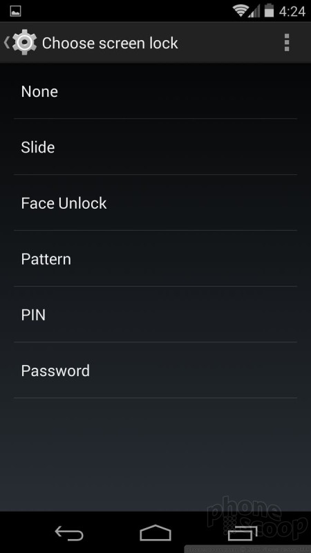
If you want to protect your Android 4.4 device (which I strongly recommend), you can choose from a handful of different unlocking methods. You have the choice of the simple pin (4 numbers), pattern unlock, password, and the face unlock. I prefer the pattern unlock myself. The face unlock tool rarely worked for me. Whichever you choose, Android 4.4 lets you select how long the phone will sit before it's locked, whether or not the power button will lock the device, and so on. If you choose to lock your device, you can access the camera and pull down the notification shade without entering the password, but that's it.
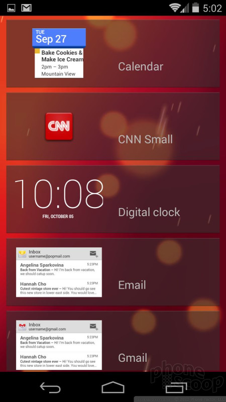
Then there are the lock screen widgets. These can be turned on or off at will. The lock screen widgets let you peek at certain apps without forcing you to unlock the device first. For example, the calendar, messaging, and email apps can be previewed on the lock screen thanks to these widgets. Only one widget fits on each screen and you swipe side-to-side to access them. The previews give you a glimpse of what's going on in your inboxes. For example, the widgets show the last 8 SMS messages I sent/received, as well as the most recent dozen or so emails. The previews let you see what's there, but not act on them. If you touch an unread email in the lock screen widget, you'll be forced to enter your password before being whisked into the Gmail app.
Personally, I find the lock screen widgets to be a waste of time. They take just as much work to view as it would to simply unlock your device and open the relevant apps directly. Further, you can see some of the same information in the notification shade. Last, they add really ugly bars to the lock screen.
The Android lock screen provides plenty of access to notifications and settings tools, but this is another area that is often customized heavily by phone makers. For example, many phones offer up to four lock screen shortcuts that take you directly to those applications.
Though they each have their differences, the stock Android and iOS lock screens are close to being on-par with one another, with Windows Phone perhaps lagging a bit. Odd that both Apple and now Google have a camera shortcut in the lower-right corner of the lock screen. It's cumbersome to use in KitKat, though, because you slide it sideways instead of up. At the end of the day, though, the lock screen is a pit stop on your way to home screen.
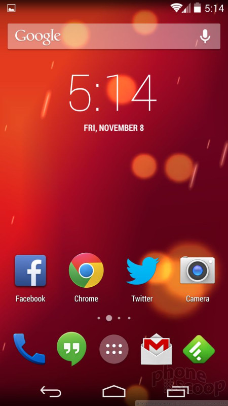
Home Screen/App Menu
Aside from a few subtle changes to the design, the Android 4.4 KitKat home screen panels look just as they do in Android 4.3, but they act somewhat differently.
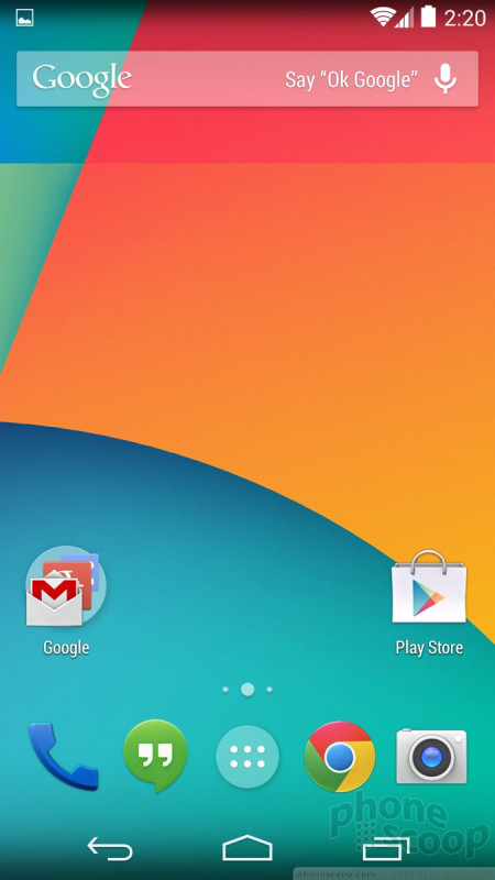
With the Nexus 5, there are three home screen panels running out of the box. One of them is reserved for a full-screen version of Google Now (more on that later). The other two are open for you to install any sort of content you might wish.
The dock at the bottom of the home screens, or "hotseat" as Google calls it, fits four apps and the app menu button. You can arrange the dock apps however you wish. You can press and hold any app from the app menu, drag it to the home screen, and drop it in the dock. You can create folders both in the dock and on the home screens that contain other apps. iOS also lets you create folders on the home screens, but Windows Phone uses Live Tiles for home screen customization.
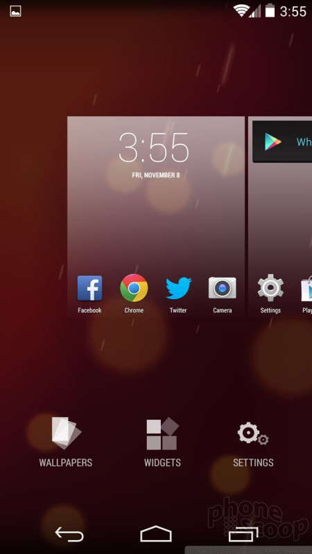
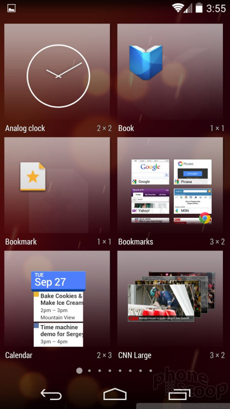
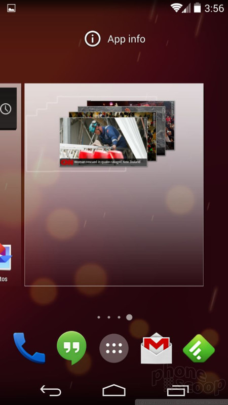
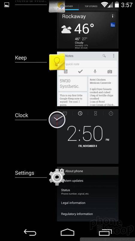
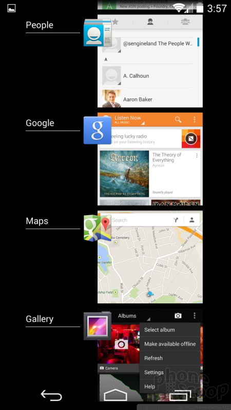
Android 4.4 changes the way you add new home screen panels and stuff them full of widgets. In earlier versions of Android, it was easy to add a home screen panel and put stuff on it if you wanted to. This same task takes a few more steps in KitKat. The first step requires you to press-and-hold on the home screen. (In Android 4.3, this would only allow you to change wallpapers.) The press-and-hold gesture now brings up a brand new user interface that includes small representations of your existing home screens, plus the tools to change the wallpaper or add widgets. Changing wallpapers is simple enough, as is adding widgets. It took me a while to figure out, though, that the only way to add a new home screen panel is to select a widget and drag it beyond the last home screen panel. It's completely unintuitive and I only discovered how to do it by accident. Some of the widgets are adjustable in size, and others are not. There are animations that let you know which is which as you move the widgets about and adjust them on your home screen panels.
The Android home screen panels offer a far higher degree of customization than is possible on devices running iOS and Windows Phone. iOS only lets you put apps on your home screens, and Windows Phone doesn't let you use folders. The ability to put apps, folders, and widgets pretty much anywhere on Android home screen panels - as well as add/delete home screen panels at will - lets users really make the device their own. This is one of Android's key strengths. Widgets are also a big differentiator. Though not everyone uses them, they come in all shapes, sizes, and varieties, and can be quite useful for gleaning information from your home screens or creating a living, breathing experience.
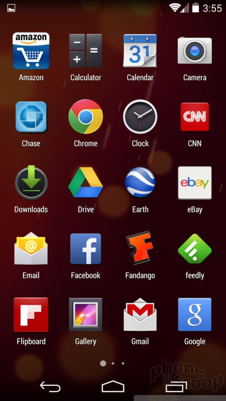
The main app menu has also changed a bit. First, the icons are all bigger. In native Android 4.3, the app menu fit five apps across in each row. In Android 4.4, the icons are so big that the app menu now only fits four apps across each row. This means there are fewer visible apps on a single screen. Google has deleted several tools in the app menu that some may miss. In Android 4.3, there was a tab at the top of the app menu that allowed you to view your apps or your widgets. In Android 4.4, you can no longer view widgets on this screen, you have to use the above-mentioned process from the home screen to access widgets. I dislike this change, but it does put all the home screen customization tools in one spot. Further, the app menu loses the little link to the Play Store (to add new apps.) This is disastrous. Clicking this little button took you straight to the Apps section of the Play Store. Now, you have to access apps through the Play Store, which takes at least two steps. There was no reason to get rid of this button other than to clean up the design. Last, you can't alter how the app menu grid is arranged. It can't be viewed as a list, or in a custom grid, or arranged in folders. The app menu is now just a simple, inflexible grid.
This seems an incredible backward step in my opinion. Why take functionality away? The good news is the main app menu is another aspect of Android that manufacturers like to tinker with. No doubt many companies will add these features back in their custom take on KitKat.
Settings
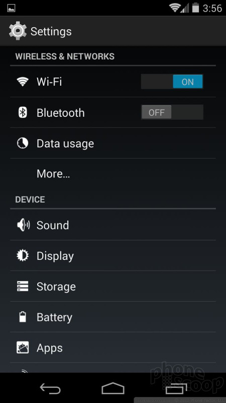
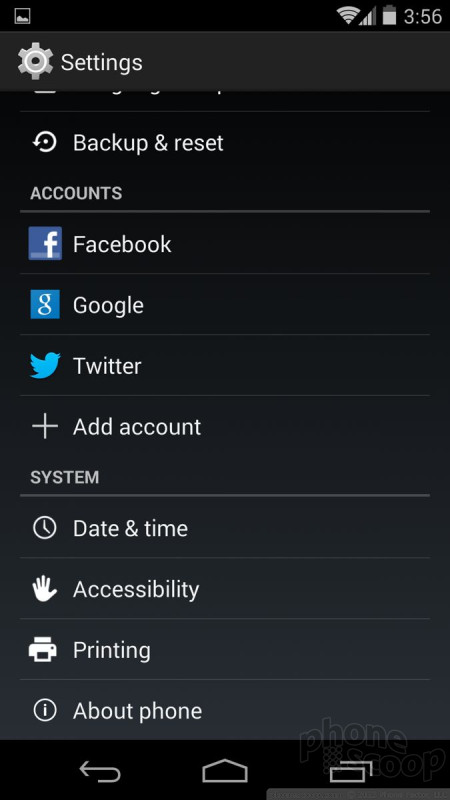
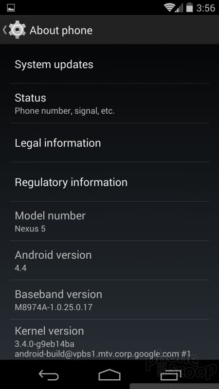
The settings menu is, thankfully, mostly carried over from earlier versions of Android. About the biggest change is the icon. The settings menu itself is a stark and bare affair. You've got white icons/text on a nearly black screen arranged in simple list form. Wireless and network controls (Wi-Fi, Bluetooth, data) are bunched at the top, followed by device controls (sound, display, storage, battery), personal controls (location, security), accounts (Facebook, Twitter, Google), and system controls (time/date, accessibility). It's pretty simple to figure out and thankfully there are no unwelcome surprises. The settings menu has remained essentially the same for several years now.
Some hardware makers, particularly LG and Samsung, like to customize the appearance of the settings menu a bit, but the stock experience is pretty barren. It all works well enough, and manufacturer customizations rarely improve usability.
Notifications
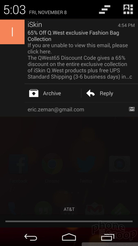
Notifications are another area where KitKat is nearly identical to older versions of Android. The notification shade can be pulled down from pretty much any screen. Just swipe down from the very top of the screen. Once down, the shade shows a fairly big clock and notifications from apps such as email, Twitter, Google+, etc. Many of the notifications can be acted upon or dismissed. I like that you can dismiss individual emails and/or messages and leave others alone. You can even choose to archive emails or reply to them directly from the notification shade.
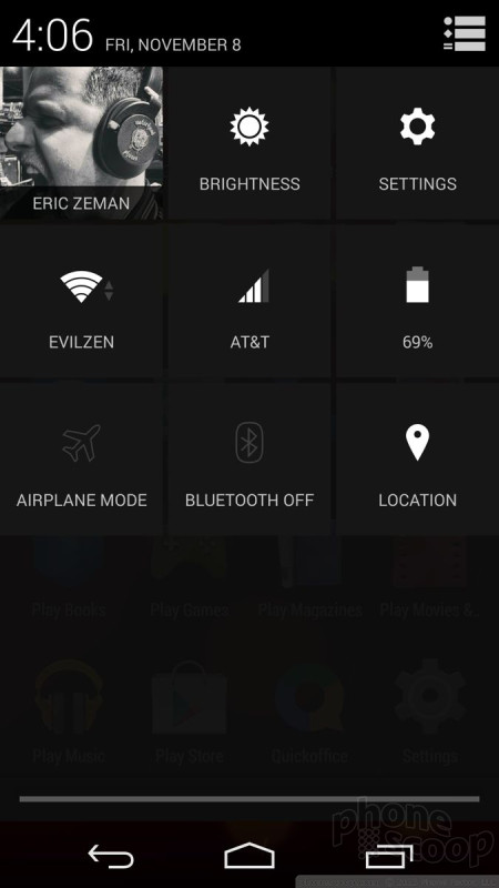
There's a little icon in the upper right corner of the notification shade that allows users to open some of the basic settings tools, such as toggles for the wireless radios, brightness, etc. These take some getting used so, as the actions aren't entirely intuitive. For example, let's say you have Wi-Fi on and want to turn it off. With the tool open, you can tap the Wi-Fi icon. This doesn't toggle the Wi-Fi radio off, however. Instead, it opens the Wi-Fi settings tool. In order to turn the Wi-Fi radio off from the notification shade, you have to long-press the icon. Thankfully, this is another element that phone makers like to adjust by adding more toggles and controls. (A power-user shortcut to this quick settings screen is to swipe down with two fingers instead of one.)
iOS used to be behind Android in the notifications department, but it has now surpassed it with iOS 7. I think the new iOS Notification Center and how it interacts with the iOS notification shade notification shade makes iOS's notifications a more customizable and better tool. That said, Android's notifications still offer plenty of bite, and vastly outclass those of Windows Phone.
Multitasking
Android is capable of multitasking, or fast-app-switching, if you will. There's a dedicated button at the bottom of the screen that brings up the multitasking menu. A press of the button opens a vertical carousel of other apps that have been used recently. If you see the app you want to jump to, tap it. Apps exist in a semi-suspended state and are as they were when you last used them. That means if you were in the middle of typing an email, it'll still be there when you jump back to the email app. Android KitKit can keep several dozen apps running in the background. If you want to close an app, simply swipe it away from the multitasking screen.
Some hardware makers like to substitute their own interface for multitasking, such as a grid instead of a list. iOS and Windows Phone offer similar multitasking tools. The three platforms are on even footing as far as fast-app-switching is concerned. However, multitasking is an area that Android hardware makers have been able to exploit to excellent use. Devices such as the Galaxy Note 2, Note 3, or LG G2 have incredible extended multitasking powers that allow two apps to run side-by-side at the same time. That's possible due to the flexibility of the Android platform. iOS and Windows Phone can't run two apps side-by-side.
Performance
One of the main thrusts of Google's work on Android 4.4 was to make the operating system more nimble. It streamlined the underlying code so that Android can run on simpler, less sophisticated hardware. According to Google, all of the features of Android 4.4 will be available on devices with as little as 512MB of RAM. In other words, Google optimized Android for entry-level phones so that it can sell even more low-cost devices around the world.
We tested Android 4.4 KitKat on a Nexus 5. The operating system hasn't been made available yet to other devices, such as the Nexus 4 or the Google Play Edition HTC One/GS4. The Nexus 5 has a quad-core Snapdragon 800 processor under the hood — one of the best available — and it didn't blink. Every app opened quickly, screen transitions were fluid, and the Nexus 5 had no trouble running games, playing video, or surfing the web and listening to music.
That said, Android 4.4 isn't perfect. It's not as buggy as iOS 7 was at launch, but we noticed a fair number of weird app crashes. Surely the bugs will be ironed out long before Android 4.4 is installed on most devices.
 iPhone 15 Series Goes All-In on USB-C and Dynamic Island
 Motorola Refreshes razr Lineup with Better Batteries & More
 OnePlus' New Mid-Range Phone Has a 108 Megapixel Camera
 Samsung's New Foldables Stick to the Formula
 iOS 18 Overhauls Home Screen, Messaging, Photos