Review: Android 5.0 Lollipop
Nov 8, 2014, 10:00 AM by Eric M. Zeman
Google's latest update to Android is the very tasty Lollipop. The new mobile operating system is a treat everyone should enjoy. It employs a new, unifying design language and adds an incredible number of new features. Here is Phone Scoop's in-depth review of Lollipop.
Lollipop is Google's most significant update to Android since they released version 4.0 in 2011. Not only does Android 5.0 feature a brand new design, but many of the core apps have been updated. Google has hit the reset button on major ideas within the operating system, such as how it handles notifications and multitasking. It's changed up how everything looks. Yet Google has also kept a lot of the basics intact, such as how home screens work. Android 5.0 Lollipop is the platform's coming-of-age story. It's fully grown up now, blossoming with new maturity.
Material Design
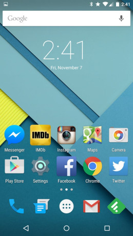
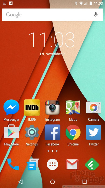
The most obvious new feature of Lollipop is Material Design. The new design language touches every aspect of Android. The changes between the look and feel of Android 4.x and Android 5.0 are striking. It's not quite as drastic a change as the difference between iOS 6 and iOS 7, but it's not far off, either. There's nothing subtle about Material Design.
Google believes three critical principles define what you see Lollipop: the material metaphor, bold intent, and purposeful motion. "We challenged ourselves to create a visual language for our users that synthesizes the classic principles of good design with the innovation and possibility of technology and science. This is material design," said Google.
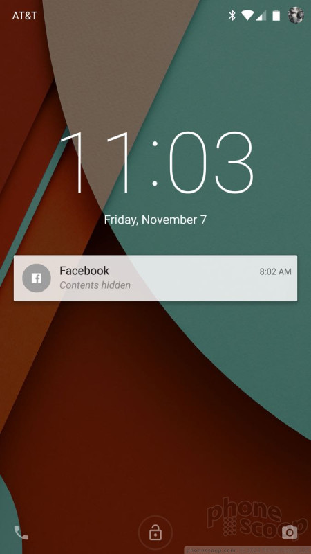
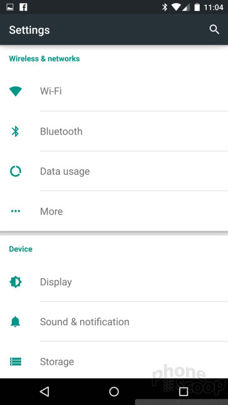
Icons are bigger, bolder, and more colorful. The fonts are different. White space is more prevalent throughout. Where Android 4.x was dark, Android 5.0 is light. New animations abound, which create a sense of purpose for each app when it opens and closes. Material Design is most prominent in core apps, such as Gmail, Phone, Contacts, messaging, and so on. Google has been updating these apps outside of Android 5.0, and many are already available to devices running older versions of Android. (Google has been pushing app developers to adopt Material Design within their own apps. It has offered tutorials and other tools to developers to tout the new look. We hope they'll play ball.)
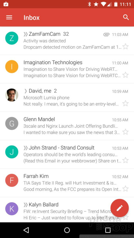
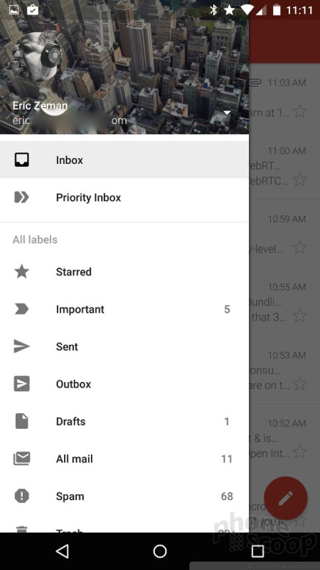
Two of the main tools of Material Design that you'll notice in Google-made apps are circles and trays. Circles are floating all over the place, often in the lower-right corner of apps like email or messaging. The circles are generally meant as buttons for starting something new, like a text. The circles always stand out; they are impossible to miss. The trays are a bit harder to see. In the upper-left corner of many apps you'll see perhaps the name of the app along with three horizontal lines. These lines are your signal that there's a settings tray associated with the app. The tray will slide out from the left edge of the screen and provides you with all the tools you need to adjust or control that particular app. This tray always shows you what Google account you're using within Google apps, and your Google+ profile image at the top.
Material Design isn't just for Android smartphones, it's for Android everywhere. Material Design was created so a single UI can be spread across multiple form factors. You'll see it on Android tablets, Android wearables, and Android TV. After using Lollipop across different devices for more than a week, I can say this is really helpful. My eyes are comfortable when transitioning from phone, to watch, to tablet, and back. It all makes sense.
Of course, design can be subjective. I won't be surprised if some people hate Material Design and what Google has done to Android. Personally, I think it is the best-looking version of Android by far.
Eric has been covering the mobile telecommunications industry for 17 years at various print and online publications. He studied at Rutgers Newark and University of Kentucky, and has a degree in writing. He likes playing guitar, attending concerts, listening to music, and driving sports cars.
 Apple Announces iOS 15
 Google Teases Pixel 7 Series, Pixel Watch
 Samsung S24 Series Adds More AI, Updates the Hardware
 Android 12 Sports New, Customizable Look
 Major Update to Google Messages Brings iPhone-Compatible Emoji Reactions


Comments


PLEASE add customizable themes!

Everything so light?
I really hope they leave an option for those of us who prefer light text on a dark background as it's just easier to read.

Excellent review!


galaxy discover

I Wonder
I love the fact that manufacturers are now racing to be the first one to update their phones to Android 5.0. In the past you used to have to wait months, even up to a year, to get the update, if you got it at all. By now OEM's are starting to recognize that customers want the upgrades, and are trying to get them out in a timely fashion. Indeed, they are even competing to be the first one to update all their devices. Consumers benefit from this.

RIP Lock Screen Widgets :-(