Review: Android 5.0 Lollipop
Chrome
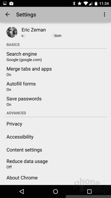
Google updated its Chrome web browser with Material Design several weeks ago. In fact, it was one of the first apps to get such an update from Google. Material Design is perhaps least apparent within Chrome when compared to other apps. The tabs look a bit different, and the fonts have changed, but there's less color and more white space in Chrome.
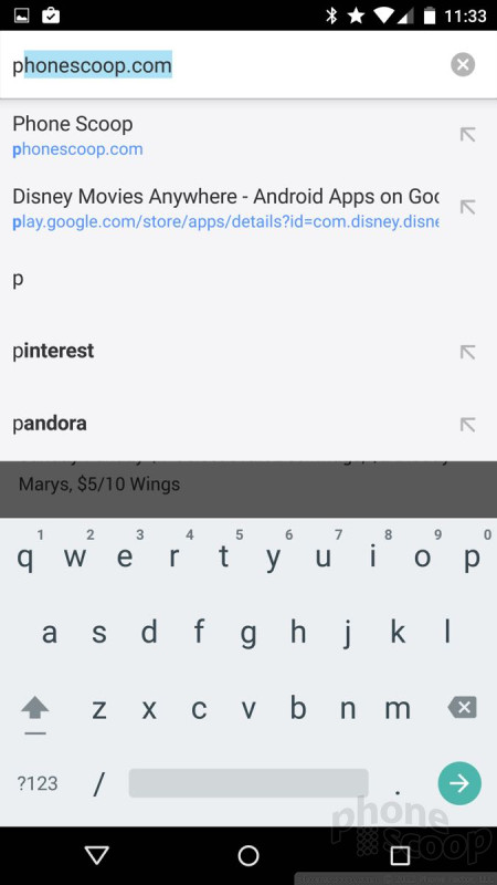
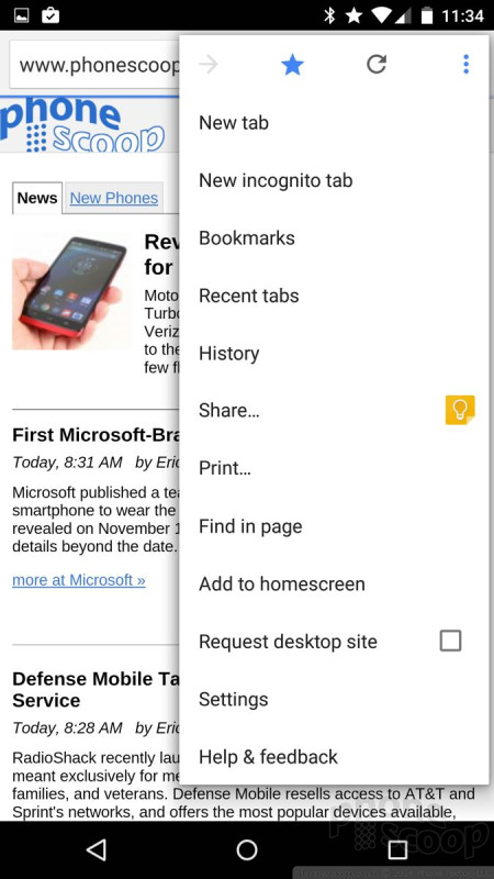
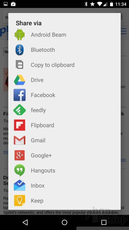
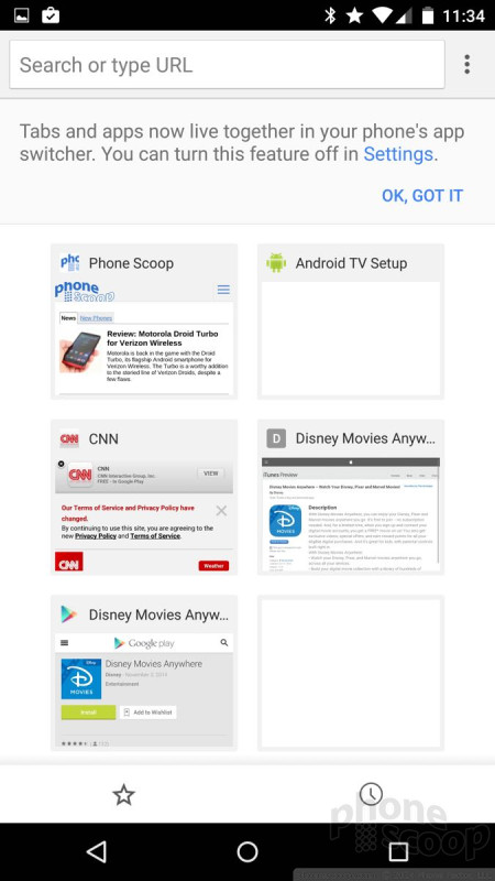
Google made minimal changes to the behavior of the omnibox and settings tools within the app, which function much like they do on devices running earlier versions of Android. The omnibox is lightning quick to suggest URLs and search queries as you type, thanks in part to your browsing history. The settings tools appear in a drop-down menu, through which you can launch new tabs, access your bookmarks, see recently-closed tabs, as well as access your entire browsing history. Sharing tools are extensive, and it's easy to search the contents of individual web pages, add shortcuts to the home screen, or request desktop sites. If you care to dig further, you can set Chrome to autofill forms and passwords, restrict content, and tamp down data usage.
Chrome is a near desktop-class web browser that Google has managed to stuff into a phone. It syncs with your desktop version of Chrome and can access your web history across machines. Apple and Microsoft have given similar tools to Safari and Internet Explorer, respectively. Based on my experience, Safari is still the king of mobile browsers. It's much faster, easier to use, and has more features. Google and Microsoft are closer than ever, but Safari provides the best overall mobile browsing experience, for my money.
Camera
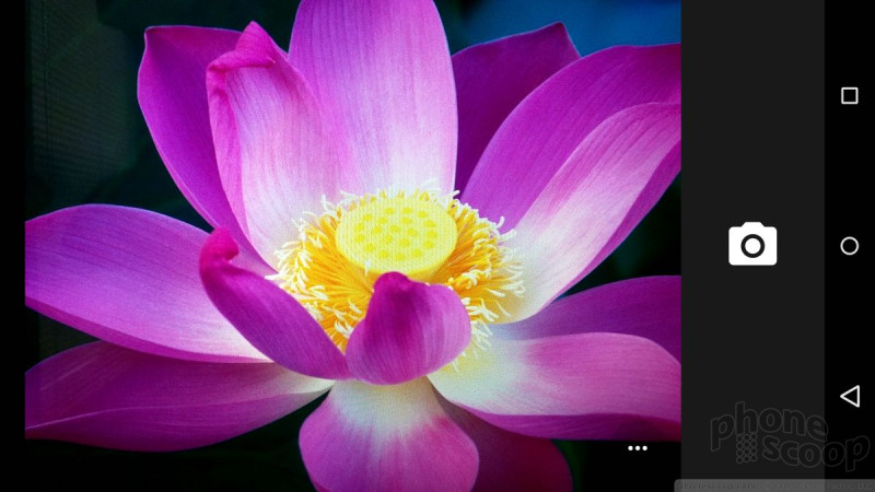
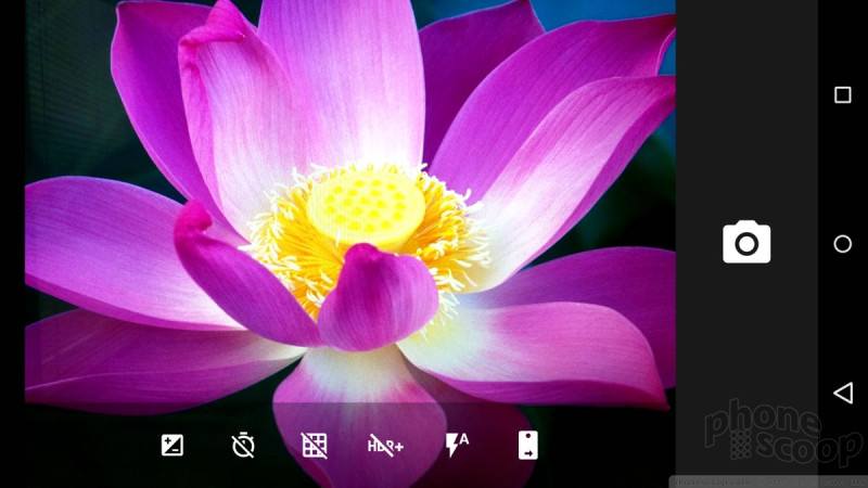
Google overhauled the camera app, and I have to say I think it's improved from the stock Android 4.x shooter. It relies on some familiar trappings, but it will make sense to most people.
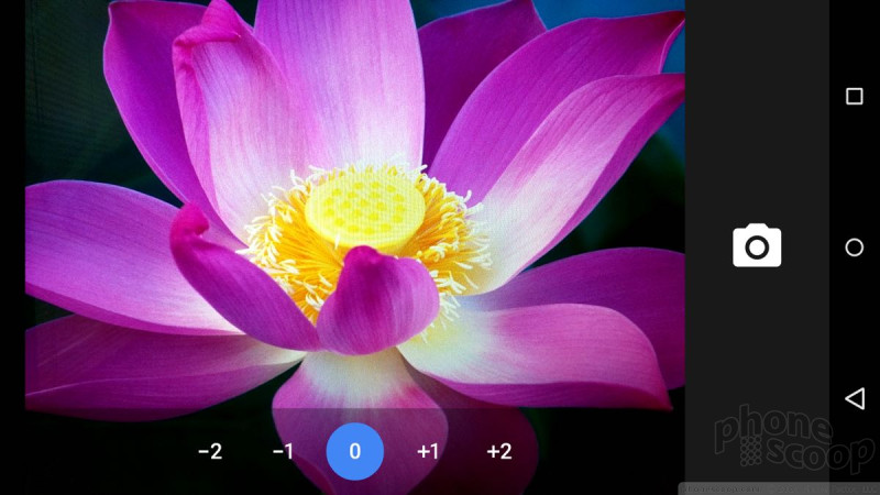
The camera has two main screens: shooting mode and menu mode. You can access several settings from the shooting mode by pressing the three little dots that appear in upper right corner. A strip of icons drops down that allow you to swap to the user-facing camera, toggle the flash and HDR on/off, turn on the framing grid, set a timer, and adjust exposure. These are all pretty self-explanatory. Pressing the shutter button captures an image and you're ready for the next one. Use the trusty pinch-to-zoom gesture for zooming the camera in or out.
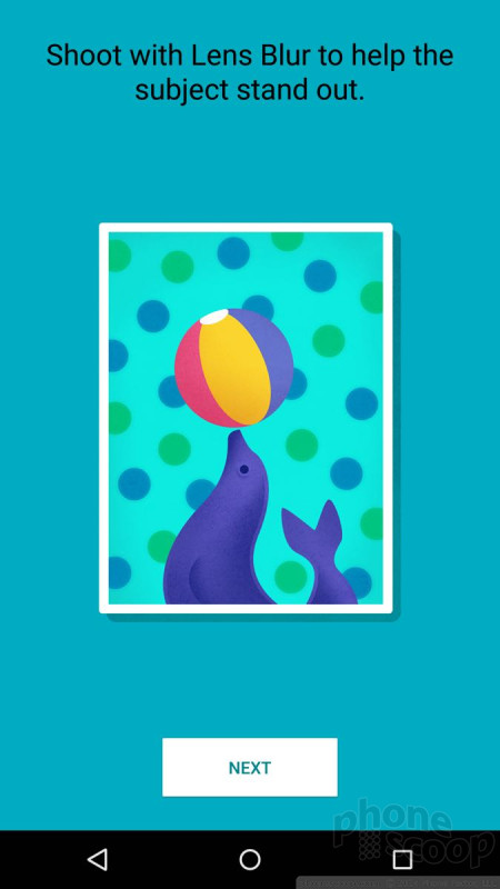
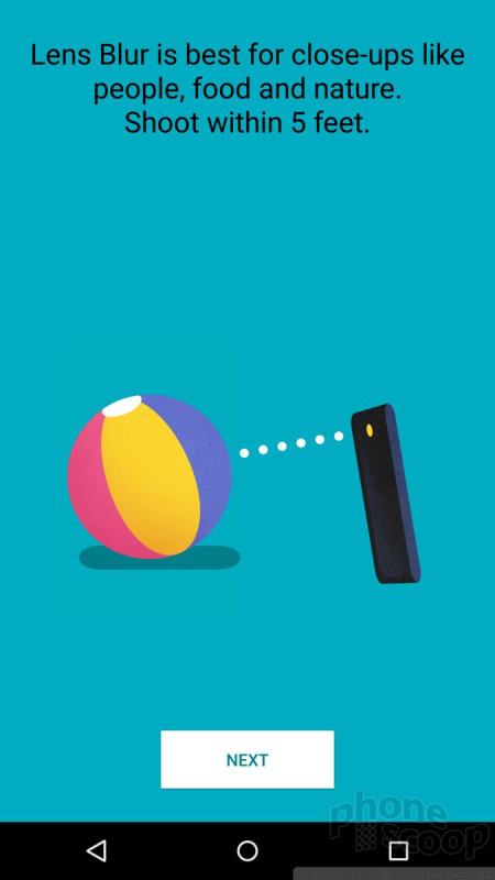
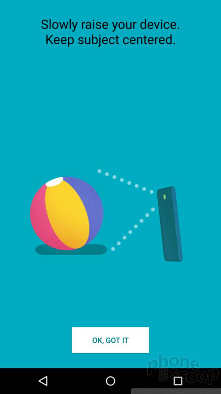
If you want to capture anything other than regular images, you need to call up the larer menu. Slide your finger from the left side of the screen toward the center and you'll see the different capture modes that are available. They include photo sphere, panorama, lens blur, camera, and video camera. Most of these are self-explanatory, with the exception of lens blur.
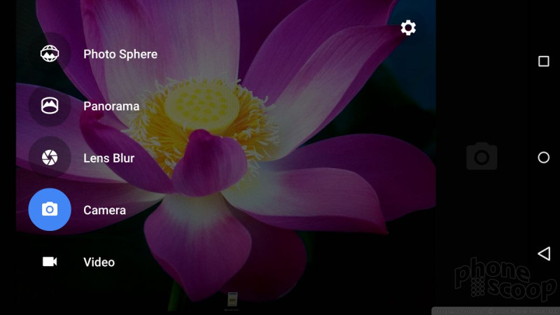
Lens blur is meant to help make the subject of photos stand out against the background by ensuring that they are in focus, while everything else is out of focus or blurred. Lots of phones offer this type of feature, but perhaps call it something else. What's novel in Lollipop is the way you capture images. Believe it or not, lens blur suggests you move the camera slightly and slowly while capturing the picture. Normally you want to hold as still as possible to ensure sharp focus. After you've taken the photo the camera processes it for a second. The result is an image with an in-focus subject and a blurred-out background. However, like a Lytro camera, you can select any part of the image to be in focus. I don't quite know how they're doing it, but it works.
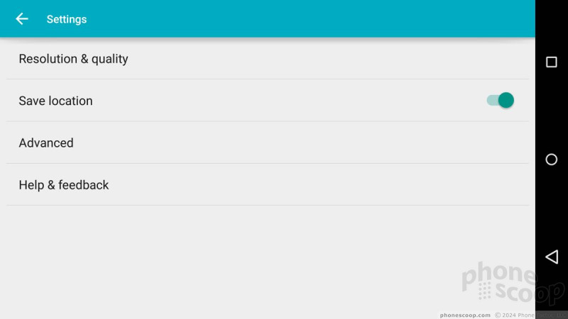
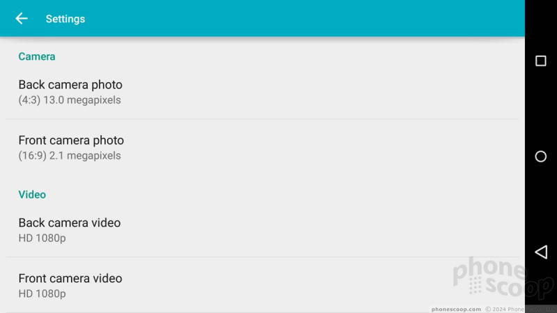
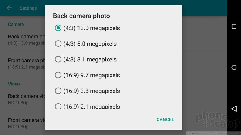
From the menu mode screen, you can also press a little cog in the corner to adjust aspect ratio, image resolution, video resolution, and how the camera handles exposure.
In all, it's simple and straight-forward. It took me maybe 60 seconds to assess all the camera app's features. Most phone makers write their own camera apps, so this app may be limited to Nexus devices, but at least the stock Android camera app provides a usable feature set.
Apple and Microsoft offer more robust camera apps, as far as I'm concerned. For example, the native Android video camera doesn't shoot video in slow-motion or time-lapse, but the iPhone sure does. Further, Microsoft has an advanced camera app that is professional grade when it comes to manual shooting tools, trouncing the amount of control available to users of the stock Android camera. Finding the right balance between features and ease-of-use is no simple task and I'm not sure any of the three big platforms has nailed it yet.
Drive, Docs
Android 5.0 Lollipop does more than look pretty; it works hard, too. Google has been tweaking its productivity apps all year and the latest versions not only adopt Material Design, but add some compelling new features, as well.
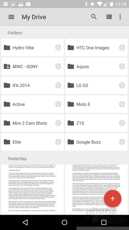
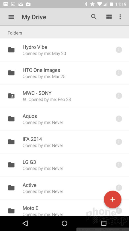
The newest version of Drive and its associated Docs and Sheets apps have improved search tools. Drive, in particular, is better at suggesting search terms with autocomplete. Drive now allows users to send email messages directly from the Drive app (rather than force people to start within Gmail). This can be handy. Drive has a better PDF viewer, too. The PDF view supports search and text selection within documents, which is nice.
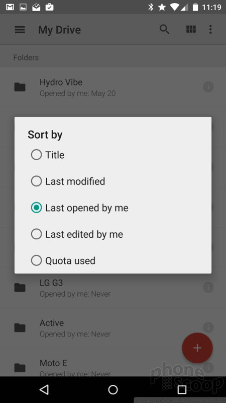
I really like how easy it is to browse through your documents now. The file viewer screens are much richer in detail thanks to Material Design and make finding the right document a breeze. You can view documents in list form, or in a grid with previews of each document. You can also filter, sort, and share them with ease.
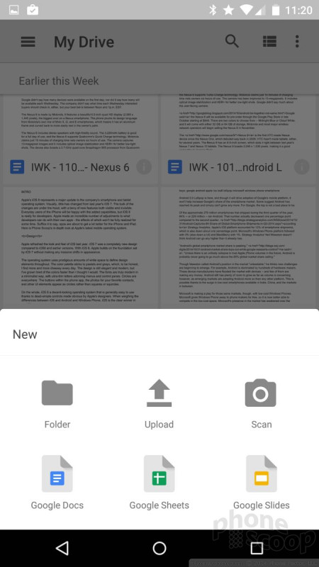
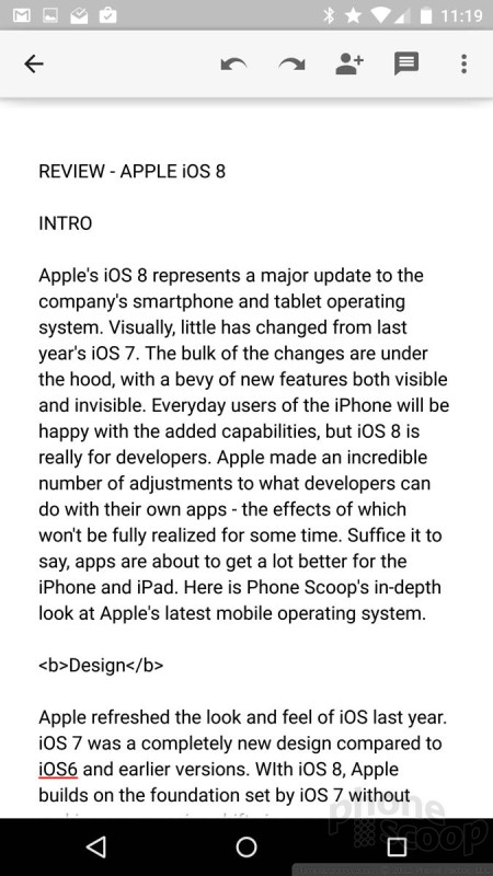
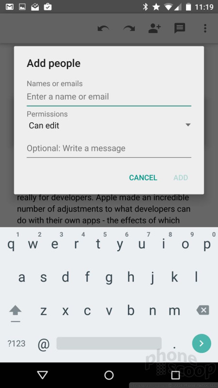
I still think it's silly that Google has separate apps for actually editing Docs and Sheets, but they work seamlessly with the Drive app itself. The handset-based versions of Docs and Sheets lag their desktop counterparts, but at least you can make basic edits, add comments, and share the documents with others, even in Microsoft Office formats. As with other Google-made apps, the latest versions of Drive, Docs, and Sheets are available to all Android 4+ devices.
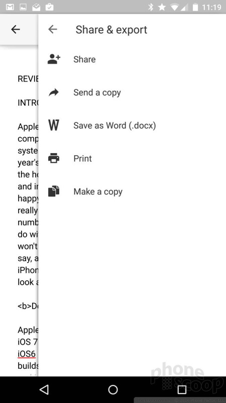
Google is closely catching up to Microsoft in the productivity department. I'm not going to say Google Docs is comparable to Microsoft Office, but many of the functions are the same — and they're all free to Google account holders. Apple's suite of productivity apps is a bit more feature-rich on iPhones, but they're clunkier to use and don't sync as seamlessly with the cloud. For example, everything you do within Drive on your phone or tablet is automatically backed up online. I don't find Apple's backup service to be as reliable — or as easy to access.
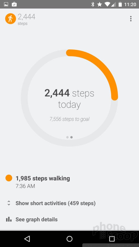
Fit
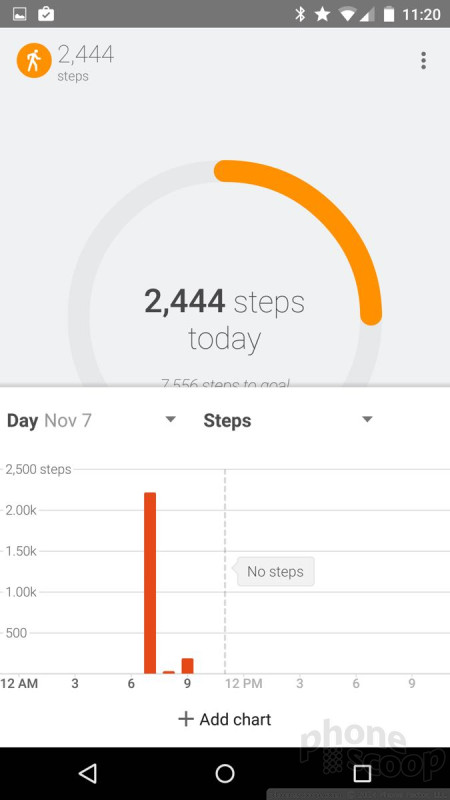
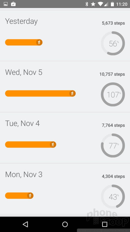
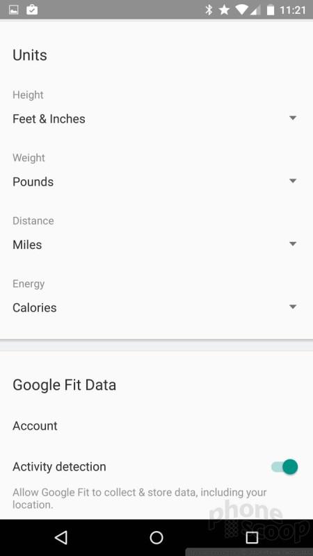
Fit is Google's answer to Apple's HealthKit. Sort of. Google Fit is a health and fitness tracker in its own right. You add some basic details about yourself (age, weight, height) and it starts collecting data. By itself, it can track steps, but that's about it. I tracked my steps on the Nexus 6 for a week and it seemed accurate enough. I like how it makes the information easy to digest, with neat graphics and charts. That's more than HealthKit does by itself.
Google Fit isn't about tracking steps, though. It is supposed to hook into Google Fit-compatible apps that send their data over, too. At the moment, no such apps are available. In theory, Google Fit will allow people to collect all the health and fitness data generated by wearables and other apps and store it all in Google Fit. The neat part is Google Fit can then send everything to the cloud, where you or your healthcare professional can access and use it for whatever purposes you deem... fit. This could be a great way for personal trainers or therapists to manage patients remotely, for example. Google hasn't provided a lot of detail yet on how secure the data is, or how you access it.
What's really dumb is Fit doesn't seems to sync with Android Wear, at least not yet. I tested Google Fit alongside the step tracker on the LG G Watch R, and the two devices never synced data, such as my step counts. Each device counted my steps independently. Perhaps Android Wear itself needs to be updated before it can talk with Google Fit. At this point, they're not sharing.
Google Fit is one of those aspects about Lollipop that has a long way to go before its true utility emerges. That said, I think I caught a glimpse of where that path might take us, and it's pretty neat.
Maps
Maps is one of those apps that Google updates all the time. Google only recently added Material Design to Maps, but also cooked in some tasty extras. Maps now lets you make restaurant reservations from within the app itself thanks to a partnership with OpenTable. The app also offers details about potential Uber rides, such as ETA and price estimates, and can take you directly to the Uber app for bookings.
Maps continues to be an incredible tool for planning routes, be they by car, bus, train, or foot. The accuracy of Maps is excellent, and Street View imagery is an added bonus. I really like Maps' ability to suss out details for local businesses and points of interest. The new cards for business listings are pretty and chock full of data. The cards make it a breeze to call the business, obtain directions to the business, or read reviews about the business. Of course the cards are bright and colorful, and often incorporate images of the businesses in question.
Google Maps continues to set the bar for free navigation, though Microsoft's HERE Maps are very competitive. One advantage Microsoft has is the ability to download local maps for offline use. Apple Maps are much better than they were two years ago, but they still lag Google and Microsoft as far as features go. For example, Google and Microsoft are much better at providing real-time traffic data *and* highlighting it on their maps. Google and Microsoft also provide excellent public transit and walking directions. Apple Maps still fails to offer public transit.
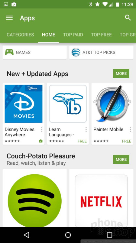
Play Apps
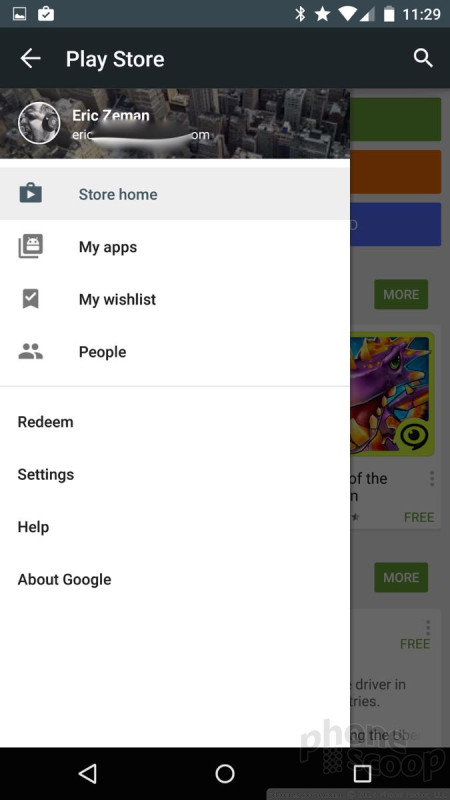
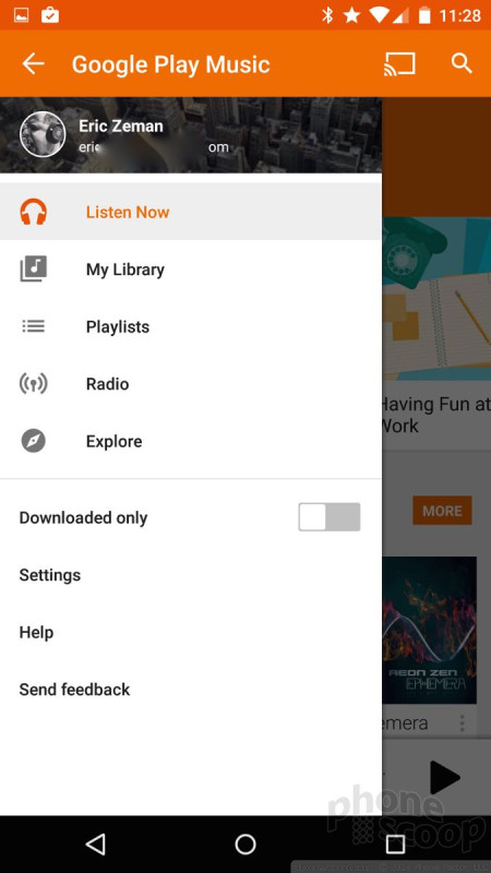
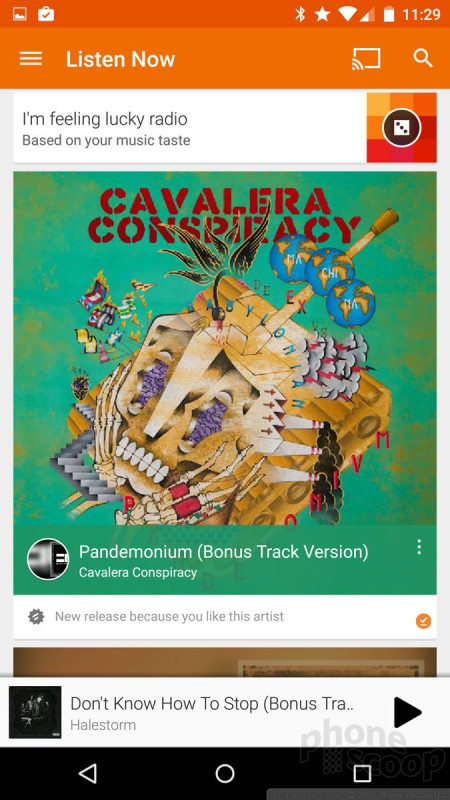
The Play Store and all its associated Play apps (Music, Books, Games, Movies & TV, Newsstand) have been updated with Material Design. All these apps make extensive use of the control tray, which slides out from the left edge when you press the three horizontal lines at the top of the screen. The uniformity of how you interact with the apps helps users adjust to them quickly.
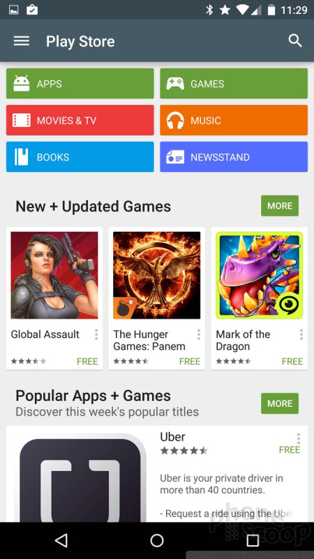
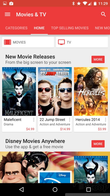
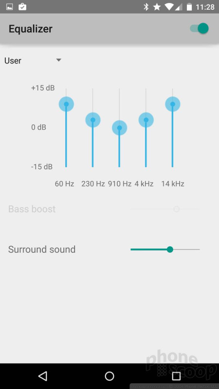
These are all apps that Google updates regularly outside of full system updates, so many of the individual features aren't exactly brand new. For example, Google updated Play Books in late October with better navigation tools for non-fiction content. It also updated Play Movies & TV with new info cards that appear when you're casting content to a Chromecast or Nexus Player. Play Music has new, better radio stations, and a much better controls over how your music sounds. For example, it has a five-band equalizer in addition to more than a dozen equalizer presets (pop, dance, rock, etc.). The Play Music and Play Movies/TV apps are also much better at differentiating between content that's stored locally versus content that's only available online.
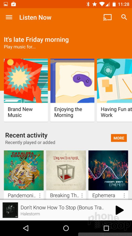
One thing I like about the Play Apps versus their counterparts on iOS and Windows Phone is how easily the content syncs across devices. It is super easy to access everything on your PC, your tablet, or smartphone. With Android Wear, you can also choose to store music directly on your smartwatch for playback via Bluetooth headsets. That said, I think the iTunes Store is better when it comes to selection and actual shopping. Still, Google has come a long way in that department.
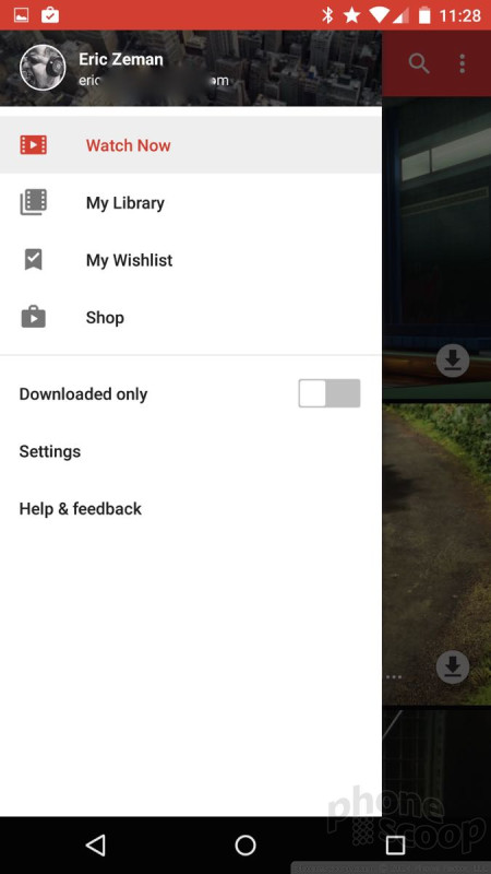
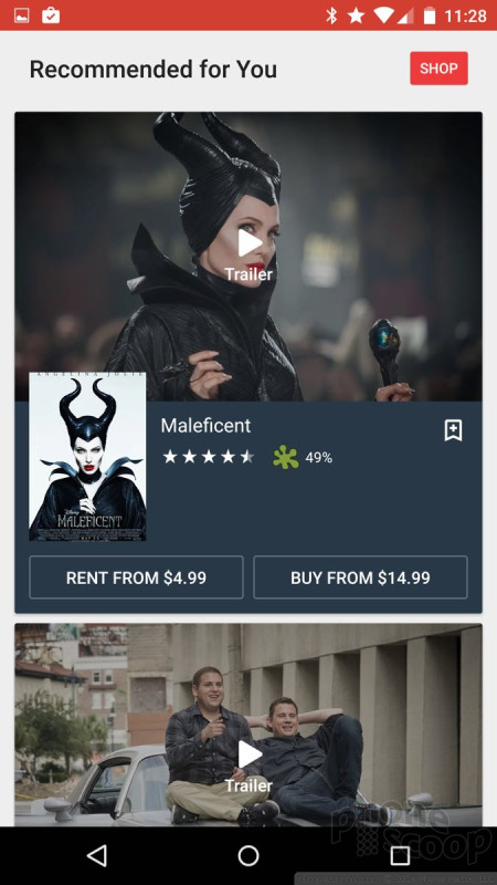
Photo Gallery
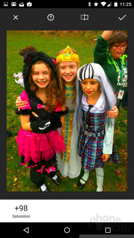
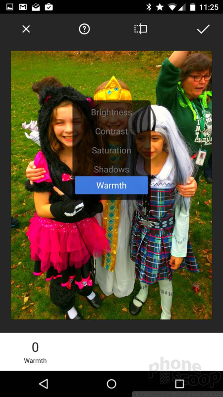
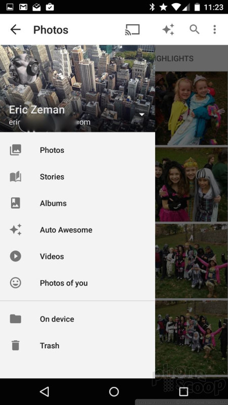
The old-school Photo Gallery app is finally no more. In its place is the Photos+ app, which Google has placed on Android phones for more than a year. Now, it is simply called Photos. The app serves several purposes. First, it can be used to manipulate images. Second, it can be used to share images. Third, it can be used to store images in the cloud.
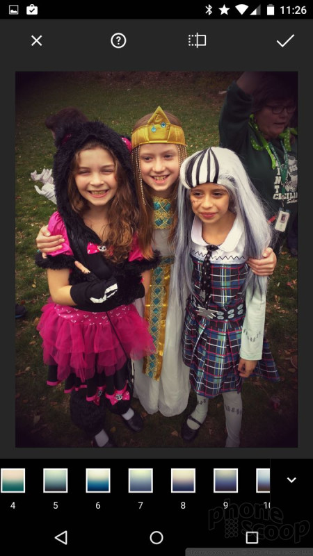
First, manipulating. The new Photos app offers an extensive selection of editing tools. The tools are arranged in a strip across the bottom of the screen. As always, there's the Auto Enhance feature, which will automatically adjust brightness, contrast, and color to make corrections. I find Auto Enhance doesn't do much, though. Crop and rotate are both simple tools that work well.
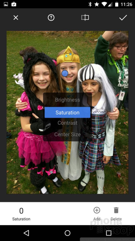
The rest of the editing features, while extensive, overlap a lot and are rather obtuse if you ask me. The first, for example, is called Looks. It has 15 different filters contained therein that mimic those in Instagram. The second is called Tune Image, which lets you adjust warmth, shadows, saturation, contrast, and brightness. It's not intuitive at all, though. The default setting is for saturation and, at first, that's all I thought the tool did. I discovered that I could adjust the other aspects of the photo quite by accident because you have to press-and-hold the white strip at the bottom to bring up a secondary pop-up box. A third tool is called Selective. This lets you spot-adjust small sections of the photo, but it has the same usability goofs of the Tune tool.
The rest of the tools are filter-based and have names such as Vintage, Drama, Black & White, HDR Scape, Retrolux, Center Focus, Tilt Shift, and Frames. Each allows you to adjust the strength of the filter, and of course you can apply multiple filters and effects if you wish. Honestly, it's almost overwhelming. You can spend forever tweaking your photos.


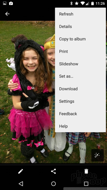
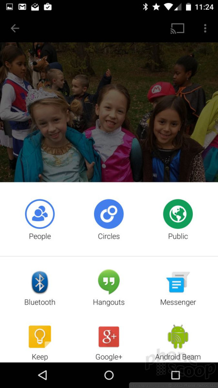
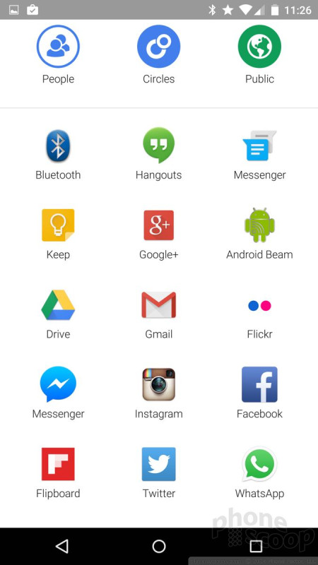
After you've tweaked your photos, you can easily share them. Press the little share symbol at the bottom of the screen and Photos brings up a huge box with all the apps you can share your photos with/to. There are at least 20 options, including SMS, Gmail, your Google+ profile, Drive, Bluetooth, Keep, and so on. It's nice having easy options here.
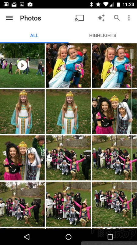
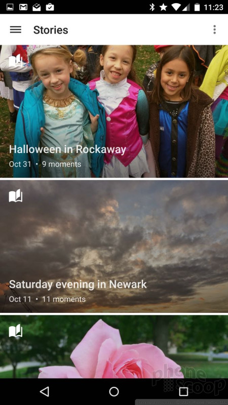
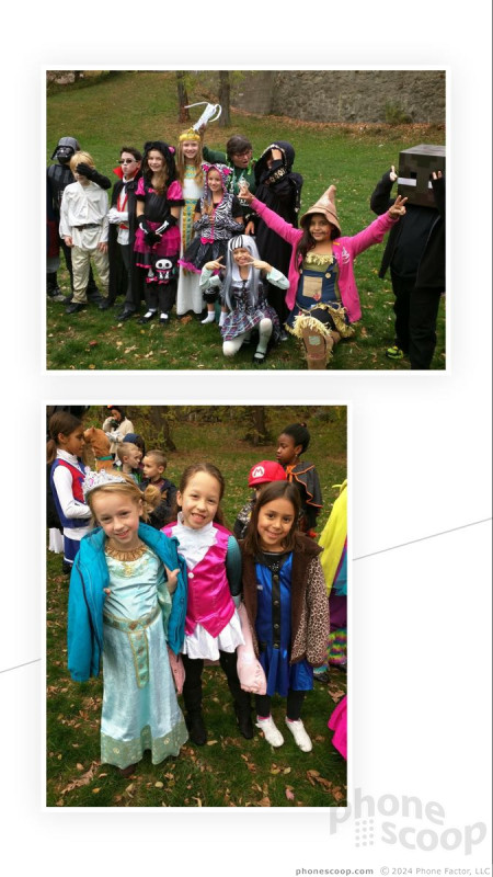
Then there's the Photo app's ability to organize your images. As always, you can set Photos to automatically back everything up to your Google+ photo account. The app takes some initiative in helping you organize photos into usable albums. For example, it will create Stories, which are based on time and location. The Nexus 6 automatically created a Story around all the shots I took of my kids on Halloween and even named the Story "Halloween in Rockaway." I like this feature a lot. Photos will also automatically create albums based on dates, or where the photos came from, such as separate folders with all your Instagram photos, Facebook shots, and so on.


iOS 8 is a bit easier on the editing front, but backing up and organizing with Google's Photos service is easier than iOS 8. Microsoft's OneDrive backup service is powerful, but it's not as adept for organizing your photos and it certainly doesn't do anything such as automatically create albums based on events.
 Apple Announces iOS 15
 Google Teases Pixel 7 Series, Pixel Watch
 Samsung S24 Series Adds More AI, Updates the Hardware
 Android 12 Sports New, Customizable Look
 Major Update to Google Messages Brings iPhone-Compatible Emoji Reactions