Review: Samsung SYNC
Samsung has given their interface an overhaul since we last reviewed the t509. They have added a number of new tweaks that make the Sync easy to use. Unfortunately it isn't all better, as Cingular's control of the main menu and its organization have further obfuscated some useful applications.
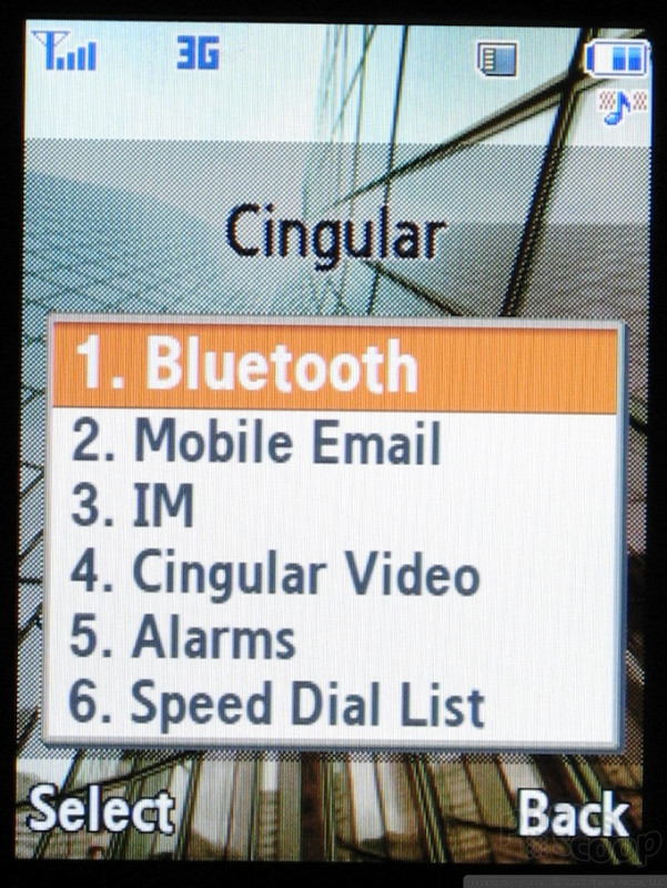
On the home screen, Samsung has a added an options menu similar to Sony Ericsson or Motorola's JUIX phones. This provides shortcuts to oft used functions like Bluetooth, the alarm clock and email.
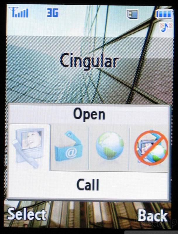
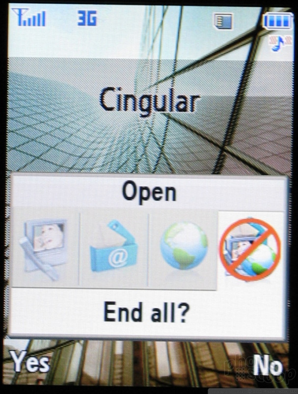
Once you are in the menu system, navigation is usually consistent. The right softkey steps backward, the center select acts as select, stepping forward, and the left softkey opens an options menu if available. If not, the left softkey duplicates the select function. The only exception we've found to this is the message composition window, which completely breaks this model.
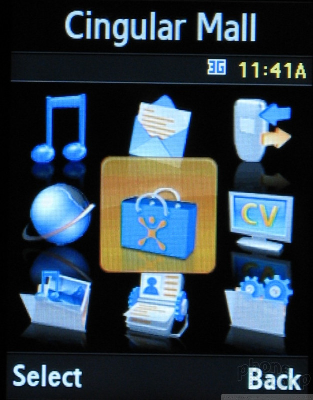
The main menu first gets you acquainted with the speed of the Sync. Zipping around the nine icons gives you an idea just how fast it is. Its speed comes in handy because sometimes you have to go through a number of levels before reaching what you are looking for.
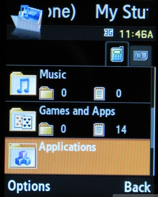
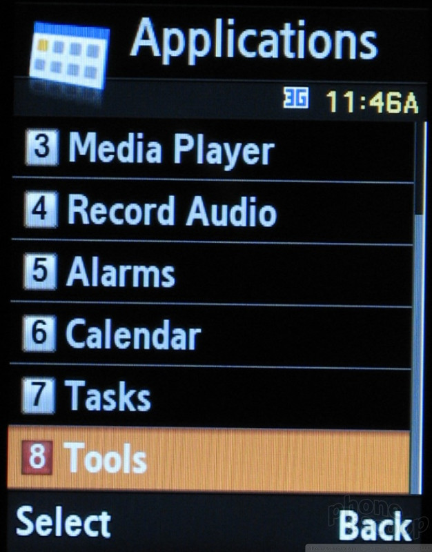
The top level is dominated by Cingular services: web, content shops, video and music. While this makes it easy to jump to video clips, it means other things, like the calculator for example, are buried 3 levels deep in the My Stuff folder.
Other than having to bury applications, Samsung has continued to try and expose as many options as possible to reduce the number of clicks it takes to complete a task. In menu, the selected option is not only highlighted, its text size is now larger to draw further attention to it. When a menu item is selected, the first four options that would normally be in the next menu are displayed, often saving you a few clicks when navigating around.
Samsung has obviously paid quite a bit of attention to fonts and text on this revision, taking advantage of the screen's increased resolution. They have used a new smooth, easy to read font in a variety of sizes throughout the menus. This increased legibility and usability significantly.


 Hands On with the Boost Summit 5G
 Samsung Puts its Best Camera Yet in the Galaxy S23 Ultra
 TCL's Newest 5G Phone for US is Most Affordable Yet
 OnePlus' New Mid-Range Phone Has a 108 Megapixel Camera
 Samsung Launching Two New Affordable 5G Phones Today, Too
 Samsung SYNC SGH-A707