Review: Sony Ericsson W810
Although the Sony Ericsson menu interface is 3 years old now, you'd never know it. SE continues to update and improve the menus, not just making them more user-friendly, but also faster. Additionally they continue to make small tweaks that show they pay attention to how people actually use their phones.
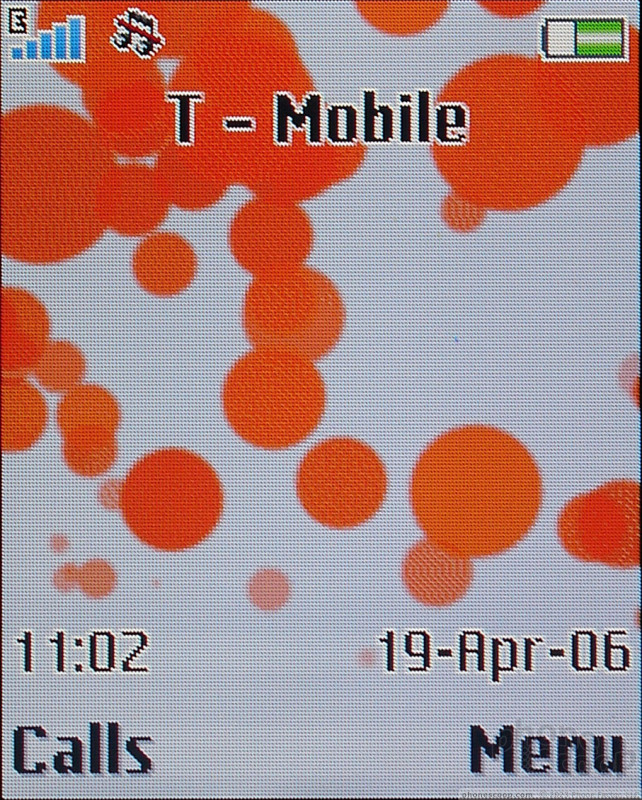
Sony Ericsson has changed the home screen to make the most important feature - access to the main menu - more obvious. Unfortunately by doing this, they violated their own standards. This is the one case where hitting the right soft-key takes you deeper in, rather than back or giving you options. This is also the only case in which the D-pad select does the same thing as the right softkey instead of the left. After some testing, we've discovered new users don't even notice this inconsistency. It seems this change is an immediate improvement to all but the most seasoned SE users.
Sony Ericsson also reorganized all the menus inside applications so that all menus are now accessed from the right softkey as well. The center select key is no longer used to access menus in random applications, instead it consistently does whatever action the left soft key is labeled with.
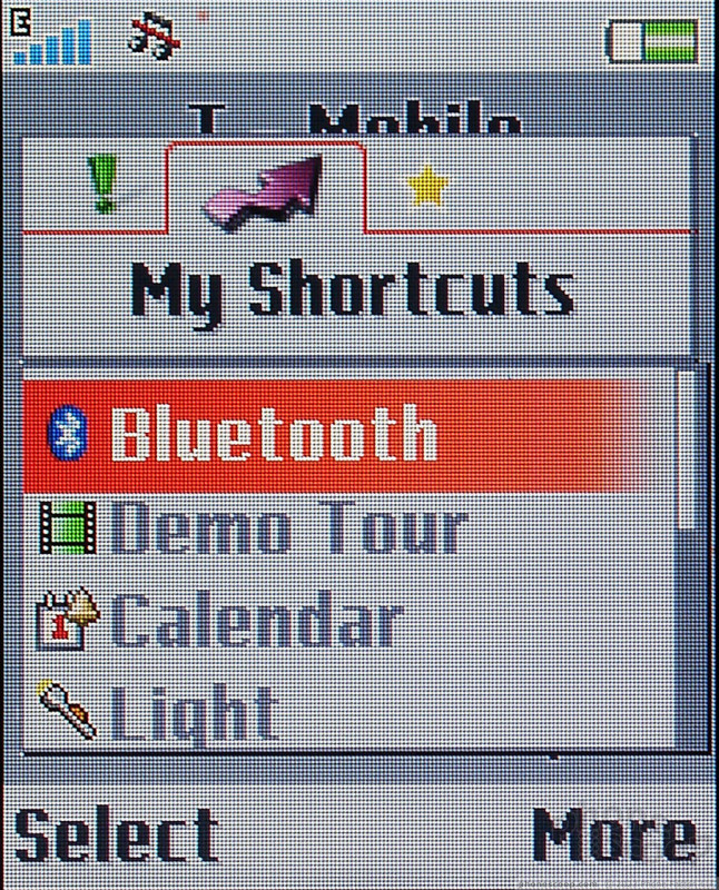
SE realized that the first few Walkman phones suffered by replacing the shortcut key with the Walkman one. The keypad of the W810 was restyled to provide dedicated keys for both the Walkman application and shortcuts. The shortcuts key allows users to access the shortcut menu from any application, which is a nice improvement, however the shortcut menu is still not as convenient as the old "more" menu because most functions now require at least 2 clicks instead of one. This is still more convenient than digging through menus to activate Bluetooth or turn on the flashlight, though, especially since it can be accessed no matter where you are in the menu system.
The shortcuts menu also has two additional tabs. "Events" lists new messages, missed calls and other notices until they have been clicked on. A notice is still displayed on the home screen for each event, and separate icons for each event type are still displayed in the title bar of the home screen. The shurtcuts menu also features a tab for bookmarks, which provides easy access to commonly visited web pages without having to first start the browser and then select a site.
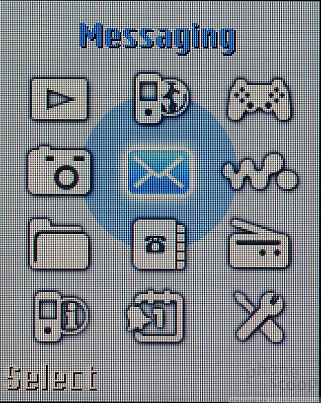
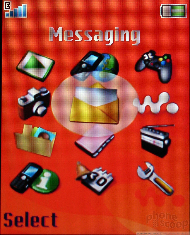
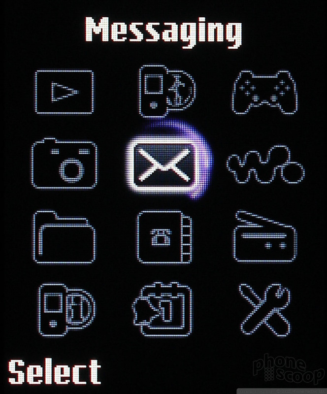
The main menu remains the same, with a grid of 12 choices that can be accessed by pressing the corresponding key on the keypad as well as using the D-pad. Where previously all themes on the phone had to use the same main menu icons, the W810 now offers an alternate set of main menu icons which are used in some themes. This second set features PSP-esque style icons, and also vibrates the phone slightly every time a different is scrolled to. It is not enough vibration to be annoying - just engaging.
 CES 2006
 Hands On with the T-Mobile SyncUp Kids Watch
 Hands On with the Motorola edge+ (2022)
 iPhone 15 Series Goes All-In on USB-C and Dynamic Island
 Asus Zenfone 8 is a Compact Flagship
 Sony Ericsson W810