Review: Motorola Bravo
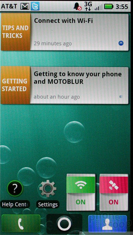
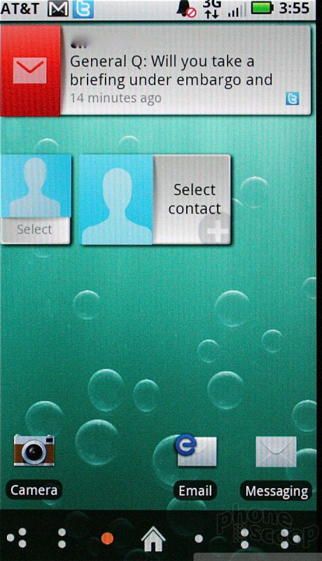
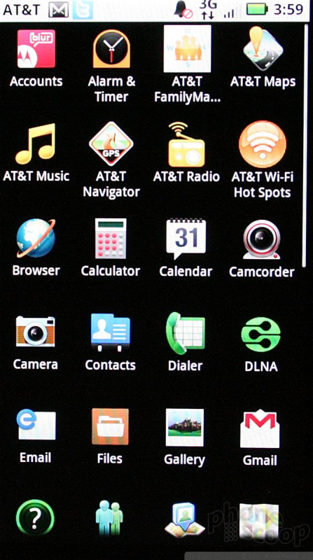
The Bravo uses the same version of Motoblur found on the Motorola Defy. It has seven home screens for user customization, and an insane number of widgets, whoozits, and whatzits to populate that vast, digital landscape.
Out of the box, Motorola has dumped apps, widgets and shortcuts onto six of the seven home screens, leaving only one completely blank. It can all be deleted and rearranged to suit individual tastes. Once you've navigated to one of the far home screens, pressing the Home key takes you back to the central home screen (after all, swiping between all those screens is *so* laborious).
The re-sizable widgets continue to be a great feature of Motoblur. This lets the end user control the size and shape of widgets. This is especially helpful when you're trying to conserve screen real estate. There are widgets for Twitter, Facebook, MySpace, as well as a widget that combines features of all three social networking services. Other widgets are available for the media player, weather apps, contacts app, RSS feeds, settings, and so on.
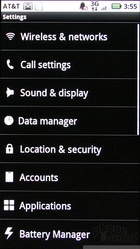
Once you move past the home screens, the Bravo looks like any other Android 2.1 phone. The way the main menu works is unchanged, and the same goes for the settings, and other tools accessed via the Menu key. Android's menu design hasn't changed much since Day 1.

 CTIA Fall 2010
 Motorola Brings More Affordable 5G Phones to its 2024 Lineup
 Moto Gives its Affordable g play More Value
 Motorola's new razr Foldable is Just $600
 Motorola Gets Serious About Foldables with New RAZR Lineup
 Motorola Bravo