Review: Motorola Droid 2
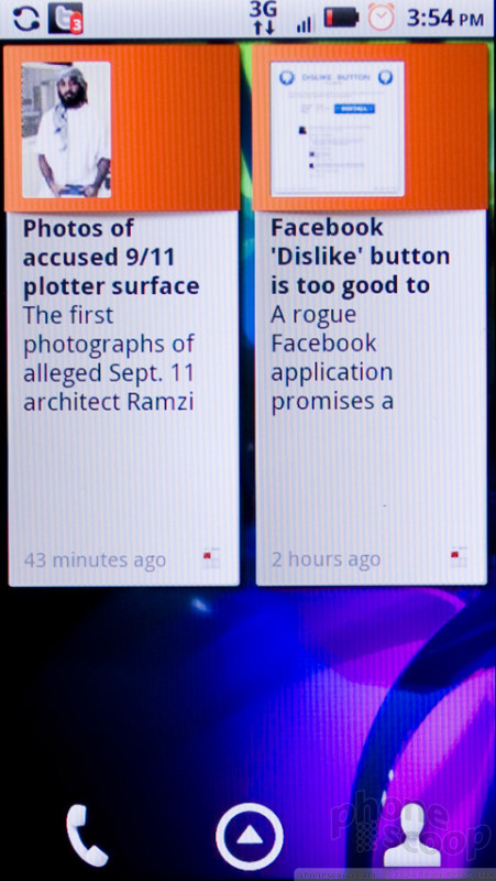
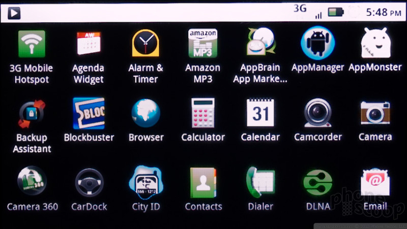
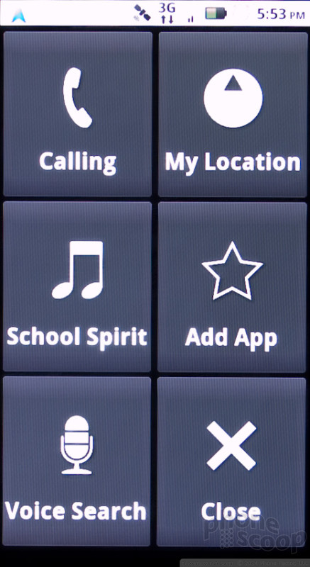
Motorola has made some nice additions to the standard Android interface without completely redesigning the look and feel. The basic paradigm is the same. You get a multi-panel homescreen - 7 panels on the Motorola Droid 2 - and you can drop onto these panels a number of app shortcuts, interactive widgets, folders or other such tools. Most of Motorola's work has come in the selection of widgets Moto offers on the Droid 2.
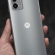
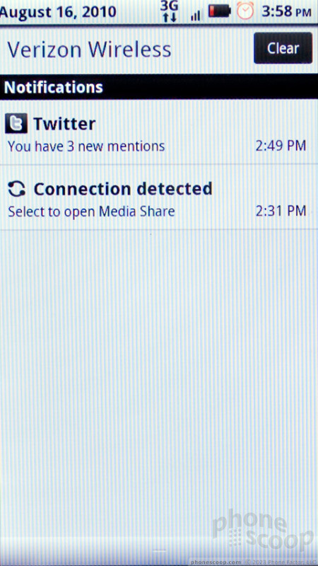
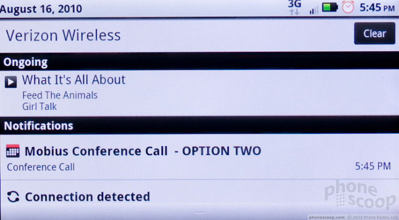
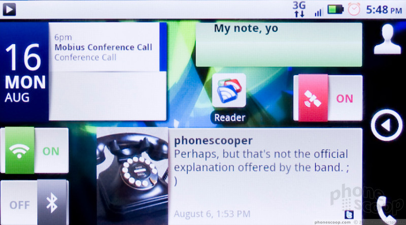
Motorola's widget tools are fantastic and adaptable, some of the best widgets I've seen on Android. You get a selection of system toggles for Wi-Fi, Bluetooth or Airplane mode. There are widgets for calendar and contacts, photos and social networking status updates. Motorola has made all of these resizable, a unique feat among Android devices.
All Android phones offer a 4 by 4 grid on which you fit widgets like Tetris pieces. Motorola's contact widgets, for instance, may start as a 1 by 2 rectangle with a picture and a phone shortcut. Then, you can drag the edges of the widget to expand it to a 1 by 4 rectangle, now with multiple contact shortcuts. Or, you can make it 4 by 2, for a larger picture and even more shortcut to make calls, send messages or even start a navigation trip. The widgets rearrange themselves automatically to fit whatever size you choose. It's a bit difficult to manage what shortcuts show up on a contact widget, but it's easy to create a unique homescreen layout that is incredibly useful, customized to your taste.
I found the interface on the Motorola Droid 2 to be surprisingly sluggish. With a full palette of custom widgets, scrolling from one panel to the next caused a noticeable lag. Sometimes the phone would stall halfway, then resume after a second's thought. There were many instances of lagging response throughout the phone's menus.
The Droid 2 can be used in portrait or landscape mode. The phone had trouble redrawing my homescreen panels in landscape. Pictures would disappear from contact icons and text would get clipped.
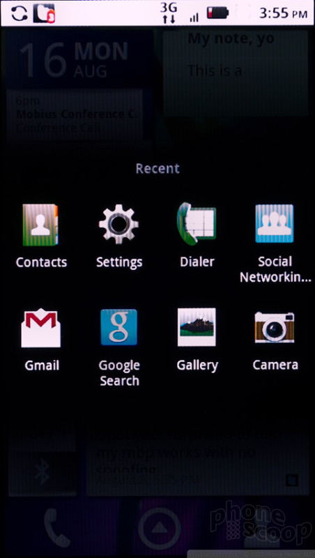
Otherwise, Android is a fine interface, but it can be a bit confusing, and the design could use an overhaul deeper into the phone's guts. The system settings menus are a confusing mash of white text on a black background, and it can be difficult to jump directly to the setting you need to change.

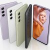
 Samsung Refreshes Galaxy S Series with S Pen, New Cameras
 iPhone 14 Plus Offers a Big Screen For Less
 CAT Puts Android With Play Store in a Compact Flip Design
 Samsung Revives S21 Fan Edition
 Motorola Droid 2