Review: Samsung Omnia II
You could get away with using the Omnia II and not ever discover that the device runs Windows Mobile 6.5. Samsung has taken its TouchWiz 2.0 user interface further into the operating system that I've seen in the past, meaning that most of the software users will interact with is Samsung's. (It should be noted that users can choose to turn TouchWiz off , if they so prefer.)
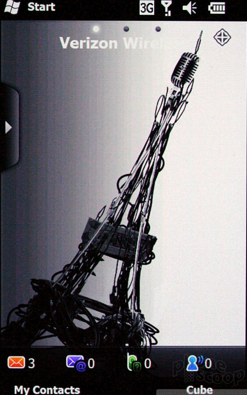
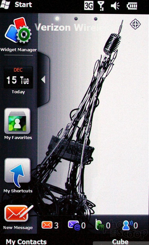
The best part about TouchWiz 2.0 is the home screen. The home screen is a fully customizable desktop area where you can drag and drop widgets and shortcuts to pretty much any application you want. When you first get the phone, you'll see a little tab on the left side of the screen close to the top of the phone. Touch this tab and a dock pops up from the left side, similar to the dock in Mac OS X. The dock is easily opened and closed with this little tab. Here, you can snag the widgets and drop them onto the desktop, or you can take them from the desktop and drop them back into the dock. You can also open applications directly from the dock.
Samsung has dozens of widgets that can be used with the dock available for download. You can scroll the dock up and down to see the other widgets in there. Using the menus, you can control which widgets are visible and which aren't. The default is to make them all visible. There are three "home" screens that can be populated with widgets, apps or content, depending on user preferences.
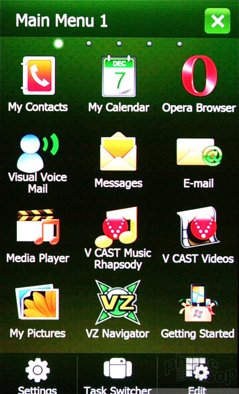
The main menu has all of the phone's software and Verizon services laid out in a basic grid. There are so many applications stuffed onto the Omnia II that there are actually FIVE pages reserved for the main menu. You simply swipe left or right to get to the other menu pages (similar to the home screen on an Android phone).
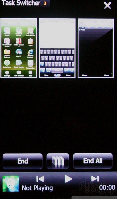
There's a task switcher button at the bottom of the main menu that lets you jump between open applications quickly. It allows up to nine apps to run in the task switcher at a time, and displays a nice screenshot of the app so you know what you're jumping back or forward to.
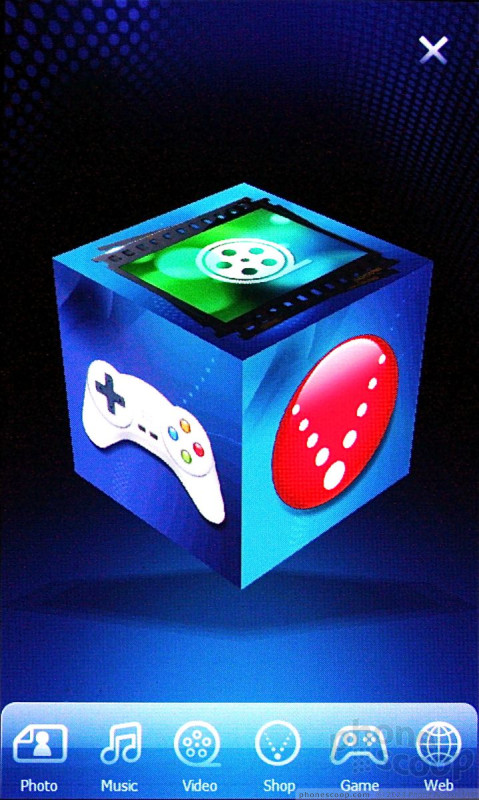
The most notable change with TouchWiz 2.0 is the 3D cube interface for media. The cube is a 3D image that floats in the middle of the screen. Below it is a dock with a handful of buttons. The cube has a different application on each side making for a total of six. You can spin the cube around on the screen to find and open the application you want, such as the photo gallery, music player, and so on. It's neat, and looks cool. I am not sure that it's the most practical way to access your applications, but I've seen much worse. It takes a little while to get used to the positioning of the six applications, but it's not too hard to get the hang of.
 CTIA Fall 2009
 Samsung Omnia II for Verizon Revealed
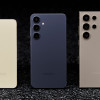
 Samsung Refreshes Galaxy S Series with S Pen, New Cameras
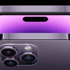 iPhone 14 Plus Offers a Big Screen For Less
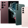
 Samsung S24 Series Adds More AI, Updates the Hardware
 Samsung Omnia II (CDMA)