Review: Android 4.4 KitKat
Nov 11, 2013, 12:00 AM by Eric M. Zeman
Google's latest rendition of Android makes subtle design changes, introduces a few new features, and offers lots of meat for developers. Here is Phone Scoop's in-depth review.
Android 4.4 KitKat doesn't represent a major shift for Google's mobile operating system. Instead it is an evolutionary update that retains most of the look and feel that Android has held since the arrival of Android 4.0 Ice Cream Sandwich. KitKit refines Android; it doesn't reframe it. There are plenty of important changes under the hood, however, that Google says will make Android perform better on a wider range of hardware. For now, however, Android 4.4 is limited in availability to devices bearing the Nexus name.
Design
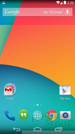
Google made only minor changes to the appearance of KitKat when compared to Jelly Bean. The basic design elements are mostly the same, though there are little differences sprinkled throughout. For example, the digital clock widget for the home screen is slightly different (the numbers are thinner), and some of the graphics in the settings menu have been changed. A handful of the app icons have been refreshed here and there, and all the icons are bigger when viewed in the main app menu.
In some respects, the user interface is a little bit flatter. For instance, the icon for the phone app has a 3D look in Android 4.3, but it is definitely more 2D in Android 4.4. Google also changed the appearance of the black bars at the top and bottom of the home screen. In Android 4.4, those bars aren't solid black; instead, the wallpaper fades to black in a vertical gradient. The effect makes the screen look and feel bigger, as more of the wallpaper is visible in the background. This change looks nice on the home screen, but becomes problematic when you're interacting with an app that has a lot of text in it, such as Google Now. Because the Back, Home, and Multitasking buttons are positioned over this gradient, the background bleeds through and can make the white software buttons harder to see. Thankfully, the fade-out effect goes away once you are using apps such as email, etc.

Most of the individual apps made by Google for Android are unchanged in both appearance and function. I can't see any appreciable changes to the design of key apps such as Gmail, Chrome, the Calendar, Play Music, and most others.
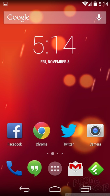
KitKat is a fairly clean and modern operating system as far as the design is concerned. It is heavy on blacks, whites, off-whites, and grays. The blue highlighting of previous versions has been largely excised. Android isn't a very colorful operating system, and certainly not as Easter-y as iOS 7, nor as primary-color laden as Windows Phone. Android's design doesn't get in the way of usability, nor is it objectionable. It's good for consumers that Android, iOS, and Windows Phones have distinct designs.
One thing worth mentioning, however: Most Android devices will never look like KitKat does on the Nexus 5. Manufacturers and carriers are wont to customize the look and feel of their Android devices (think HTC's Sense and Samsung's TouchWiz). That means substituting fonts, icons, widgets, colors, and more. Nexus-branded devices will always have access to this stock Android design, as will Google Play Edition devices. Every other Android phone out there will probably offer a slight variation on the themes set here by Google. This is one of Android's many strengths, and one of its many headaches.
Eric has been covering the mobile telecommunications industry for 17 years at various print and online publications. He studied at Rutgers Newark and University of Kentucky, and has a degree in writing. He likes playing guitar, attending concerts, listening to music, and driving sports cars.
 Samsung Refreshes Galaxy S Series with S Pen, New Cameras
 iPhone 14 Plus Offers a Big Screen For Less
 Snapdragon 8 Gen 2 Redefines AI in Flagship Phones
 Android 12 Sports New, Customizable Look
 Android 12 Beta 2 Brings New Internet, Privacy Controls


Comments

Should have more color settings!