Review: Android 4.4 KitKat
Nov 11, 2013, 12:00 AM by Eric M. Zeman
Google's latest rendition of Android makes subtle design changes, introduces a few new features, and offers lots of meat for developers. Here is Phone Scoop's in-depth review.
Intro
Android 4.4 KitKat doesn't represent a major shift for Google's mobile operating system. Instead it is an evolutionary update that retains most of the look and feel that Android has held since the arrival of Android 4.0 Ice Cream Sandwich. KitKit refines Android; it doesn't reframe it. There are plenty of important changes under the hood, however, that Google says will make Android perform better on a wider range of hardware. For now, however, Android 4.4 is limited in availability to devices bearing the Nexus name.
Design
Google made only minor changes to the appearance of KitKat when compared to Jelly Bean. The basic design elements are mostly the same, though there are little differences sprinkled throughout. For example, the digital clock widget for the home screen is slightly different (the numbers are thinner), and some of the graphics in the settings menu have been changed. A handful of the app icons have been refreshed here and there, and all the icons are bigger when viewed in the main app menu.
In some respects, the user interface is a little bit flatter. For instance, the icon for the phone app has a 3D look in Android 4.3, but it is definitely more 2D in Android 4.4. Google also changed the appearance of the black bars at the top and bottom of the home screen. In Android 4.4, those bars aren't solid black; instead, the wallpaper fades to black in a vertical gradient. The effect makes the screen look and feel bigger, as more of the wallpaper is visible in the background. This change looks nice on the home screen, but becomes problematic when you're interacting with an app that has a lot of text in it, such as Google Now. Because the Back, Home, and Multitasking buttons are positioned over this gradient, the background bleeds through and can make the white software buttons harder to see. Thankfully, the fade-out effect goes away once you are using apps such as email, etc.

Most of the individual apps made by Google for Android are unchanged in both appearance and function. I can't see any appreciable changes to the design of key apps such as Gmail, Chrome, the Calendar, Play Music, and most others.
KitKat is a fairly clean and modern operating system as far as the design is concerned. It is heavy on blacks, whites, off-whites, and grays. The blue highlighting of previous versions has been largely excised. Android isn't a very colorful operating system, and certainly not as Easter-y as iOS 7, nor as primary-color laden as Windows Phone. Android's design doesn't get in the way of usability, nor is it objectionable. It's good for consumers that Android, iOS, and Windows Phones have distinct designs.
One thing worth mentioning, however: Most Android devices will never look like KitKat does on the Nexus 5. Manufacturers and carriers are wont to customize the look and feel of their Android devices (think HTC's Sense and Samsung's TouchWiz). That means substituting fonts, icons, widgets, colors, and more. Nexus-branded devices will always have access to this stock Android design, as will Google Play Edition devices. Every other Android phone out there will probably offer a slight variation on the themes set here by Google. This is one of Android's many strengths, and one of its many headaches.
UI Basics
Google may have made only minor alterations to the overall design of Android, but it made some interesting changes to the behavior of the user interface. Here are the specifics.
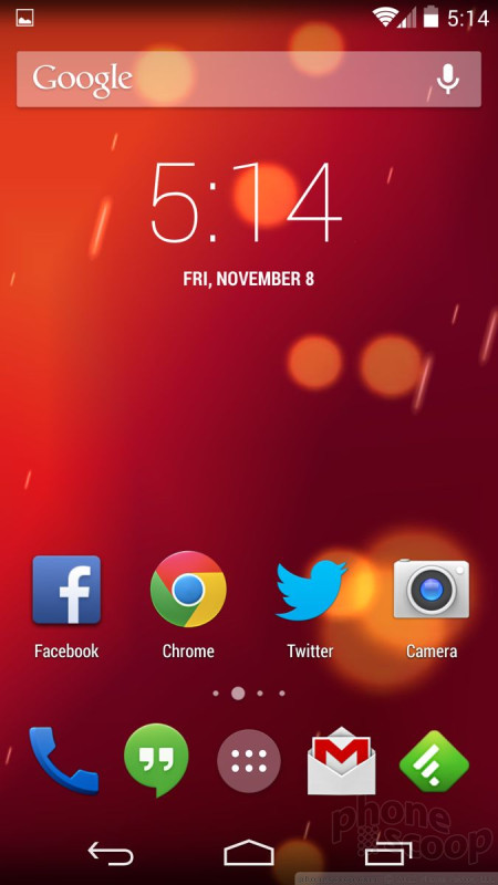
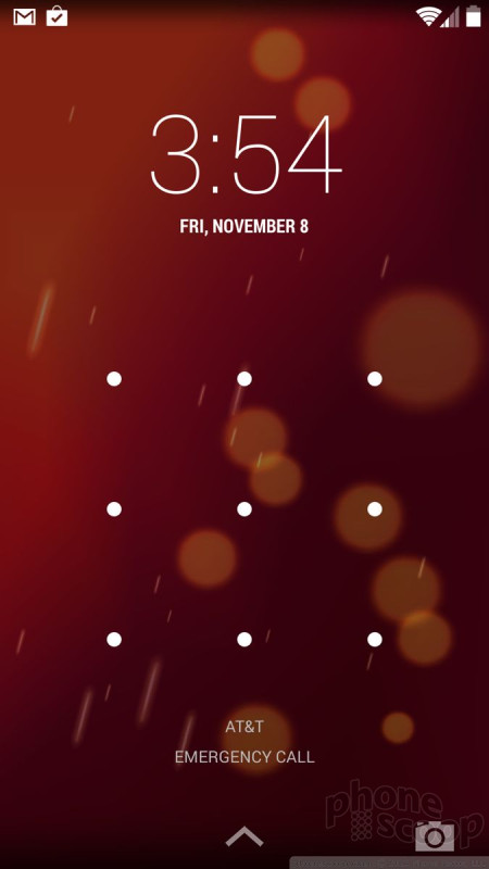
Lock Screen
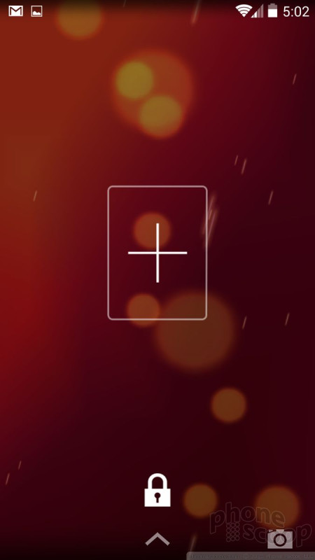
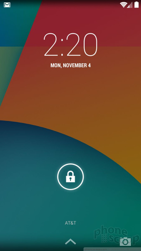
The lock screen can be fairly simple or somewhat complicated, depending on your preference. Out of the box, "Slide" is the default lock screen behavior. It consists of a lock icon floating close to the bottom of the screen. Press it and drag it anywhere to unlock the device. You can also choose to have no lock screen at all, or use an actual lock.
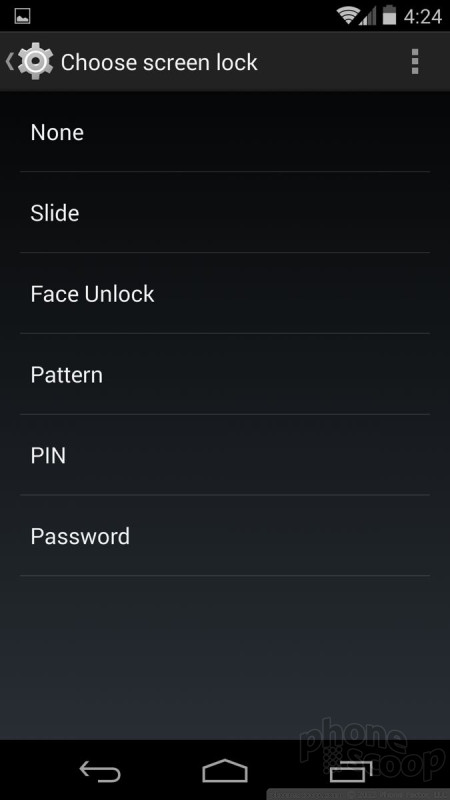
If you want to protect your Android 4.4 device (which I strongly recommend), you can choose from a handful of different unlocking methods. You have the choice of the simple pin (4 numbers), pattern unlock, password, and the face unlock. I prefer the pattern unlock myself. The face unlock tool rarely worked for me. Whichever you choose, Android 4.4 lets you select how long the phone will sit before it's locked, whether or not the power button will lock the device, and so on. If you choose to lock your device, you can access the camera and pull down the notification shade without entering the password, but that's it.
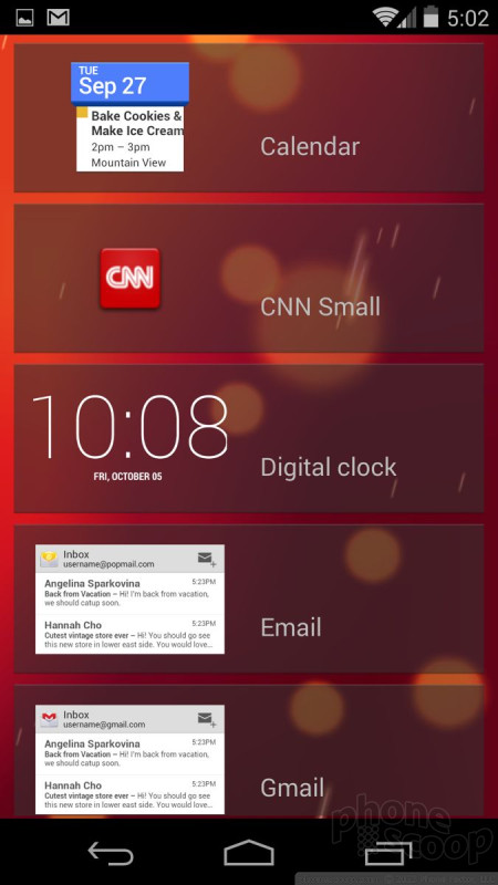
Then there are the lock screen widgets. These can be turned on or off at will. The lock screen widgets let you peek at certain apps without forcing you to unlock the device first. For example, the calendar, messaging, and email apps can be previewed on the lock screen thanks to these widgets. Only one widget fits on each screen and you swipe side-to-side to access them. The previews give you a glimpse of what's going on in your inboxes. For example, the widgets show the last 8 SMS messages I sent/received, as well as the most recent dozen or so emails. The previews let you see what's there, but not act on them. If you touch an unread email in the lock screen widget, you'll be forced to enter your password before being whisked into the Gmail app.
Personally, I find the lock screen widgets to be a waste of time. They take just as much work to view as it would to simply unlock your device and open the relevant apps directly. Further, you can see some of the same information in the notification shade. Last, they add really ugly bars to the lock screen.
The Android lock screen provides plenty of access to notifications and settings tools, but this is another area that is often customized heavily by phone makers. For example, many phones offer up to four lock screen shortcuts that take you directly to those applications.
Though they each have their differences, the stock Android and iOS lock screens are close to being on-par with one another, with Windows Phone perhaps lagging a bit. Odd that both Apple and now Google have a camera shortcut in the lower-right corner of the lock screen. It's cumbersome to use in KitKat, though, because you slide it sideways instead of up. At the end of the day, though, the lock screen is a pit stop on your way to home screen.
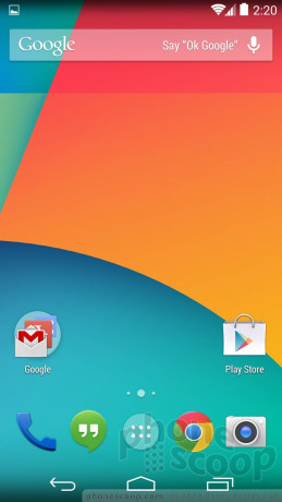
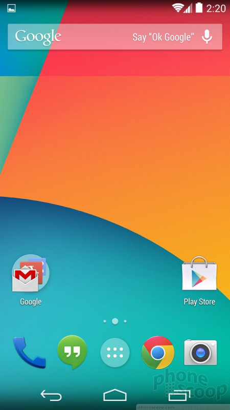
Home Screen/App Menu
Aside from a few subtle changes to the design, the Android 4.4 KitKat home screen panels look just as they do in Android 4.3, but they act somewhat differently.
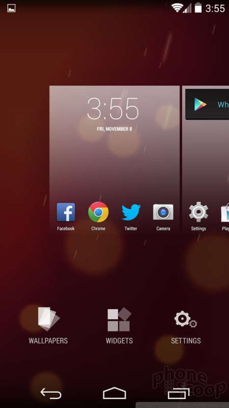
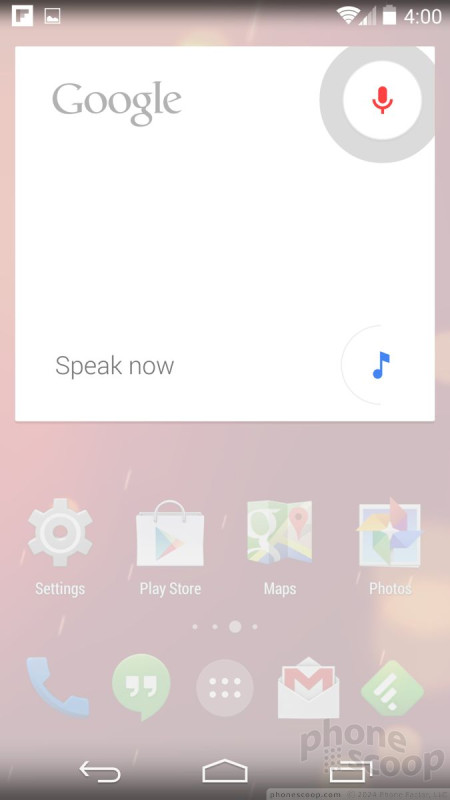
With the Nexus 5, there are three home screen panels running out of the box. One of them is reserved for a full-screen version of Google Now (more on that later). The other two are open for you to install any sort of content you might wish.
The dock at the bottom of the home screens, or "hotseat" as Google calls it, fits four apps and the app menu button. You can arrange the dock apps however you wish. You can press and hold any app from the app menu, drag it to the home screen, and drop it in the dock. You can create folders both in the dock and on the home screens that contain other apps. iOS also lets you create folders on the home screens, but Windows Phone uses Live Tiles for home screen customization.
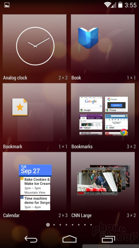
Android 4.4 changes the way you add new home screen panels and stuff them full of widgets. In earlier versions of Android, it was easy to add a home screen panel and put stuff on it if you wanted to. This same task takes a few more steps in KitKat. The first step requires you to press-and-hold on the home screen. (In Android 4.3, this would only allow you to change wallpapers.) The press-and-hold gesture now brings up a brand new user interface that includes small representations of your existing home screens, plus the tools to change the wallpaper or add widgets. Changing wallpapers is simple enough, as is adding widgets. It took me a while to figure out, though, that the only way to add a new home screen panel is to select a widget and drag it beyond the last home screen panel. It's completely unintuitive and I only discovered how to do it by accident. Some of the widgets are adjustable in size, and others are not. There are animations that let you know which is which as you move the widgets about and adjust them on your home screen panels.
The Android home screen panels offer a far higher degree of customization than is possible on devices running iOS and Windows Phone. iOS only lets you put apps on your home screens, and Windows Phone doesn't let you use folders. The ability to put apps, folders, and widgets pretty much anywhere on Android home screen panels - as well as add/delete home screen panels at will - lets users really make the device their own. This is one of Android's key strengths. Widgets are also a big differentiator. Though not everyone uses them, they come in all shapes, sizes, and varieties, and can be quite useful for gleaning information from your home screens or creating a living, breathing experience.
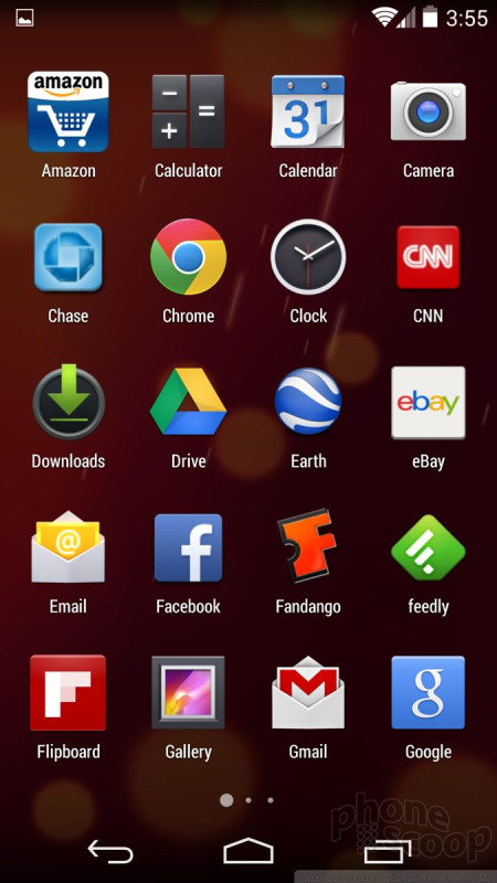
The main app menu has also changed a bit. First, the icons are all bigger. In native Android 4.3, the app menu fit five apps across in each row. In Android 4.4, the icons are so big that the app menu now only fits four apps across each row. This means there are fewer visible apps on a single screen. Google has deleted several tools in the app menu that some may miss. In Android 4.3, there was a tab at the top of the app menu that allowed you to view your apps or your widgets. In Android 4.4, you can no longer view widgets on this screen, you have to use the above-mentioned process from the home screen to access widgets. I dislike this change, but it does put all the home screen customization tools in one spot. Further, the app menu loses the little link to the Play Store (to add new apps.) This is disastrous. Clicking this little button took you straight to the Apps section of the Play Store. Now, you have to access apps through the Play Store, which takes at least two steps. There was no reason to get rid of this button other than to clean up the design. Last, you can't alter how the app menu grid is arranged. It can't be viewed as a list, or in a custom grid, or arranged in folders. The app menu is now just a simple, inflexible grid.
This seems an incredible backward step in my opinion. Why take functionality away? The good news is the main app menu is another aspect of Android that manufacturers like to tinker with. No doubt many companies will add these features back in their custom take on KitKat.
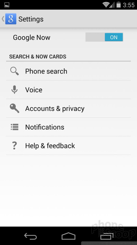
Settings
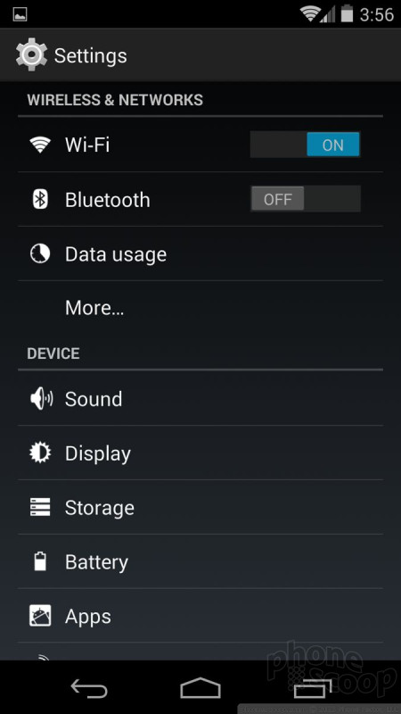
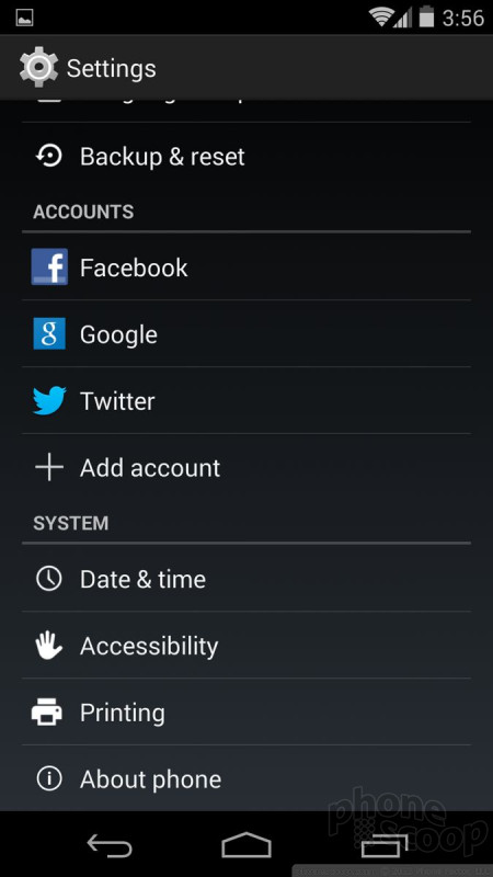
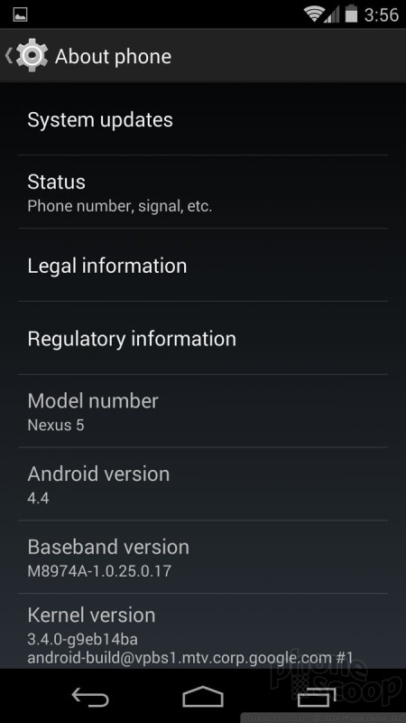
The settings menu is, thankfully, mostly carried over from earlier versions of Android. About the biggest change is the icon. The settings menu itself is a stark and bare affair. You've got white icons/text on a nearly black screen arranged in simple list form. Wireless and network controls (Wi-Fi, Bluetooth, data) are bunched at the top, followed by device controls (sound, display, storage, battery), personal controls (location, security), accounts (Facebook, Twitter, Google), and system controls (time/date, accessibility). It's pretty simple to figure out and thankfully there are no unwelcome surprises. The settings menu has remained essentially the same for several years now.
Some hardware makers, particularly LG and Samsung, like to customize the appearance of the settings menu a bit, but the stock experience is pretty barren. It all works well enough, and manufacturer customizations rarely improve usability.
Notifications
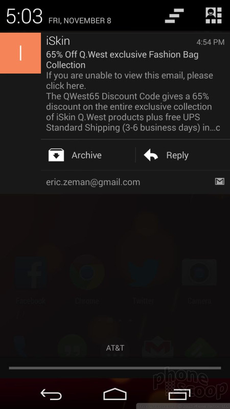
Notifications are another area where KitKat is nearly identical to older versions of Android. The notification shade can be pulled down from pretty much any screen. Just swipe down from the very top of the screen. Once down, the shade shows a fairly big clock and notifications from apps such as email, Twitter, Google+, etc. Many of the notifications can be acted upon or dismissed. I like that you can dismiss individual emails and/or messages and leave others alone. You can even choose to archive emails or reply to them directly from the notification shade.
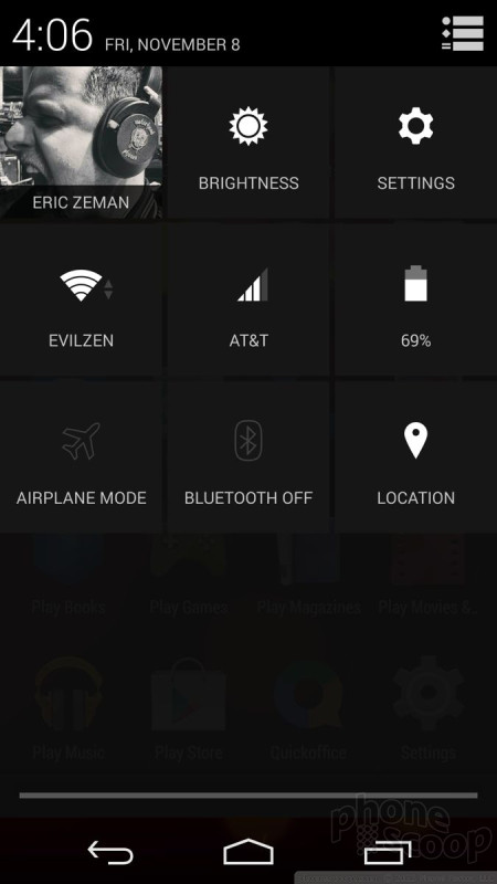
There's a little icon in the upper right corner of the notification shade that allows users to open some of the basic settings tools, such as toggles for the wireless radios, brightness, etc. These take some getting used so, as the actions aren't entirely intuitive. For example, let's say you have Wi-Fi on and want to turn it off. With the tool open, you can tap the Wi-Fi icon. This doesn't toggle the Wi-Fi radio off, however. Instead, it opens the Wi-Fi settings tool. In order to turn the Wi-Fi radio off from the notification shade, you have to long-press the icon. Thankfully, this is another element that phone makers like to adjust by adding more toggles and controls. (A power-user shortcut to this quick settings screen is to swipe down with two fingers instead of one.)
iOS used to be behind Android in the notifications department, but it has now surpassed it with iOS 7. I think the new iOS Notification Center and how it interacts with the iOS notification shade notification shade makes iOS's notifications a more customizable and better tool. That said, Android's notifications still offer plenty of bite, and vastly outclass those of Windows Phone.
Multitasking
Android is capable of multitasking, or fast-app-switching, if you will. There's a dedicated button at the bottom of the screen that brings up the multitasking menu. A press of the button opens a vertical carousel of other apps that have been used recently. If you see the app you want to jump to, tap it. Apps exist in a semi-suspended state and are as they were when you last used them. That means if you were in the middle of typing an email, it'll still be there when you jump back to the email app. Android KitKit can keep several dozen apps running in the background. If you want to close an app, simply swipe it away from the multitasking screen.
Some hardware makers like to substitute their own interface for multitasking, such as a grid instead of a list. iOS and Windows Phone offer similar multitasking tools. The three platforms are on even footing as far as fast-app-switching is concerned. However, multitasking is an area that Android hardware makers have been able to exploit to excellent use. Devices such as the Galaxy Note 2, Note 3, or LG G2 have incredible extended multitasking powers that allow two apps to run side-by-side at the same time. That's possible due to the flexibility of the Android platform. iOS and Windows Phone can't run two apps side-by-side.
Performance
One of the main thrusts of Google's work on Android 4.4 was to make the operating system more nimble. It streamlined the underlying code so that Android can run on simpler, less sophisticated hardware. According to Google, all of the features of Android 4.4 will be available on devices with as little as 512MB of RAM. In other words, Google optimized Android for entry-level phones so that it can sell even more low-cost devices around the world.
We tested Android 4.4 KitKat on a Nexus 5. The operating system hasn't been made available yet to other devices, such as the Nexus 4 or the Google Play Edition HTC One/GS4. The Nexus 5 has a quad-core Snapdragon 800 processor under the hood — one of the best available — and it didn't blink. Every app opened quickly, screen transitions were fluid, and the Nexus 5 had no trouble running games, playing video, or surfing the web and listening to music.
That said, Android 4.4 isn't perfect. It's not as buggy as iOS 7 was at launch, but we noticed a fair number of weird app crashes. Surely the bugs will be ironed out long before Android 4.4 is installed on most devices.
Apps
Google shied away from redesigning every app in Android, but it did make changes here and there to how some of them behave. Here's what's new/different compared to earlier versions of Android.
Camera
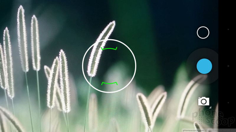
The camera application is largely carried over from Android 4.3, and that's a shame. The stock Android camera software is some of the weakest there is. The user interface is barren and unintuitive, and is seriously lacking in customization and tools. Fortunately - if history is any indication - the vast majority of phone makers will replace Google's camera app with something better.
The basic shooting tools allow you to select a focus point and then press the shutter button.
The camera has four basic shooting modes, which are normal, video, panorama, and PhotoSphere. The first three are self-explanatory. PhotoSphere lets you create 360-degree images. It works well, but takes time to master.
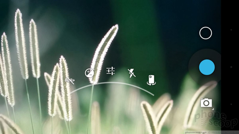
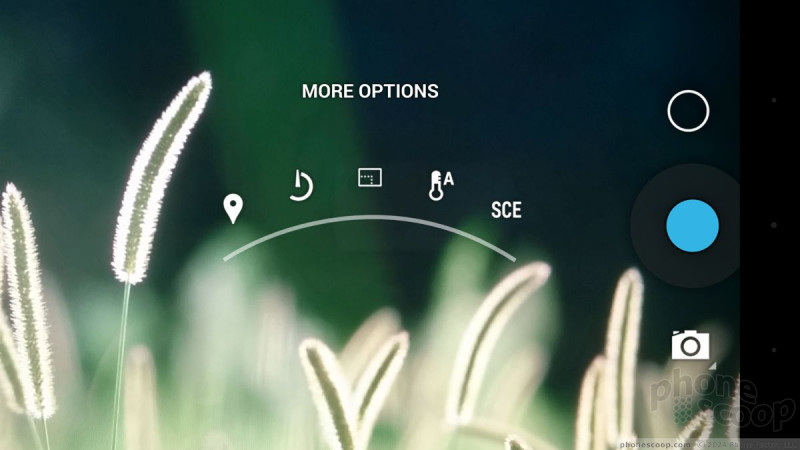
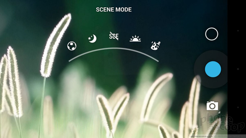
The settings and fine controls are accessed via a clumsy set of semicircles that appear in the viewfinder if you swipe your finger up. Thankfully, you can access the exposure, the flash, front camera, and HDR settings fairly quickly. Anything beyond that requires mroe delicate fingerwork on the screen.
Most of the options are simple on/off-style toggles. If you dive in far enough, you'll find that you can toggle location on/off, set a timer, control picture size, set white balance, or choose a scene. The scenes are sports, night, auto, sunlight, and indoor/party. There are no advanced modes, such as using the front/rear cameras at the same time, or even burst mode.
The iOS camera is slightly more intuitive to use and is definitely faster at shooting. The basic Windows Phone camera is also faster. The stock Android camera is just not up to par, but again, thankfully, Android OEMs work hard to improve the camera on their own devices. I just wish Google and its team put more effort into make the stock camera a decent piece of software.

Chrome
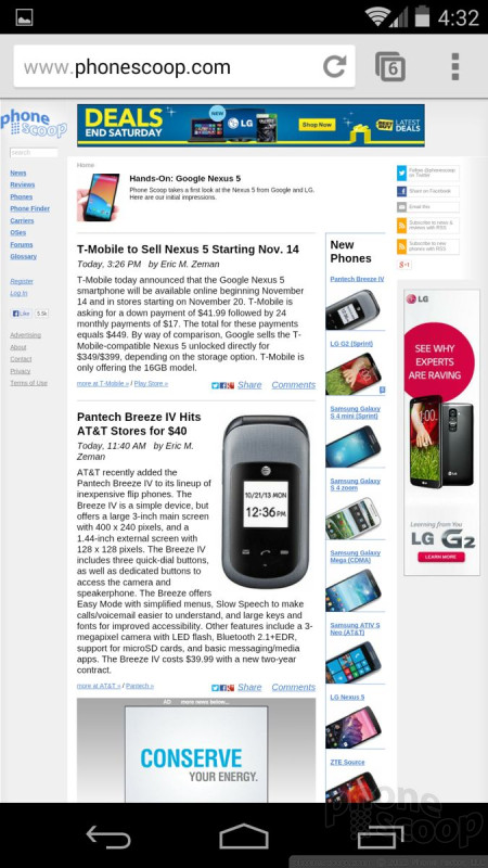
Chrome has become the default browser of most Android phones over the course of the last year. It shares many features with its desktop cousin and of course Google's Chrome-based operating system. The version in KitKat is the same that's available to any Android 4.0+ phone right now.
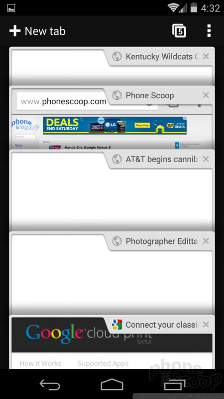
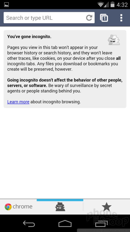
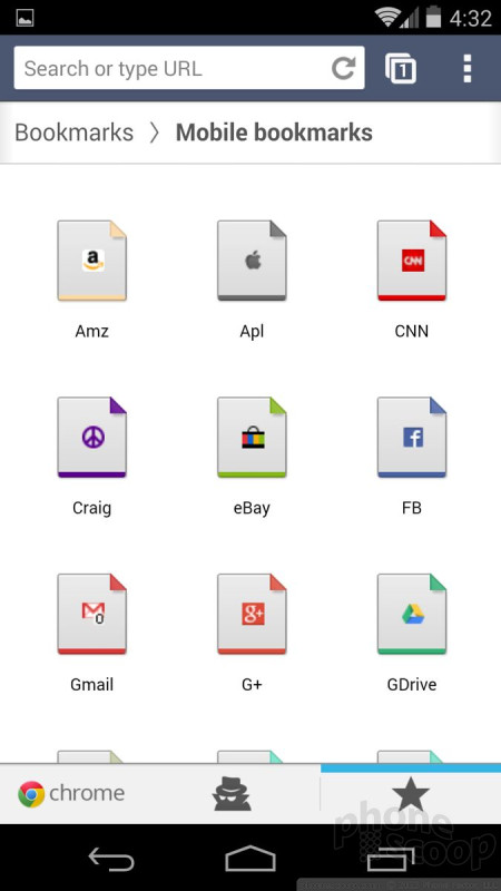
The browser is excellent at rendering web sites. I like the tools for managing bookmarks and syncing with the desktop version. The browser can handle multiple open tabs at a time, offers private tabs (not tracked), and can be used to share web content through social networks, email, messaging, and so on. It's on even ground with Apple's Safari browser in terms of features, and is much more powerful than IE10 on Windows Phone. However, it's pretty darned slow. Even on the Nexus 5, with a Snapdragon 800 processor on Wi-Fi, Safari in iOS 7 kicks Chrome's tail when it comes to loading web sites quickly.
Google updates Chrome frequently, so features are functionality are likely to evolve quickly over time.
Google Now
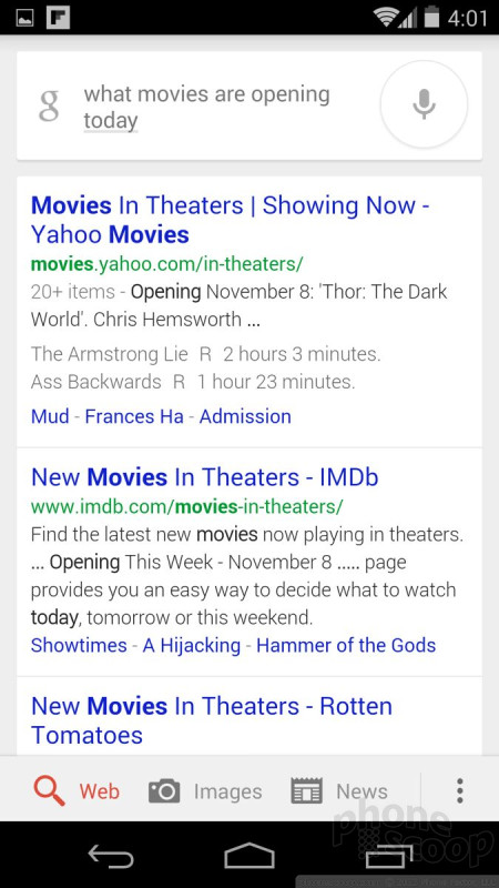
Google Search and Google Now both receive big promotions in Android 4.4 KitKat. The Google Search bar is present in more places, and more responsive to voice commands. For example, simply say "OK Google" whenever the search bar is visible, and it will open Google Now and begin listening for voice commands. The biggest improvement to Google Search is its ability to parse local content on the device itself. In other words, it can search for that text message you just can't find, or a specific song in your playlist where before it was limited to searching the web. This is a big help, especially for the serially unorganized..
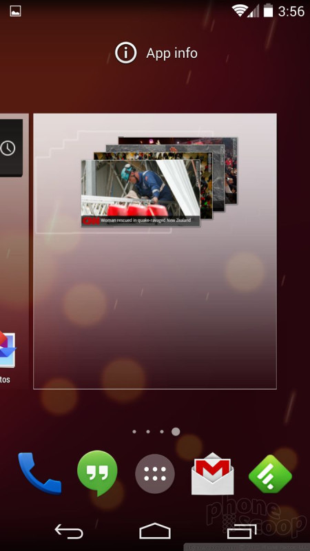
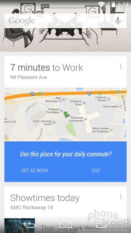
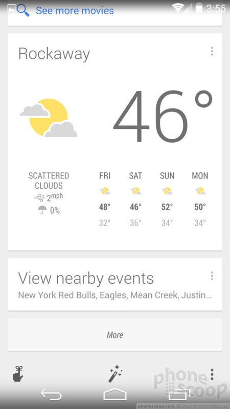
As noted earlier, Google Now receives the home screen treatment and runs continually rather than just when called upon. It has its own home screen panel when you swipe left, much like HTC's BlinkFeed or the search screen in older versions of iOS. It can be customized with the type of content you want/need to see. For example, it can be set to show the local weather, offer driving suggestions during rush hour, reminders for So-And-So's birthday party, your favorite team's sports scores, and so on. Some of my favorite features are things such as automatically generated boarding passes for when I fly. They just show up. As long as you take the time to set up your preferred content, Google Now can be incredibly helpful.
In my experience, Google's ability to listen to spoken commands and accurately translate them into text and then act on them is far superior to Apple's Siri. It's faster and correct more often. Google Now can also interact with more parts of the operating system than Siri. This means you can issue more commands and enjoy a higher success rate.
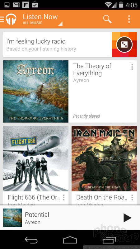
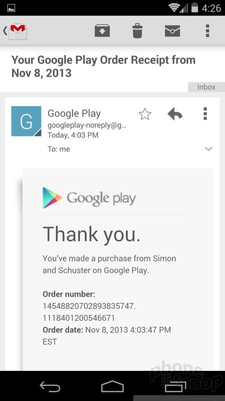
Google Play
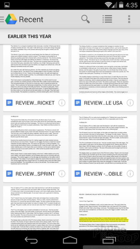
The Google Play Store is Google's version of Apple's iTunes and the App Store in one. The app itself is primed to be refreshed soon, but the version shipping with Android 4.4. KitKat on the Nexus 5 is the same that's been available for most of 2013. The Play Store is where you buy games, apps, music, movies, TV shows, books, and magazines. Some content can be rented. Each type of content has its own store-within-a-store that's easy to browse through or search for what you want. That said, Google's selection (especially of movies/music) is not as good as iTunes. In fact, it's not as good (yet) as Amazon.com's own content selections, though I'd say it is on par with what's available to Windows Phones.
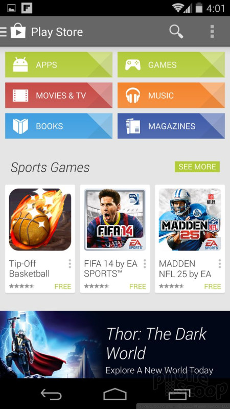

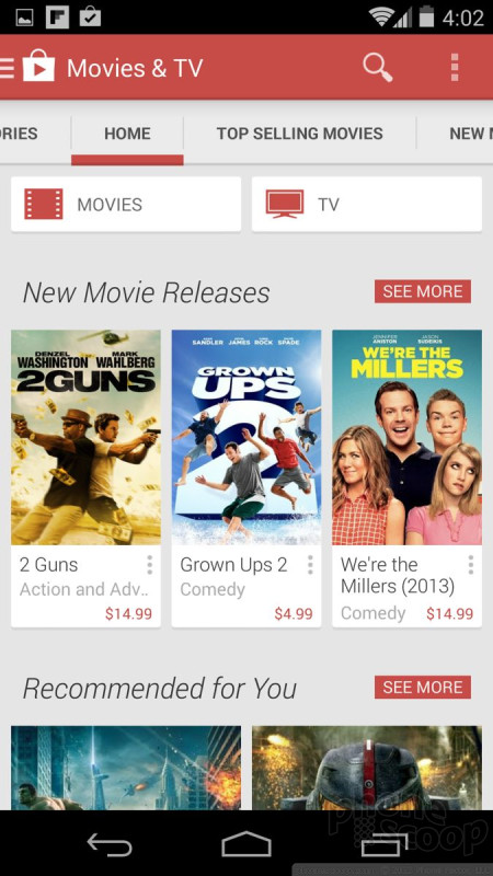
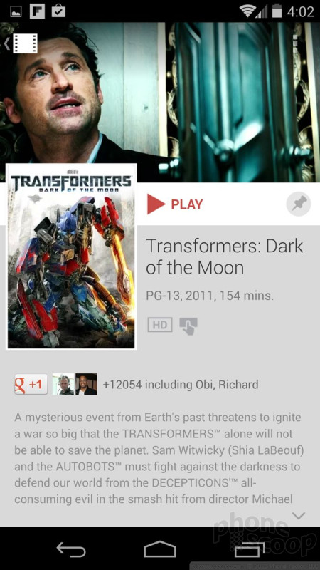
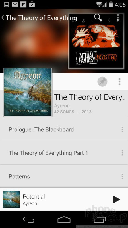
Each type of content you might purchase has its own app. Use the Play Music app to listen to tunes, use the Play Books app to read books, use the Play Movies app to watch movies, etc. All these individual apps use a similar user interface that is easy to figure out. Once you use one, you've used them all.
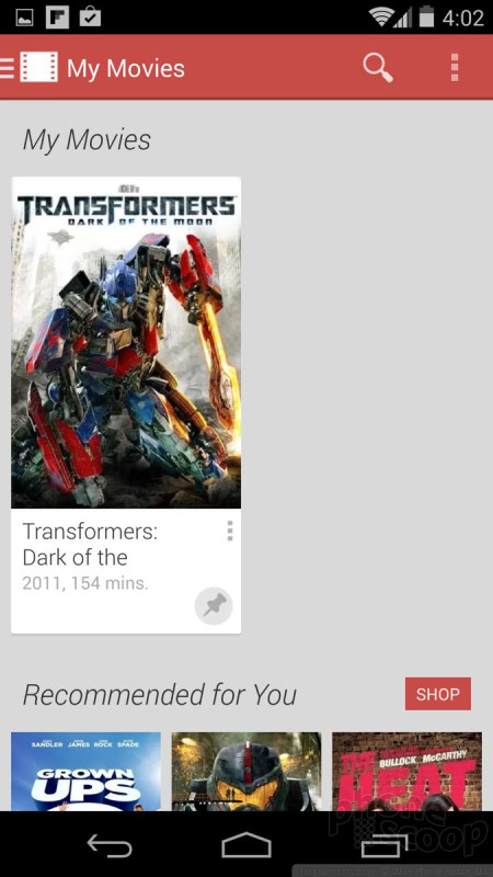
One thing that I find frustrating (but Google touts as a "feature") is that everything is stored in the cloud. In contrast, if I buy a movie from iTunes, I can download it and store in on my machine(s), back it up, etc. The same is not true of movies purchased from Google. You can download the movie to your devices for offline playback, but you can't necessarily keep a file anywhere safe on your computer. Music you've purchased from the Google Play Store needs to be downloaded over the network to be stored locally for offline playback. This is painful and I hate it. Further, the Play Music app won't see your own side-loaded content, only stuff you've pulled down from the Play Store. The same is true for movies and the Play Movies app; it only sees purchased content or movies captured by the device itself.
These frustrations aside, the Play Store and its associated content apps offer plenty of material for your consumption.

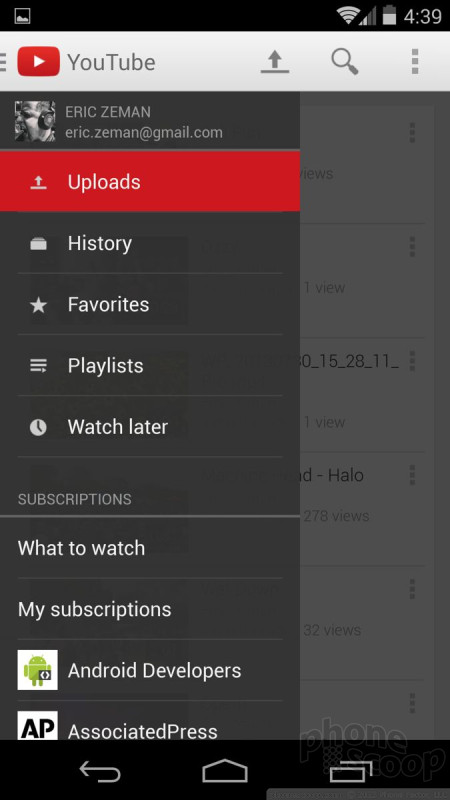
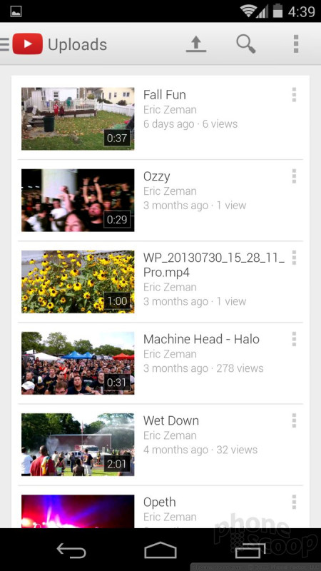
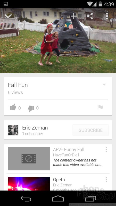
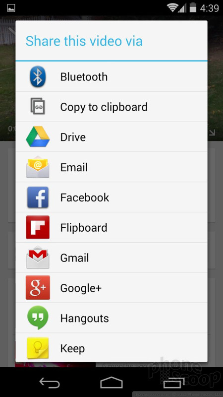
YouTube is its own animal. Like Facebook, Twitter, and Google+, YouTube is deeply entwined with the operating system. You can upload videos to YouTube, as well as manage your account and subscriptions. Sharing from YouTube to other social networks or services isn't too much trouble, and the app offers all sorts of playback options. For YouTube aficionados, the native Android app is the best there is.
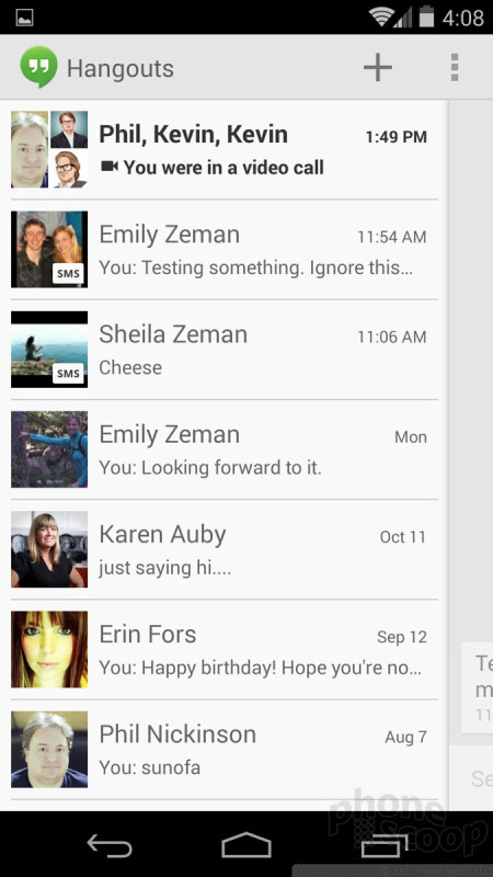
Hangouts/Gmail
Android 4.4 KitKat is as powerful a messaging platform as any other smartphone operating system. It makes some key changes that will impact users.
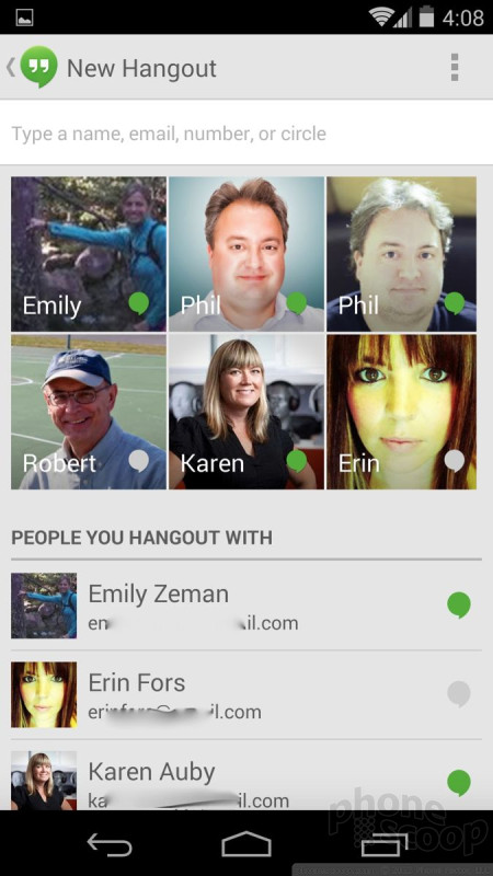
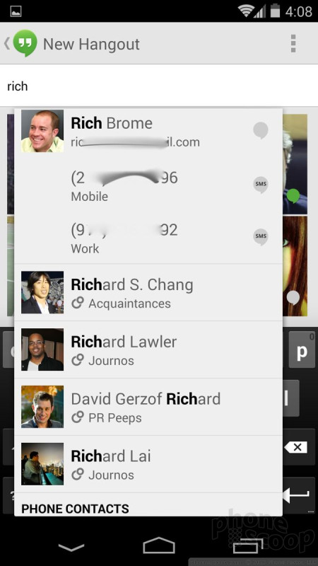
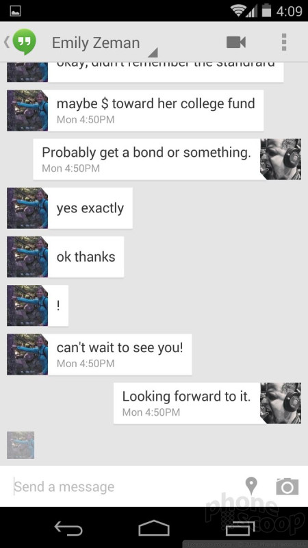
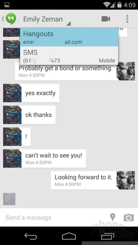
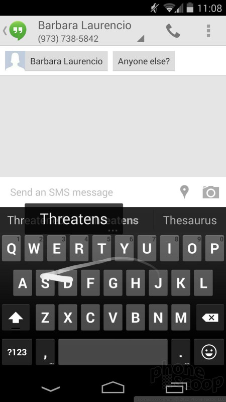
In KitKat, the old SMS/text messaging application is gone. Instead, Google's Hangouts instant messaging application has graduated to include SMS, MMS, and IM in one place. It's a bit of a mess.
All conversations are stored in threads, but the threads are separated by their messaging type. That means you'll often have two threads for the same contact. For example, my sister uses Hangouts on purpose instead of SMS to save money on her monthly plan. With the new Hangouts with SMS, I have two threads for my sister: one for IM conversations and another one for actual SMS conversations. Multiply this by several dozen contacts and you can see how it might get frustrating quickly. "I swear she told me 5 PM for dinner. See, here it is in this thread. Oh wait, she changed it over in the other thread. Argh!"
Hangouts does provide a little "SMS" icon on conversations that are taking place via text and not IM so you know which are which, but it's still annoying. Further, when you want to start a new conversation, the tool to choose to send a text message versus an IM could be much easier to figure out. When you're inside any given conversation, there's a drop-down menu at the top that indicates whether you're looking at SMS or IM. It lets you switch to the other thread if you want to. All that said, the app still supports picture/video messages and stores them all inline. You can see who's online and who's not (for IM convos), as well as easily archive conversations and recall them later if need be.
One thing worth pointing out: Android 4.4 makes it easier to choose a different default SMS application. This was technically possible before, but a hassle to set up and wasn't always seamless. So if you don't like using Hangouts for SMS, you don't have to. I suspect some device makers will ship their phones with their own SMS apps set as the default.
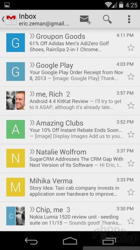
Gmail itself is essentially carried over from earlier versions of Android. I don't see any new features in KitKat. For power Google/Gmail users, Gmail on Android devices is the best way to use Google's email service. It is simply unparalleled in terms of continuity with Google's online version. Gmail accounts can be synced to iPhones and Windows Phones, but it doesn't work nearly as well, nor offer as many features.
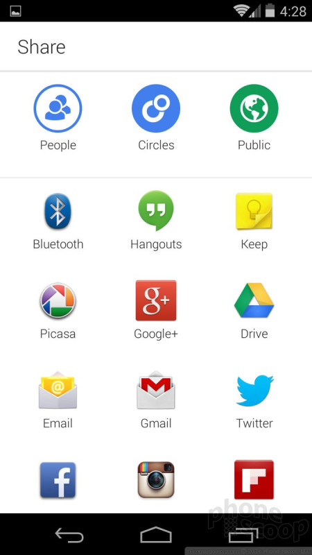
KitKat also includes built-in support for Facebook, Google+, and Twitter. Once you've signed into these accounts, you can share to/access them from nearly every other application. Android has done a really good job of integrating social networking into the OS, though iOS and Windows Phone aren't too far behind.
Keyboard
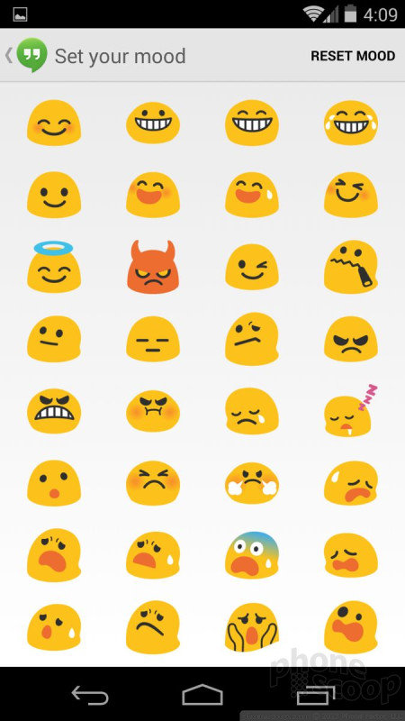
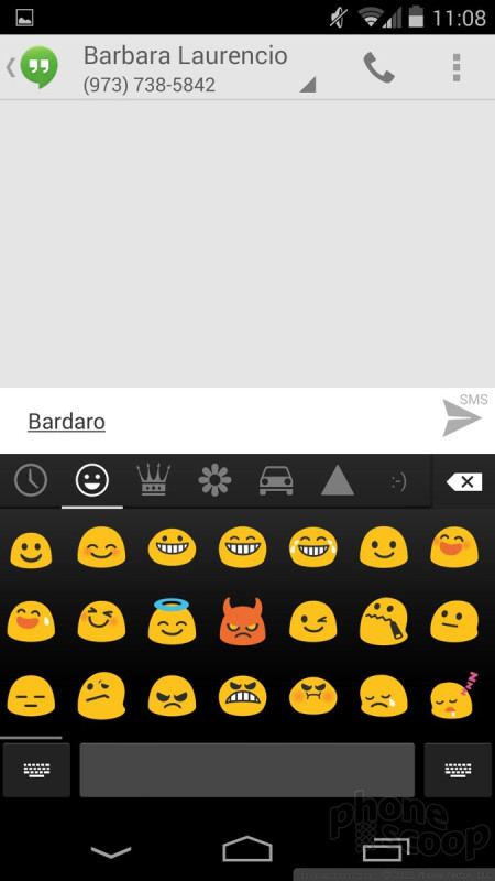
The keyboard has been revised ever-so-slightly in KitKat. For starters, the blue trail that used to follow your finger when you swiped from one key to the next is no longer blue. It's now more of an off white color. The real big change is new access to emoji. Though it takes two steps to reach, you can now stuff the same emoji that Google offers in its Google+, Google Hangouts, etc., in your emails, SMS, and other text. It also has a neat new gesture that lets you add spaces in text by dipping down to the space bar when you're tracing a trail across the screen. This means you can type without ever lifting your thumb from the glass. Neat.
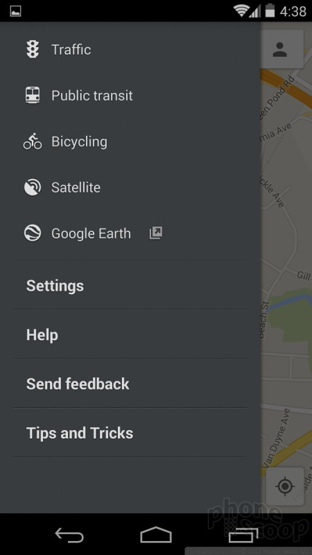
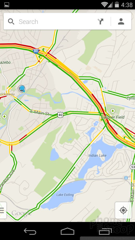
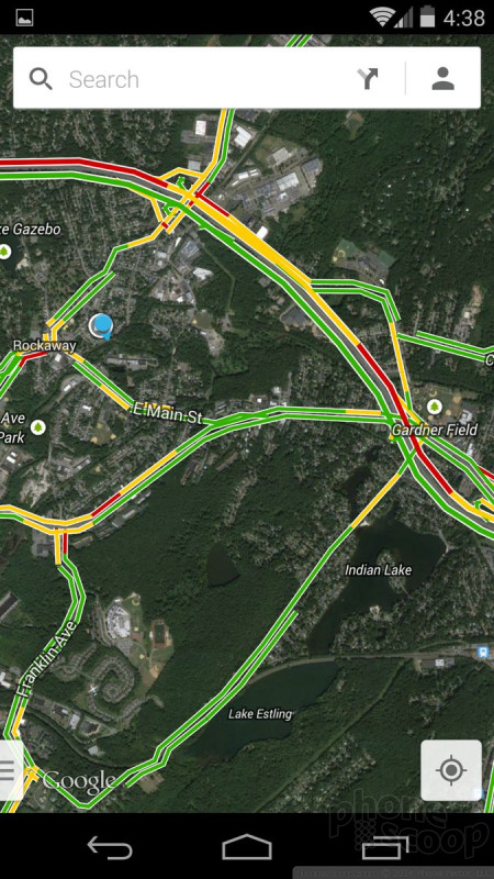
Maps
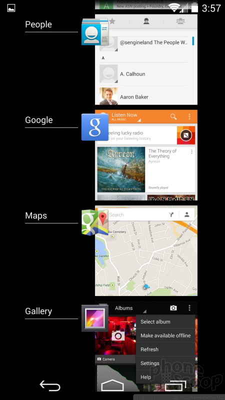
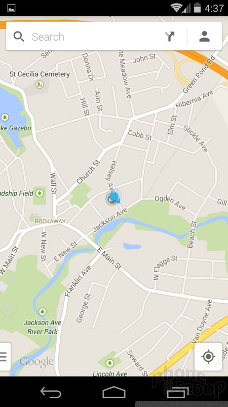
Google Maps is another app that Google updates consistently outside of full system updates. That means the version that came with KitKat on the Nexus 5 is the same as what's available from the Google Play Store today.
Google Maps' best feature is how well it works with Google Now to provide real-time alerts when you're on the road. For example, Google sees that you're at work and are ready to drive home at the end of the day. If there's an accident on your normal route home, Maps/Now will alert you about the problem and automatically reroute you. In fact, Maps/Now may even tip you off early, so even if you do get stuck in the traffic you won't be (that) late.
Google Maps is on even footing with Nokia HERE Maps on Windows Phone devices, but it is much better than Apple Maps on iOS devices. The advantage Google has over HERE Maps is that it offers all the tools in a single app, rather than spread across several apps (HERE Maps, HERE Driving, HERE Transit, etc.).
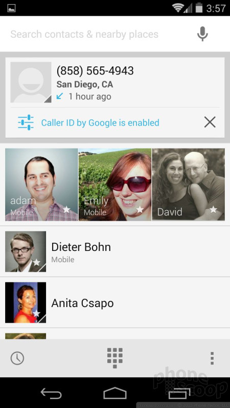
Phone/Contacts
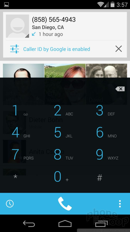
The phone dialer has been revised, and takes some getting used to.
In Android 4.3, when you opened the phone app, it defaulted to the actual dialer. There were tabs across the top to access call history and contacts. That's all changed. In Android 4.4, the phone app is busy and not entirely intuitive.
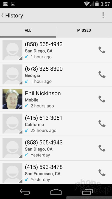
The biggest element at the top of the screen is the most recent call, highlighted complete with caller ID, thumbnail, timestamp, etc. Google prioritizes the most recent incoming/missed call. It pulls up a lot of details, if it can, including date, time, name, and even address. If it is someone from your contacts, you'll see all their details in this highlighted call log.
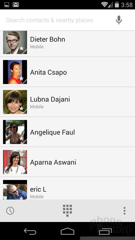
Below this single-entry call log, you'll see your Favorites, if you've set them up. For some reason, there are three big thumbnails for the first three, followed by a list of the rest. In addition to Favorites, this screen also adds frequently called/contacted people. Over time, those who you call the most will always be the first options you see when you open the phone app. If you want to sort through your entire contact database, you have to scroll and scroll and scroll downward.
At the bottom of this new phone home screen, there are buttons to access call history, the actual number pad, and call settings. At the very top, there's a search bar. If you have more than 100 contacts, just use the search bar at the top of the screen to find people. Better yet, just hit the microphone in the search bar and ask it to call your Mom. (Oddly, if you're on the home screen, you can use the "OK Google" prompt to have the phone call your Mom. Why you have to press the microphone first when in the phone app is curios.)
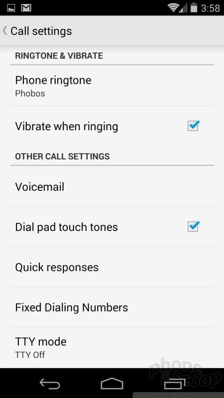

The phone app offers the expected set of tools once you've actually decided to make a phone call. You can send calls to the speakerphone, to Bluetooth headsets, add a third line, as well as access your messages and that person's contact details. The more advanced settings allow you to set auto-response messages, call forwarding, and so on.
I think the phone apps in iOS and Windows Phone are much easier to use. Though I understand what Google is trying to accomplish here, I think it took a step backwards as far as usability is concerned. However, again, it is worth noting that phone makers like to customize the phone app, so don't be surprised if the phone dialer functions differently on non-Nexus hardware than described here.
As far as the People (contacts) app is concerned, there are minor changes that don't really impact usability. For example, the colors have changed. Contact profile thumbnails have been moved from the right side of the screen to the left side of the screen. When you tap on a contact's thumbnail photo, a pop-up box gives you buttons to call, text, email, or favorite that person. The actual contact cards themselves are unchanged.
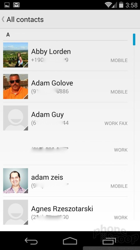
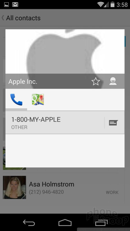
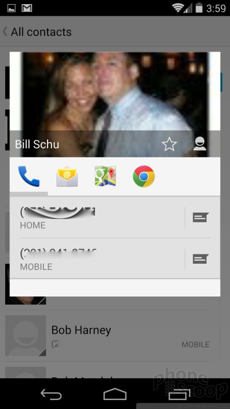
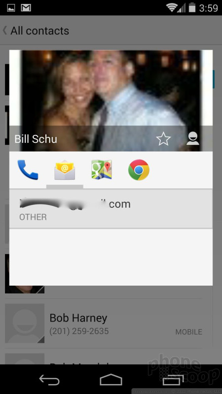
I like how contacts behave in Android 4.4 much more so than in iOS. Tools such as the pop-up boxes really help speed up reaching out to people. Further, Android lets you peg individual contacts or groups of contacts to the home screen as shortcut widgets. These can be great tools. Windows Phone's People Hub is an entirely different — and much more interactive — way to manage your contacts. Of the three systems, I prefer Windows Phone for the depth, but Android is a close second thanks to functionality.
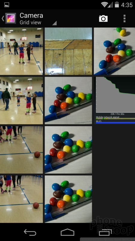
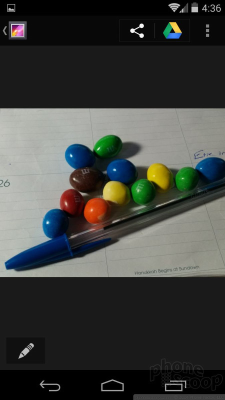
Photo Gallery
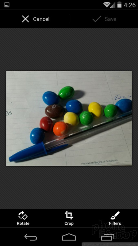
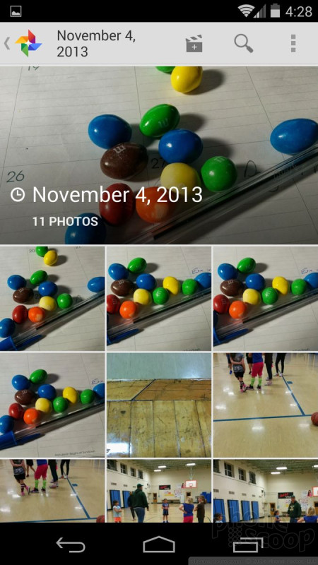
The main gallery application is a direct carry-over from Android 4.3. In a screen-by-screen comparison, I didn't see any differences between the gallery app in Jelly Bean versus KitKat. There is, however, a new Google+ Photos app called simply Photos.
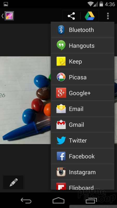
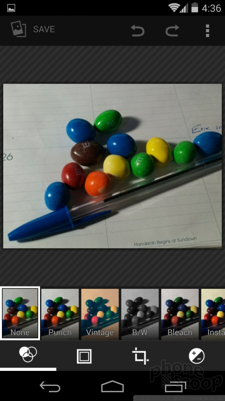
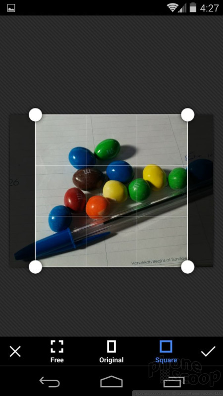
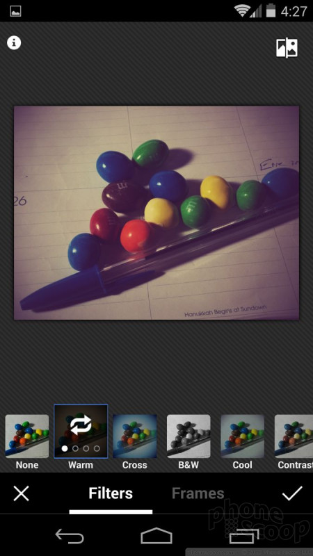
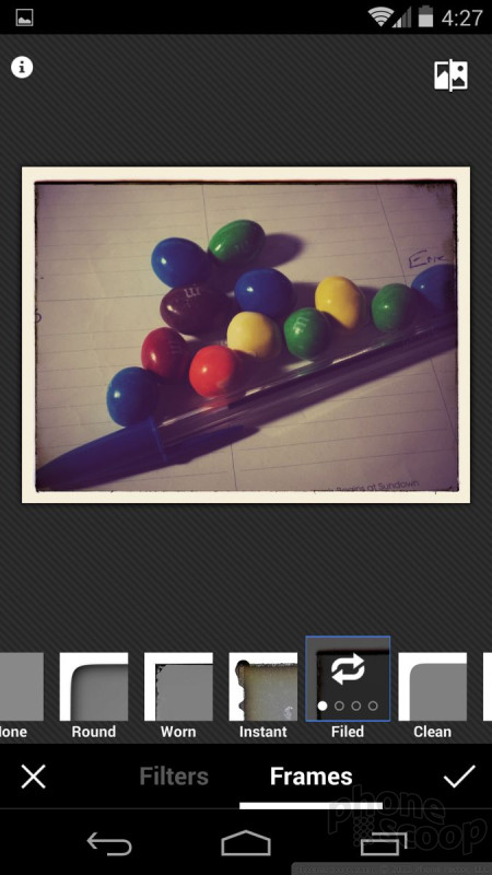
The Photos app augments Google+ (technically, it is Google+'s photo feature, just pulled out on its own) and allows you to better manage your photos both locally on the device and online in Google+. First, the Photos app has its own editing tools that is different from the gallery. Images can be rotated, cropped, and altered with filters. The cropping tools include a frame and a square option if you want to give photos an Instagram-like effect without actually using Instagram. There's also the "Auto Awesome" feature, which automatically touches up and improves photos. If you've taken a bunch of photos all at the same time/location, the Auto Awesome tool will also create animated scenes by pasting the photos together. (They're sort of like a GIF, but not.) The editing tool also permits you to share photos with other social networks, via email/SMS, as well as stored on Google Drive.
I like that the app separates what's on the device from what you've already uploaded to Google+. If you want to look at some of your older, online photos, it's a breeze to scroll through them and even make alterations to them that are synced to the online version.


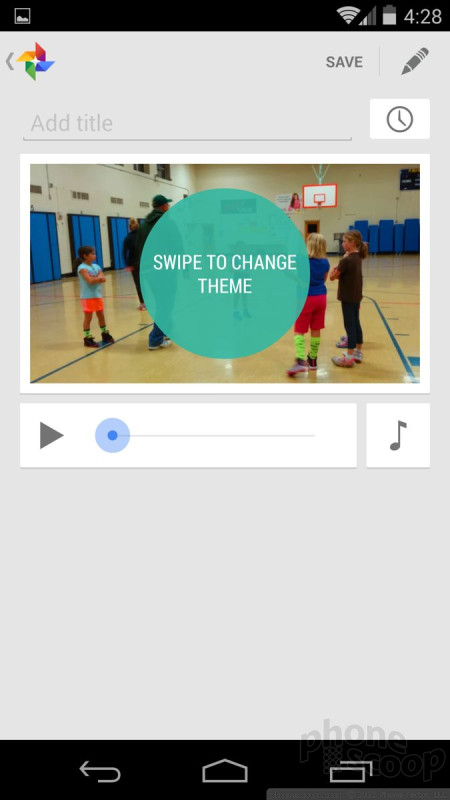
Last, the Photos app lets you combine media (photos and videos) to create a multimedia presentation of sorts. It is rather limited and doesn't go nearly as far as iMovie does on iOS devices, but it's a serviceable video creator.
Google is targeting Windows Phone's Photo Hub with its Photos app and Google+ integration. Google is approaching it from a different direction, but the idea is the same: Get people to share photos online as easily and often as possible. iOS made some big changes to its gallery app in iOS 7 and it is much better than before. Google's tools are a bit better connected, though.
Utilities
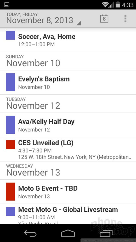
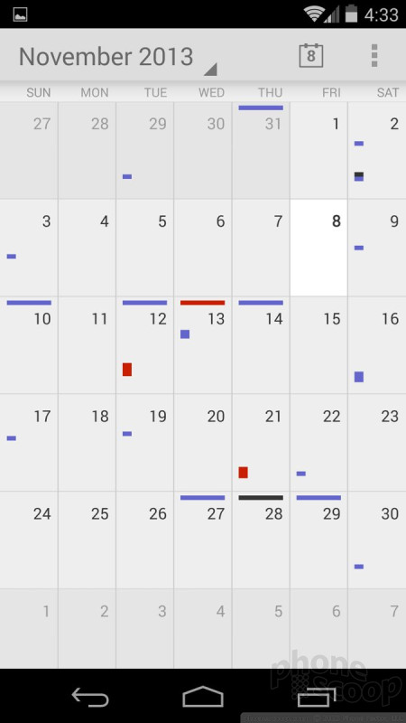
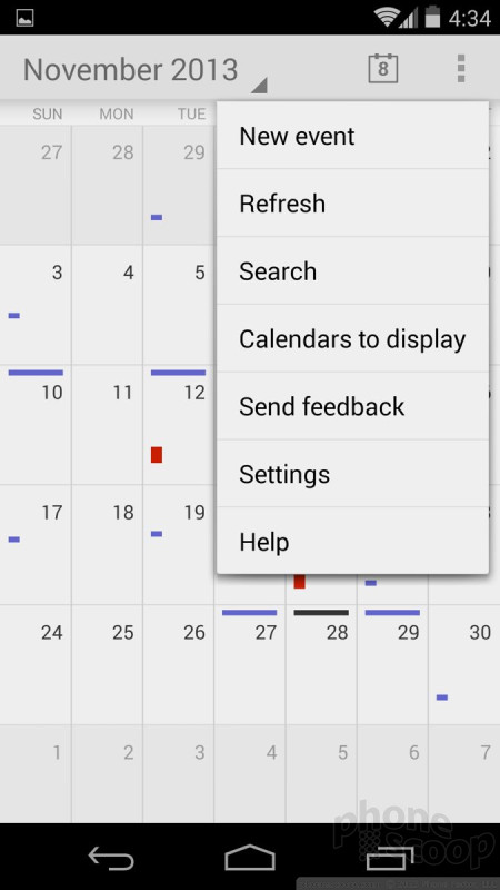
There are a handful of productivity tools that come with Android 4.4 KitKat. The calendar application, for example, works well if you're a Google Calendar user. It syncs everything quite nicely and plays perfectly with the desktop calendar client.
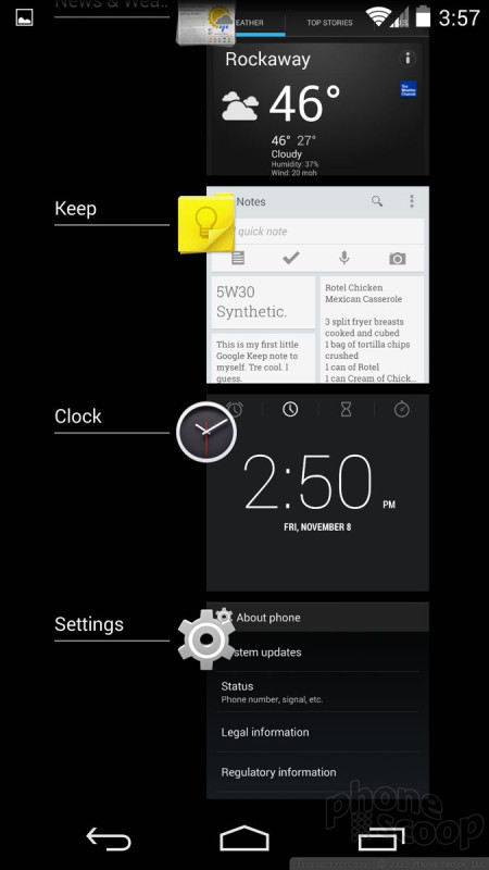
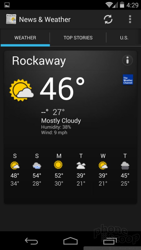
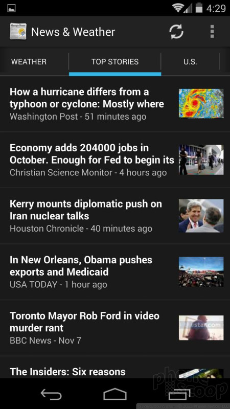
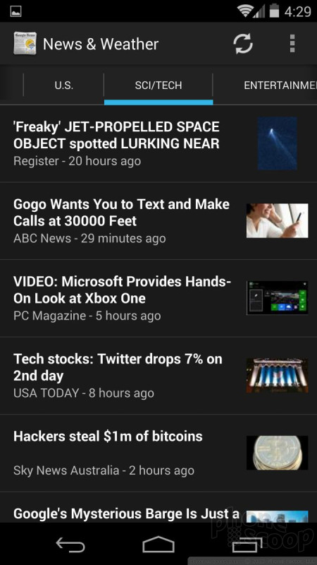
There's a basic News & Weather app that most people probably ignore, but can still be useful. Open it up, and you'll see the current, local weather conditions, as well as the forecast for the next six days. The app also offers top headlines, which are culled from various news sources around the web. You can customize the headlines to a certain degree, and pick from sports, entertainment, world, U.S., health, and business. The News & Weather app has its own widget if you want to access this info from the home screen.
Google Keep is on board and can be used to store notes, info, and other bits of random information. It is sort of like Microsoft's OneNote or Evernote, but it doesn't offer nearly as much functionality as those apps. Basically, it syncs text, links, voice memos, and photos with your Google Drive account, but corrals them into a separate spot for easier finding.
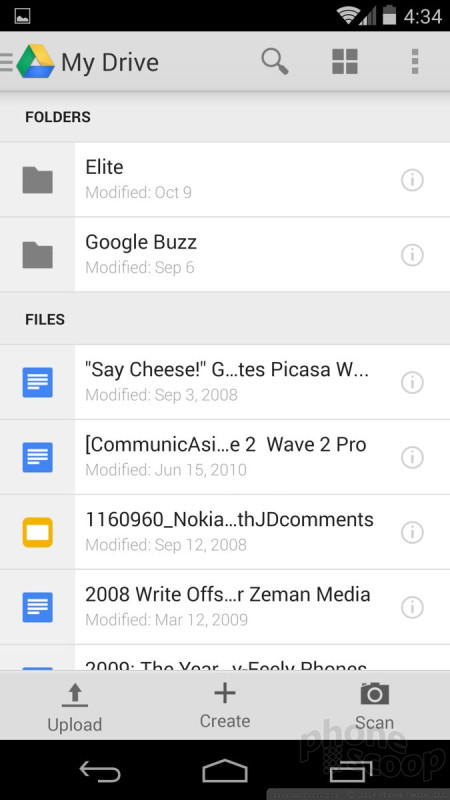
Speaking of Google Drive, it is baked into more aspects of the operating system. You can save just about any type of content (photos, video, notes, files, etc.) to your Google Drive. Drive also lets you be productive on Android devices, as it includes its own cloud-based documents, spreadsheets, and presentations apps. The smartphone-sized versions of these apps are not the easiest to manipulate, but it can be done. Google Drive can be a great tool for collaboration, as sharing documents/files with others is never more than an emailed link away. There's some weird stuff going on, though. KitKat includes QuickOffice, which Google bought early this year. Before Google bought it, QuickOffice allowed non-Microsoft devices to open/access Microsoft Office Documents. The same is now true. It offers very, very basic editing functions for Word, Excel, and PowerPoint files. What's weird is, you can use QuickOffice to create a Word document and then save it to Google Drive, if you want. You can't, however, use QuickOffice to open/edit a regular Google Doc. If you happen to have a Word document stored in your Google Drive, you can open that in QuickOffice. The two apps/services don't necessarily play well together (yet).
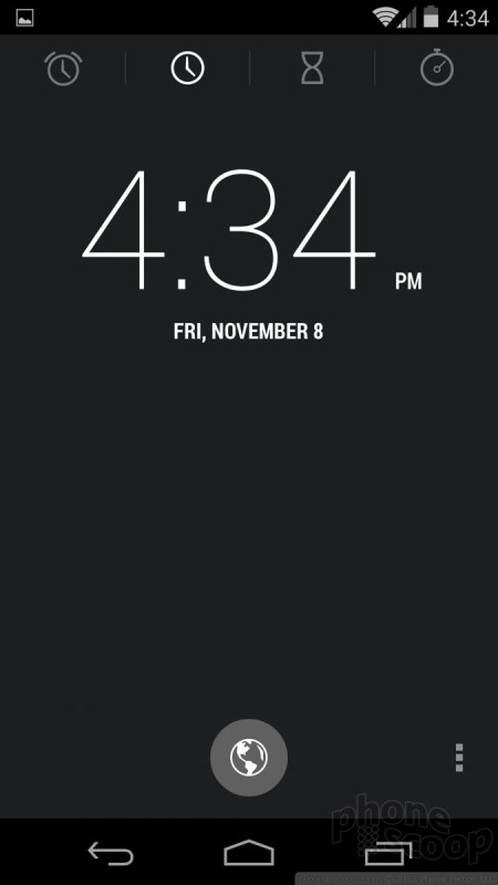
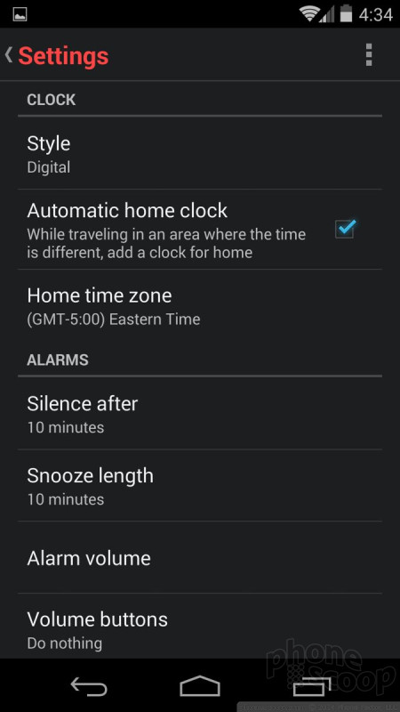
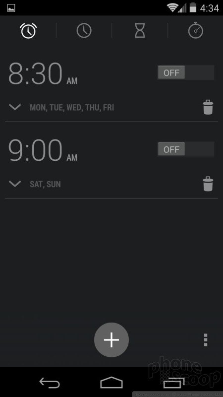
The clock application, which also manages alarms and times, is as bare and spartan as it gets. The app itself is a direct carry-over from Android 4.3. It offer simple white numbers on a black background. It includes a world clock, as well as a timer and stopwatch. It also has a night mode that puts the clock on the screen as a floating wallpaper for those who use their smartphones to tell time at night. It isn't much fun to use, but it is functional and I suppose that is what matters.
Under-the-Hood
Most of Android 4.4 KitKat's best features are ones that most users will never see. The latest OS from Google is a gold mine for developers, who have an amazing amount of control over their apps and how those apps will interact with the operating system. Here's a brief taste.
Step Detector/Counter: The OS now includes native support for a new combo sensor that detects steps and counts steps. step detector and a step counter. This means developers of health and fitness-type apps will be able to take advantage of these tools to improve the performance of their apps. Think better battery life.
Printing: People will be able to use Android 4.4 KitKat to print to more cloud-based printers thanks to new developer APIs. Users will be able to discover available printers, change paper sizes, choose specific pages to print, and print almost any kind of document, image, or file to internet-connected printers.
Immersive Mode: Google has made it possible for app developers to use every pixel on the phone's display. Developers will be able to create apps that do away with control strips or buttons and use the full screen. The buttons and controls can be called back when needed, leaving the user to experience a seamless, full-screen app. The UI can be accessed through an edge-to-edge swipe.
Accessibility: Android 4.4 offers system-wide support for Closed Captions for video playback. Users will be able to choose whether to show captions and what language, text size, and text style to use.
Connectivity: KitKat comes with native support for IR ports. This makes it easier for phone makers to include hardware for remote control apps that interact with home theater gear. KitKat also builds in support for more Bluetooth profiles, such as Bluetooth MAP and Bluetooth GATT.
Wrap-Up
Android 4.4 KitKat is a capable operating system that doesn't offer a lot of new user-facing features, but will eventually lead to a broader range of high-quality apps.
Google did little to change the design and appearance of the operating system. The changes it did bother with leaned toward trimming down clutter and reducing noise. The app menu, for example, has fewer graphical elements and is simpler in appearance. Unfortunately, this comes at the expense of several useful features. Android has used the same basic design since it debuted Android 3.0. When Google gets around to Android 5.0, that's when we might see a major shift in Android's design. For now, it's still fresh enough.
Google significantly altered two important apps: the phone and Hangouts. The changes brought to those apps will take time for users to adjust to, that is if they're not overridden by hardware makers. The bulk of Google Apps show few changes in KitKat, specifically.
When weighed against iOS and Windows Phone, Android has some significant advantages. It offers far more customization opportunities, not only for users but for hardware makers. Users and makers alike are free to tweak the appearance of the home screens and other facets to make each device their own. More than ever, Android and iOS go toe-to-toe and feature-for-feature. Where iOS is simpler to use, it is more rigid. Where Android is more flexible, it's a bit more complex. iOS has the edge when it comes to apps and content, but Android has the edge when it comes to hardware selection and variety.
Since only a handful of devices will ever run the stock version of Android, what matters more is how device makers and developers customize it for their devices and apps. The new SDK and APIs offer developers more freedom to tap into the operating system and hardware features. This is what will, in the long run, push Android and KitKat ahead of other platforms.
Eric has been covering the mobile telecommunications industry for 17 years at various print and online publications. He studied at Rutgers Newark and University of Kentucky, and has a degree in writing. He likes playing guitar, attending concerts, listening to music, and driving sports cars.
 iPhone 14 Plus Offers a Big Screen For Less
 Snapdragon 8 Gen 2 Redefines AI in Flagship Phones
 iPhone 15 Series Goes All-In on USB-C and Dynamic Island
 Apple Watch Goes Ultra
 Google's Pixel Watch is Here


Comments

Should have more color settings!