Review: HTC One for Sprint
Media
Android media software is fairly standard these days.
HTC has HTC Watch, their own content market. After Netflix and Hulu, I personally don't have the patience for yet another TV and movie service.
The music app has some nice added features, like a visualizer, although no custom equalizer. Your choices are plain or Dre's equalizer.
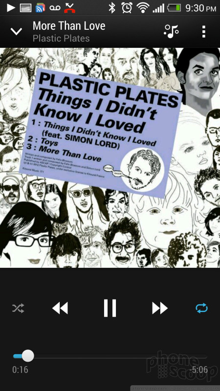
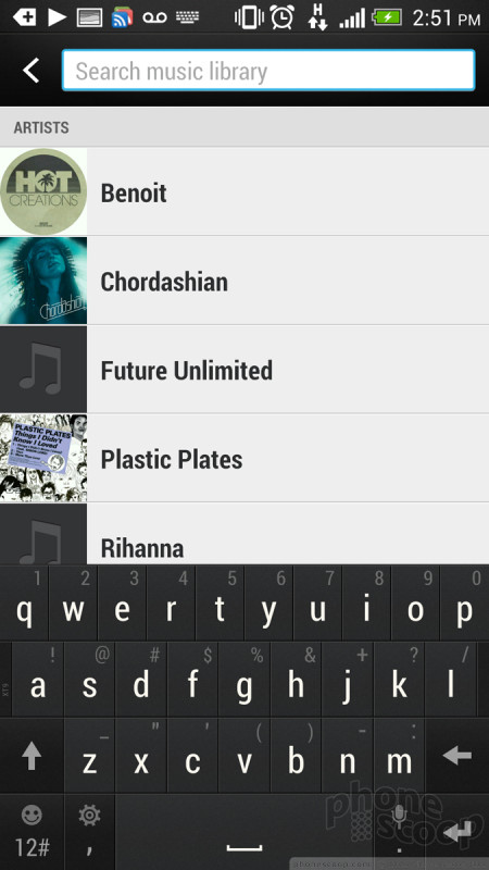
When playing music, you do have a handy control in the notification shade, and on the lock screen. The lock screen music controls can be swiped up to take you directly into the music app. There's also a setting to bring the music app "above" the lock screen, meaning you can not only control music from the lock screen without entering your security code, but dive into the music app itself, just like you can with the camera app. Neat.
The real media story here is the screen and the sound. The sound is the best I've ever heard from phone speakers, bar none, and the screen is just gorgeous.
The Beats audio enhancement kicks in automatically when needed, and there's a little indicator for it in the status bar at the top. It sounds great. Audiophiles have been known to criticize Beats for jacking up the bass more than it should. Through headphones, I tend to agree. That's a personal preference, and you can easily make your choice in Settings.
But through the built-in phone speakers, the Beats enhancement sounds fantastic. In side-by-side tests with the same music on an iPhone, the One sounded dramatically better with every type of music I tried. I certainly don't recommend doing your main music listening that way, I'm just saying they're phenomenal as phone speakers go. Playing games, I noticed details in the soundtracks that I had missed on other phones.
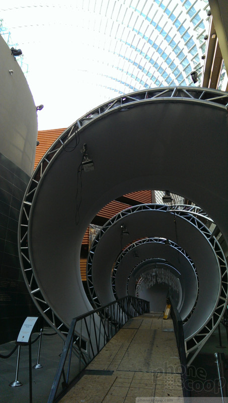
In a more practical use case, I watched some movie trailers and YouTube clips. The 1080p full-HD display resolution is really noticeable here. Watching video on the One was as close to "cinematical" as I've ever experienced on a phone. It looks and sounds so good that you're drawn into the content, which is how it should be.
NFC
One of the more amazing engineering feats that HTC accomplished with the One is putting NFC into a phone with a metal body. That's supposed to be impossible, as NFC typically requires a large, flat antenna that takes up half the back of a phone. An antenna that a metal body would block.
I tried Android Beam between the One and a Nexus 4. I was able to tap and send photos and web pages both ways reliably.
Based on my tests, the One's NFC antenna is somehow built into the top of the phone, near the camera. Perhaps that's related to the (otherwise odd) small vertical strip of plastic just above the camera lens.
Camera
HTC's big gamble with the One is betting that you'll accept fewer megapixels if it means better photo quality. It makes sense; how often do you honestly print your camera phone photos at 8x10 and frame them? If, like most of us, most of your photos are shared online, then the 4 megapixels of the One's camera sensor is more than enough. The relatively low pixel count of the sensor allows each pixel to be much larger, letting in more light, improving quality all around, but especially in low light. HTC calls this an "Ultrapixel".
Having fewer pixels to process - plus HTC's exclusive ImageChip hardware technology - lets HTC offer Zoes. A Zoe is an innovative new type of media. You capture it just like a photo, but behind the scenes, the One is also capturing a short HD video and a rapid burst of full-resolution photos. Plus, the capture starts before you press the shutter button, so you never miss a moment. It's a great idea and very fun to use.
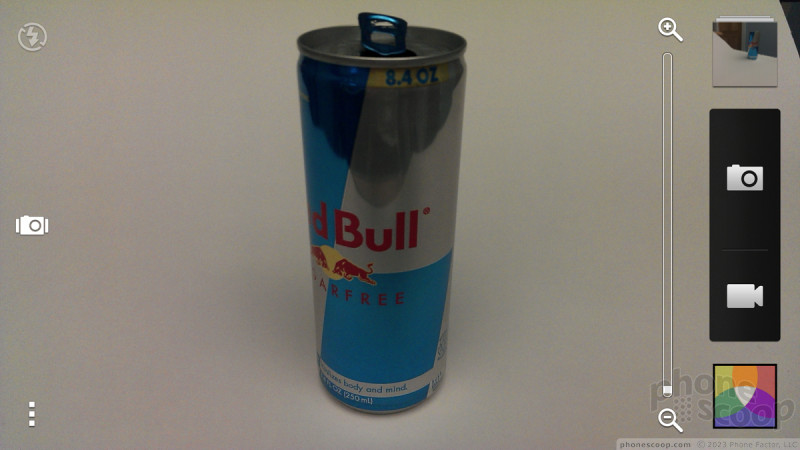
The camera is very fast all around and relatively easy to use.
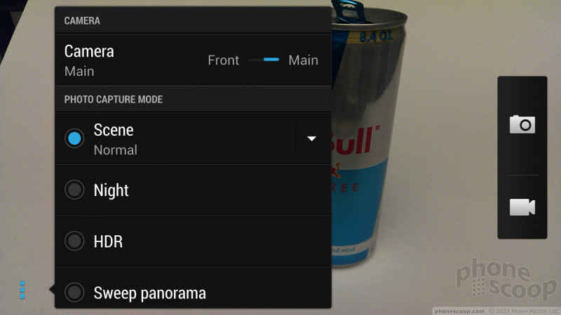
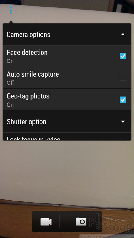
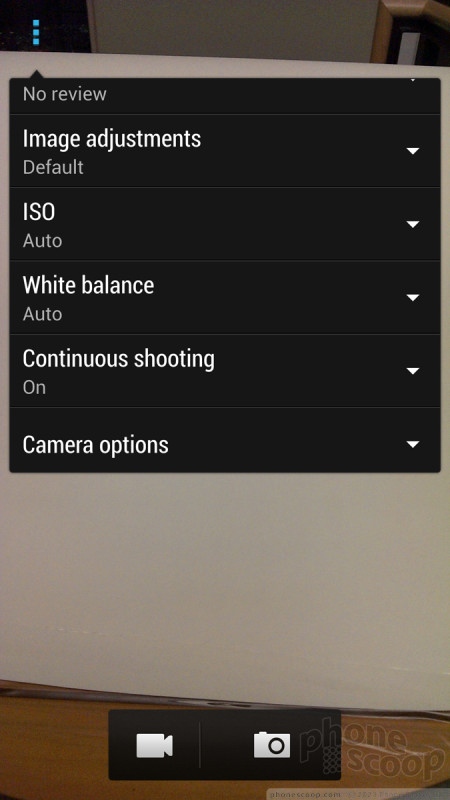
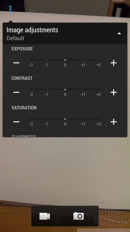
Relatively. It could be simpler. There's a Zoe button on the main viewfinder screen, a menu to choose between Scene, HDR, Night, and Panorama, and then sub-menus for "Scene" modes, with options like Landscape, Text, and Macro. They're all mutually-exclusive still camera modes, yet they're spread across three different, inconsistent interfaces. Zoe is the only mode with its own button on the main viewfinder, presumably because HTC wants to promote it. That I get, but the dedicated Zoe button makes it look like you can combine Zoe mode with other modes, like night mode. You can't. Why isn't there just one "mode dial" for all of these modes?
I had an issue with focusing on one occasion. It was a well-lit room at night, and my first two tries resulted in completely blurry photos. But that could be a software glitch in my pre-production unit that HTC will fix. The other 99% of the time it worked quickly and accurately.
Photos
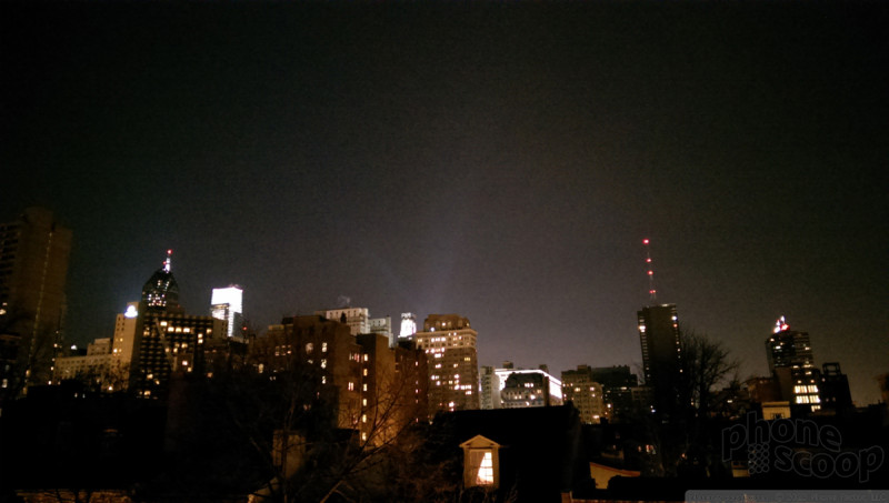
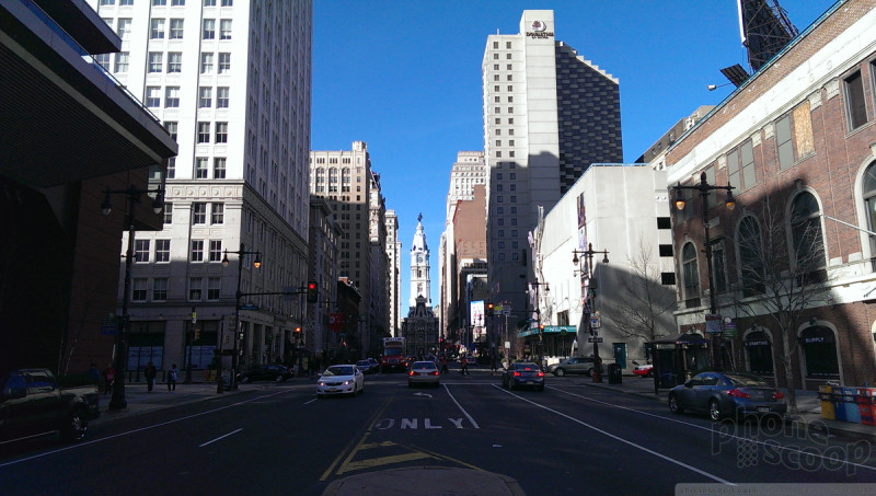
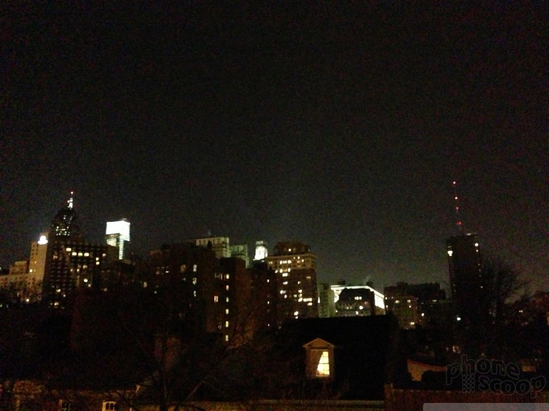
The One's camera delivers decent results, but really shines in low light. In dimly-lit rooms, it could see better than I could. No joke. I was consistently amazed with its ability to accurately capture very dim scenes and deliver a photo with almost no visual noise. Going head-to-head with the iPhone 5 in low light, the One beat the iPhone every time. Not by miles, but noticeably and consistently.


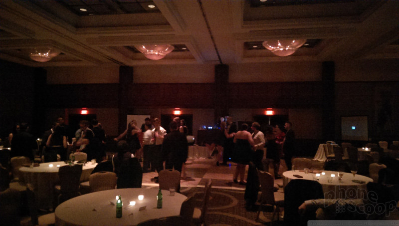


While the One has most impressive low-light performance in normal photo mode, that doesn't carry over to Zoe mode. At all. Don't even try using Zoe mode in low light, or you'll miss whatever you were trying to capture. Really, Zoe mode should detect low light and warn you about that. Still, the low-light performance (in normal mode) is impressive, and no other phone even has Zoe mode, so the One still has a leg up on the competition.
The sweep panorama mode works well. It's extremely easy and fast.

I was not impressed with HDR photos. It seems to be doing some real HDR using multiple exposures. It captures and processes very quickly. But the resulting shots go a little far in pumping up the shadows, and do nothing to bring out details in the highlights, resulting in HDR photos with a very over-exposed look including very blown-out highlights. I hope this is something HTC will address in its final software tweaks.
UPDATE: HTC says my HDR photos should have looked much better. They're investigating the issue.
Camera vs. iPhone 5 in low light


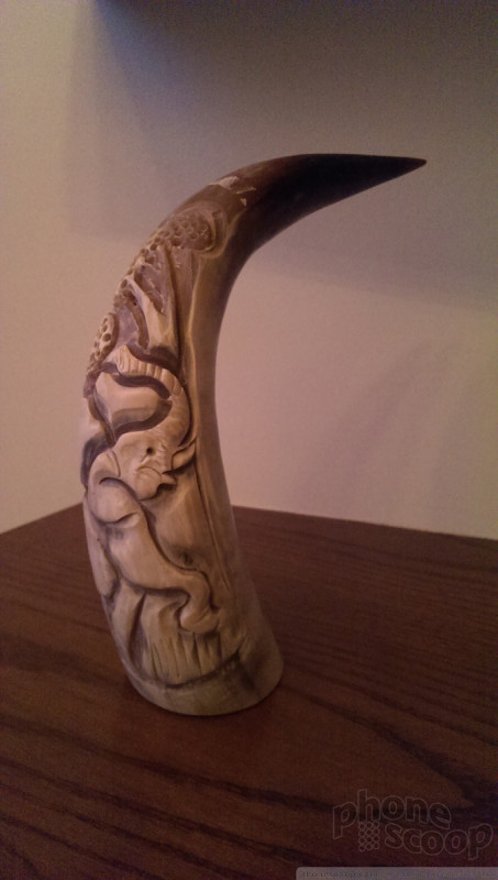

Macro photos look great, even though I'm not sure "Macro" mode actually does anything. You can get as close as about two inches from your subject in Normal mode, and the same in "Macro mode".
Video
Video looked great. Performance was in line with what I saw on the still side. As with stills, the HDR mode was consistently overexposed, bringing out the shadows but blowing out highlights.
HTC's "HDR" microphones are excellent. They pick up every sound with remarkable clarity.
....Including background noise. Like the camera sensor in low light, the One's microphones have genuinely super-human sensitivity. If you have foreground sound like someone speaking, the background noise is clear, but stays mostly in the background, as it should. But if you're trying to film a quiet scene, the mic gets ambitious. I filmed a relatively quiet street scene from the top deck of a parking garage above a supermarket. When I got home, I was shocked by how loud it was. It was mostly loud street noise, but I could almost make out conversations of people walking by far below on the sidewalk. I swear I could even hear the registers beeping inside the supermarket three floors down and through two sets of doors. That's absolutely remarkable. The problem is, it didn't come close to representing what I heard in person at the time.
But for most situations, you're going to be impressed with the picture and sound quality of your videos.
Gallery
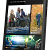
The gallery app focuses heavily on your friends' Facebook photos and videos. By default, that's mostly what you see on the top screen. It looks and works like BlinkFeed, complete with the same gratuitous animation. You see a friend's name and their most recent photo. Tapping that takes you to all of their photos. Near the top is a weird tile that says "Friends" which leads not to photos, but to a text list of your Facebook friends, even ones that have no photos available to you. That doesn't make much sense to me.
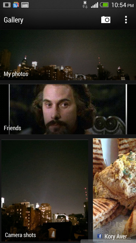

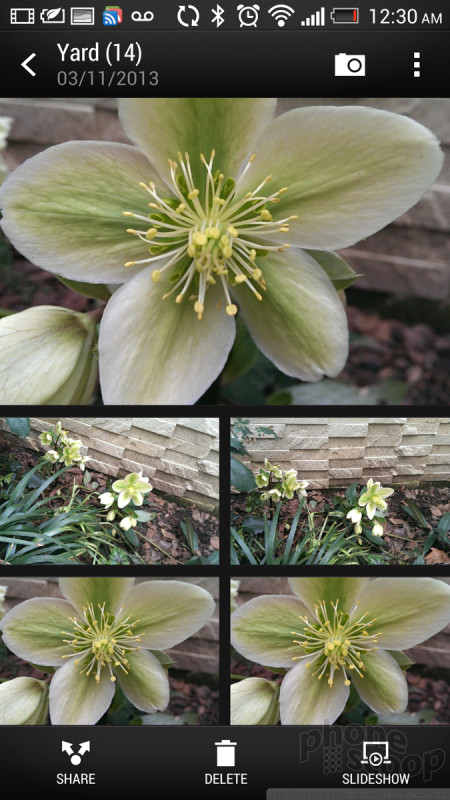
Also at the top of the feed, you'll find the redundant "My photos" and "Camera shots". There's a "Camera shots" in "My photos", too. The top-level "Camera shots" won't show you a thumbnail view, just your most recent photo, and you can swipe sideways to see older photos. If you go to the "Camera shots" under "My photos", you see thumbnails in a nice, continuous-scrolling grid. In both places, photos disappear from "Camera shots" once you assign them to albums.
It's under "My photos" that you'll find everything you would normally expect to find in a Gallery app. I'd personally prefer that HTC skipped the social stuff and put my albums at the top levels.
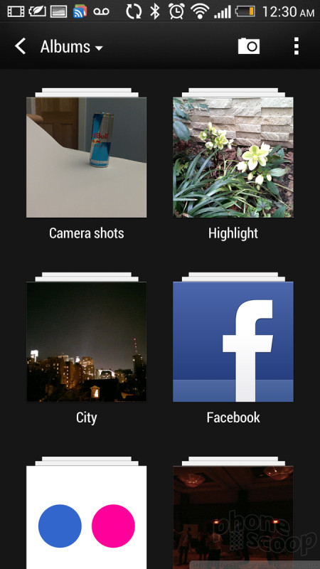
It took me awhile to figure out My Photos. It's not intuitive. When you start out, you don't see any albums, even though it says "Albums" at the top. You see a menu with types of albums. You'll have to click "Picasa" and go one more level down to see the Google photo albums that would be at the top level of the Gallery app on a stock Android phone. You also have to drill down a level to see your Facebook and Flickr albums.
For a long while, I couldn't figure out how to create or organize albums, nor access any of the cool features of the gallery app that HTC had previously demo'd for me. Eventually I discovered the easy-to-miss tiny blue triangle next to the word "Albums" that you're supposed to tap to access "Events" mode. It's only in Events mode that you can create albums, which then appear in both Events and Albums.
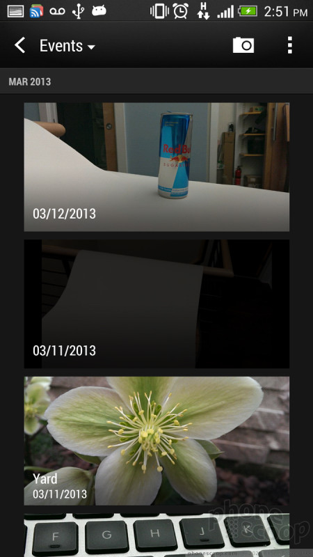
Events mode works completely differently from Albums mode. So different, that they feel like two different gallery apps, created by different companies. There's a lot of inconsistency in how things work between the two modes.
In Events mode, you'll see a single vertical list of photo albums. By default, they are virtual albums grouping photos by day. You can move photos to your own albums by pressing and holding on an album, then choosing the "Split to" command. Let's pretend that makes sense.
When viewing an album in Events mode, the first screen includes a large, automatically-generated video highlight reel, plus a few thumbnails below that. Those thumbnails look like the start of the album, but they're actually selected highlights from the album, so if you scroll down, you'll see those same photos again. It's confusing, especially because you're presented with the same view when choosing photos to move, share, or delete. Seeing the same choice twice in a list of checkboxes drove me nuts until I figured out what was going on. HTC is trying to make the first screen a "cover page" for the album. It's a cute idea, but in practice, it's just confusing. Albums in Events mode also have the same paging and animation as BlinkFeed.
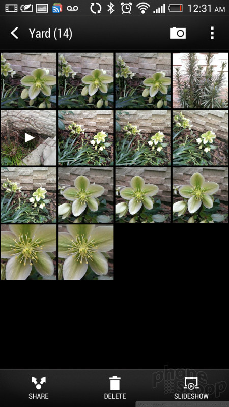
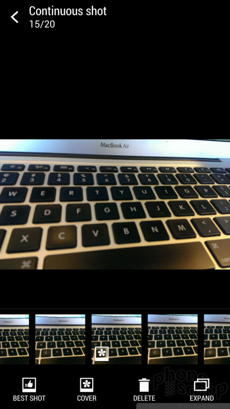
In both Albums mode and Events mode, Burst shots are helpfully grouped together and get a special icon badge. Zoes automatically play as video in thumbnails. That's neat, but only one plays at a time, so you can't see at glance which photos are Zoes. An indicator badge on Zoes would be helpful. If you tap on either a group of burst photos or a Zoe, (which also includes a set of burst photos,) you get a very nice interface for editing that collection of media.
For burst photos, you can simply mark the best one as a "cover" photo, or just delete some of the worst ones, or, in one step, choose the best, deleting all of the others. It's a great interface for dealing with a set of burst photos.
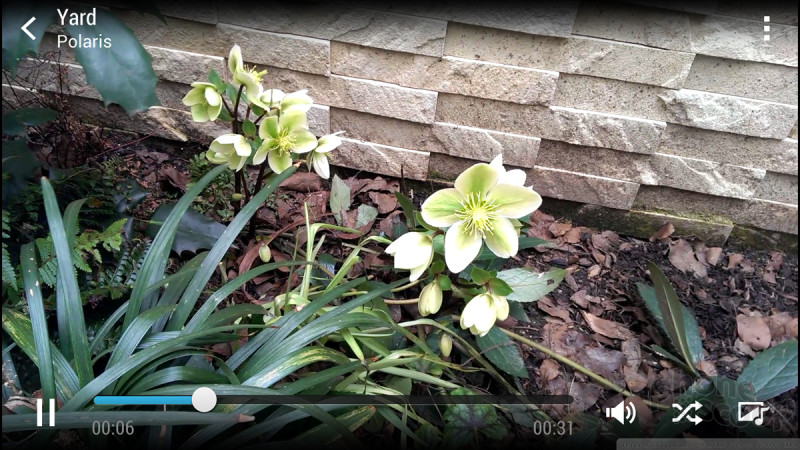
A Zoe is both a photo and a video, so opening one plays the video part, then defaults to the photo from when you pressed the shutter button. That photo is always the default. You can use a control below the photo to scroll to other full-resolution photos that were captured as a burst while the video was captured. The only thing you can do with those other photos - again, including ones from before you pressed the shutter button - is extract them and save them as separate photos outside of the Zoe.
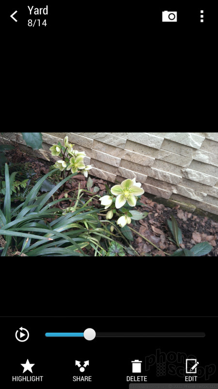
With all types of media - photos, videos, and Zoes - you have the simple on-screen options to "highlight" (star), share, delete, and edit. "Highlighted" media appear in their own album, and get priority in album covers and 30-second video highlight reels.
Editing options include the standard crop and rotate, plus the now-common retro-film-style filters. There's also a handy "straighten" feature and a red-eye tool.
Then there are the "retouch" tools, which, quite simply, make you and your friends look better. You, too, can look just as unnaturally good as a magazine cover model, in just a few dead-easy steps. The tools automatically recognize your face and the only control for each is a simple slider for how much enhancement you want to apply. Various options will make you thinner, smooth blemishes, remove shine, and make your eyes brighter. It's spooky how well these tools work; you will look more like you belong on a magazine cover, and it won't be obvious that the photo was edited. If you have a vain streak, this feature is a godsend. If you value photographic integrity, it's depressing. Then again, let's be honest; that ship sailed a long time ago.
One of the headline features besides Zoe is the the ability to create a slick 30-second highlight reel of a group of photos, videos and Zoes. You can do this from the virtual event album of all the photos you took on a certain day, or an event album you create yourself. A highlight video is generated on the fly when you simply go into any event album. Tapping on it takes you to a full-screen mode where you can tweak it. You can hit a “shuffle” icon to simply re-generate the video if you didn't like how it randomly arranged your content. You can choose a different theme; there are several, and each has its own music and visual style. Some themes apply more filters to your content than others.
I was consistently impressed with how this feature worked. It made even my most boring test photos and videos look interesting and fun, but in a tasteful way.
When you're happy with your video, you can save or share it, and there are many sharing options. If you send to Zoe Share, you get a web service that will display the video and album appropriately for various services and device. But Zoe Shares only last for 30 days, then disappear, so this is really just about on-the-fly sharing, not long-term storage for your memories.
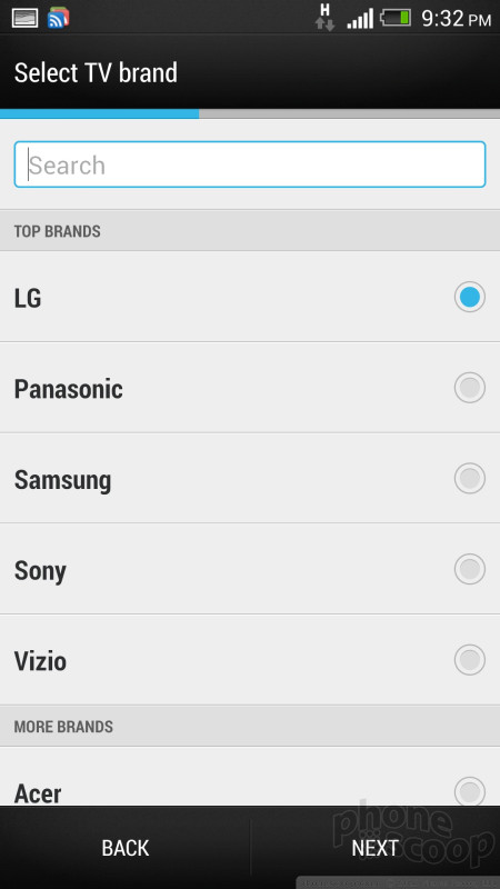
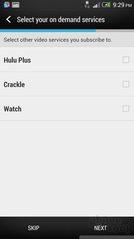
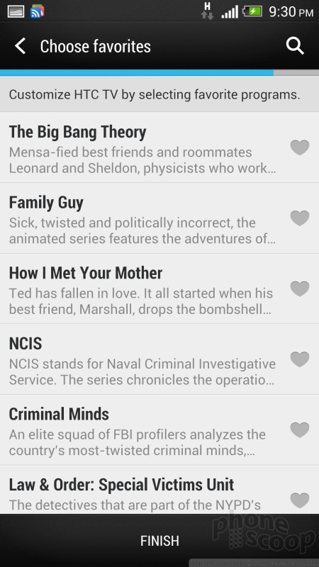
TV
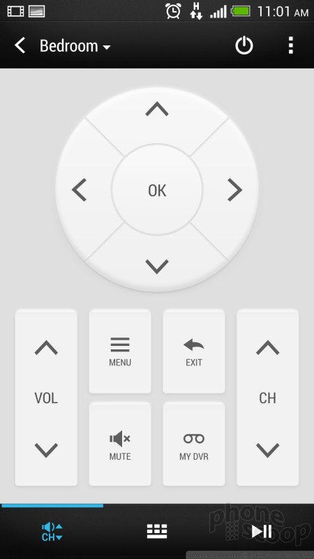
I'll be honest: I was not expecting to be impressed with the TV app. It is, as its core, a universal remote control. It's based on Peel. It doesn't tap into your DVR content. It doesn't magically solve "the TV problem" that everyone's hoping Apple will solve.
But I was pleasantly surprised. Setup was fast and easy. It was - no exaggeration - easily 30 times faster (and less frustrating) to set up than my Logitech Harmony universal remote. And I didn't have to plug it into a computer to do it. Within two minutes, I had something that does about 90% of what my Harmony does. The IR blaster works better than many of my dedicated remotes, easily reaching my equipment from anywhere in my large living room.

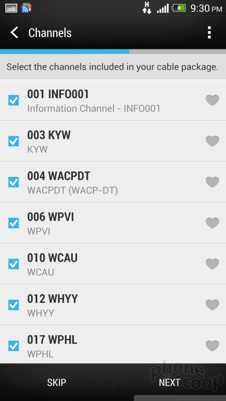
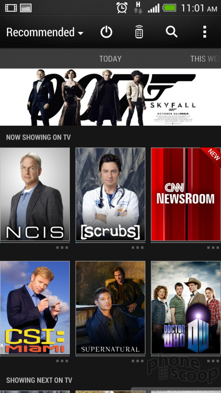
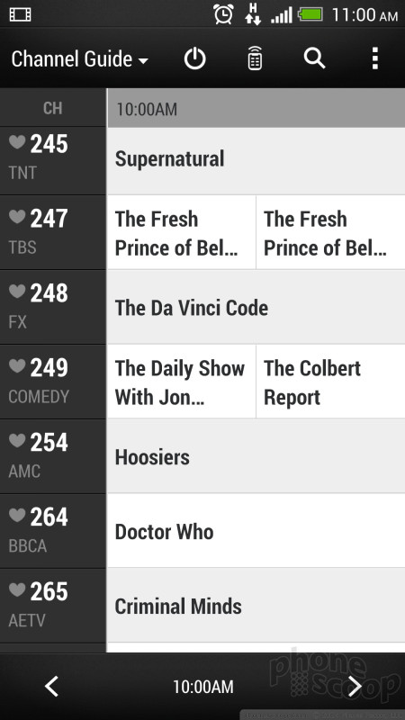
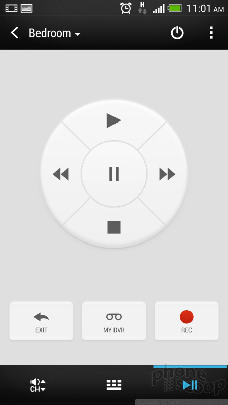
I don't watch much live TV, so it's just a bonus that it shows you what's on now with a nice interface and lets you change to any of those shows with one tap. There's also a traditional channel guide interface. Although it doesn't tap directly into my DVR content, I can still control my DVR with ease using the controls it does have.
It's not the ultimate universal remote. There's going to be some button you like or need that it doesn't duplicate. You can't turn your whole system on or off with one tap. But it came much closer to replacing my Harmony than I expected.
It thoughtfully has shortcut controls that stay in the notification shade, giving you easy access to your new remote control as you check email while watching TV. (You can dismiss the shortcut control when you're done watching TV.)
Honestly, I want this in every phone from now on.
Personalization
Previous versions of HTC Sense had the confusingly-named "Scenes" and "Themes" options. HTC "fixed" this confusion by removing both features from Sense 5 completely. I find the HTC's design of the interface to be quite handsome, but if you wanted to change it, you're out of luck. I'm not sure how many people used "Scenes" to manage different sets of work vs. personal home screens, but if that was important to you, I couldn't find it in Sense 5. It's a curious time to omit such a feature, when BlackBerry is making its related Balance feature a selling point of BlackBerry 10.
As always, HTC gives you multiple types of lock screens. There are optional lock screens for productivity, music, and photos. There's also an option to disable the lock screen altogether, so that just pressing the lock button take you right to a home screen.
In all, the One offers fewer personalization options than past HTC phones. On the plus side, the standard theme, the included wallpapers, and the ringers are fantastic. Plus the tool for setting your own music as a ringer is great, complete with a nice trimmer feature.
Clock & Weather
If there's one thing HTC has always nailed, it's the clock. That doesn't change in Sense 5. Actually, they've trimmed the clock options, but at least the default is close to what we'd call the perfect digital clock.
The old clock widget is now baked into the lock screen, BlinkFeed, and even the app menu. There are no options for different clock styles, such as analog. There is a matching widget you can put on the Android home screen (that syncs with the same settings for date format and weather.)
Integrated into the clock area is a pretty but quirky weather feature. Ours defaulted to London weather. It's just silly that it doesn't default to your current location. Getting it set to our city manually was an exercise in frustration. HTC says a software update will fix this. After testing several pre-production units and this final Sprint unit, the weather app still doesn't work appropriately. It rarely displayed the local weather, and instead offered an unhelpful message that read "unknown location" even after we programmed in a zip code.
The default main weather screen shows some very pretty full-screen video animation representing the current weather, and the current temperature. In tiny fine print are today's forecast high and low temps. You have to swipe over once for an hourly forecast, and twice for the multi-day forecast. That's a hassle. If you dig through the options, you can make either forecast the default, but that's a terribly boring grey view compared to the pretty "Now" screen. It's a shame that you have choose between the pretty view and the useful view.
HTC Transfer
HTC Transfer is HTC's software for transferring everything from your old phone to your new phone. It's very robust and seems to cover every technically possible way to transfer as much as possible from every type of phone.
One pet peeve: there's an option to use a QR code to start the transfer process. What good is that when a QR code reader doesn't come with most phones? Sure you can search for and download a third-party app, but if HTC is going to suggest people use QR codes, shouldn't they start by putting the necessary reader software in their own phones?
On issue I have with HTC Transfer (and the related HTC Backup) is that Google is now duplicating much of this functionality with its cloud services, which kick in automatically when you simply sign in to Google for the first time. Sitting at the the start of the HTC Transfer process, I found myself wondering what I should let HTC move and what I should just let Google sync from the cloud. HTC Transfer should have guided me through those choices, but it didn't.
HTC Sync
Thoughtfully, when you plug your One into a computer, up pops the window for transferring photos and music, plus a window with an icon that says "HTC Sync Manager". That icon is actually just a link to download the app from the web, presumably so you're always getting the latest version. It's a nice touch.
The software was a bit temperamental for me, but it worked.
When your photos are synced and downloaded to your computer, some interesting things happen. First, HTC buries everything inside redundant folders like a Russian nesting doll. There are four levels of folders that serve no purpose whatsoever. Some of these folders must serve a purpose on the phone, but they should be stripped when moving things to you computer.
On the plus side, once you get to your content, you'll find that HTC actually organizes your photos and videos into folders that match the albums you've created in the Events part of the gallery app. They're actually stored that way on the phone, too, which is a nice touch.
Zoes, however, are stored as a large list of files. An album containing nothing but two Zoes translates to a folder with 40 photo files and two video files. That's much better than having your content locked up in some proprietary file format, but it's a lot of files to wrangle.
One important note: the Zoe files create substantial problems if you auto-upload your camera images to online services such as Dropbox or Box. Zoes files are all combined into folders, one folder per Zoe. Each folder holds dozens of files, including videos. These folders cannot be managed by online services, which choke on them. For some users, automatic backups of photos might be a must-have feature. The folders created by the Zoes complicate auto-uploading and could be a problem to those users. If you buy the HTC One, you'll have to turn off automatic uploads.
Bluetooth
The One's Bluetooth radio worked perfectly. The device paired with other phones, tablets, PCs, and headsets in a snap. When placing calls through a regular Bluetooth headset, the quality was quite good, but not as good as through the regular earpiece. In a car, using my car's hands-free system was pointless. The speakerphone of the One is so loud and so clear that I had no need to actually use my car's Bluetooth features. That said, it worked properly and sounded good.
GPS
The One was slow to perform on GPS networks. It often timed out when I attempted to use Google Maps to plot my location (this is with GPS, cell-based, and Wi-Fi-based location services all turned on). Google Maps software, however, remains as useful as ever.
Browser
The One arrives with both a generic Android browser and Chrome installed. Both performed about the same with respect to rendering and loading web pages. They have slightly different controls, but are otherwise on equal footing at delivering usable web sites. As we've noted in past reviews, the Chrome browser is particularly useful if you also use the desktop version. Many browser alternatives are available in the Google Play Store. Web sites were slow to render over Sprint's 3G network, though, unless there was an incredibly strong signal.
 Hands-On with the HTC One
 HTC One Boasts New Camera Technology
 HTC One Available from AT&T, Sprint, T-Mobile Today
 Facebook Home and Updated Messenger Hit Android
 AT&T Gives the HTC One a $199 Price Tag
 HTC One (M7 / CDMA)
 HTC One (M7 / GSM)