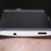
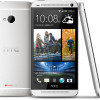
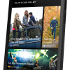
Review: HTC One for Sprint
Menus
HTC has rethought the Android menu system with its Sense 5 interface. On the one hand, they've "fixed" a lot of the things Google has done in Android 4 that I dislike. On other other hand, if you're really used to Android on any other phone, you're going to be disoriented at first. There's a re-learning curve, for sure.
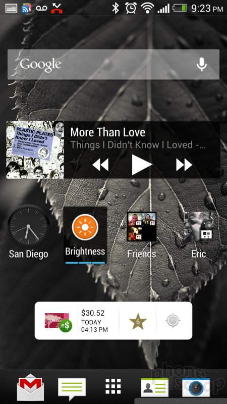
HTC's research has shown that most users don't use many Android home screens, and most don't use many widgets. HTC has changed the interface quite a bit in response to that data, de-emphasizing the Android home screen to the point where you can avoid it completely. At the same time, the traditional Android home screen is still there if you want it, and HTC has even enhanced it in some nice ways.
HTC has added BlinkFeed (think FlipBoard, more on that later) as another top-level home screen equal to the Android home screen (it's the default home screen, actually), and enhanced the app menu to the point where it serves almost as a third type of home screen.
You move between BlinkFeed and the traditional home screen by swiping sideways. You move between those and the app menu with the app menu button in the bottom dock. And that bottom dock is present on all three.
The app menu is where you manage the persistent dock icons, instead of the home screen. That same icon dock carries over to the lock screen, where the icons serve as lock screen shortcuts to whatever apps you like.
The large HTC clock & weather “widget” is present on all of these screens. It's welcome on the lock screen and BlinkFeed. It's an optional widget on the Android home screen. But having the clock widget on the app menu can be disorienting because it can make the app menu look like an Android home screen, if you arrange your home screen in the common configuration of a clock widget plus some apps.
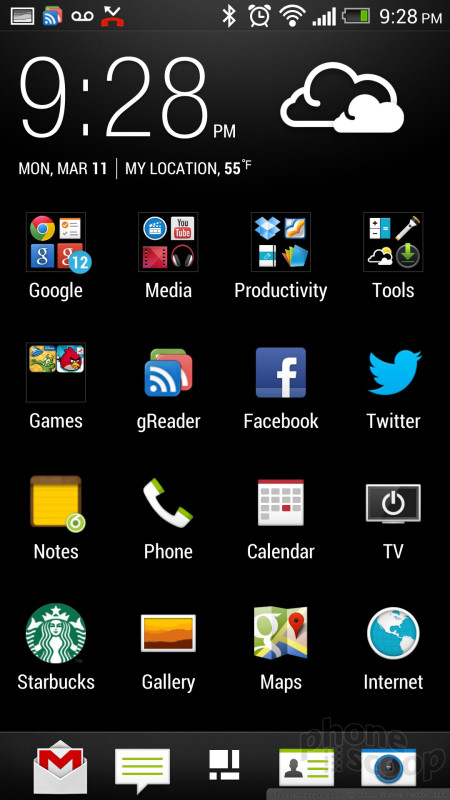
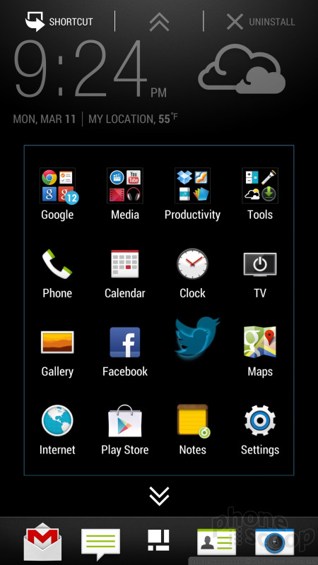
The app menu is a "first-class citizen" home screen in a few ways. For one, if you launch an app from the home screen and then hit the "home" key, you'll be taken back to the app menu. This is how HTC has made it so that you can easily avoid the Android home screen altogether. Of course the app menu also lets you rearrange icons however you like, and organize them into folders.
But HTC isn't leaving Android purists out in the cold completely. You can make the Android home screen the default instead of BlinkFeed. You can still put apps and shortcuts on your home screen and put any of those icons in folders. There's also a "plus" icon in folders that gives you an additional way to add any app to any folder on the home screen. (That doesn't offer shortcuts, though.) You can still use widgets, and it supports re-sizable widgets.
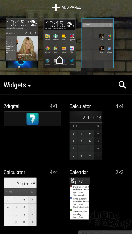
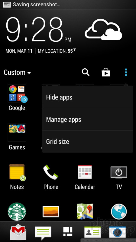
Going further, Sense 5 actually has a quite nice tool for managing your traditional Android home screens. Like old-school Android, you can just press and hold on a blank area of a home screen to launch the tool that lets you add anything to the home screens. (I always preferred this way of adding things to my home screens.) You can browse apps, widgets, and types of shortcuts on the bottom half of the screen, and drag them up to thumbnails of home screens on the top half. You can also add and remove home screens here. Oddly, HTC makes you use a drop-down menu to switch between widgets, apps, and shortcuts; wouldn't swiping sideways through tabs be easier? There's a search function here, but it's very limited. It doesn't search across apps, shortcuts and widgets at the same time, nor does it search on things you can create a shortcut to, like contacts.
Between the emphasis on the app menu and the old-school home screen editing, HTC seems to be taking Sense 5 in the opposite direction compared to what Google is doing with the interface of stock Android 4. Regardless of which way you feel is better, the two approaches are increasingly different.
While HTC has always been known for its great Android home screen widgets, there are far fewer of them in Sense 5. They've also cut down on the number of standard Google widgets. For example, there's no photo/gallery widget. Whenever I travel, I take a screenshot of my mobile boarding pass and put the barcode on my home screen for easy access. I can't seem to do that on the One. (The third-party widgets I've tried so far are clumsy at best.)
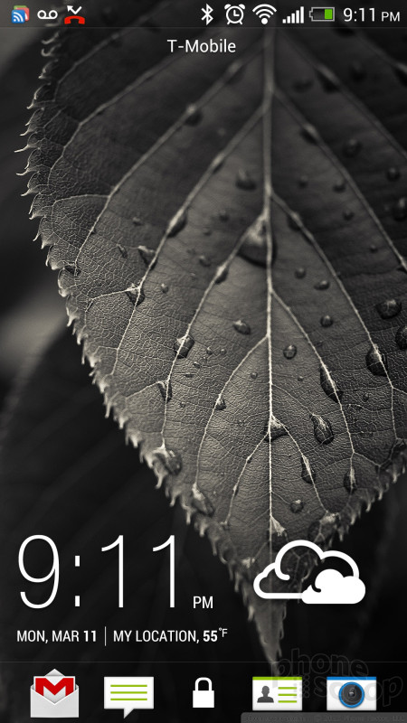
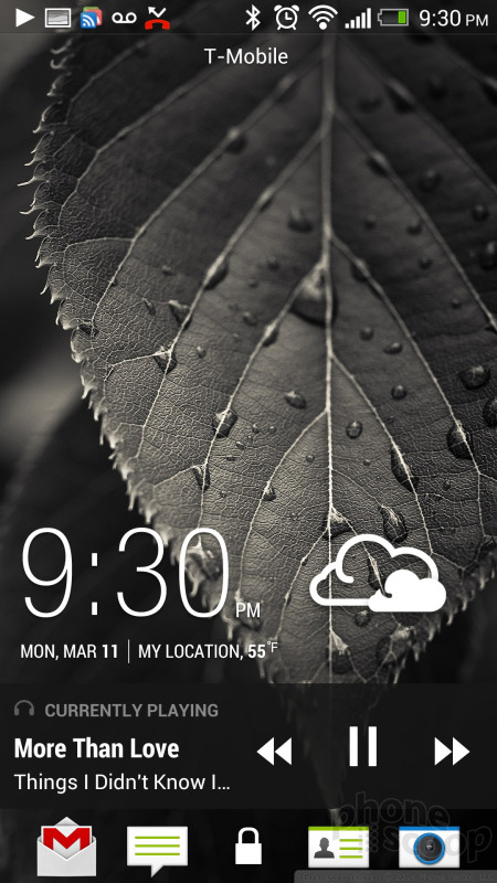
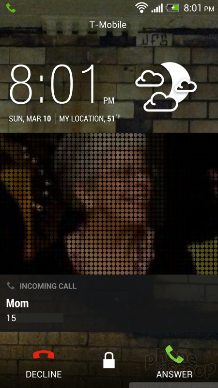
Another one of HTC's strengths is the lock screen. The default lock screen is simply great. It has smart notifications for new messages and missed calls, and simple but solid music controls when playing music. The clock and weather are easy to read. The date's a little small for me, though. There are four customizable lock screen shortcuts. All of this works properly with a security code, etc. You can optionally set the camera, music app, and message previews to be either "above lock" or protected by your lock code. It's a very well-thought-out system for configuring your lock screen security. You can also choose from several alternate lock screens that have even more features. Put all of this together and you have the best lock screen I've ever seen on any phone, period. Google would do well to take a cue from HTC here.
BlinkFeed
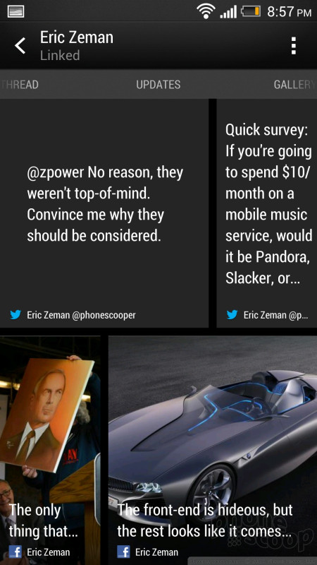
BlinkFeed is an intriguing concept that's still rough around the edges. It gives you a customizable visual feed that combines your Facebook and Twitter content, plus a few news feeds from a very limited list of sources (about 100, for starters). You can't add your own RSS feeds, so whatever you're into, you probably can't add your favorite blogs or other news sources. Prefer to get your gaming news from Polygon? You're out of luck.
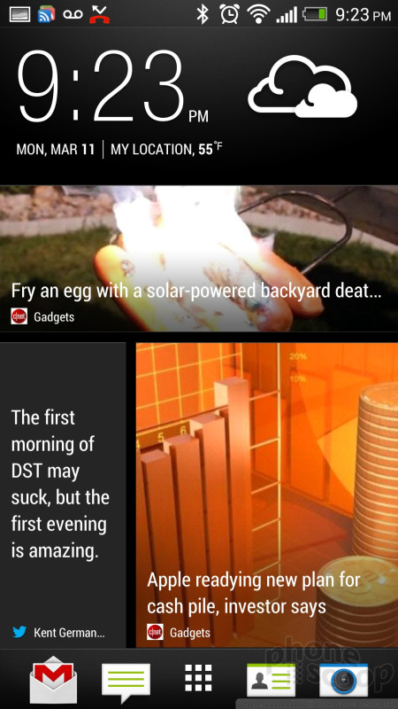
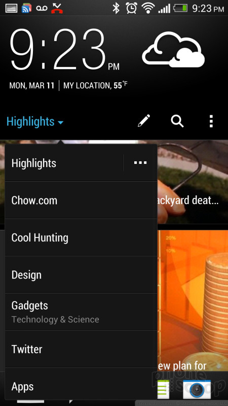
Besides (limited) specific publications, HTC also offers categories like design, gaming, and politics. (I ran into glitches with that, which I hope will be fixed. For example, the "Design" category showed me articles about someone smoking pot, something about Justin Beiber and a guide to processor speeds. What?)
The BlinkFeed scrolling animation resembles roofing shingles blowing in a strong wind. HTC has created some great interface animations in recent years; this is not one of them. In my opinion, it's gratuitous and doesn't make much sense. The 3D tilt effect doesn't reverse when you scroll the other way, and having everything tilt in the first place is a little annoying. The scrolling isn't continuous; it's broken up into "pages". It's not terrible, but it's inconsistent with the rest of Android. It also slows you down. With continuous, kinetic scrolling, you can flick quickly and skip several pages at a time. You can't do that with BlinkFeed.
Curiously, BlinkFeed includes a search function. That's not a bad thing, I just have trouble figuring out the use case that HTC designed it for. It seems like an odd thing for HTC to put effort into, as opposed to, say, letting you put your favorite news sources in your feed.
BlinkFeed will randomly also throw in a tile with two upcoming calendar entries. It's a nice thought, but far too limited to be useful.
I want to like BlinkFeed, but it's hard to see me using it regularly. If you could add your own feeds from any web site, it would be a lot more interesting to me. The limited news sources HTC provides don't interest me much. You can use it just for updates from your social networks, but you'll get a much richer and complete feed by going into Facebook and/or Twitter apps.
Calls and Contacts
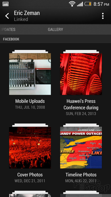
HTC Sense still has nice features for extending contact functionality, showing recent text and phone conversations, Facebook and Twitter updates, and photos from that person. But it could use some updating.
It's great that one tab of the contact card shows recent messages with that person, but it only shows one, which may be a message from you to them, saying something generic like "OK". That's not helpful. Showing the three most recent messages would make that feature vastly more useful.
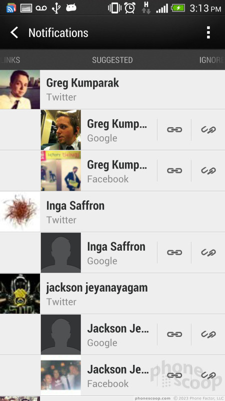
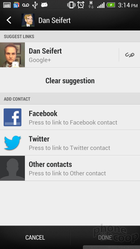
HTC has great tools for linking your Google contacts with Facebook and Twitter profiles. There's a bulk tool for linking everyone at once, and there's an option in each contact as well. There's some interface inconsistency, though. In an individual contact card, a broken chain icon means "link this contact", while in the bulk tool, that same exact icon means "don't link". Once you learn the quirks, the linking tools seem to work well, and enables a lot of great functionality.
Messaging
HTC has put their touch on the Android messaging experience.
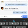
At first glance, I couldn't discern which message threads had unread messages; they're all the same color. It took me a day to notice the thin blue bar at the left that marks threads with new messages. Unfortunately, its terrible design blends right into my friend's faces. (And no, they're not all from Pandora.)
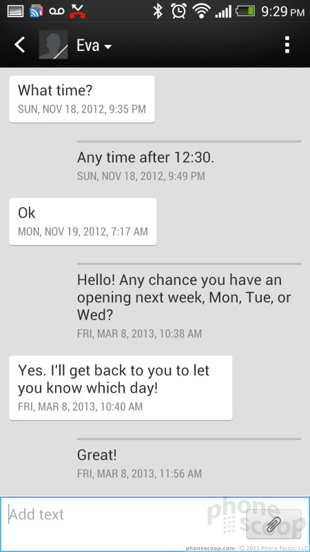
I love the way message threads emphasize what the other person says with a high-contrast bubble, leaving your own messages almost in the background. I know what I said, so that's very smart highlighting.
There's also a backup and restore function for your messages. It can save to a local file or to an email account. The restore function can filter duplicate messages. It seems robust, except I couldn't find an option to schedule automatic backups. If you're like me, you'll back up your messages once, then forget to ever do it again. The next thing you know, it's too late. You need that backup, but it's a year out of date.
Beyond the basic SMS/MMS tool, all the other standard Android apps are available.
 Hands-On with the HTC One
 HTC One Boasts New Camera Technology
 HTC One Available from AT&T, Sprint, T-Mobile Today
 Facebook Home and Updated Messenger Hit Android
 AT&T Gives the HTC One a $199 Price Tag
 HTC One (M7 / CDMA)
 HTC One (M7 / GSM)