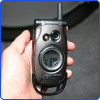
Review: BlackBerry Pearl
Although we were impressed by RIM's new hardware, the software falls somewhere between underwhelming and completely frustrating.
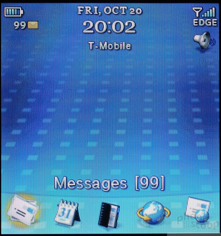
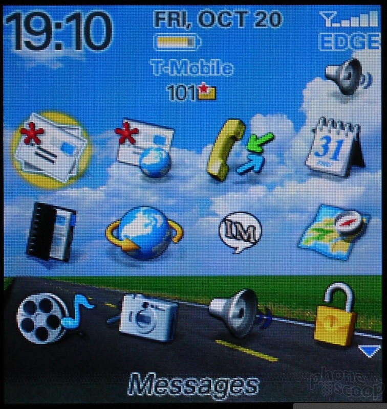
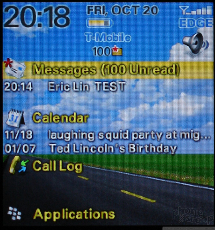
The home screen is graphically rich and can be customized with a number of different layouts, called themes. Icons to open often used applications can be displayed down either the side or the bottom of many layouts, while others fill the entire screen with a scrolling grid of every available icon. There are indicators and status displays that report new mails, new messages and other phone events like missed calls. However if you'd like an actual display of what happened such as new emails or list of calls you missed, you'll need to select a theme that includes the "today" screen.
The main menu, or the icon grid home screen is comprised of icons for almost every application. The only ones which do not have their own icons are the new multimedia applications. They are grouped under one icon. Many items that would normally be in a phone's settings menu are also given their own icon instead of being buried in the options menu. This is a nice touch for quick access of items like Bluetooth and profiles.
The most confusing item in the icons is one for keyboard lock. instead of assigning a hardware key combination to lock the keypad, you must instead activate using the "application." You do unlock the keypad with a combination of presses, however.
There is a second keylock mode you can start by holding down on the mute key, which can only be ended by holding the mute key again. In mute key standby mode, the screen will not come on with a key press to check the time or mail status.
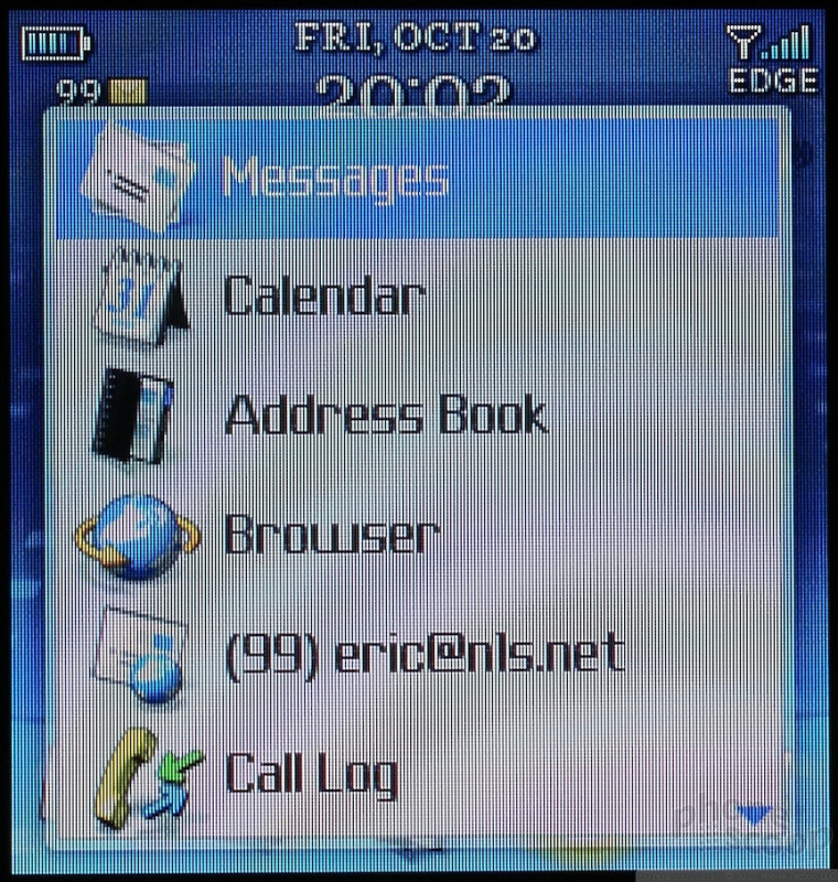
With the exception of the the new camera viewfinder and media player, the home screen is the only graphically rich screen on the entire phone. As soon as you click past the main menu the Pearl transports you back to 1989, when people still used the text-only interfaces of DOS and WordPerfect 5.1.
It is not just the menus but everything on the phone that is displayed as plain text with no formatting. In most cases there is no indication of fields or other divisions between different elements. When there is some sort of divider, it is strictly a horizontal line, nothing more.
When you select an application, you are typically presented with a list - a list of messages, a list of names, a list of hours in the day. Pressing in on the trackball (select) will display the full item in the list, but it rarely can do anything beyond show more. In order to take any action (other than call a number), you either need to keep clicking select until you get a pop-up menu or you can skip ahead by just hitting the menu key (the honeycomb shaped icon to the left of the trackball). In many cases pressing the menu key is the only way to do something; pressing select will get you nowhere.
The only applications that do not have this plain text interface are ones created exclusively for the Pearl - the camera and the media player. Although these applications don't look like the others, they act like them, offering little control through the trackball or keys, forcing you to resort to the menu key for most options.
 CTIA Fall 2006
 Blackberry Pearl To Launch on T-Mobile Sept. 12
 Qualcomm Taps Iridium for Satellite Connectivity
 iPhone 15 Series Goes All-In on USB-C and Dynamic Island
 Motorola Refreshes its 4G moto g stylus
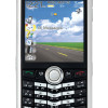
 BlackBerry Pearl 8100