phonescoop.com
Phonescoop.com logo

Rich, I know it's probably not top on your list, but I was just looking at the logo at the top of the page and I was wondering if you had plans to update it at some point?
I haven't seen a phone with a pull-out antenna (or an external antenna for that matter) since analog was retired.
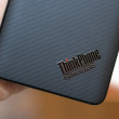
That being said, I know the lack-luster black slab of a phone being touted today doesn't make for a great logo either. Kinda' reminiscent of "what's that rectangle in their logo for?"
BTW, great site, and always getting better!
I haven't seen a phone with a pull-out antenna (or an external antenna for that matter) since analog was retired.
That being said, I know the lack-luster black slab of a phone being touted today doesn't make for a great logo either. Kinda' reminiscent of "what's that rectangle in their logo for?"
BTW, great site, and always getting better!
...

I think the logo is a way of saying "Hey, we've been around awhile, since phones had pull-out antennas!"
...

speedywalk said:
...That being said, I know the lack-luster black slab of a phone being touted today doesn't make for a great logo either. Kinda' reminiscent of "what's that rectangle in their logo for?"...
...and that's the answer. 😉
Today's phones don't have any recognizable shape suitable for an icon/logo.
We prefer the old design (with a keypad and antenna stub, at least) because it's instantly recognizable as a cell phone.
For the same reason, nearly all phone interfaces use an icon of a landline phone handset to represent the phone app and send/end actions. It's recognizable as a phone. A rectangle isn't.
We may remove the pull-out, whip-style antenna from the logo before long, bu...
(continues)
...