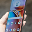
Review: Nokia Lumia 900 for AT&T
A swing and a miss from Nokia

Compared to the N800, there are too many corners cut with this supposedly high-end device.
1. The screen has a really crappy bezel around it. This totally ruins the aesthetic of the phone. Quite frankly, this lack of attention to detail is what separates Apple from HTC, Samsung, etc. If Nokia is going to distinguish themselves, they need to pull out the stops on *all* of their hardware expertise and not just phone it in after they get 80% of the way there.
2. The tolerance of the SIM tray is pretty bad by iPhone 4s standards (which are super tight.) It always looks misaligned, though the dark color hides it, it looks pretty bad in the cooler colors.
3. The texture is a lot cheaper feeling than the N800. This isn't quite Samsung-gr...
(continues)
...

bluecoyote said:...
Compared to the N800, there are too many corners cut with this supposedly high-end device.
1. The screen has a really crappy bezel around it. This totally ruins the aesthetic of the phone. Quite frankly, this lack of attention to detail is what separates Apple from HTC, Samsung, etc. If Nokia is going to distinguish themselves, they need to pull out the stops on *all* of their hardware expertise and not just phone it in after they get 80% of the way there.
2. The tolerance of the SIM tray is pretty bad by iPhone 4s standards (which are super tight.) It always looks misaligned, though the dark color hides it, it looks pretty bad in the cooler colors.
3. The texture is a lot cheaper feeling than
(continues)
...
You're signing a $1,600.00+ contract. Upfront cost is a drop in the bucket (though not wholly insignificant.)
For $100.00 more you could have a clearly nicer phone that you're tethered to for those two years. For the same price, you could also have a much nicer phone that you're tethered to for those two years.
For $100.00 more you could have a clearly nicer phone that you're tethered to for those two years. For the same price, you could also have a much nicer phone that you're tethered to for those two years.
...

A nicer phone is HIGHLY subjective. This is a windows phone, to some people they won't even consider a Android or iOS device. So this may be the nicer of the phones. I understand it dosn't appeal to you but that says nothing for the market. A drastic example but to this day my mom swears the Motorola Razr is the nicest phone on the market today. With all that said, I am not excited for this phone by any means. Lol
...

😉 Of course you wouldn't. Why don't you just go back to playing on your Android 😛
...

That's funny! The only people I know that "would only consider Windows" are dinosaurs. Most people would not. Insider Windows as it rides of into the sunset...
...
Your so ignorant....I just ran into a developer for Microsoft and he obv wants nothing but windows phone. My son is a huge Xbox fan...His obv choice is a windows phone. Its a brand new operating system so maybe you are a dinosaur?
...

MarryTheNight said:
Dude, the phone is $99 on a contract. It's not that serious.
AND--it's a seriously good phone.
...

Windows Phone sucks. It's a bitter pill to swallow but thats just the harsh reality. No one wants it. Put a refurb Galaxy S II next to this phone for only $9.99. Which one do you think the consumer is going to choose?
I really find the whole aesthetic direction Windows and Microsoft in general is going with their whole Metro UI is just effing hideous. I never thought that in 2012 we would be moving towards the simplest, most minimalist and just plain ugly UI I could ever have possibly imagined.
We got crazy 3D acceleration in even on low end PCs now and the best M$ could come up with is colored rectangles and a thin font that's overly big and overlaps on to other screens. Just retarded looking. Seriously WTF???!!!!
...

While WP isn't for everyone, it far from sucks, as you put it. Is there romm for improvement, yes. But, that's your opinion and I respect that. However, there are a lot of us who find the simplicity of the UI a nice change and there are some very nice things about the OS, I like. I've never owned an Android phone, I did get my wife one just so I could have time to compare the two. There're pro's and con's for both but, in the end, it all depends on what you like and what works for you. Having palyed with my wife's phone, I appreciate the customization features the phone offers but, that's all it does for me. I'm not saying that Android is bad or worse than WP, I'm just saying that for now, I prefer WP. Call it wanting to be differnt, call it...
(continues)
(continues)
...
I don't know why you're bashing on minimalism. I'm sick of fake-gradients and fake-leather all over apps. WP has a lot of issues, but that's not one of them.
I prefer it to Android in many regards, but I view both significantly behind iOS. I actually like the Metro UI too, which does away with a lot of the stupid UI elements we've seen.
The apps for WP7 have been promising too, in part because they avoid the sheer crappiness Android is littered with. But they still aren't as good in quality as iOS (in which most apps are now pretty damn rock solid.) But - like WebOS - they're in this no-mans-land of free and premium that consumers don't respond to.
But WP7's real issues are that its web browser is WAY off of Safari, Chrome, and ...
(continues)
...

You're ridiculous. You actually think Apple is the high end of technology and the standard by which to compare other phones, when in fact they only make over priced middle of the road junk. You have to find a low end Samsung device to find one as poor as the iPhone. Apple's last two phones were outdated the day they released them. Samsung's technology is quite a bit out in front of Apple's. And so is LG's, Motorola's, and HTC's for that matter. RIM and Nokia may very well be the only two major manufacturers Apple can really compete with. Wake up.
...
Why did:
1) They sell in record numbers? (You mean to tell me "Apple Sheep" keep growing from 1 million to 14 million?" )
2) It remain the platform for the leading apps? (Tweetbot, Clear, Flipboard, and up until yesterday, even Instagram have no Android equivalents.)
3) It remains the platform of the most graphically sophisticated applications? (Infinity Blade, etc.)
I'll tell you this as a developer: The HTML5, CSS3, and AJAX performance in iOS on an iPhone 4 (not 4S) is faster than any Android handset made, by a factor of about 20 (iPhone 4 vs. Galaxy Nexus.) On the 4S it's by a factor of about 100.
...
1) They sell in record numbers? (You mean to tell me "Apple Sheep" keep growing from 1 million to 14 million?" )
What do sales numbers have to do with how current their technology is? The fact that plasma tv's still sell shows that you are wrong. The truth is that there were already more advanced phones on the market than the iPhone4 and iPhone4s one the days they were released. The HTC EVO is a good example. And if the iPhone isn't outdated, where is the 4G?
2) It remain the platform for the leading apps? (Tweetbot, Clear, Flipboard, and up until yesterday, even Instagram have no Android equivalents.)
Leading apps? In whose opinion? Being exclusive to the minority could hardly make you a leader. If you want to talk leading ap...
(continues)
...
bluecoyote said:...
Compared to the N800, there are too many corners cut with this supposedly high-end device.
1. The screen has a really crappy bezel around it. This totally ruins the aesthetic of the phone. Quite frankly, this lack of attention to detail is what separates Apple from HTC, Samsung, etc. If Nokia is going to distinguish themselves, they need to pull out the stops on *all* of their hardware expertise and not just phone it in after they get 80% of the way there.
2. The tolerance of the SIM tray is pretty bad by iPhone 4s standards (which are super tight.) It always looks misaligned, though the dark color hides it, it looks pretty bad in the cooler colors.
3. The texture is a lot cheaper feeling than
(continues)
...

While I don't consider myself an apple fan boy, I have to agree with OP... Many of the android phones I've held in my hand (specilally Samg) felt horribly cheap. This is prior to Oct 2011 (when I was looking at other phones) since I got the iPhone 4s I haven't shopped or looked around at other phones. If they've stepped up their game; good. But a few months back. The iPhone had -hands down- the best materials an best assembly.
...
Yes, and many cars I have driven are slower than a Camaro. But a Camaro is hardly the fastest car on the road.
...

Man, camaros are slow. My old 205 HP Cobalt SS was faster than a 300HP+ Camaro RS. Raced one at a light, it was Lime Green with a Blue racing stripe, the driver was trying to show off for his passenger. Totally smoked them, hit 100 KPH in 2nd gear.
Camaro = Slow car.
Camaro = Slow car.
...
Zpike said:
Yes, and many cars I have driven are slower than a Camaro. But a Camaro is hardly the fastest car on the road.
Wrong forum, this is not a cars forum. It's called Phonescoop; not Carscoop 😕
...
Apple makes an objectively good product. I'm a good product fanboy. Save the term fanboy for someone who rationalizes crap.
...
Yeap. Even bigger fail for M$ with their crappy OS. M$ really needs to get out of the OS business. Nokia should have gone with Android.
...

I agree, Nokia probably would have been better off building a Flagship Android phone, Probably could have even lowered the price going that route as well instead of having to pay MS all the fees for the OS. I will have to say at a $99.00 upgrade price, with a 1.4GHZ Snapdragon Processor, the speed sounds about right.... I am just not sure why they picked WinMo for their phone, which Nokia "Going for broke" on. It definately doesn't live up to their "Smartphone Beta Test" ads that they have been showing.
...
If you like Android, stick with android. Everyone doesn't want Android or iPhone. Nokia went with WP because it is a good OS. Granted, there're a few things that need to be put in place but, nothing that makes the OS bad without it. The apps are growing in the market place and have grown quite quickly, considering the amount of time WP has been out. WP will be just fine. Love it or hate it, WP is here to stay.
...
This forum is closed.