Review: Nokia 6126
Series 40 is probably one of the most well known, and well loved interfaces on mobile phones. But on recent models, Series 40 version 2 was starting to get long in the tooth. As Nokia added more and more features, the menus got more and more complicated.
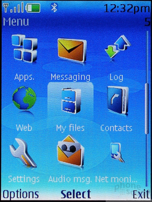
The 6126 is one of the first phones for the US with Series 40 version 3. While most of the menus look the same, a careful observer will note that everything has been overhauled and rearranged to streamline clicks. The number of clicks to get to almost anything has been reduced.
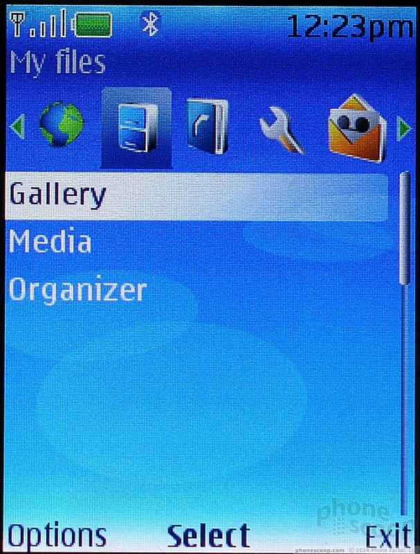
The only exception is actually in the main menu, where a few items like the Organizer applications that were once at the top level have now been moved. The organizer is now in the My files menu, which stumped us because we never considered the timer or to-do list our 'files'. The alarm clock is also hidden in there.
Instead of placing the media and organizer menus at the top, useful spots in the main menu have now been taken over by less than useful applications like audio messaging (voice MMS) and a usage monitor (which could win a prize for least self-explanatory application).
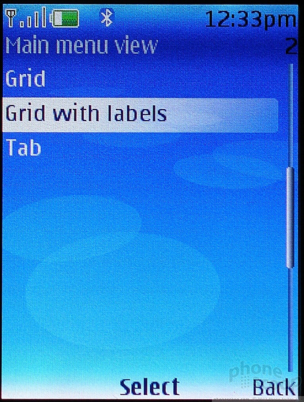
The icons in the main menu can be re-ordered, but items hidden in submenus cannot replace the top menus. Fortunately Nokia solves this problem with a new tabbed layout. Like the layout made popular on Verizon's main menu, this option lets you scroll through each of the main menu items and lists all their items beneath.
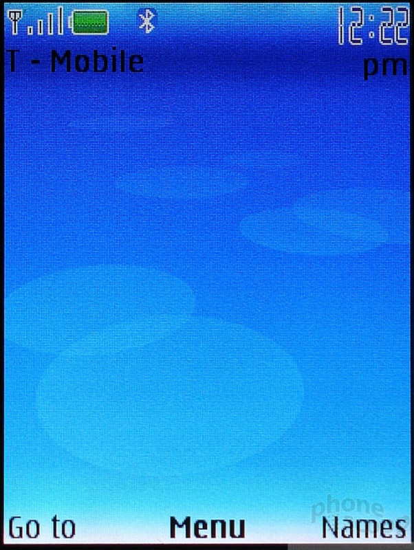
You may find yourself skipping the main menu altogether, because the home screen can be configured with so many shortcuts. As on past Nokias, the home screen can be customized with a shortcut for each direction on the D-pad and both soft keys. If that's not enough one of the shortcuts can be set to the "Go to" menu - a list of more shortcuts that you can customize.
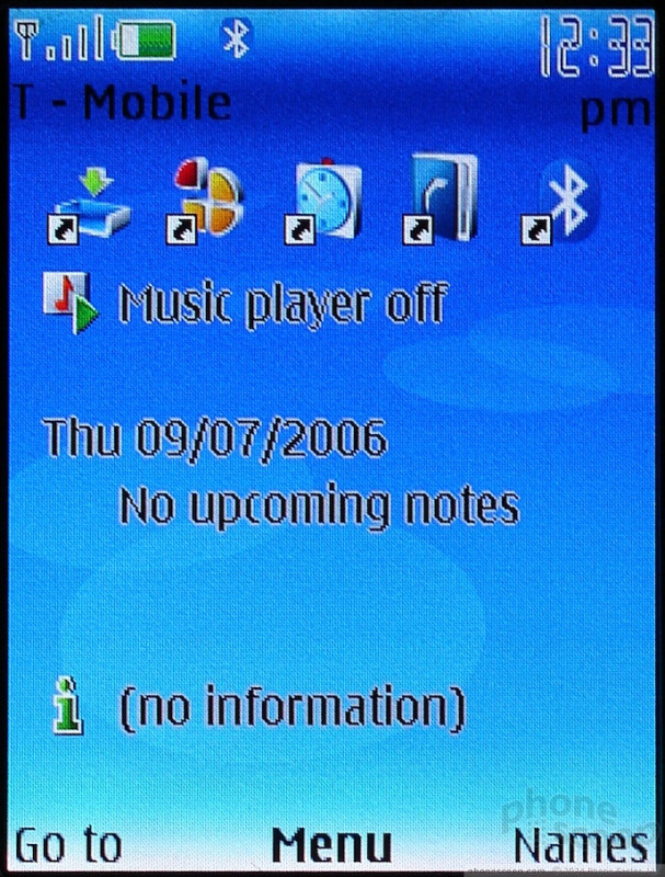
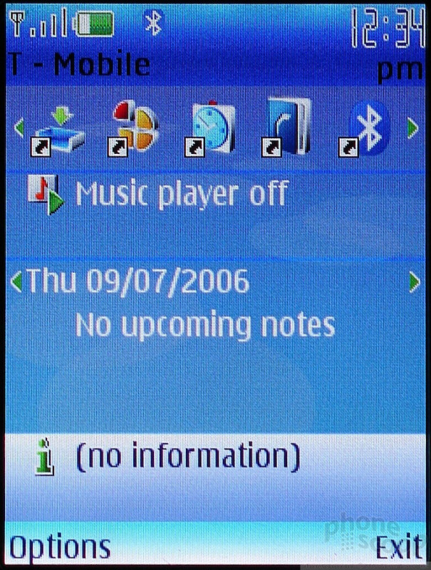
Version 3 adds yet more shortcuts to the home screen by giving you the option to use an active standby screen similar to the one on S60. On Series 40, Active Standby includes a carousel of 7 application shortcuts, a music player status menu, calendar, and an alerts box. In addition to all these shortcuts, the soft key shortcuts are still active as well.
The only draw back to active standby is the text in one of the modes. Active Standby has 2 modes - standby and active (it's obvious from the name, right?). In standby mode shortcuts and status are displayed but can't be used. In this mode the status text is a practically illegible black text with white outline. In active mode, when you can use the standby screen, text is white on dark grey and is quite legible in all conditions.
Once you get past the home screen and main menu into the applications, the improvements in version 3 of this interface are not immediately obvious, even though you are staring right at them. That is because the interface still looks like Series 40. In every application, the left soft key opens an options menu, the select key triggers the default action, and the right soft key goes back. But the moment you try to do something, you'll start to think "I don't remember it being this easy before."
Tasks, especially advanced ones, take fewer clicks and are now far more obvious than before. Nokia deserves credit for making applications easier for experienced users and novices alike.
 3GSM 2006
 Samsung Refreshes Galaxy S Series with S Pen, New Cameras
 Hands On with Teams-Certified Bluetooth Earbuds
 iPhone 15 Series Goes All-In on USB-C and Dynamic Island
 Anker's New MagSafe Chargers Offer New Form Factors
 Nokia 6126 / 6131 / 6133