Review: BlackBerry Torch 9850
The Torch 9850 runs BlackBerry 7 and it works exactly as it does on the Bold 9900/9930. The major difference, of course, is that the larger screen of the 9850 gives you way more room to interact with all of the menus and applications.
If you've used a BlackBerry in the past, you may have set up a BlackBerry ID. This is a great tool, as it helps migrate apps and accounts from an old BlackBerry to the new one. Doing this saves a lot of time come device set-up. If you don't have a BlackBerry ID, I strongly suggest you create one for future use.
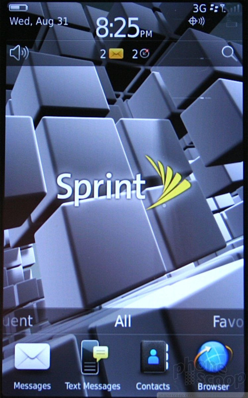
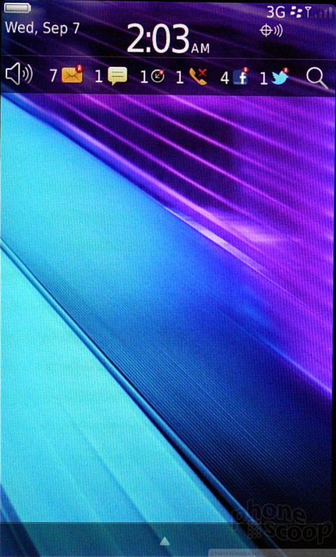
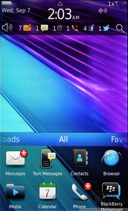
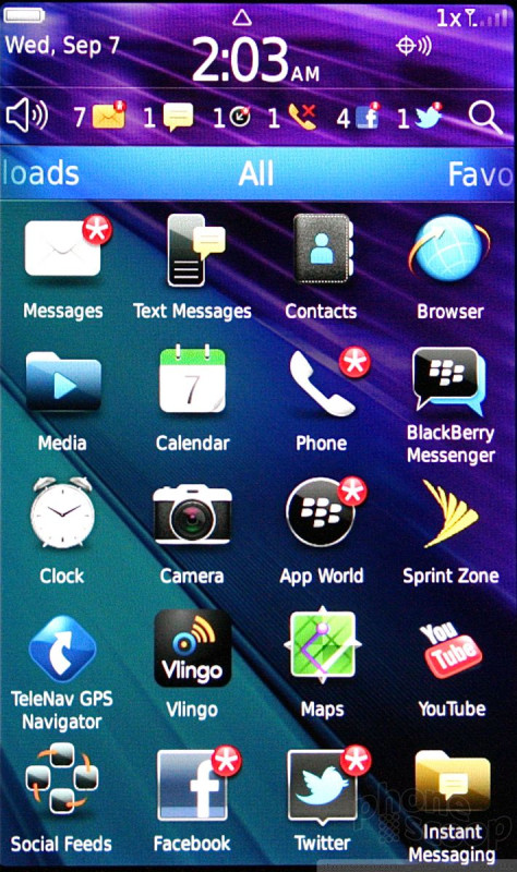
The home page has the status bar, the notification bar, main screen/wallpaper, and the app tray. The status bar is used to access network-based tools and controls. The notification bar acts similarly to the drop-down notification shade in Android. Tapping it lets users quickly get a look at all of the unread messages they may have received.
The app tray is where users will really be able to customize BlackBerry OS 7 handsets. The tray offers five different user-configurable home screens / menus. The first (and default) screen lists all the apps. The others are broken down by group.
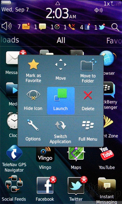
Beyond these home screen and menu tools, the other key behavior to learn is the press-and-hold gesture that is used to open secondary menus and other tools in some applications. This function often duplicates pressing the BlackBerry key.
The Torch 9850's larger, 3.7-inch display makes a huge difference in usability with the BlackBerry 7 software. Rather than feel like a touch interface tacked on after the fact, it feels far more natural than on the 9900/9930. It is also nice that RIM didn't give up on buttons completely. The dedicated send/end and BlackBerry/search keys and the optical track pad go a long way toward speeding up some actions on the device. It is a good mix of form and function.
It's not perfect, though. I find that the small sliver of screen space that needs to be pressed to get the notification tray to open is annoying small. It could be much larger, making it easier to use. Same goes for the bar uses to pull up the app tray. Why are these elements so small when there's so much screen to make use of?
 Video Tour: BlackBerry Torch 9850
 BlackBerry Torch 9850