Review: Samsung Droid Charge
The Samsung Droid Charge ships with a modified version of Android 2.2.1. The modifications are mostly visual, in that Samsung has applied its own design aesthetic to the menus and application icons. As with the Galaxy series of devices from Samsung, I can't stand the bright xcolors and overall cartoonish look of the user interface. The ridiculous use of primary colors (especially blue and green) make me want to find Barney and strangle him. That's just me, though, you might like 'em just fine.
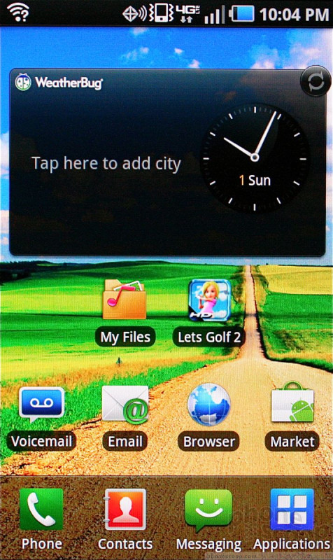
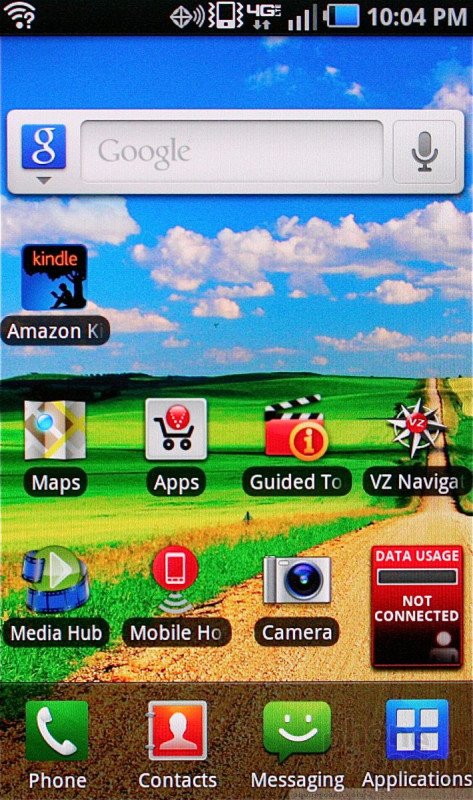
The Charge has seven home screens, most of which Samsung has taken pains to stuff with widgets and shortcuts. As with most Android phones, the home screens can be adjusted at will to suit individual tastes.
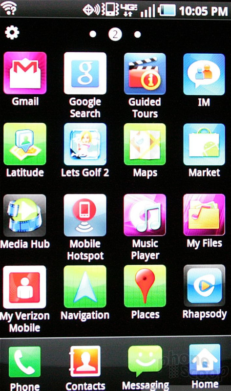
The main menu is laid out in 4 x 4 grids. Rather than use a single "page" for the main menu that scrolls up and down, Samsung prefers to have rigid pages that slide from side to side, like the iPhone. Sliding the main menus left or right jerks the screen sideways to the next grid of 16 apps.
Applications are listed alphabetically by default, but it is easy to rearrange them into any order you like. The main menu can also be set to appear in a single list view.
As for performance, I saw a few hiccups here and there, but the Charge charged forward with all actions for the most part. Screen transitions were smooth, applications opened quickly, and the device didn't crash during my review period.
 Samsung Droid Charge