Review: Helio Kickflip
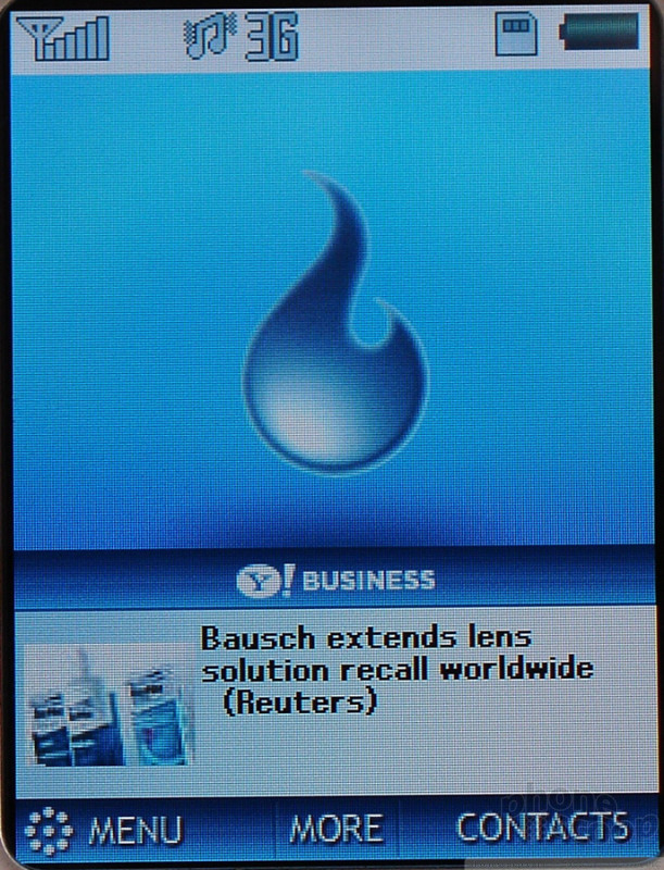
The default home screen for the Kickflip, and for other Helio models as well, is practically empty. A small set of indicators run across the top, while a digital clock and label for the soft keys hug the bottom of the screen. There is no operator logo or other content in center of the screen, leaving it open to display a maximum area of whatever wallpaper you choose.
The Kickflip offers a number of ways to fill up your home screen if you so desire. You can add a text banner, a calendar, animated wallpapers or the Helio On Top (HOT) widget, which allows you to choose from several RSS feeds that are displayed on the bottom half of the screen. The clock is shifted to the top when HOT is active.
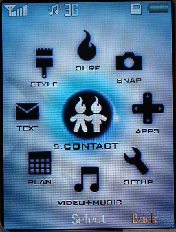
Pressing the right soft key takes you to the contacts list, while pressing the left brings up the main menu. This scheme is maintained even while HOT is active. The main menu looks circular, but actually it is a 3 *3 grid. Pressing the direction keys on the D-pad does not continue to rotate through menu selections. The nine selections organize tasks and applications into obvious groups with colloquial names like "style" "text" and "surf". Other than surf, each of these menu items opens a list of related options and applications. Surf immediately starts the web browser.
There are ways to get to most common applications without going through a menu list. Hitting the right soft key on the home screen opens the contact list, and there are similar shortcuts using the D-pad and side buttons for most other common applications. None of these shortcuts can be changed by the user.
The Helio interface features at least three different menu styles inside applications, if not more. The web browser, media player, camera and download applications each have a different menu that is unlike other native applications. Some, like the camera menu, really improve the experience. Others, like the browser's menu are a bit too much of a mystery and make surfing more difficult. Most users we talked to could not even find the bookmarks, for example.
The common menu system shared by the remaining applications is very contextual. Menu options and even button assignments don't just change from screen to screen, but also by what item is highlighted on a particular screen. It can be a bit confusing for expert users accustomed to buttons always having the same function, however what it does is expose many options that new users might otherwise not find without presenting an overwhelming list. Helio should be applauded for this effort, but more work needs to be done to streamline the menus.


 CTIA 2006
 ZTE's New Phone for Visible Offers Wireless Charging for Under $200
 Nokia Brings New G Series to US
 Motorola's New Budget Phone is Already Very Popular
 TCL Intros Two New Affordable 5G and 4G Phones for US
 VK Mobile Kickflip