Review: Huawei M735
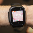
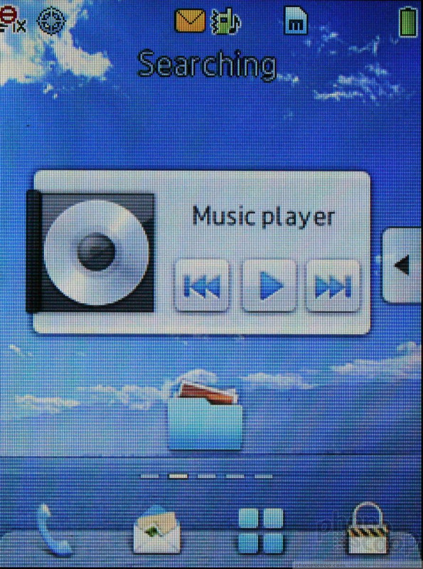
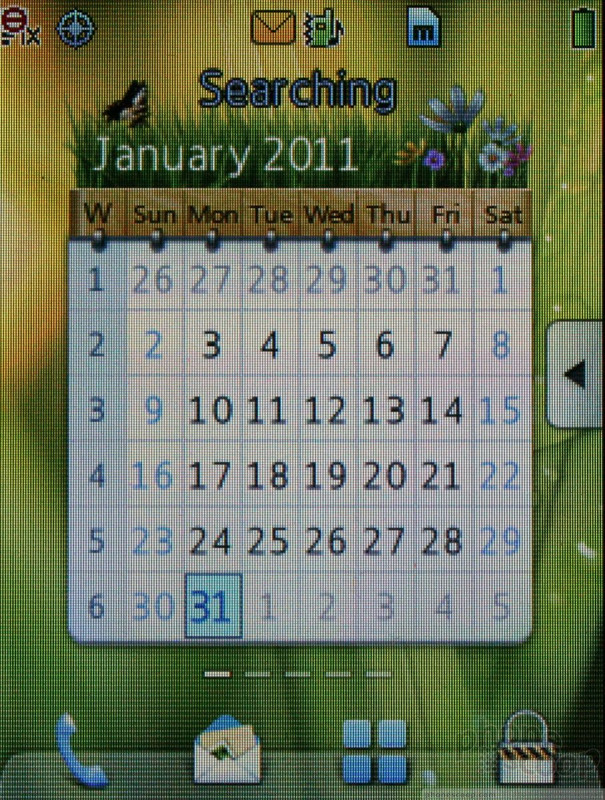
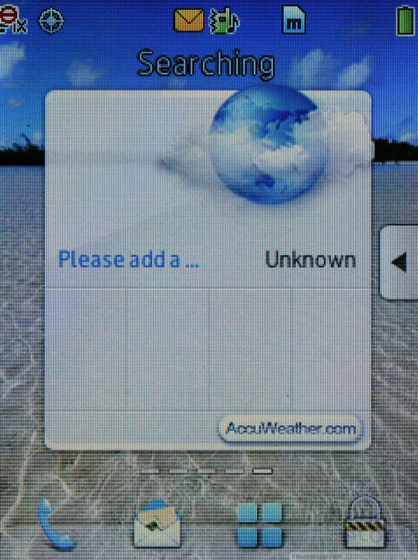
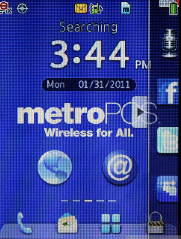
The M735 uses a custom-made user interface that feels and looks like a mash-up of Samsung's TouchWiz and LG's feature phone touch interface. It offers five home screens that can be customized with widgets and/or application shortcuts. You an swipe left or right to get to these additional home screens, but I found it much faster to use the d-pad. There is also an app drawer on the right side of the screen accessed via a tab that works identically to the one used by Samsung in its old TouchWiz devices. With five home screens that are each customizable, I question the value of the app drawer, but it is there if you want to use it. Last, there are four permanent icons along the bottom of the home screens for accessing the phone, messages, main menu, and screen lock.
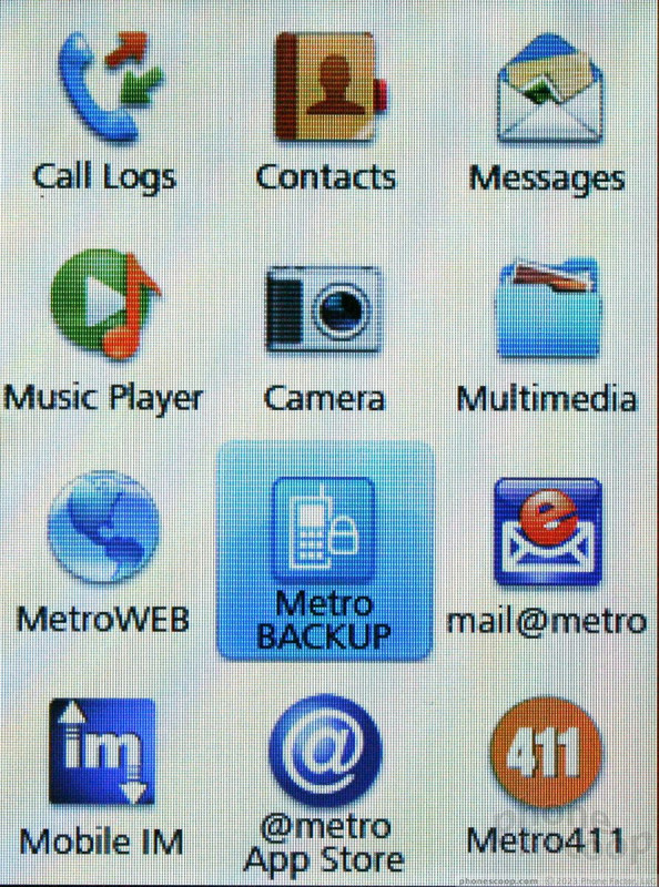
The main menu is a large grid of icons. This grid view can't be changed (to a list view, for example), but you can move the icons around into an order that suits you better. Just press and drag the app icon to another spot in the menu. Once you drill down past the main grid, menus switch to text-driven lists of action items.
It's not the prettiest user interface I've seen, but it is functional and doesn't impact usability in a negative way.

 Hands On with the Orbic Myra 5G for Verizon
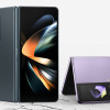 Samsung Refines its Foldable Phones
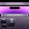 iPhone 14 Plus Offers a Big Screen For Less
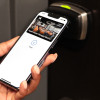 Hyatt Launches Apple Wallet Room Keys
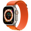 Apple Watch Goes Ultra
 Huawei M735