Review: Sanyo Taho
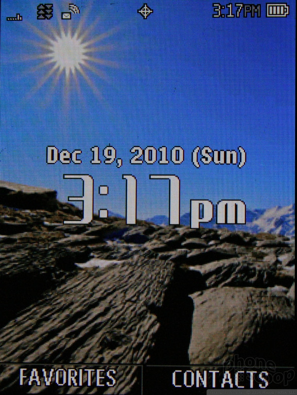
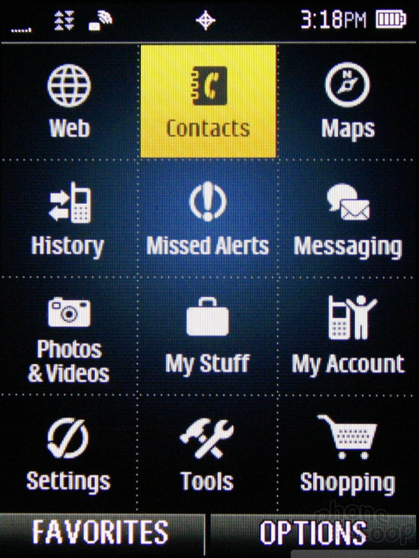
The Taho uses one of Sprint's most basic user interfaces, and it has been around for years. The home screen has links to your favorites and contacts via the soft keys. If you want to get at the main menu, press the center of the D-pad. The main menu is a 12-icon grid that can also be viewed in list form. Rather than make you jump through hoops to change the way the main menu looks, the left soft key does the trick. For my money, the grid view is easier to use on a day-to-day basis.
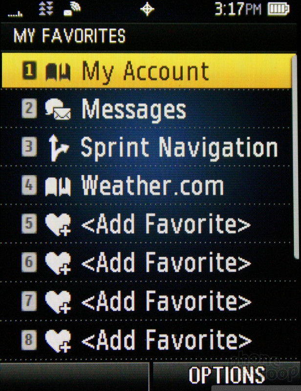
The 12 icons don't offer any surprises and are composed of the requisite mixture of phone tools and Sprint service offerings. Similar to other Sprint phones, it uses the My Stuff folder to centralize all your media and apps and games. The "Shopping" icon doesn't take you to an on-board apps store. Instead, it fires up the browser and loads Sprint's content portal.
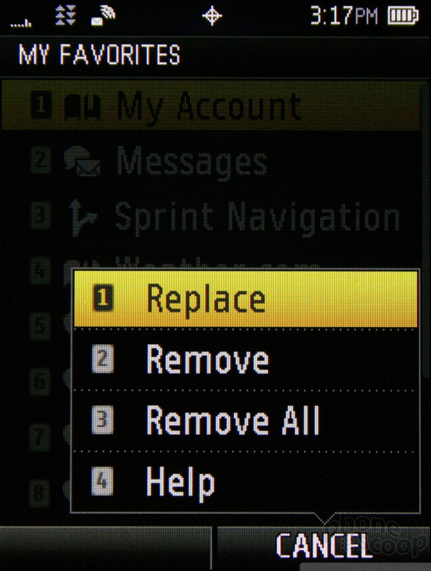
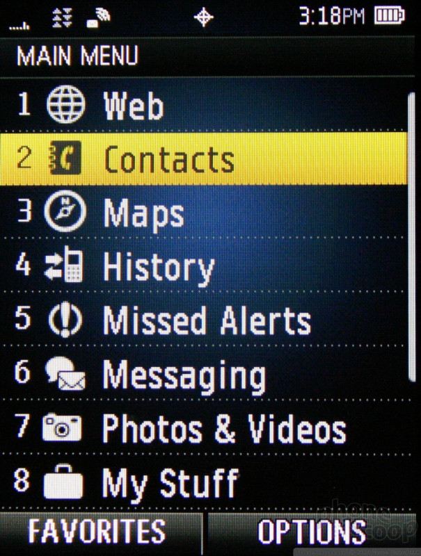
Once you move deeper into the menu system, the default view of the menus switches to a list.
 Hands On with the CAT S22 Flip
 Apple Intros AirTag to Help Find Your Keys
 Verizon Picks up Nokia's New Flip Phone
 Android 12 Sports New, Customizable Look
 CAT Puts Android With Play Store in a Compact Flip Design
 Sanyo Taho by Kyocera