Review: Huawei Ascend

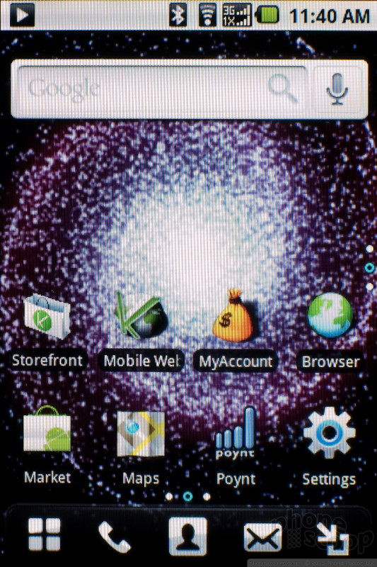
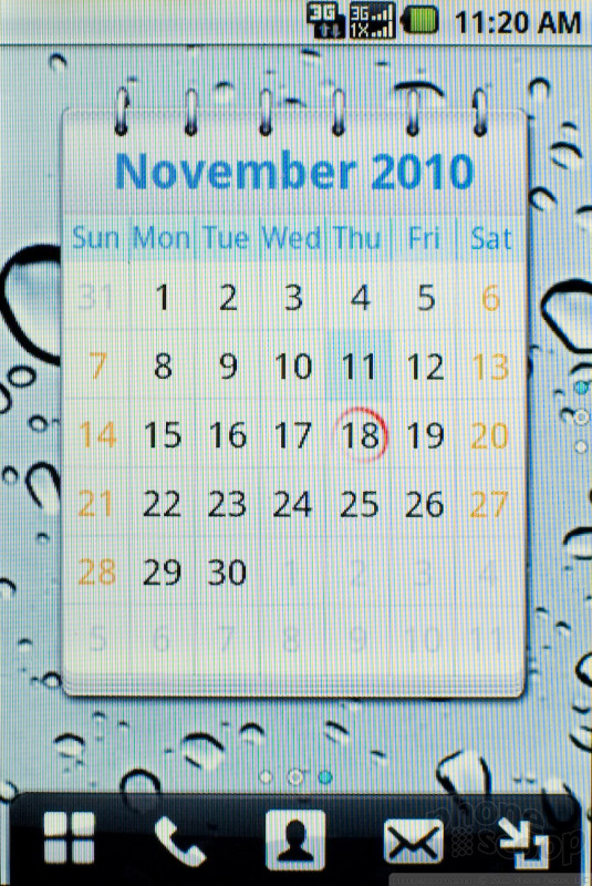
Huawei hasn't overlaid its own interface on top of Android so much as the company has tweaked the existing Android 2.1 design. Sometimes this is for the better, and sometimes it's just weird. A stock Android phone offers homescreen panels, and you swipe left or right to see the full lineup of available screens. On the Ascend, you actually get a 3 by 3 grid. So, there are nine homescreens, and in addition to swiping left and right, you can swipe up and down, while the notification shade at the top and the buttons and the bottom remain in place. That might seem like a little much, but it does offer plenty of screen real estate to organize all of the icons and widgets you want. Huawei also includes a button near the bottom of the screen that zooms out and shows you all nine panels at once, so you can jump quickly from one to the next. You can even scroll diagonally, but it's harder to pull off. The phone also makes it tough to scroll between panels with large widgets on screen. You have to aim for an empty spot so the phone won't think you're tapping the widget instead.
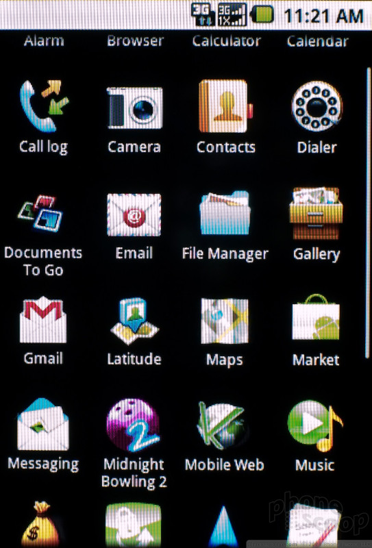
At the bottom of the display, there's a row of buttons that persists no matter which panel you're viewing. There's that zoom out button on the far right, and an application drawer button on the far left. In between you'll find a phone button that opens the dialer (the Send key jumps to the call log), an address book button and a messaging button that opens up the SMS text messaging app.
The Menu key on the phone brings up the standard Android menu, with Huawei's Themes option added. There are only three themes on the device, a default, an entertainment theme and a work theme. To some extent, these themes will remember your settings and hold onto them, so you can jump from one to another depending on how your day is going. Wallpapers did not stick, so you either have to appreciate the wallpaper Huawei chose for that theme or change it every time. But apps and widgets that you drop onto one of the nine panels will stay there if you change from work to entertainment, then change back again.
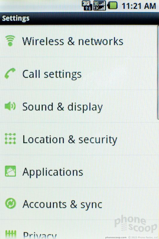
Huawei has also changed some of the menus and built-in apps. The settings menu is nearly identical to a stock Android phone, except for one crucial change. Instead of white text on a black background, it's black text, white background. I definitely prefer Huawei's look, and it was easier to read outside, where black screens can disappear under a harsh glare. The phone app, contact list and SMS apps all get the Huawei design touch. These changes are a bit more dramatic looking, but all the same functions and features are there. In each case, I preferred Huawei's clean, updated look to the stock Android design. It's all very well done.
The best thing about Huawei's interface design is that it made the phone more usable. Often I wonder if a manufacturer has tweaked the interface just to be distinguish themselves from the pack, not to improve the design. In the case of the Ascend, I like most of Huawei's designs better than the standard Android look.
 CTIA Fall 2010
 Cricket Goes for Another Ovation
 AT&T's Newest 5G Phone is Just $90
 TCL Creates New Stylus Phone for US
 Huawei Ascend