
Review: Samsung Transform
The Samsung Transform looks something like a Samsung Epic 4G lite. It's a bit thick, with nicely rounded corners. It's a QWERTY slider with a large touchscreen up front, like the Epic, and it also uses the same layout for the touch keys beneath the display. But that's where the similarities end. The Transform is a sort of nondescript phone. It's well rounded on every edge, so it feels good in the hand, though it is a little bulky. This also means it will fit into a pair of cargo shorts, but this isn't the phone for you if you like tight pants.
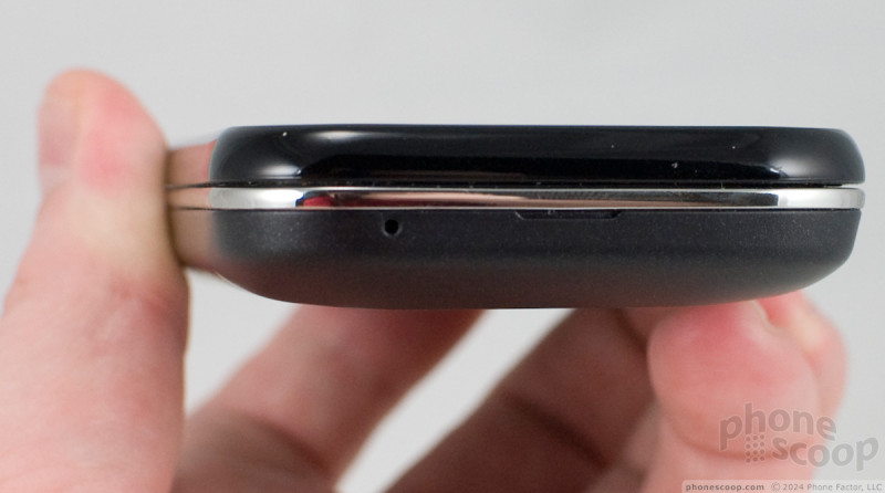
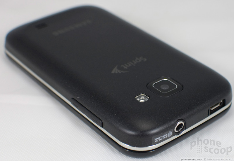
In a dimly-lit room, the icons for the touch buttons fade from view, and the front looks like a plain black slab. There's a chrome waistband around the middle, separating the glossy top from the soft touch paint on the back battery cover. The entire back peels off easily, revealing the battery and the microSD card slot, though thankfully the slot is on the side of the phone, so you don't have to remove the battery to swap cards.
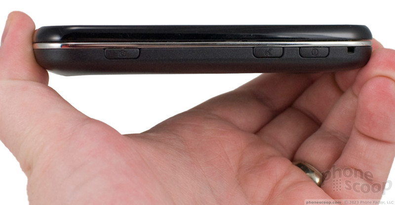
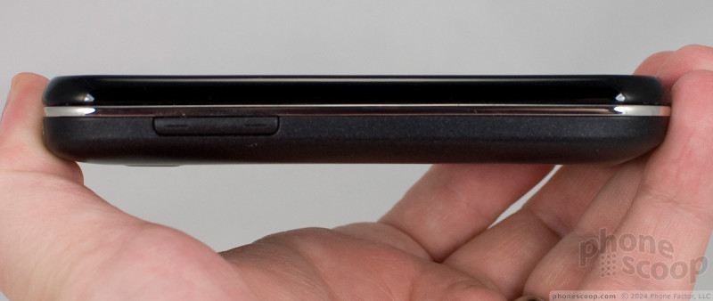
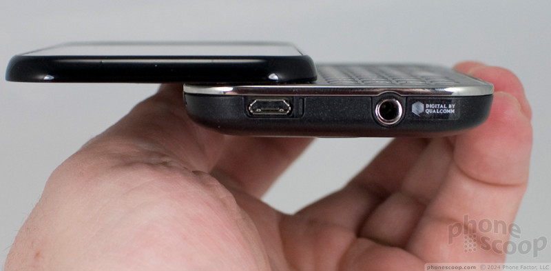
On the right side of the phone you'll find the power / screen lock key, the voice dialing key and, farther down, the camera button. All of these were nicely raised with just enough action. The camera button, especially, was easy to use with its two-stage, auto focus feature. The volume rocker is on the left side of the phone, also well raised, so it's easy to find during a call without fumbling. Up top, there's a 3.5mm headphone port so you can use whatever earbuds you like with the Samsung Transform. There's also a microUSB port, hidden beneath a sliding port cover. I'm neutral on Samsung's recent sliding port cover fetish. On the one hand, the covers are well designed and certainly won't break off, like many port covers I've used. On the other hand, I'm just not dusty or messy enough to feel a port cover is worth the hassle.
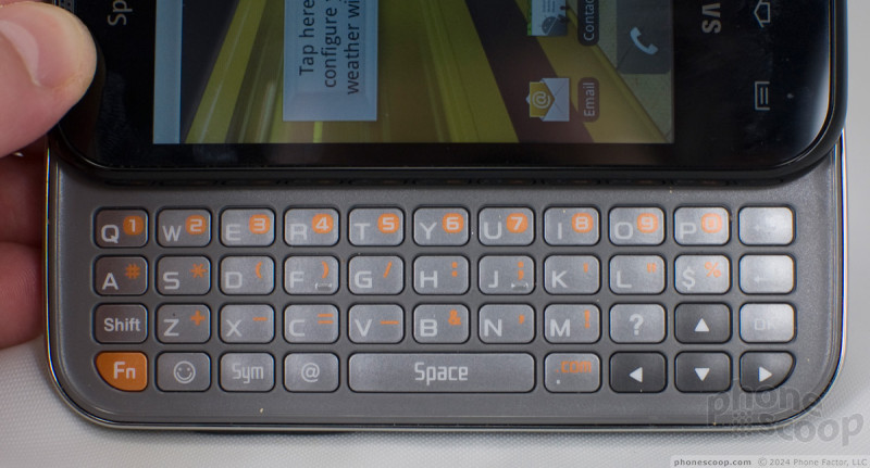
The keyboard snaps open and shut with a pleasantly stiff, reassuring clap. Samsung uses a 4-row keyboard design, and the number keys are hidden in the top row as "Fn" keys. I like the layout of the letter keys. They seem symmetrical and nicely balanced, but I am not a fan of this keyboard for a number of reasons. First, the top row butts up against the top half of the slide, which made typing those keys less comfortable. Second, Samsung makes some strange choices for punctuation keys and shortcuts. The period, question mark and the @ symbol each get their own keys, which is nice. There's also a dedicated key for smileys, which is fine for the right user, but also a dedicated $ key. A dollar sign key? I can't imagine a user who would prefer a $ to a dedicated .com key (it's a Fn alternate for the period on the Transform), or even a simple comma. Finally, the keys themselves are flat without a nice tactile break between them. It was very difficult to type without looking, which is one of the great benefits of a hardware keyboard over a virtual, onscreen keyboard.
 CTIA Fall 2010
 JBL Puts a Touchscreen on its Earbuds Case
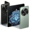 OnePlus' First Foldable Aims High
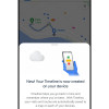 Google Making Maps Location History Private, Even from Police
 Samsung Transform


