Review: Nokia N8
Browser
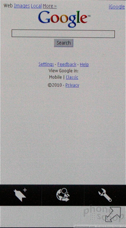
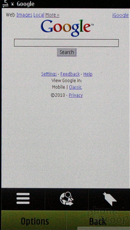
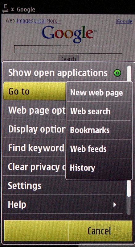
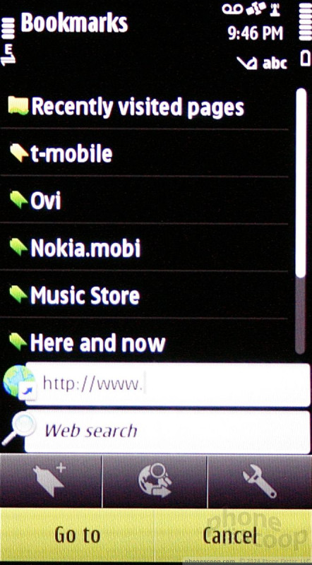
The N8 has the venerable S60 browser, which, though based on WebKit, doesn't hold a candle to other WebKit browsers available in the market. Its biggest fault? No address bar.
Having an address bar at the top of web pages that is easily accessed by pulling down on a web page is vital for touch phones. Instead, on the N8, it is a two-step process to bring up an address bar for entering URLs. This really slows down browsing, in my opinion.
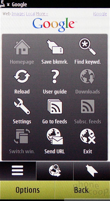
There is a transparent double-arrow that floats in the bottom right corner of the N8's browser screen. Press it to open the site navigation tools, such as a search bar, the options button, or bookmarks. The browser is far too menu-driven, in my opinion.
This same basic S60 browser first appeared on devices as long ago as 2006. While Nokia attempted to touch-optimize it for Symbian^3 - and it's far better than most feature phone browsers - it's still not as finger-friendly as it could be. For example, the "Back" function in the browser offers a neat, visual stack of web sites and lets you pick which you navigate to. The problem is, it is so sensitive that it's nearly impossible to fine-tune your selection to get the exact page you want. Very frustrating.
Despite those issues, it still does a fine job at rendering HTML web sites, and content looks good for the most part. Browsing speeds were more than adequate on both T-Mobile and AT&T's networks. I had no trouble loading pages.
Customize
The N8 allows for some customization. It comes with a number of wallpapers and themes, and users can easily adjust ringtones, and that type of stuff.
On a deeper level, the home screens can be customized with widgets. There are a limited number of pre-loaded widgets, but there is quite a large catalog of them in the Ovi Store. These widgets pull down web content and can be used to deliver info to the home screens of the N8.
Each of the home screens is limited to just six widgets, and they all appear stacked one on top of the other. I don't care for the way it looks, but others might. Of course, the main menu can be rearranged, and also configured to appear in list form.
What I dislike most — the fonts and most background colors — can't be adjusted.
 Hands-On: Nokia N8
 Hands On with the T-Mobile REVVL 6 Pro 5G
 Nokia Phones Coming to New US Carriers in 2022
 Samsung Reveals One UI 5
 Nokia N8-00