Review: Nokia N8
Symbian^3 (S^3) is a brand new version of Symbian. Nokia's S50 5th Edition was essentially Symbian^1; therefore, S^3 is two generations later and ought to be better, right? It doesn't quite pan out that way.
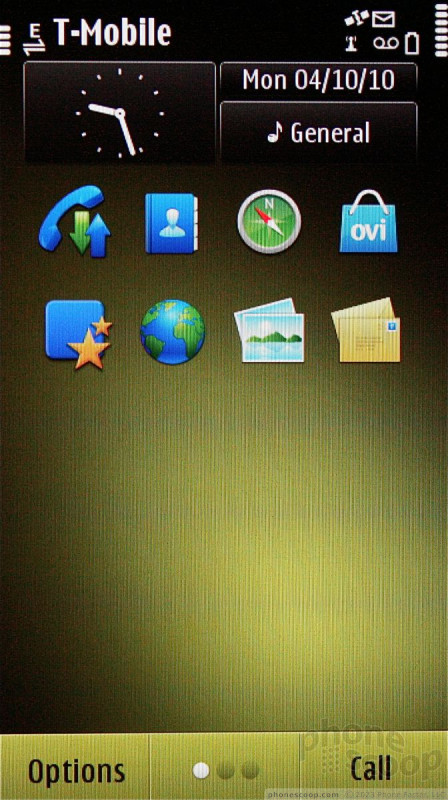
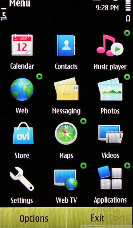
The N8 has three home screens, each with its own set of widgets. Anyone familiar with S60 is going to feel at home. The main home screen has the clock, date and time; profile setting; eight application shortcuts; and two widgets. Clean, it is not. All of the home screen elements are different shapes and sizes, adding an unwanted element of chaos to the way it feels. There is also a dock that persists across the bottom edge of all three home screens, which provides access to options, the phone app, and screen switching.
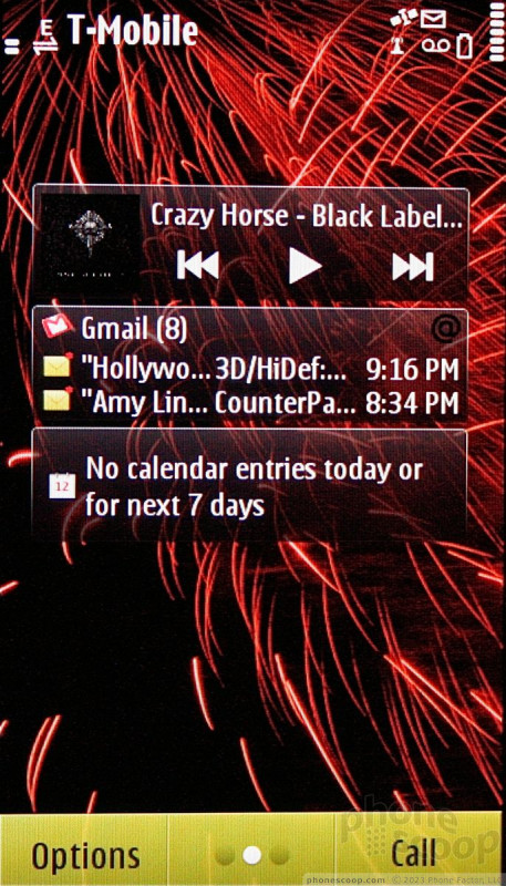
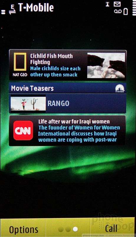
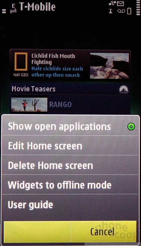
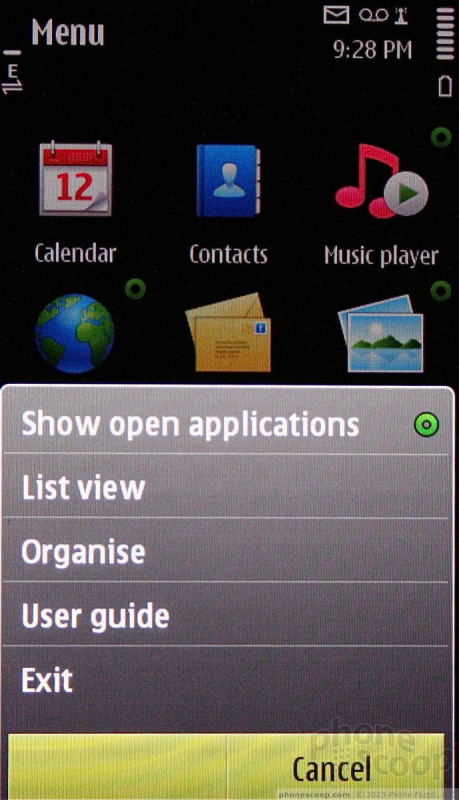
The secondary two screens are pre-populated with widgets, such as ESPN, CNN, and so on. They display the latest headlines, and news feeds, and can be rearranged, deleted, or added to. Press the on-screen Options button to make adjustments to the home screens' appearance and widgets' behavior.
From the home screen, if you press the home button on the front of the N8, it takes you to the main menu. If you press the home button while in any other application on the device, it takes you back to the central home screen. This takes a little getting used to. Press and hold it to access the task manager/app switcher function.
The main menu strongly resembles that of older S60 models. The overall look at feel is decidedly "Nokia." It is laid out grid-style, with 12 icons. Users can switch the main menu to list view, as well as rearrange where the menu items are located on the screen.
These main screens aren't awful, and make sense in a way. But the learning curve is higher than with other, competing platforms. It definitely is not intuitive. (Thankfully, however, Nokia has ditched the one-tap, two-tap nonsense that plagued S^1/S60 5th Ed.)
Things start to get fuzzier once you dive deeper into applications. Individual app menus come in a jumble of tabs, drop-downs, pull-downs, and extended options. You can find yourself layers and layers deep in the OS trying to find stuff, just as with old S60 phones.
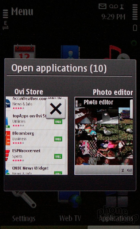
What about performance? In a word: Inconsistent. Some times home screens, apps, and widgets worked flawlessly, and other times the phone crashed hard, froze, and needed to be reset. I'd say about 20% of the time you're doing anything, the device would just give up and not respond to any input whatsoever.
Sometimes you'd get the domino effect, and the N8 would suddenly respond to a dozen key presses all at once and you've suddenly called Uncle Bob in Tahiti. Very frustrating.
The problem is, the N8 multitasks too well. It will allow you to stack up running app after running app until the device just can't handle it any more and crash. It would be better if only X number of apps were allowed to run in the background, preventing the memory sabotage issue.
To put it bluntly, Nokia still has a long way to go when it comes to improving the overall look, feel, and usability of the user interface. It continues to be a weakness.
 Hands-On: Nokia N8
 Hands On with the T-Mobile REVVL 6 Pro 5G
 Nokia Phones Coming to New US Carriers in 2022
 Samsung Reveals One UI 5
 Nokia N8-00