
Review: Pantech Ease
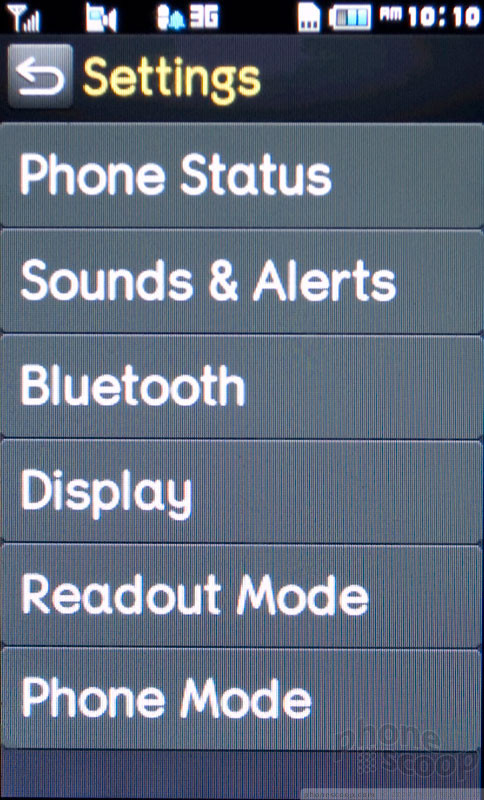
The Pantech Ease comes with two menu designs. There is the Advanced Mode, which is identical to what you'll find on the Pantech Pursuit. I skipped this menu and stuck with the Easy Mode. The Easy Mode uses larger text, large menu items with wide buttons, and a simplified feature set.
There are features that you cannot access from the Easy Mode. You lose the three-panel home screen, with its customizable shortcuts for apps and contacts, as well as the more extensive, three-panel main menu. AT&T Social Net, a simple social networking app for sending and checking status updates on Facebook, MySpace and Twitter, is hidden in Easy Mode. Instant Messaging disappears, and so does AT&T Music. Apps like Mobile Video and Mobile Banking are also absent.
Most of these, I don't think the intended audience will miss. Social networking is probably not so popular, though I'm sure there are plenty of grandparents who might check in on Facebook from time to time (like my parents do). But I don't think the Ease's target will miss AT&T Music or Mobile Video, nor will they miss IM much. I wish you could customize what disappears when Easy Mode is activated, but that option might be more complicated than it's worth.
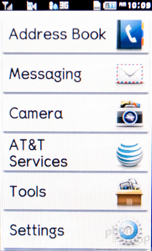
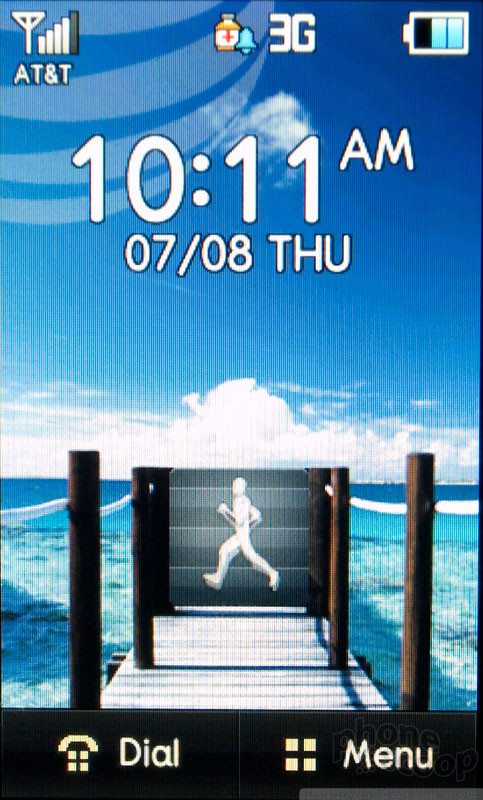
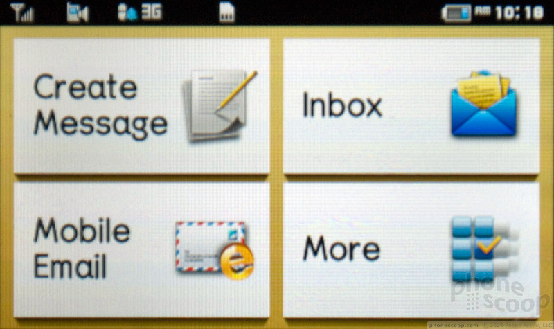
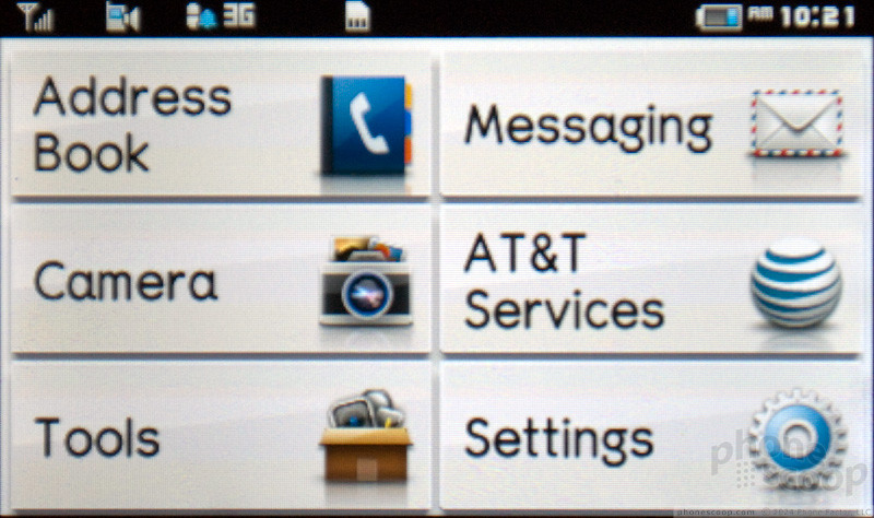
The menu in Easy Mode is much easier to use. On the home screen, there is a button to open the phone dialer, and another to open the main menu. The Call button jumps right to Recent Calls. The main menu only has six options. There's a button for Address Book, Messaging, Camera, AT&T Services, Tools and Settings. The layout and organization could have been better. For instance, the phone has a camera button, but the Camera menu also takes you to the photo gallery, so maybe it should be called Photos instead.
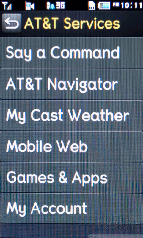
AT&T Services is too generic and confusing as a menu name. Sure, AT&T Navigator lives there, but how will my parents, who are in the prime audience for this device, remember that this is also where they find the weather app and the Web browser? Aren't those Tools? The menu could be organized and labeled better.
That said, even if my parents forgot where to find the AT&T Navigator app, there are really only two logical choices, instead of three panels worth of icons. I appreciate that Pantech has adapted the phone's menu for the target audience. It's rare to find phones these days that are so focused.
 Review: Pantech Pursuit
 iPhone 14 Plus Offers a Big Screen For Less
 Apple Watch Goes Ultra
 Motorola Defy Satellite Link Now on Sale
 Apple Intelligence Promises Personalized AI, Requires iPhone 15 Pro
 Pantech Pursuit


