
Review: LG GS505 Sentio
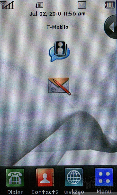
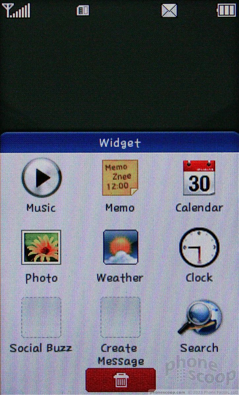
The Sentio uses the same basic user interface that LG has stuffed into its touch phones for years. There is one home screen, which users are free to populate with widgets. In the upper right corner of the screen is a little tab, similar to Samsung's TouchWIZ. Tap the tab, and a tray comes out. The tray can hold up to 9 widgets, but no more than that. The widgets can be dragged from the tray onto the home screen if you wish. Users can customize the tray a little bit, but since it holds only 9 widgets, you have to delete the ones already there to add more. It's a silly limitation.
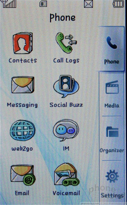
There are also four icons at the bottom of the home screen. One is for the main menu. This main menu is similar to that seen on devices such as the LG Vu Plus. There are a series of tabs on the right side of the screen which are meant to lump applications/controls into groups. Each grouping has eight apps/controls in it. For the most part, they make sense.
The apps/controls are represented by icons in the first two layers, but once you dig down deep enough, everything switches to text menus. Sometimes these menus are longer than a single screen view, so you have to scroll to get to the items at the bottom. Enter the Sentio's scrolling problem, and you can see where I'm going. It leads to frustration.
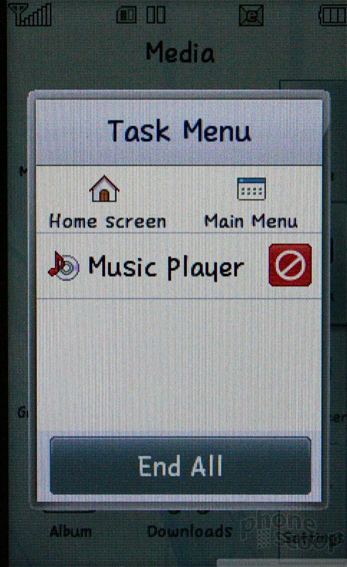
I didn't dislike the menu system as much as Philip did for the Vu Plus, but it certainly does the Sentio no favors. Perhaps the most puzzling thing is that many of the essential controls require the press of a tiny button stuffed into the upper right corner of the screen. This button doesn't have a name, or any text on it to describe what it does. You just have to figure it out by pressing it to see what happens. Intuitive? No. It would be better if LG made this button a little bit larger, and actually clued users in to what its purpose is.
I think the bigger problem is that the Sentio is limited to just one home screen and has limited screen real estate to begin with. This means that if you want to make use of the widgets, you can only do so a few at a time. Adding just one more home screen would give the user a lot more flexibility in customizing the phone.
 Qualcomm vs. Bullitt: Satellite Connectivity Comparison and Hands On
 Qualcomm Intros Snapdragon Chips for 2023's Mid-Range & Affordable 5G Phones
 Google Brings Calendar App to WearOS
 Gabb Expands Lineup with Phone for Teens
 Motorola Brings More Affordable 5G Phones to its 2024 Lineup
 LG Sentio GS505


