Review: LG Fathom
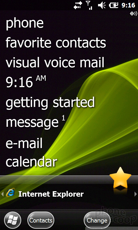
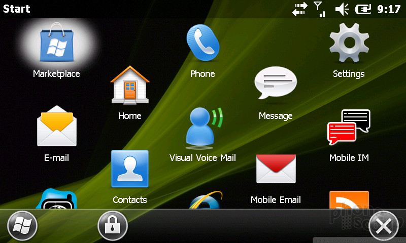
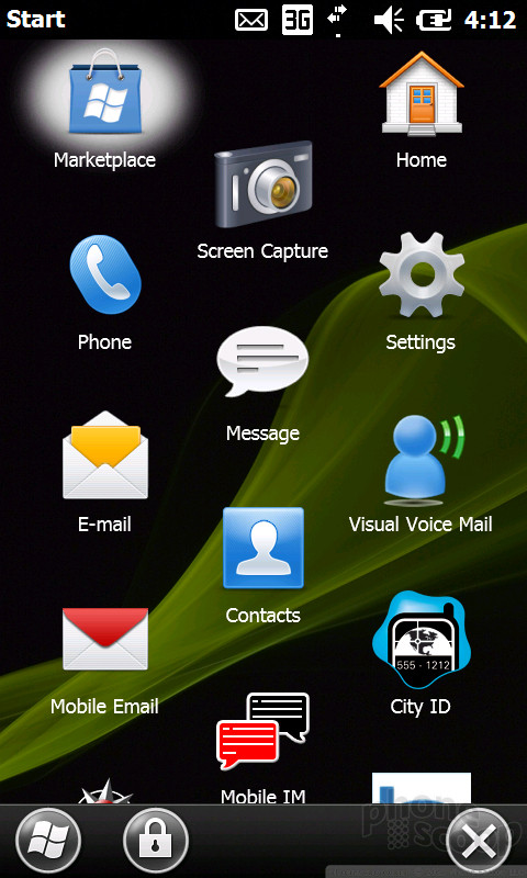
Even if LG hadn't screwed up the Fathom by using a resistive screen, it was probably already a lame duck with its dated Windows Mobile interface. A few new buttons and better touch response can't save this sinking ship. The new WinMo 6.5.3 update does offer some nice improvements for WinMo fans, like those touchable buttons at the bottom of the screen. Sometimes they seem useless. Why does that bottom row need a Windows Start button, when the phone has a dedicated, hardware Windows key already? But sometimes they were useful and contextual. On the Today screen, for instance, when you have Music selected, you get a "Library" button below; when you have Message selected, you get a "Compose" button beneath. The buttons persist throughout the OS, and though they take up screen real estate, it's well spent. Or at least it would be if the touch response was much better.
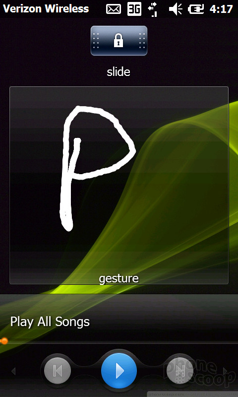
The phone has a clever lock screen. Instead of just using the normal slide, the Fathom also gives you a small area in which you can write a single letter to jump to a specific app or feature. Write an "i" and you go to Internet Explorer. Write a "P" and the phone pops up. It actually worked pretty well, and went beyond gimmick to a useful shortcut. I wish I could program my own shortcuts into the writing area, but instead it draws from a small list of available actions.
There is no Back key on this phone, and I actually miss it. Microsoft's newest phone, the Kin, only has a Back key, so clearly it's important to Windows Phones. Sometimes you get a Back key on screen, but sometimes it's just an OK key. The difference? Hard to tell. OK doesn't actually quit a program. This is especially confusing in the email app. When you finish a message, don't press OK, because that actually closes the messages and saves it to Drafts. Instead, you want the tiny picture of the envelope.
You can now rearrange applications in the Start menu by dragging them wherever you'd like. In the past, you could only send an app to the top. Welcome to 2008, Microsoft.
Truth be told, I don't hate Windows Mobile. I think it looks better and is better organized than Symbian or BlackBerry phones. But those devices aren't made for touch - with a couple exceptions - and in the touch arena, Windows Mobile just can't compete. It's an OS designed for your IT manager, not for you. There are too many options and settings to deal with, and it seems like basic systems don't work properly without expert guidance. The music library doesn't automatically find songs until you dig through a menu to tell it what to do. The Wi-Fi never worked for me, and the setup procedure requires an MCSE certification. Even setting up Gmail Sync, which should have been exceedingly easy, didn't work properly the first times I tried, then magically seemed to connect.
When I started the phone for the very first time, the first thing I saw was an error message. That's Windows Mobile in a nutshell.
 Samsung Refreshes Galaxy S Series with S Pen, New Cameras
 Hands On with Teams-Certified Bluetooth Earbuds
 Apple Intros AirTag to Help Find Your Keys
 Anker's New GaN Chargers Offer High Wattage in Tiny Package
 Wiko Drops a Better Ride for Boost
 LG Fathom