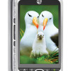
Review: HTC myTouch 3G Slide
The myTouch 3G Slide doesn't use HTC's Sense UI, but it doesn't really use stock Android, either. HTC and T-Mobile have made some subtle changes that make the Slide at least different from other Android handsets, if not more usable.
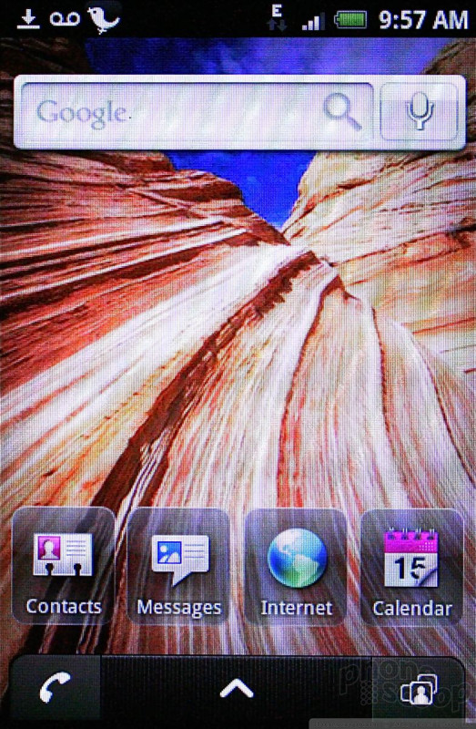
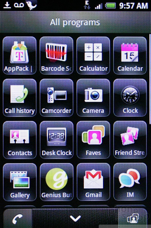
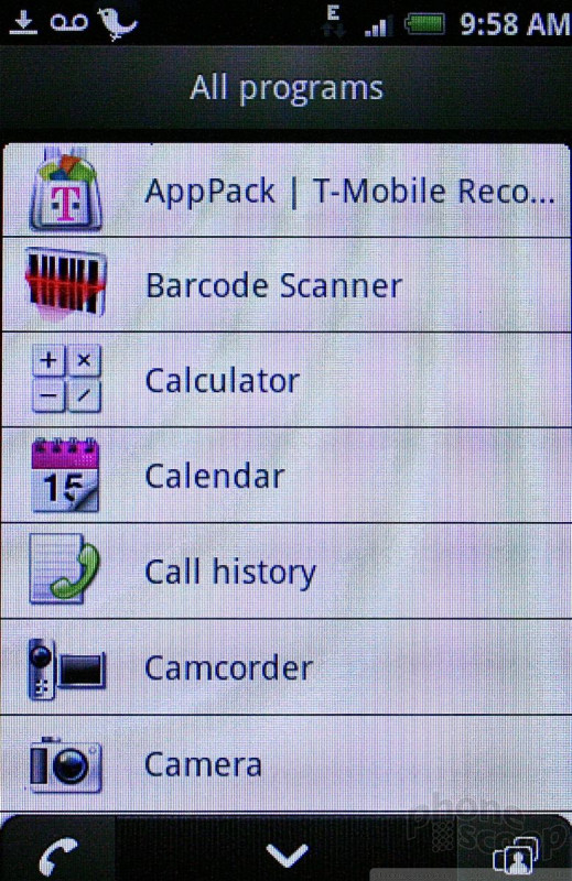
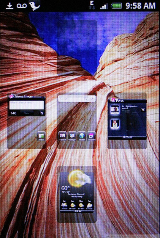
The Slide has five customizable home screens. The central home screen lacks the search bar along top as is customary for HTC Android handsets. What you get instead are four software apps loaded on the home screen for contacts, messages, browser and calendar. Unlike the "free-floating" Android icons we're using to seeing, these (and all the icons in the Android main menu) are framed in an opaque square. It doesn't make them any easier to use. They simply look different.
The main menu tab at at the bottom of the screen is flanked by two permanent icons. The one on the left launches the phone, and the one on the right launches the Faves contact list. These buttons persist across all five home screens, making it easy to get to the phone in a hurry.
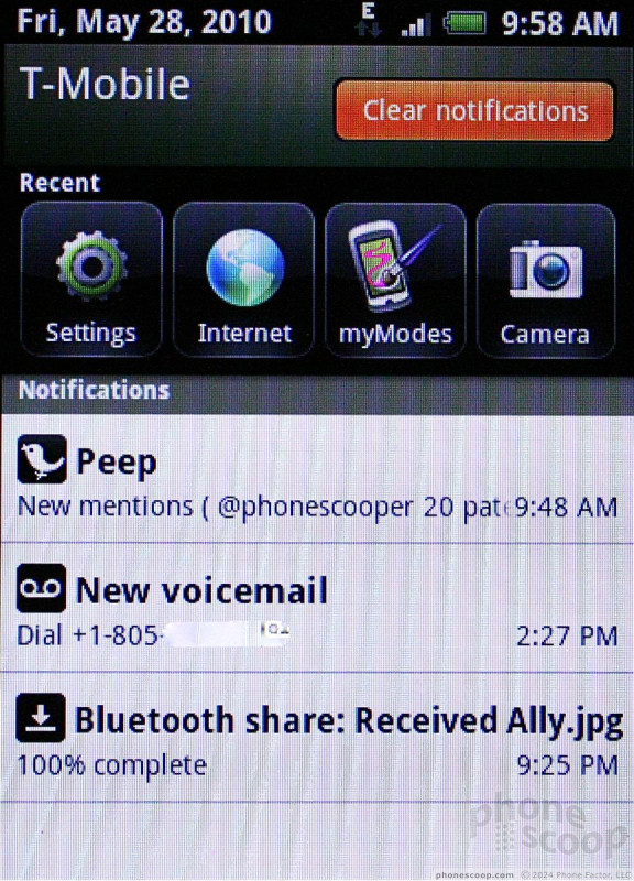
Another thing that is slightly different is the notification shade. When you drag it down, it displays notifications as normal, but it also includes the four most recently used apps. This means if you've used apps W, X, Y, and Z, it will show the icons for those apps when you pull the shade down.
Last, another change I noticed is that the unlock screen contains more notifications, such as missed calls, SMS messages, and emails.
Other than that, not much has changed about the way Android's menus behave.
 HTC myTouch 3G Brings Android 2.1 and QWERTY Goodness to T-Mo
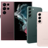 Samsung Refreshes Galaxy S Series with S Pen, New Cameras
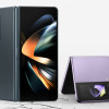 Samsung Refines its Foldable Phones
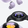 Samsung Upgrades its Wearables
 iPhone 14 Plus Offers a Big Screen For Less
 HTC myTouch 3G Slide