Review: Microsoft Kin One and Two
Things get confusing here fast, so lets take it slow.
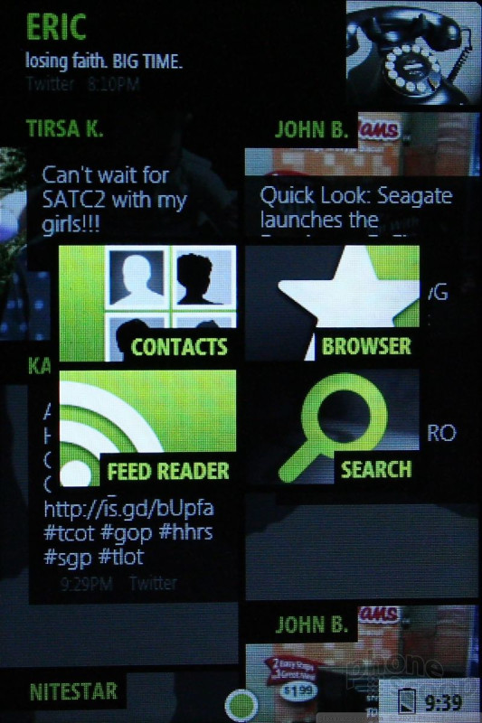
There are three home screens. The central home screen is a real-time flow of social networking status updates. Think Twitter, Facebook, RSS feeds and MySpace. Any time you pick up the Kin, the first thing you see is what your friends and family are up to. At the tippy top of the screen is your own most recent status update. Press it to share what's on your mind. I do really like that Kin automatically brings in profile pictures with no effort on the users' part. Users can also populate this screen with RSS content, web site info, and so on. It makes for an ever-changing, colorful and dynamic home screen. Microsoft calls this Kin Loop. (As in, you're always in the "loop", get it?)
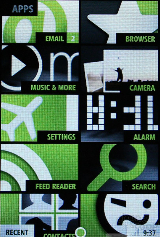
The screen to the left is the main menu. It's a grid, which is made confusing by crazy shapes and colors. I get the appeal to the design, but in this case form does not trump function. There are twelve main tasks, in two vertical columns of six each. They are Messages, Phone, Email, Browser, Music, Camera, Settings, Alarm, Feed Reader, Search, Contacts and Help. The last two aren't visible, you have to scroll up to see them. Press any of these, and you're taken (eventually) to a sub-menu. Some of the sub-menus have sub-menus of their own. I was surprised by how deep you have to dig to get at some simple stuff, such as the ringtone profiles, or lock screen images, etc. There are a lot of layers, and it takes time to get used to them.
The home screen to the right is dedicated entirely to each user's Faves. Yes, Microsoft is forcing users to dedicate two-thirds of the Kin's home screen space to social networking and contact management. Makes it pretty obvious what Microsoft expects people do to with Kin, no?
A big part of the UI that ties all of these elements together is the Kin Spot. It's the little dot at the center of the Loop (central home screen). See something on the home screen that you want to re-post or share with your contacts? Drag it to the Spot. Once you've dragged content to the Spot, you can do a whole bunch of different things with it, including uploading to Facebook or other services such as SMS, MMS or email. It's a really neat concept.
The one over-riding problem with all of the menus - and the Kin in general - is the slowness of the UI. You could compare it to the first version of webOS that shipped nearly a year ago. Screen transitions are slow and stuttery, apps freeze up every now and then, and the Kin takes forever to react to the simplest of commands.

 Review: Kin Two
 Samsung Refreshes Galaxy S Series with S Pen, New Cameras
 Samsung Refines its Foldable Phones
 Samsung Upgrades its Wearables
 iPhone 14 Plus Offers a Big Screen For Less
 Sharp Kin One
 Sharp Kin Two