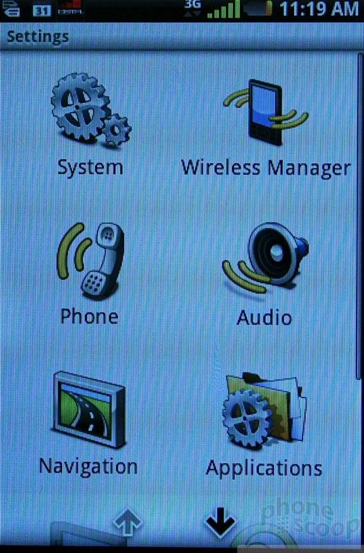
MWC 2010
Feb 14, 2010, 6:30 PM by Eric M Zeman & Rich Brome
updated Feb 21, 2010, 9:46 PM
Phone Scoop's full report from MWC in Barcelona. Hands-on with new phones from Puma, Motorola, LG, Samsung, Sony Ericsson and a special preview of Windows Phone 7.
Part 1
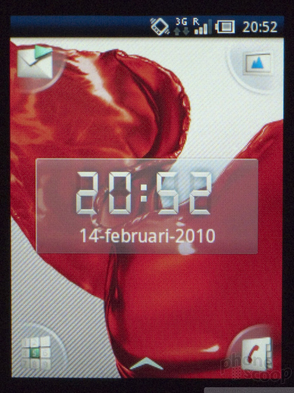
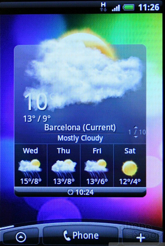
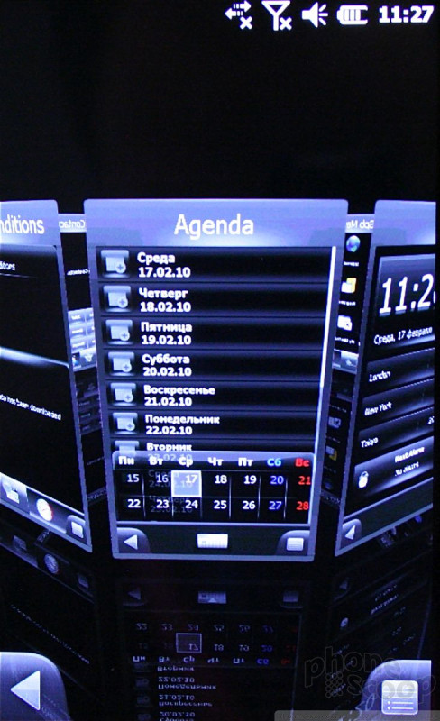
Samsung Wave
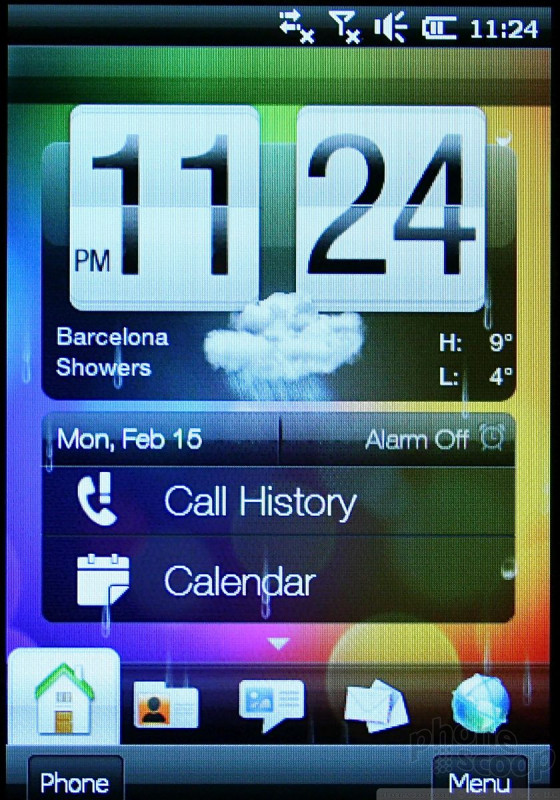
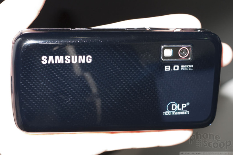
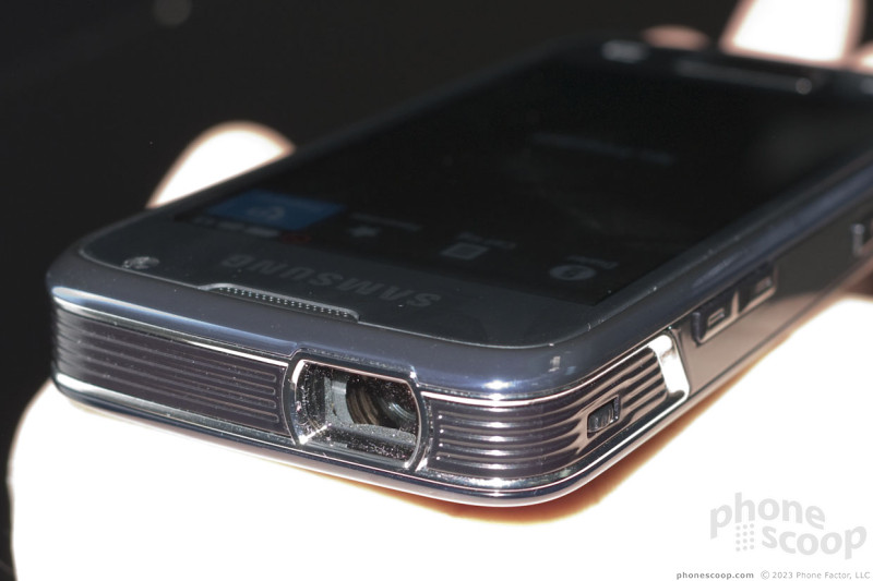
Today Samsung announced its first Bada OS phone, the Wave. It's a slim touch phone that marries an interesting array of elements together into a stylish phone.
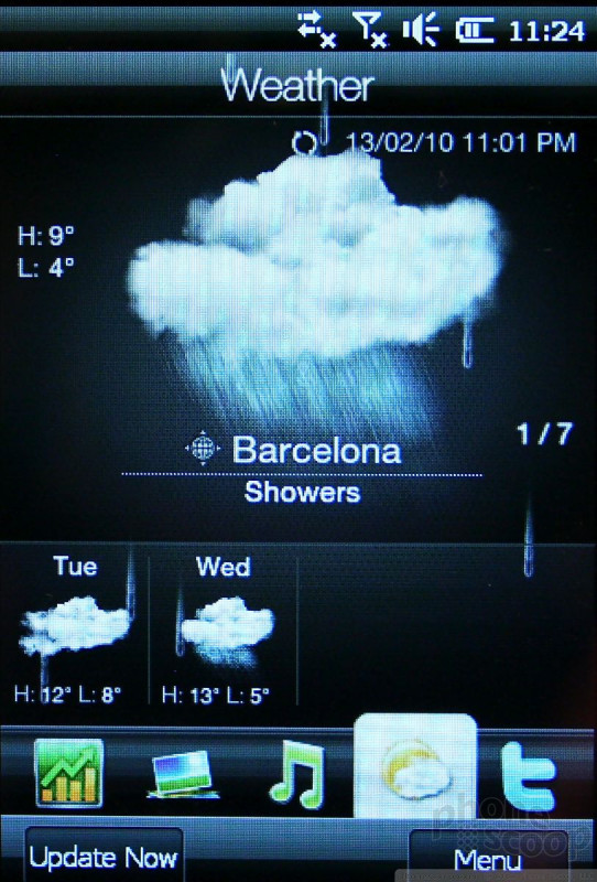
The defining feature of the Wave is no doubt its "Super AMOLED" display. It is, without doubt, the most amazing display I've seen on a mobile phone. The resolution (480 x 800) matches many of its peers, but the brightness is an order of magnitude better. The pictures and video Phone Scoop captured simply can't do justice to the real thing. It's simply stunning. What's a shame is the size. It measures 3.3 inches, which makes it smaller than many of today's best smartphones. A Samsung representative, however, said that the company plans to release a device with a four-inch Super AMOLED later this year.
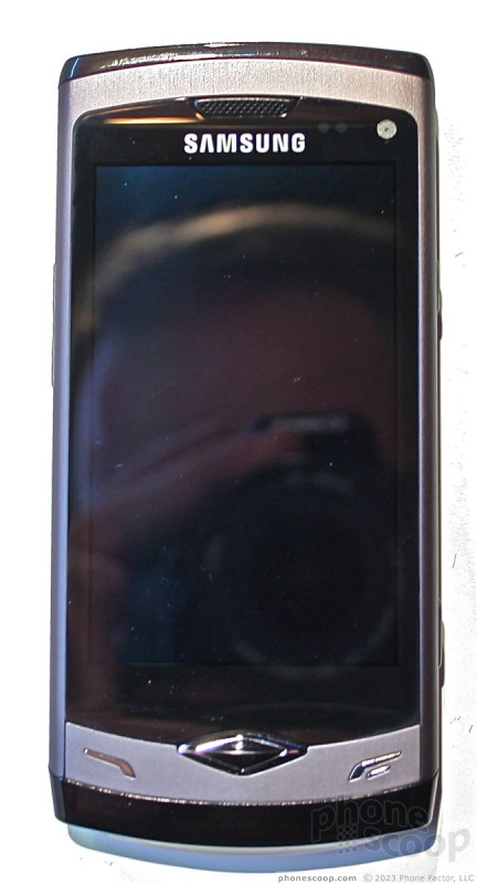
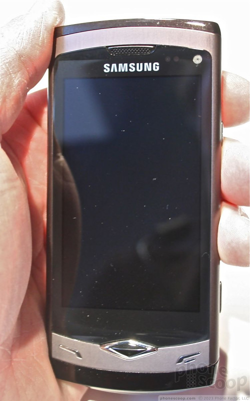
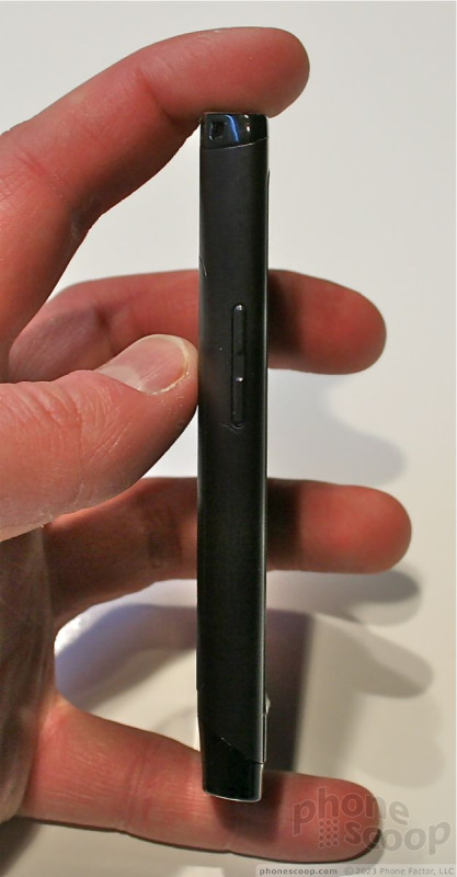
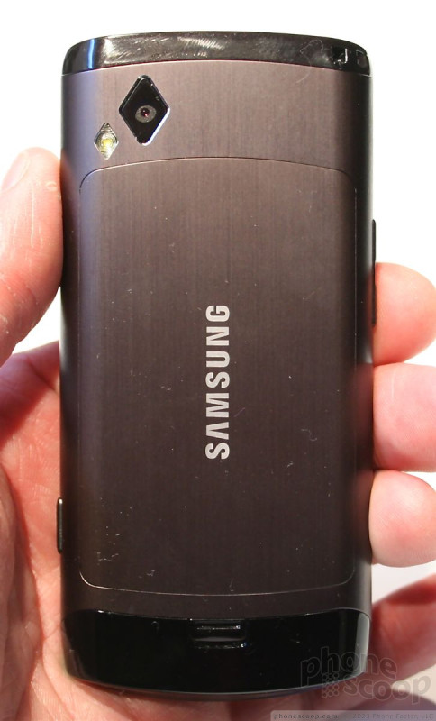
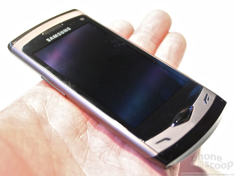

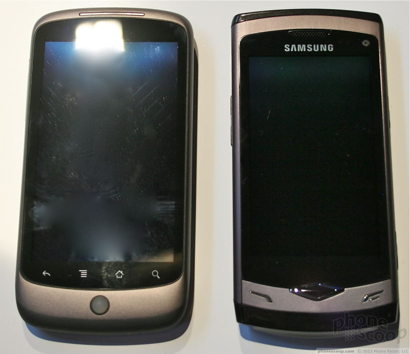
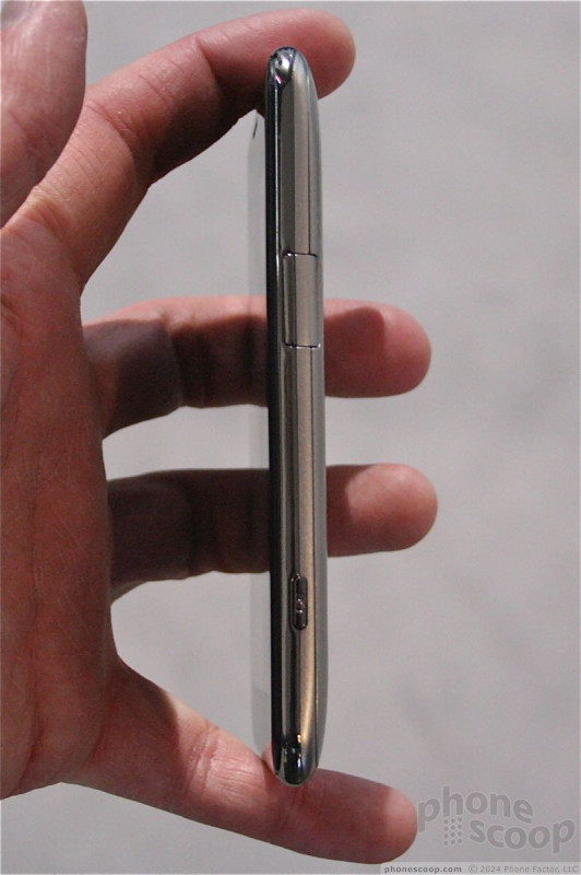
The form factor is pretty typical for a Samsung phone. Some of the design language echoes that of the Ultra Edition series of phones that Samsung churned out back in 2006 and 2007. It is extremely slim, light-weight, and feels really good in the hand. The overal form factor is smaller than a Nexus One. It is very pocket friendly, and will slip in and out easily.
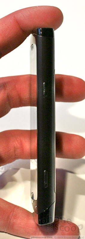
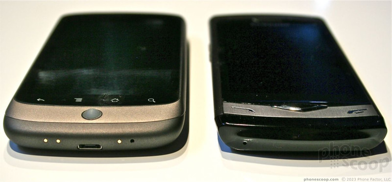
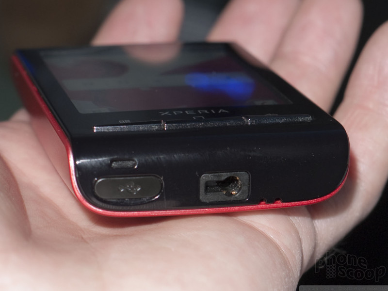
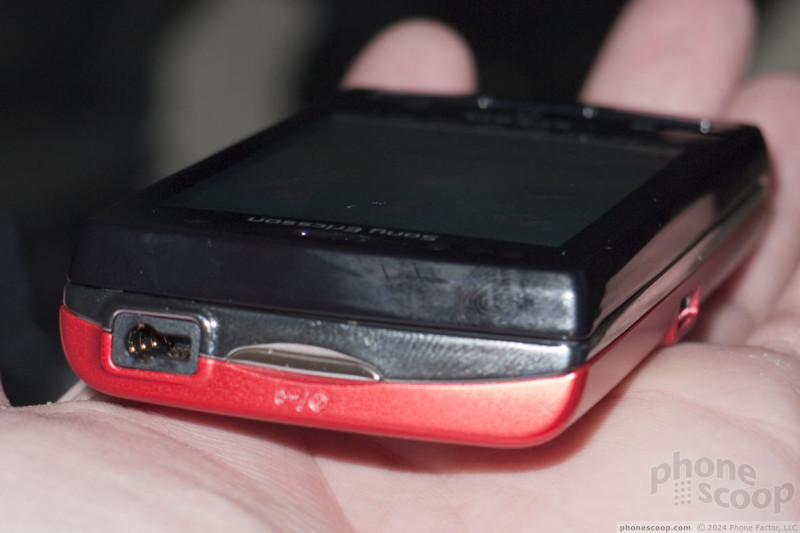
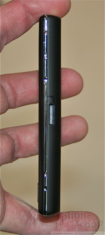
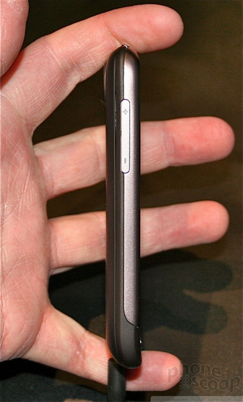
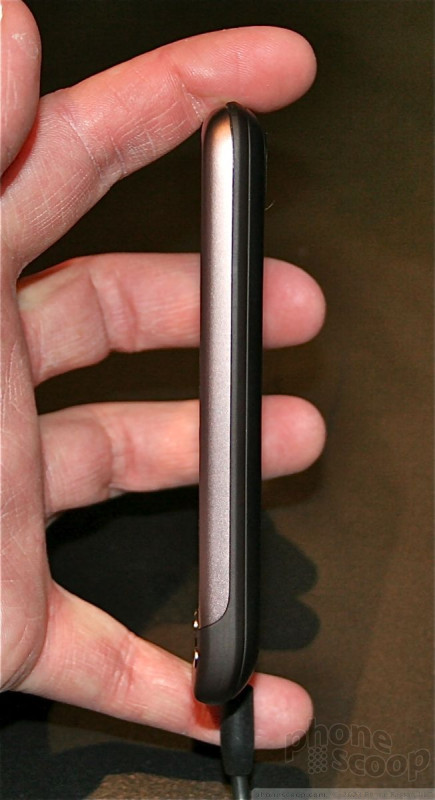
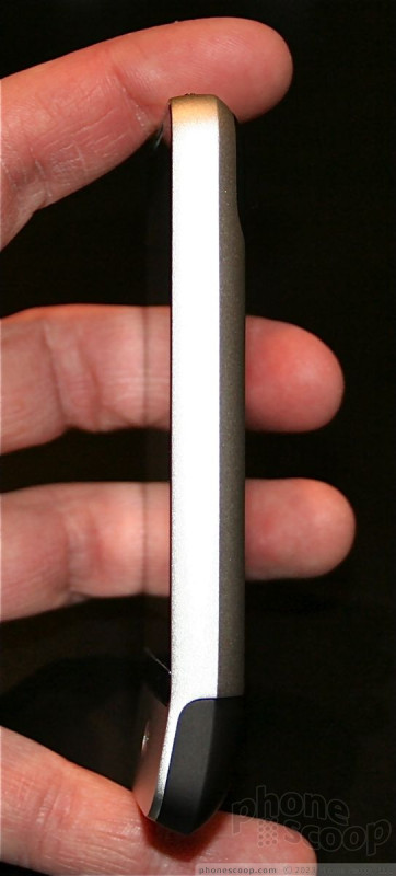
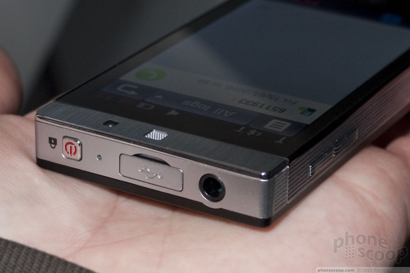
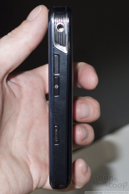
The three physical buttons on the front are squished way down at the bottom of the Wave, making them somewhat awkward to reach with your thumb. Even so, they had good travel and feedback. On the left side of the phone is the volume toggle. It is a bit on the small side, but it had good travel and feedback. The lock key and camera key are on the right side of the phone. They are also both a bit small, but travel and feedback was good. The 3.5mm headset jack and mircoUSB port are on the top.
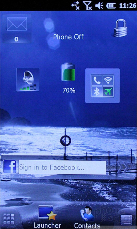
As for the operating system, well, it didn't feel all that different from Samsung's current crop of TouchWiz phones.
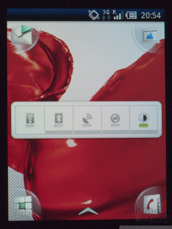
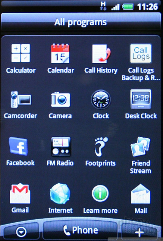
Bada is a new platform that Samsung created to compete with the likes of Android and perhaps Symbian. We really can't say straight up what native Bada feels or looks like, however, because the Wave runs TouchWiz 3.0. TW3 has been improved a lot when compared to TouchWiz 2.
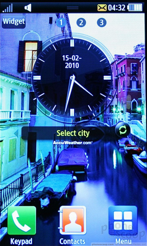
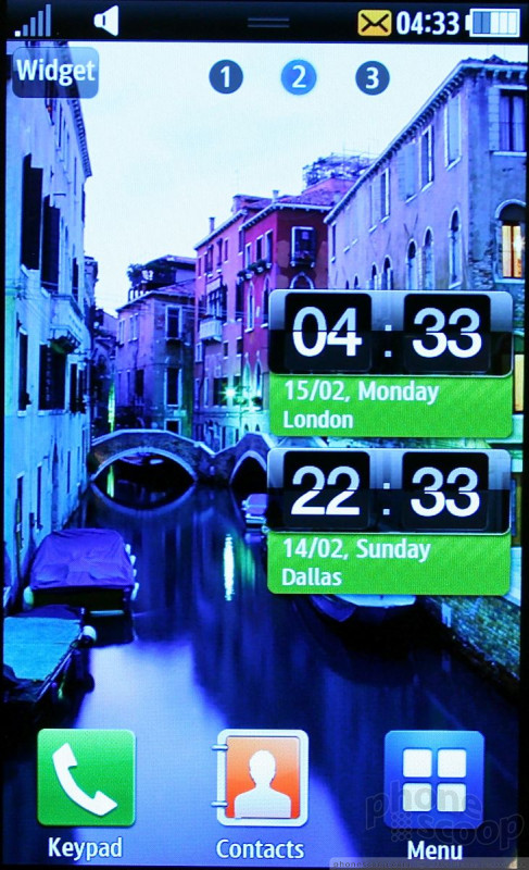
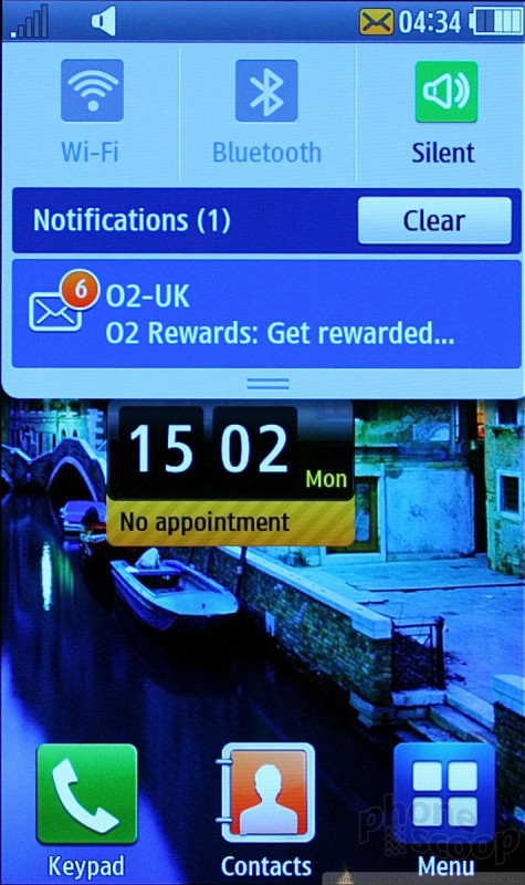
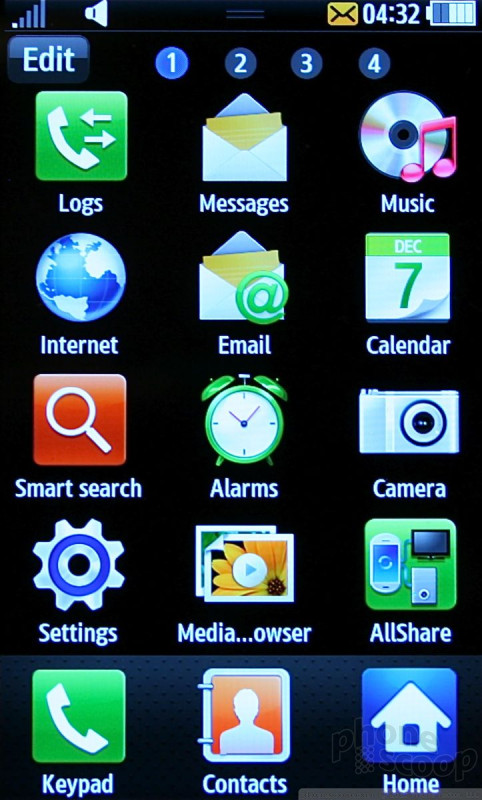
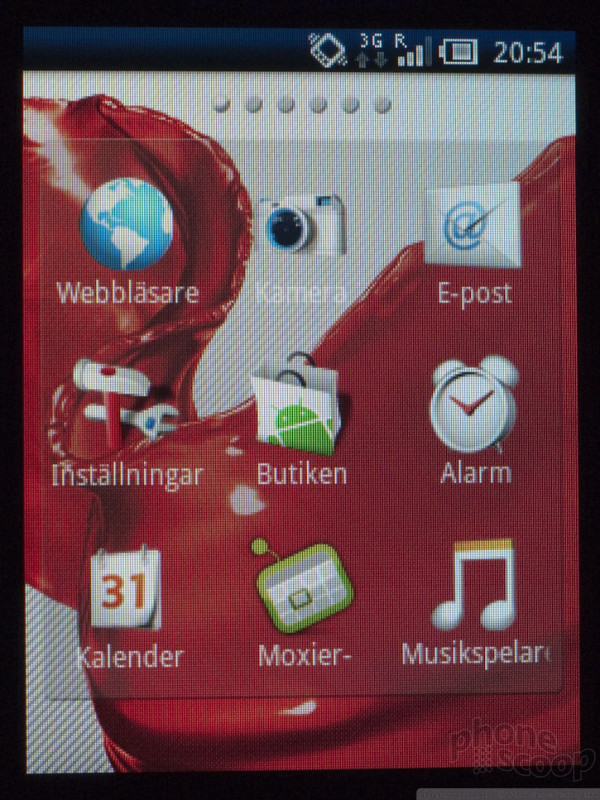
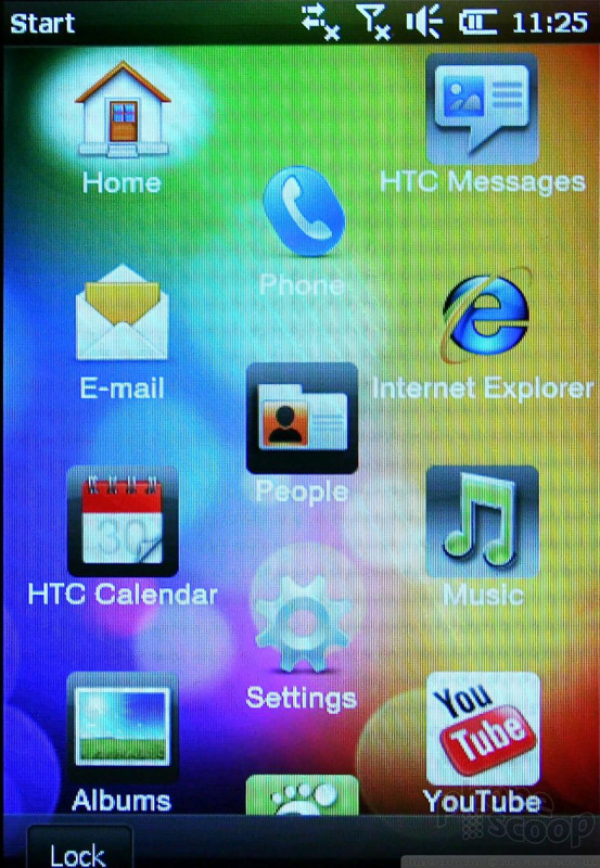
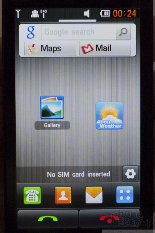
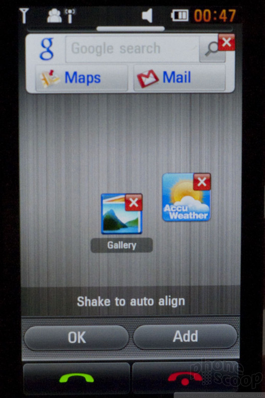
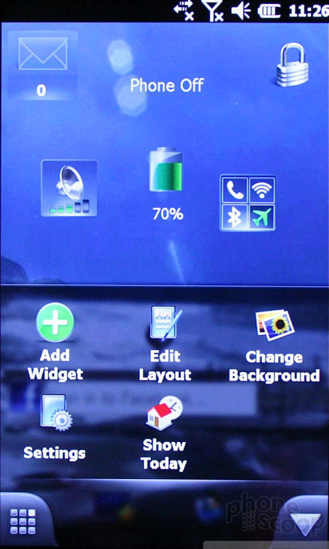
TW3 has multiple home screens and supports up to 10 of them. The home screens can be populated with widgets, links, bookmarks, shortcuts or other apps for quicker access. The dock that hides in TW2 appears to be gone in favor of the multiple home screens.
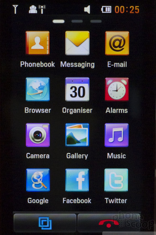
The main menu is accessed by pressing a button on the home screen. It is laid out in a grid exactly like the iPhone, and swipes from screen to screen exactly like the iPhone. It is blazingly fast. The Wave is powered by a 1GHz processor (made by Samsung) and it is one of the faster phones I've used. Much of the software is an obvious evolutionary update of the TW2 software, especially applications such as the music player and camera.
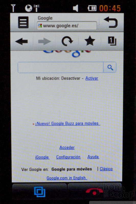
The browser is Samsung's own Dolfin browser. When it worked (which was rare) it actually loaded the WAP version of Phone Scoop rather than the html version. That's pretty weak.
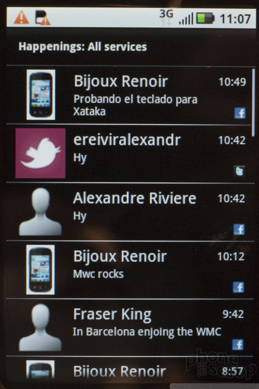
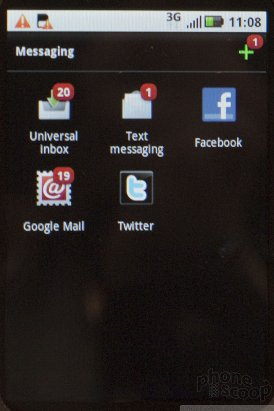
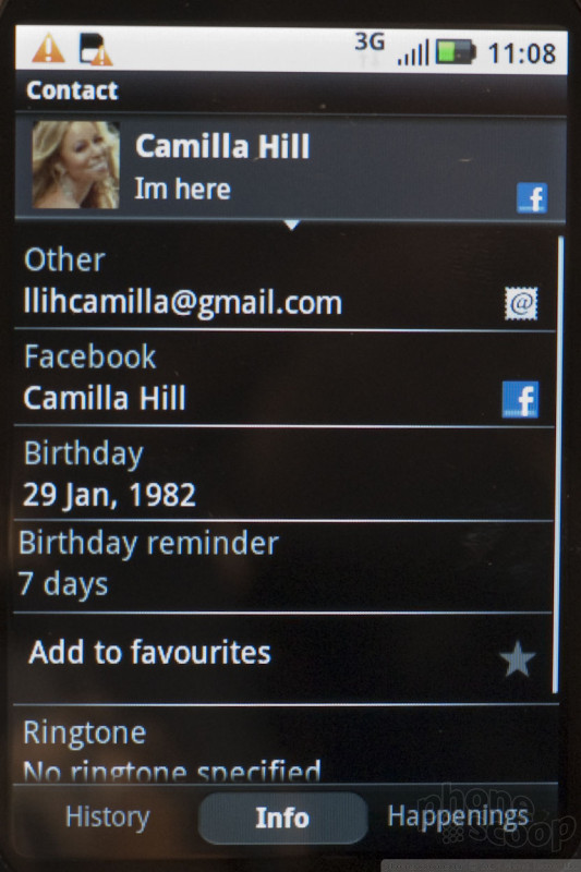
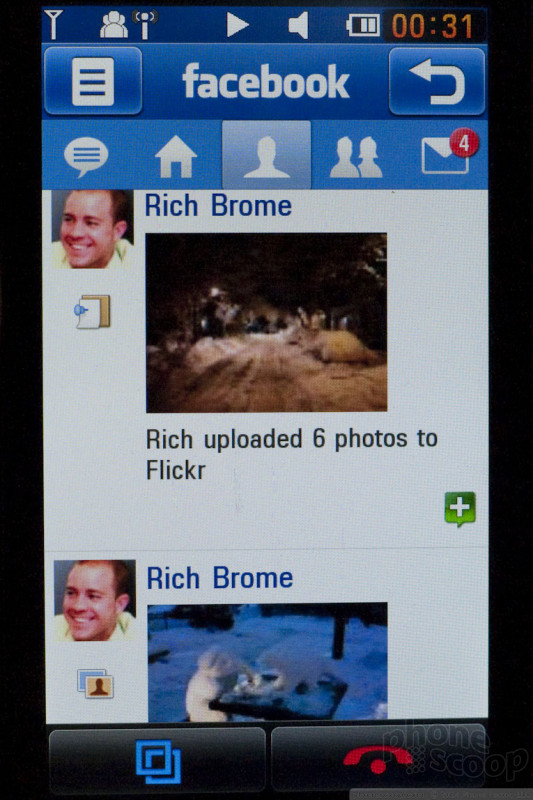
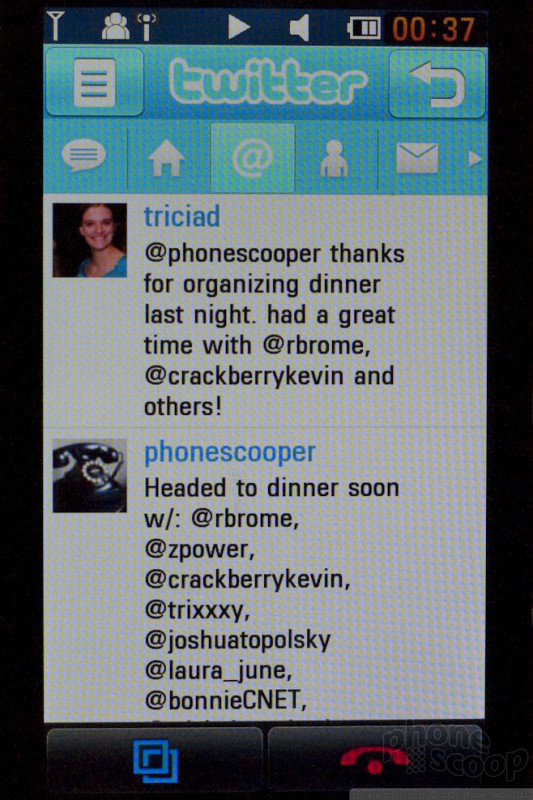
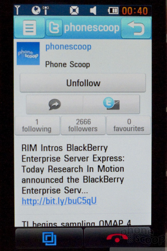
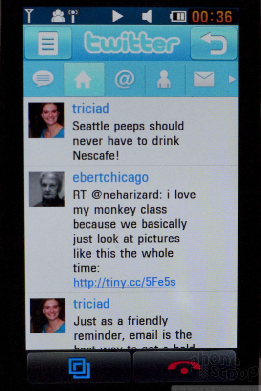
The best feature of TouchWiz 3.0 is the new Social Hub. Basically, it is exactly like Motorola's MOTOBLUR social media service, only it's a bit more polished.
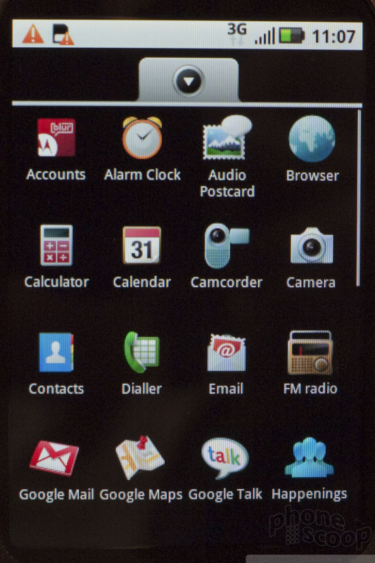
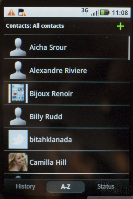
It combines all messaging and social networking messages into threaded conversations that are visible from each individual contact. So, for example, if you look up John Smith in your contacts database, you'll see all the recent calls, SMS, emails, IMs, Twitter posts, Facebook posts and shared pictures on John's contact detail page. You can also look at a master inbox that shows all messaging in one stream.
The Wave crashed several times while we were using it. Once it required a battery pull. The second time it gave us a memory error, but eventually it recovered. We were told that the software is still pretty early in the development cycle.
What's perhaps most disappointing is that Bada and TouchWiz 3.0 still feel like a feature phone platform, even though Samsung is pitching them as a new smartphone platform. Granted, we only spent a few moments with it and didn't get to play with every feature, but it simply felt like the OS didn't do all that much.
In all, there's no denying that it is a slick phone. I am sure the version that comes to market will be less buggy and even more polished. With no plans to bring it to the U.S., though, there are better alternatives if you're looking for a phone right now.
Sony Ericsson
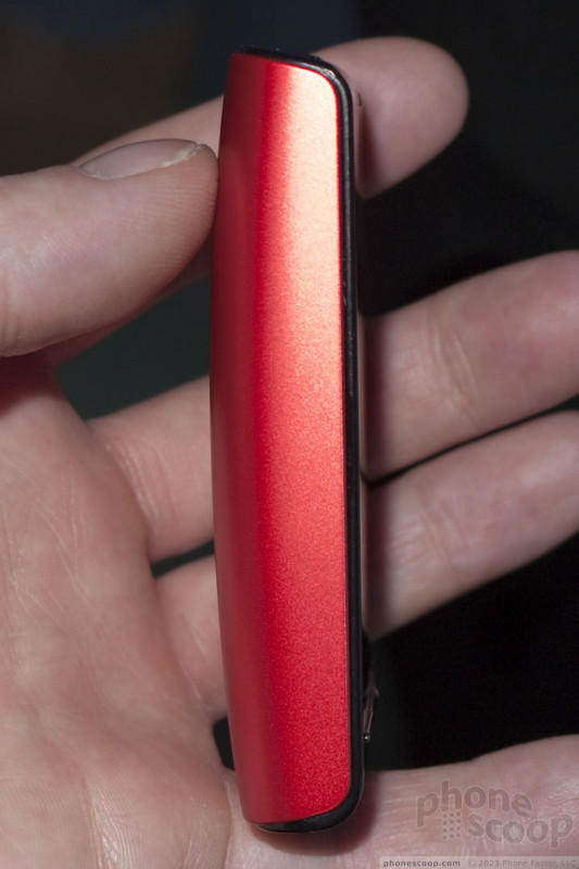
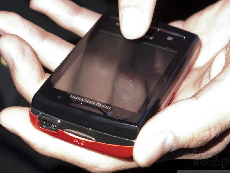
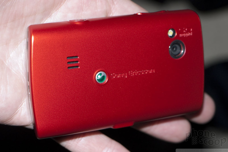
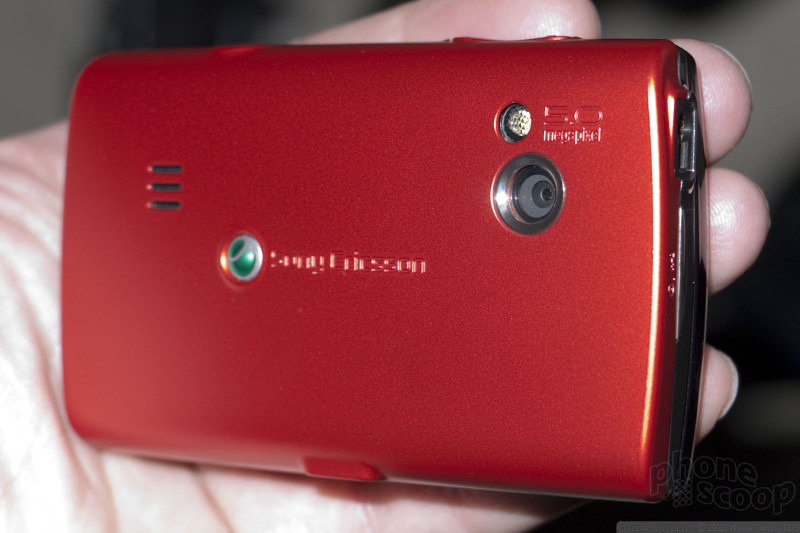
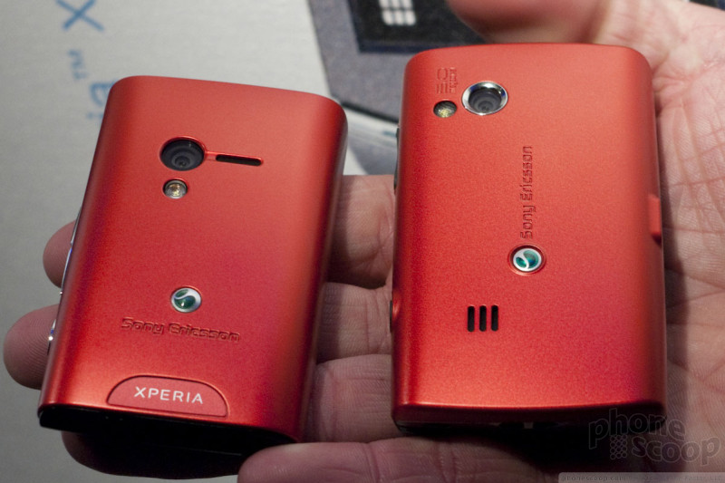
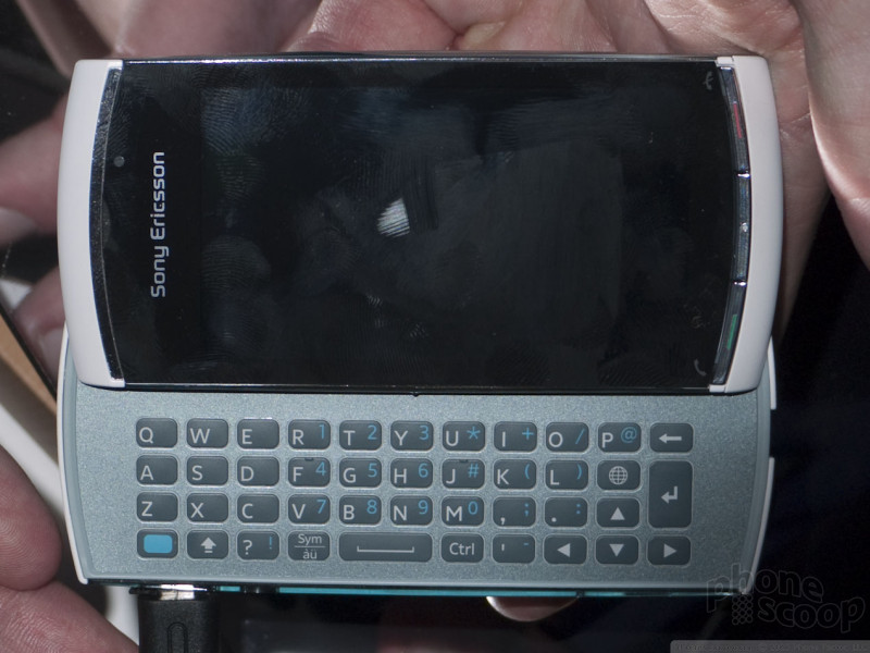
Sony Ericsson introduced three new phones at MWC this year: the Vivaz Pro, X10 Mini, and X10 Mini Pro. The Vivaz Pro is just like the Vivaz, but with a slide-out keyboard. It's also a Symbian phone, so the chances of it coming to the US are small. The more interesting ones - in our humble opinion - are the X10 Mini and X10 Mini Pro. These are very small yet high-spec Android smartphones with a unique new Sony Ericsson interface layer.
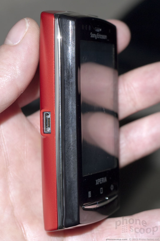
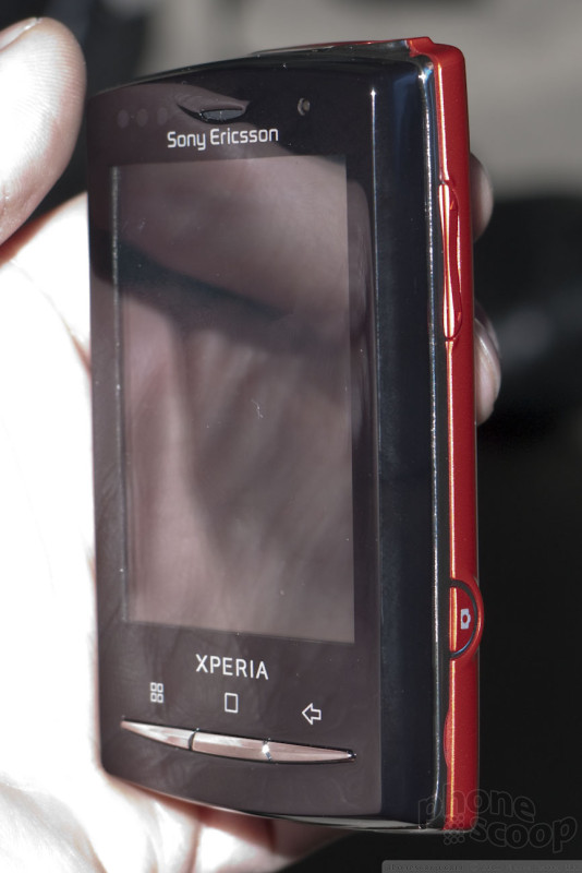
Xperia X10 mini & mini pro
It's curious that they chose to associate these new "mini" phones with the Xperia brand, and with its newest iteration - the X10 - specifically. The Xperia brand to date has consisted exclusively of ultra-flagship phones that make no compromises in specs whatsoever. With the X10 Minis, they're going a little lower-end with the Xperia brand.
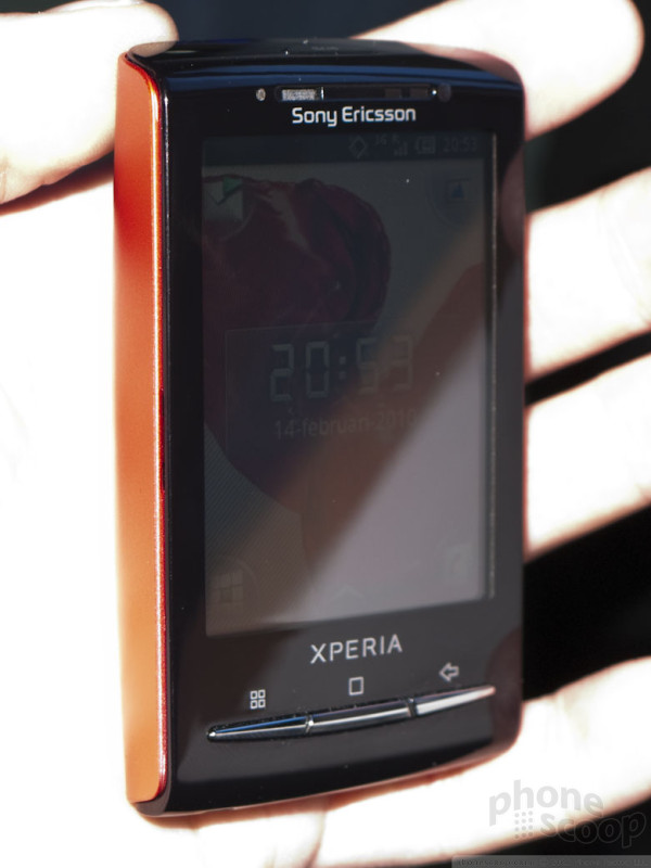
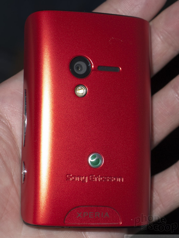
Sony Ericsson's pitch is that they simply took the X10 and made it much smaller, with no compromise. But in fact, the camera resolution is less, and they removed the sexy Mediascape software. Then there's the screen. The lowly 2.5-inch QVGA display looks quite pixelated compared to most current full-touch phones, and like absolute garbage compared to the luscious screen on the full-size X10. The screen just doesn't live up to the Xperia brand.
The big benefit of the lower screen resolution is that the graphics chip doesn't have to work as hard. On the X10, the hardware really struggles to keep up with the fancy graphics and ultra-high-resolution display. Even with its 1,000 MHz processor, there's a lot of lag and stuttering. Not so on the X10 Mini; the interface is fast and fluid, even though the processor is technically slower, at 600 Mhz. It feels like one of the faster Android phones we've used.
The only real difference between the X10 Mini and X10 Mini Pro is the slide-out keyboard, which adds a little to the size. The slide mechanism feels solid and is spring-assisted, so it slides open and closed easily, with a satisfying snap. The keyboard itself is excellent. It's small but works quite well. The keys have a good feel to them. The space bar was a bit stiff on one unit we tried; we hope that issue is fixed before the hardware is finalized.
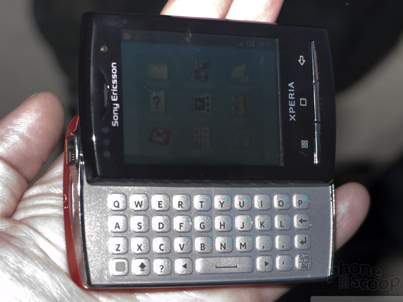

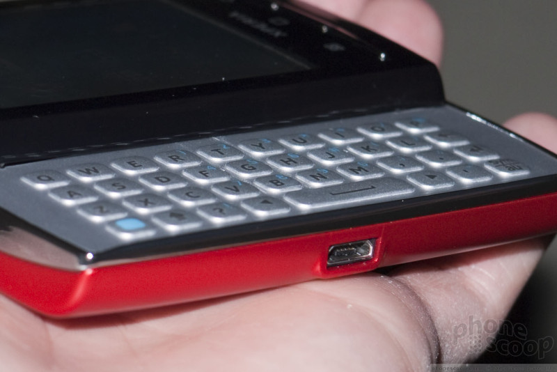
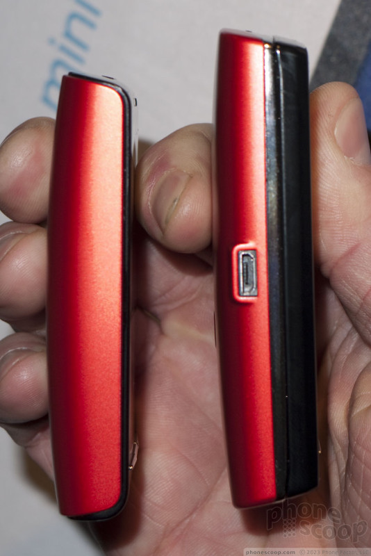

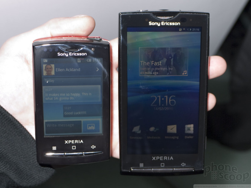
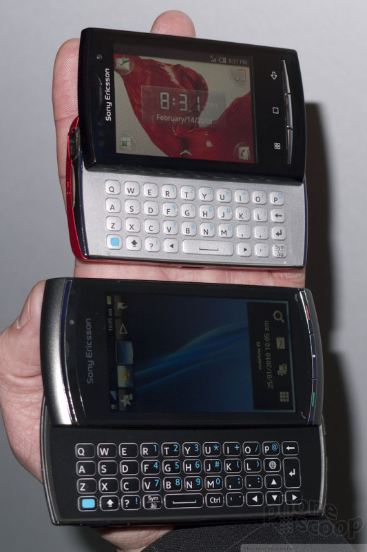
The X10 Mini and Mini Pro are otherwise similar. They look identical from the front. The screen is the same, the UI is the same, the camera and other specs are all identical. You simply get your choice of keyboard or no keyboard. It's like they finally listened to everyone who ever said "Gosh that would be the perfect phone if it just had a keyboard... or were a little thinner." They did the same thing with the Vivaz and Vivaz Pro. This idea of producing a keyboard and non-keyboard variant of every phone is something we could easily get used to.
The "UXP" interface layer is Sony Ericsson's answer to HTC's Sense and Motorola's Blur. Like the competing software, UXP tries to sex things up, add more social media features like Facebook & Twitter, and present all communication in a contact-centric way. It's very sexy and - at first glance - seems to work well.
The X10 Mini and Mini Pro sport a new version of UXP optimized for small screens and one-handed use. Instead of fiddling with a little tab to summon the app menu, you just do a large swipe-up gesture (an awful lot like a Palm webOS.) It also puts four shortcut icons in the corners of the home screen. By default, these are things like contacts and media, but you can also customize them to be any app you like, using an easy drag-and-drop interface.
Here's a video of the UXP interface in action:
The X10 series of phones all run Android 1.6 at the moment, but they're all upgradeable to higher versions, and Sony Ericsson promises that such an upgrade will be available... by the end of the year.
Ultimately, I liked the X10 Mini and Mini Pro. The screen resolution is disappointing and seems incongruous with the Xperia name and otherwise great specs. But if you can see past the large pixels, there's a great little phone here. The keyboard on the Mini Pro is great, Sony Ericsson is known for good cameras, there's a host of other features, and Sony Ericsson has done a great job making their custom interface layer work well for one-handed use. All of that in a phone small enough that it definitely lives up to the "mini" name. We hope a US carrier pick one or both of these up.
The X10 Mini and X10 Mini Pro will both ship in the first half of the year (by June, at the latest.) It usually takes much longer for Sony Ericsson phones to reach the US, if they do at all. An executive promised that they are trying to bring these to US carriers, but (understandably) wouldn't commit to any timeline.
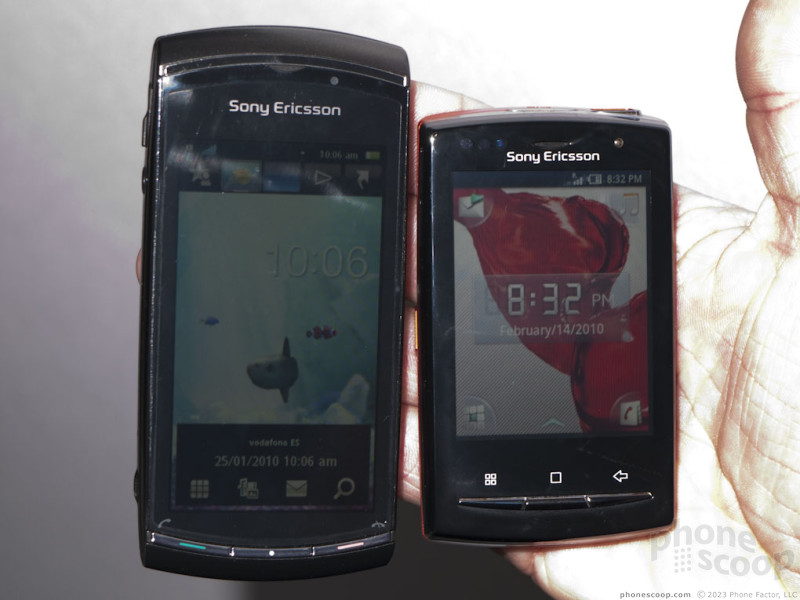
Vivaz Pro
The Vivaz is a Symbian phone, which limits it chances of coming to the US, so we won't dwell on it, but the hardware sure is sexy. They managed to take the Vivaz - quite a thin phone - and stuff in a sliding QWERTY keyboard while only adding 2mm to the thickness. The slide and keyboard are both decent. The keys felt a bit mushier than the X10 Mini Pro, but it was still quite usable and easy enough to type on.
The Vivaz is a perfect example of Sony Ericsson's new design philosophy revolving around "human curves". It sounds a bit weird when they talk about it, but holding it in your hand, you understand. The Vivaz doesn't just look sexy; it feels sexy.
If only the Symbian software were as sexy. It's slow, ugly, and the resistive screen is annoyingly unreliable. (That's not a bash against all resistive screens. I have used a few good ones; this is not one of them.)
Connectivity & Expansion
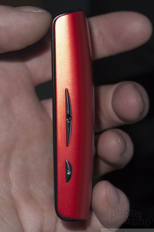
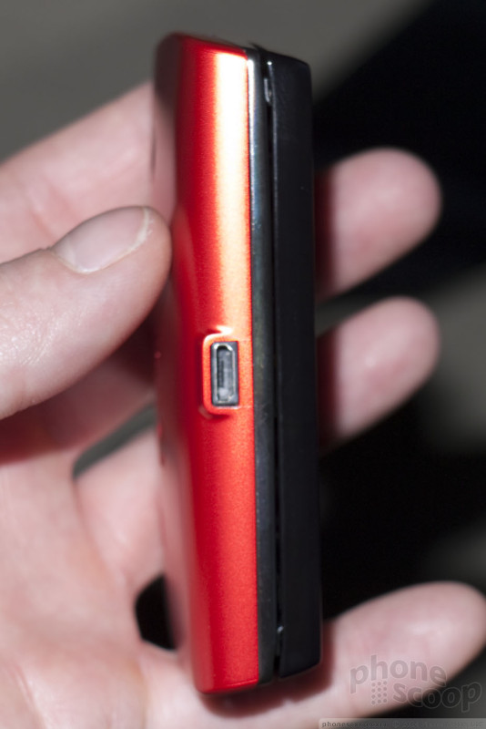
Sony Ericsson is finally, truly embracing industry standards for connectors and memory cards.
The M2 (Memory Stick Micro) format is finally put-a-nail-in-it dead. All of the new phones use standard microSD memory cards. Gone also is the proprietary connector for charging, data, and headsets. Sony Ericsson now uses microUSB for charging and data.
Better still, the new phones have a nifty audio jack called AVP (audio/video port) that is full compatible with standard 3.5mm headset and music headphones, but also works with special Sony Ericsson accessories with added features. It looks like a keyhole. Examples include headphones with music controls on the cord and speakers that draw power from the phone for better sound. (Those accessories are on display this week.) An accessory manager also hinted that the company may make headphones with active noise cancellation. That type of headphones usually requires a small battery; with this new connector, it could draw power from the phone instead.
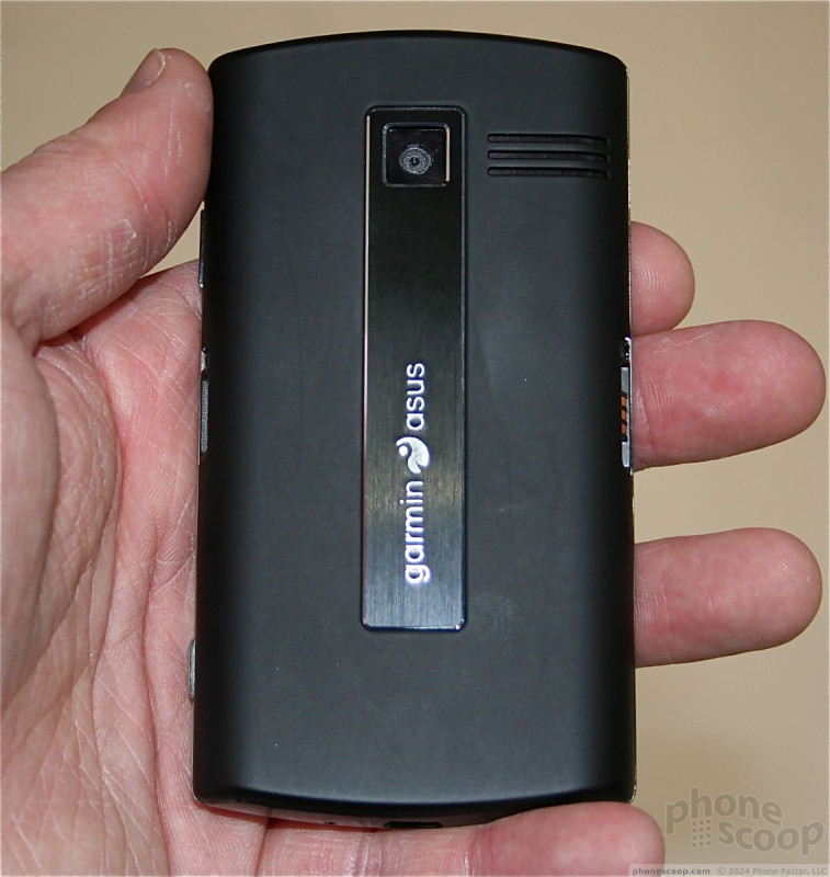
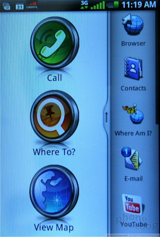
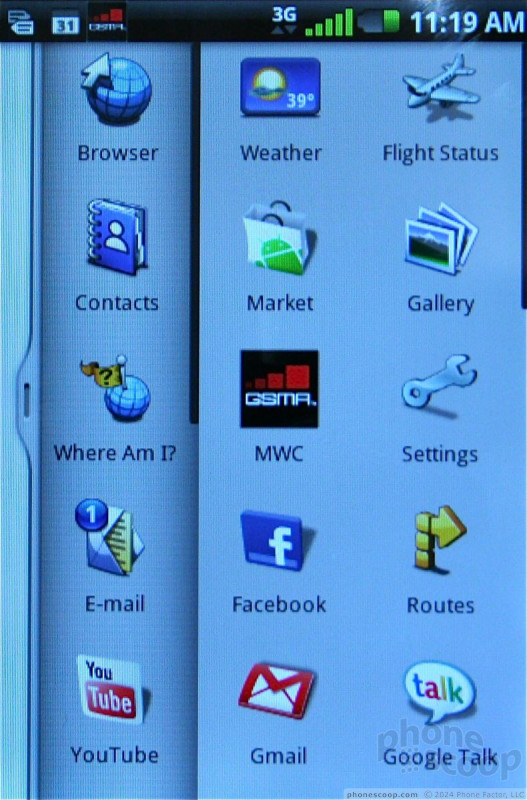
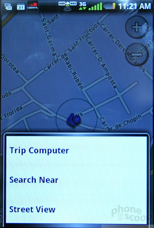
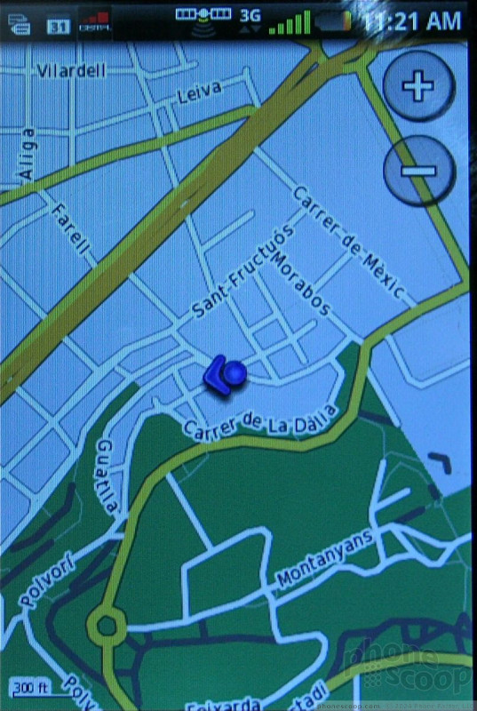
Garmin Nuvifones
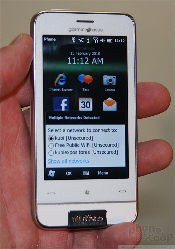
We had a chance to play with the two new Garmin-Asus Nuvifone devices the Android-toting A50 and the Windows Mobile 6.5.3-totaing M10. Neither of these will make it the U.S., but they are interesting nonetheless in how Garmin-Asus has chosen to customize each platform. Here's our take.
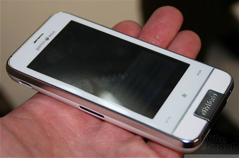
A50
This handset is much better than the original nuvifone announced two years ago. it has a nice, bright, colorful screen that looks sharp. The overall feel of the device is solid. It's lightweight, feels good in the hands, and is obviously customized to sit sideways in a Garmin-Asus cradle.
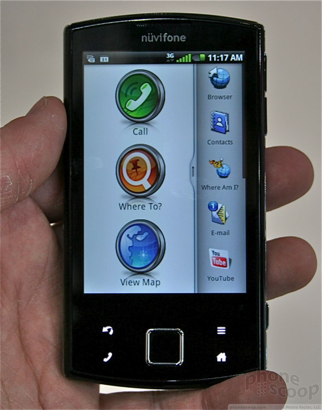
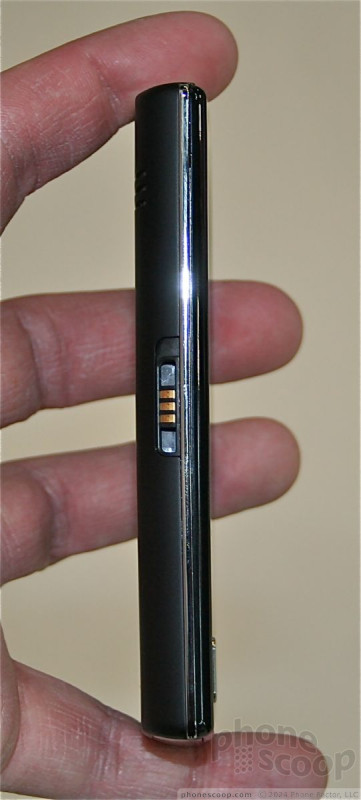
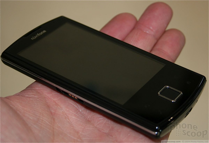
There's a D-pad on the front of the phone, and it has good travel and feedback. Surrounding the D-pad are four capacitive bottons for back, home, menu and search functions. They all work well, and provide haptic feedback when pressed. There are only a few button on the side of the A50 for the camera, volume control and lock/unlock.
While using it, I noticed that everything about the A50 was fast and smooth. Screen transitions were quick, there was no stalling, and all the animations were smooth without stuttering or other weirdness. Garmin-Asus did a good job optimizing the software for the underlying system architecture,
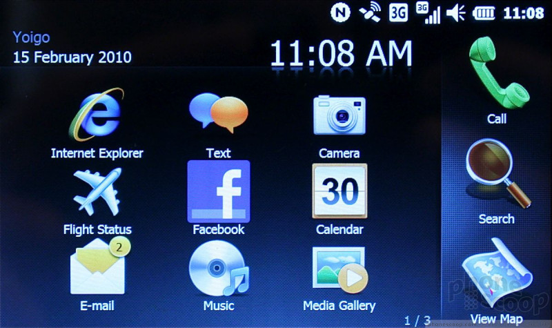
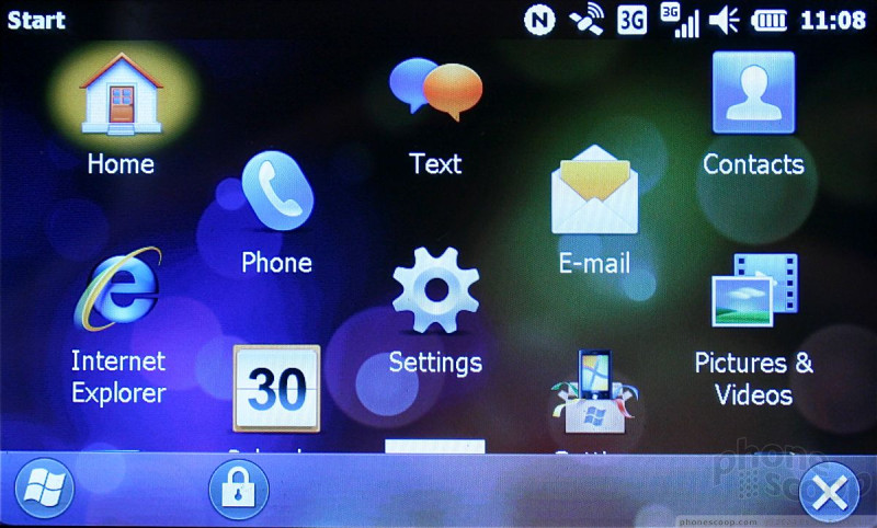
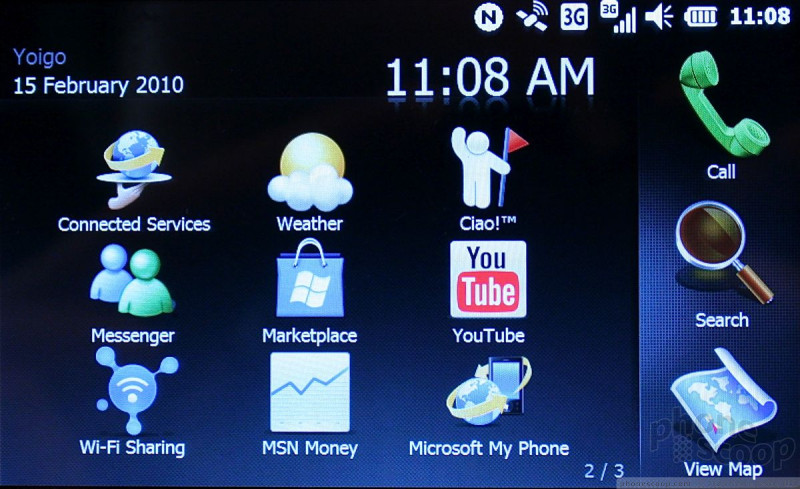
While the hardware is slightly blase, the operating system is much more interesting. Though the A50 is based on Android, you'll see no evidence of it in the user interface anywhere. Garmin-Asus has completely customized the user interface with its own style, which is geared to making calls, initiating searches and loading mapos faster than anything else. There are two drawers that can be pulled out from the right side of the phone to reach the phone's more extensive list of apps.
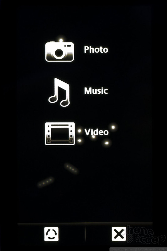
What's most interesting is that Garmin-Asus has customized Android all the way down to the base menu system. It's all different and new when compared to any other Android handset on the market. Check out the images to see what we mean.

M10
The M10 is far less thrilling than the A50. It runs Windows Mobile 6.5.3, and Garmin-Asus has done much less to innovate on top of Microsoft's platform.
The hardware is very vanilla. It's a slab touchphone the minimal buttons and features. The screen does look good, though the A50 bests it. It's a bit on the thick side, considering what it offers. There are three capacitive buttons at the bottom that let users access the typical WinMo menus and features. They worked well.
The user interface has only been mildly overlaid with Garmin's own user interface. The main menus for the M10 are the standard WinMo 6.5.2 menus. The focus is still to help users make phones calls, load maps, and perform searches as fast as possible. The device was speedy and responsive to input.

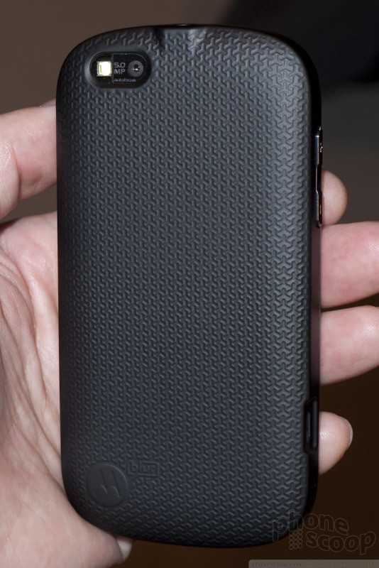
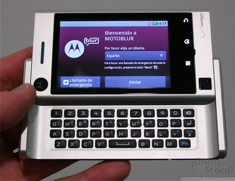
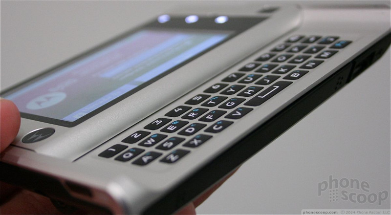
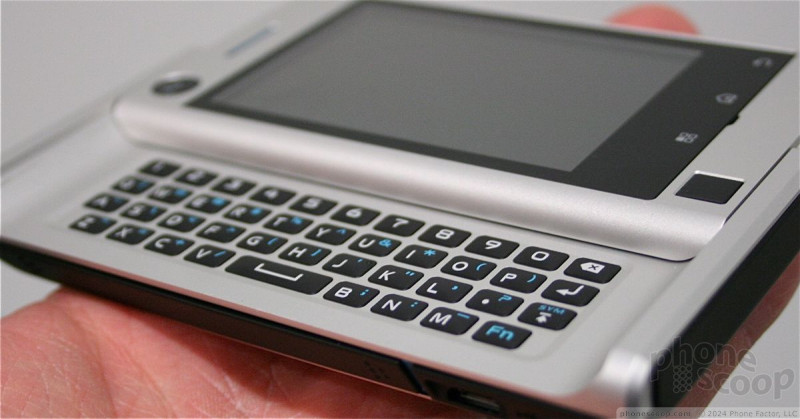
Moto Cliq XT
Motorola is really cranking out new Android phones these days. The Cliq XT is essentially a keyboard-less version of the Cliq. This allows the XT to be dramatically thinner.


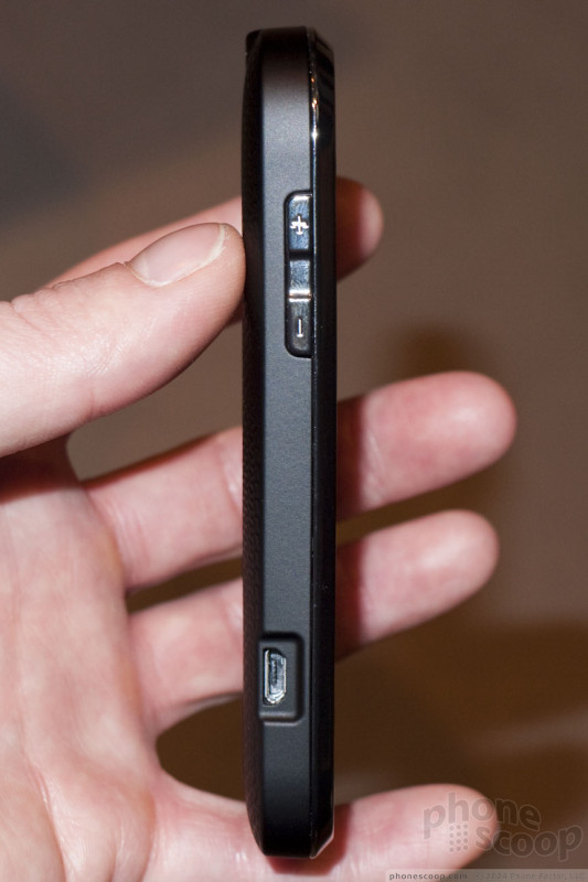
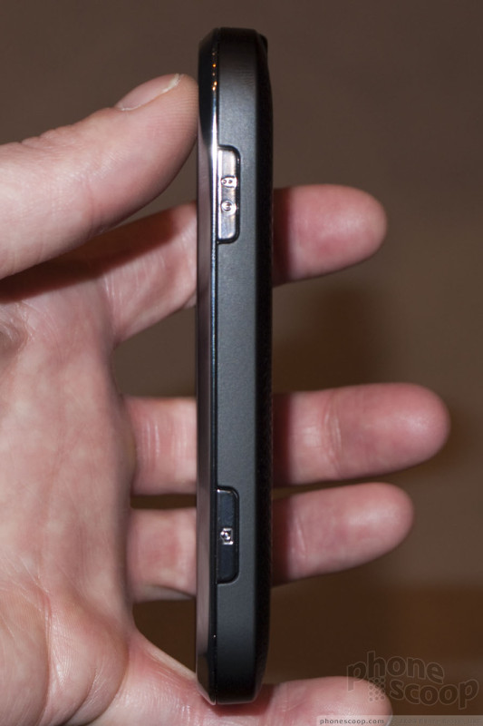
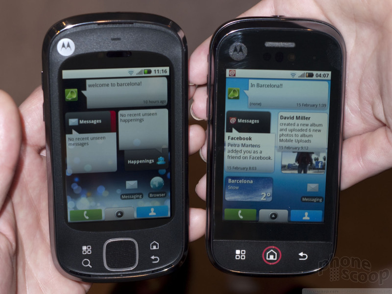
The XT has a small touch pad below the display for scrolling. This is like the "optical mouse" on some recent phones, but using technology more like the touch pad on a laptop. Surrounding the touch pad are the standard four Android navigation keys: home, menu, back and search. I was delighted to discover that these are actual physical keys, not touch keys, and they're decent keys, too.
The design is distinctive and not-unattractive. The back has a nice-feeling texture. It feels good in hand. The build quality is decent. With a 5-megapixel camera and WiFi, the features are respectable.
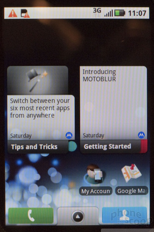
Like the Cliq, the Cliq XT has BLUR, Motorola's layer of software over Android that adds a plethora of social networking features. Blur is built on Android 1.5, so, at least for now, the Cliq XT runs a relatively old version of Android. That may affect compatibility with third-party software going forward, as developers increasingly target newer versions of Android. We hope Motorola can update BLUR to run on newer version of Android, and roll that out to existing phones.
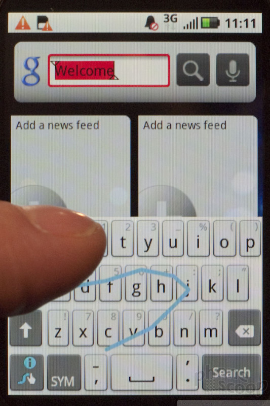
Our favorite feature of the Cliq XT is Swype text entry. This impressive software lets you enter whole words just by dragging your finger across the virtual QWERTY keyboard in one motion. It's remarkably accurate even if you aren't. Motorola told us it will be standard on the Cliq XT, which is great news.
Look for the Cliq XT in March on T-Mobile USA.
Here's a quick video of the key features:
Part 2
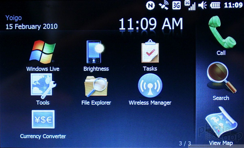
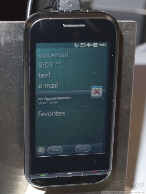
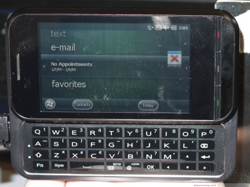
Windows Phone 7
Microsoft today unveiled Windows Phone 7 Series. This new version of their mobile OS is a dramatic departure from previous versions. Microsoft went back to the drawing board on this one, both with the code and with the user interface. They're not talking much about the code and platform just yet (that comes next month) but they have shown us the user interface.
Contrary to some rumors, there is no "consumer" and "professional" version - there's just the one version.
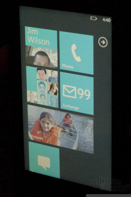
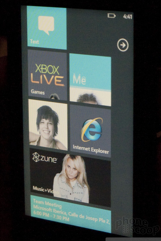
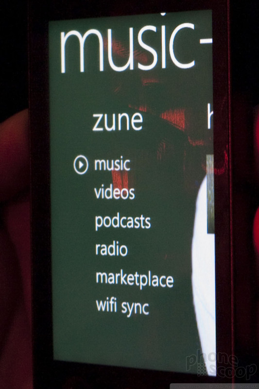
The user interface looks absolutely nothing like previous versions. If you've used a Zune HD, you're halfway there. There's a lot of big, pretty text, lists, and swiping up, down, left and right. The animation between screens is sexy as hell. Only what's absolutely necessary and relevant is shown on the screen. Forget about status bars, menu bars, or any of the usual "chrome", as Microsoft calls it. Instead, all you see is the content you're working with at the moment, and absolutely minimalist icons. Well, there is a very minimal status bar on some screens, but it's much more minimal than you're probably used to.
It looks very clean and pretty, although sometimes it's a little too simplified. It's not always obvious what the little icons at the bottom do, and it's not at all obvious that you need to tap on the blank area next to them to bring up more options.
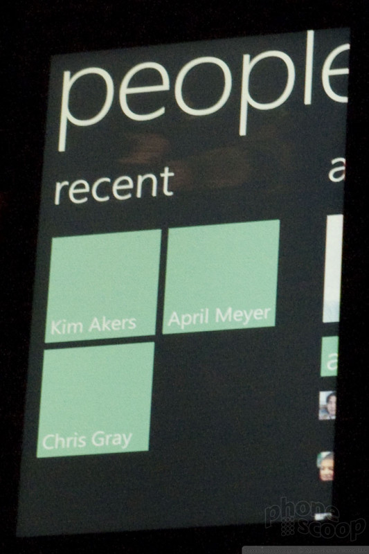
The home screen has a "live tile" concept, with a two-column grid layout. Various widgets can go here, with live updating info, like new text messages, missed calls, weather, etc. You can also move any app or contact here as a handy shortcut. Some tiles are double-wide, stretching across both columns. Third-party apps can have live-updating tiles as well.
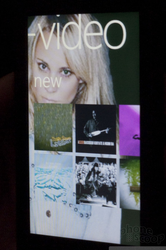
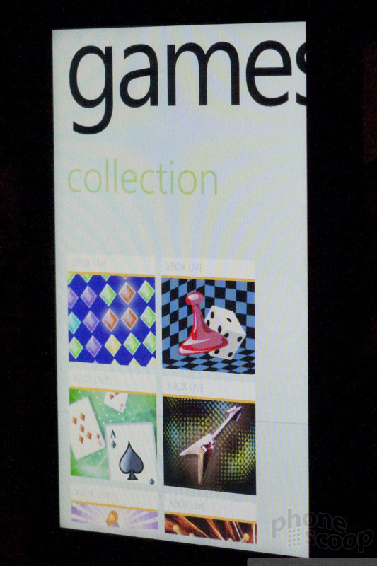
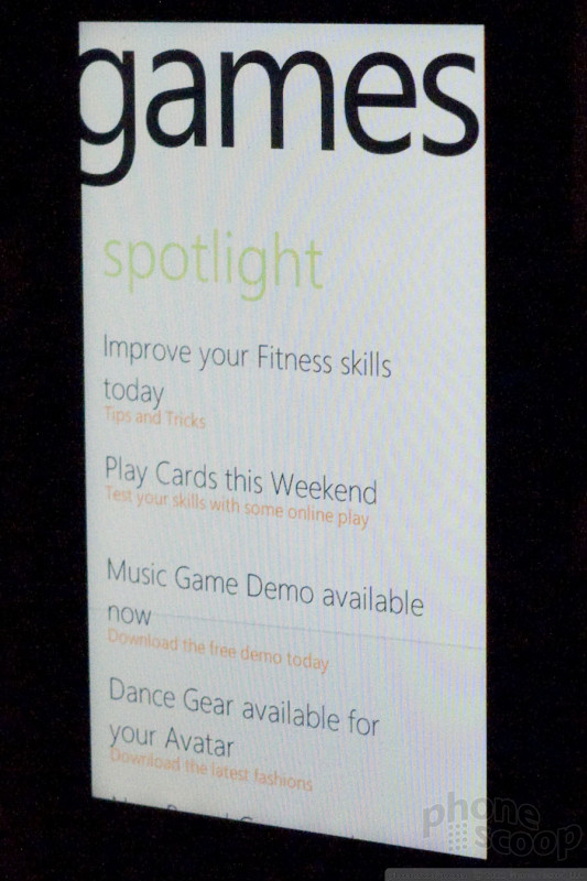
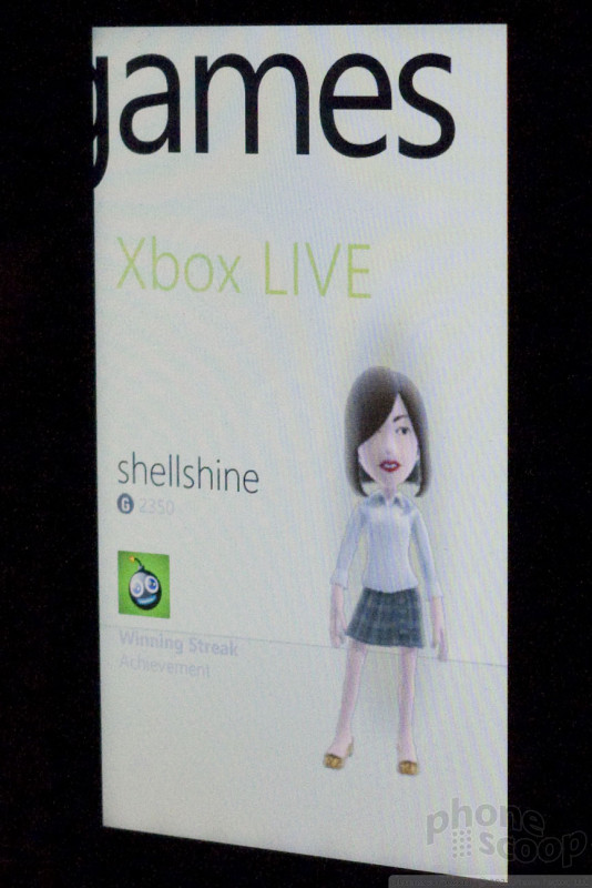
Windows Phone 7 includes integration with both XBox Live and Zune services. (Coinciding with this, Zune services will finally be going global.) The Zune part isn't Zune "lite", either; it's basically a full Zune HD built right into your Windows Phone. Speaking of Zune, the Zune desktop software will now be the main way you connect your Windows Phone to your PC, much as iTunes is the conduit for connecting an iPhone to the desktop. Goodbye, ActiveSync and WMDC.
Windows Phone 7 - Zune And XBox
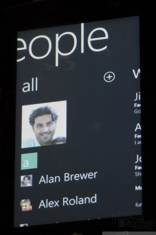
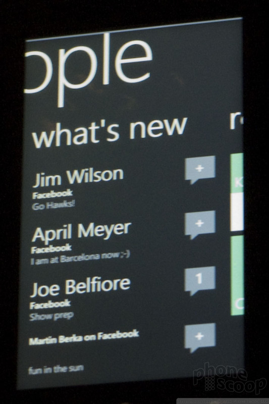
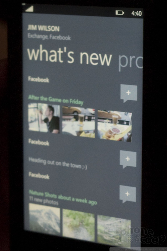
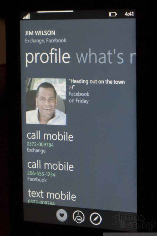
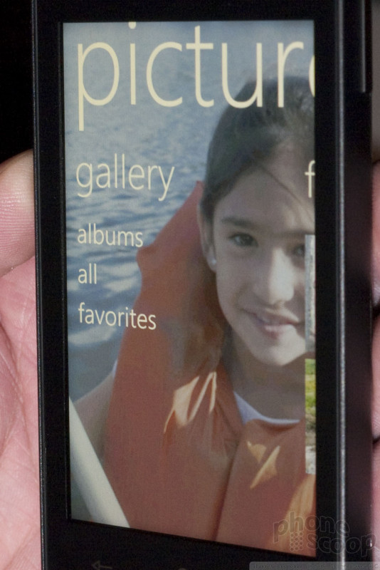
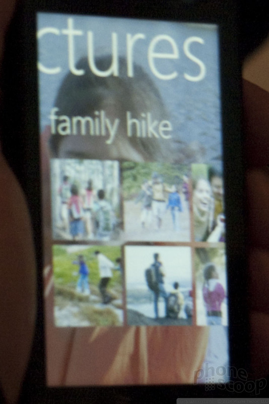
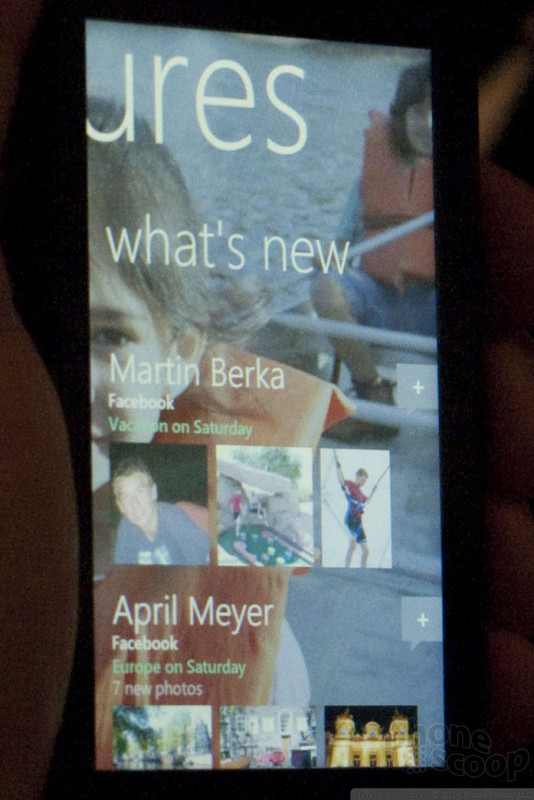
There are several "hubs" in the interface. Examples include People, Pictures, Zune (music), Office, etc. The People hub is esentially the contacts app. The Pictures hub includes social media integration, so you can upload to Facebook and see a feed of you're friends' recent photos. The Office hub include "Documents", obviously, but also OneNote and SharePoint areas that are synced to the cloud.
As you might expect from any modern mobile OS, there's integration with social media like Twitter and Facebook. You can pull in your Facebook contacts, photos, etc. and sync with Exchange as well. In several parts of the OS, there's a "what's new" screen, that bubbles up any new communication with your contacts, etc. Facebook and Windows Live are the big networks that will be fully supported at launch, but other networks will be added "quickly."
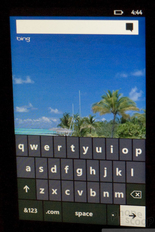
There are some basic hardware requirements, such as a large WVGA capacitive-touch screen, three main buttons on the front, plus a camera and power button on the side. The three buttons on the front are Start (home), Back, and Search. Like Android, the search button is contextual, so if you press it while in your contact list, it will search your contacts. On the home screen, it brings up a Bing web search. (There's no device-wide search.)
The hardware and software requirements are much stricter than before. Microsoft is specifically trying to compete with "vertically-integrated competitors" (in other words, Apple.) Microsoft isn't getting into the hardware business, but manufacturers will not be allowed to make a low-end Windows Phone 7 Series device. They will be allowed to add a sliding keyboard if they wish, or a really high-res camera, but there's not much other wiggle room for manufacturers to differentiate, at least compared to previous versions of Windows Mobile.
On the software side, companies can load their own live tiles or a few other specifically-allowed customizations, but for the most part the interface must look the way Microsoft designed it. Interface layers that "cover up" the Microsoft interface - like HTC TouchFlo - will no longer be allowed.
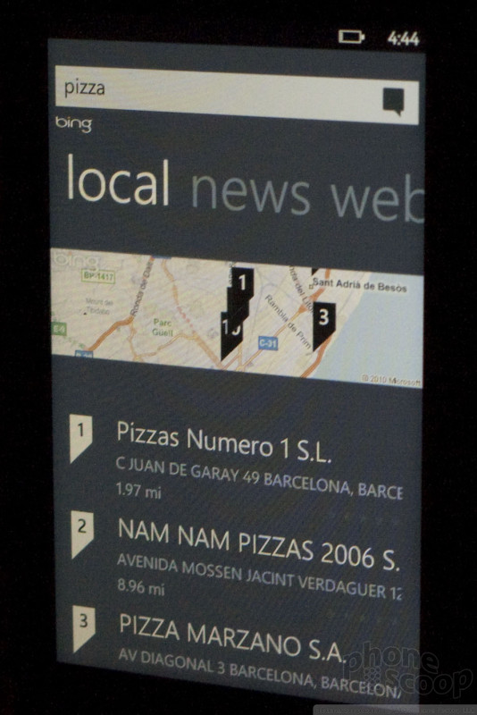
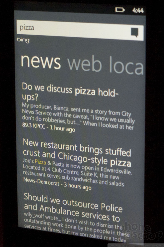
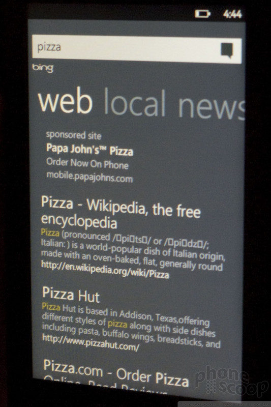
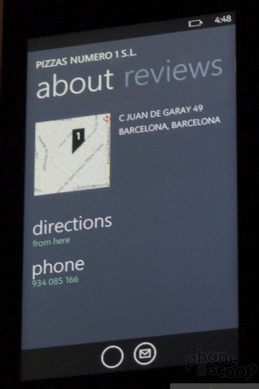
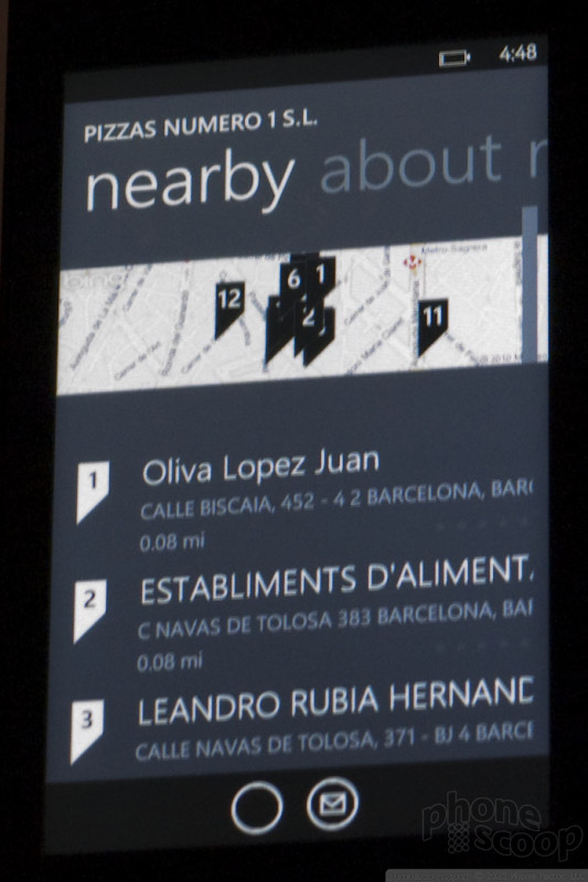
The Bing web search is more than just a link to Bing. It offers a "pivot" options at the top. Think of pivot options like tabs on a web page. The options include local search results with a map, automatically customized to your location. You can also switch to news results, or regular web results. The results are displayed natively in the pretty Windows Phone 7 style; you're not just looking at a web page with search results.
The OS supports landscape mode, but only in a few specific scenarios, like photos, or messaging (where you might want to use a slide-out keyboard.) So if you're typing an email with the keyboard and then want to switch apps, going out to the home screen will force you into portrait mode.
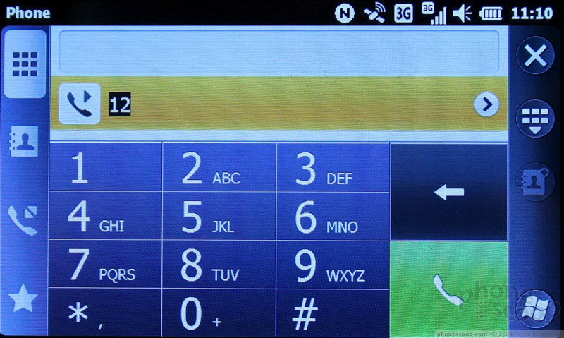
The virtual keyboard is decent - similar in performance to Android - supporting word prediction.
Multi-touch is supported in the browser, maps and photos. If you're familiar with how the iPhone Safari browser works, you'll be right at home in the new version of Internet Explorer. You can pinch to zoom, or double-tap for quick and intelligent zooming in and out. It works well.
All four major national carriers in the US will be offering Windows Phone 7 Series devices. As for manufacturers, HTC, Samsung, LG, Sony Ericsson, Dell and HP will all be making phones using the new platform. They should be hitting stores in time for the holiday shipping season.
We'll have more hands-on impressions soon.
Dell Mini 5
We spent a few moments with Dell's flagship Android device, the Dell Mini 5. This device is clearly meant to be used as a mobile Internet device and not a primary phone, but you can make phones calls with it (if you don't mind looking like an idiot).
The Mini 5 has a 5-inch screen that looks great. It may have the same resolution as other, smaller screens (480x800), but the size makes it really pop.


It has three capacitive buttons on the right side (or bottom depending on how you hold it), and they worked well enough to perform searches, get you back to the home screen or open the menus.
Dell has added a lot of its own software and customization to the Android platform, but the basics are still the same. Dell added all the pre-loaded apps to the homescreen, so they are a quick touch away at all times. There's a Facebook widget that works well, there's a really nice video player application, and Dell has done some other nice things with the software that make it perform a bit more like a laptop rather than a smartphone.
Here's a video tour of the Dell Mini 5 in action:
HTC
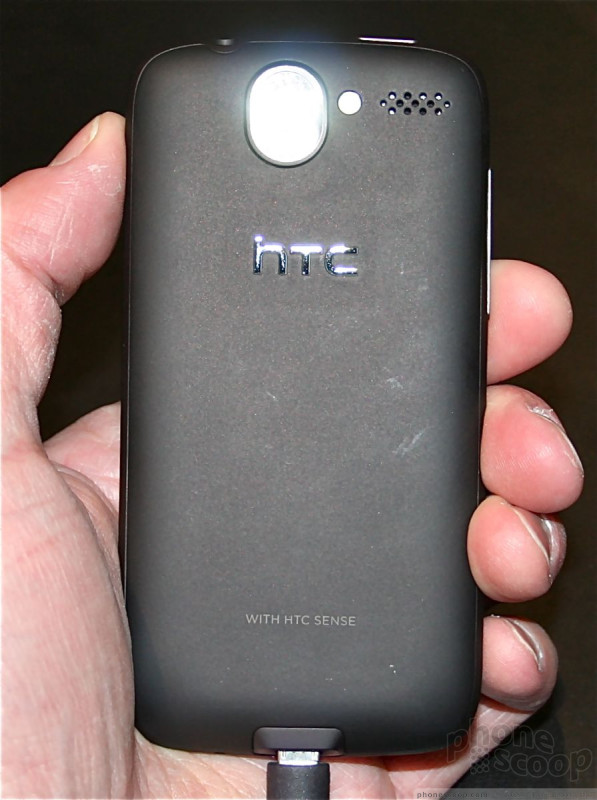
Today in Barcelona HTC announced three new smartphones. Two run Android and one runs Windows Mobile 6.5.3 — and all three run the newest version of Sense UI. Here are our initial thoughts.
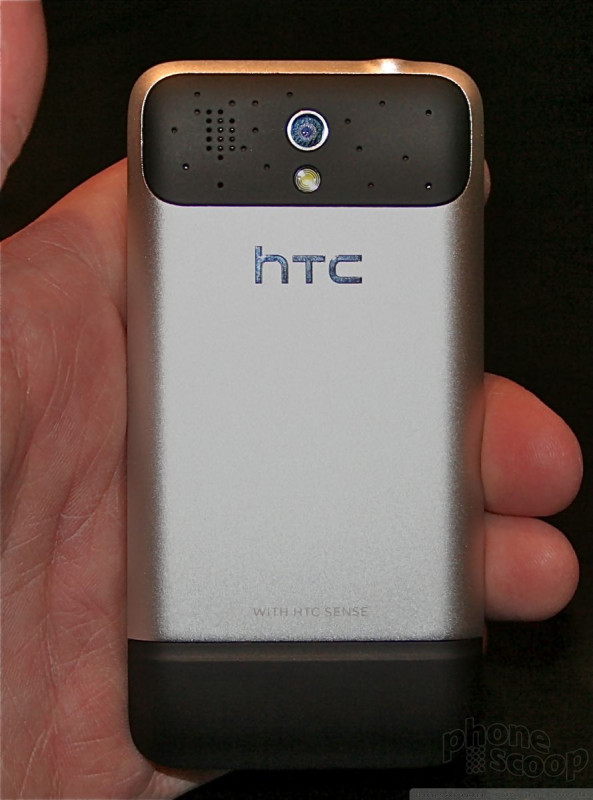
HTC Desire
Think of the Desire as the Nexus One, but with slightly better hardware and the addition of Sense UI. It carries forward many of the specs of the Nexus One, including the display and processor. It feels great to hold. All the metallica surfaces are nice to touch and are pleasing to the hand. It's lightweight and slim.


HTC has replaced the capacitive buttons and trackball with hardware buttons and an optical mouse. These hardware changes make the device much better. It truly is more usable and finger-friendly. Losing the trackball, in particular, makes the phone feel of higher quality, and the optical mouse/button looks classier, too.
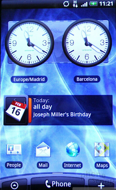
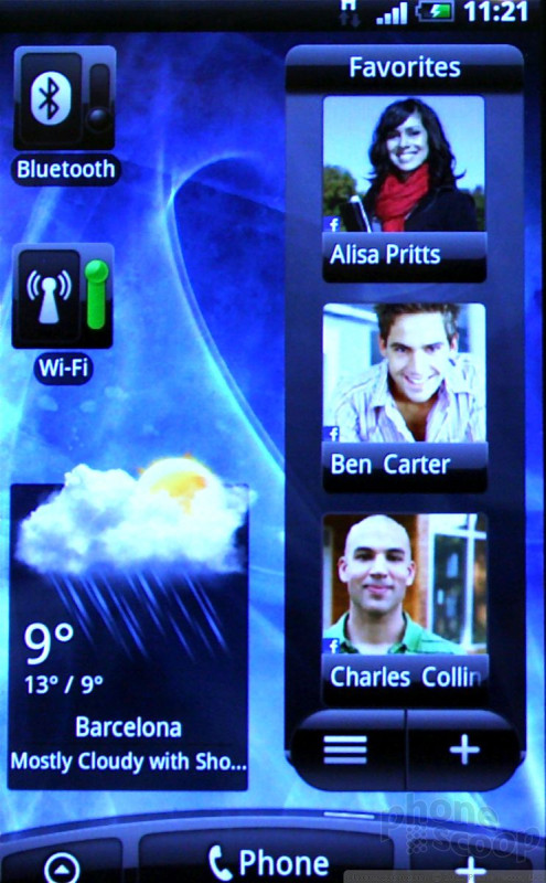
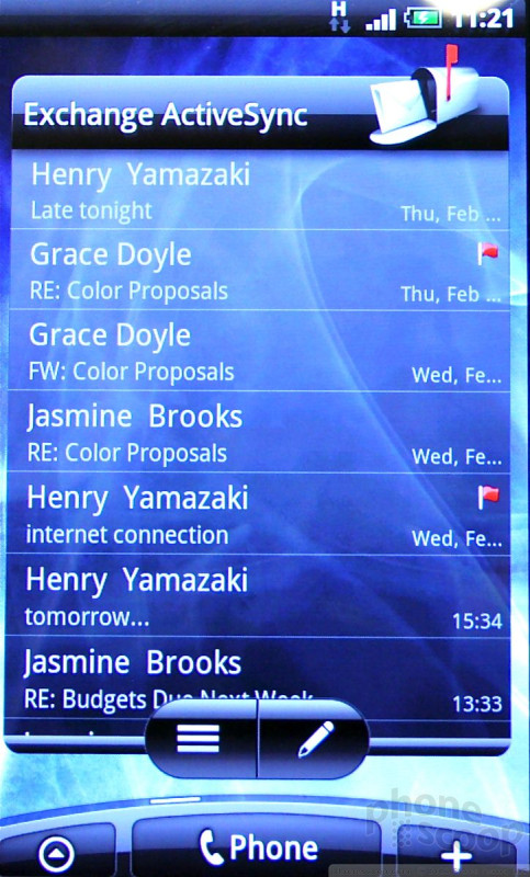
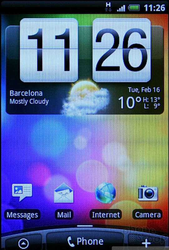
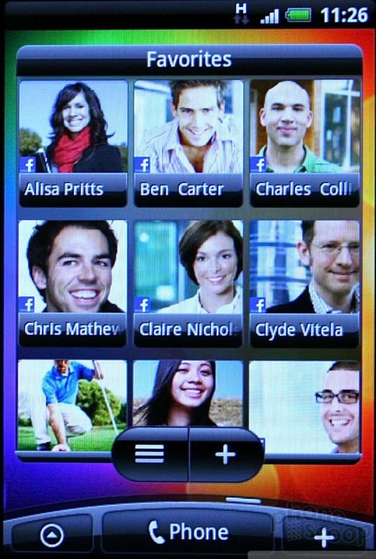
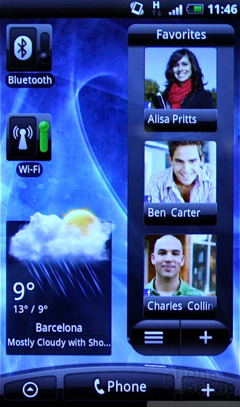
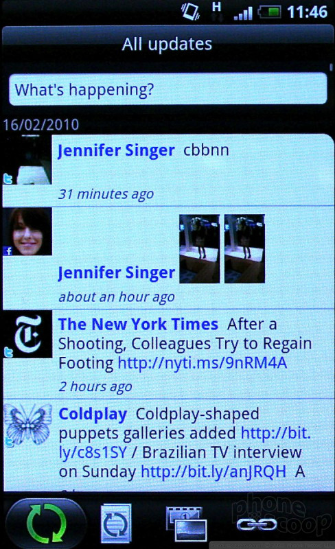
The real benefit the Desire has over the Nexus One is the newest version of Sense UI. HTC has refreshed Sense with some new features. It has updated the weather widget, added the ability to create separate visual phone books, and added a social networking application called Friend Stream. Friend Stream is a neat way to look through friends' posts on various social networks. It's not as over-the-top has MOTOBLUR, and does a good job of streaming everything together in one long feed of updates.
One of the coolest new features in Sense UI is called Leap. Basically, you pinch any of the seven home screens (using multitouch) and it will zoom all the screens out and show you a rendering of each screen. You can then tap the screen you want to leap to, and Leap takes you there. It's supposed to be a faster way to get from home page to home page rather than scrolling all over the place.
Because the Desire has a 1GHz processor in it, it was speedy to use. We noticed no delays in swiping from screen to screen, or moving from app to app.
As far as Android devices go, the Desire is certainly lust-worthy. It easily is one of the best Android handsets to date. Too bad it doesn't support 3G networks. Knowing HTC, though, a U.S. variant may come to market later this year.
Here is a video tour:
HTC Legend
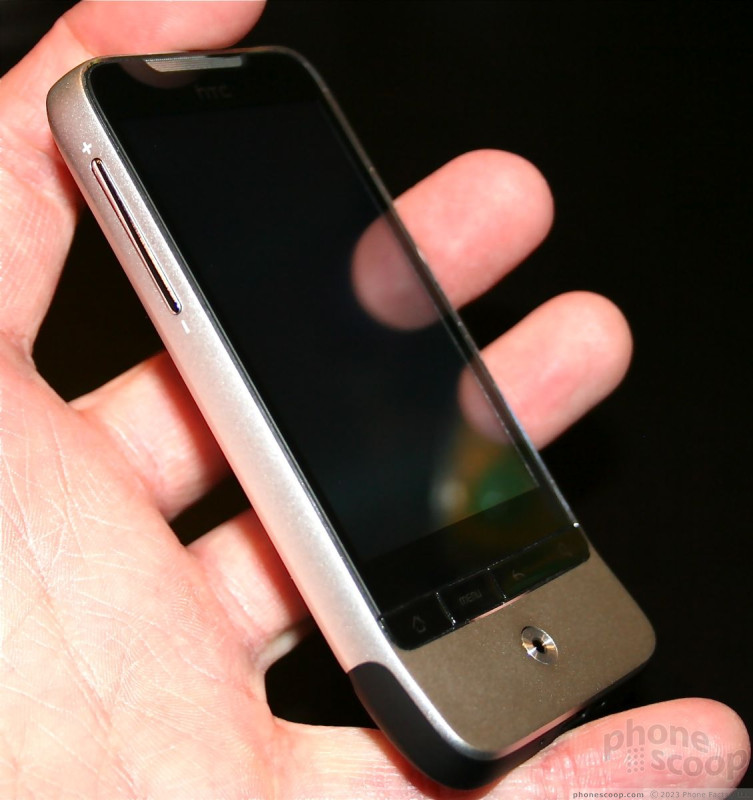
The Legend is the successor to HTC's GSM Hero from 2009. The updated version is better in nearly every way. The frame was milled fro a single block of aluminum. That means it is strong as hell, has seamless lines, looks great, and feels really good in the hand.


First, the display remains the same 3.2-inch 320 x 480 shape and resolution, but it has been updated to an AMOLED display, which really makes it pop. Though the basic specs haven't changed, by switching ti AMOLED, the new display looks superior when held side-by-side with the original Hero.
HTC has revised the buttons on the front of the Legend. On the original Hero, they felt a bit misplaced, and the "back" key in particular was hard to use. The new version moves the four buttons up closer to the bottom of the screen and they are better buttons. They are easy to find, have good travel and feedback, and feel good to use. I also like the new optical mouse/button. It looks better than the trackball and works better to, in my opinion.
The rest of the hardware feels great. The seamless block of aluminum means no cracks or crevices along the edges.
It also features the new Sense UI with Friend Stream and Leap. In all, this is a very solid update to what was already a good phone.
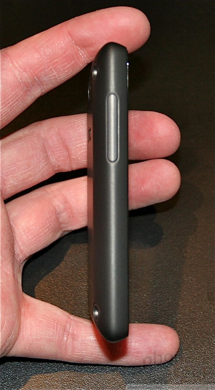
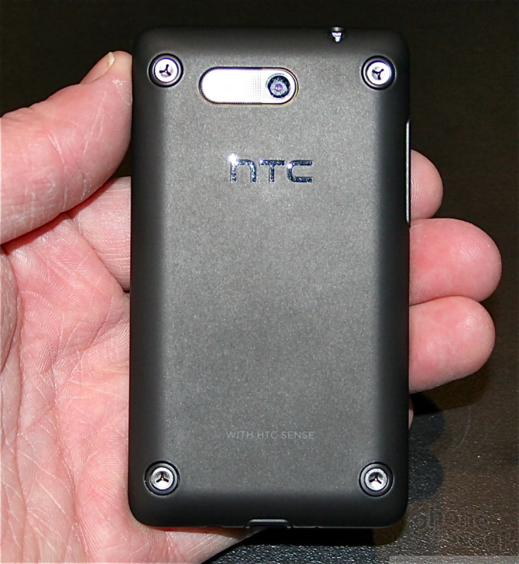
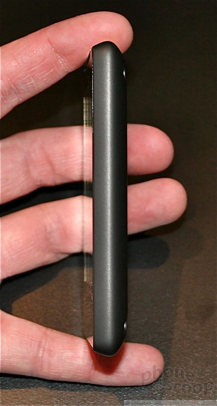
HTC HD Mini
The HD Mini is no doubt a solid Windows Phone, but Rich and I simply don't get the branding. It has nothing to do with with original HD2, and should have been given its own name. That gripe aside....
The HD Mini is a small little phone. HTC really shrunk it down to get it to a much more pocketable size. It is slim, lightweight, and feels really good in the hand. The fit and finish of the materials is rock solid. I have to say, HTC has been doing a really good job lately with its manufacturing processes.
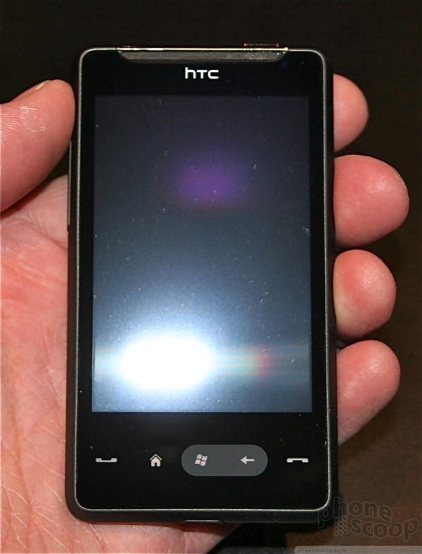

The screen is smaller than I'd like for a touch phone, but it looks great. The colors are bright and sharp, and the resolution is good enough so that Sense UI looks really nice.
HTC replaced the hardware buttons on the HD2 with capacitive buttons on the HD Mini. I find this move puzzling. Physical buttons always work better. The capacitive versions just aren't as effective.
The new version of Sense on the HD Mini works really well, and whatever processor is inside was more than enough to handle running the skin on top of Windows Phone 6.5.3. Speaking of WinPho 6.5.3, the upgrades that are native to the newer version of WinPho are completely obliterated. You can't even tell that Windows has been updated.
In all, this is a solid little phone that will surely do well for those looking for a form factor such as this.
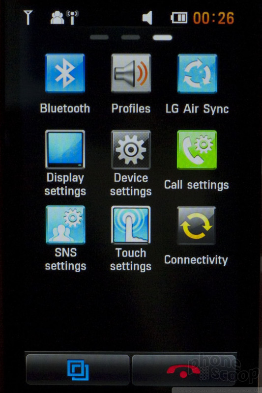
LG Mini
The LG Mini (model number BD880) is LG's new iconic touch-screen phone for 2010. This isn't a smartphone with a standard app platform like Android. Rather, the software is technically proprietary LG, but it attempts to include many smartphone features. Last year's equivalent model was the Arena, which we've heard will finally come to the US soon (a full year after it was announced here in Barcelona.) With luck, some version of the Mini will reach the US before 2011. We hope that's the case, because we really like the Mini.
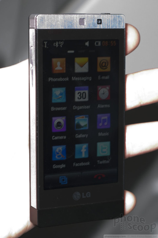
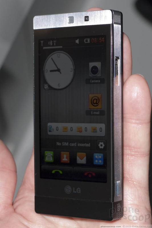
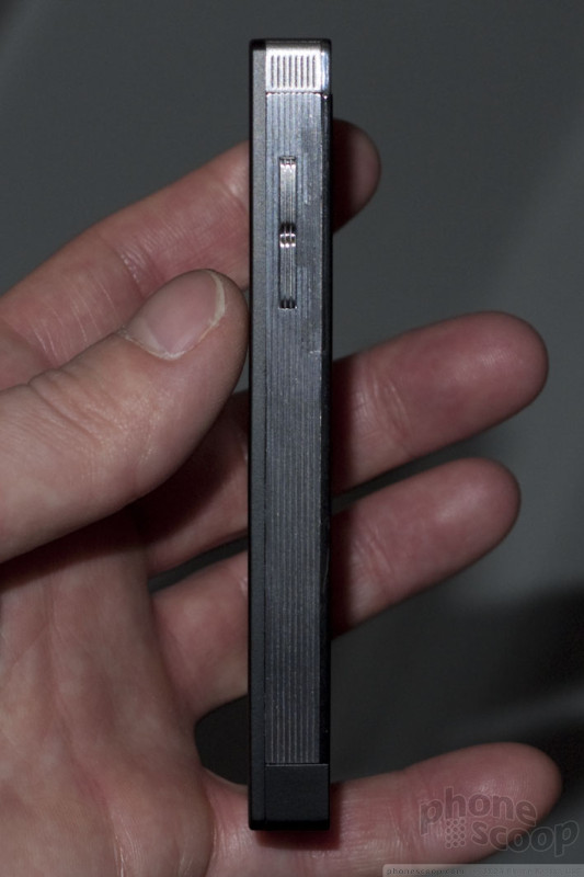
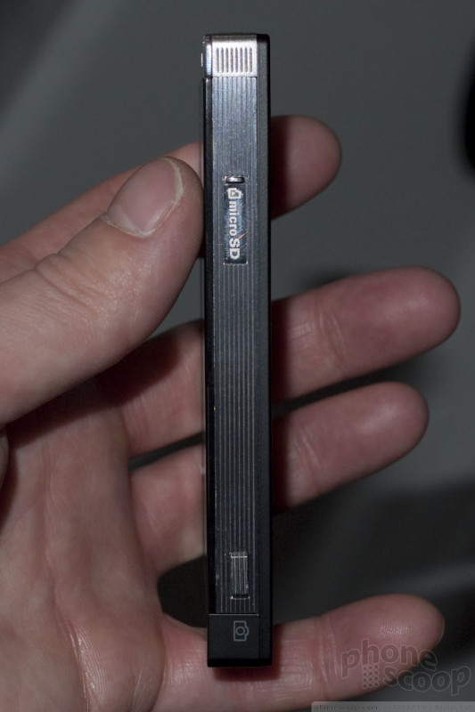
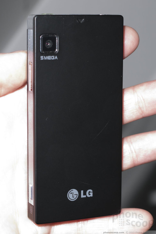
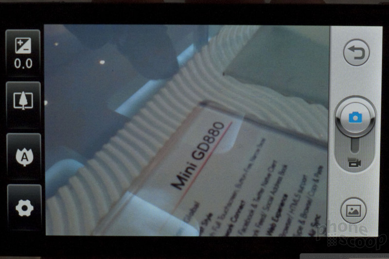
The best thing about the Mini is the hardware. It's small, thin and sexy in a very minimalist, refined way. It feels great, like a precision piece of very small machinery. It's small and stylish enough to be an out-on-the town "evening phone", yet just powerful enough to handle a day of business. The features include 3G data, WiFi, GPS, 5-megapixel camera and a 3.5mm audio jack.
The Arena had LG's much-touted S-Class interface. To us, S-Class seemed like a little much. It had a lot of flashy graphics - like a 3D cube and a "rolodex" media browser - that looked neat, but weren't very practical. Fortunately, LG seems to have listened to feedback; the new touch interface on the Mini is much more streamlined and straighforward.

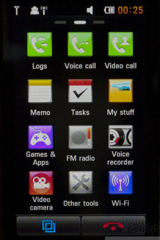

There's a widget home screen, naturally. The main menu is arranged as pages of icons, just like the iPhone. Going into various apps, there's usually a Menu or OK key at the top-left of the screen, and a Back button at the top-right. That seems backward to us, but it doesn't take long to get used to. For the most part, the interface is easy to use.
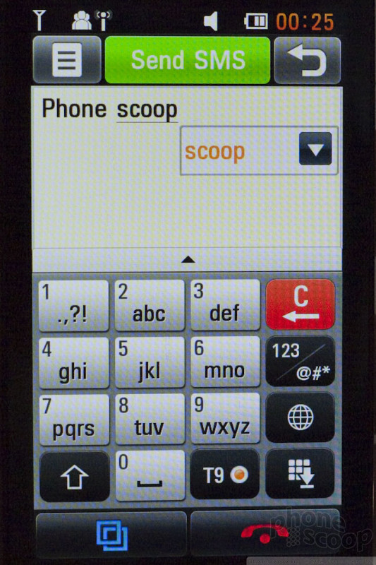
Certain apps like the gallery and music player look downright ugly unless you know the trick of turning the phone sideways to activate the pretty interface (like CoverFlow on the iPhone.) For text entry, you can choose a 12-key keypad with T9 for one-handed use, or turn the phone sideways for a virtual QWERTY layout. The browser works in landscape mode as well.
The Mini's smartphone-like features include support for Microsoft Exchange, as well as a unique sync feature that keeps your desktop PC synced with your phone, including browser history, photos, contacts, and schedule.


There are also Twitter and Facebook clients. The Facebook client is more robust than one might expect. You'll have no problem keeping up with your friends using it. The Twitter client is impressive in some ways, but seems to lack some key features. For example, we couldn't figure out how to reply to a specific tweet, much less retweet something. Still, both apps offer much more than most feature phone Facebook and Twitter clients.
The Mini technically supports multi-touch actions like pinch-to-zoom, although we had trouble getting it to work reliably. It's not a great implementation of multi-touch. The touch screen in general proved finicky. For me, it worked great for five minutes, then started to become less reliable. Others reported that was unreliable for them. This may be a prototype issue that will be addressed by LG in coming months.
Here's a quick video tour of the Mini:
Part 3
Moto Devour
We had a few moments to spend with the Motorola Devour, which is headed to Verizon Wireless in the coming weeks. The device is another Android phone from Motorola that uses MOTOBLUR, its social networking service.
If you were unimpressed with the CLIQ hardware, prepare to be less impressed with the Devour. It has the same 3.1-inch 320x480 screen. No change there. It is, however, a lot thicker and heavier. It also has a goofy industrial design that mixes aluminum and black plastic in the worst way possible. It is all corners and angles, and will surely cause a non-life-threatening injury to someone's groin at some point in its future. It really doesn't feel all that comfortable to hold in the hand, especially since it is so thick. Also, because the frame of the phone is so huge, it makes the display look that much smaller.
There are three capacitive buttons along the bottom of the screen, and they are positioned well enough for easy use. The optical trackpad, though, we can't say we're thrilled with. It's stuffed in the very corner of the phone's front face. It clearly is not meant to be used when the Devour is held in portrait orientation. It's more meant as a navigational aide when holding the phone sideways. Speaking of which...
The slider mechanism felt rough, but it opens easily enough, I suppose. Similar to a SideKick, the Devour has two high edges on the left and right sides of the keyboard. In my opinion, these might get in the way of typing every now and then depending on how you position your thumbs when typing.
They keys themselves were perhaps the Devour's best feature. They are much better than the keys on the CLIQ and DROID. They are separate, and have just enough shape to make them stand out. They are also coated in a nice rubber substance, which I prefer to glossy (slippery) keyboards.
Unfortunately, the Devour was non-operational, so we weren't able to play with the software. It runs Android 1.6 with MOTOBLUR. I am sure Verizon has customized it bit, but it can't be all that different from the software on the CLIQ or Backflip.
Here's a quick video peek at the Devour.
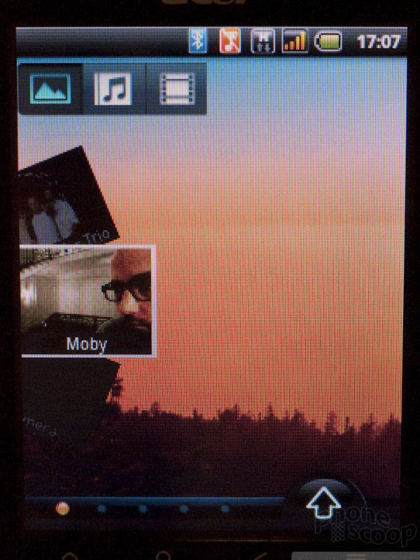
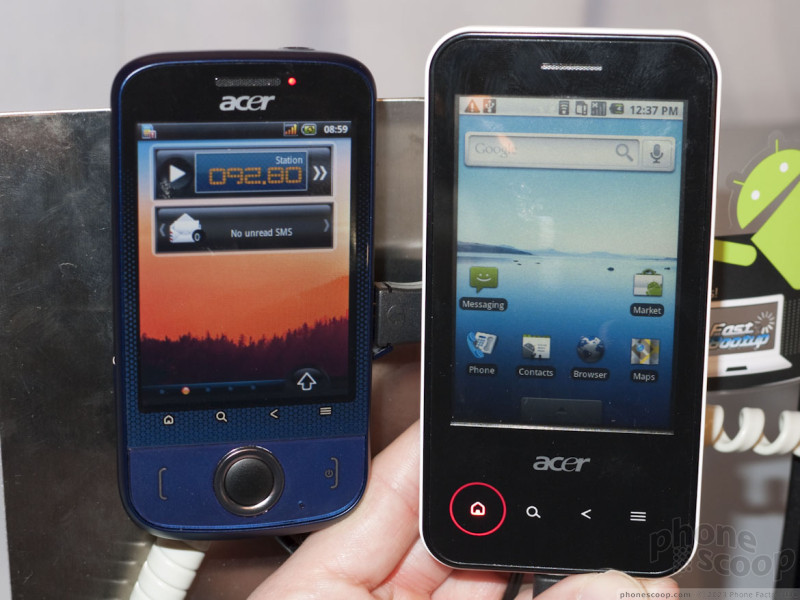
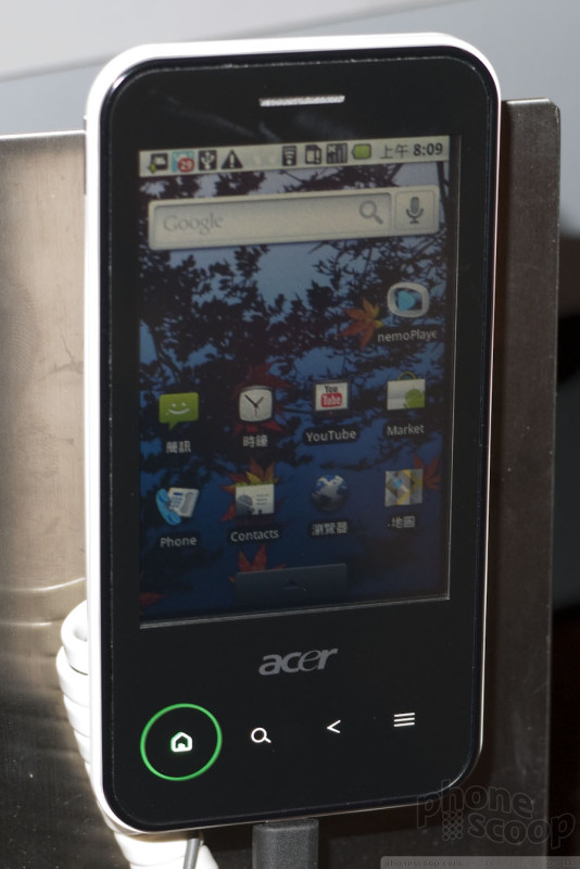
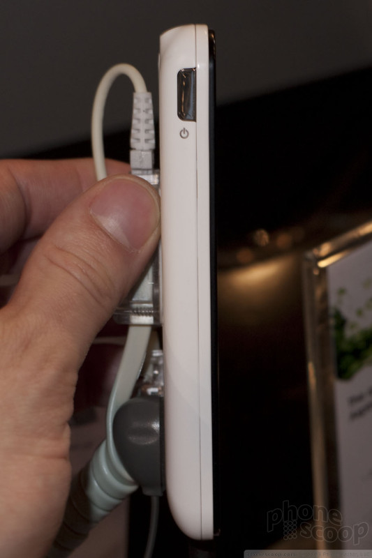
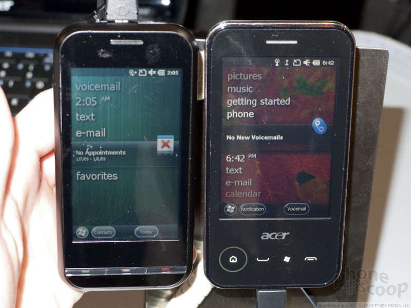
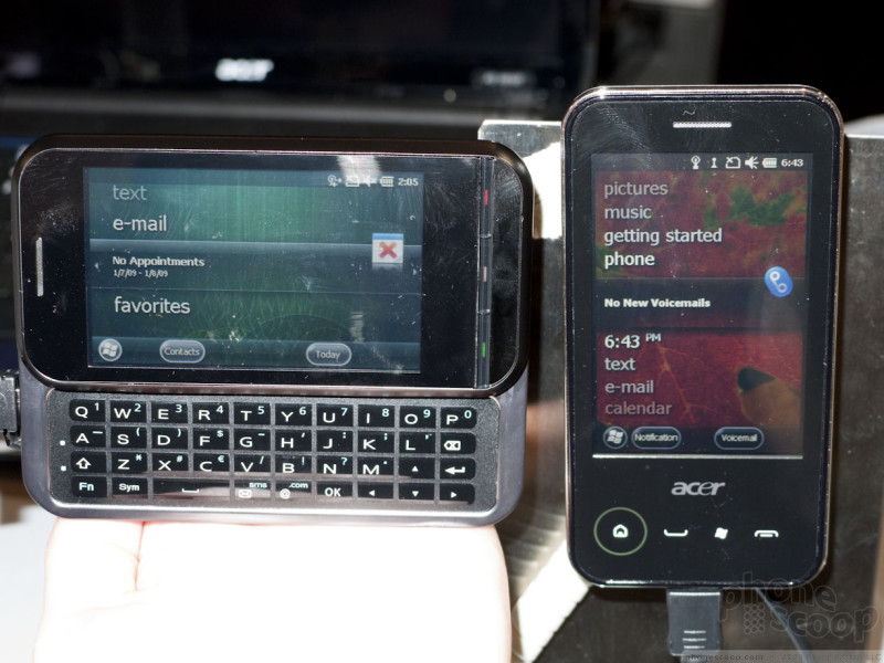
Acer
Acer had a variety of smartphones on display. Some were running Android, other models were Windows Mobile 6.5.3, and at least one model had a variant for each platform. Nearly all of them were advertised with support for European 3G networks "or" American 3G networks. At a trade show like this, that's just the manufacturer's way of saying to carriers "we'll make one for you if you want it." Consumers shouldn't assume there will definitely be a version of each model for each region coming all the way to store shelves. Still, American versions of the phones below are being pitched to American carriers, so we took a look at 'em.
Acer has already announced the "Liquid" Android phone. It's a rather large, plastic-y phone. Still, with a powerful Snapdragon processor, it's nothing to sneeze at. What's new this week is a version with Android 2.1, which Acer is referring to as a new model: the "Liquid e".


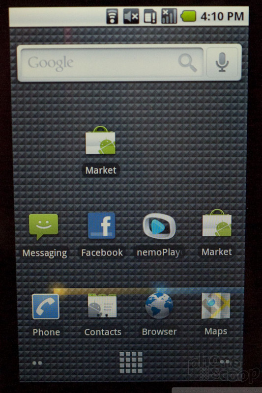

At the opposite end of the lineup is an entry-level Android phone: the beTouch E110. The display is only QVGA, which is quite low-resolution. Similarly, the camera is only 3-megapixel, whereas most new Android phones are coming with 5-megapixel cameras. So the idea here is affordability.
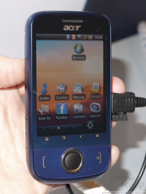

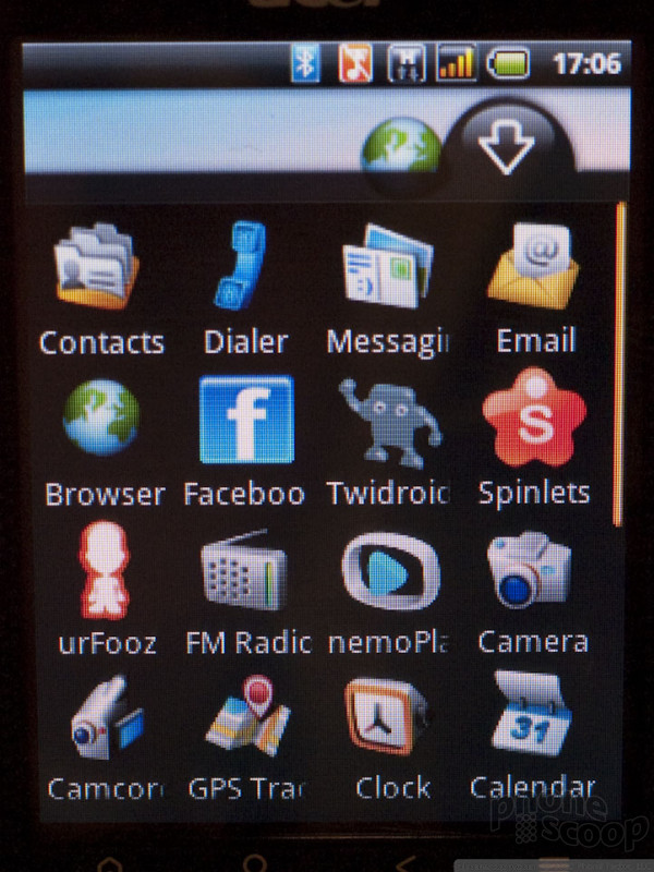
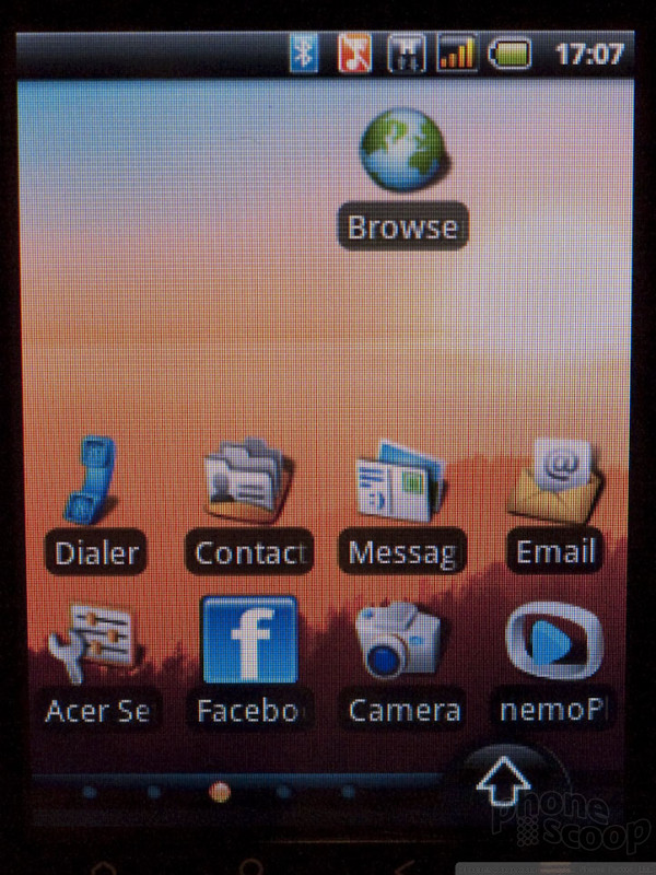

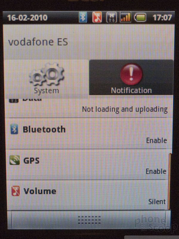
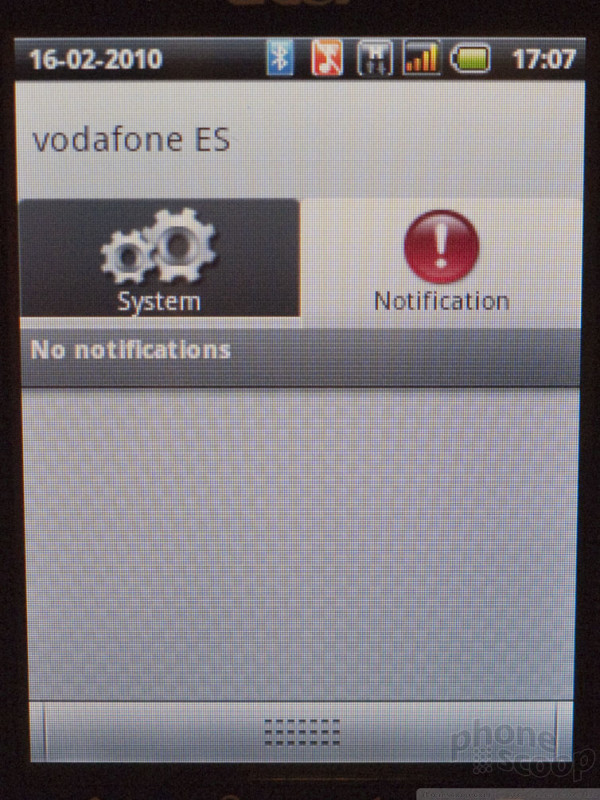
Still, Acer has added one interesting innovation: they've modified the Notifications panel to include a tab that lets you quickly check status and change certain settings. Some manufacturers do this with home screen widgets, but by putting this in the Notifications panel, it's available from any screen, not just the home screen.
Moving a tad further up the lineup, we find the beTouch E400. The display is higher resolution, it runs Android 2.1, and a document viewer (DocumentsToGo) is included.

Below is a video tour of three Acer Android phones:
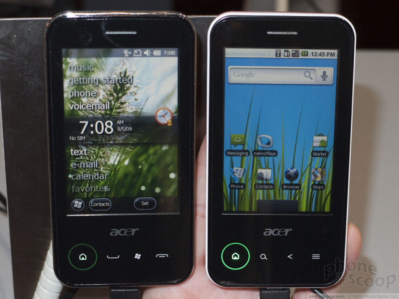
Windows Mobile
Updated Feb 17: What's really curious about the E400 is that Acer also makes a Windows Mobile version called the neoTouch P400. It looks perfectly identical, with the same distinctive circular "home" button. The neoTouch P400 runs Windows Mobile 6.5.3, which explains why the same hardware can run both OSes; WinMo 6.5.3 supports capacitive touch displays, which are standard for Android.

Also on display was the NeoTouch P300. In spite of the lower model number, it adds a sliding QWERTY keyboard.


Adobe Flash
Adobe and a number of partner companies are now touting Adobe Flash 10.1 for mobile devices.
Android will be among the first platforms to get Flash 10.1, thanks to some help from Google, which has bent over backwards to make it happen, even changing parts of the core OS to suit Adobe. The first devices to get it will be Android 2.1 devices with some of these OS changes tacked on. Later versions of Android will have these changes baked in as standard.
However, it's unclear (and possibly yet to be decided) whether Flash itself will become a standard part of Android. Google CEO Eric Schmidt took time out of his keynote to demo Flash in the Android browser, but it was on a Nexus One, and it was mentioned that the Nexus One's (unusually) fast processor is part of what enables Flash on Android to run well. If Flash doesn't become a standard part of Android, Adobe told us they will make it available for download in the Android Market.
Regardless, the companies involved have committed to pushing an update to Nexus One and Droid phones that enables full Flash 10.1 in the browser.
Palm webOS is also getting Flash 10.1 soon, and Adobe is working with Microsoft to bring it to Windows Mobile (although the timing is less clear for that platform.) Eventually Adobe plans to bring it to BlackBerry and Symbian, as well.
It's important to note that we're not talking about Flash Lite, or just Flash Video, or just Flash without video. No, this is full-on Flash, showing everything you can see on a desktop PC with Flash. The only exception are a handful of extremely memory-intensive Flash apps, like Photoshop.com, which will easily use 60 MB of app working memory (RAM). That's just not practical on a mobile device yet. Also, some games that rely on complex keyboard input may not work well on devices without keyboards, obviously.
Adobe has taken care to optimize the experience for small screens. Any Flash element on a web page can easily be zoomed to full-screen mode, and any Flash Video content within that can easily be zoomed to full-screen as well.
Adobe also announced Adobe Air for mobile devices, which frees Flash from the browser and lets developers turn Flash content into full apps. These apps can be sold in apps stores and have app icons in the OS just like native apps.
Below are some videos showing Flash 10.1 running on Android 2.1 devices:
A Nexus One displaying Flash 10 games, a Flash image editor, and amazon.com with Flash:
A Motorola Droid displaying Flash 10 games and youtube.com:
Bluetooth 3.0 HS
Broadcom was demonstrating the capabilities of its newest Bluetooth + WiFi combo chips here at MWC this year. Its new BCM4329 chip - already used in the HTC HD2, Touch2, and Nexus One - is capable of supporting Bluetooth 3.0 with the proper software (driver stack) on the phone.
Bluetooth 3.0 brings a number of improvements to the standard, but the most important for consumers is the new "HS" (high speed) mode. HS actually uses 802.11 (WiFi) to transfer data, but the process starts with using Bluetooth to find the other device (usually another phone) and establish the direct phone-to-phone connection. It makes it easy to send a file from one phone to another - like a photo - just like you would with Bluetooth OPP (OBEX), but much faster, since it's using the speedy 802.11 radio. Sending a file directly from one phone to another via WiFi isn't normally possible, or at least not easy. Bluetooth 3.0 HS make it simple.
Here's a quick video demo of Bluetooth 3.0 HS in action. As you can see, a 3-megapixel photo is captured and sent to another phone almost instantly:
One of the weak points of Android is its limited Bluetooth profile support. By default, Android uses the BlueZ Bluetooth software "stack", which only supports some basic audio profiles, like HFP, HSP, and A2DP (stereo.) Broadcom's chips - used in many Android phones - can of course support many more profiles, but there needs to be software support to enable that functionality. Broadcom now offers that software stack to manufacturers.
Samsung already uses this Broadcom software stack in phones like the Behold II and Moment, which is why those are some of the only Android phones to support profiles like OPP (for exchanging files) and PBA (for syncing your contacts with a car Bluetooth system.) Broadcom is working to add support for many more Bluetooth profiles to its Android software stack.
Part 4
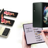
Puma
One of the bigger brand announcements of the week came from Sagem and Puma. The two companies teamed up to deliver the Puma phone, which offers users into the whole "sport" lifestyle a phone to call their own.
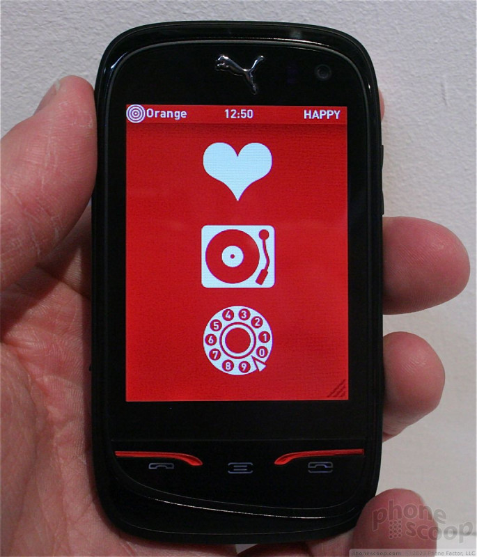
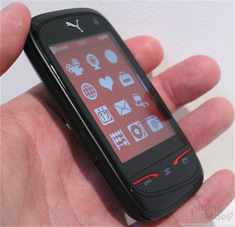
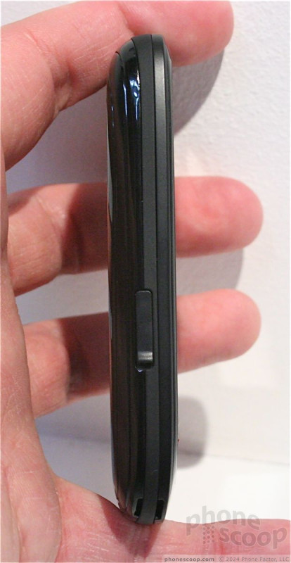
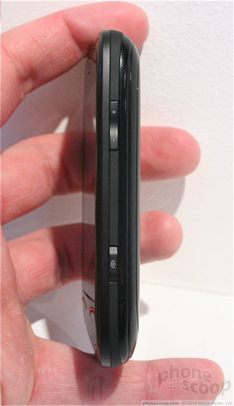
As a handset, it's nothing spectacular to look at. In fact, it looks like the Palm Pre, but without the slider. The screen looks good, especially with the red and black Puma coloring that's used on most screens. There are several hardware buttons, such as send/end and back, below the touch screen. The felt a little wobbly on the unit we played with. Its rounded shape means it slips easily into/out of pockets, and it is certainly compact.
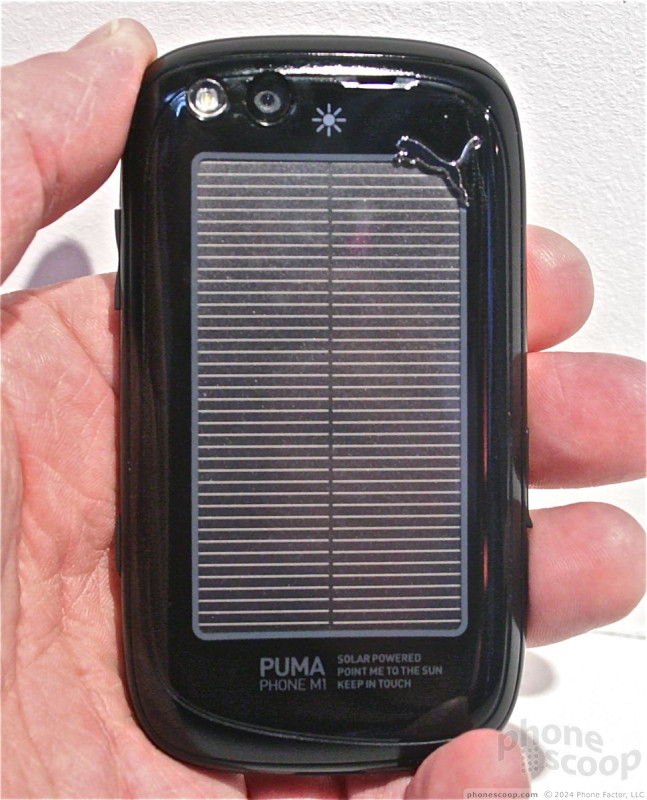
Nearly the entire back surface of the phone is a solar cell. It collects energy from any light source (sun, incandescent, fluorescent) to power the phone. Sixty minutes of sunlight gives you 15 minutes of talk, 35 SMS messages, or 2 hours of music playback. It's not really attractive, but I really like the idea of using solar energy to power phones.
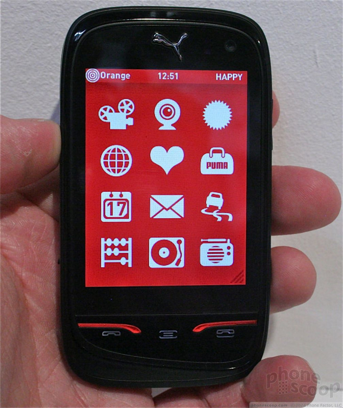
The user interface was completely custom designed from the ground up. In reality, it's a vehicle to promote the Puma brand. Everything about what the UI offers ties back to the things an active, Puma-loving person is going to want to do.
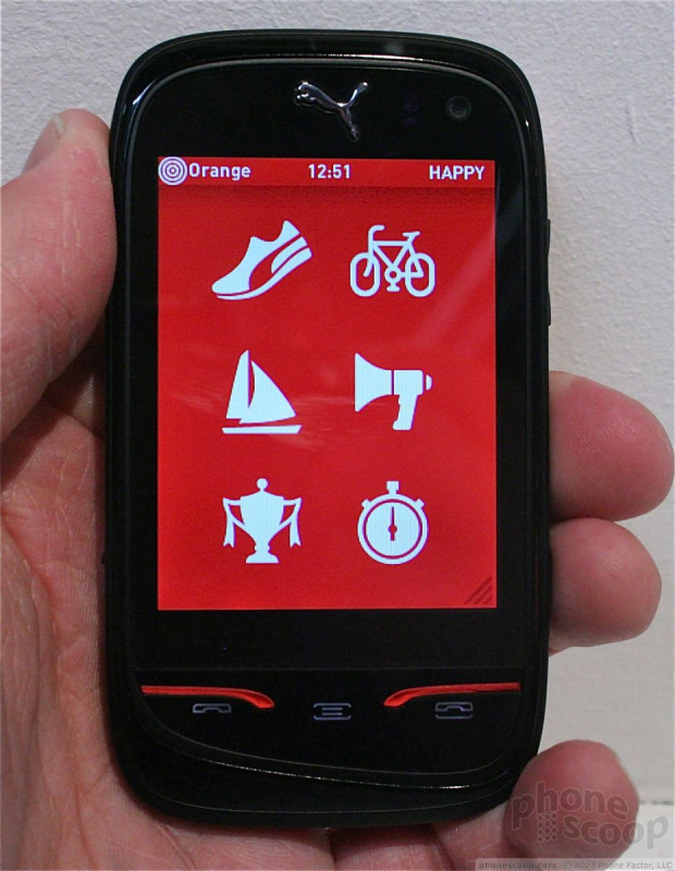
There are a lot of sports-related applications on board, such as a pedometer, a GPS-equipped bicycling app that will map and record routes and a really neat stopwatch. The Puma also has plenty of lifestyle apps, such as the camera, music and video playback, social networking, and of course quick and easy access to the Puma World site/store.
Who knows if or when it might ever reach the U.S. market, but it's an interesting exercise in using brand power and community to sell a phone.
Toshiba
Toshiba showed off its TG02 smartphone in Barcelona. This thin, Windows Mobile 6.5.3 device features the latest SnapDragon processor and a nifty, trick user interface. The device itself is decent looking, but doesn't do enough to differentiate from the crowded field of slab-style touch phones.
It's large, but very thin. The thinness means fewer hardware features, though. There's no 3.5mm headset jack, for example, nor a flash.
The capacitive buttons below the screen were a bit unresponsive, but that could have been as much from the user interface layer that Toshiba created for the device.
About that UI...


The main menu screens to look all that different from any other phone, but what Toshiba has done is to wrap them up in a neat 3D carousel that users can interact with via the accelerometer. Tilting the TG02 tilts and rotates the 3D carousel. I'm not sure it's the most practical thing in the world, but it sure looks nice.
Check out the video below to see it in action.
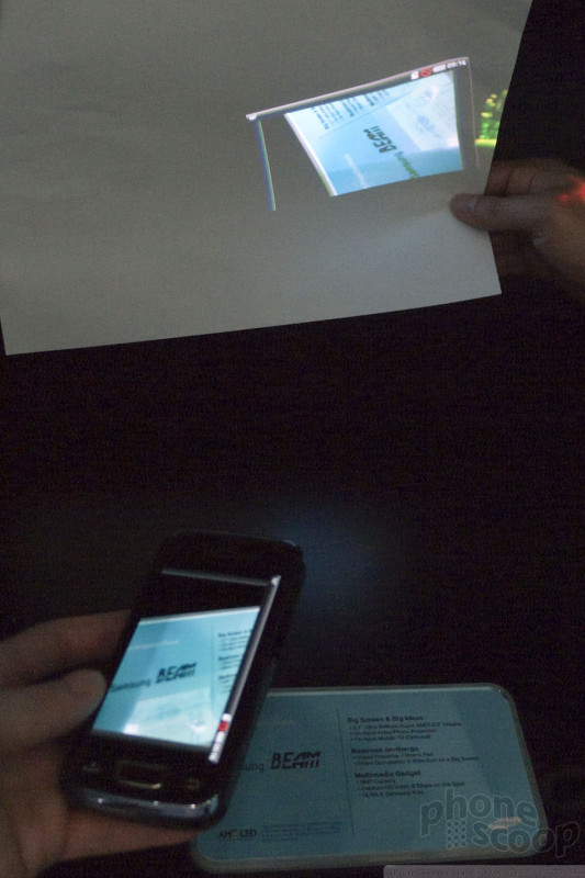
Samsung Beam & more
Samsung Beam
Samsung showed off a projector phone just recently at CES. In short order, they're back with yet another projector-blessed model, this time with Android.


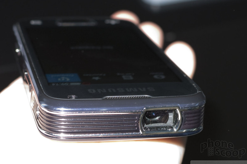

The Samsung Beam looks more like a phone that might actually come to market, compared to previous prototypes we've seen. It's a smartphone, for one, which makes sense for the typical projector-phone use case: a business type who needs the ability to make impromptu presentations on the go. It's just barely within the range of "pocketable", although there's still a noticeable size tradeoff.
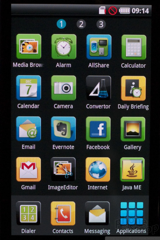
Curiously, it's running a customized theme of Android we hadn't seen before. It's nothing too dramatic - the dots that indicate which home screen you're on are numbered, for example - but nonetheless, it's new to us.
The projector works much like previous demos we've seen. Any projector in a phone is going to be relatively dim, (or it would suck your battery dry in minutes,) and the Beam is no exception.
Unlike the Samsung projector phone we saw at CES, the Beam always displays exactly the same thing on the screen and through the projector. We preferred the concept we saw at CES of having just controls on the screen while projecting pure content. It's a shame the Beam doesn't have that feature. The Beam does have the same nifty "Visual Presenter" feature, though, which uses the camera on the back to project a live video image of whatever's below the phone. You can use it to project printed materials, for example.
Femtocells
Also in the Samsung booth were some interesting femtocell products.
One was a successor the Verizon Network Extender. We asked what was new about it; the reps in the booth didn't know, and it wasn't obvious from inspecting it. The existing model doesn't support EVDO, so we hope this new model at least supports that.

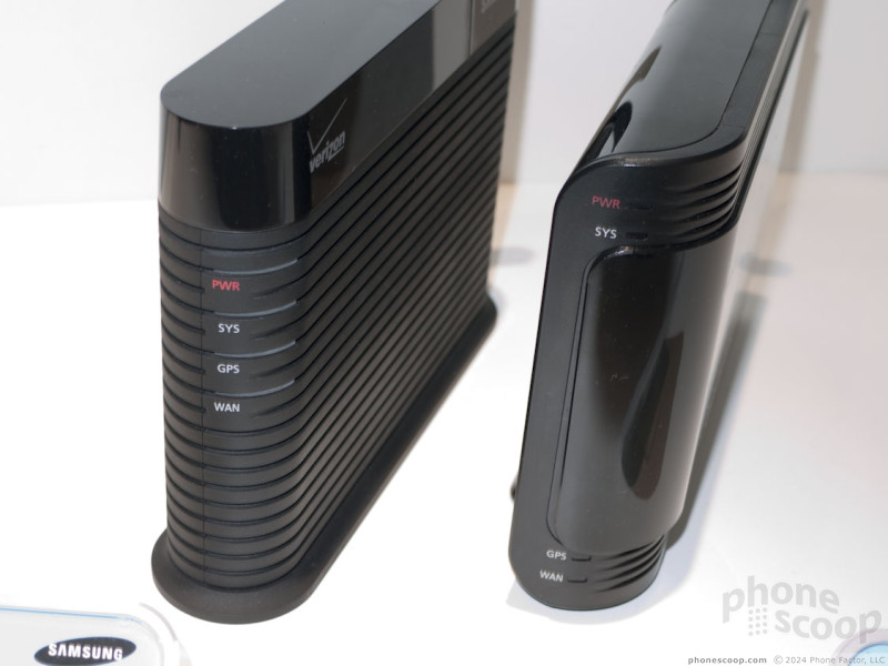
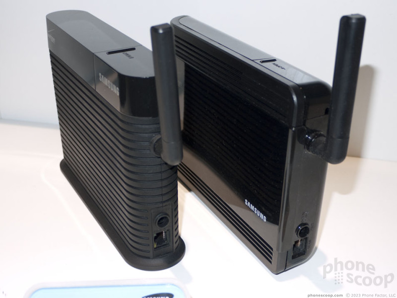
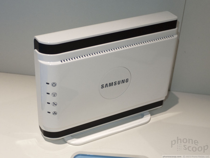
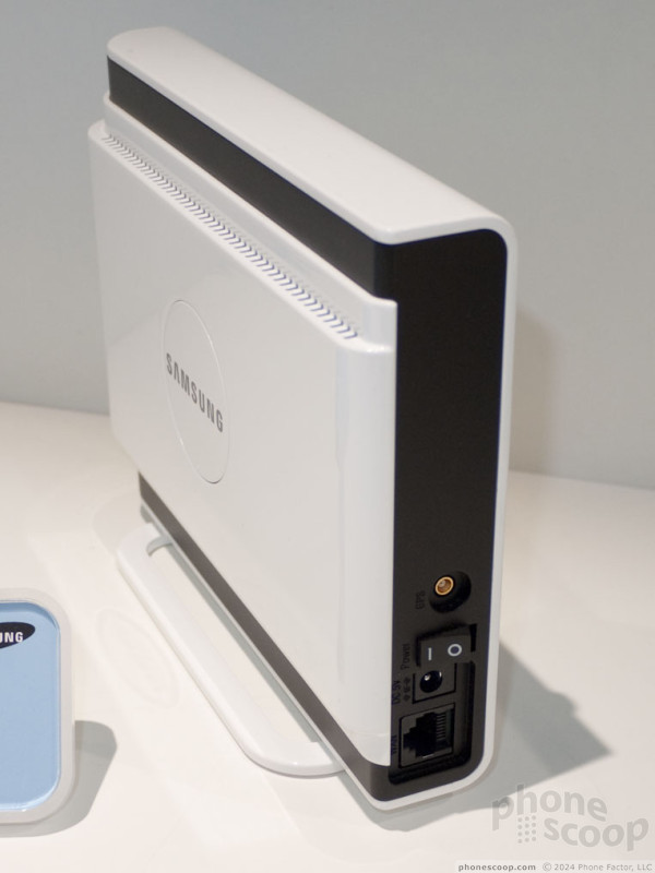
Also on display was a mobile WiMAX femtocell, which has the same styling as the Samsung CDMA femtocell offered by Sprint (the Airave.) We'd like to think that's a sign Sprint will offer this, but we don't know for certain.
Eric has been covering the mobile telecommunications industry for 17 years at various print and online publications. He studied at Rutgers Newark and University of Kentucky, and has a degree in writing. He likes playing guitar, attending concerts, listening to music, and driving sports cars.
 Hands on with the moto g 5G
 Hands On with the Motorola edge (2022)
 Hands On with the Motorola edge+ (2023)
 Hands On with the 2023 moto g 5G & moto g stylus
 Samsung Updates Foldables with Water Resistance, S Pen
Comments

Adobe and Android

I think WP7 caught everyone off guard...
Also no syncing for contacts and such is great. Finally. Also I'm happy they added WiFi Zune sync also, one of the coolest zune features after zunepass.
My only real concern is how this device will be able to work with power users. Most people I know who use ...
(continues)

Metallica?

Toshiba and spb mobile shell

Nuvifone A50 not coming to US?

Bada = Fail
I swear, does Samsung have ANY quality control procedures?
Zune software...
Are they going to make it cross platform compatible? If not they're shooting themselves in the foot.

it's just so amazingly... ugly ... to me