
CTIA Fall 2009
Oct 7, 2009, 1:13 PM by Eric M. Zeman & Rich Brome
updated Oct 8, 2009, 6:38 PM
Live from San Diego for the wireless industry's big fall event. Hands-on with the new Samsungs, Nokias, HTC HD2, Pantechs, and the PCD Razzle, including hands-on video.
Part1: Samsung
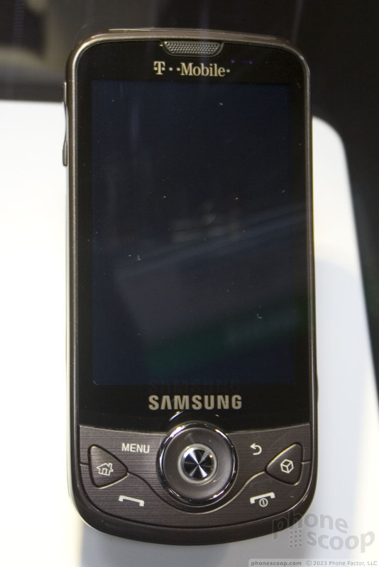
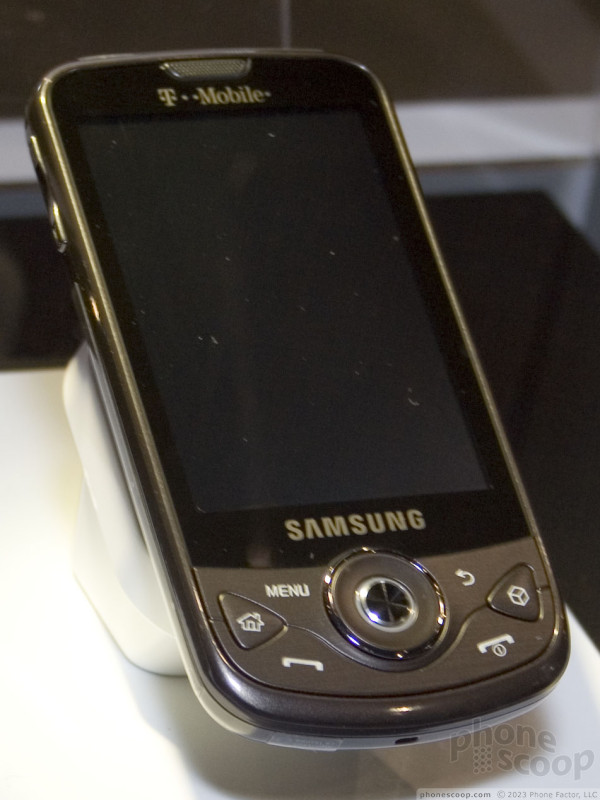
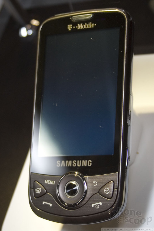
Moment
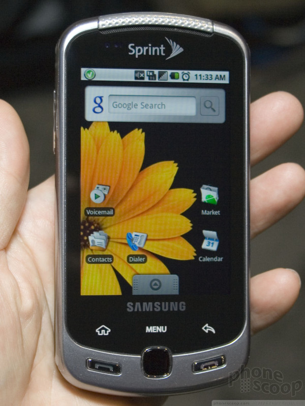
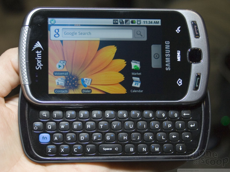
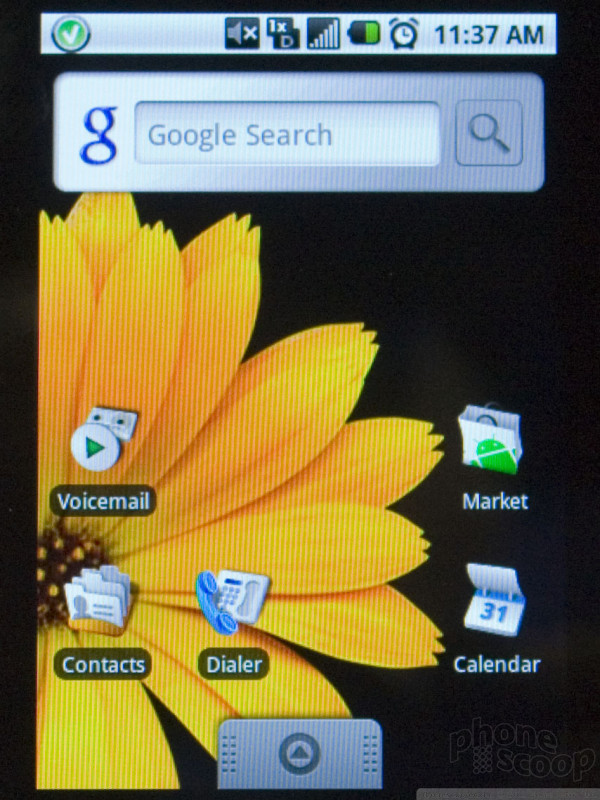
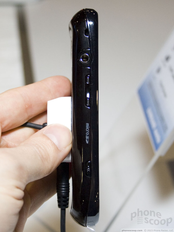
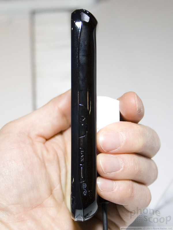
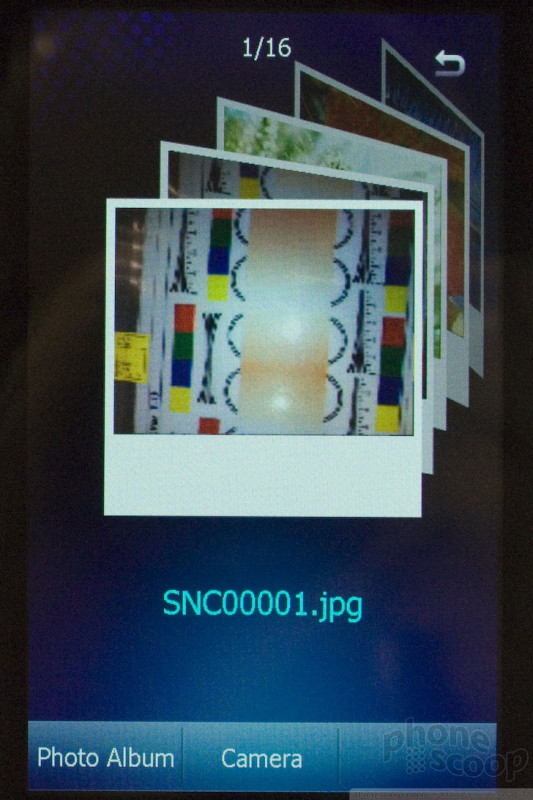
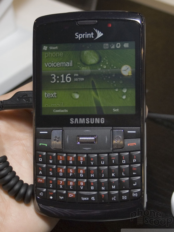
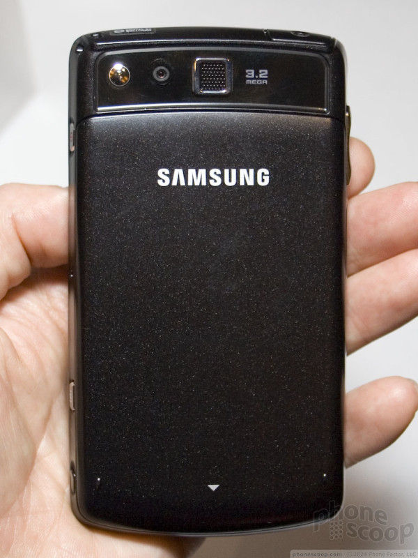
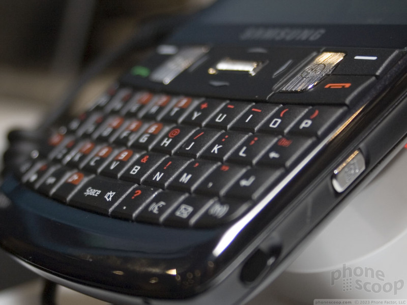
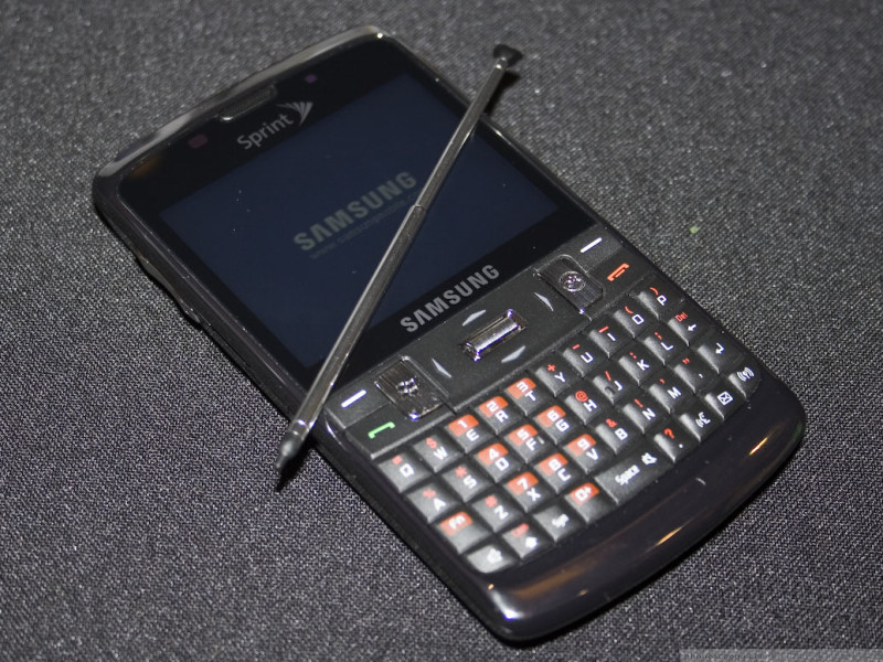
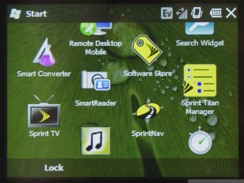
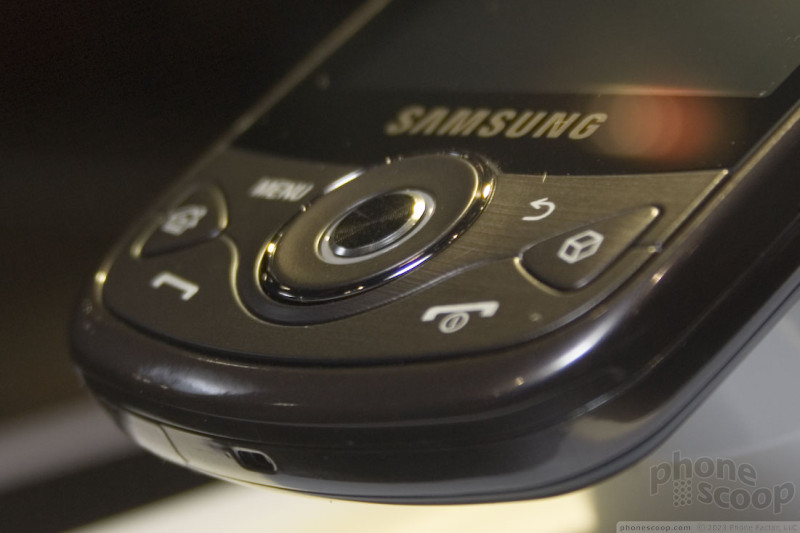
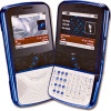
Our hands-on photos of the Samsung Moment Android phone for Sprint:
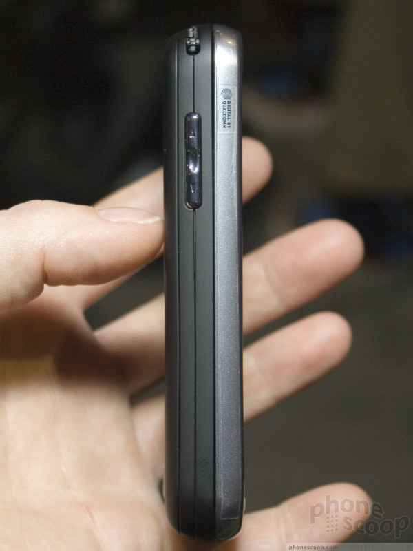
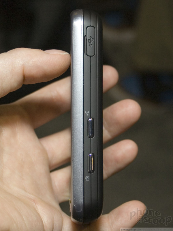
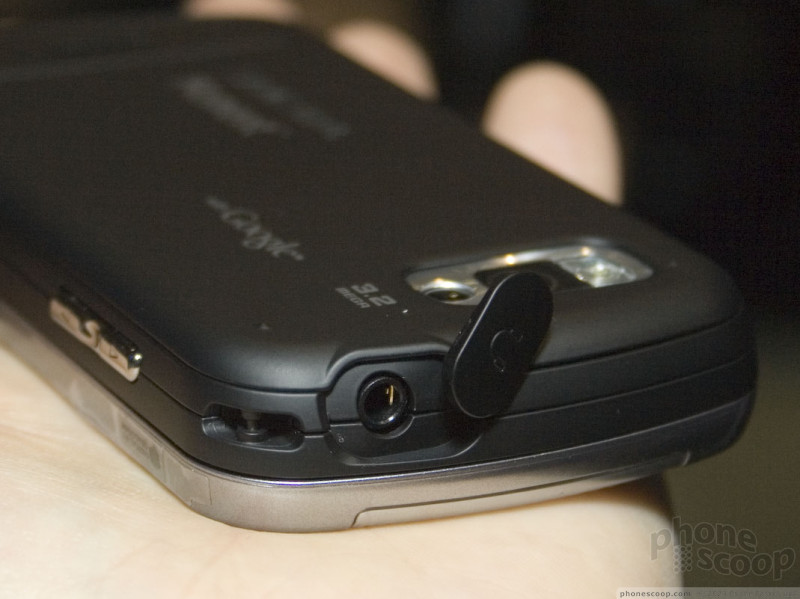
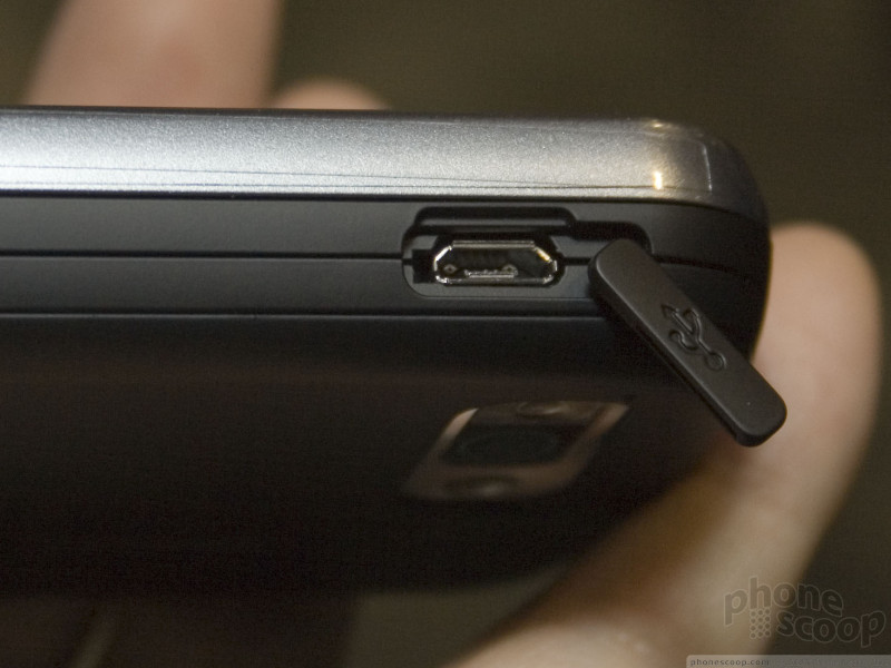

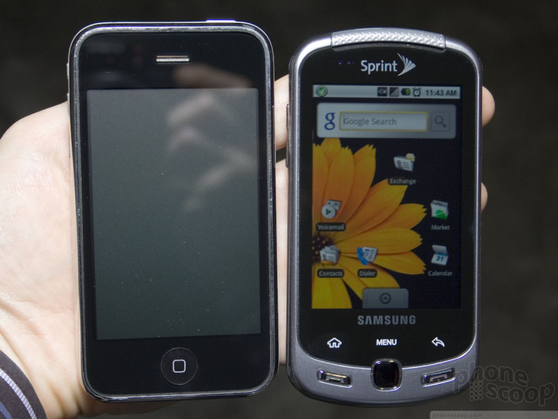
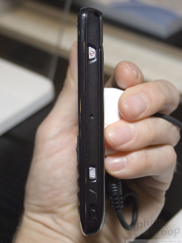
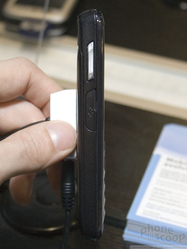
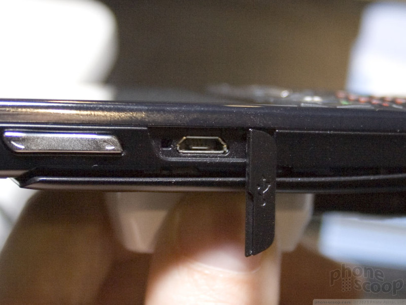
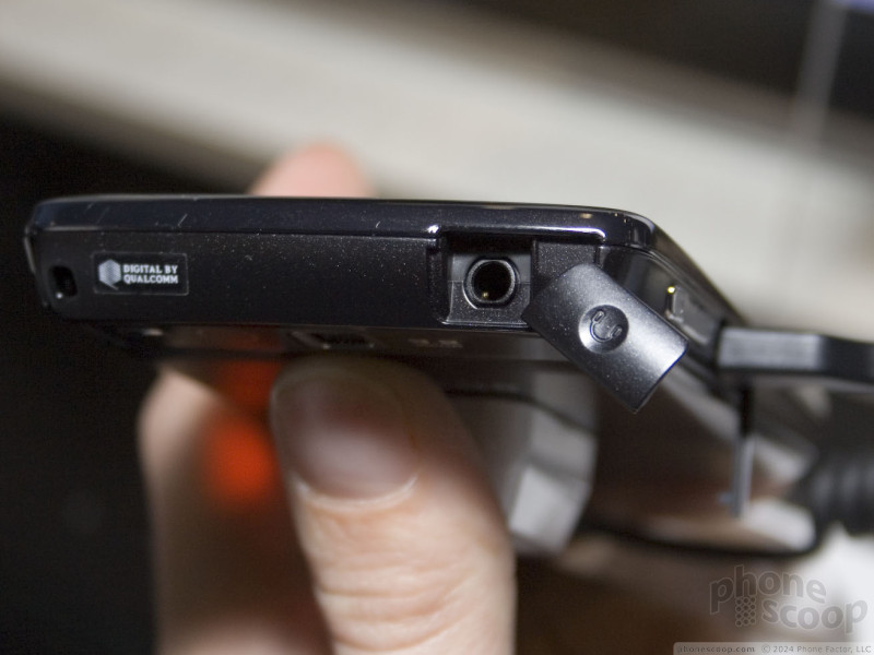
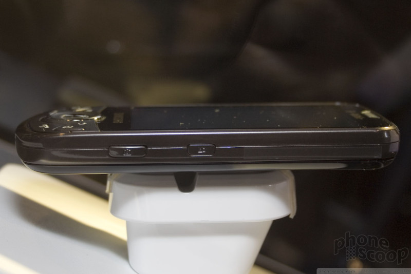
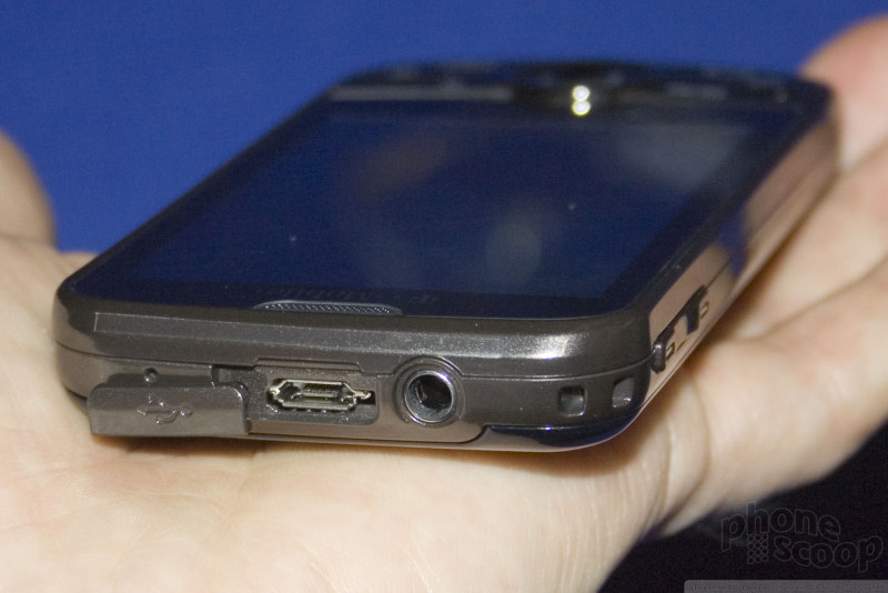
As you can see, it has a 3.5mm headphone jack, and the memory card slot is unfortunately located where you must remove the battery to change it. However, the slot supports up to 32 GB cards, so you can put in a very large card, and with the standard micro-USB connector makes it easy to move files on and off the phone.
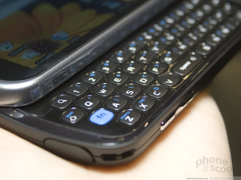
The phone itself is a decent size; not large, but not surprisingly small. It feels good in hand, with a good slide mechanism. Having touch keys along the bottom instead of physical keys is annoying for us, but they work fine. It has a dedicated search key like the Hero, but it's located on the QWERTY keyboard, which makes a lot of sense. The keyboard is good; not great, just good.
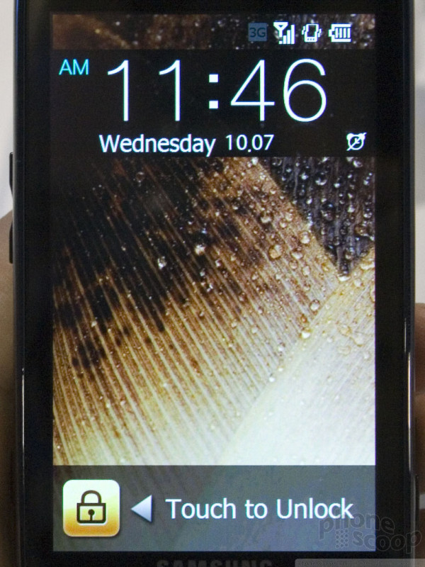
The active-matrix OLED display is gorgeous, of course. We're getting used to that on high-end Samsungs, but it's still a wonderful thing.
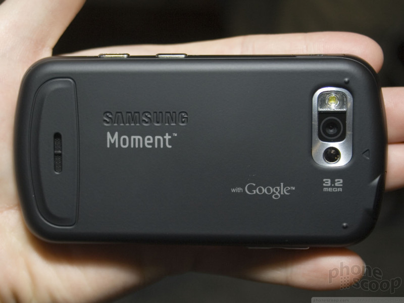
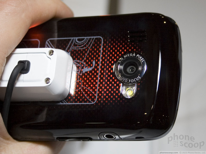
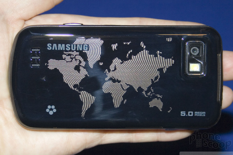
The Moment also sports Wi-Fi and a 3.2-megapixel auto-focus camera. There's an optical trackpad (like the Omnia, and instead of a physical trackball.) An 800 MHz processor keeps things speedy (and they are.)
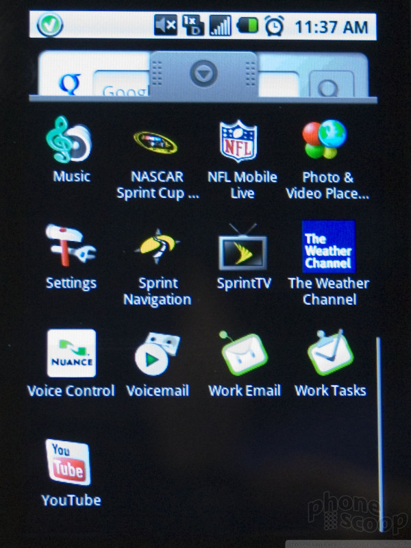
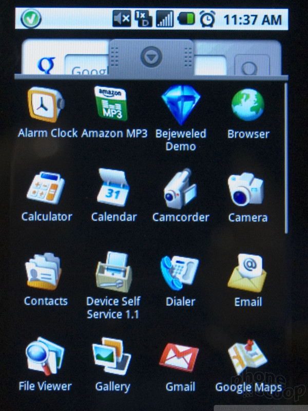
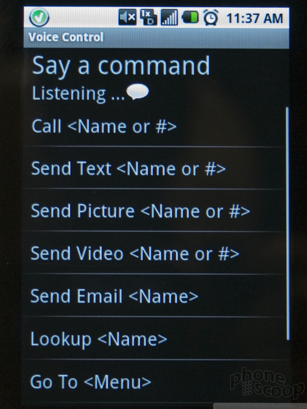
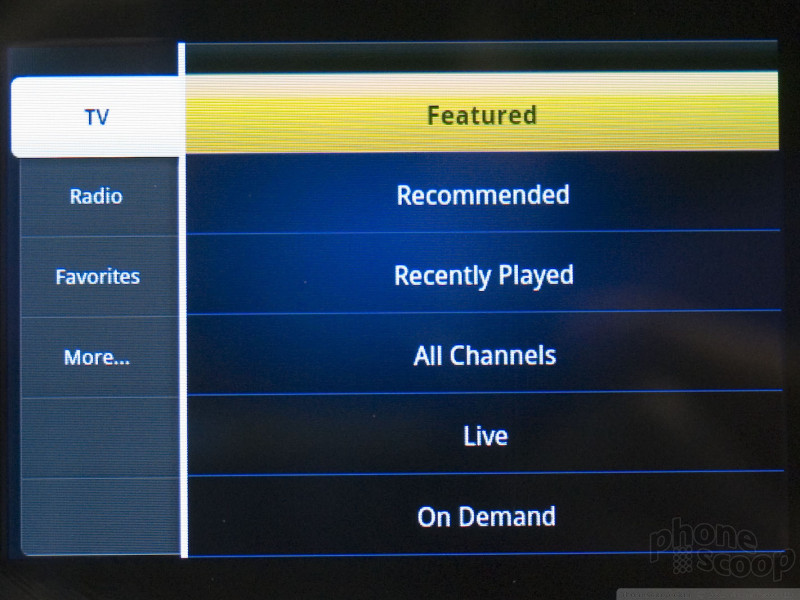
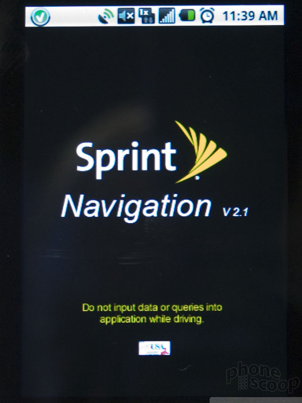
The interface is pretty much stock Android. (Prototypes we tried ran version 1.5, but Samsung promised that it will ship with 1.6.) What's curious is how little customization they've done. There's no TouchWiz, no fancy widgets, no expanded or custom home screen... just standard Android. That's not a bad thing - stock Android certainly has its fans. It does have the full Google experience, plus important extras like support for Microsoft Exchange. Naturally there are also standard Sprint apps loaded, such as Sprint TV, NASCAR, and Sprint Navigator.
One area that could really have used some customization is the camera. Unfortunately, even the camera app is stock Android, meaning the ONLY setting is to turn the flash on or off. Samsung knows how to do a great camera interface on a touch-screen phone, and the Omnia II is a great example. It's a shame they couldn't bring that to Android on the Moment.
Here is a quick video of the Samsung Moment for Sprint:
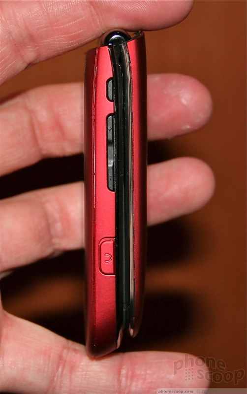
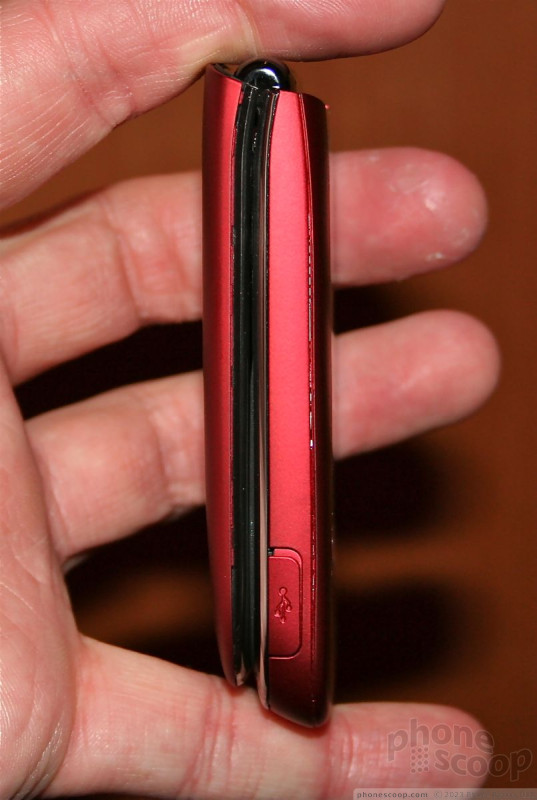
Omnia II
Samsung was showing off the Omnia II for Verizon at its booth. Samsung announced the Omnia II at an event in New York in June. They promised a Verizon version at the time, but technically didn't show it. Now it's on display.

The design is slick-yet-professional on the front, with a huge OLED touch screen above a sleek button area. The back has a unique shimmering red design that's decidedly less business-like. It's a strange design choice. It may match Verizon's logo, but perhaps not their customers.
Physically, it's surprisingly thick. It feels about as thick as the Moment, but lacks a slide-out keyboard, so it really has no good reason to be so thick.
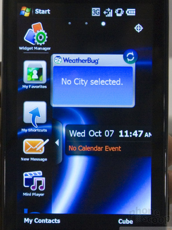
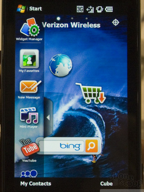
Like the first Omnia, the II merges Windows Mobile with Samsung's TouchWiz interface. Again, Samsung has done a good job of making Windows Mobile more finger-friendly and covering up the uglier parts of Windows Mobile. With the Omnia II, they've gone even farther with this. Both the home screen and the main menu now have a sliding panels design where you can swipe left or right to switch between pages of widgets or icons, just like iPhone or Android.
The current prototypes run Windows Mobile 6.1, but Samsung was quick to let us know that the software isn't final. They specifically left open the possibility that it would ship with 6.5, and said that the release date has not been determined yet. However, Samsung's TouchWiz and other interface tweaks replace enough of the default Windows Mobile interface that we're not sure it would matter much to most people whether it runs 6.1 or 6.5.
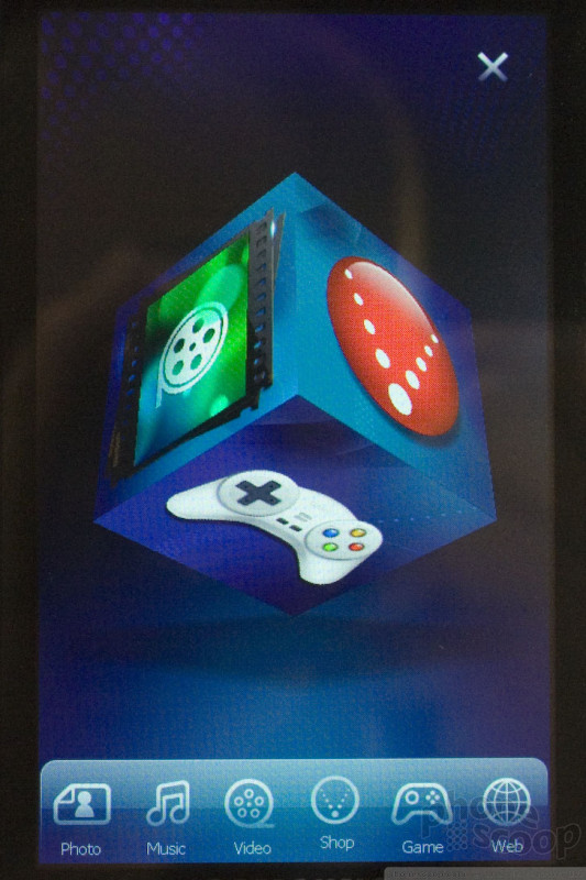
Perhaps what's most interesting about the Omnia II is the new version of TouchWiz that it uses. In addition to the nice design touches it has sprinkled throughout the Omnia II's menu system, it also features the new media cube.
The cube is a 3D image that floats in the middle of the screen. Below it is a dock with a handful of buttons. The cube has a different application on each side making for a total of six. You can spin the cube around on the screen to find and open the application you want, such as the photo gallery, music player, and so on. It's neat, and looks cool. I am not sure that it's the most practical way to access your applications, but I've seen much worse. It takes a little while to get used to the positioning of the six applications, but it's not too hard to get the hang of.
Another nice touch is the way the browser handles bookmarks. Rather than interact with a boring list of links to web sites, the Omnia II gathers them together and presents them in carousel fashion. Each bookmark is represented by a card with a screen shot of the web site on it. You can sort through the cards and choose the site you want to visit. It makes finding bookmarks a lot more fun.
In all, the Omnia II is a decent integration of TouchWiz and Windows Mobile. It feels more refined that the original Omnia, that's for sure. Release date and pricing information is not yet available.
Here's a video tour to give you a better idea of what we're talking about.
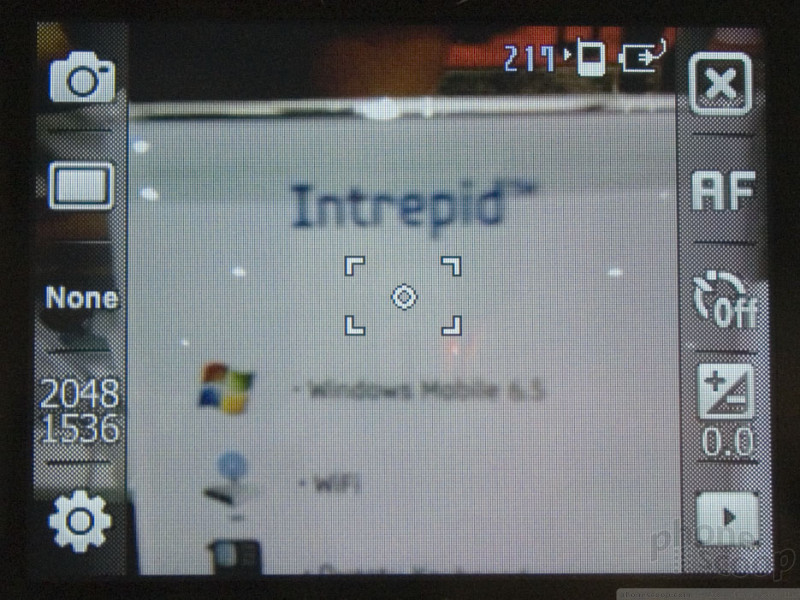
Intrepid
The Intrepid is essentially a follow-up to the Ace. It's a very business-oriented phone aimed at the corporate type who needs Windows Mobile and global roaming. The Intrepid doesn't change a whole lot, but it does update to Windows Mobile 6.5.
[updated] The keyboard look more BlackBerry-like, which should be a good thing, but using it was disappointing. The keys are very sharply angled, in a weird way. The keys are large enough that you should be able to use your thumbs, but the weird angle forces you to use your fingernails. It could be much better.
Curiously, the Intrepid has a touch screen, even thought it's only QVGA resolution. It never hurts to have the extra option of using your fingers, and most of the improvements in version 6.5 of Windows Mobile are aimed at devices with touch screens, but somehow it seems odd in this device. It's almost as if they added the touch screen just to show off the pretty new Start menu in Windows Mobile Pro 6.5.
Like the Moment, Samsung and Sprint have done little to change the default OS. Just like the Moment has "plain" Android, the Intrepid has a very standard version of Windows Mobile. That seems to be a thing with Sprint these days. Too much carrier meddling with the interface is often unpopular with tech-minded consumers, so it's refreshing to see a carrier trying to deliver the "orginal" OS experience.
The rest of the Intrepid hardware is unremarkable, although it's nice to see a 3.5mm audio jack and 3.2 megapixel camera. That's more attention to casual needs than we see in some business-oriented phones. The low-res screen is unfortunate, though. A higher-res display would benefit all tasks, business and otherwise.
Behold II
Unfortunately, the Behold II is only making an appearance sans battery so far at the show, but we snapped some photos that show the most interesting bits.
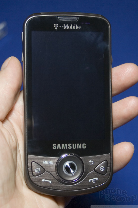
It does appear to have a 3.5mm headset jack. In general, it's a sexy device, and feels nice, but we won't know much more until can get our paws on a unit that powers up.
Part 2: Nokia
3711
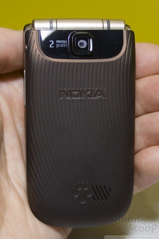
The 3711 is a simple phone designed to appeal to a mass market, yet its feature list is respectable, and it has some nice touches of classic Nokia style that set it apart.
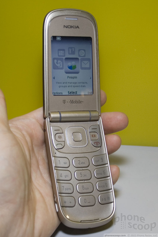
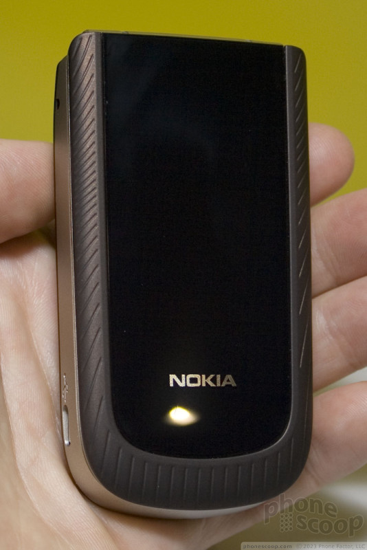
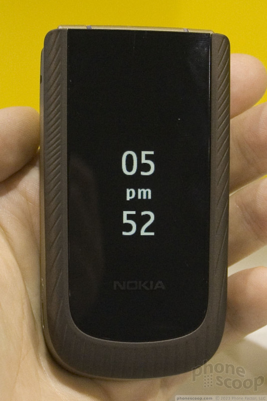
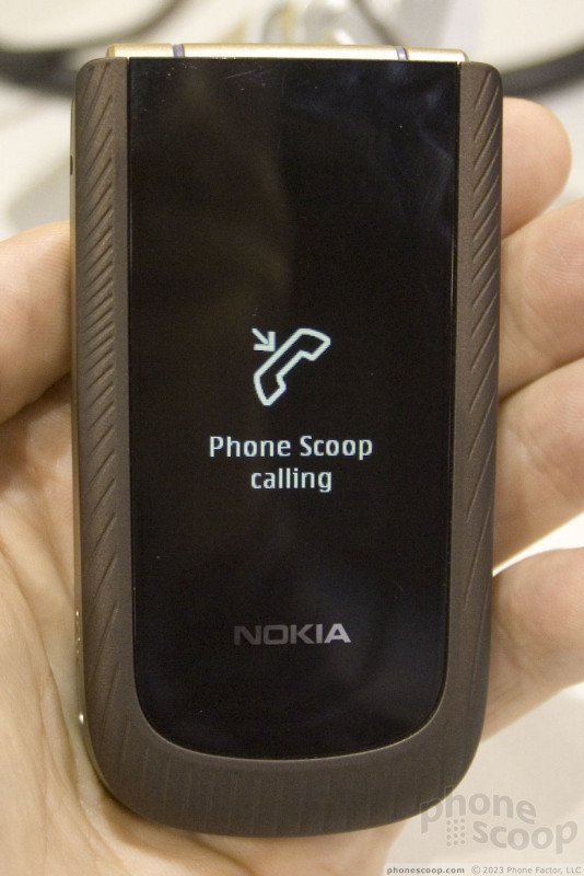
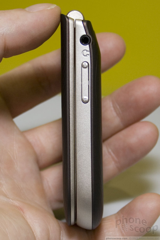
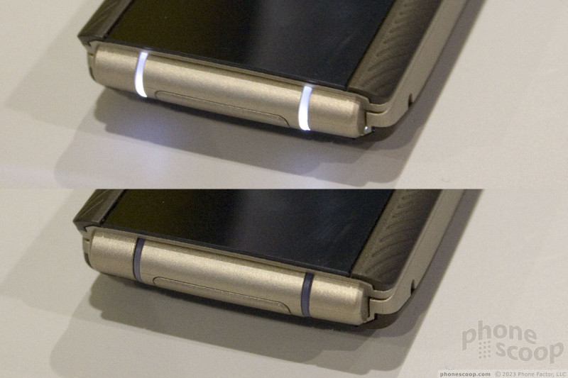
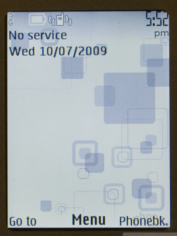
The clamshell design sports a "hidden until lit" outer display, which does exactly what it sounds like. You would swear the phone has a dark outer face with no outer display... until you press a side key to summon the time, or receive an incoming call or message. Then, well-designed white graphics appear all alone... you never see the edge of the display, just the pretty graphics in the middle of the face.
The outer display is monochrome, but white, which matches the unique indicator lights in the hinge, and the keypad backlight. The lights in the hinge gently pulse to indicate a missed call or message. White lights generally look nice, although it's not ideal for the champagne-colored keys, where it creates a white-on-white situation in certain lighting that's hard to read.
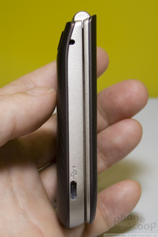
Otherwise, the phone is well-designed. It's small and light, yet feels well-built. The keys are extra-large and easy to feel. They could have more travel and feedback, but at least they're ridiculously easy to find with your fingers. The soft-touch finish around the front edge and on the back feels nice.
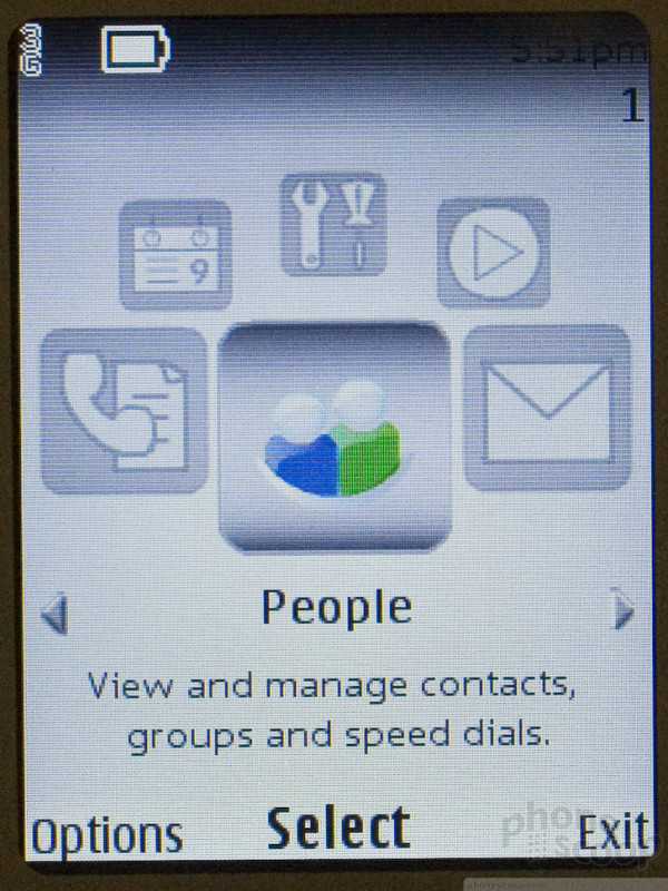
The 3711 technically uses Nokia's Series 40 interface system, but you'd never know it, thanks to T-Mobile's unfortunate customizations. By default, the first layer or two of the interface is so heavily customized by T-Mobile that, if you expect it to work like a Nokia - or any normal phone, for that matter - you'll be completely lost.
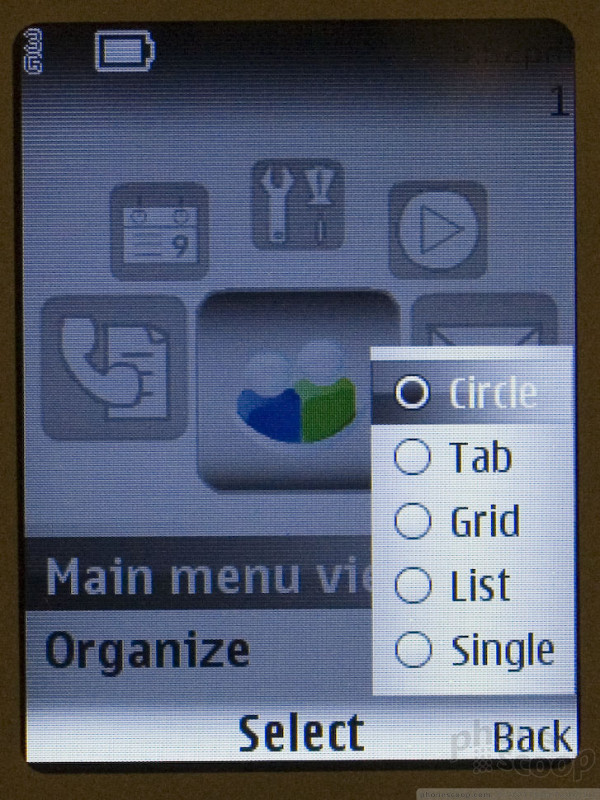
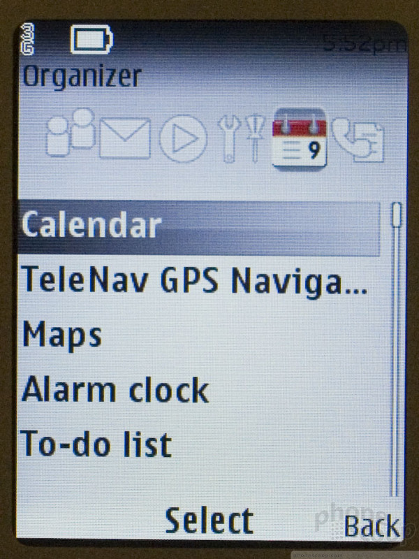
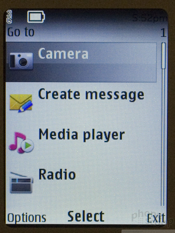
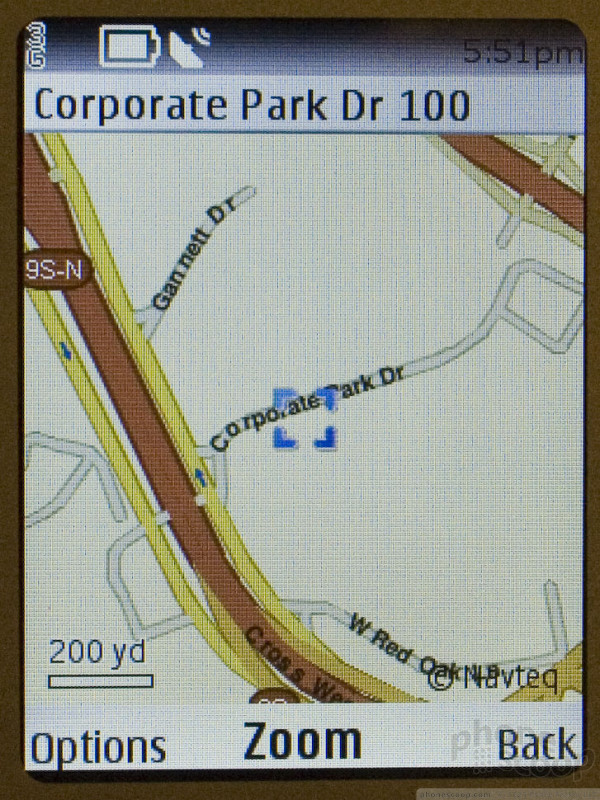
For example, one key feature is GPS navigation using Nokia's Ovi Maps service. It took me quite a while to find it, though, because it was strangely buried in the "organizer" menu, which makes no sense. It seems T-Mobile was intent on making the main menu a carousel to match their MyFaves interface, without thinking about how cramming the whole interface into just six menu categories would make the phone more difficult to use. Less is not always more. There are other options for the main menu, which are inconsistent with each other. On top of that, there's a "go to" menu from the home screen that acts like yet another, differently-organized main menu. It's nice to have so many options and ways to get to things, but the inconsistency can be confusing.
The UI issues are something that anyone could adjust to after a few days, though. In general, this seems like a fine phone. With 3G data, GPS navigation, 2-megapixel camera, and a nice classic Nokia design, the 3711 looks promising for a non-smartphone.
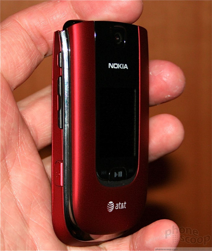
6350
Nokia had only a few newer devices on hand at the event this year, one of which was the entry-level 6350 flip. This small feature phone carries forward very similar design language to that of Nokia's crop of low-cost clamshells. It has a smooth, rounded shape that is comfortable to hold when closed. It is small, light, and extremely pocketable.
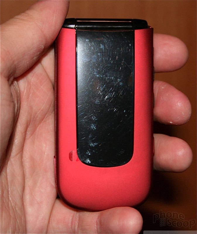
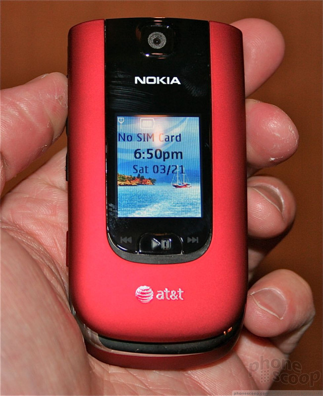
There are are dedicated music controls on the front face of the device that also double as lock/unlock keys. The three buttons are a bit on the small side. The center play/pause button felt great, but the flanking rewind and fast-forward keys were very mushy. There is a tiny little display on the 6350 that shows basic status indicators and icons. It can be used as a watch to quickly check the time if you so wish.
There are several buttons on the side of the phone. The volume toggle feels comfortable and is easy to find and use. Travel and feedback of the toggle were just right. Below that is a hatch covering the headset jack. The jack is 2.5mm, which means it won't work with standard stereo headphones without an adapter. On the right side there's only a hatch covering the microUSB port.
Flipping the 6350 open, you'll see a keypad that could be made by no phone company other than Nokia. It has Nokia written all over it. The buttons are large, well-placed, and have excellent travel and feedback. The design of the keypad reminded me that Nokia does know how to get the basics right when it wants to.
The D-pad and other controls also felt good. I found it interesting that the 6350 has a dedicated GPS navigation button. Most devices leave access to GPS apps buried in the menu. For Nokia to bake access to the Navigation application into the hardware means that it considers that feature one of the phone's more prominent selling points.
As for the menu system, the 6350 runs Series 40 with the usual AT&T customization and icons. AT&T customizes Series 40 quite heavily, which means it looks more like a generic feature phone and less like a Series 40 device. You have to dig into the menus if you really want to find what makes this Nokia, er, well, a Nokia.
In all, the 6350 looks like a great little voice-centric phone for AT&T.
Part 3
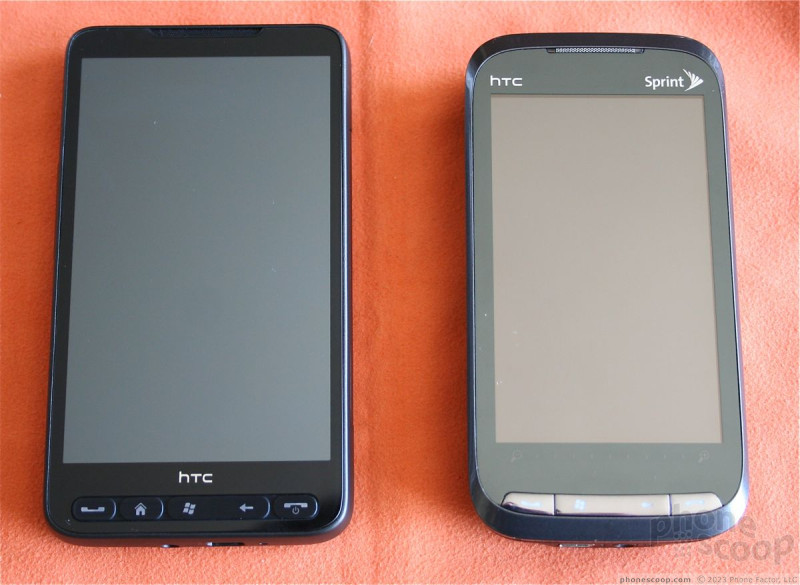
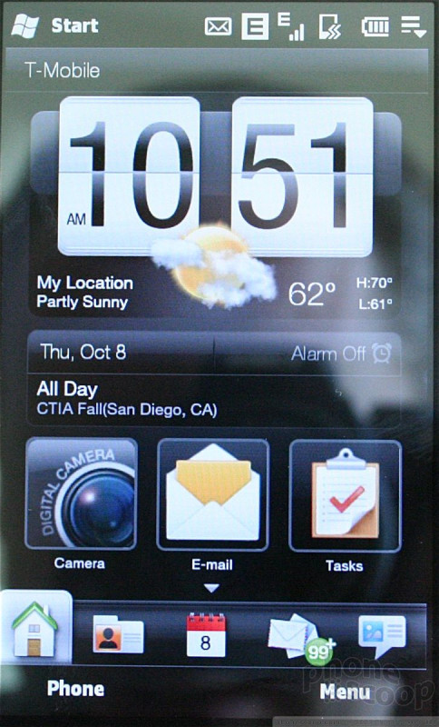
HTC HD2
We were able to spend some time today with the newly-announced HTC HD2. Let's start off by saying "Wow!"
The HD2 follows in the footsteps of the original HD in that it provides a massive high-resolution screen. It measures 4.3 inches across the diagonal, and rates WVGA on the resolution side of things. What does that mean? It's absolutely gorgeous. Seriously, this is one of the best displays I've ever seen on a mobile phone.
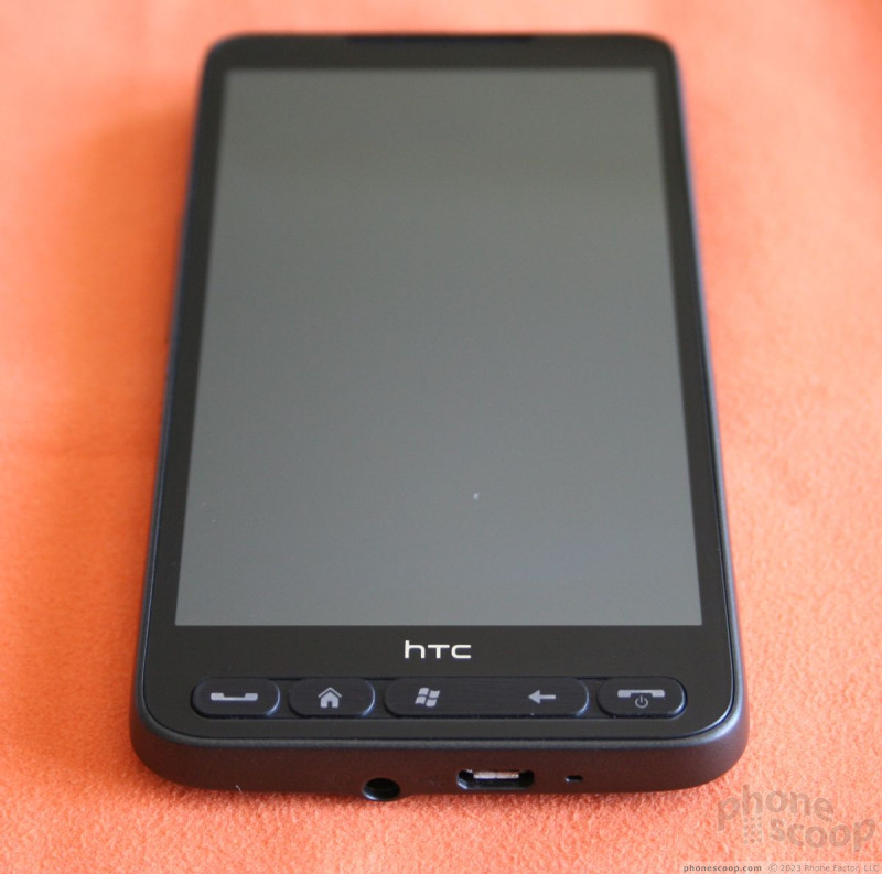
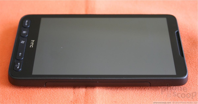
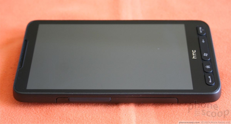
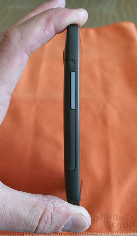
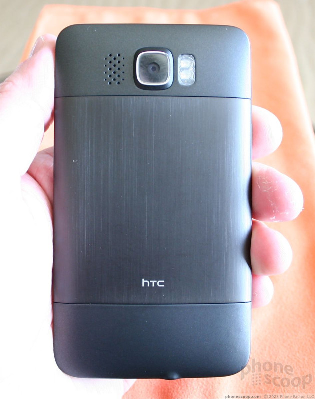
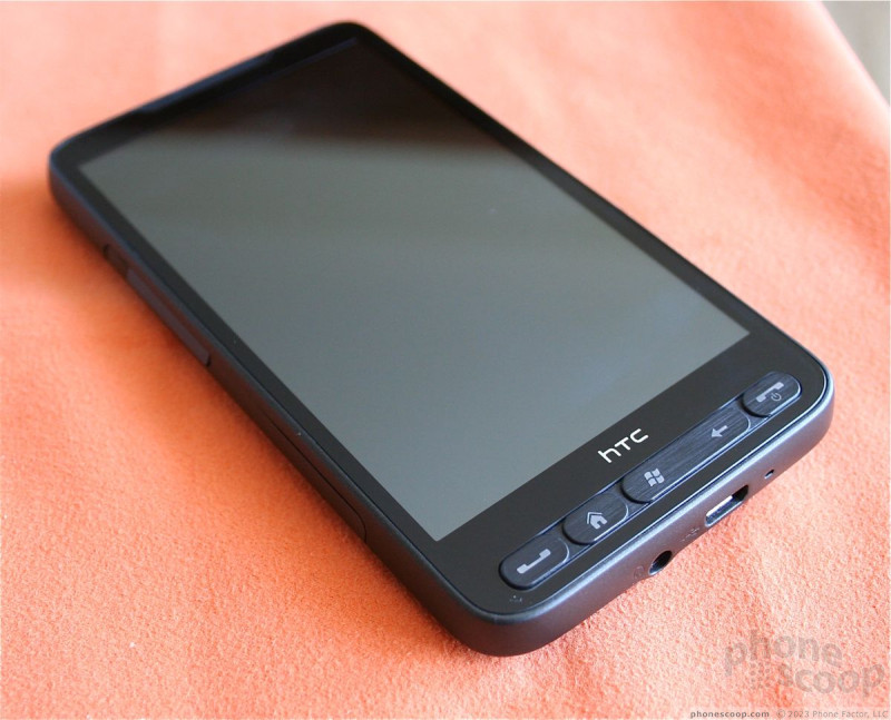
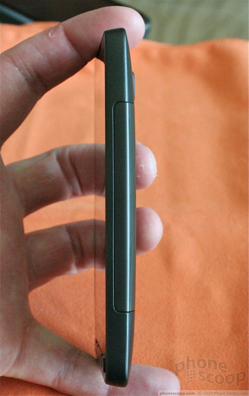
Display aside, the HD2 is all about the high-end experience. The materials are high quality metals and plastics. It feels a bit weighty, and of course the large display means it has a significant footprint. Even though the length x width dimensions are sizable, it is unbelievably thin. The back is covered in a rounded metallic skin and the camera module sticks out from the back surface just a wee bit.
On the front the phone, below the display, is a series of buttons that let you send/end calls, as well as access the start menu and jump back to the previous screen/application. All these buttons have great travel and feedback, though they do feel a bit squished down along the bottom of the phone's face.
The HD2 runs TouchFLO, and the first thing I noticed when exploring the user interface was that it was incredibly snappy. Without a doubt, the smoothest, best performing TouchFLO device I've used. HTC admitted that it has a Snapdragon processor inside, but HTC wouldn't cop to the clock speed. Suffice it to say, it's fast, smooth, and so, so fun to interact with.
Right now, this phone is only available in Europe and only supports European 3G networks. When prodded, the HTC spokesperson said, "I should be fired if I can't sell this device in the U.S." In order to bring it to the U.S. market, HTC will need to configure it with either 850/1900MHz 3G or 1700MHz 3G to support either AT&T or T-Mobile.
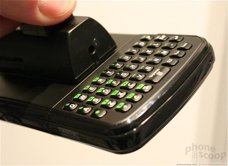
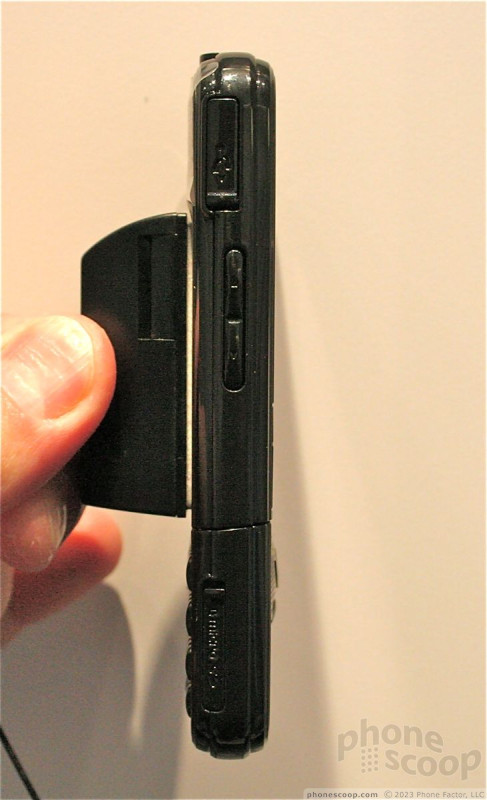
PCD Razzle
We were able to spend a few moments going over the new PCD Razzle, which will be sold by Verizon Wireless.
The Razzle is an interesting form factor in that the lower half twists around and lets the user have access to either a full QWERTY keyboard or stereo speakers depending on how they want to use that phone.
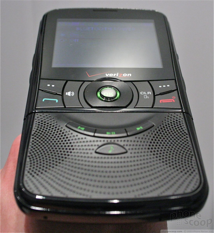
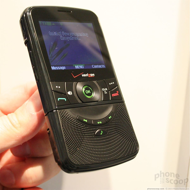
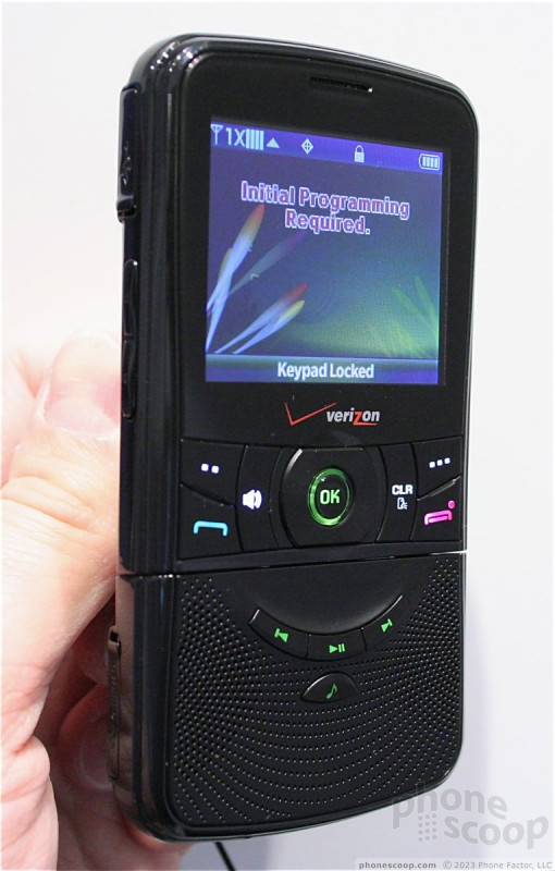
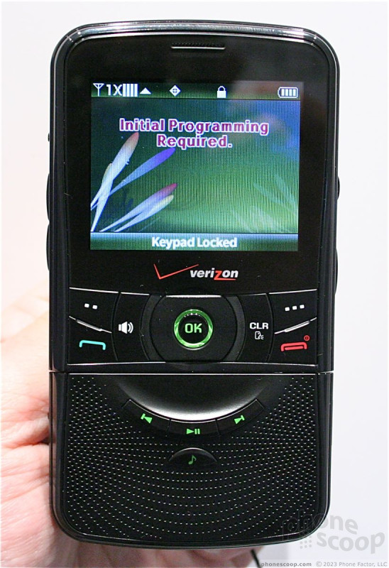
The Razzle is a standard monoblock when the speakers are facing front. It has a number of control keys in between the speakers and the display, such as the D-pad, send/end keys, soft keys, etc. The They keys came off feeling a little bit on the cheap side. They were slightly loose, and travel and feedback weren't really satisfying.
In between the speakers, there are dedicated music playback keys to launch and interact with the music player. The way the phone is deigned, it really reminds me of an old-school transistor radio.
When you're ready to send some text messages, grab the bottom of the phone and give a twist. The keyboard will swing around, creating a bit of a chin. The Razzle is comfortable to hold and use when in this configuration. The keyboard feels pretty good. The keys have excellent travel and feedback, though I didn't like the way the keys themselves felt under my thumb. The keyboard is de-activated when it is facing the back of the phone, but you can still make and answer calls by using the soft keys and menus.
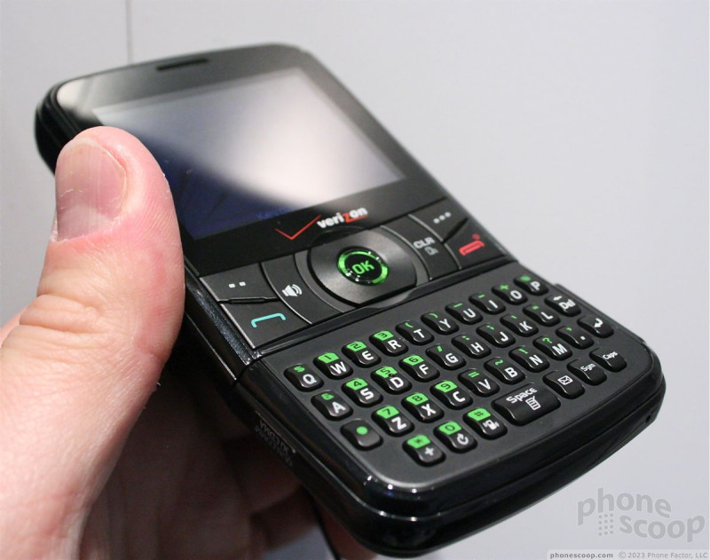
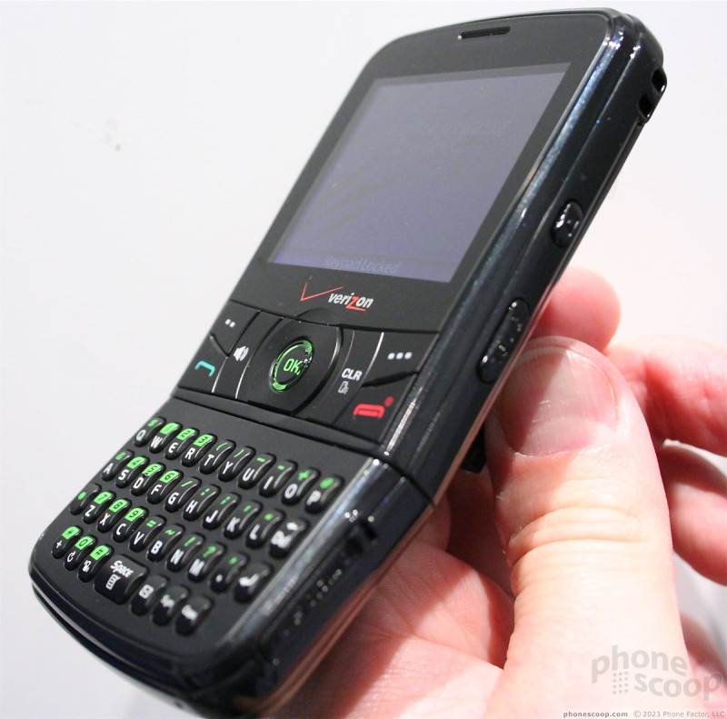
Speaking of menus, there's nothing to set it apart from other phones on the Verizon network. Its menu is similar in form and function.
Given the unique form factor, the Razzle is definitely a niche product.
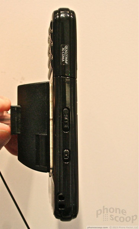
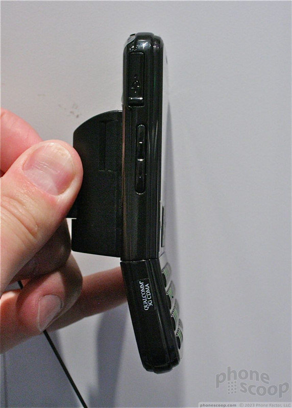
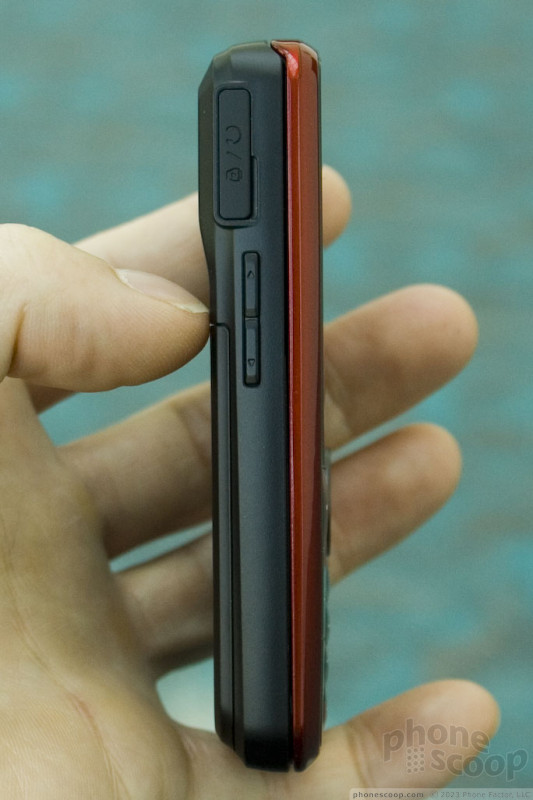
Pantech Reveal & Impact
The Reveal from Pantech seems like an oddball phone at first. Why would you put a numeric keypad on a phone, and then a QWERTY keyboard right below that on a slide? The way Pantech explained the rationale, though, actually makes a lot of sense. Essentially, it's just like the dual-slide, dual-keypad Matrix - a nice concept - but with only one slide, which allows it to be much thinner. Thickness is a major downside of all dual-slide phones to date; the mechanism just takes up too much space.
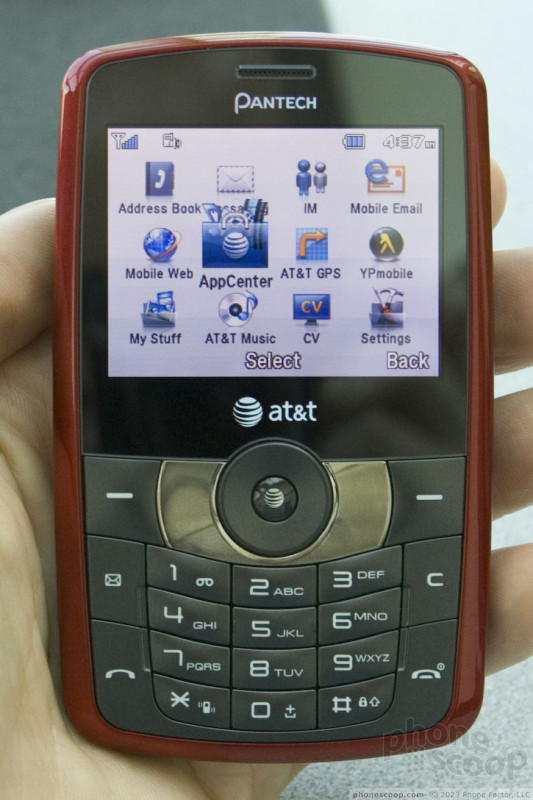
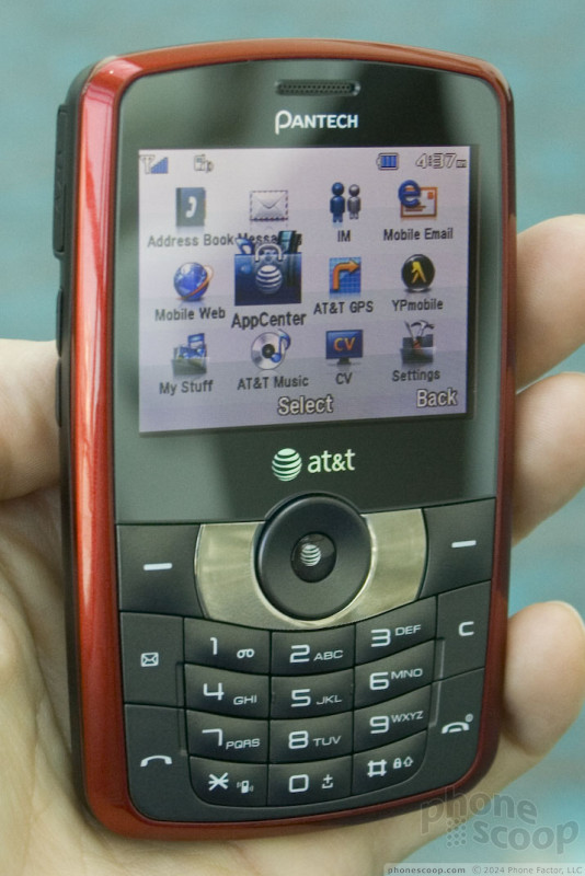
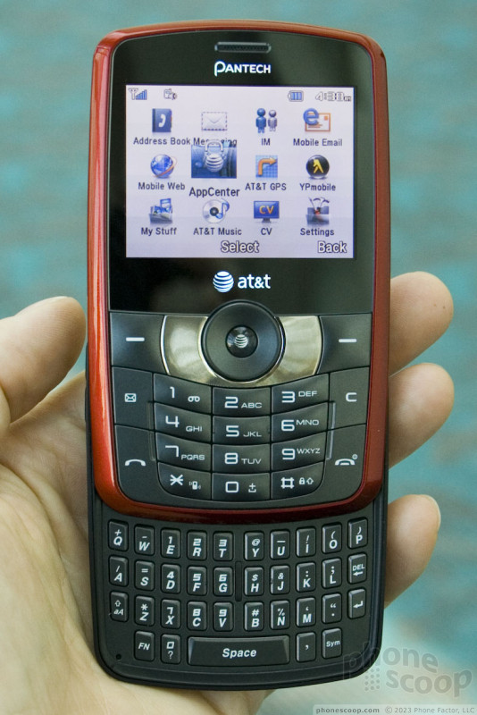
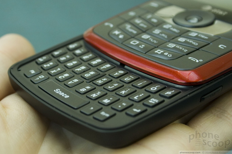
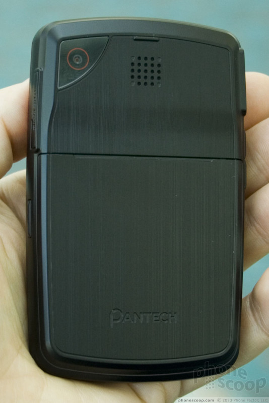
Once you try the Reveal, the concept makes even more sense. When open, you have a full four-row QWERTY keyboard with a large space bar, plus the numeric keypad above remains active, serving the same purpose as a dedicated fifth number row. The keyboard even has room for dedicated period, comma, and question mark keys. So even though it looks odd to have one type of keypad stacked on top of another, it makes for a pretty good messaging experience.
The Reveal feels good. The slide mechanism and overall build quality are excellent. The keys - both numeric and QWERTY - are also good. The numeric keys are roomy and have a nice domed shape, with good feel when pressed. The QWERTY keys are small, hard and squarish, making them feel a tad awkward, but they're easy to find and press accurately. It's better than a lot of keyboards on other phones from larger manufacturers.
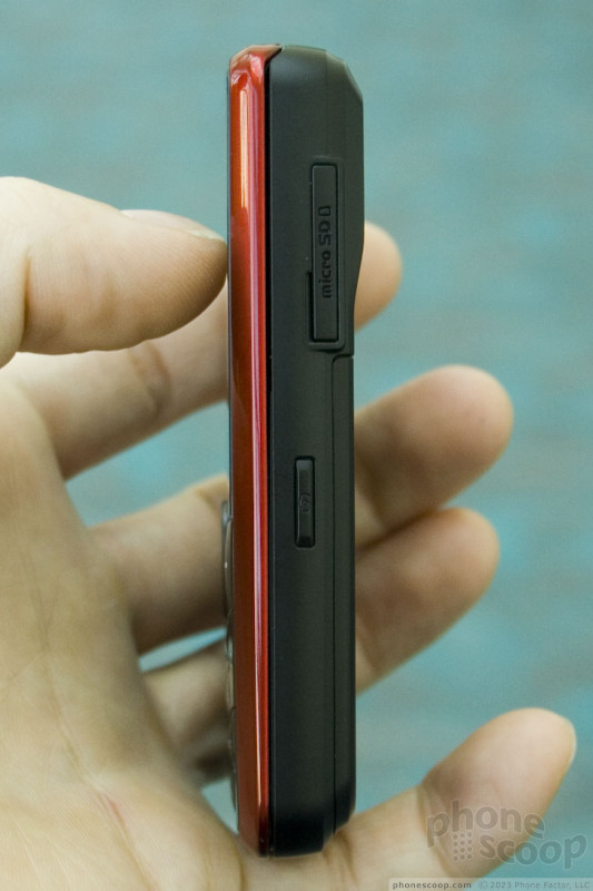
The Reveal also sports 3G data, a 2-megapixel camera supporting video capture and AT&T Video Sharing, plus a microSD memory card card slot.
Look for the Reveal on AT&T starting October 18th.
The other new Pantech this week is the Impact. This sleek little phone has a very unique style. The form factor is a little like the LG enV3, in that it has a small display and numeric keypad on the front, but opens up sideways to reveal a QWERTY keyboard and much larger display.
The Impact we saw was trimmed in pink, and had a generally feminine design flair, although it will also be offered in blue. The face is one large metallic oval. It's mostly dark when off, but when in use, a monochrome display appears at the top, and a set of touch numeric keys below that. I'm not a fan of all-touch keypads like this. I wish they had at least included a physical d-pad in the center.
Opening it up reveals a surprisingly wide, high-resolution display. It's very bright and crisp. Surrounding the display is a mirror; not something mirror-like, no: a full-on mirror.
The QWERTY keyboard is large and works very well. A circular d-pad is located off to the right, with soft keys and send/end keys across the top. The keyboard includes a dedicated key to launch social networking features, including Facebook, MySpace, and Twitter. Pantech claims these are full software clients, although AT&T wasn't allowing us use units with SIM cards, so we couldn't try them out.
AT&T also forbade us form taking photos of the Impact, unfortunately.
Like the Reveal, the Impact includes 3G data, a 2-megapixel camera and microSD memory card slot. The memory card slot is oddly located at one end of the top half. Video Sharing is also supported.
Look for the Impact in mid-November on AT&T.
Eric has been covering the mobile telecommunications industry for 17 years at various print and online publications. He studied at Rutgers Newark and University of Kentucky, and has a degree in writing. He likes playing guitar, attending concerts, listening to music, and driving sports cars.
 Review: Samsung Omnia II
 Samsung Omnia II for Verizon Revealed
 Verizon Dazzles with the Razzle
 PCD Quietly Slips Out the TXT8030 Twisting Phone
 Hands On with the Motorola edge (2022)
 PCD Razzle TXT8030
 Samsung Omnia II (CDMA)
 Nokia 3711
Comments

these phones suck...
(continues)

Slow day

Samsung Omnia II

