
CTIA Fall 2009
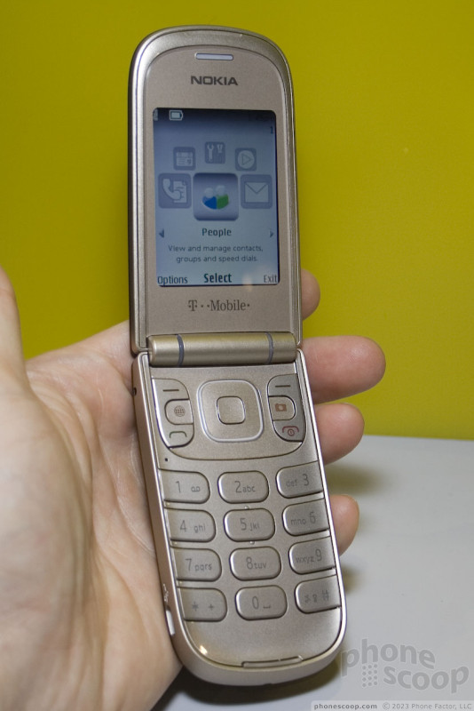
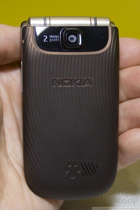
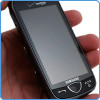
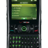
The 3711 is a simple phone designed to appeal to a mass market, yet its feature list is respectable, and it has some nice touches of classic Nokia style that set it apart.
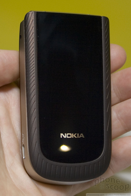
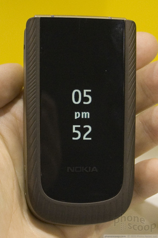
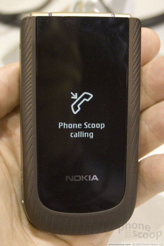
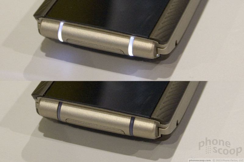
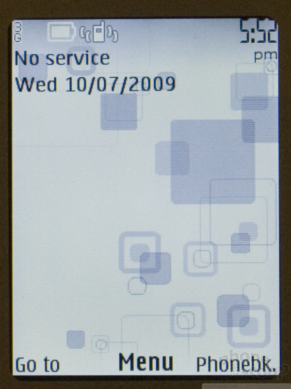
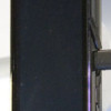
The clamshell design sports a "hidden until lit" outer display, which does exactly what it sounds like. You would swear the phone has a dark outer face with no outer display... until you press a side key to summon the time, or receive an incoming call or message. Then, well-designed white graphics appear all alone... you never see the edge of the display, just the pretty graphics in the middle of the face.
The outer display is monochrome, but white, which matches the unique indicator lights in the hinge, and the keypad backlight. The lights in the hinge gently pulse to indicate a missed call or message. White lights generally look nice, although it's not ideal for the champagne-colored keys, where it creates a white-on-white situation in certain lighting that's hard to read.
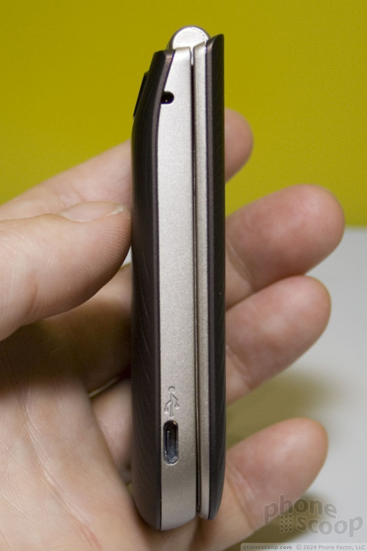
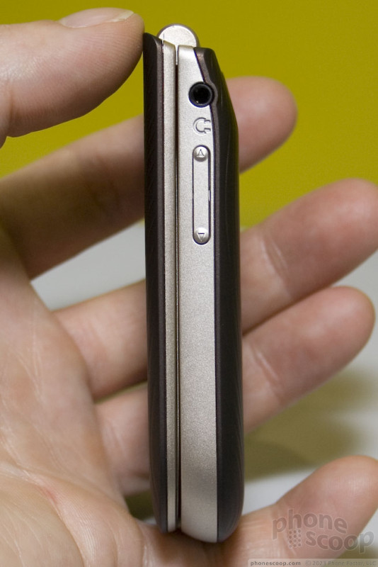
Otherwise, the phone is well-designed. It's small and light, yet feels well-built. The keys are extra-large and easy to feel. They could have more travel and feedback, but at least they're ridiculously easy to find with your fingers. The soft-touch finish around the front edge and on the back feels nice.
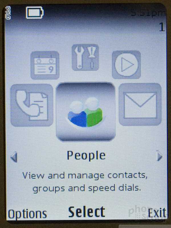
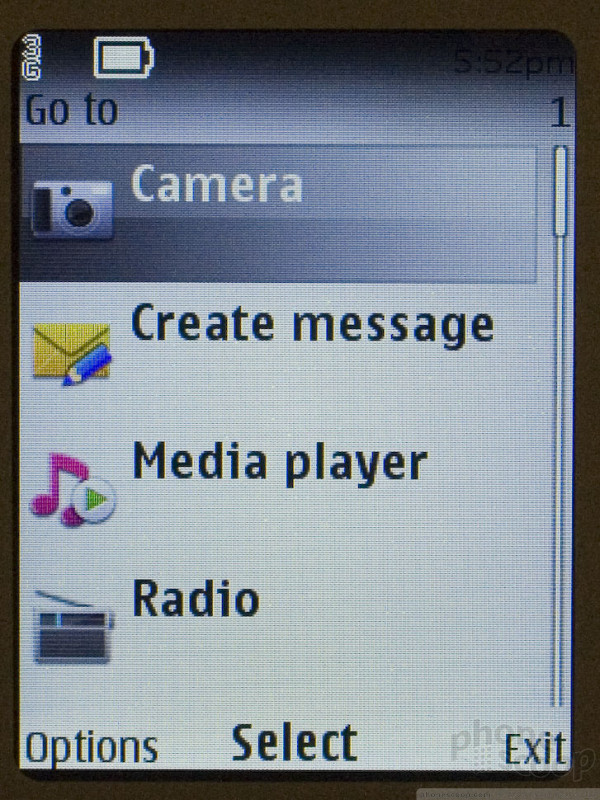
The 3711 technically uses Nokia's Series 40 interface system, but you'd never know it, thanks to T-Mobile's unfortunate customizations. By default, the first layer or two of the interface is so heavily customized by T-Mobile that, if you expect it to work like a Nokia - or any normal phone, for that matter - you'll be completely lost.
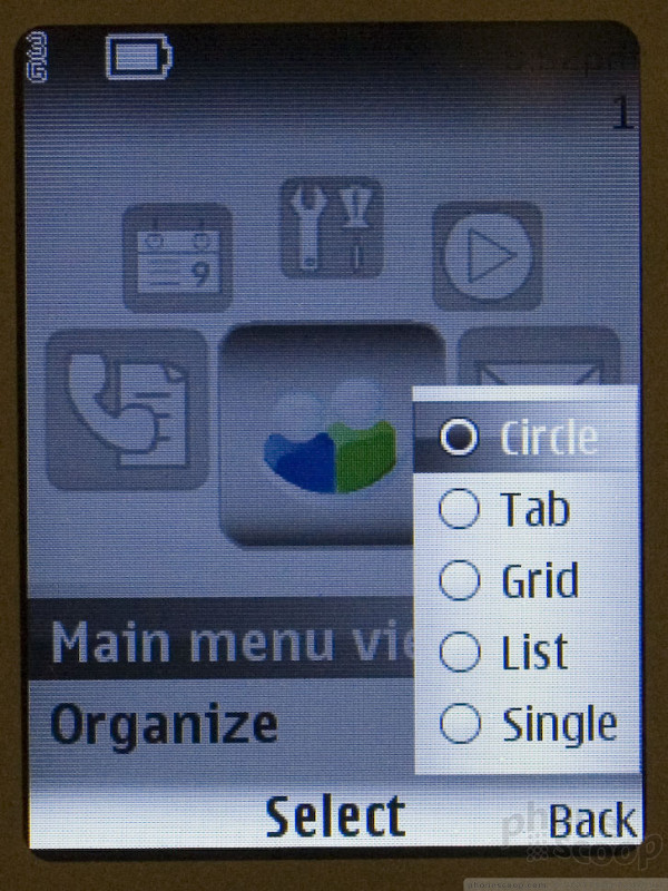
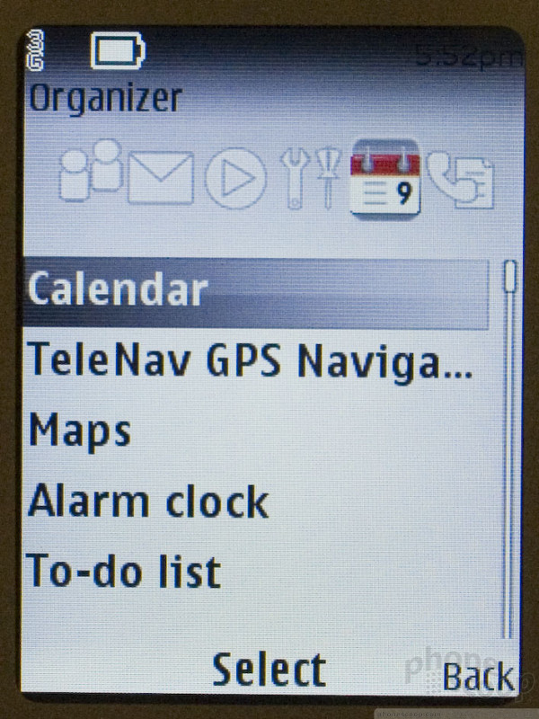
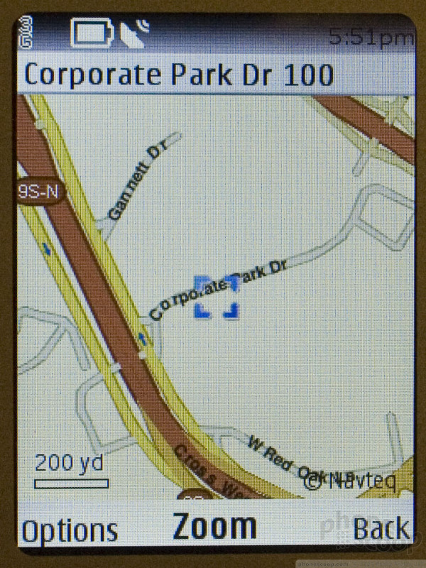
For example, one key feature is GPS navigation using Nokia's Ovi Maps service. It took me quite a while to find it, though, because it was strangely buried in the "organizer" menu, which makes no sense. It seems T-Mobile was intent on making the main menu a carousel to match their MyFaves interface, without thinking about how cramming the whole interface into just six menu categories would make the phone more difficult to use. Less is not always more. There are other options for the main menu, which are inconsistent with each other. On top of that, there's a "go to" menu from the home screen that acts like yet another, differently-organized main menu. It's nice to have so many options and ways to get to things, but the inconsistency can be confusing.
The UI issues are something that anyone could adjust to after a few days, though. In general, this seems like a fine phone. With 3G data, GPS navigation, 2-megapixel camera, and a nice classic Nokia design, the 3711 looks promising for a non-smartphone.
 Review: Samsung Omnia II
 Samsung Omnia II for Verizon Revealed
 Verizon Dazzles with the Razzle
 PCD Quietly Slips Out the TXT8030 Twisting Phone
 Hands On with the Motorola edge (2022)
 PCD Razzle TXT8030
 Samsung Omnia II (CDMA)
 Nokia 3711

