MWC 2009
Feb 15, 2009, 7:13 PM by Eric Zeman and Rich Brome
updated Feb 19, 2009, 5:00 AM
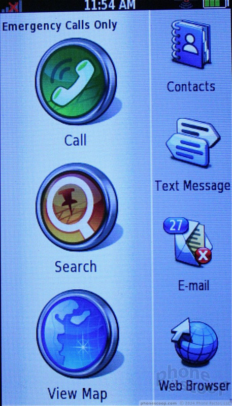
Our Mobile World Congress coverage, with hands-on reports from Barcelona on the HTC Magic with Android, Linux phones, Acer, and new phones from Samsung, Nokia and Sony Ericsson.
Part 1
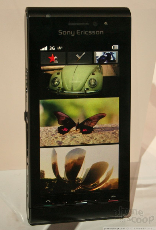
Sony Ericsson
Sony Ericsson kicked off Mobile World Congress this year with a whimper. It only announced one fully-conceived phone, while teasing us with scant facts about another. Despite the lack of exciting announcements, there were a few other Sony Ericsson models on hand that we haven't had a chance to play with yet.
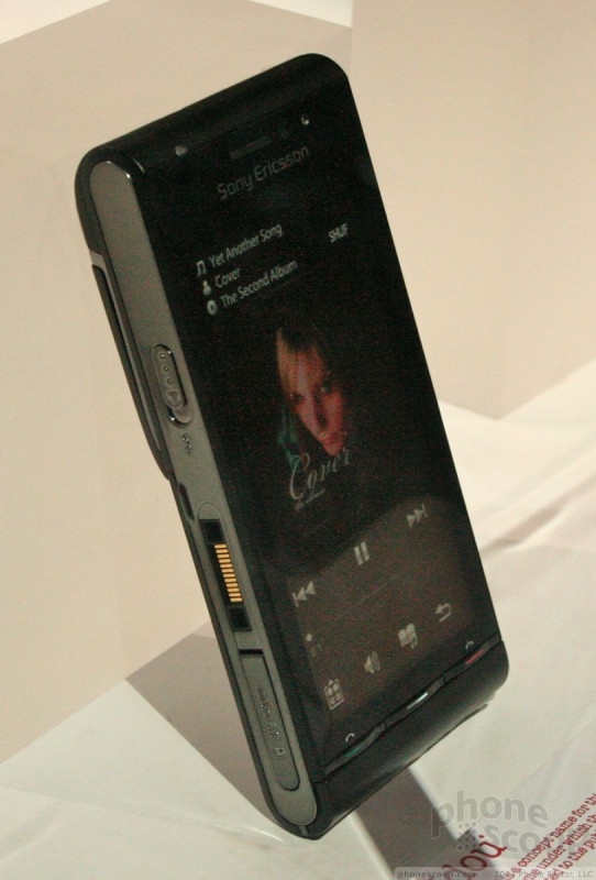
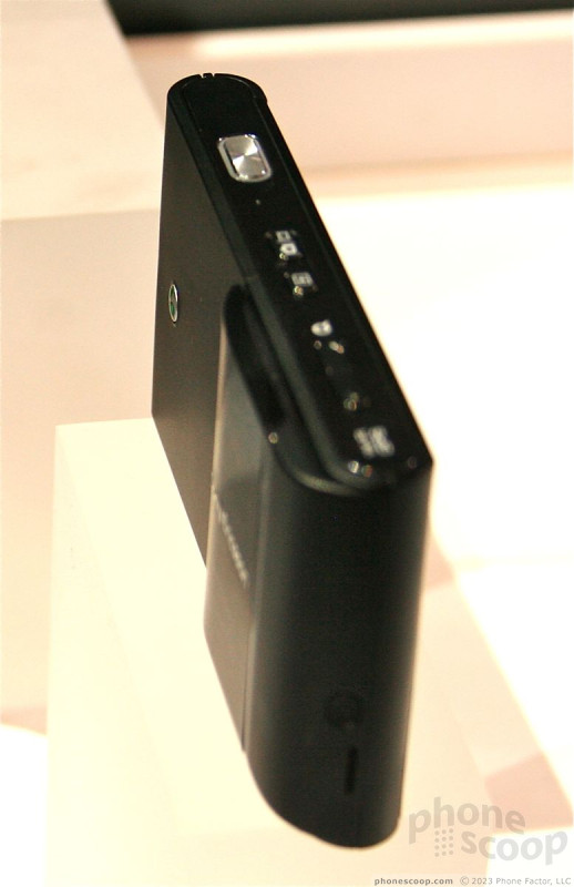
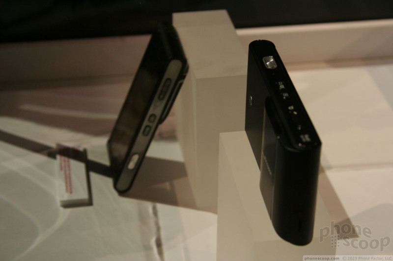
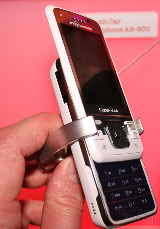
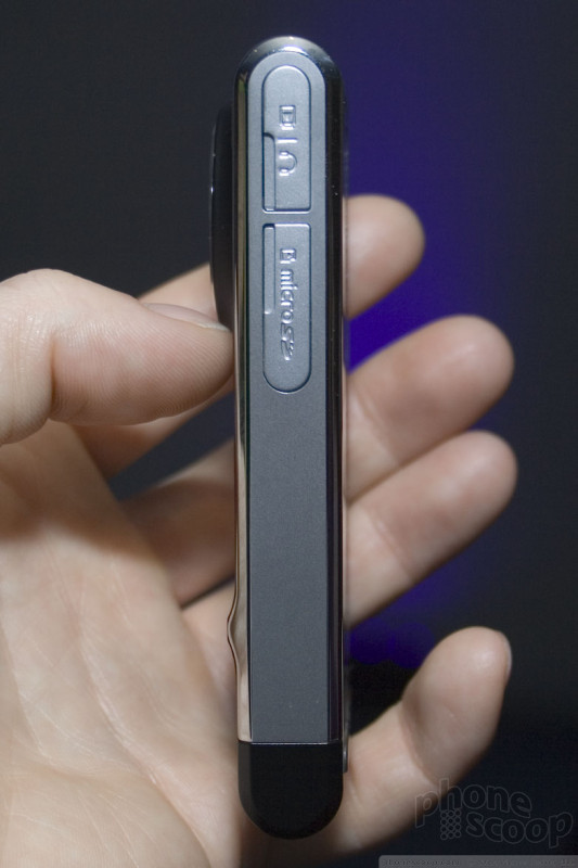
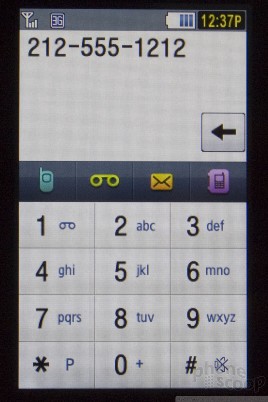
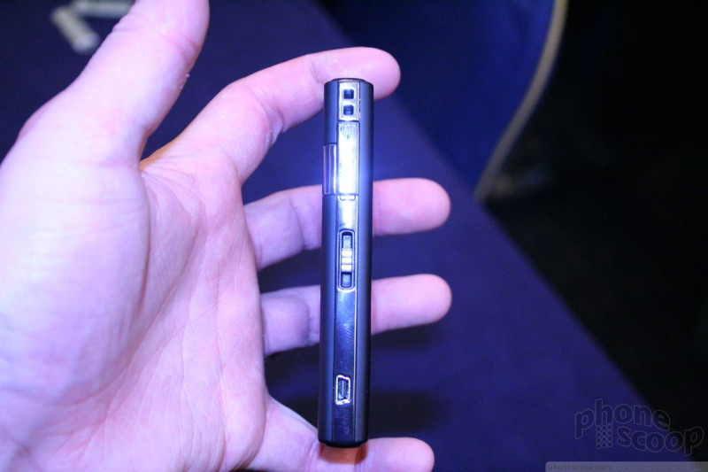
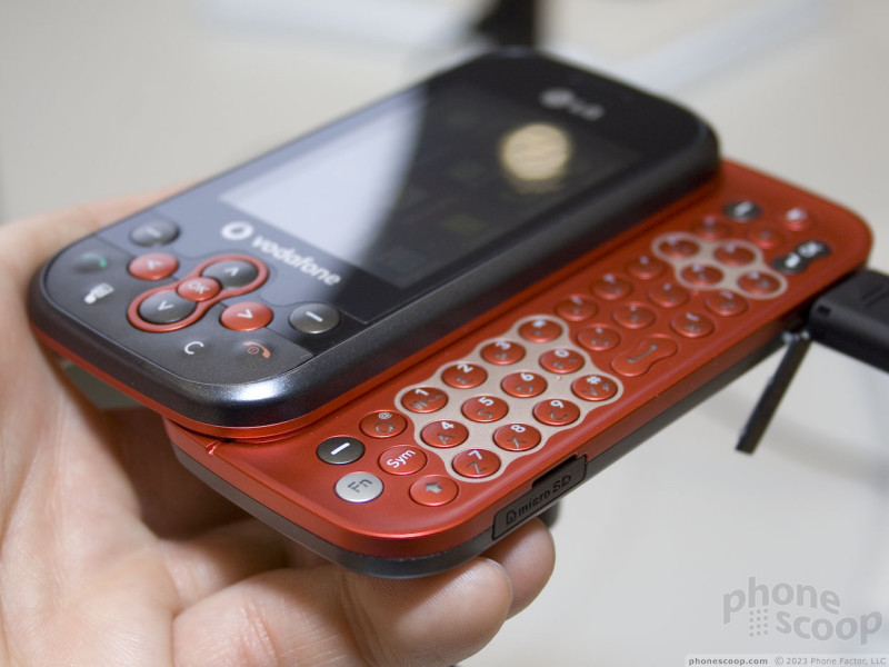
W995
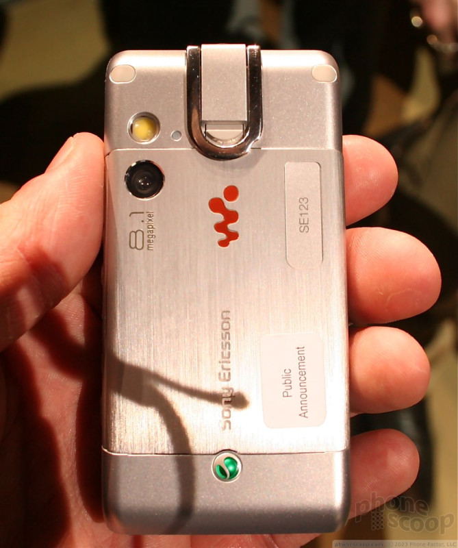
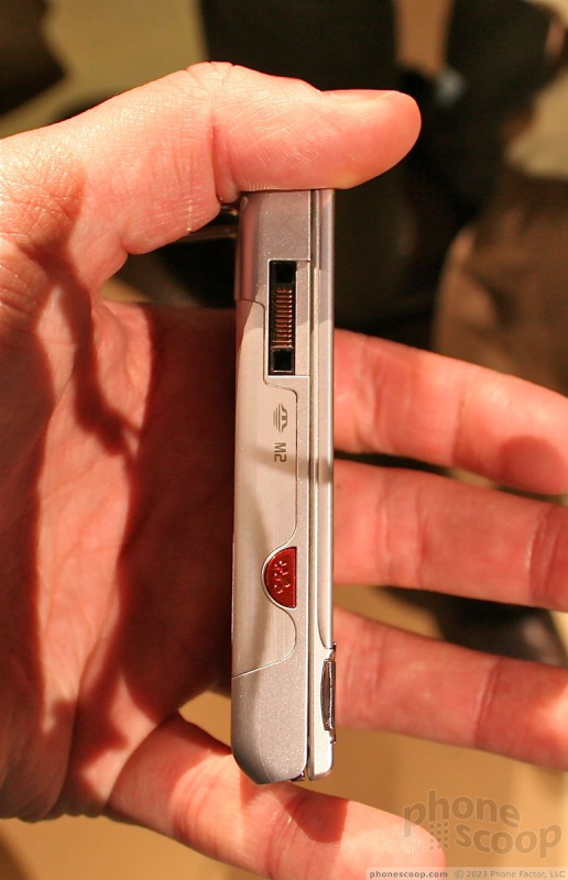
The W995 is the latest and greatest Walkman phone from Sony Ericsson. I'd be lying if I said it was exciting. It may boast some impressive specs, but it is so similar to other Sony Ericsson phones, that it would be hard to tell them apart. Lack of interesting design features aside, the devices Sony Ericsson had on hand were solid and felt like production-quality phones.
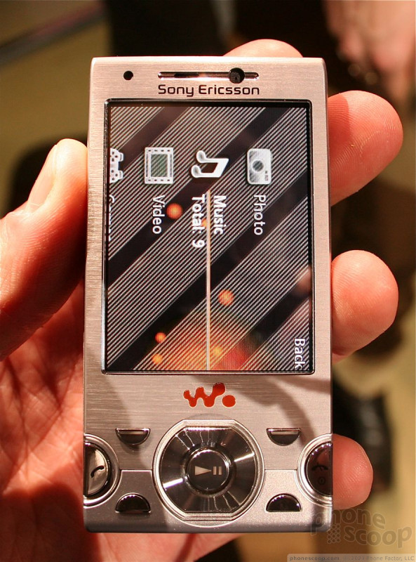
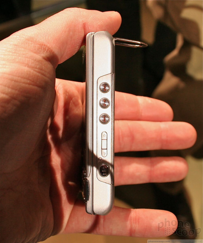
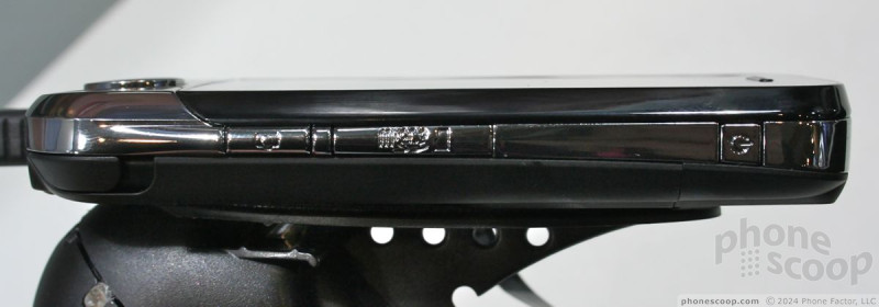
The slider mechanism was strong and smooth, with no wobbly-ness at all. The control pad was the usual mess of buttons from Sony Ericsson. No less than six buttons flanked the D-pad, making the navigation area feel a bit cramped. The D-pad itself was easy to find and use. The dialpad felt very good. The number keys were well spaced and had excellent travel and feedback. The buttons on the side of the phone all felt good enough.
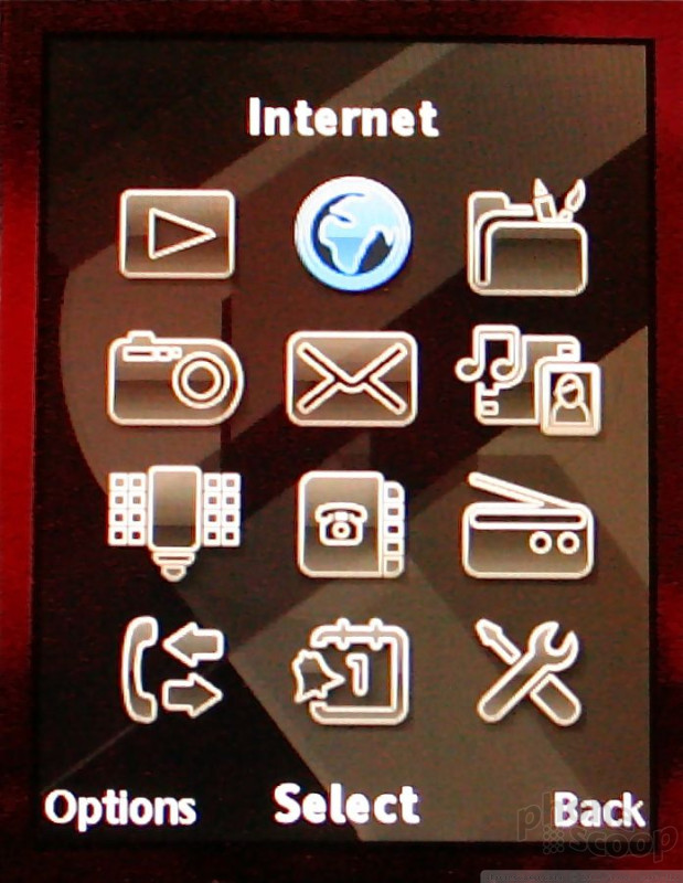
The software running the phone didn't look terribly different from what we've seen on other Sony Ericsson phones. The PS3-style media menu remains the same, and the camera software was quite good. The W995 has an accelerometer and reacted immediately to any changes in orientation of the phone.
It has a pop-out stand so the phone can be placed on a level surface and watched like a miniature TV. This is meant to make sharing content easier. It has a regular 3.5mm headset jack, supports Sony Ericsson's M2 memory format and has stereo external speakers.
In all, the W995 is certainly a solid phone and offers a decent spec list. It's too bad Sony Ericsson wrapped it in the same garb as so many of its other phones.
Idou
We didn't get to touch the Idou - it was behind glass - but we did take a close look at it. If Sony Ericsson can implement the software on it well enough, it should be a really exciting phone. The Idou will run a future version of Symbian, which has yet to be developed by the Symbian Foundation. SE loaded it with some sort of demonstration software that looked pretty slick, but there's no real indication that this represented the actual software that the phone will ship with. The operating system, however, will be fully touch-based.
The Idou is a nicely-sized black slab of a phone with a cover over the camera and an array of buttons all over it. It is a little on the thick side for my tastes, but isn't terribly fat. Unfortunately, that's about all we can say at this point. Even so, we shot some video for you to look at.
C903
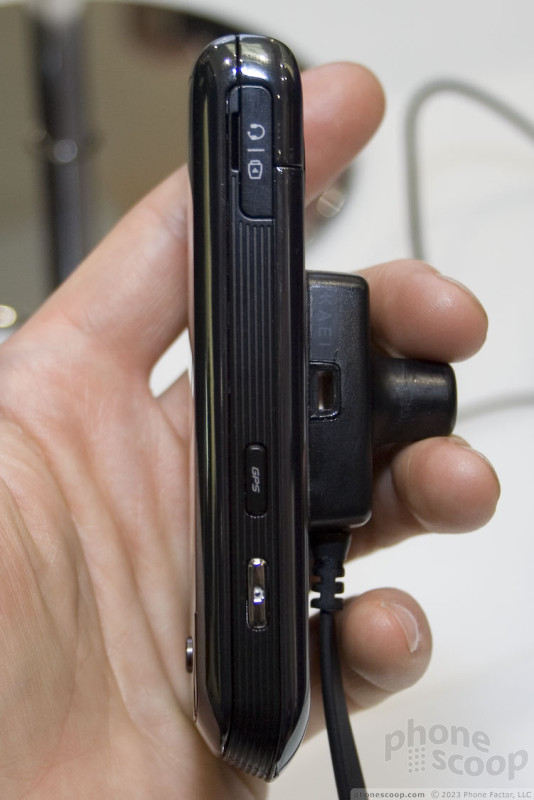
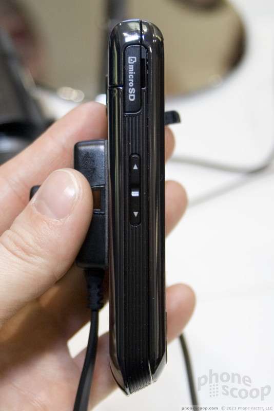
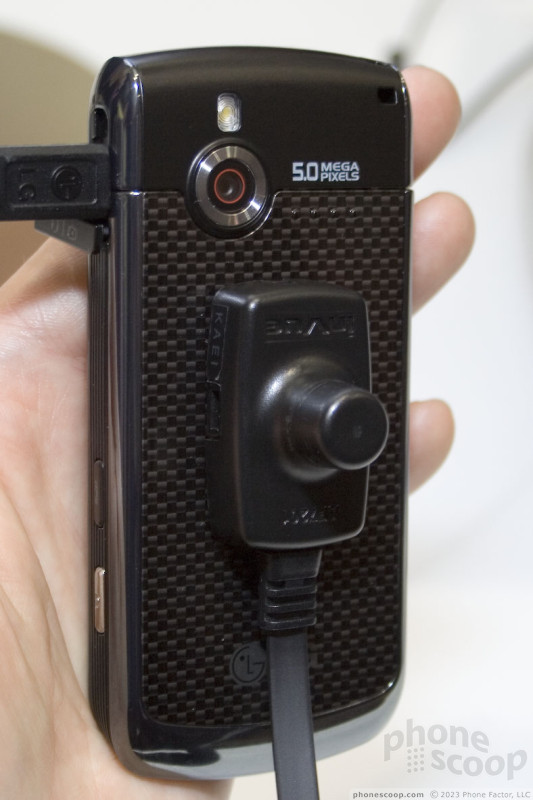
The C903 is an 8.1 megapixel camera phone that will have support for North American 3G networks. Like the W995, the Sony Ericsson family resemblance is very strong. The control pad felt especially crunched and the soft keys jutted out from the phone's face in a way that they may catch things in your pocket.
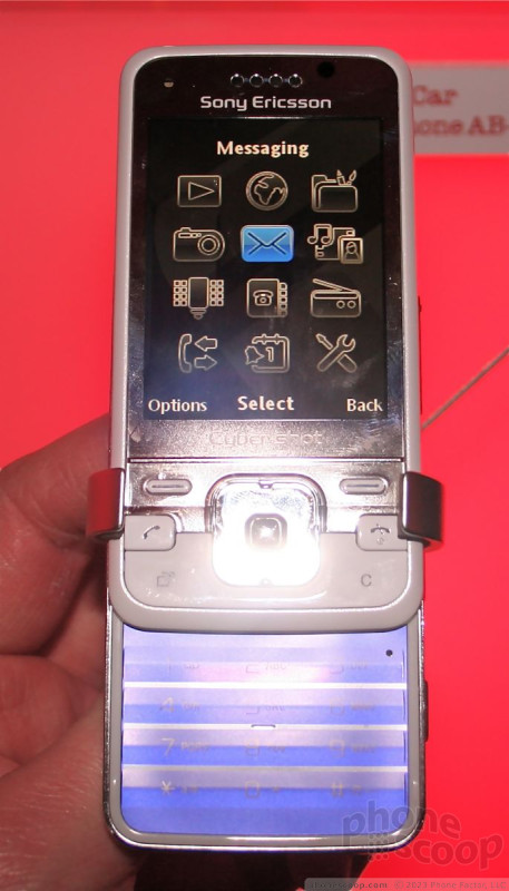
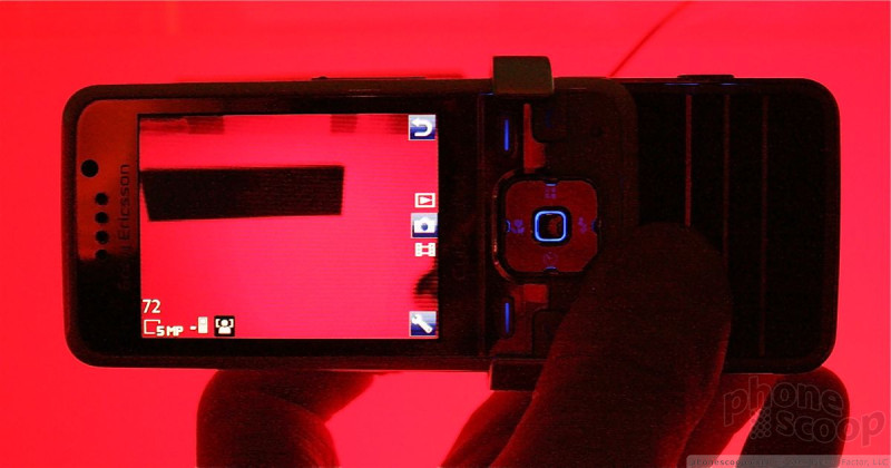
The display was brilliant and looked fantastic. The dialpad was nearly identical to that of the W995. In fact, it was so similar, I have to wonder if it is made from the same parts. It worked well.
The back of the phone has a hatch covering the camera lens and flash. Slide it down to reveal both, and launch the camera software. This hatch felt a little flimsy to me. It could be that the devices on-hand were well-worn, or it could be a bad design. Sony Ericsson wouldn't say if the phones we sampled were final builds or not.
The user interface was identical to that of the W995, with the same menus and icons and software. The camera software, in particular, was very responsive and fast. There was little to no delay when making adjustments to the camera's settings or functions, and the flash was insanely bright.
It will no doubt make photographers happy with its capable camera and solid photos-handling applications.
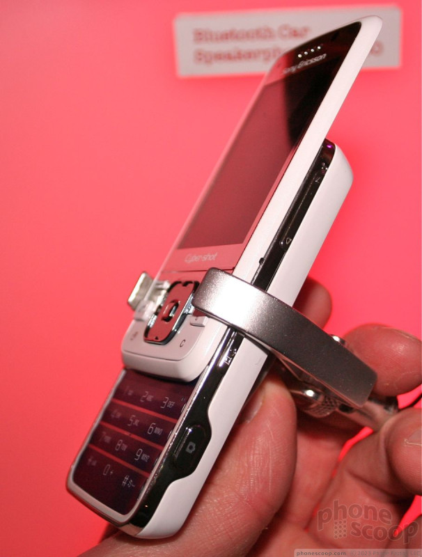
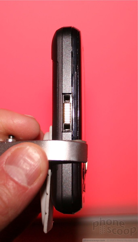
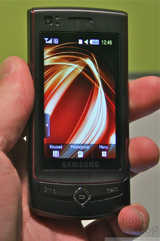
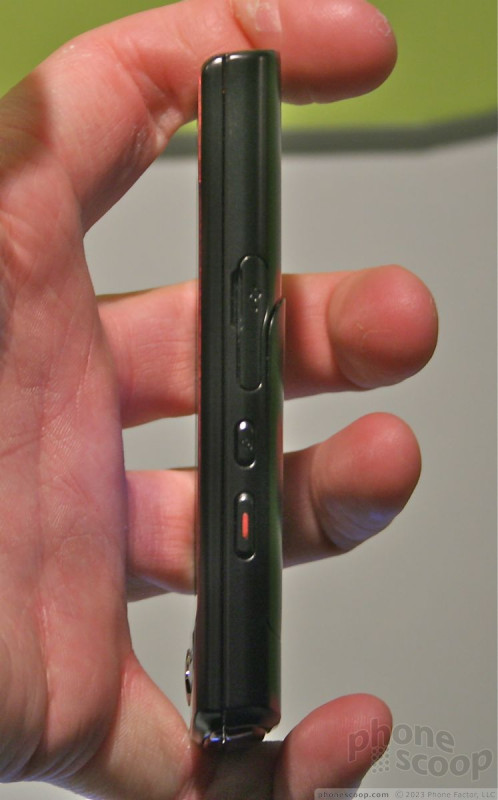
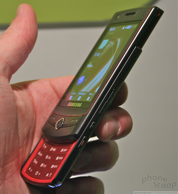
W395
This was the lowest-end device announced by Sony Ericsson this year, but it is no slacker. It has a 2 megapixel camera and the latest Walkman and music software from Sony Ericsson. Everything about it felt good. The buttons on the front face surrounding the D-pad were comfortable. The D-pad itself was a breeze to find and use. The keypad wasn't as good as the other two discussed above, but it was still decent. The slider mechanism felt strong and it was comfortable to hold.
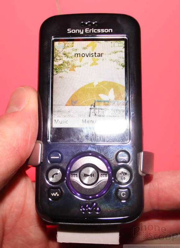
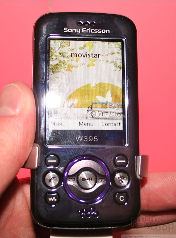
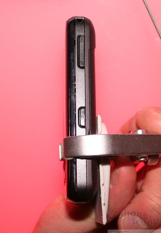
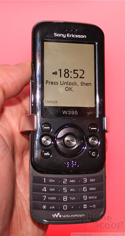
The buttons on the sides were a bit harder to find and use that I would have liked, and I thought the user interface was a little sluggish. In all, though, it is a decent little phone.
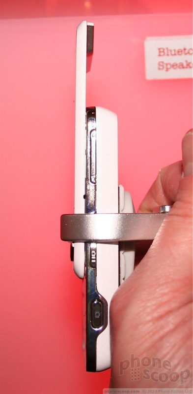
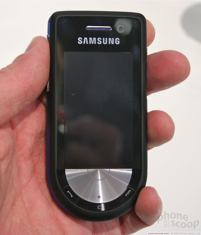
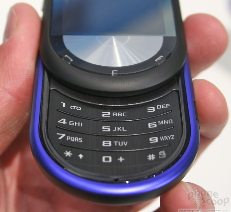
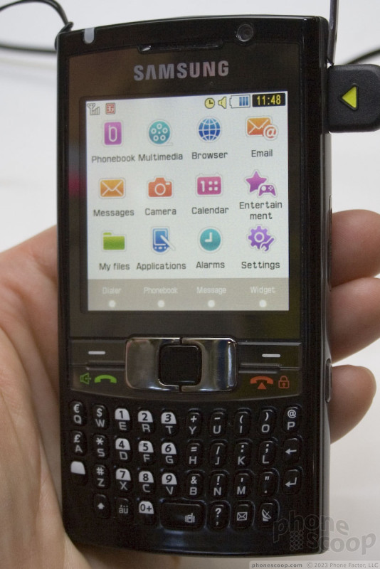
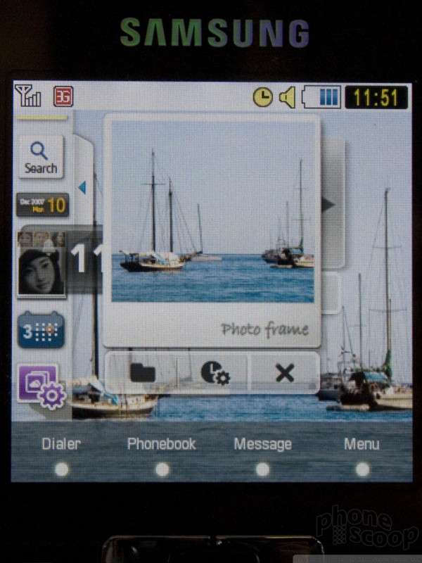
Memoir
Samsung USA and T-Mobile USA executives flew all the way to Barcelona to announce the Memoir, a phone that will be exclusive to T-Mobile USA. It goes to show how truly global of event MWC has become.
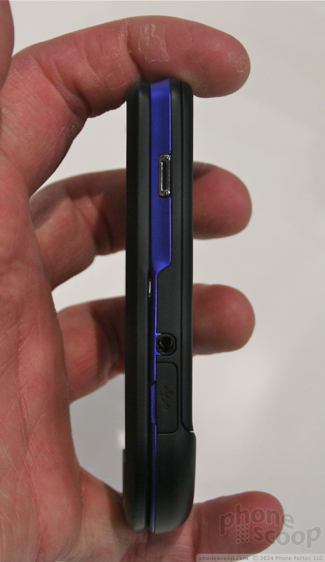
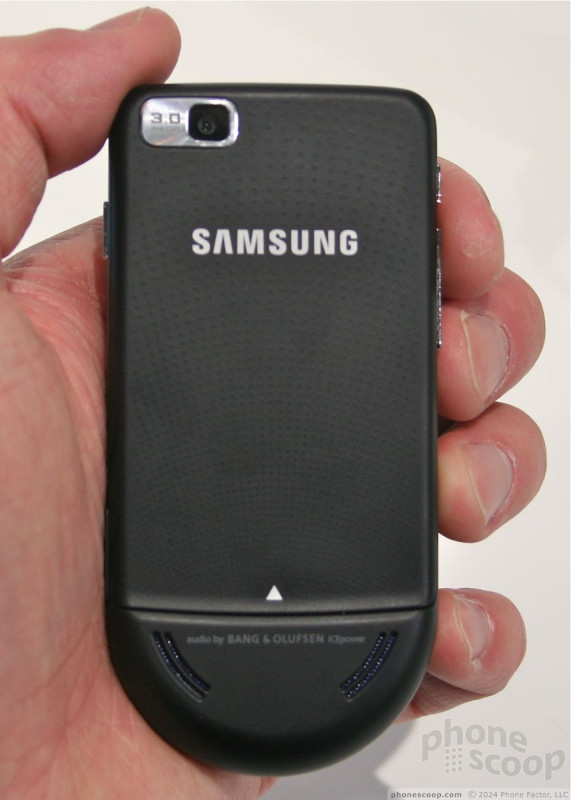
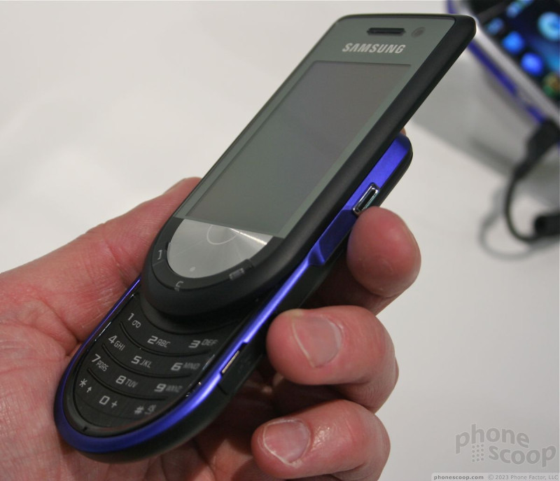
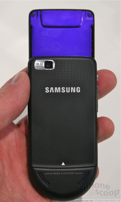
The Memoir is essentially a US version of the Pixon for the rest of the world, but clad in a different body design. I happen to think the Memoir body looks and feels much nicer. It has a good size, weight and feel to it. It's not the thinnest out there, but for such a high-res camera, it's not as thick as you might expect.
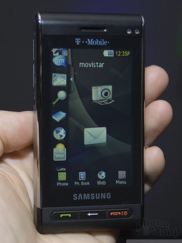
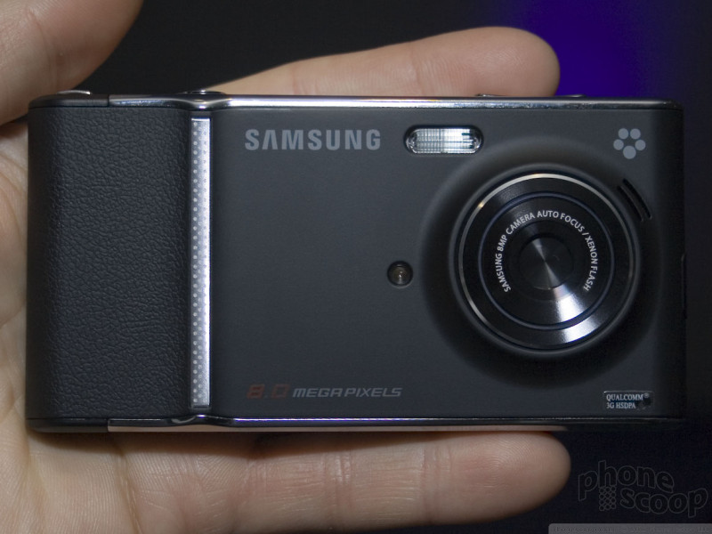
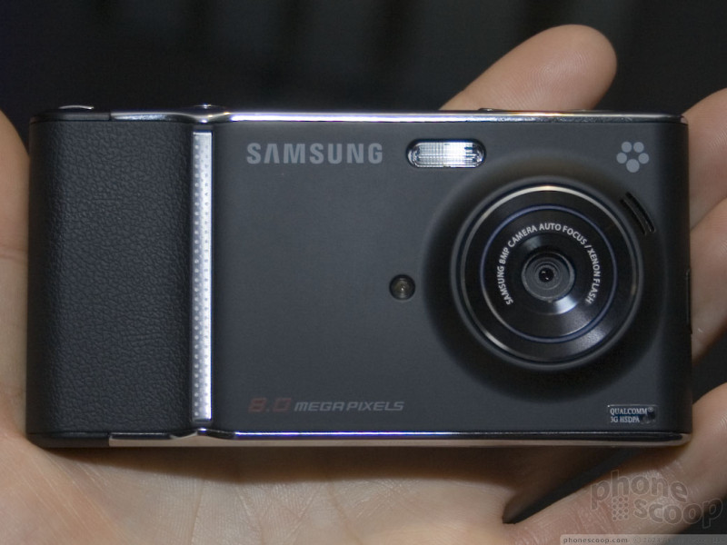
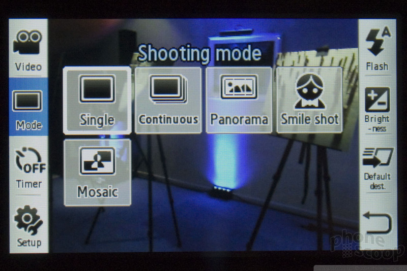
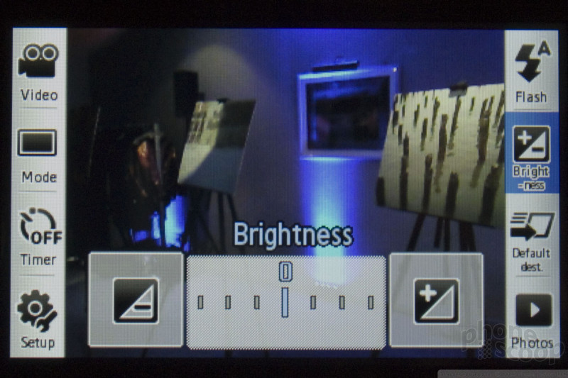
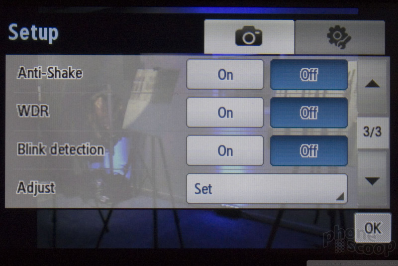
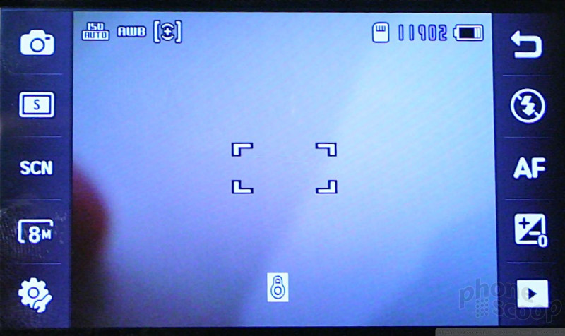
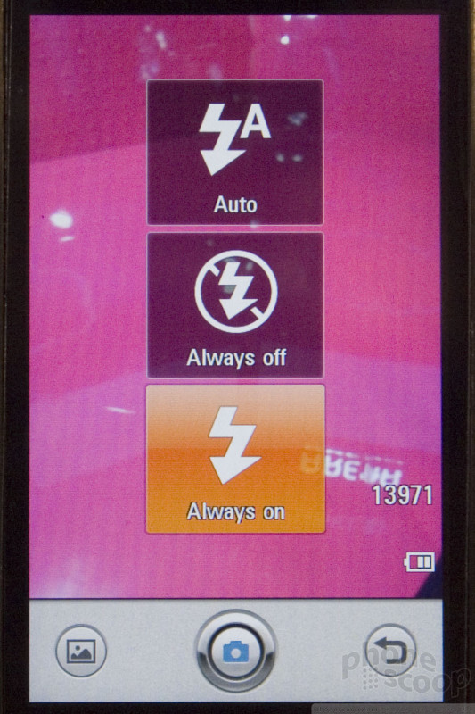
The Memoir's key feature and reason for existing is its 8-megapixel camera, which Samsung expects will be the first in the US. The camera is auto-focus, and focuses relatively quickly. It has a xenon flash, which is better than the more-common LED type, although it's still small and not nearly as powerful as a standalone camera flash. The camera lens has an automatic lens cover.
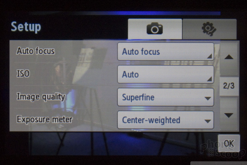
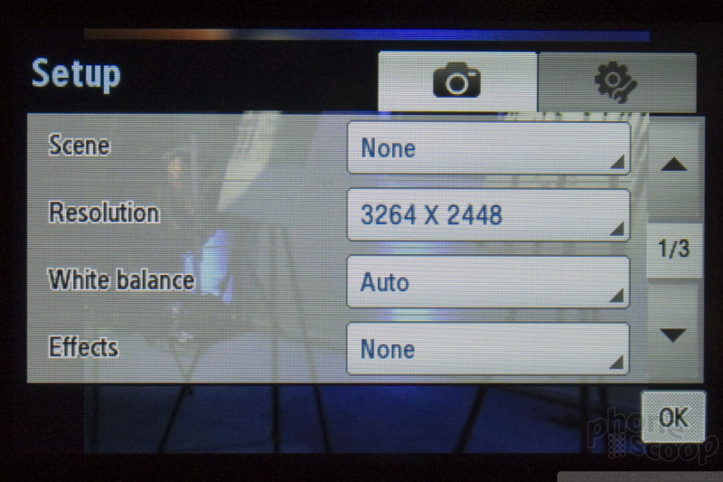
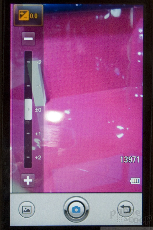
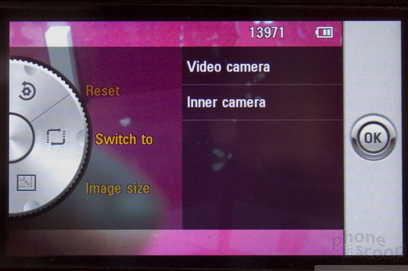
The camera UI takes full advantage of the large touch screen, putting a large array of controls around the edge of the display in the viewfinder. They go away after a second so you can see the full frame, but come back with a quick touch anywhere on the display. These controls make it easy to adjust key things like digital zoom, brightness and scene mode with just a touch or two.

The Memoir seemed about average at shutter lag. After pressing the shutter button, it took a second or two to capture the shot. That's expected on an auto-focus camera phone, but the lag wasn't as long as some other phones we've seen. In general, the overall performance of the phone was about average. No huge slowdowns, but not impressively speedy, either.
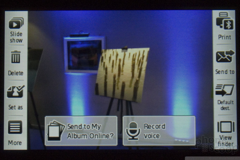
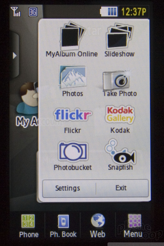
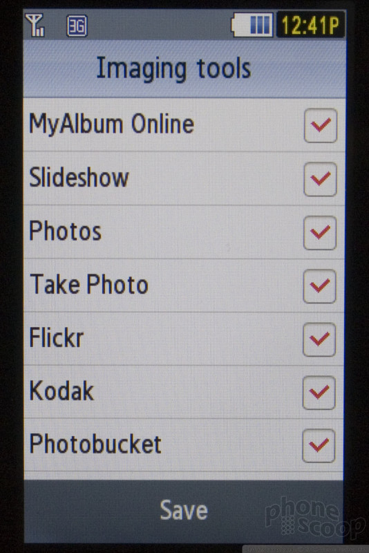
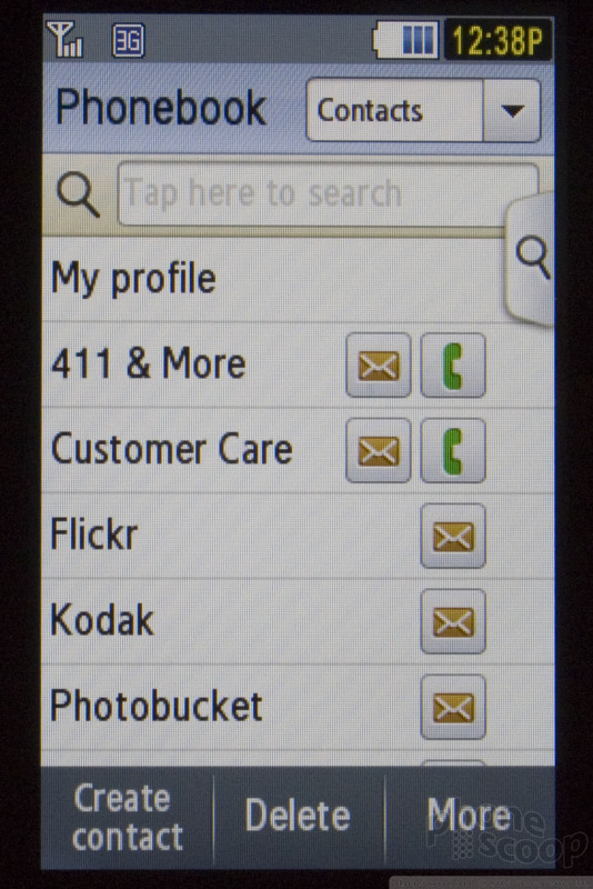
The phone appears to have built-in support for Flickr, Photobucket and other photo-sharing sites. However, when we tried the "upload to web" feature, it seemed to resize the photo to something small and try to upload it to T-Mobile's online photo album service. Data service wasn't active on the demo phones, so we didn't have a chance to see the full process, but what we saw didn't seem very tightly integrated with any photo service other than T-Mobile's. The photo widget on the home page does link to those sites, but they appear to be nothing more than web bookmarks. We look forward to reviewing the Memoir to see exactly how the photo uploading experience works.
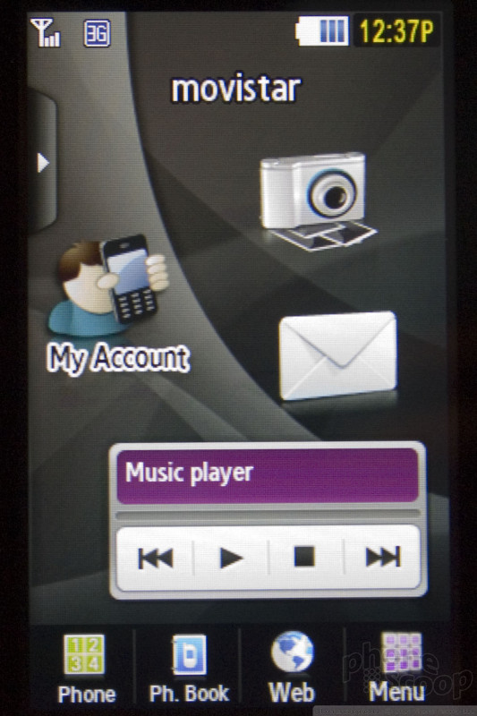
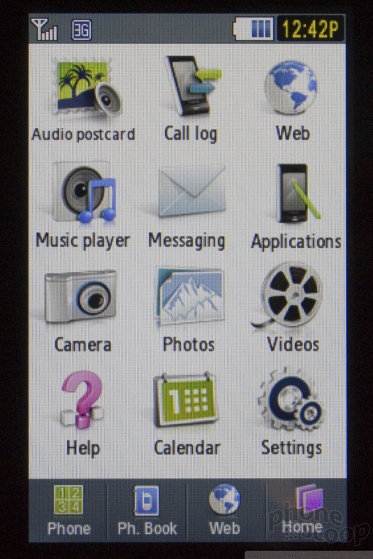
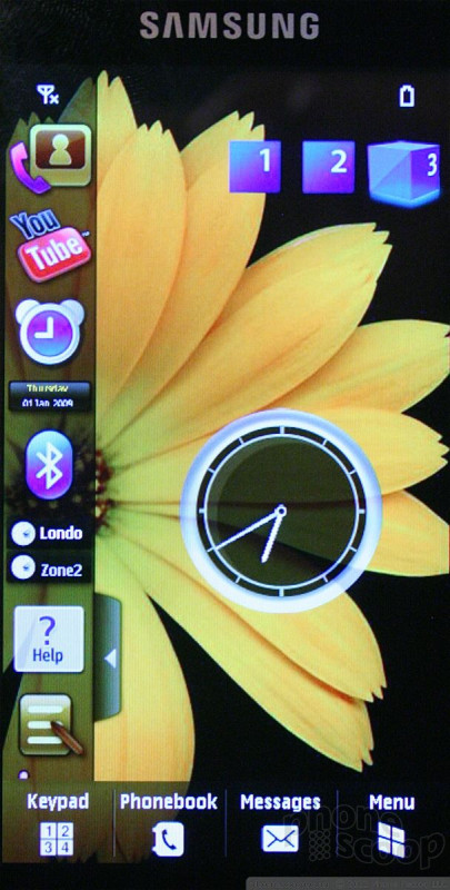
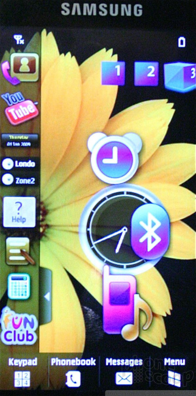
The rest of the OS is fairly standard for a Samsung TouchWiz phone. On the home screen, they have added the ability to launch widgets directly from the widget dock, so you can use it as a kind of slide-out menu for your less-frequently-used widgets.
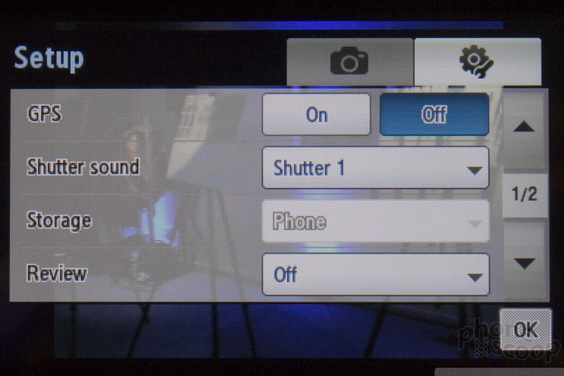
Other major features include GPS, which can be used to geo-tag photos and for serious navigation (Telenav is included.) It also supports T-Mobile's unique 1700 MHz 3G network.
Look for the Memoir to launch next week.
Here is our video tour of the Memoir:
Part 2
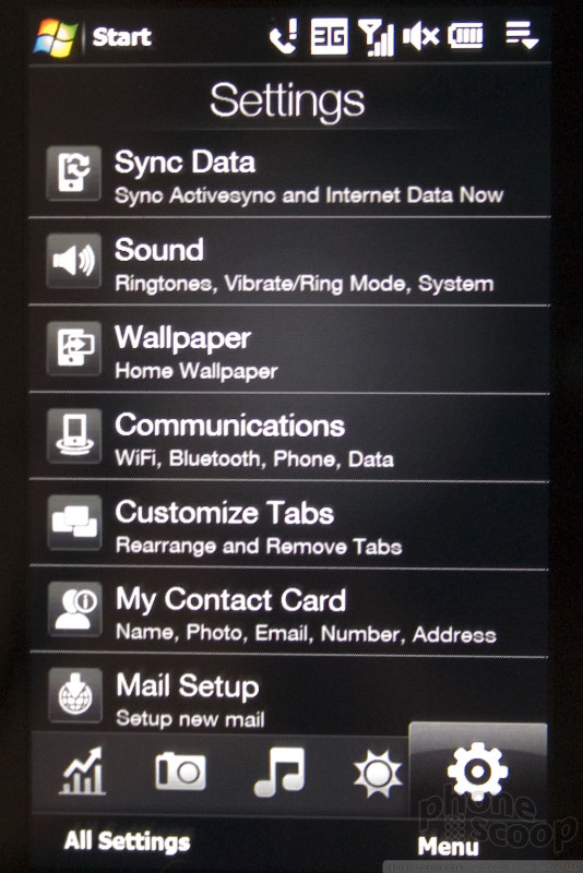
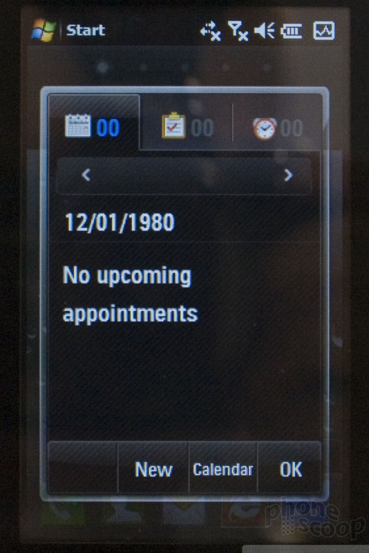
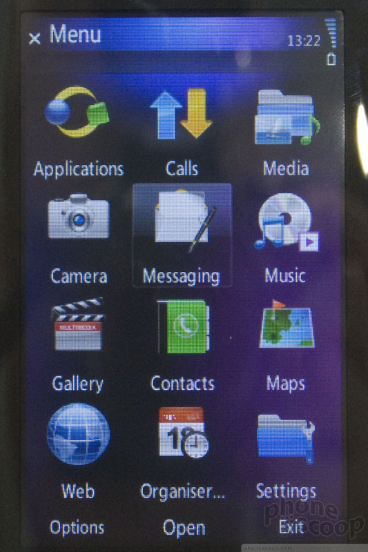
Windows Mobile 6.5 (updated)
Video added late Wednesday, Feb. 18. See below.
One of the more major announcements at this year's MWC is Windows Mobile 6.5. There are some key improvements, mostly in making it more finger-friendly, to better compete with the current crop of finger-touch phones on the market. Many of the new features are quite welcome and a step in the right direction.
However, comparing the new Windows Mobile to the competition, we get the distinct feeling that it's all a bit too little, too late, especially since 6.5 won't find its way into consumers' hands until October at the earliest. Hard-core Windows Mobile fans - especially Exchange users - will find enough to keep them happy. However, Microsoft continues to underestimate its competition and slowly fall further behind each year when it comes to innovating for consumers.
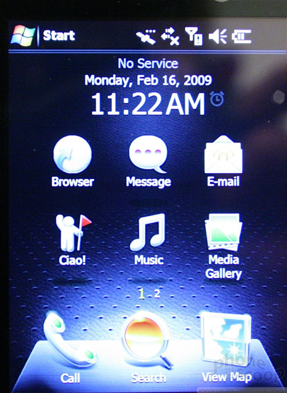
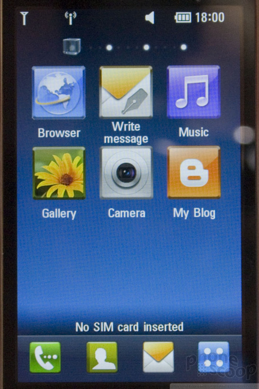
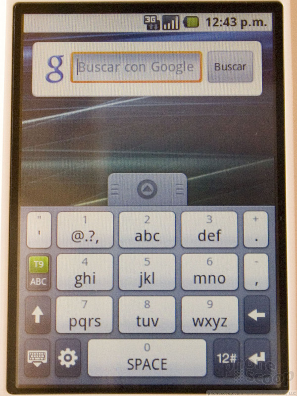
First, some basics. Windows Mobile remains split into two distinct versions: "Standard" (non-touch) and "Professional" (touch). Almost all of the improvements to 6.5 are exclusive to the Professional (touch) version; Standard 6.5 is almost indistinguishable from Standard 6.1. The focus of 6.5 Professional is mostly on making it prettier and finger-friendly. In other words, Microsoft is finally responding to the iPhone.
The finger-friendly interface overhaul is nice.
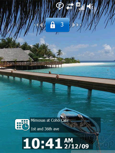
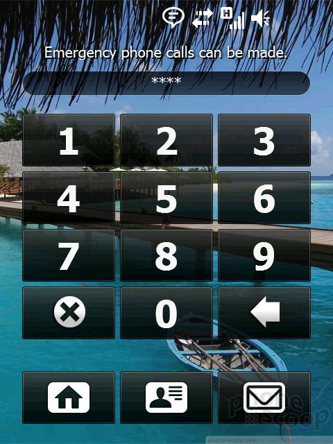
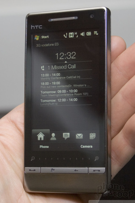
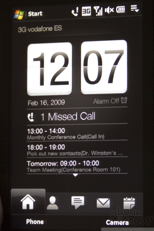
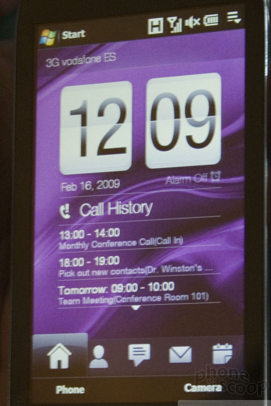
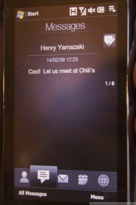
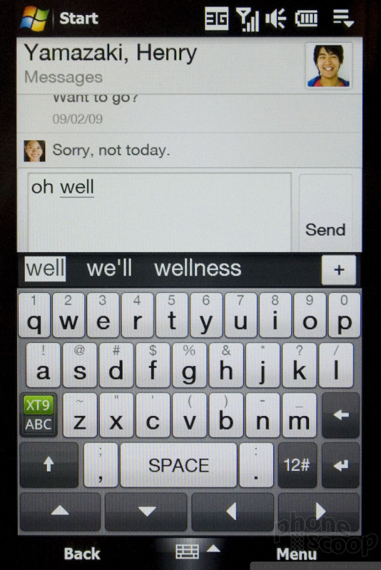
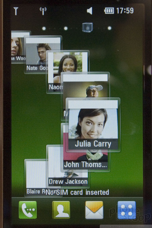
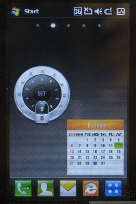
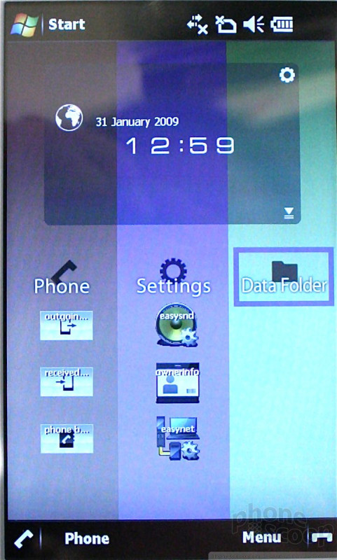
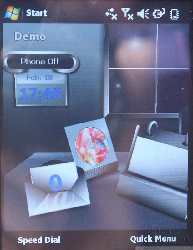
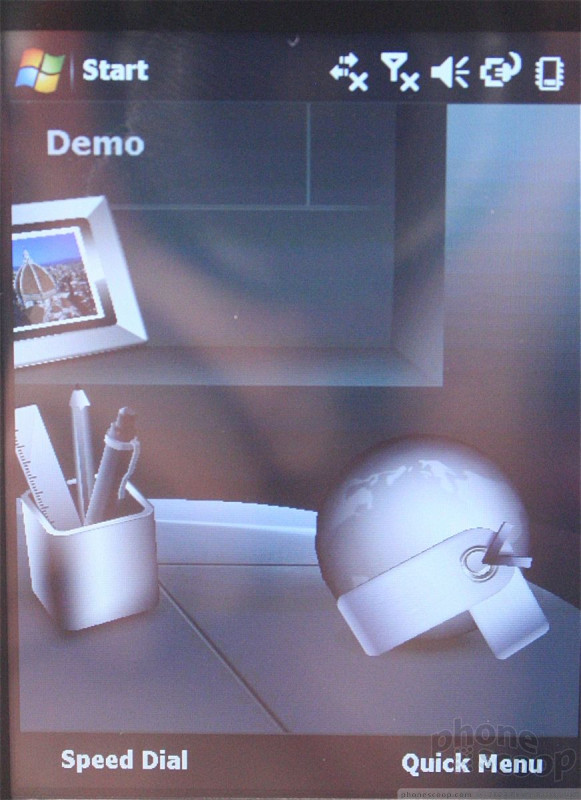
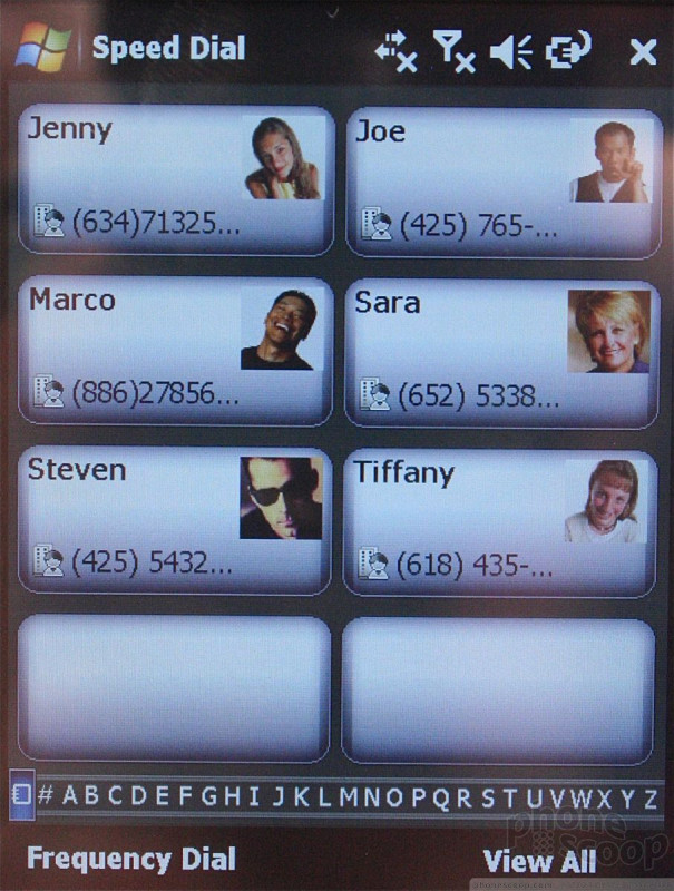
There's a new unlock screen, with key status info presented well, such as time, upcoming events, and missed messages. An interactive slide-to-unlock feature makes it easy to jump right into missed calls, messages, and voicemail.
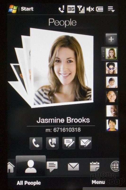
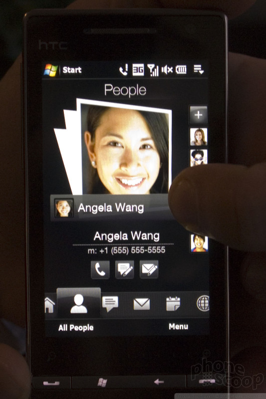
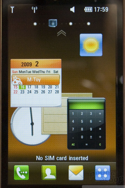
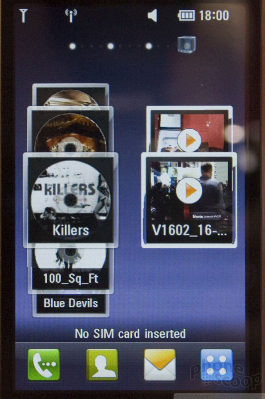
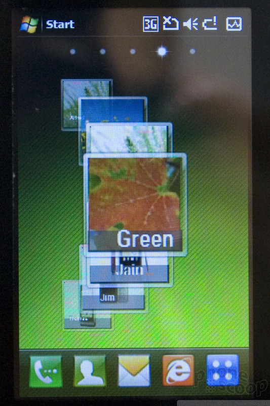
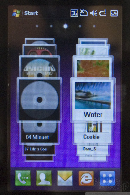
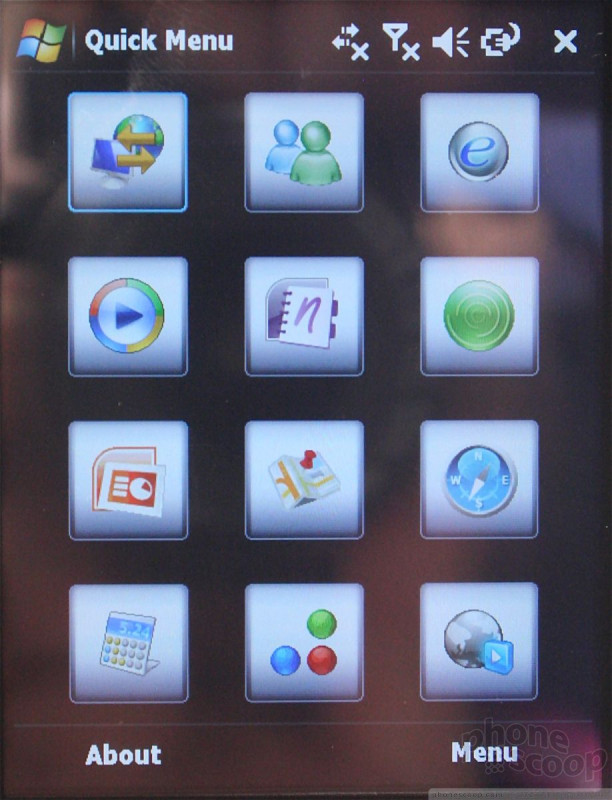
WinMo 6.5: Unlock, Home Screens
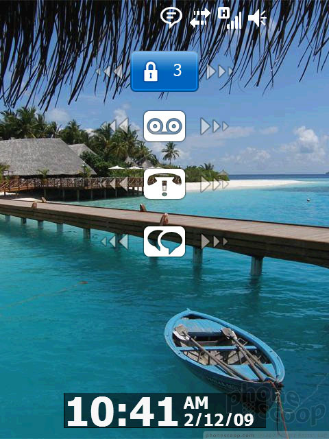
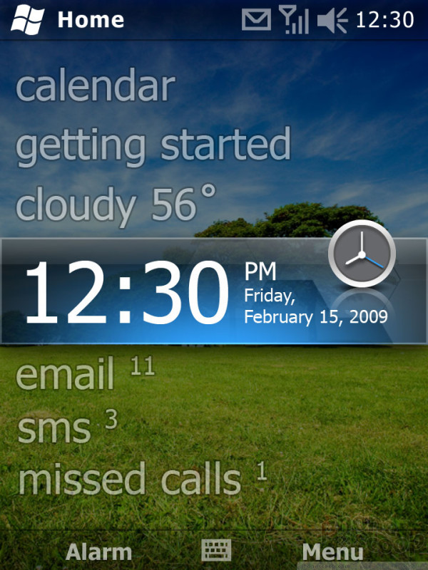
The new home screen copies the lovely look of the Zune interface. It features intuitive and efficient four-way navigation. It brings key info right to the top level, and makes it easy to jump into applications when you need to dive in deeper. In other words, it brings the nice "sliding panels" interface from 6.1 Standard to the Professional version, with pretty Zune looks, in an attempt to catch up with manufacturer-made interfaces like HTC's TouchFlo 3D. It does a decent job.
Where the new home screen disappoints is that it completely removes the widget-like Today Screen Plug-In architecture from previous versions. Widgets are something of a hot trend right now, and Microsoft essentially had a huge head-start on that with its Today Screen Plug-Ins. Quite a few good third-party ones are available. While the replacement home screen is nice out of the box, Microsoft has not only broken compatibility with old plug-ins, but failed to provide a new API for third-party plug-ins at all. This feels like a major step backwards, and is a baffling move.
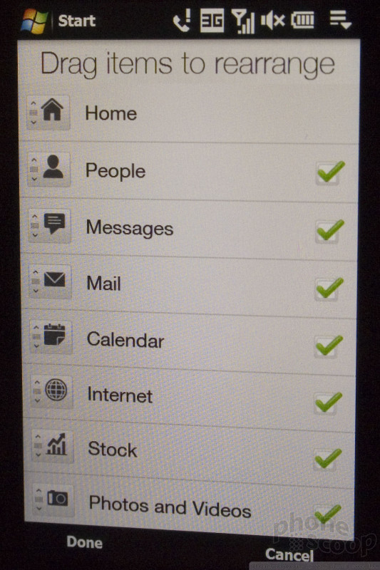
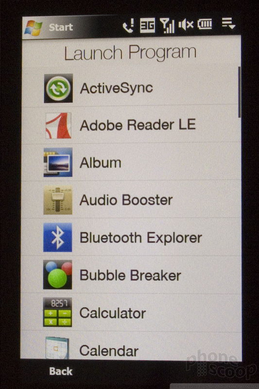
Moving on to the main menu, there's finally just one. This is long overdue, but we're not complaining. Every previous Windows Mobile phone has had at least two different "main menus" (Start and Programs.) Some, like the Samsung Omnia, have six "main menus", and each works differently! It's never made any sense. 6.5 finally fixes that with one unified "Start" menu for all programs.
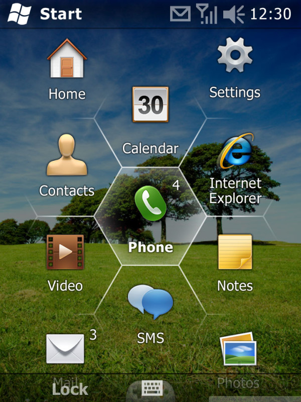
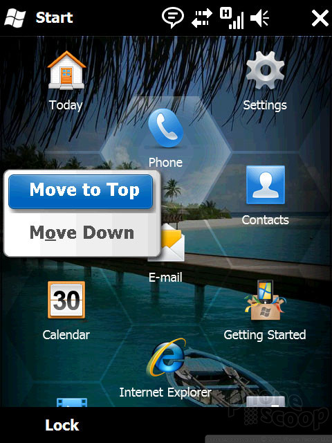
The new main menu has a unique and slick hexagonal layout. You
can flick up and down through it, and it has a "bounce" at the bottom and top, just like the iPhone. You can arrange the icons how you like by pressing and holding to reveal "move to top" and "move down" options, although common-sense options like "move up" and "move to bottom" are oddly missing, and drag-and-drop re-arranging would be much easier. There is no way to arrange icons into pages, like competing OSes, nor folders, like previous versions of Windows Mobile; one giant list of all programs is all you get. Still, we'll take this relatively intuitive interface over previous versions of Windows Mobile any day.
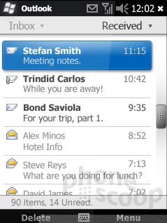
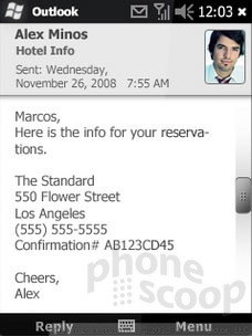
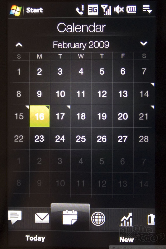
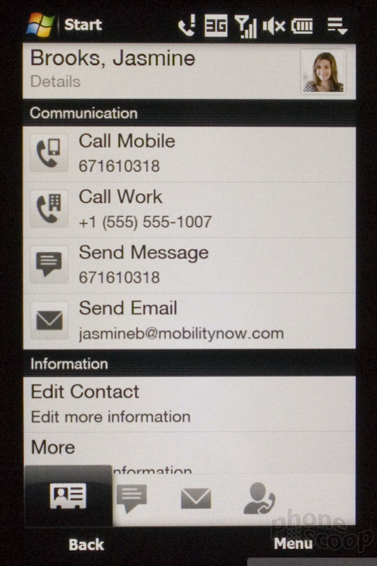
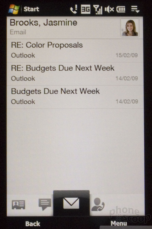
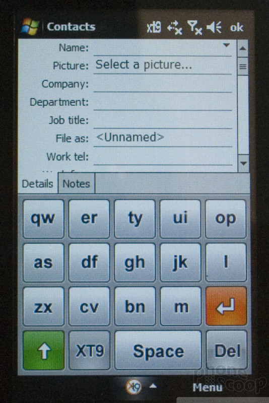
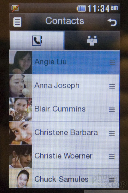
Standard Microsoft applications like Contacts, Calendar, Messages, Email, and Settings have also been overhauled to be more finger-friendly, and look much nicer and more modern. This is a major overhaul not to be glossed over. We're happy to report that the overhaul is a good one. There's not much to say except that its works as you'd expect. That's a good thing.
Other OS-wide aspects of the interface have also been made finger-friendly, like the top and bottom bars, and the options menus that usually appear when you press the right soft key. Third-party applications need to be updated to be as finger-friendly as the built-in ones, although the major third-party developers have already done a lot of work in this area. Oddly, Microsoft tells us that the new options menus do not automatically apply to third-party apps, which is odd. That would seem like an easy way to make third-party apps a little more finger-friendly.
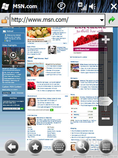
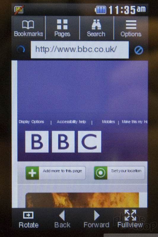
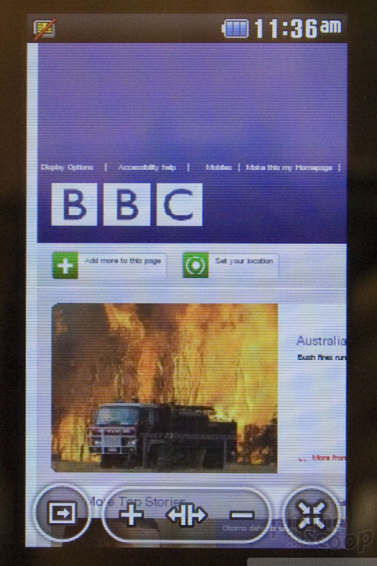
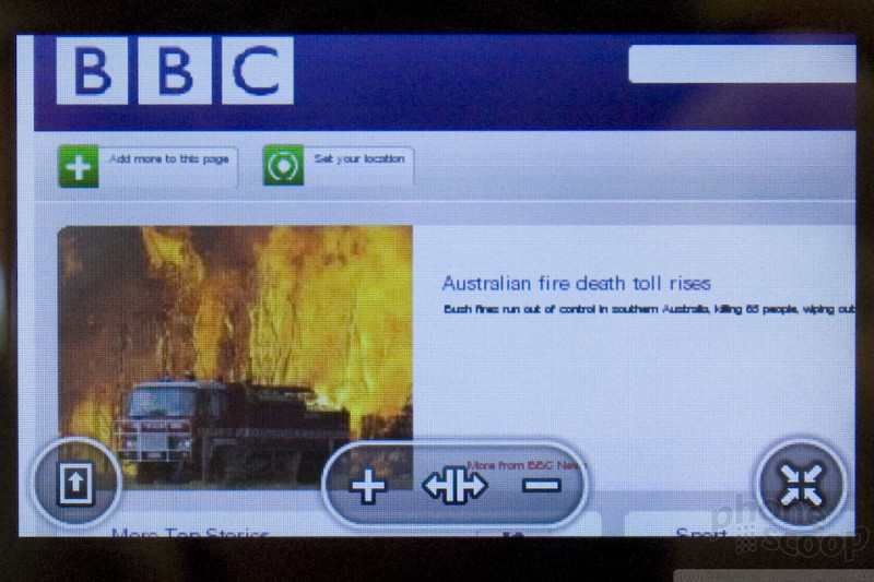
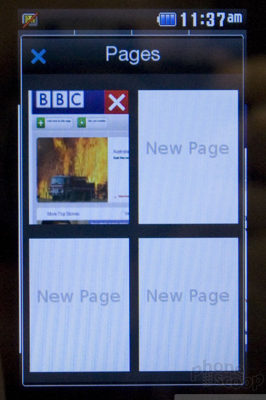
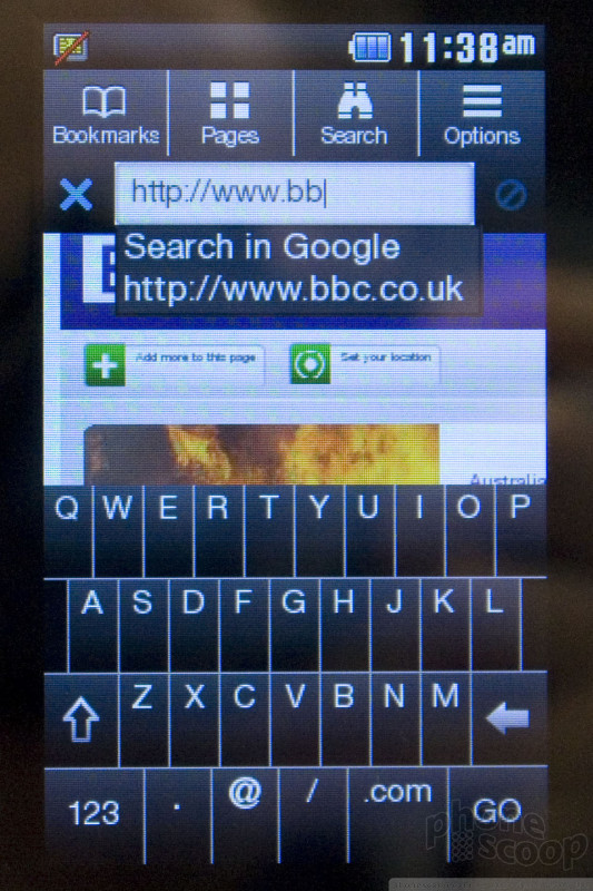
The browser also receives a face-lift. It's more finger-friendly and has pop-up controls much like Opera. It uses the same rendering engine as IE6 for desktop PCs, plus some newer components, such as the JavaScript engine from IE7. New navigation controls include a sliding zoom control and a small overlay to show you where you are on a page when zoomed in and panning around.
NEW: Video of 6.5 in action:
On the ecosystem front, Microsoft has some new branding surrounding Windows Mobile, and a new manufacturer partnership. The new brand is simply "Windows Phone", which is a new way to say "phone with Windows Mobile". (Note that the OS itself is still called "Windows Mobile".) The new partnership is LG. LG's already put out the WinMo phones like the Incite, but now they're making a serious contractual commitment to Microsoft. Windows Mobile will now be LG's "primary" smartphone platform, and the company will crank out 50 (yes, fifty) new Windows Mobile phones over the next four years.
Microsoft is also introducing a new free service for Windows Mobile called My Phone. It's basically a free backup service that works over the air (over your phone's data connection.) Daily (or however often you want) it will sync your phone's content with the My Phone servers. Then, any time you lose your phone, or simply change phones, you can sync your new phone with My Phone, and it will have all of your data in one step. The My Phone web site lets you log into a private interface where you can view and manage your content, as well as register phones. The ability to register more than one phone is what lets you easily move all of your content from an old phone to a new one.
My Phone syncs your contacts, calendar, tasks, text messages, photos, video, music, and documents. However if you have Exchange set up on your phone, then contacts, calendar and tasks are managed and synced by Exchange exclusively, and won't be backed up by My Phone.
Microsoft will offer My Phone for free to all Windows Mobile 6.0 - 6.5 users, with 200 MB of storage. At the moment, there is no option for additional storage, even for a fee, so if you have more than 200 MB of photos, video and music (quite likely), you'll need to decide which types of content you want synced and which you don't. At least you do have that option; you can have it sync just your text messages and photos, but not videos and music, for example.
My Phone is launching first as an invite-only beta this week, then to the public in the fourth quarter (at the same time as Windows Mobile 6.5.)
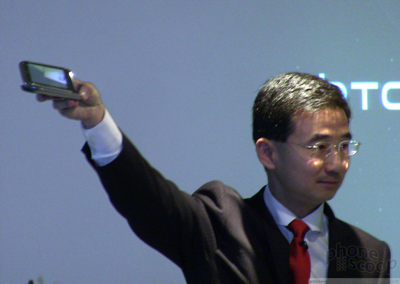
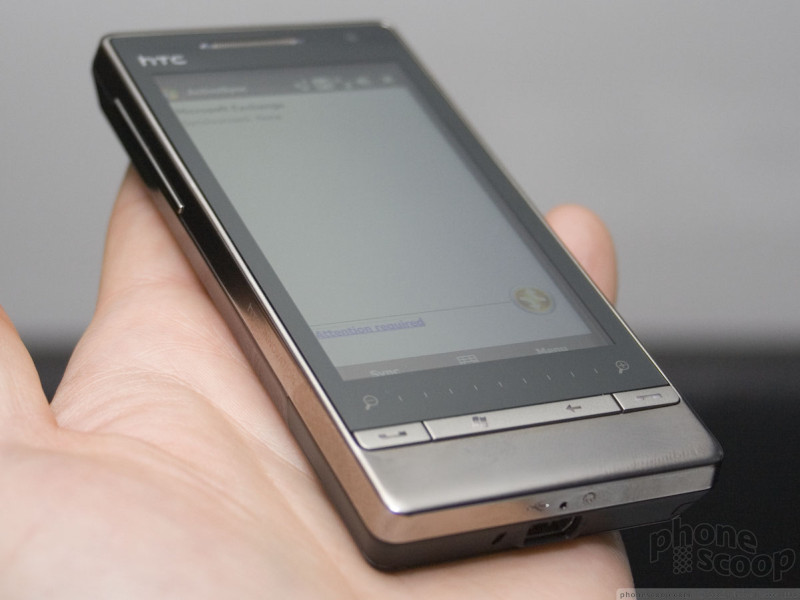
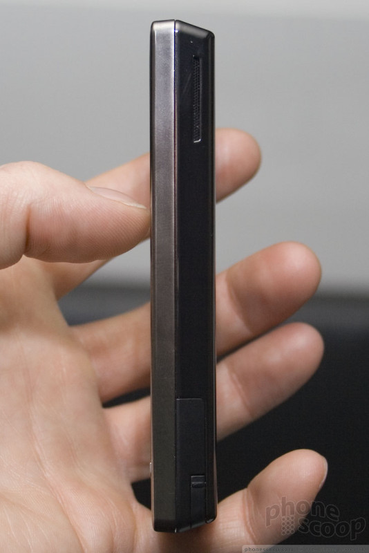
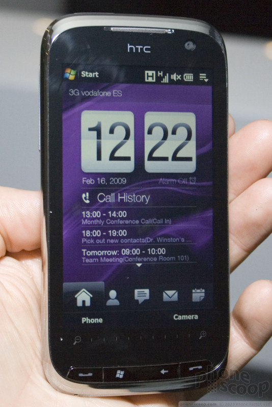
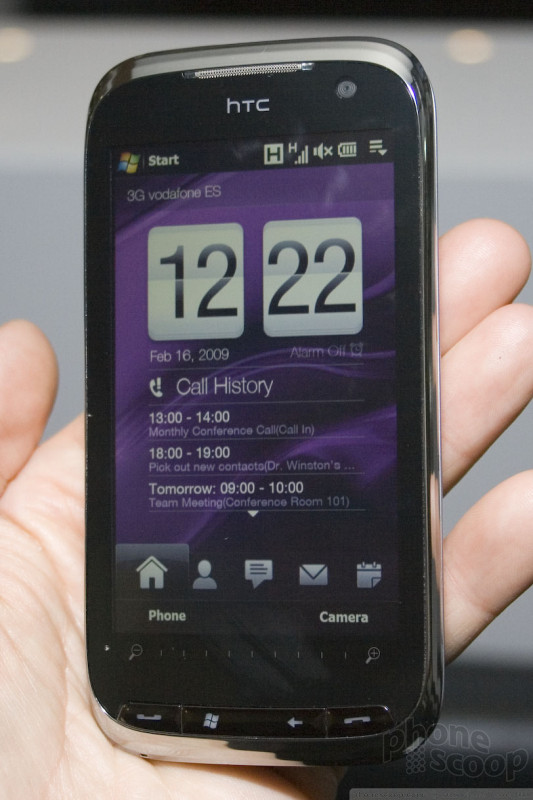
HTC (updated)
* Updated: Video of Touch Pro2, and new text messaging screen. See below.
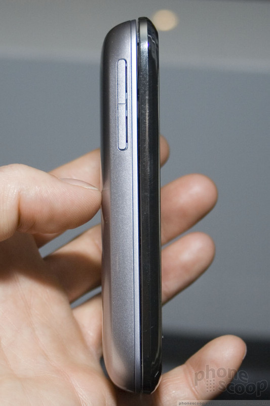
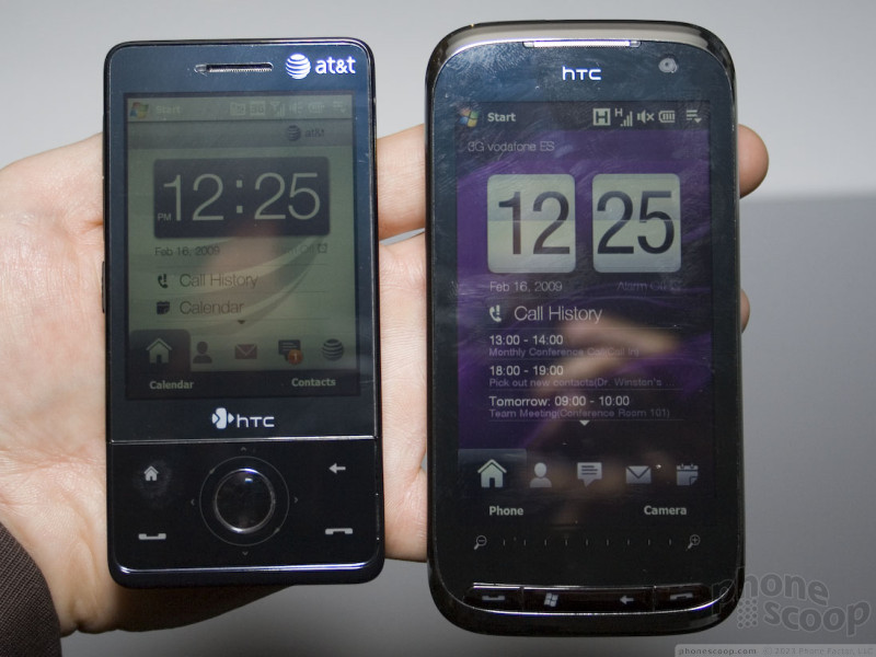
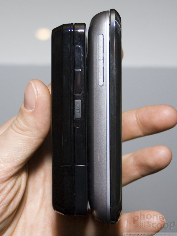
HTC today revealed successors to its two flagship devices from 2008: the Touch Diamond and Touch Pro. At first glance, you might think they're just updated versions with bumped specs, but getting our hands on them, we noticed a lot of major differences. There are some really major improvements in the new Touch Diamond2 and Touch Pro2.
Both devices ditch the d-pad and circular touch wheel for zooming (which was always awkward,) replacing that with a much larger display and a horizontal touch strip for zooming. The previous displays were all smaller than three inches; the new devices have displays well over three inches. That's a huge difference in screen estate. Not only are they larger physically, but they add more pixels, too, upgrading from VGA (640 x 480) to WVGA (800 X 480.)
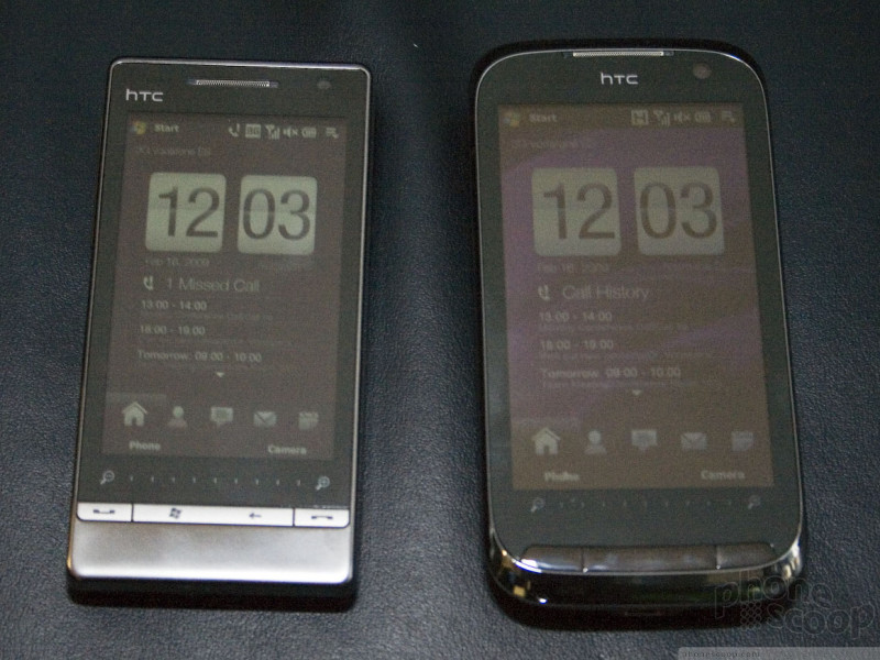
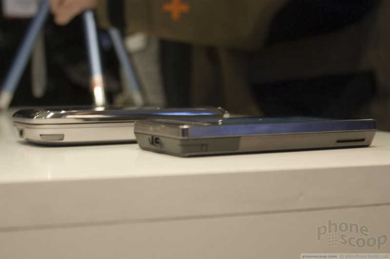
Both devices are also slightly thinner, while upgrading to higher-quality materials. While the Diamond and Touch Pro looked nice, they did feel a little plastic-y. The new models feel much nicer and more solid.
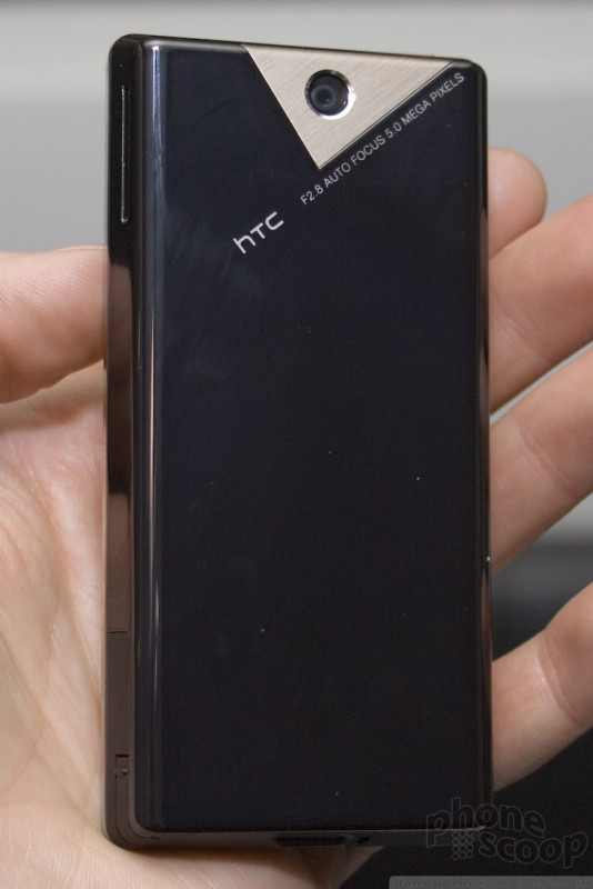
The Touch Diamond2 is even more consumer-centric than before, upgrading to a 5-megapixel camera. It also addresses a huge complaint of the original by adding a memory card slot. It's a very slick device.
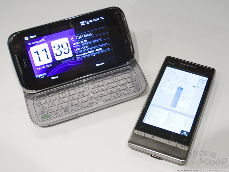
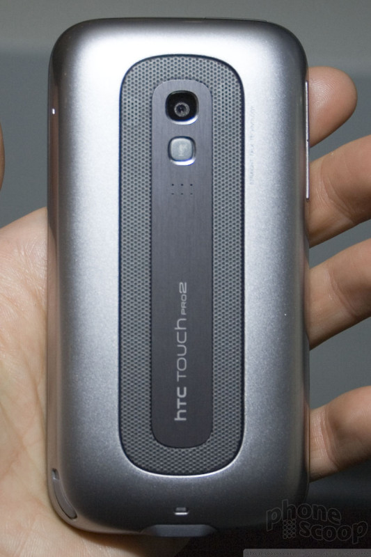
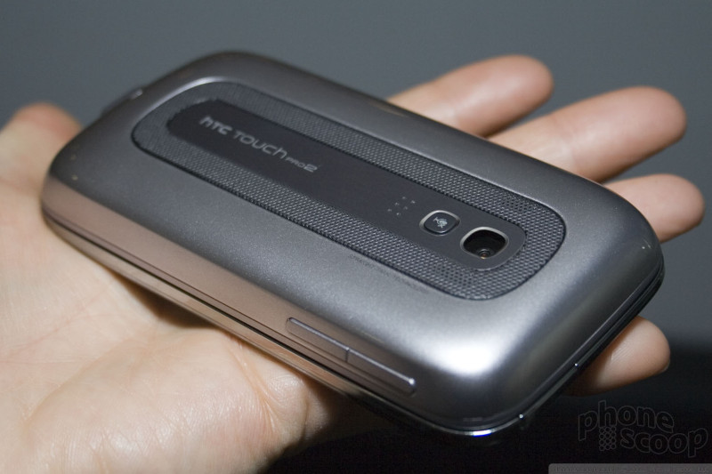
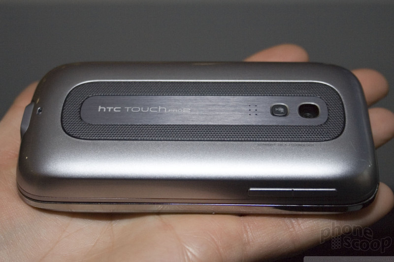
The Touch Pro2 is even more different than its predecessor. It has an even larger display, almost as large as the Touch HD. It also brings back the tilting, sliding display mechanism that made the Tilt so interesting. They managed to do all of this in a package slightly thinner than the original Touch Pro. Oh, and they packed in a larger battery, too.
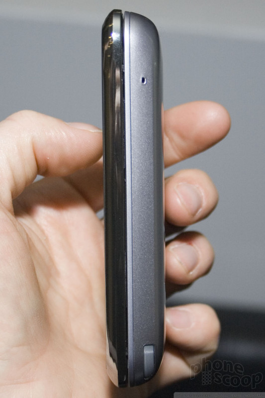
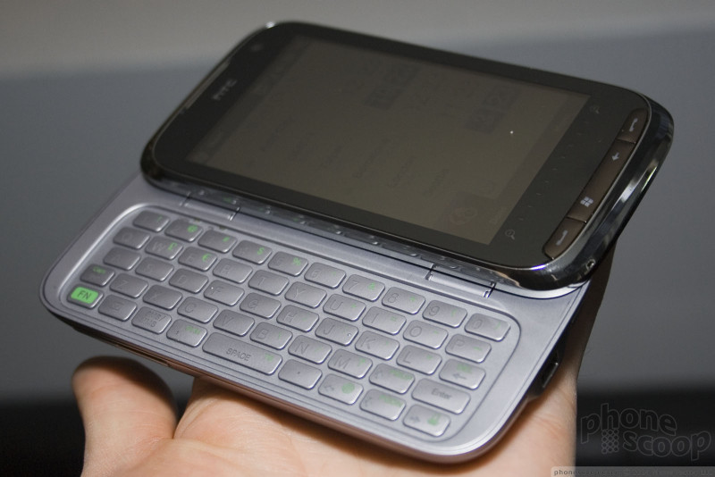
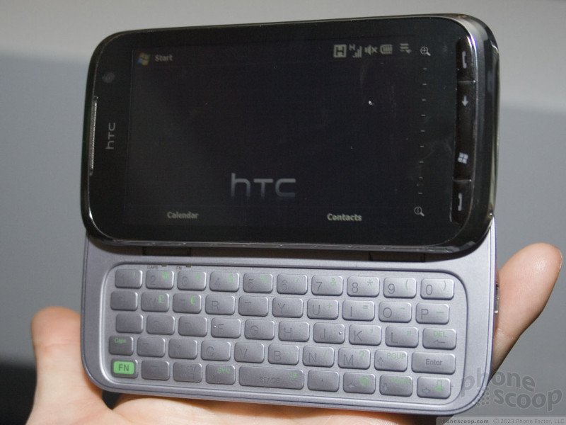
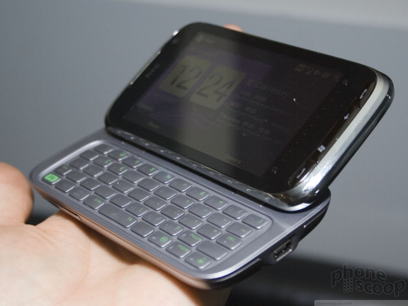
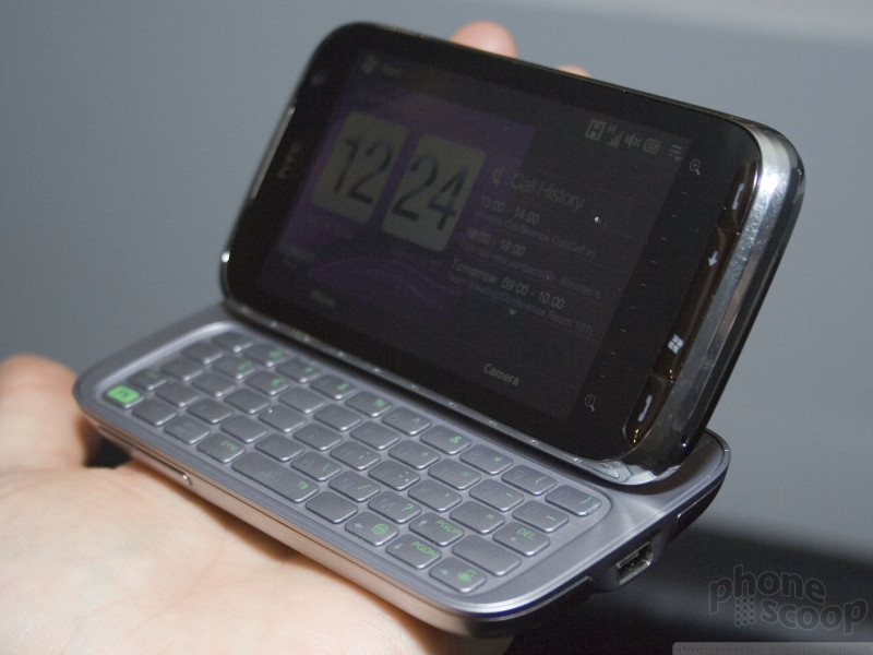
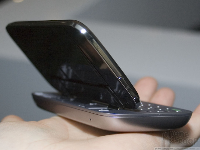
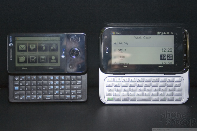
The Touch Pro2 has a phenominal feel to it. It's slightly heavier, but the changed shape more than offsets that, so it actually feels lighter than the original. It looks sexy, feels great, and the slide mechanism feels good, too. The tilt mechanism is fully adjustable, so you can tilt it up just a little to hold in your hands, or tilt it up further to set on a desk for video watching, etc. You just tilt it where you want it, and it stays put. That display is gorgeous, by the way.
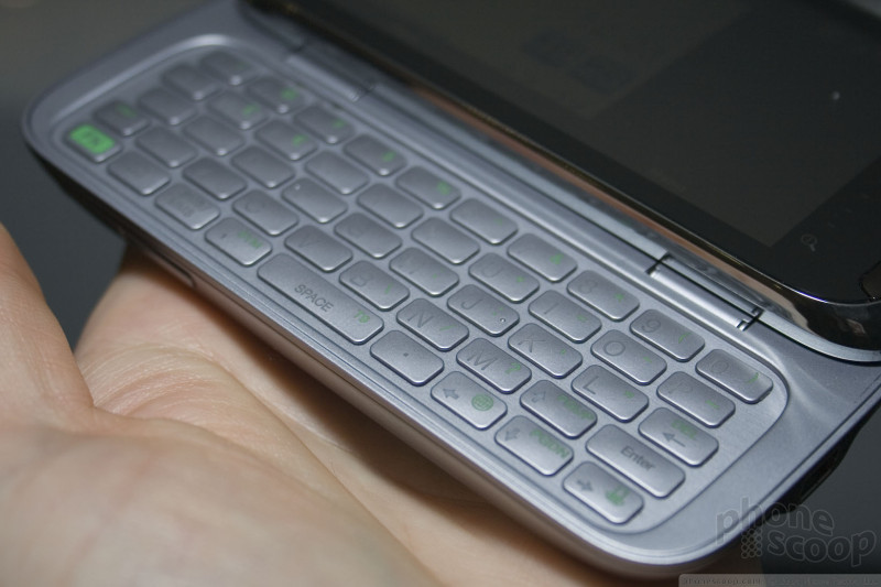
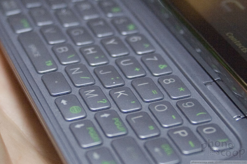
The best feature of the Touch Pro2 just might be the keyboard. It's one of the best I've ever tried. The keys are perfectly sized and shaped, and feel wonderful to type on. There are five full rows, including a dedicated number row at the top, and a dedicated space bar and punctuation row at the bottom.
The Touch Pro2 also has some unique business features. Collectively, they brand this "Straight Talk". If you're looking at an email thread among a group of co-workers and decide a phone call would be faster, there's a tool to quickly set up a conference call with some or all of those people. There's also a feature on Outlook Mobile that recognizes invitations to conference calls on your schedule, and gives you a simple button to dial into that conference call right from the appointment screen.
Building on the conferencing features, it also has a sophisticaed speakerphone that HTC describes as office conference room quality. It includes two microphones and two speakers, which enables loud volume and background noise filtering. To activate the speakerphone, just flip it over on its face. The large speakers on the back face up, and a large grille even makes it look like an office speakerphone. There's even a mute button in the middle of the back. It's really designed to be set on a desk and used by a group of people as a very serious speakerphone.
On the software side, HTC has a new version of TouchFlo 3D.
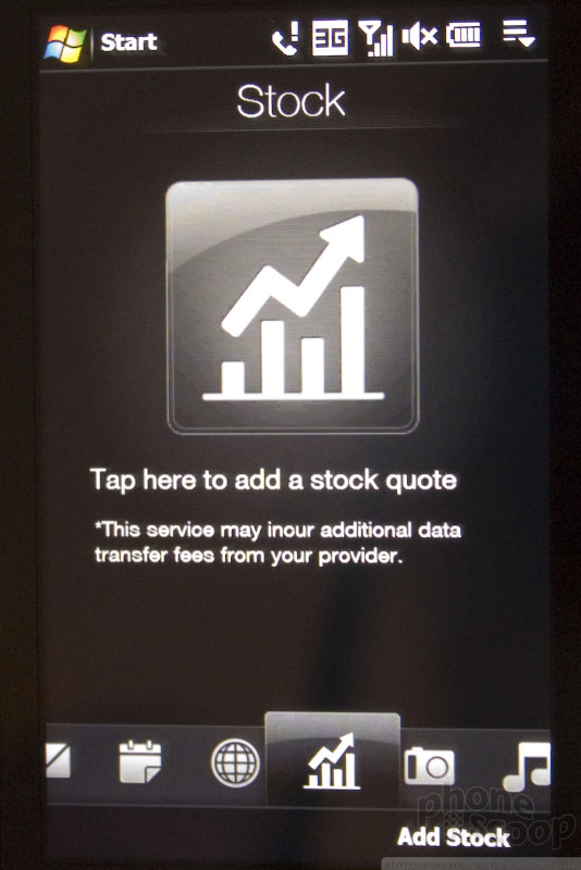
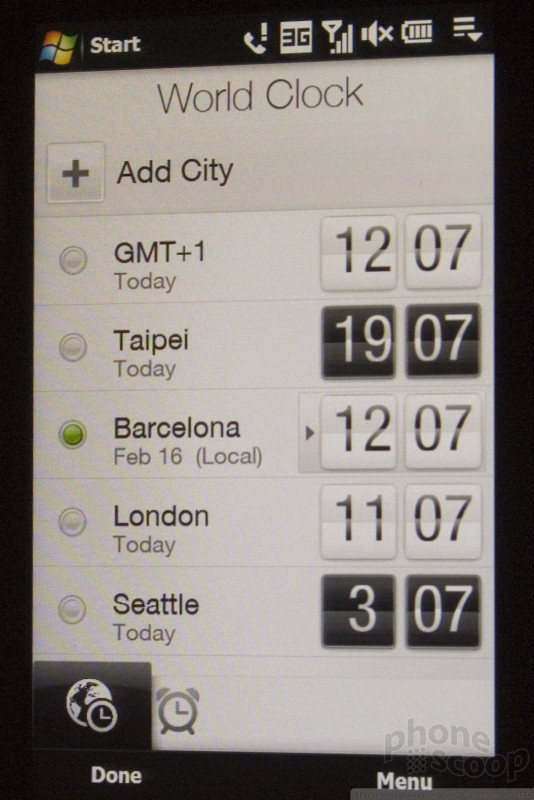
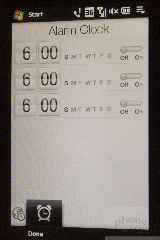
The new TouchFlo 3D has a few major changes and a few smaller ones. The smaller ones are things like a stock quote tool and improved alarm and world clock functions.
The major changes include the ability to customize the TouchFlo bar at the bottom of the screen. You can now disable ones you don't want. Another big change is that the Windows Mobile Start menu has been replaced with the main TouchFlo programs menus, just like on Windows Mobile 6.5.
NEW:
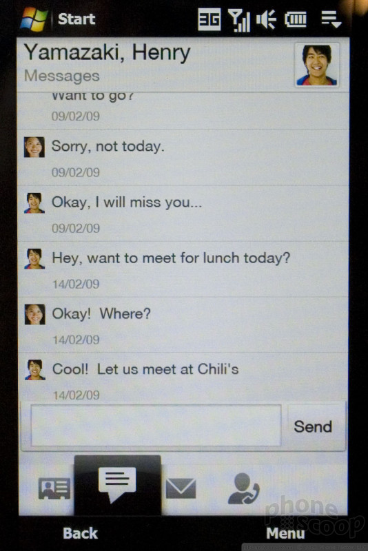
HTC has also taken TouchFlo deeper into the experience, removing the need to jump into Windows Mobile certain tasks. For example, now when you start a new SMS from TouchFlo's Contacts area, you can compose the SMS right in TouchFlo, and then a whole conversation can continue in TouchFlo. In other words, HTC has created their own complete threaded text messaging function that bypasses the Windows Mobile version completely; no more jarring jump between pretty TouchFlo and ugly Windows Mobile when using SMS.
They've also updated their virtual QWERTY keyboard to an offset layout that more closely matches desktop PC keyboards. The new layout also includes arrow keys for navigating text fields, to compensate for the lack of a d-pad on the new Touch devices.
Speaking of 6.5, the Touch Pro2 and Touch Diamond2 will initially ship with Windows Mobile 6.1, but will be upgradeable to Windows Mobile 6.5 - for free - when Microsoft makes it available toward the end of the year.
NEW:
Here's a video tour of the Touch Pro2:
Nokia
Nokia debuted the latest additions to its E series in Barcelona. Both sport E71-inspired designs and nearly every messaging feature known to man. Let's take a closer look.
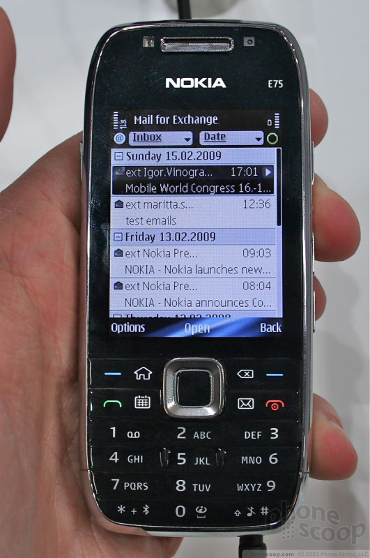
E75
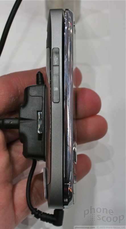
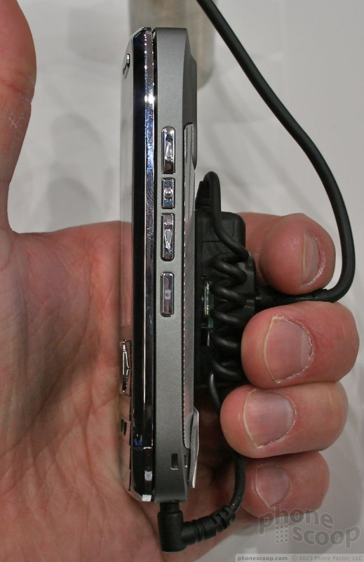
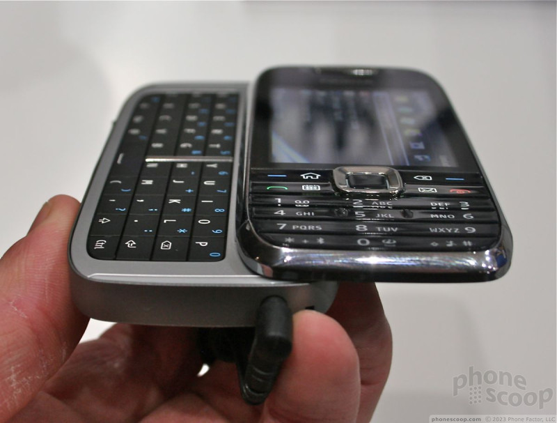
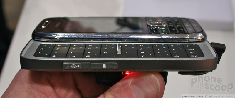
The E75 is, according to Nokia, the next evolutionary step in the Communicator series. It offers a full QWERTY keyboard (as the Communicators always did), but in a much smaller - and dare I say, sexier - package. The E75 may not be the thinnest phone on earth, but for a sideways slider, it's pretty darned thin. Quality of workmanship and materials abound. It is forged from metals and high-grade plastics that simply feel excellent in the hand. The rounded back edges fit well against the palm of your hand. Because so much of the body is metal, it is a fairly heavy phone, but not egregiously so.
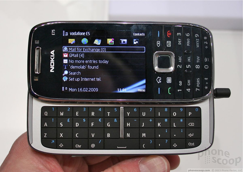
The controls on the front of the phone resemble those of the E71 and E51. They provide quick access to the phone's messaging features, including the inbox, contacts and calendar. The 12-key number pad on the front is roomy enough and the buttons had good travel and feedback.
The slide mechanism felt solid and strong. It opened and closed easily, with just the right amount of spring action. In my opinion, the screen was a little slow to re-orient between landscape and portrait modes when the phone is opened and closed.
The QWERTY keyboard is nearly completely flat. The keys have very little - if any - shape to them. I thought typing on the E75 was acceptable, but others might not. I thought there could have been a bit more travel and feedback from the keys. Even so, the keyboard isn't so wide as to make it unusable.
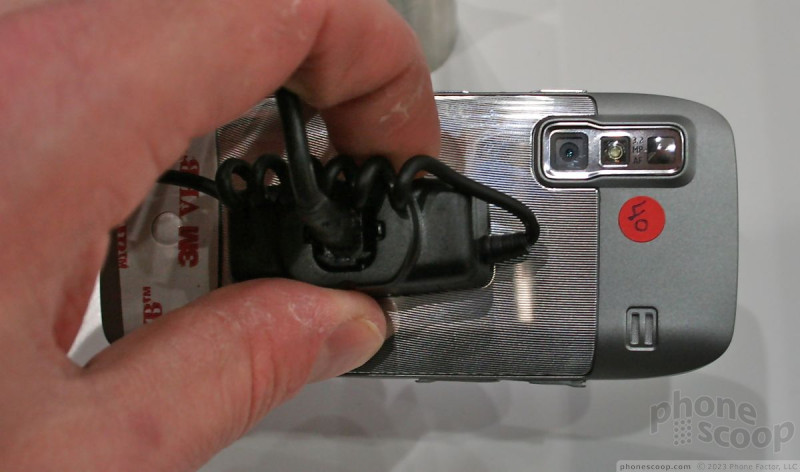
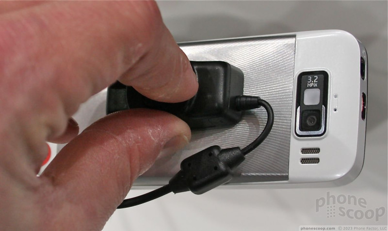
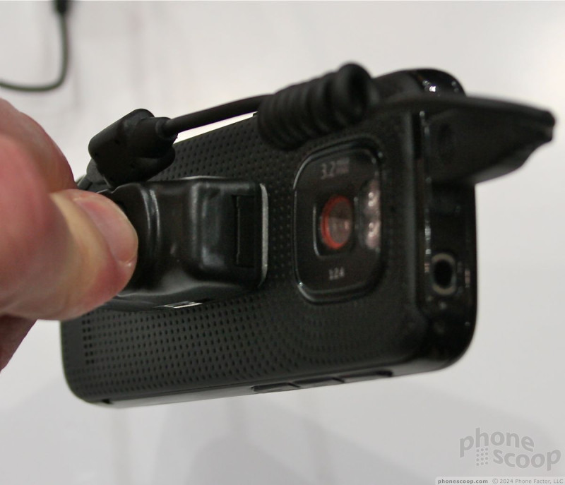
It comes with S60 3rd Edition Feature Pack 2, and every type of messaging and email service that Nokia offers. It surely is intended to be a messaging powerhouse. It also has a 3.2 megapixel camera with flash, a full 3.5mm headset jack, and an easy-to-use external hatch for the mircoSD card.
The E75 will be available in March.
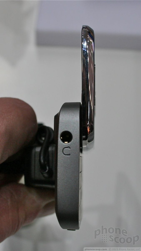
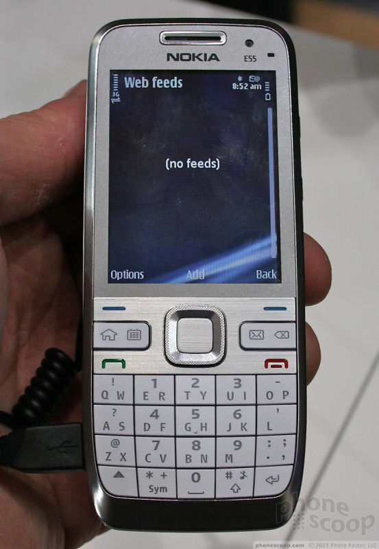
E55
The E55 is what you'd get if you mushed the E51 and E71 into one phone. It is wider than the E51, but thinner than the E71. How did Nokia do this? It is providing a 20-key SureType style keyboard for compising messages. That means there's two letters per key (as on a BlackBerry Pearl). Given the attention that Nokia paid to the keypad, I was sorely disappointed with it. There was hardly any travel and feedback to the keys, which felt like cardboard. One thing Nokia got right with the keypad is the size. It is so much more usable than the Pearl's SureType keypad. The buttons are large enough and well space. Since the E55 isn't due until June, let's hope that Nokia refines the keypad over time.
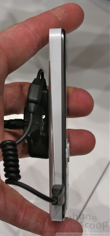
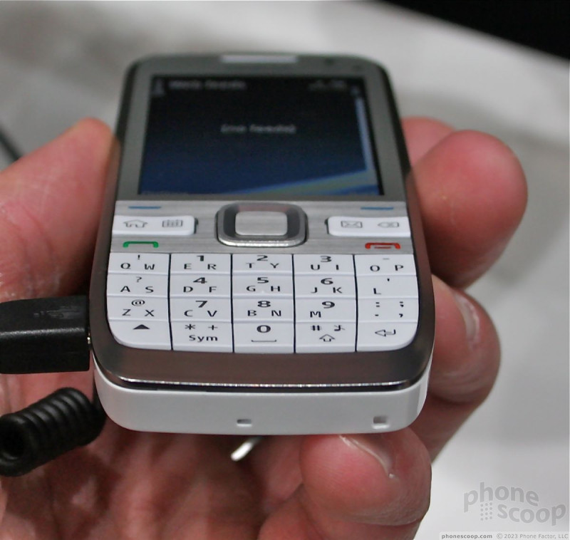
Otherwise, the hardware is excellent. Nokia claims that the E55 is the world's thinnest smartphone. I don't know about that, but it is no doubt one skinny phone. The materials feel like they are milled aluminum (inspired by the new MackBook Pro?). It has a tiny footprint and rests very comforatbly in your hand. It is easily grasped, and holding it for two-handed typing was comfortable and the phone felt balanced.
The bottons on the right side of the phone for controlling the volume were nearly identical to those on the E71. They were a little stiff.
The E55 also runs S60 3.2, and includes a full bevy of messaging software. It is a gorgeous phone to behold, and a good phone to use.
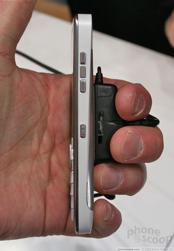
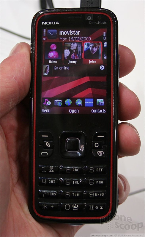
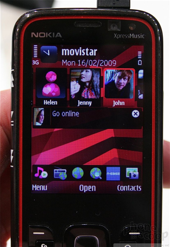
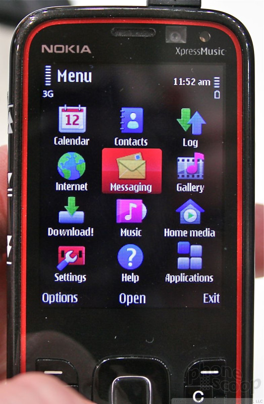
5630 XpressMusic
The 5630 was announced before the MWC show started, but this was the first chance we had to play around with it. It is the most recent addition to the XpressMusic line and brings with it some of the innovative new features seen on S60 5th Edition.
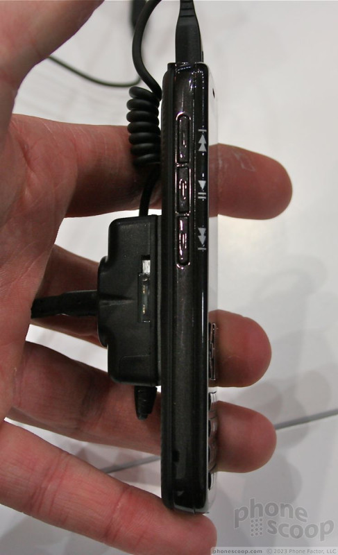
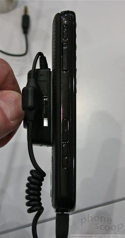
It carries with it the current red and black design language from other XpressMusic phones. It is a little on the long side, in order to accomodate a sizable display. Despite the length, the dialpad felt squished. I didn't care for it at all. The materials felt cheap and the travel and feedback on the keys was poor. Same goes for the navigational buttons. They felt very stiff.
The 5630 is a very light phone, and hardly had any weight to it at all. Because it is so narrow, it will easily fit into a pocket. It also rests well in the hand, though the exterior plastics felt a bit on the cheap side to me.
The 5630 runs Sybmian S60 3rd Edition, but uses some of the innovations seen on S60 5th Edition. In particular, these are the "favorite contacts" idea at the top. You can store up to 20 distinct contacts that you can scroll through. You'll see their photo ID, and can access all the test messages, emails, phone calls and other correspondence with that person by clicking on them. The user interface was snappy and quick. The shortcut bar normally found at the top of an S60 phone's screen has been shifted to the bottom of the screen. It is just as usable, though.
The one problem is, that by including all this information on the home screen, you lose some space for showing your calendar appointments andf so on. Of course, given the customizability of S60, I am sure there is a way around this.
Overall, the 5630 will certainly satisfy its intended market, which is music fanatics that want just a bit more power in their device compared to a normal feature phone.
Part 3
Samsung
Samsung announced a number of high-end devices running its new TouchWiz platform at Mobile World Congress. They are all powerful phones with a distinct set of media capabilities.
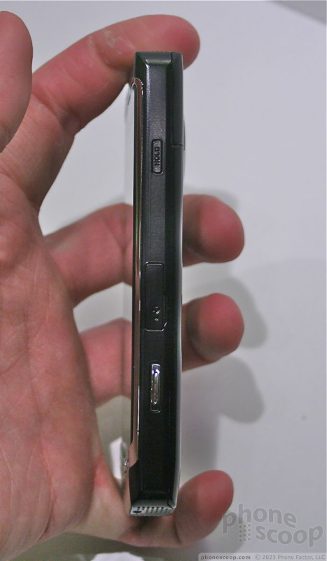
Omnia HD
The Omnia HD is flat-out ridiculous. It has a huge 3.7-inch AMOLED display that is quite literally one of the best displays I've ever seen on a mobile phone. It is insanely bright, very sharp, and graphics and icons look superb. Really, I could go on and on about how amazing the display is, but I'll spare you. Suffice it to say, it'll knock your socks off.
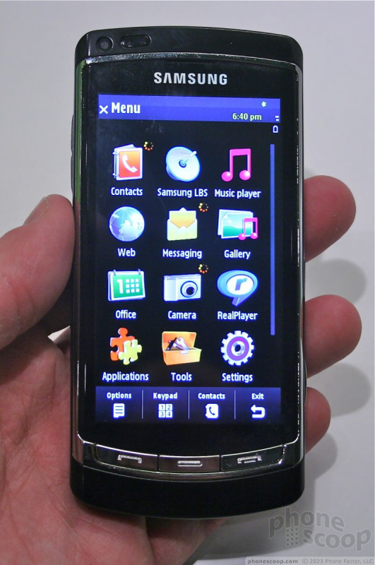
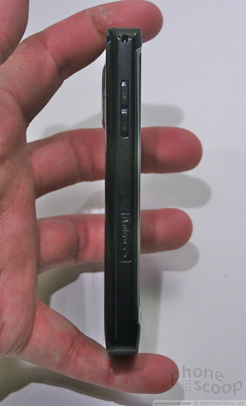
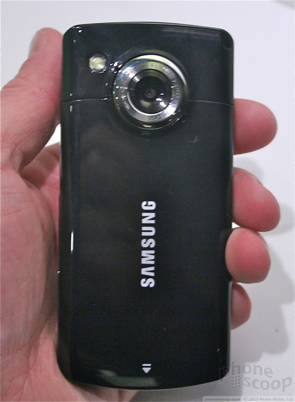
The Omnia HD is all about video. Because of the large screen, the phone itself is huge. It is quite a formidible piece of hardware to carry around in your pocket. The camera rates 8 megapixels and the Omnia HD can record video in 720p resolution at 24 frames per second. This makes it a killer imaging device. The hardware was good all around. A bit on the simple side, but all the buttons - few of them though they are - worked well and had good travel and feedback.
The Omnia HD runs the new version of TouchWiz. It is very much like the original version, but has added some 3D screen transitions, the ability to have more than one home screen, and the ability to multi-task with multiple applications running at a time. It runs S60 5th Edition, which is geared towards touch input. The UI was very responsive and snappy. This was perhaps the best rendition of a resisitve touch screen I've seen from Samsung.
Perhaps my favorite feature of the Omnia is what it doesn't have. Samsung has ditched its proprietary data port for a microUSB data port and it has added a full 3.5mm headset jack for regular headphones. This is a welcome change.
The camera software is the same that appears on Samsung's stand-alone cameras. It is very feature-rich and allows you to manipulate the camera's settings heavily. It is well integrated into the touch user interface.
The Omnia, however, will not be seen on U.S. shores. It will only support 900/2100 3G networks.
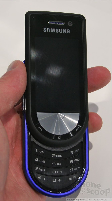
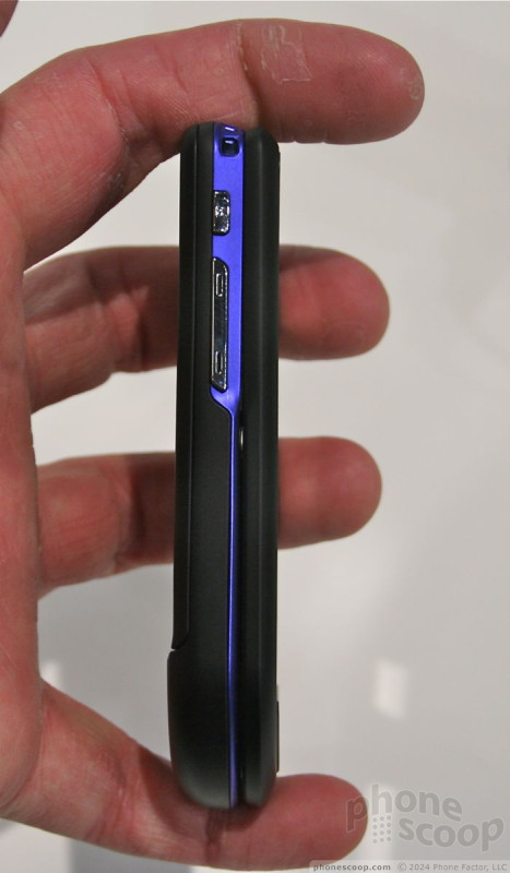
Beat DJ
If you can't figure out what the Beat DJ is all about based on the name, you must not listen to music much. The DJ is all about providing a great music experience, and for the most part, it delivers.
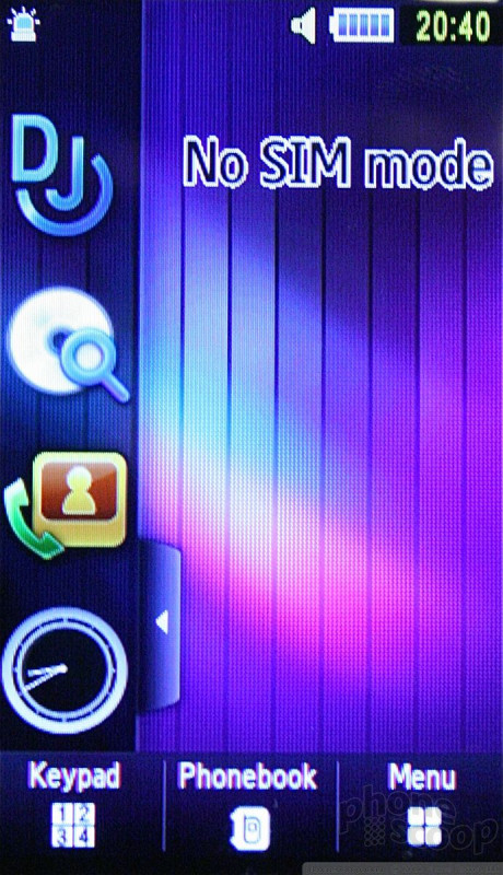
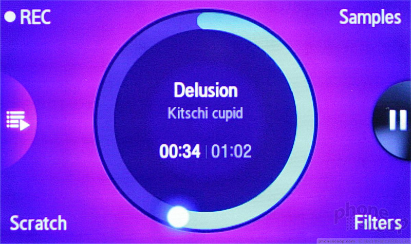
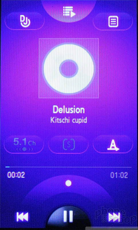
The hardware actually resembles the Pantech Ocean 2 a bit. It isn't a slider at all, but it has the same oval shape, and is a bit thicker than you'd like it to be. That said, it is comfortable to hold, doesn't weigh all that much and easily slips into and out of your pocket.
The DJ also runs the latest version of TouchWiz, though is doesn't have some of the 3D effects seen on the Omnia HD. It also has an AMOLED screen, but it isn't as large as the Omnia's. There are just three buttons on the face of the phone, tucked along the very bottom. They are easy enough to find and use. The buttons along the sides of the phone also worked well.
The DJ's stand-out feature is the music player, of course. It has a a more advanced feature set that we've seen on other Samsung music phones, and offers the DJ spinner. You press a button labeled "DJ" when playing music, and the phoenb re-orients to landscape mode and a circle appears in the center of the screen. This circle is supposed to represent a record, and you can use it to "scratch" your tunes rap-style as you play them back. It is fun to play with.
The DJ also has very good quality stereo speakers, the new microUSB charge port and a 3.mm headset jack. In all, the DJ is more of a niche phone, but it fills that niche well.
Ultra Touch
The Ultra Touch is the latest in the Ultra line up. That means it is thin, stylish, and powerful. What's interesting about this device is that Samsung has given it the full TouchWiz touch user interface, but also included a regular 12-key dialpad for text and numerical input. According to Samsung, this is meant to help coax users who might not be interested in touch devices into trying it out, since they'll be able to rely on the physical keypad.
The hardware definitely impresses. It is a very solid and well-built phone with quality materials. The function keys on the front work well, though I thought the D-pad was a wasted effort. It is very small, and clearly Samsung intends for you to just touch the screen to get what you want. The dialpad feels like it was something Samsung just copy-and-pasted from another handset. The Samsung heritage is obvious. The keys, which are flat with very little contour, had decent travel and feedback. The buttons that are positioned along the side of the phone are good, and had decent travel and feedback.
The user interface is just as snappy as the other phones, and the screen seemed to be responsive enough that we didn't notice the need for multiple presses to get things done. The phone reacted well to our input.
Once thing I'll say is that the Ultra Touch is more than meets the eye when it comes to weight. It is surprisingly heavy. With the larger screen, 8 megapixel camera and slideout keypad, there's a lot going on in the metal shell encasing the Ultra Touch.
There's no doubt it is stylish and powerful. The Ultra Touch is sure to be a hit.
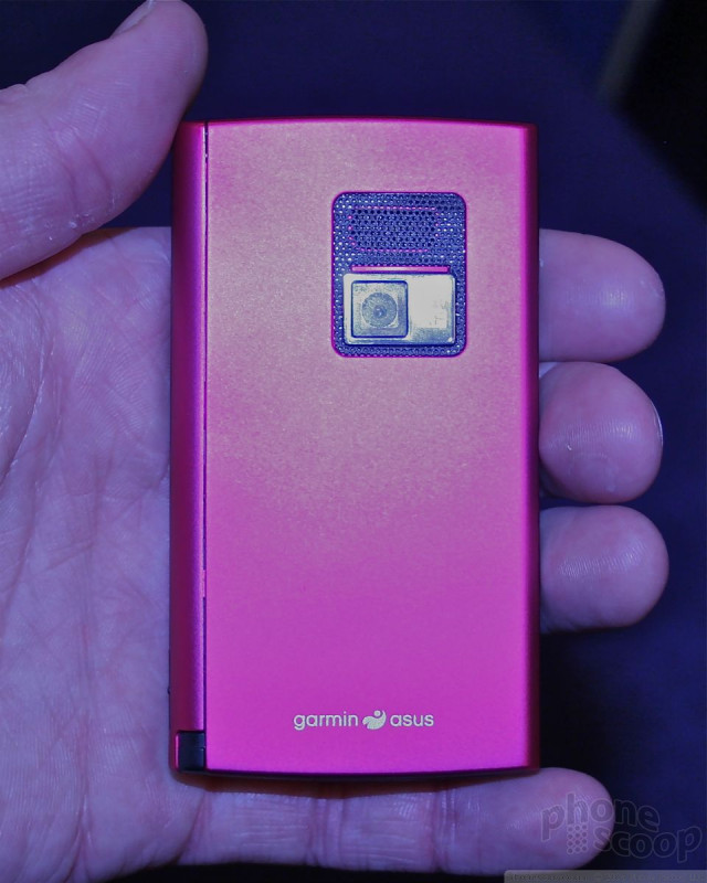
Garmin-Asus
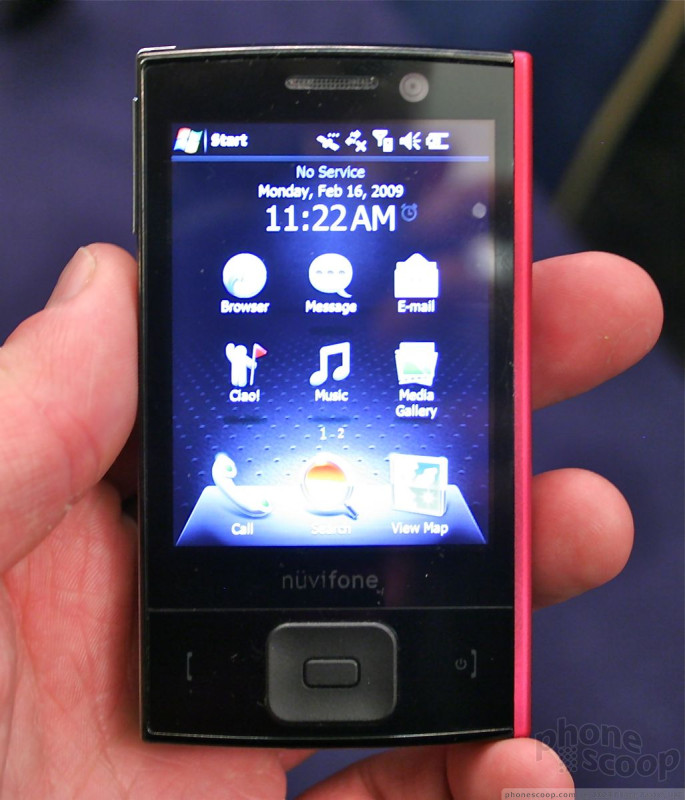
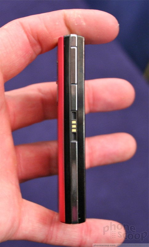
Garmin-Asus was on hand to show off its new nuvifone hardware. Both the G60 and M20 were available for some quality hands-on time. We took a look at both.
nuvifone G60
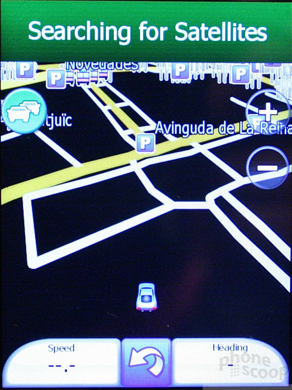
The G60 is all about tying together location-based services and cellular services. Nearly every application, it seems, ties into the phone's GPS system.
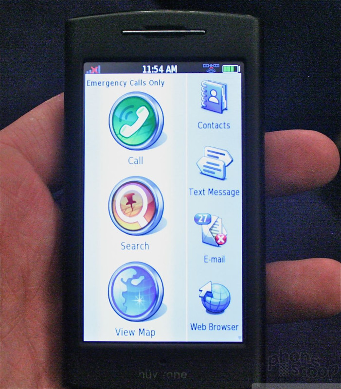
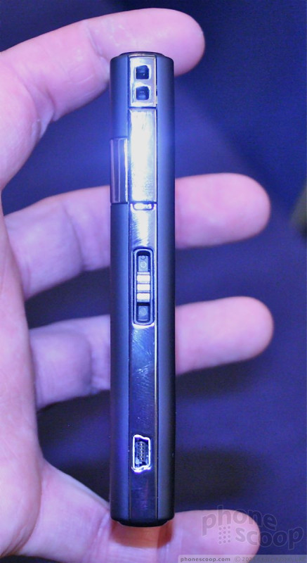
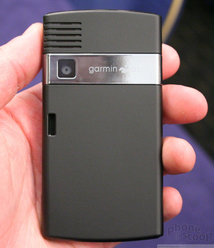
As far as the hardware is concerned, it very much resembles you-know-what from a certain company based in Cupertino. But that's where the similarities end. The G60 is larger, thicker, and heavier than the iPhone, but it isn't terribly large. The size lets it include a generous display that was nice and bright. The few buttons the G60 has were positioned well and had good travel and feedback. The G60 is a bit large to carry around in your pocket, but not terribly so. It looks (and acts) more like a GPS unit that a true phone.
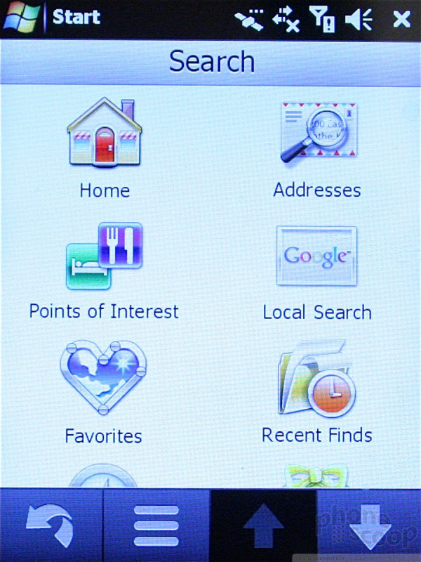
The main menu has three large items that are always accessible, the phone, search, and maps. Next to these three large buttons is a dock that can house multiple other applications, such as the browser, media player and so on. This dock sort of resembles the one used on Samsung's TouchWiz user interface, but it is different in that the applications are actual applications and not widgets.
For the most part, the G60 was responsive to touch input. Network and satellite performance were a bit slow, but we were in a crowded hotel in the middle of Barcelona. If we took the G60 outside, it might have performed better.
The applications all have a location component embedded in them. For example, with Ciao!, you can see the location of your buddies from multiple different social networks.
The contacts application will allow you to map a route directly from where you are located to a contacts' location, be it their home or work address. That's a nice feature.
All searches performed on the G60 will bring back local results. For example, if you perform a generic search for "hotels", the search results show you all the hotels located nearby, ranked in distance order. In the demonstration we saw at Mobile World Congress, the first search result returned was the hotel in which we were standing. In other words, the system works pretty good.
One cool feature is that the G60 has an accelerometer. Every single screen on the entire phone can be viewed in portrait or landscape mode. And they all look good. Garmin-Asus did a great job of making sure the screens all work well no matter which way they are viewed.
The hardware may not be the sexiest we've ever seen, but Garmin-Asus has done a lot of neat, innovative things tying GPS and cellphone features together.
nuvifone M20
The nuvifone M20 is not quite as impressive as its sibling, the G60. First off, it is a lot smaller. This may make it more pocket friendly, but this also means the screen is smaller. It was surprisingly light. In fact, it had almost no weight at all. The compact size and lack of heft make it extremely pocketable.
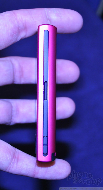
There are a collection of navigation buttons on the front. They all felt a bit on the cheap side. The plastics are not of the highest quality, and the build seemed a bit sloppy. This may be due to the pre-production nature of the unit we tested.
The M20 has a lot of the same basic features and capabilities of the G60, but the user interface is an overlay that sits on top of Windows Mobile 6.1. Unfortunately, the M20 was not nearly as responsive as the G60. The OS seemed to chug along forever before deciding to take action. I can only hope that this is based on the early version of the phone that was on hand.
Rather than feature the three large icons running up and down, the same three icons are placed along the very bottom of the M20's screen.
The rest of the screen is populated with applications that you'll interact with more often, including messaging, email, the browser and so on.
The M20 includes many of the same location-rich features of the G60, but includes Windows Mobile, making a better fit for business users.
The M20 seems like it could be a good device given more refinement. It needs to be more responsive to truly break new ground.
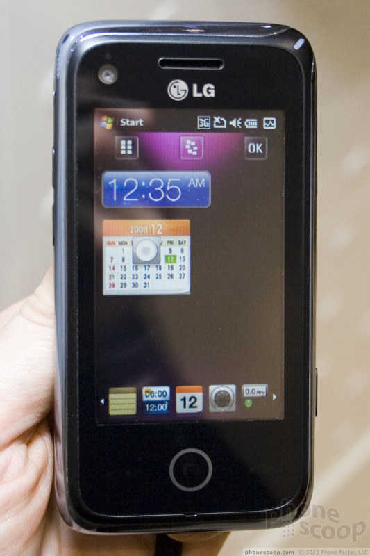
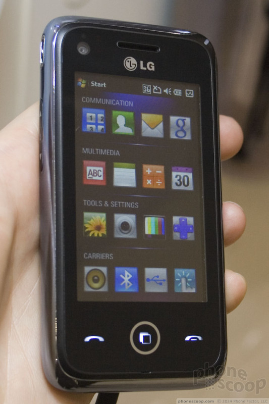
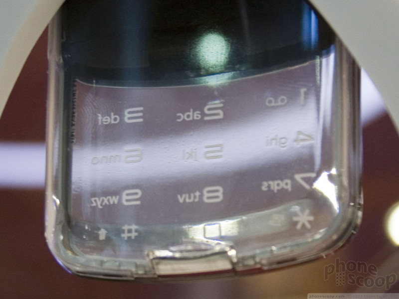
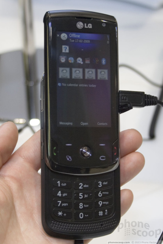
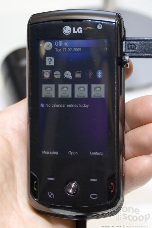
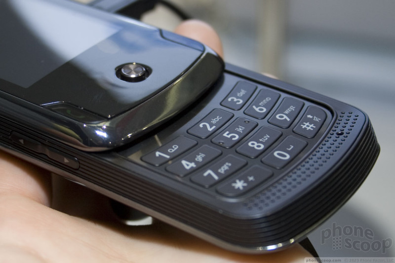
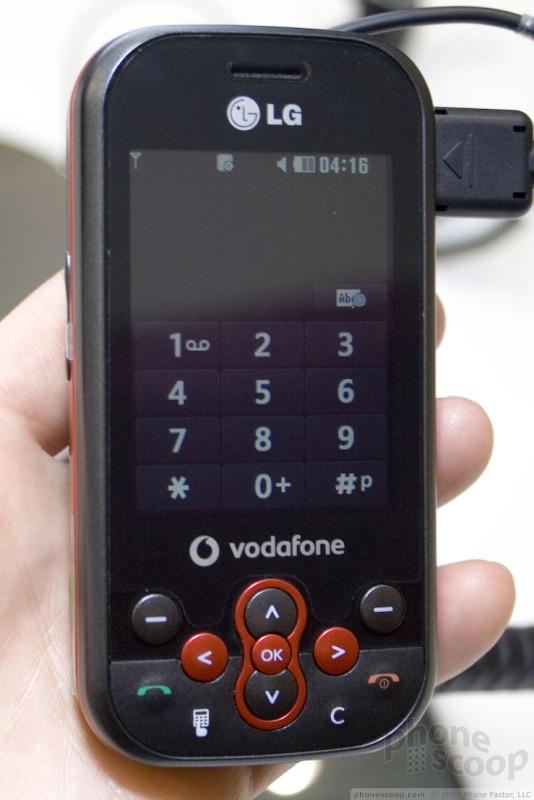
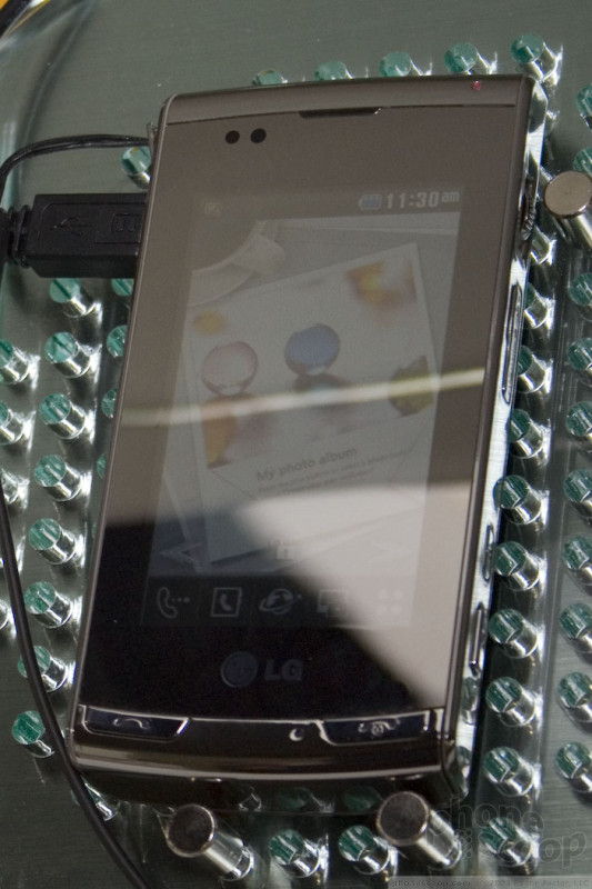
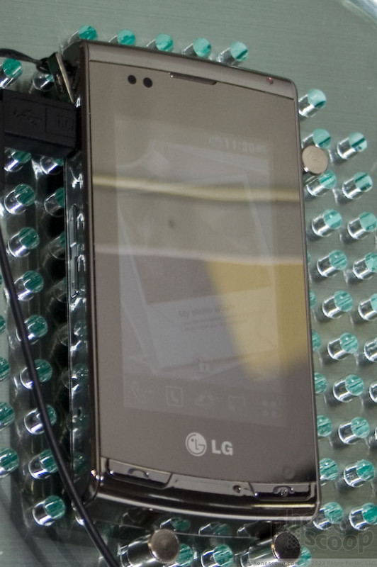
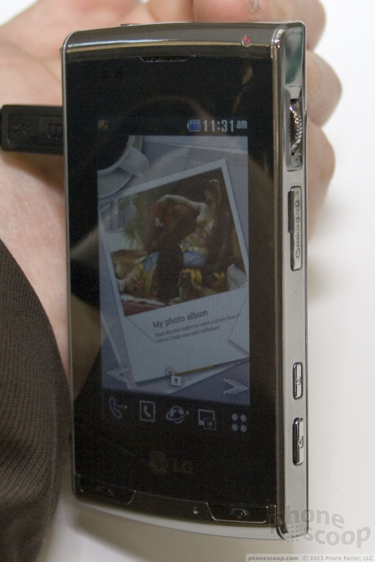
LG (updated)
Updated: see new S-Class video below.
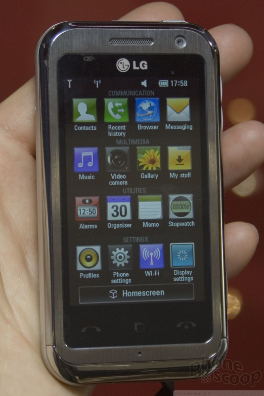
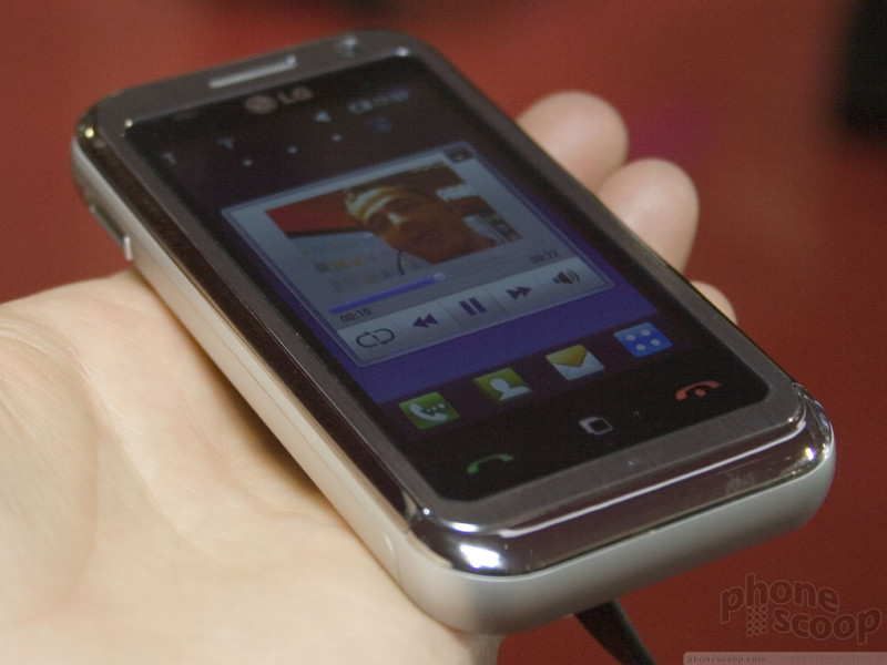
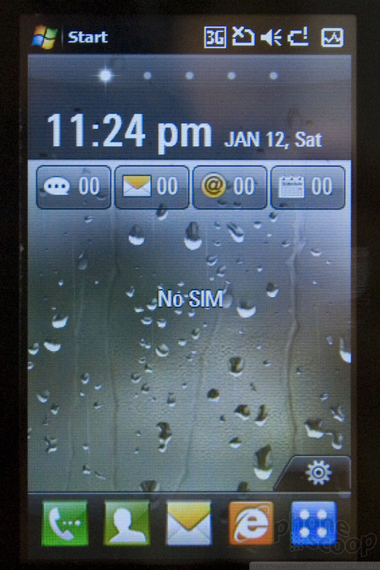
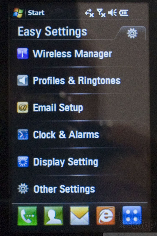
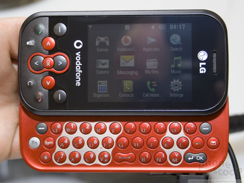
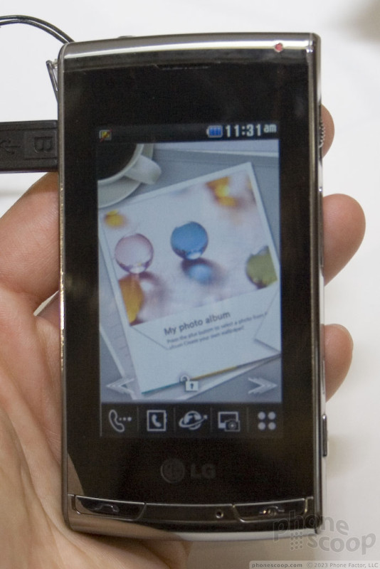
LG Introduced a new user interface (UI) at MWC this year: "S-Class". For the most part it looks like other finger-touch interfaces, but it does have a few tricks.
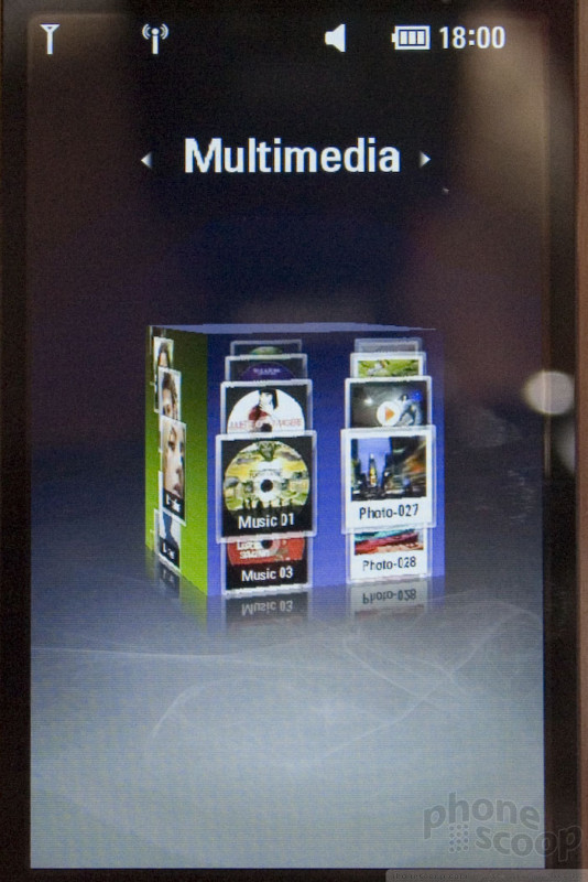
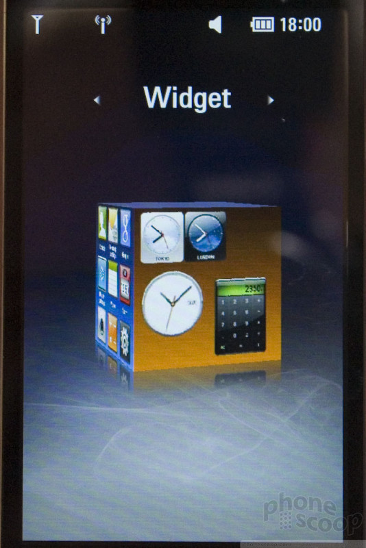
First is the 3D cube. It's just what it sounds like: a 3D cube, that you can spin with your finger to choose one of four faces, which loads a screen: Contacts, Widgets, Media, and Shortcuts. The animation is slick, fast and fun, but it's a bit of a gimmick. Flicking left/right through four pages would probably be more efficient.
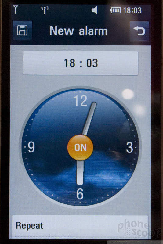
There are other aspects of the UI that are neat-looking and fun, but not entirely practical, such as the alarm clock with an analog clock face; you drag the hour an minute hand around the circle to set the alarm time. Then there's the FM radio, with a scrub wheel you drag left/right to tune to a station. It's all fun, but not as practical as it could be.
LG was also proud of the rolodex-like interfaces for scrolling through music, video, and contacts. It's fine, but hardly a new innovation. (The Gallery app on Nokia S60 phones and Apple's CoverFlow come to mind.)
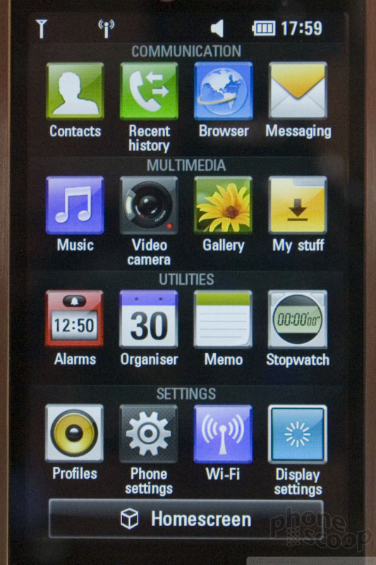
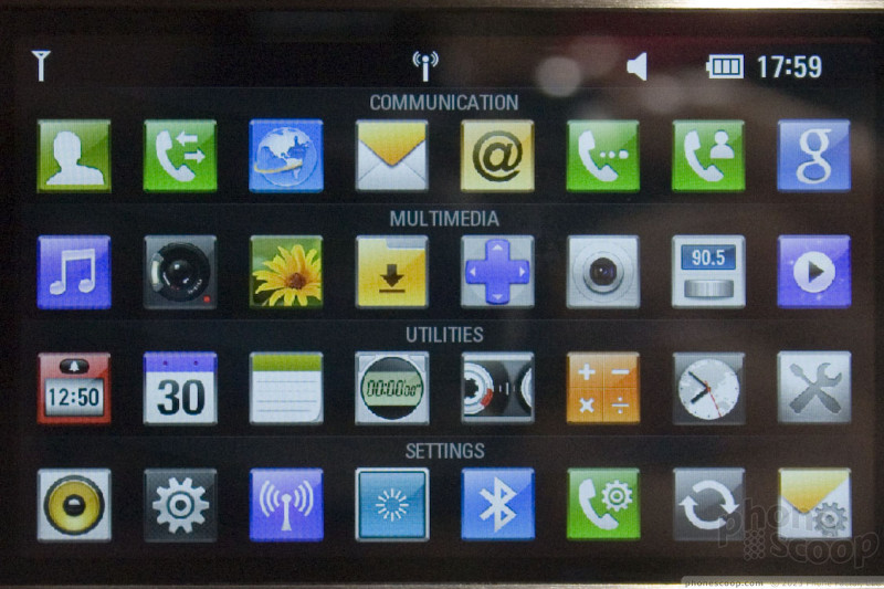
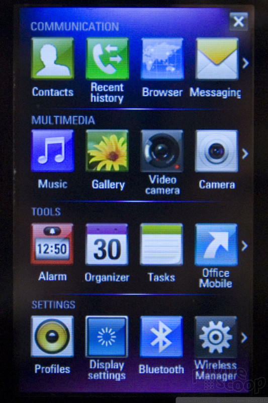
The main menu however, is quite practical and I daresay innovative. It's divided up into four rows of icons, each with a category: Communication, Multimedia, Utilities, and Settings. You can then individually swipe each row left or right to reveal more icons in that row. Turning the phone sideways switches the screen to a landscape view that shows all icons (smaller) at one time. This seems like a clever and useful way to organize a lot of icons onto a single phone screen.
Another thing I liked was the gallery application, which lets you flip through photos and videos (together) by swiping left and right - as you'd expect - but also groups them by day captured, and swiping up and down moves through days. This seems quite useful.
However, the overall usability isn't quite as good as it could be. Just having the cube and the separate main menu is somewhat confusing; which is the "top" level of the interface? I wasn't sure. Some might consider the cube the "main menu".
NEW:
Here is our hands-on video tour of S-Class on the Arena:
Also, here is a demo of the S-Class interface from the LG press conference:
LG plans to launch ten devices with S-Class this year. The first will be the Arena KM900. The FCC has already approved a version supporting US 3G networks, so there's a real chance we could see this in the US.
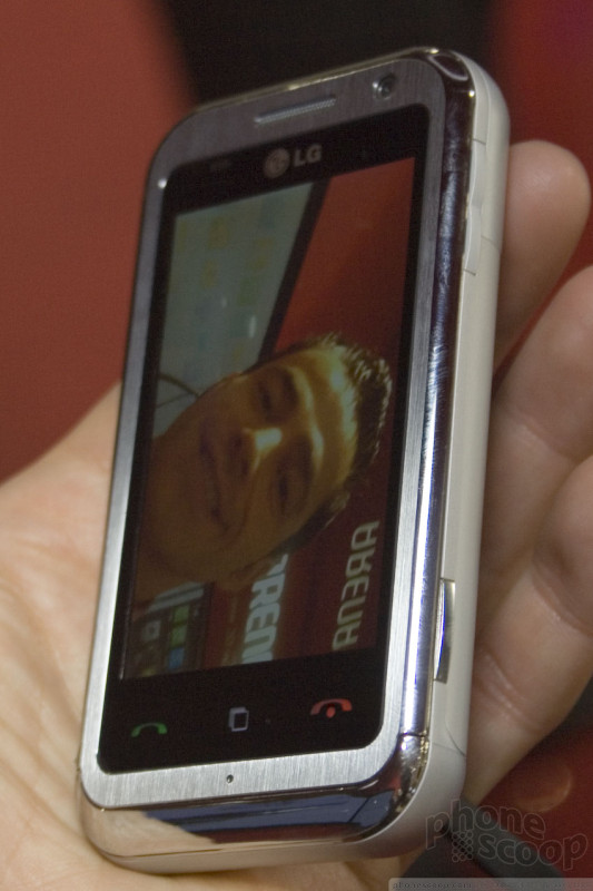
The Arena has a solid hardware feature set, including HSDPA 7.2 data, 3-inch WVGA display, 5-megapixel auto-focus camera with Schneider-Kreuznach lens, 8 GB of internal memory, and support for memory cards up to 32 GB.
It has a good solid feel to it, thanks to a metal casing. The touch screen is responsive and the display looks great. The three keys below the display are the touch type, which is annoying; physical keys would be easier to feel and press. In general, though, it seems like a good device.
LG is also bringing keys aspects of S-Class to its new Windows Mobile devices. The units we tried were definitely pre-production; what you see here is not how the final version of S-Class for Windows Mobile will look. For example, there was no 3D cube in the version we saw; in its place was a weird 5-option thing that looked like crop circles and didn't seem to work. LG's marketing materials specifically say the 3D cube should be on S-Class for Windows Mobile, so we expect that's coming before release.
LG S-Class on Windows Mobile (on GM730)
However, enough of the interface was complete and working that we could see that LG has gone down more than one level to replace various aspects of Windows Mobile 6.1 and make it more user-friendly and finger-friendly. So S-Class for Windows Mobile isn't just a top layer; it's a full-on attempt to improve on Windows Mobile, just like HTC's TouchFlo and what Samsung did with the Omnia. It looked nice and seemed to work quite well, although we didn't have much time with it.
The first Windows Mobile device with S-Class will be the GM730. It's impressively small, and also thin at 11.9mm. It looks and feels nice, with our only complaint being the three touch keys at the bottom like the Arena. There's no sign yet that it will come to the US, which is a shame because it seems worlds better than the Incite.
Part 4
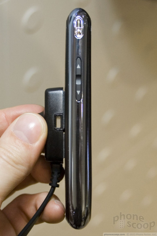
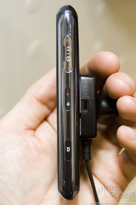
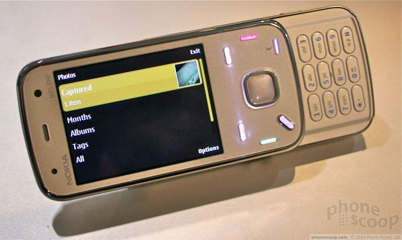
Nokia N86
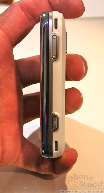
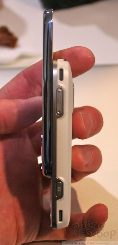
Nokia waited until Day 2 at Mobile World Congress to introduce its latest N series device, the 8 megapixel N86.
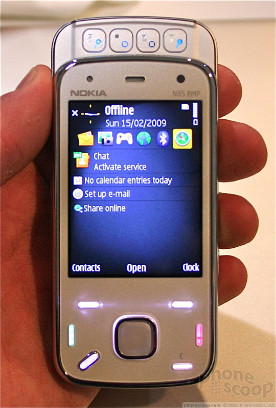

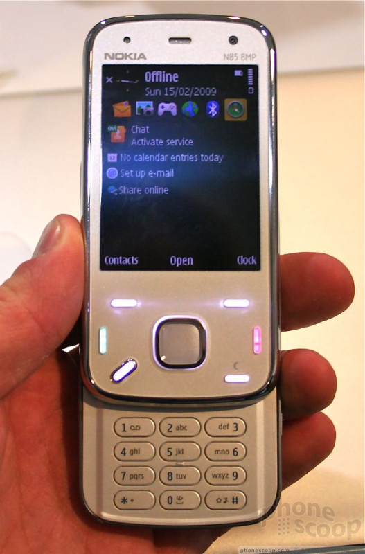
The N86 follows the footsteps of the N85, N95 and N96. That means it is a dual-slider, with standard 12-key dialpad in one direction, and dedicated media playback keys in the other.
The N86 feels much more solid and well put together than the larger N96. The materials were high quality, the back was rounded and smooth, and it felt comfortable to hold.
The sliding mechanism was pure quality. it had a very satisfying action and locked firmly into the open and closed positions with a firm spring assist.
What I didn't really care for were the function keys. They are tiny little dashes that I just find to be unusable. They have decent travel and feedback, but locating them is a bit hard. The D-pad, in contract, was excellent. I really liked the way it felt under my thumb.
The dial-pad felt good. The keys are perfectly flat and well spaced, which will make it great for pecking out messages. The media keys were also well-conceived and had good travel and feedback.
The back of the phone holds the camera. There is a little hatch covering the lens, which is easily opened. Surrounding the camera module is a kickstand that will flip out and hold the phone at a nice angle for viewing content with it resting on a level surface. This kickstand is made of plastic, not metal as on the N96. I thought it was a bit wimpy and could be prone to snapping off.
My only complaint about the N86 is that it is a little on the thick side. Sure, it is far more pocketable than the N95 or N96, but it is chubbier than the N85, which is a nearly perfect-sized device. I also wish the N86 came with the 2.8-inch screen seen on the N96 and N95-8GB, rather than the 2.6-incher that it has.
In all, though, it is sure to make many a photog happy.
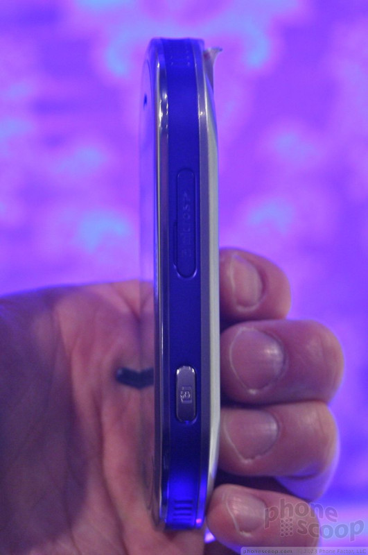
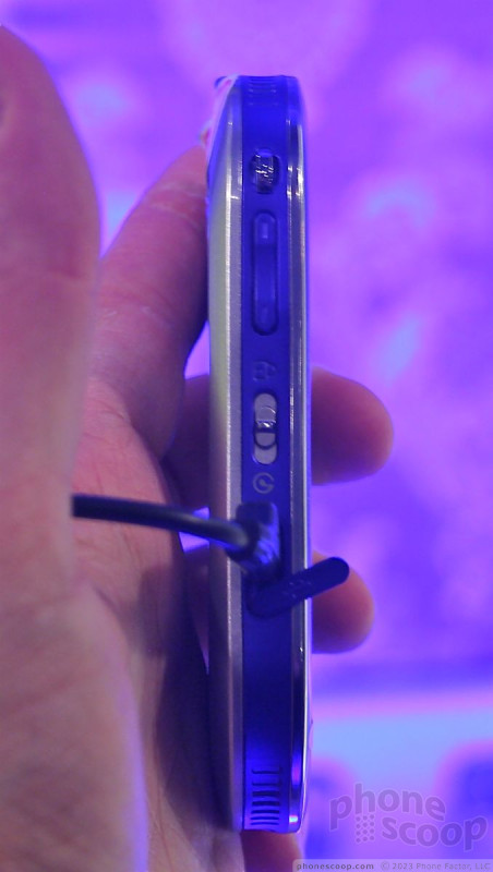
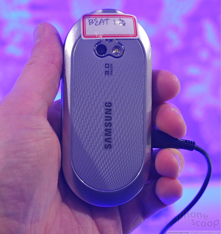
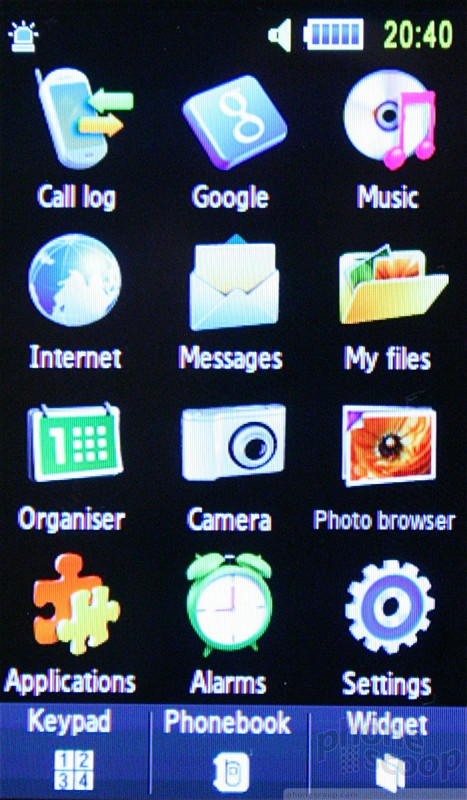
Samsung Beat Disk
Samsung had another music-based phone on hand in its booth, the Beat Disk.
Unlike the Beat DJ, which is a touch-based phone with no key-pad, the Beat Disk is a slider and has a 12-key number pad. Rather than sport the oval shape of the DJ, the Beat has a flat top.
It is a solid little phone to hold, and felt good in the hand. The slider mechanism was very good, with a perfect amount of assist from the spring.
I like the dialpad. The keys were well spaced apart and they had good travel and feedback. Since there is no contour to the keys, they don't feel awkward.
The three buttons placed along the bottom of the phone felt cheap and didn't seem to work properly. They are the send and end keys, plus a back key. They did not have good travel and feedback.
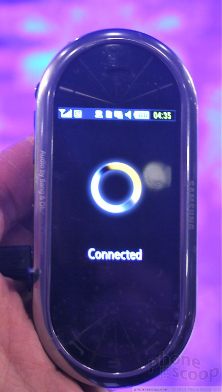
The Beat Disk also runs the new TouchWiz platform from Samsung, and features everything that's seen on the DJ, minus the spinning DJ scratch wheel.
To replace that, it has stereo speakers from Bang & Olafson wedged into the back of the phone.
For those looking for a simpler music phone with a touch user interface and a regular keypad, the Beat Disk is the way to go.
Part 5
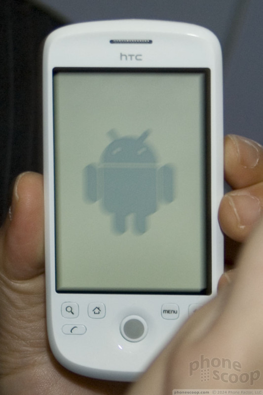
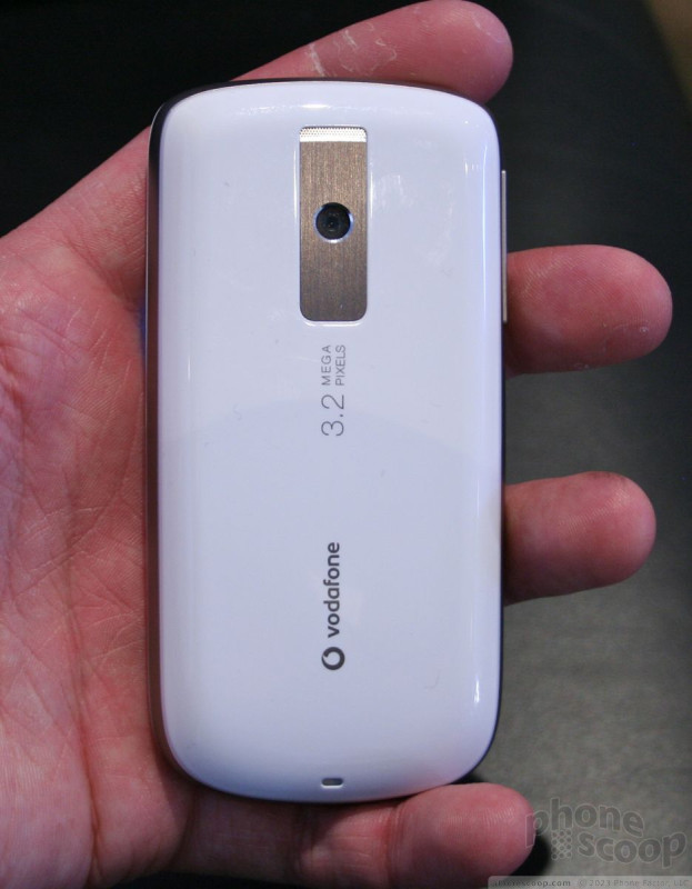
HTC Magic (updated 2)
HTC and Vodafone today announced the Magic, Vodafone's first Android phone and HTC's second.
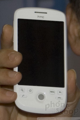
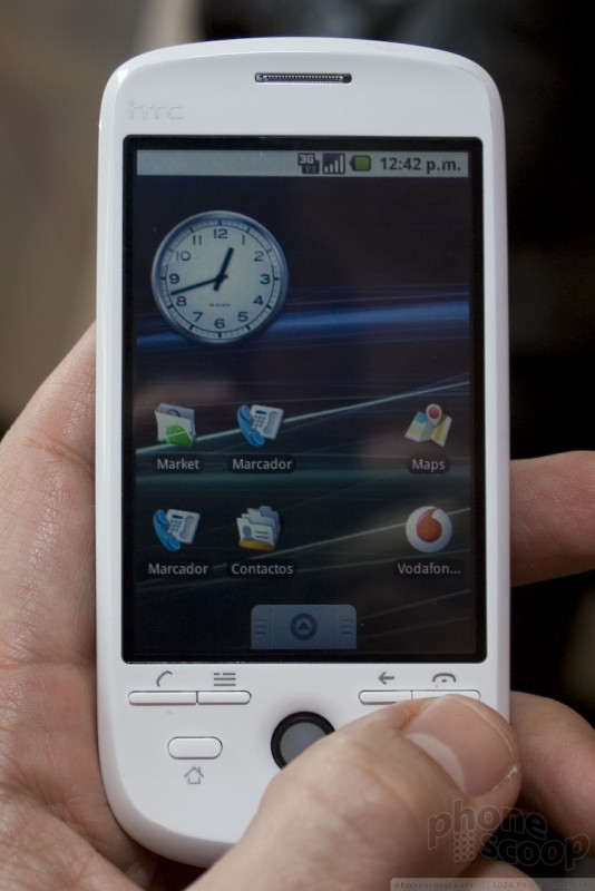
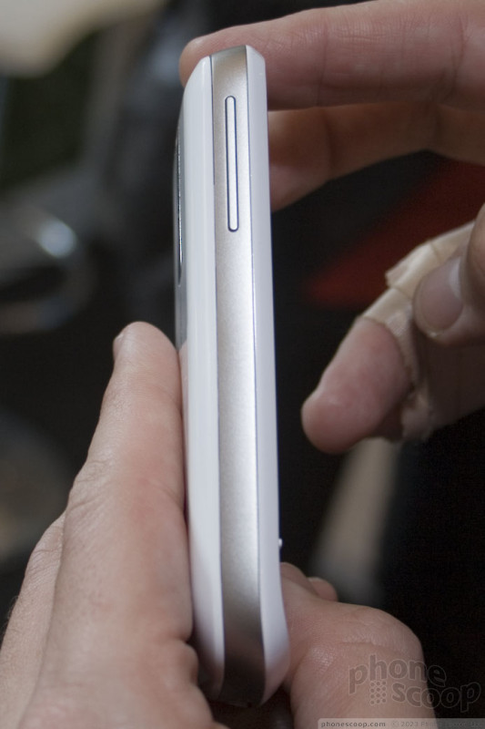
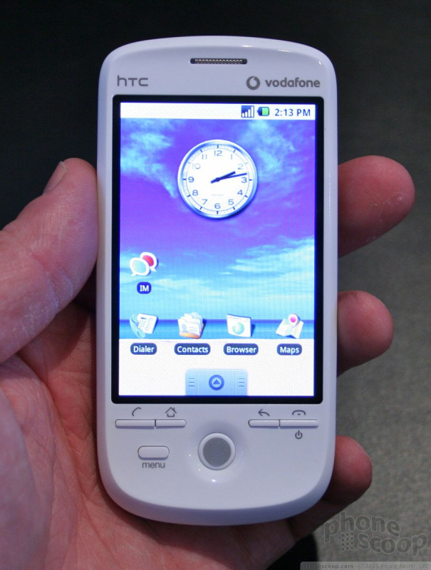
The Magic is essentially a G1 sans keyboard. Stripping out the keyboard and slider mechanism makes is noticeably thinner. The styling is similar; perhaps a less blocky, but still very clean and basic, and with a "chin" angling out from the bottom. The trackball and capacitive screen remain the same, though.
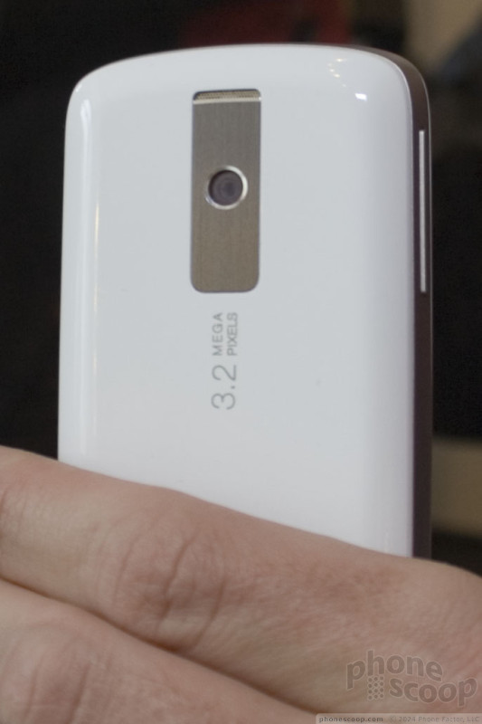
On the hardware side, it has HSDPA 7.2, Wi-Fi, GPS with compass, and a 3-megapixel camera. Compared to the G1, the battery is larger at 1300 mAh, and there is more internal memory (500 MB versus ~70 on the G1.) The memory card slot remains, but if you were hoping for a 3.5mm headphone jack, you'll be disappointed.
(One thing to note is that some of the prototypes we saw were an old design. The newer, final design has large buttons with icons on them; the tiny sliver-size keys on some of these photos are not how the final device will look.)
(The two paragraphs below were updated late on Tuesday, February 17.)
As for entering text, there is of course a virtual keyboard. We saw two different versions demo'd on two difference Magics. One has dark gray keys while another version has lighter gray keys. The dark gray version was demo'd in both portrait and landscape mode, but only supports one layout: QWERTY. This keyboard version is the one that will come on the Vodafone Magic.

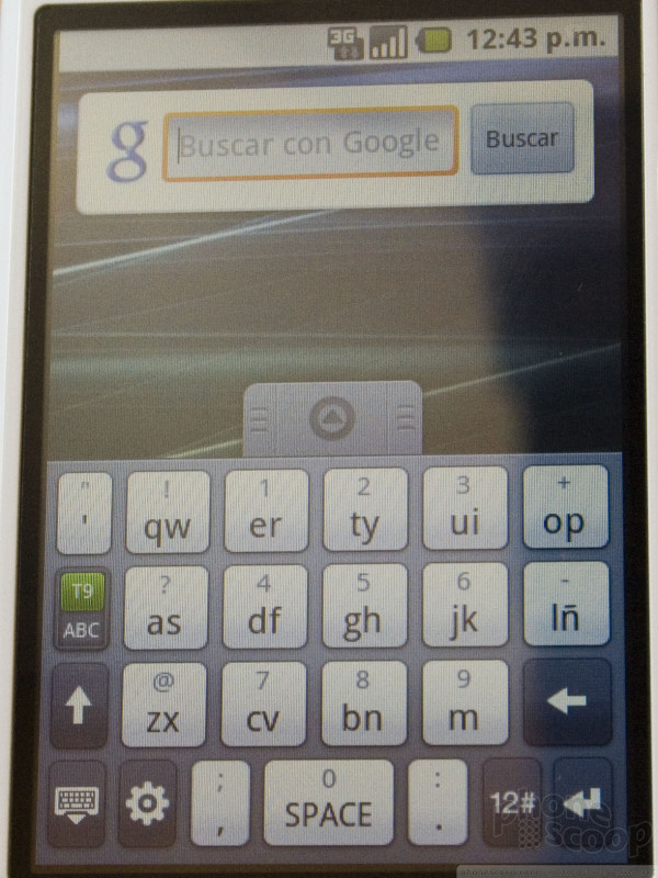
The lighter-gray keyboard design sports QWERTY, 20-key, and 12-key layouts. We were told the QWERTY layout will also work in landscape mode. These virtual keyboards look a lot like HTC's on-screen keyboard for their other (Windows Mobile) devices. The lighter one won't be on the Vodafone version of the Magic, but it was hinted that it could end up on other HTC Android devices.
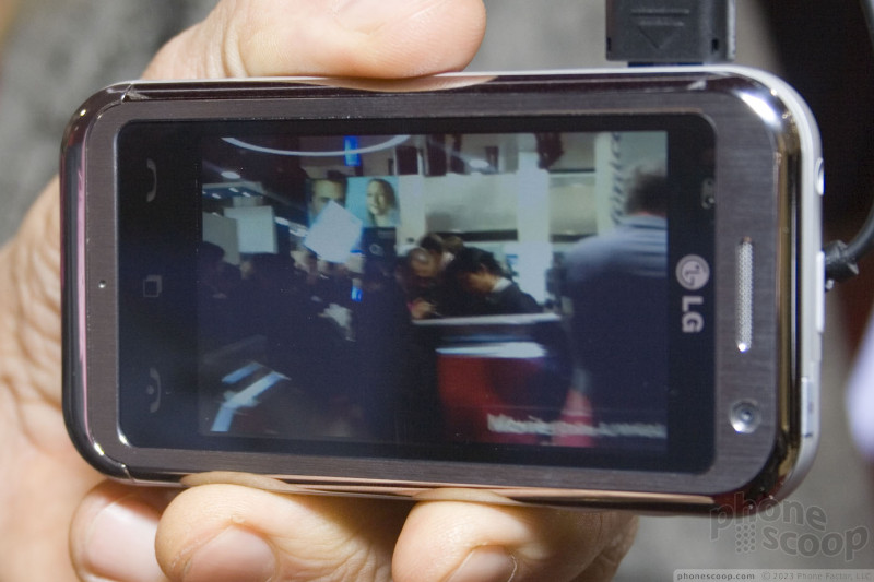
The Magic has one very new feature, the ability to record video. The software has been added to the Android platform and will ship on the Magic. Here are some shots of the video gallery.
The rest of the OS is exactly as you would expect. It's Android, and not very different from the G1.
The hardware announced today is designed for European networks with 3G supporting only the 900 and 2100 MHz bands. It is, however, possible that another version could be announced later with support for US 3G networks.
Here is a video where we take a closer look at what's NEW in the Android OS:
Here's a full video tour:
Toshiba TG01
Toshiba was showing off an early prototype of its recently announced TG01 smartphone. This thin phone sports Windows Mobile and a ginormous touch screen display.
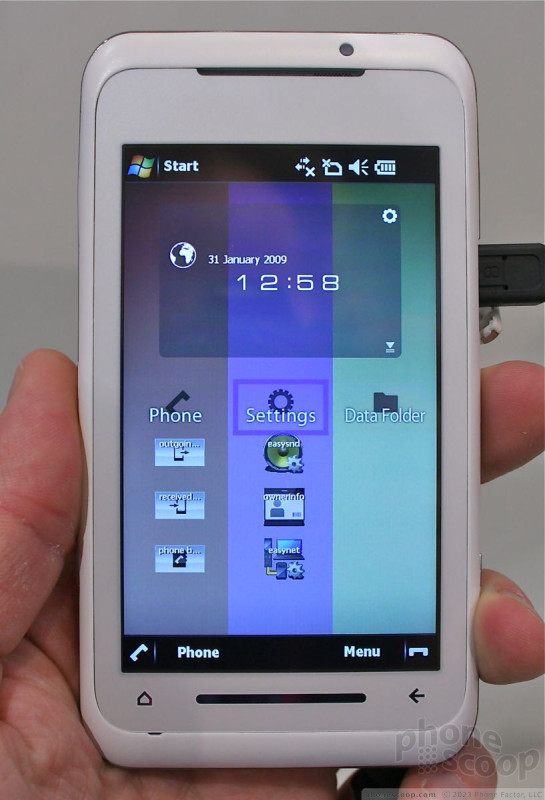
The hardware was gorgeous. Think of the white iPhone, only thinner and bigger. It has nice quality plastics, well-rounded edges and a thin stripe of chrome encircling the entire body. The only physical buttons are along the phone's side, where you'll see a camera button, volume toggle and locking key. They all had decent travel and feedback and were easily found.
The front of the TG01 is dominated by the display, which measures 4.1 inches and rates WVGA resolution. It looked very good, but not as good as some of the AMOLED displays we've seen at the show.
The display is touch sensitive, though the user interface wasn't very responsive. Toshiba told us that the hardware they had on hand was very early prototypes, and it showed on the software side of things.
The vertically striped user interface overlay that sits on top of Windows Mobile could be usable if the phone weren't so slow. I have a hard time believing the spec'd 1GHz Snapdragon processor was really in there. The phone took ages to respond, was very buggy, and randomly opened applications and screens that the user didn't touch. You can see some of the bugginess on the video (below). The stripes each contain a number of application shortcuts, and this can be customized to the user's content. If you swipe your finger sideways across the stripes, they will re-order themselves. I can't really figure out how this is useful, because it just switched around the existing set of stripes and didn't change to show different applications/shortcuts. But it sure looked like fun to play with.
Aside from the large screen, there are some other impressive specs for the TG01. It will come with quad-band GSM/EDGE radios, but only supports HSDPA/HSUPA 2100 (for Europe). It has a 3.2 megapixel camera with autofocus, and can playback MP3s and other video.
There are two touch-capacitive buttons at the very bottom of the screen, which seemed to be the most reliable way to get the TG01 to do anything.
We'll be happy to revisit the TG01 once it is more final form and we can get a better idea of just how well the Snapdragon processor works.
more LG
LG had more than just the Arena and GM730 on display at MWC. They actually debuted three new S-Class phones at the show, and were showing off a few other interesting phones that they simply weren't promoting as much.
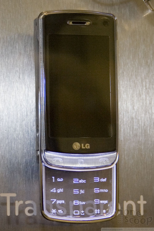
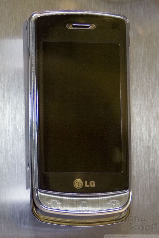
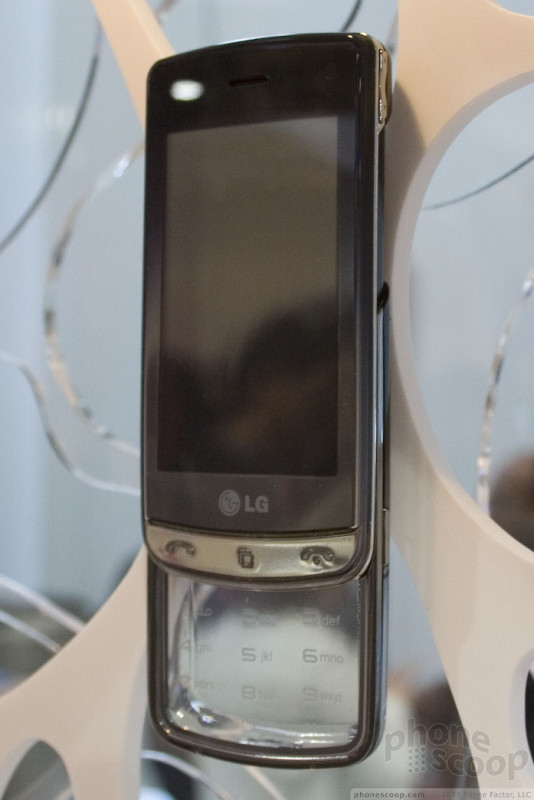
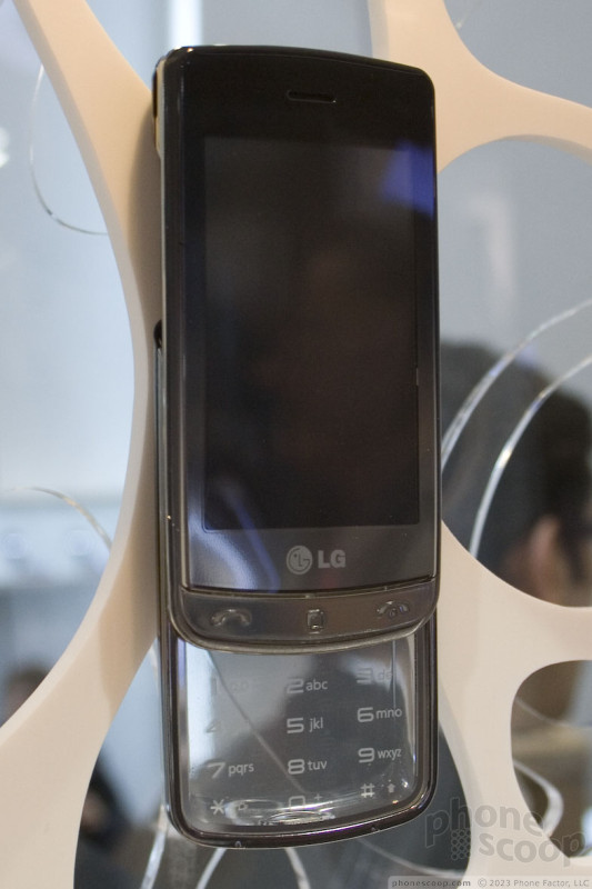
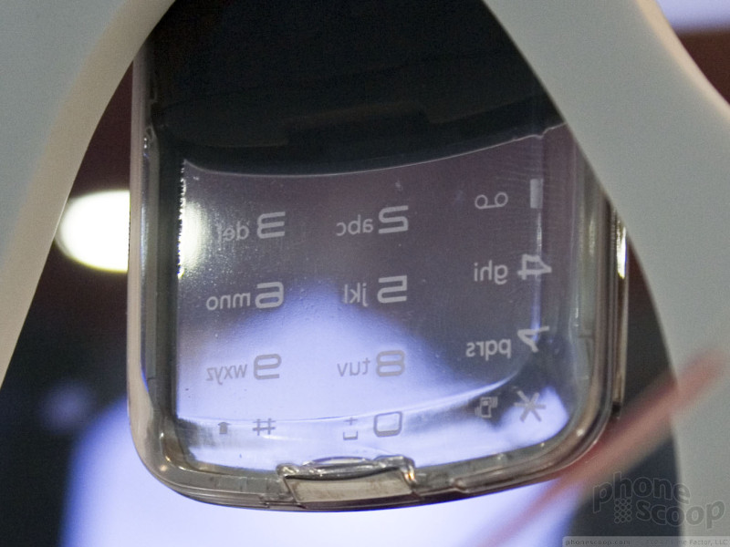
The GD900 runs the new S-Class interface, so it's a finger-touch phone. But unlike the Arena with its high-end specs, and the GM730 with Windows Mobile, the focus of the GD900 is on design. The stand-out design element is the completely transparent slide-out numeric keypad, which lights up with a cool (as in blue) glow when open. There's not much else to say about it. It's neat; it's definitely a conversation piece, as well as to a full-featured touch phone.
Here's a quick video of the GD900:
One stealth phone in the LG booth - not really "announced" that we know of - is the KT770. The big news is that this is a smartphone running S60 3.2 (or 3rd Edition Feature Pack 2 in Nokia parlance.)
As far as specs, it's well-equipped, but doesn't have anything really unique to set it apart from the pack. Features include a 5-megapixel camera, GPS navigation, and a 2.8-inch 400 x 240-pixel display.
The interface looks standard for S60. It has a bit of LG styling with the colors and icons, but that's all we noticed.
Another interesting phone is the KS360. It's not new globally, but it's rumored to be be coming to the US, so we checked it out.
The concept is quite interesting. It technically has a touch screen, but it's not really a touch-oriented phone. It's basically a typical QWERTY messaging slider, except that it has an on-screen numeric keypad instead of a physical one. This allows the screen to be larger - yet the overall phone smaller - than most other messaging sliders. It's also thinner than dual-slide phones like the Pantech Ocean and Matrix.
This actually makes a lot of sense. Personally, I rarely dial numbers. I'm much more likely to use a full keyboard or simply use a d-pad for most interactions with my phone. Everyone I call is in my contacts list, so having the dial pad relegated to temporary touch keys works well.
The virtual numeric keypad can be summoned using a dedicated button at the bottom-left of the d-pad area.
That's pretty much all the touch screen is used for, though. You can't even use the touch screen to select main menu icons, for example. LG might say you should consider it a non-touch phone with a zero-footprint numeric keypad.
The KS360 looks and feels nice. We hope the rumors are correct and it will come to the US.
We also took a closer, hands-on look at the S-Class UI on the Arena. Check out the updated LG page in Part 3 to see our new video tour.
Part 6
LiMo Phones
The LiMo Foundation has been talking up its Linux platform for a couple of years now. At first, it wasn't an actual platform, just a club of companies that each used Linux; a club with a an apparent open-door policy.
However, they've always claimed to be working on one unified LiMo Linux platform and this year they claim they've done it. However, LiMo's strategy is wildly different from platforms such as Android. There is no user interface as part of LiMo Linux itself. Rather, LiMo Linux is just the low-level OS part, and companies using it are expected to build their own user interfaces using an interface builder tool such as Glade.
Samsung phones running LiMo Linux
LiMo Foundation was showing off a number of LiMo phones at MWC this year, including a Samsung Omnia, Samsung i780 (Epix), and an LG similar to the Incite. Each was running the respective company's standard user interface on top of LiMo Linux. A crude status bar at the top was the only real visual cue that these were running Linux and not proprietary software (not that we doubt the LiMo folks.)
The Samsungs were running a version of TouchWiz. It was clearly designed for full-touch, so it didn't take advantage of the soft keys on the Epix, for example. It was speedy and fairly feature-complete. It even had some nice little animation between screens. Samsung says they plan to ship a LiMo phone this year, and based on how far along the software seems to be, that seems totally feasible.
LG's LiMo phone looked like an Incite, but they called it the "Atos-L". The LG software was clearly not very far along. Of the two units we tried, one was painfully slow (as in 5 seconds to respond to each button press and 10-20 seconds to load each new screen) and the other only had the top-level menu working; nothing else.
Still, we could see that most of the features were there (on the one) including a WebKit-based browser that looked promising. The interface looked much like the standard LG finger-touch interface you might find on a Prada phone or Vu.
Here's a video tour of all three phones:
Yahoo Mobile
Yahoo launched a whole new mobile product called Yahoo Mobile. It comes in several different flavors, including a full application for the iPhone and other smartphone platforms such as S60 and BlackBerry OS, as well as browser-based version.
All of them do pretty much the same thing: Tie all of Yahoo's mobile services into one user interface.
Yahoo Mobile (for the iPhone) has five distinct tabs that hold different content. One if for Yahoo's news feed, one is for your own news feed, one is for all your messaging, one is for connecting and the last is a directory of every mobile service that Yahoo offers.
The user interface is very customizable, and it is easy to add or delete content at a whim. By making it a full application, Yahoo was able to take advantage of the iPhone's capabilities, such as scrolling through menus.
The application takes on a different form for other smartphone platforms. In S60, for example it populates screens with widgets that launch the Yahoo service, feed or content in question. On all the versions we tested, it was easy to figure out and use.
Here is a video demonstration so you get a better idea of how it works:
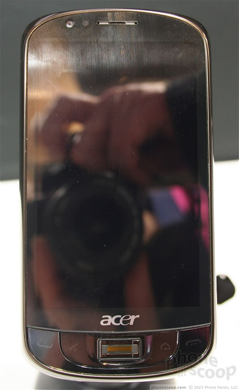
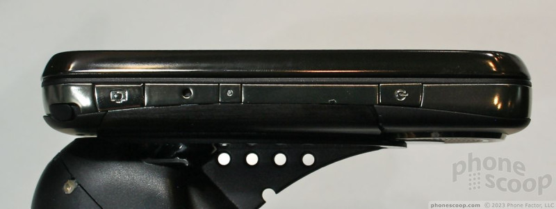
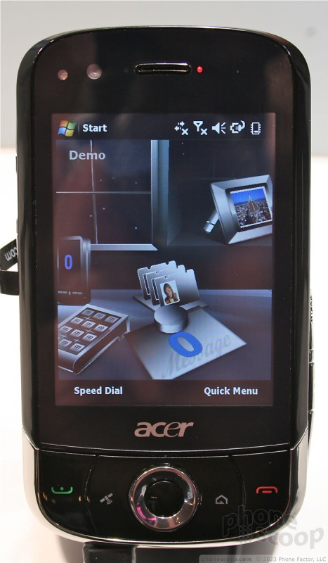
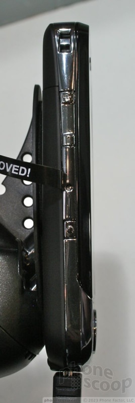
Acer
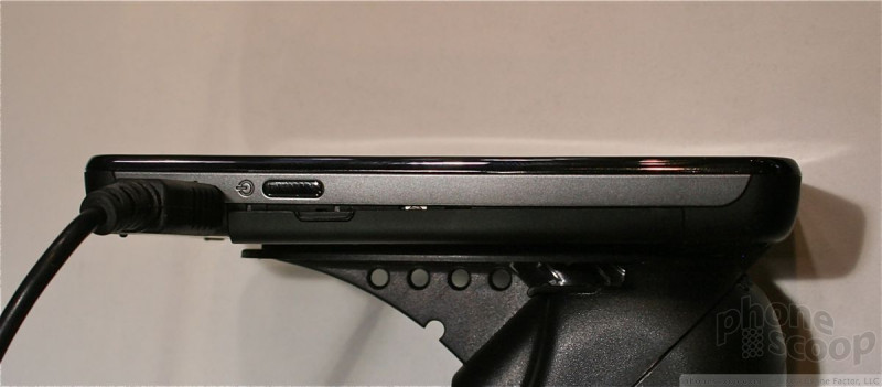
Acer introduced four new Windows Mobile smartphones in Barcelona. They may boast impressive specs, but we truly hope Acer plans to spend some time refining its hardware.
DX900
First up is the dual-SIM DX900. This is seriously that fattest smartphone I have ever held. This could be to accommodate the dual SIMs, or it could just be the design. Whatever the reasoning, it is a thick, thick phone.

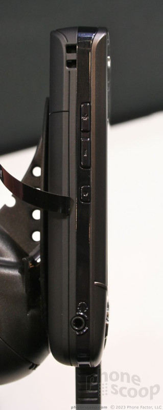
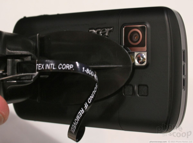
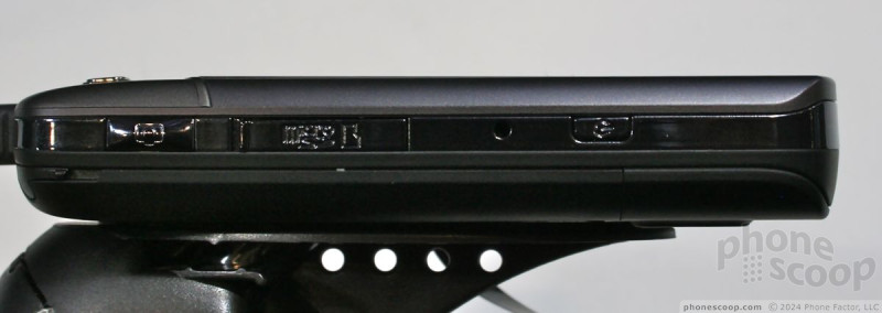
It doesn't weight too much, despite its size, but you're not going to want to carry it in your pocket. This is clearly meant for heavy travelers who need some computing power on the go and want to only carry one phone. I would expect that at the end of the day, any user of the DX900 is going to switch out one of the SIMs into their personal phone.
The plastics all felt cheap. The control keys at the bottom of the phone's front face all worked well and had good travel and feedback, but the buttons along the side of the phone didn't work at all. We understand that this are pre-production models, but even we were surprised at how shoddy the builds were.
F900
Take everything I said about the build quality of the DX900 and apply that here, too.
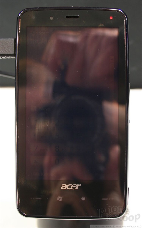
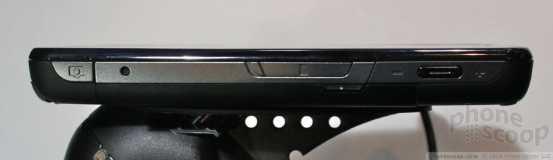
The one thing the F900 has going for it is that it is much thinner than the DX900. It is longer and wider, but the thinness helps out a lot. The screen is also much larger than the DX900, and this is a good thing. We didn't get to see the F900 in action because none of the models worked, but the screen was very roomy.
M900
The M900 on hand was literally falling apart. The control keys on the front of the device have seen some serious action. They were coming off the phones we saw.
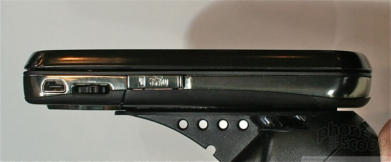
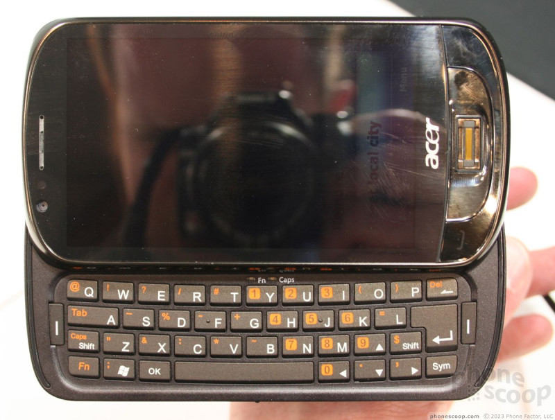
That aside, the M900's claim to fame is that is has a slide out QWERTY keyboard for messaging. The keyboard adds a lot of thickness to this phone. It isn't DX90 thick, but it's pretty chubby.
The QWERTY keyboard may look large and comfortable, but looks can be deceiving. It was quite literally the worst QWERTY keyboard I have ever used (sorry Acer!) The keys felt like cardboard and had nearly zero travel and feedback. They also were coated with some sort of texture that made my thumbs unhappy.
This was another non-working phone, but the buttons found along the outer edges of the phone were noticeably better than the two previously discussed phones.
X960
The X960 was bay far the most interesting of the bunch. The hardware may have not been all that special (apply build quality issues here, as well), but the X960 was using a trial version of a user interface overlay.
The OS takes a picture of a desk and places different applications in different places on the desk Scroll to the far left to see your calendar, listen to music, and open messages. The middle screen lets you access the phone, contacts and productivity apps, and the far right side of the screen lets you open up the Internet. It is a little cutesy, but a decent idea nonetheless.
The X960 also has an improved contacts application that places contact photos in a little bubble next to their contact information and lets you call/message them directly with a touch of the finger.
In all, we weren't that impressed with Acer's first set of devices. All of them border on the too-large, and will make for awkward devices to carry around in your pocket.
Eric has been covering the mobile telecommunications industry for 17 years at various print and online publications. He studied at Rutgers Newark and University of Kentucky, and has a degree in writing. He likes playing guitar, attending concerts, listening to music, and driving sports cars.
 Samsung Refreshes Galaxy S Series with S Pen, New Cameras
 Nokia Brings New G Series to US
 Orbic Reaches Beyond Verizon's Orbit with the Magic 5G
 Nokia G300 Lands at TracFone with 5G
 iMovie Makes it Easier to Create Polished Videos
Comments

Official Launch Info of Diamond2 and Pro2
http://www.engadgetmobile.com/2009/02/26/t-mobile-br ... »
It sounds like T-Mobile Europe will be the first to launch the Diamond 2 and Pro 2, as well the Diamond 2 might be an exclusive to T-Mobile?!
http://www.engadgetmobile.com/2008/09/29/verizon-get » ... »
You might be right, but i will wait and see who gets it in America first.

Quick Question

Touch Pro2 coming to Sprint?
When do you think we will hear from HTC or the press which US carriers get this wonderful phone?
Can anybody speculate if we will get the carrier availability news this month or will we have to wait until sometime in March or April?
(continues)

Headphone Jacks on HTC V.2 Phones?
its very frusterating!!!

Question on the Samsung Memoir if someone can answer?
I was curious do you know if the memoir will have google talk included on the IM client or not.
just was curious.
thanks
The Memoir IM client
I was curious do you know if the memoir will have google talk included on the IM client or not.
just was curious.
thanks

HTC Magic (G2)
Truth be told, there is not much new compared to the G1. It lacks a keyboard and a has a few hardware tweaks like a larger battery and more memory, but that's about it.
A...
(continues)

Windows Mobile 6.5: No more plug-ins? Tasks?
Where the new home screen disappoints is that it completely removes the widget-like Today Screen Plug-In architecture from previous versions. Widgets are something of a hot trend right now, and Microsoft essentially had a huge head-start on that with its Today Screen Plug-Ins. Quite a few good third-party ones are available. While the replacement home screen is nice out of the box, Microsoft has not only broken compatibility with old plug-ins, but failed to provide a new API for third-party plug-ins at all. This feels like a major step backwards, and is a baffling move.
I'm happy to learn that Mobile Shell 3.0 is going to be supported, but what about all the free plug-ins I used to use? Am I even able to see task...
(continues)
I'm afraid it does not seem to includes Tasks, which I'm bummed about, too. ☹️ It is just alpha right now, but the current home screen modules are:
- getting started
- fa
(continues)

New or old?
Most people have good coverage these days without dropped calls. If that's not the case with your carrier in your are...
(continues)
Touch Pro2
The screen looks amazing! And the keyboard looks like a fuze between the touch pro and the xperia. This makes me rather excited, since I found the input on the original touch pro good, but lacking ergonomics, ie stylus required to use the touch screen properly, and the keyboard lacks that something that let's you know where you are at on it without looking. Don't get me wrong, I think it is one of the best phones for inputting commands, I'm just...
(continues)
(continues)
From the article:
The best feature of the Touch Pro2 just might be the keyboard. It's one of the best I've ever tried. The keys are perfectly sized and shaped, and feel wonderful...
(continues)

N86 is sick!!
i don't know if i missed it, but does it come with the OLED screen?

Memoir Video Recording
I think the Memoir can actually record at 120 fps, like most new high-end Samsungs.